Pricing page examples (449)
A pricing page is where a visitor finds out what the product costs. Its job is to help them pick a plan and start paying. See 449 real examples.
Showing 1–24 of 449 pricing pages
How to structure a pricing page, by the numbers
The questions a team asks when it rebuilds a pricing page, answered from the 449 here.
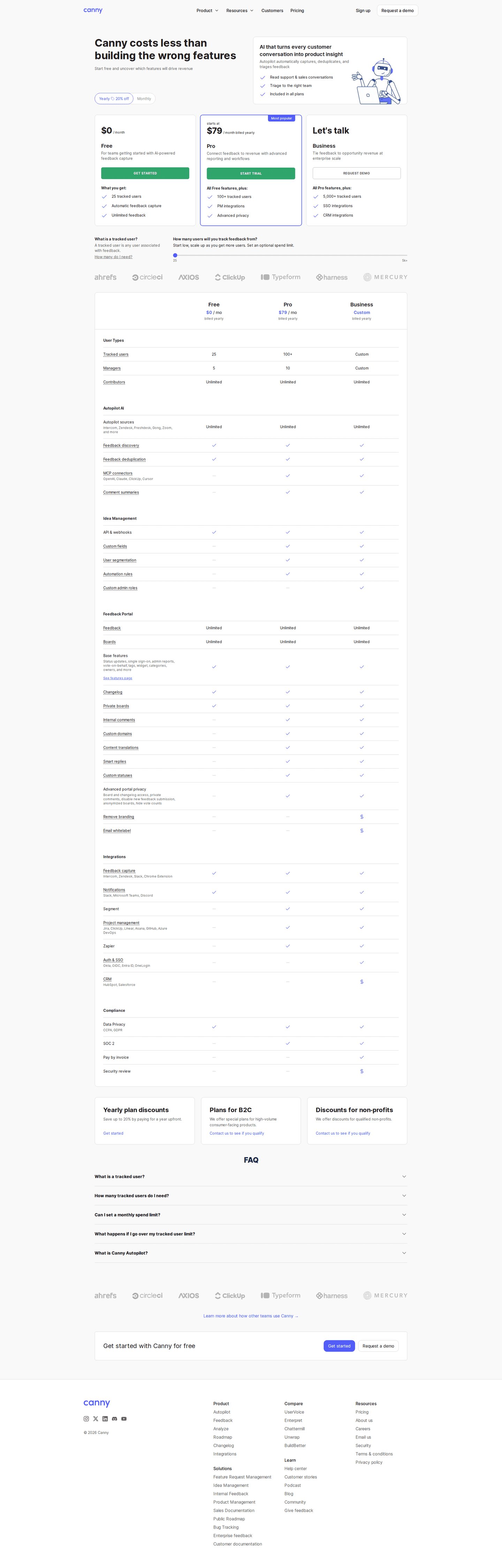
How many plans?
How many plans are on the page
- Three plans162 pricing pages
- Four plans157 pricing pages
- Two plans44 pricing pages
- Five plans28 pricing pages
- No plan grid23 pricing pages
- One plan20 pricing pages
- Three plans on 36% of pricing pages, four on 35%
- Two plans on 10%, five or more on the rest
- No plan grid at all on 5%, usually because every price is a quote
Which pricing model?
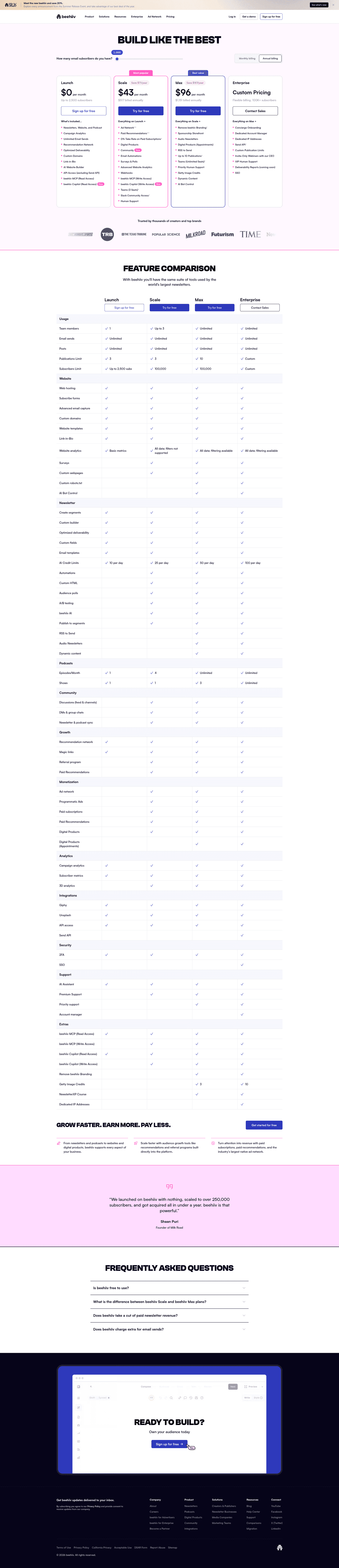
How the price is counted
- Flat monthly price119 pricing pages
- Per seat114 pricing pages
- Mixed102 pricing pages
- Usage based55 pricing pages
Flat monthly, per seat and mixed each take about a quarter of the market. Usage-based pricing, the model every AI product is expected to have, is on 14%.
Should every price be shown?
- 23% hide at least one price behind a contact button
- 78% carry a custom-quote tier, 66% an enterprise tier
- 20% put a calculator or a slider on the page so the visitor can price their own case
Monthly or annual?
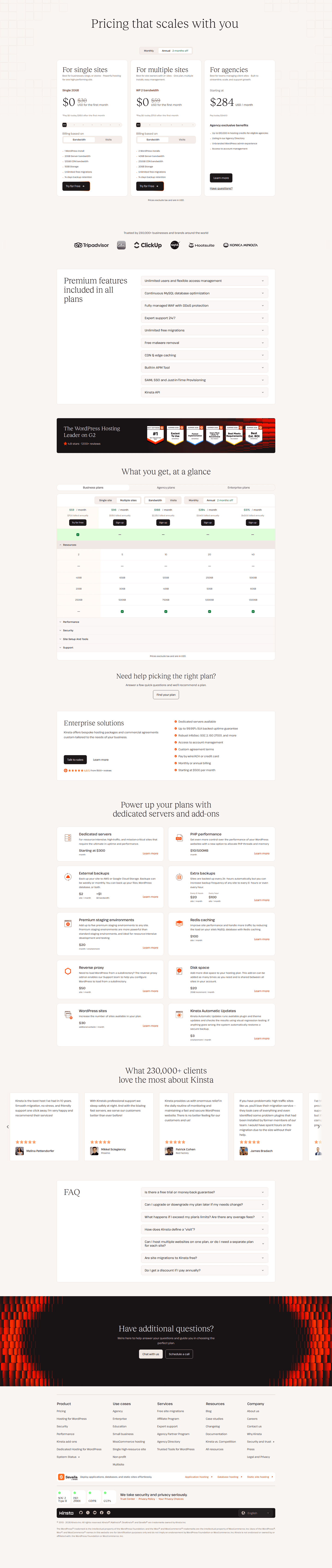
- 46% have a monthly and annual toggle
What the annual side promises
- Save 20%24 pricing pages
- 2 months free7 pricing pages
- Save 17%6 pricing pages

Free plan or free trial?
- A free tier on 43%
- A free trial on 46%
- A money-back guarantee on 5%
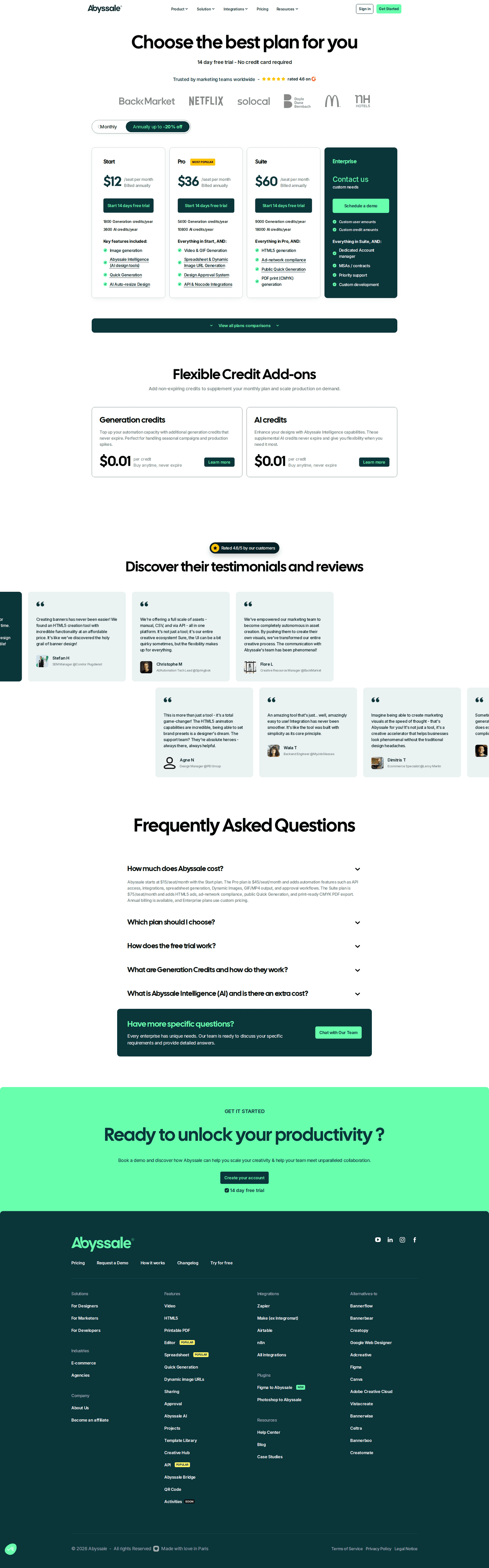
Which plan to highlight?
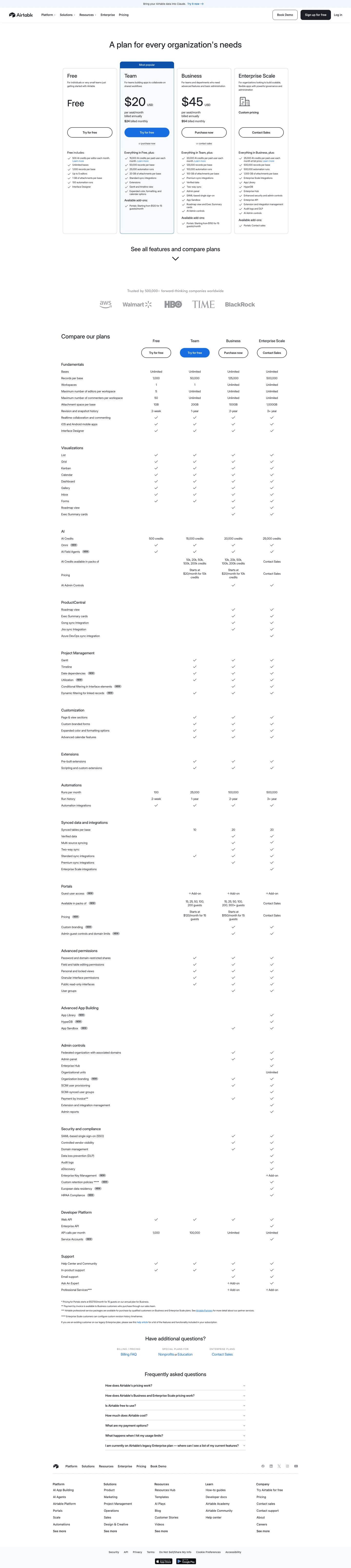
The plan the page highlights
- Pro59 pricing pages
- Business23 pricing pages
- Premium20 pricing pages
- Growth19 pricing pages
- Enterprise14 pricing pages
- Professional10 pricing pages
One plan gets the border and the badge. It is named Pro far more often than anything else, and it is almost never the cheapest one.
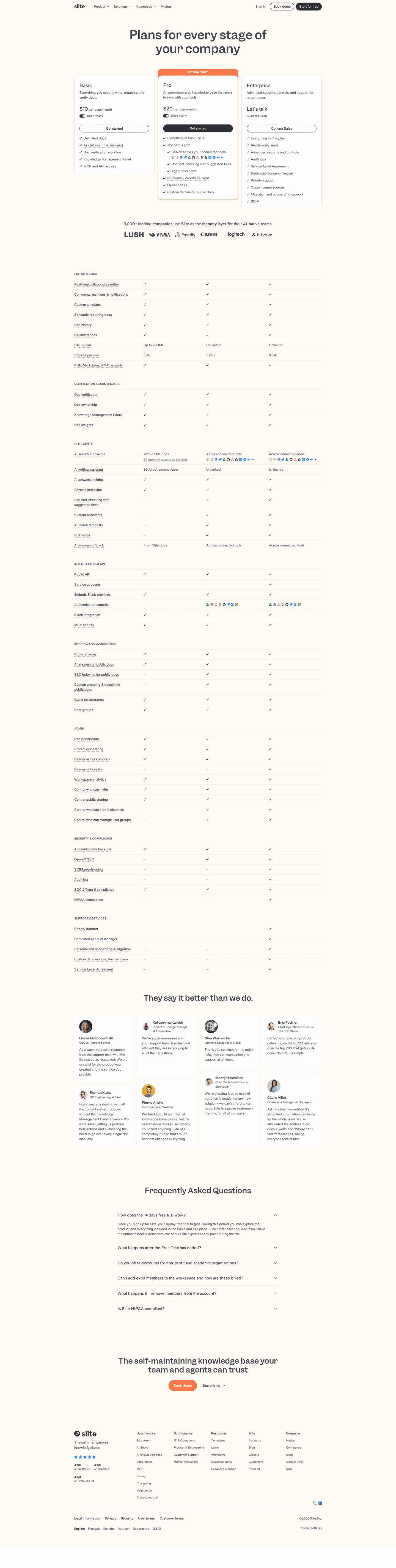
How to explain the plans?
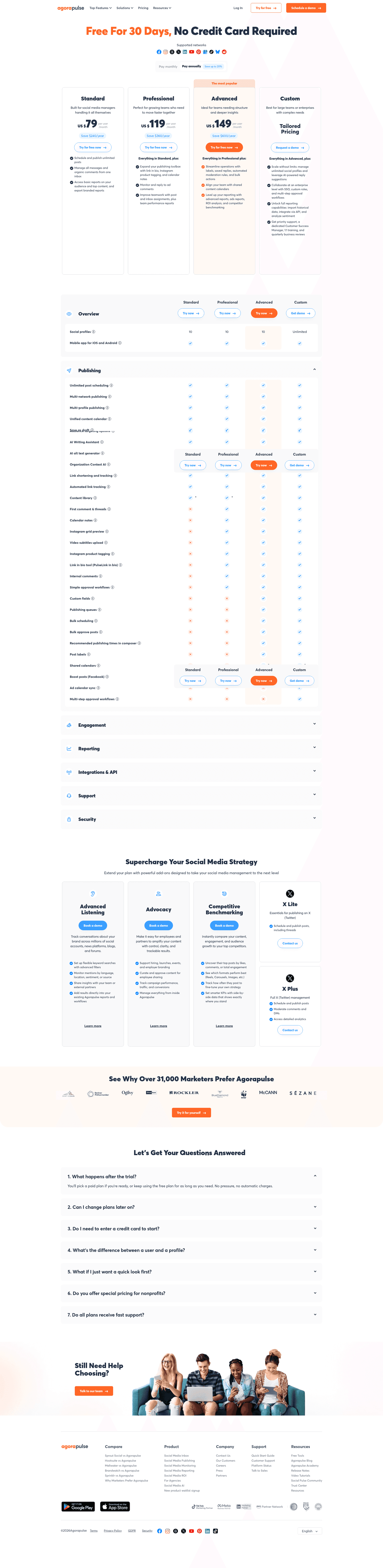
- A feature comparison table on 58%
- An FAQ on 77%
- Tooltips explaining individual features on 37%, an add-ons section on 28%
- A chat widget on 22%
What proof belongs on a pricing page?
- Customer logos on 42%
- Testimonials on 34%
- Review-site ratings on 22%, award badges on 19%
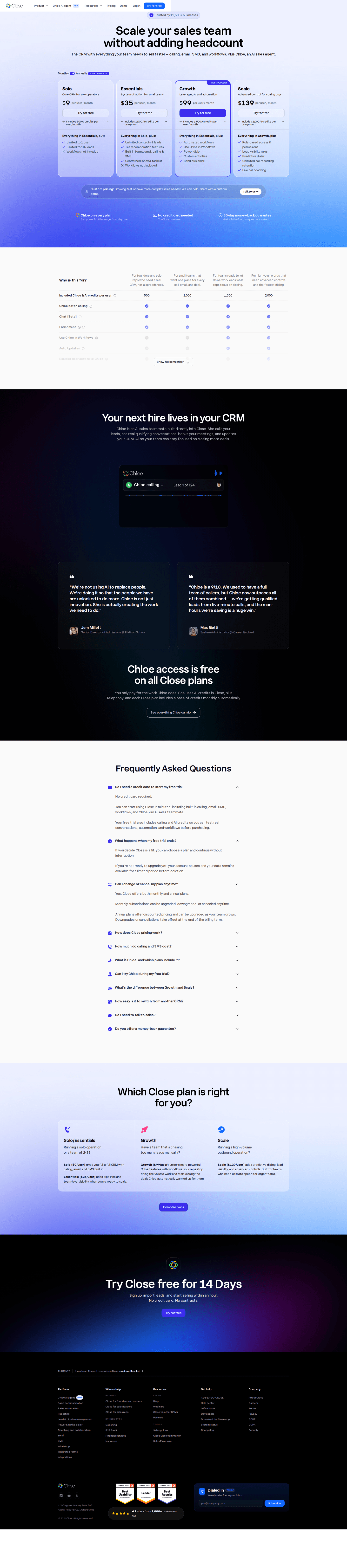
The moves almost nobody makes
Each sits under 15% of the market, with the strongest pricing page that uses it.
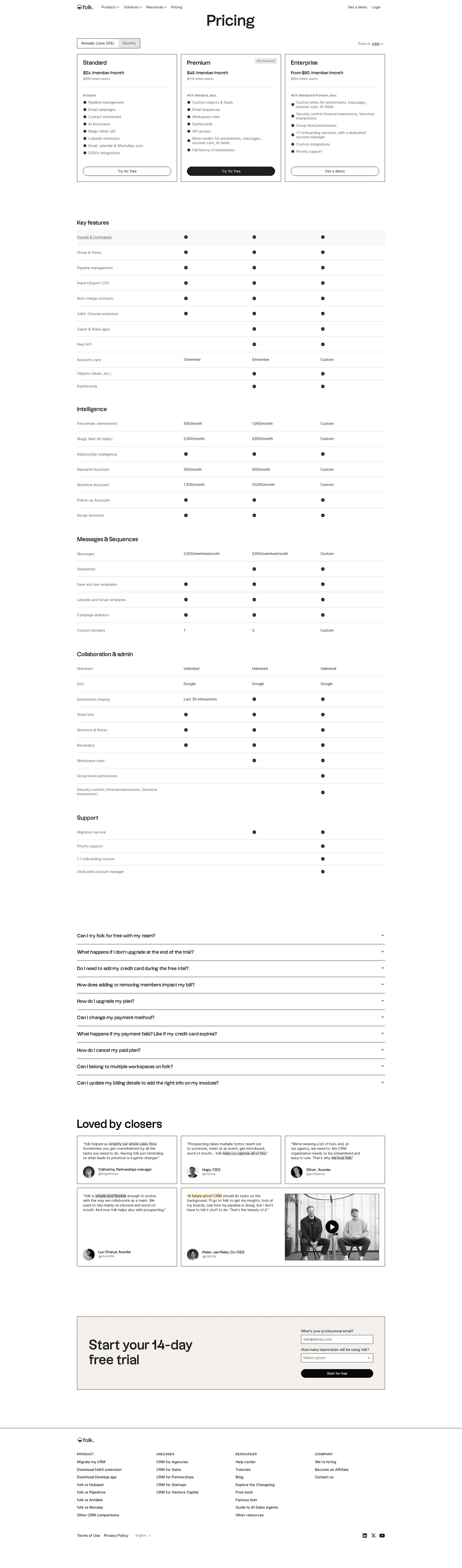
A currency selector
7% let the visitor switch currency before they read a price.
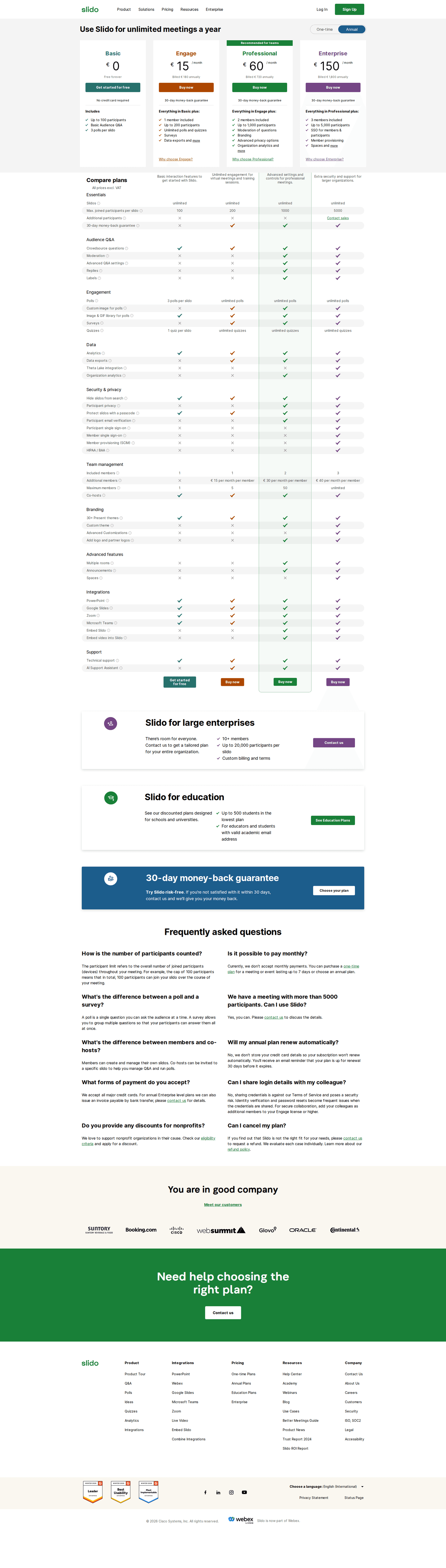
A money-back guarantee
5% write the guarantee on the pricing page itself, next to the number it protects.
Email capture on the pricing page
8% put an email field on the page, for the visitor who is not ready to pick a plan.


Curated by
Gabriel Amzallag , Founder, Web Anatomy
5 years CRO + SEO at Qonto (2021–2025). After advising 15+ SaaS on their websites (Payfit, Pigment…), the same patterns kept breaking, so I decided to build the source of truth on what works on the web: the intelligence layer every tool, builder, and team uses to ship sites that perform.
Go further than pricing pages
Growth Engine
Your top 3 opportunities for more revenue.
We find every way to grow your website’s visibility and conversions: SEO, AI search (AEO), backlinks and mentions, and UX/UI. 3 free opportunities, delivered by email.
Library
The analysis behind every page here
Each pricing page on this page, section by section, with what works and what does not. Free account.
Didn't find the pricing page you were looking for?
Narrow these down below, or start from all page types.
- Homepages
- About pages
- Contact pages
- Feature pages
- Integrations pages
- Security pages
- Enterprise pages
- Industry pages
- Persona pages
- Why us pages
- Case study pages
- Comparison pages
- Blog pages
- Signup pages
- Webinar pages
- SEO landing pages
- Free tool pages
- PPC landing pages
- Careers pages
- Login pages
- 404 pages
- AI product pages
- Press pages
- Partner program pages
- Download pages
- Resource libraries
- Developer pages
- Solutions pages
- Template galleries
- Glossary pages
- Startup program pages
- Community pages
- ROI calculators
- Newsletter pages
- Programmatic SEO pages
- Blog posts
- Customer stories pages
- Alternatives pages
- Features overview pages
- Product tours
- Integration pages
- AI agent pages
- Affiliate program pages
- Team pages
- Conference pages
Your top 3 opportunities for more revenue.
We find every way to grow your website’s visibility and conversions: SEO, AI search (AEO), backlinks and mentions, and UX/UI. 3 free opportunities, delivered by email.
Pricing page design, answered
The questions people ask before rebuilding a pricing page, answered from 449 real ones.
How many plans should a pricing page show?
01Three or four. About a third of these pricing pages show three plans and about a third show four. Two plans is a minority at about one in ten, and about one in twenty show no plan grid at all, usually because every price is a quote.
Should a pricing page show every price?
02Most show at least one and hide the top one. About four in five carry a custom-quote tier and two in three an enterprise tier, while about one in four hide at least one price behind a contact button. Hiding prices sits almost entirely with the weakest pages: almost none of the strongest do it, against about four in five of the weakest.
Should the toggle default to monthly or annual?
03A bit under half of pricing pages have a monthly and annual toggle at all. Where there is one, the annual side usually carries a label, and a "Save" percentage is the most common wording by a distance, most often twenty percent.
Should a pricing page have a free plan?
04About two in five have a free tier and a bit under half offer a free trial, and the two overlap less than you would expect: only about two in five of the pages with a free tier also offer a trial. A free trial is the more common door for products sold to teams; a free tier is more common when the product spreads one user at a time.
What goes under the pricing table?
05An FAQ, on three in four of these pages, and a feature comparison table, on about three in five. Customer logos are on about two in five and testimonials on about one in three. Tooltips explaining individual features appear on nearly two in five, and an add-ons section on about three in ten.
How is this different from the best landing pages leaderboard?
06This gallery is a visual browse: what pricing pages look like and what they contain. The best landing pages benchmark is the graded view, where pages are scored against conversion best practices and ranked by industry. Same companies, different question.