New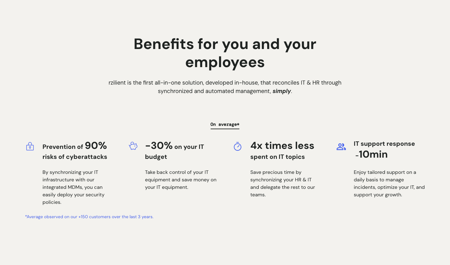
Value Proposition|
The value proposition section is what makes visitors choose you over every other option. Explore 393 scored examples and see what the best do differently.
Updated November 2026
Showing 1–29 of 393 examples

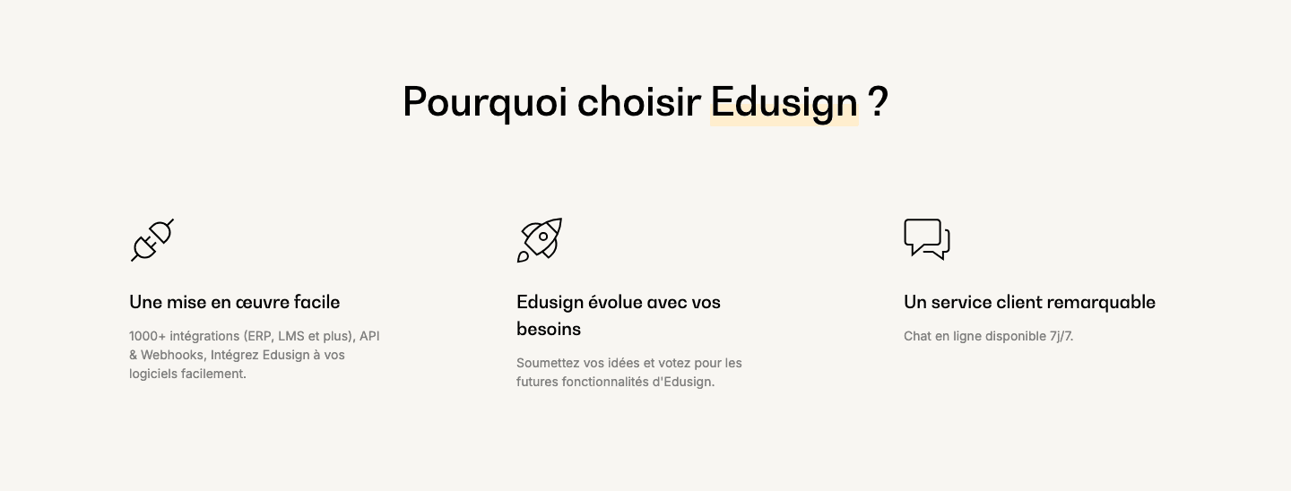
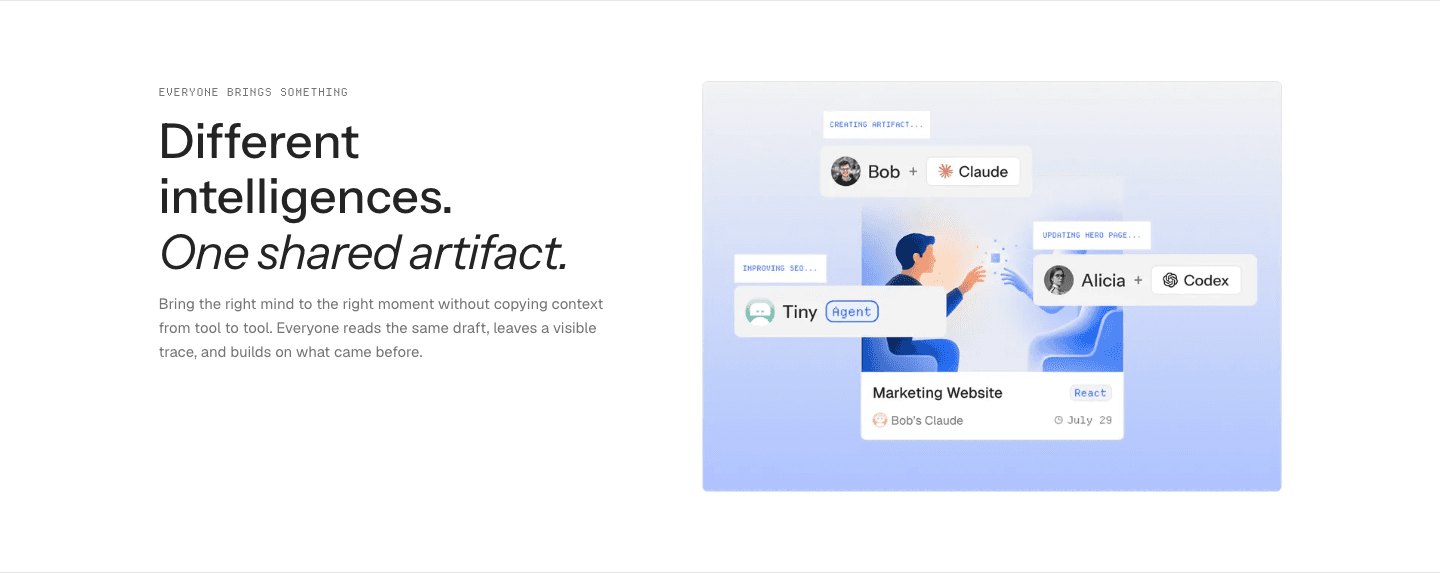
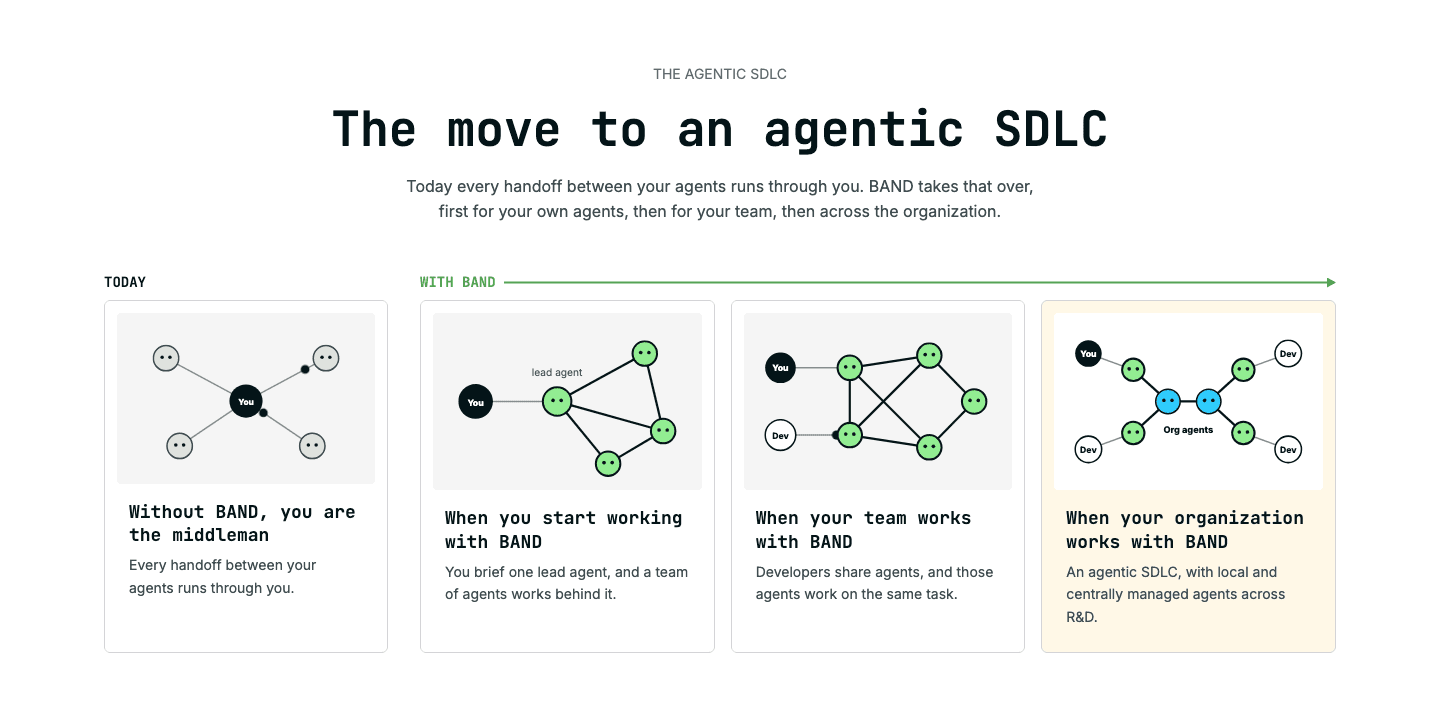
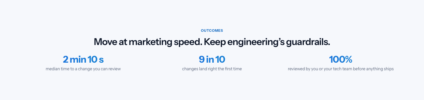
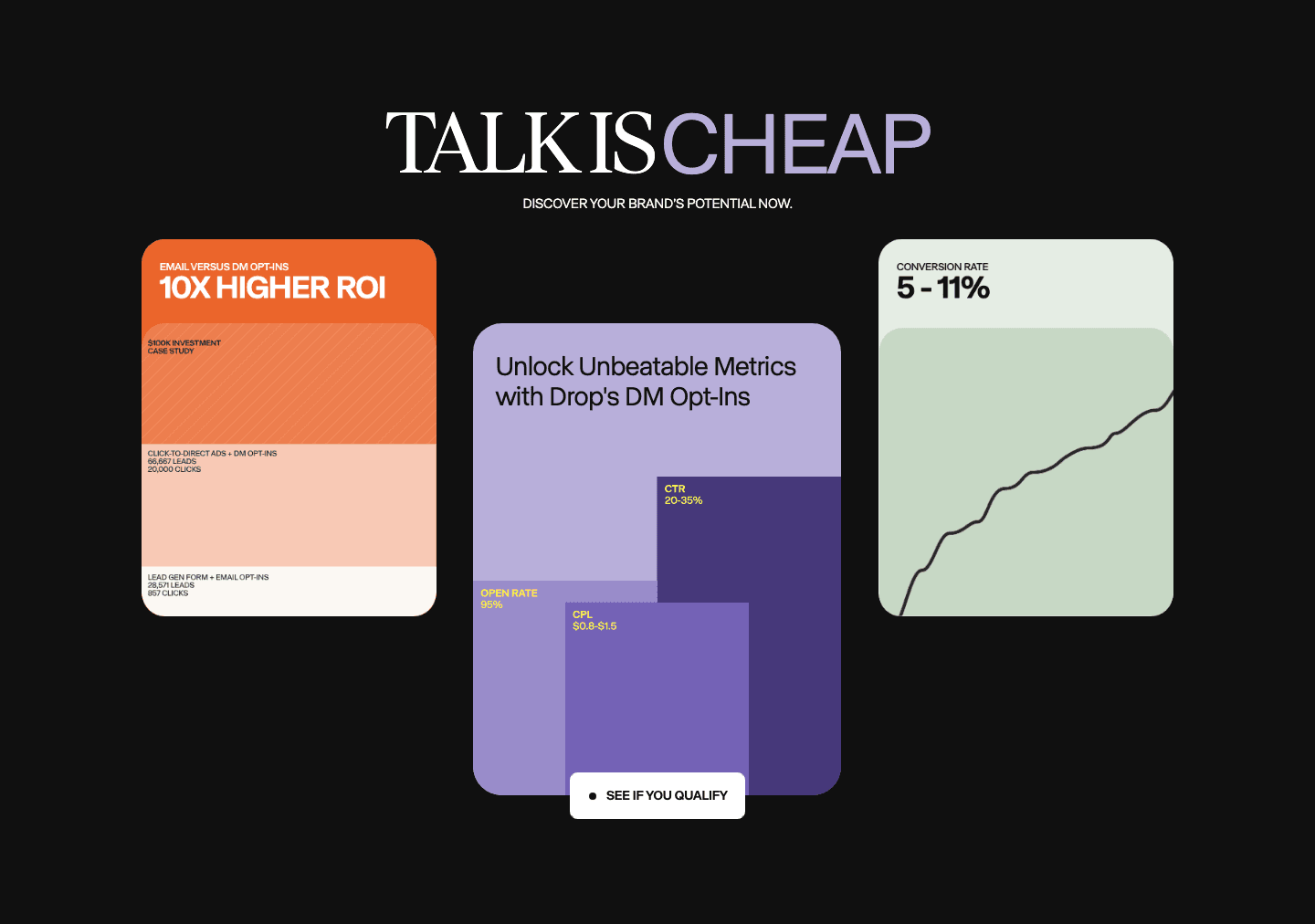
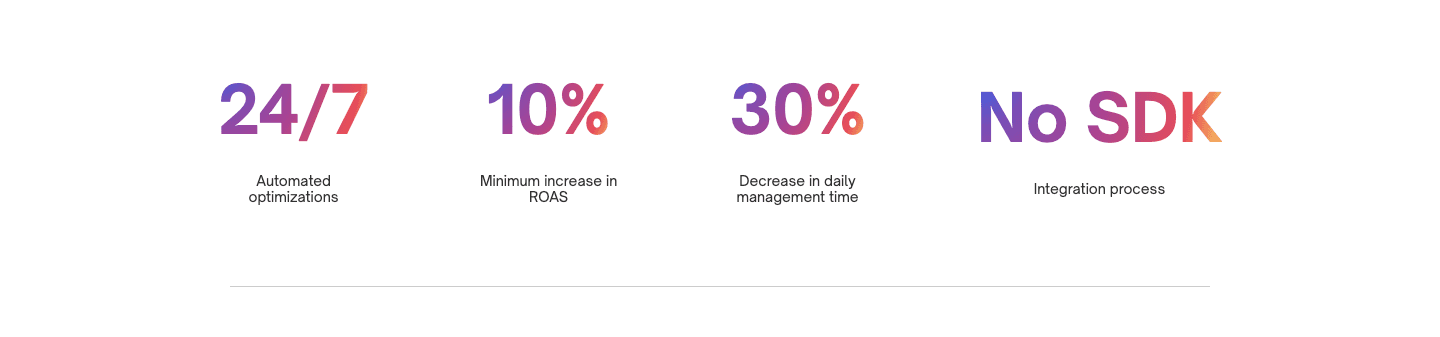
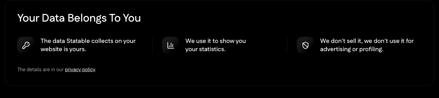
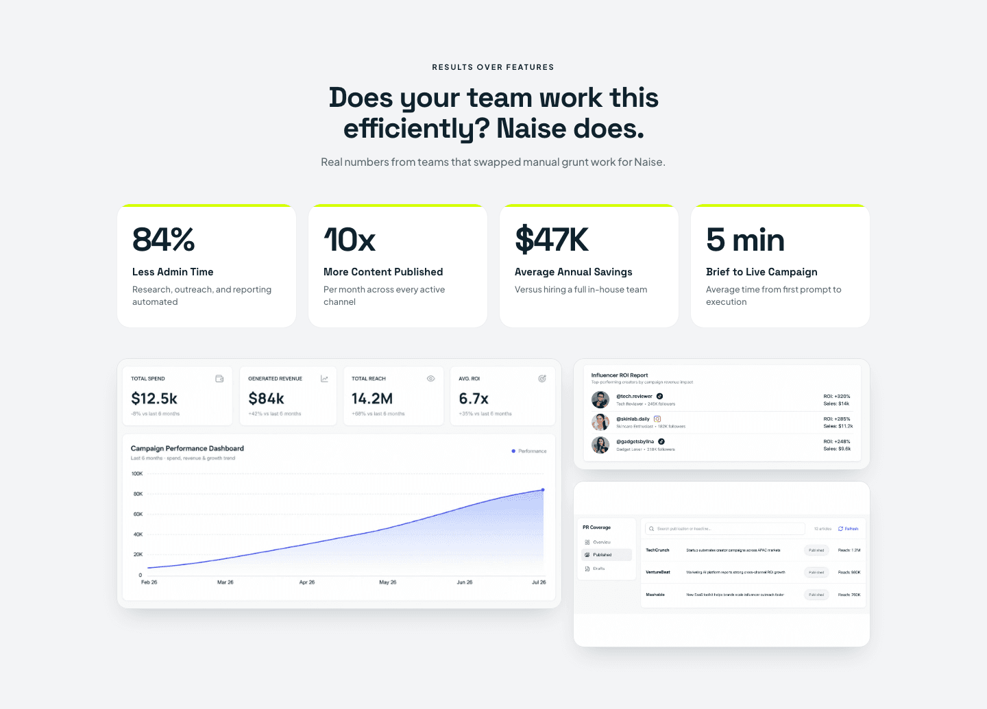
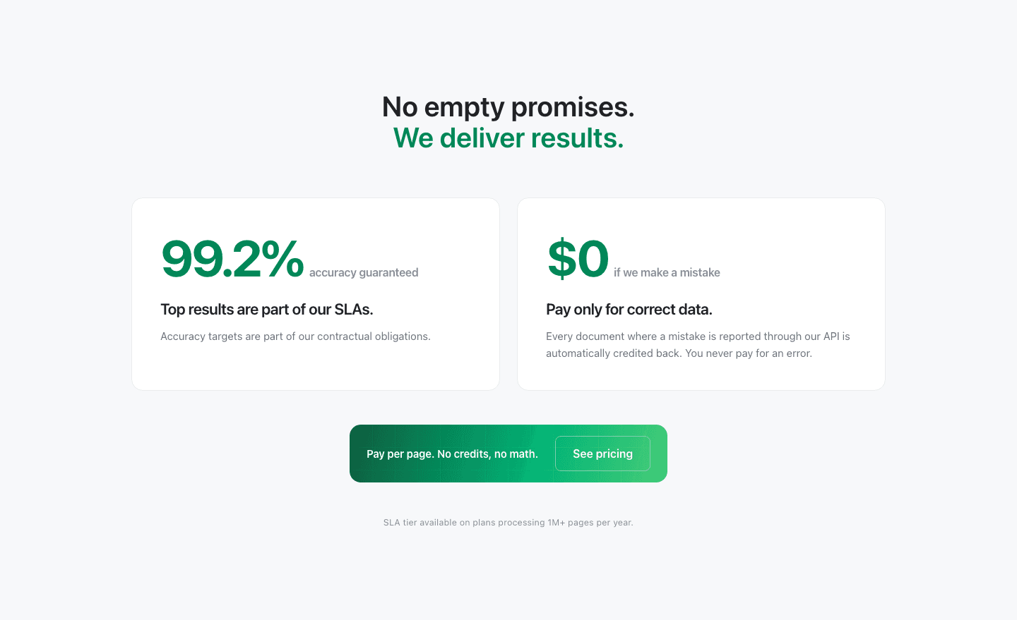
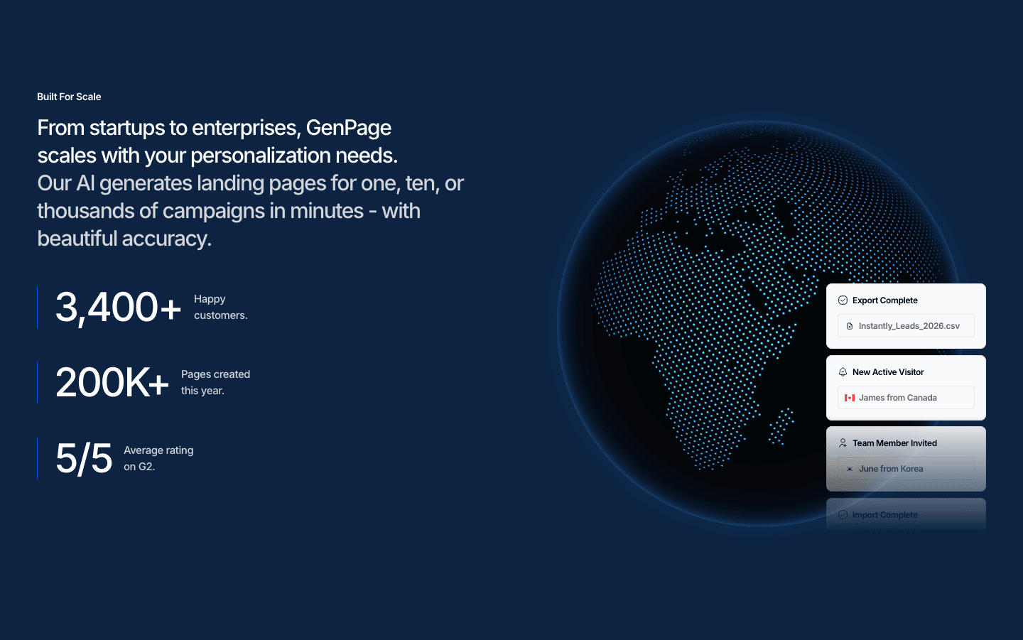
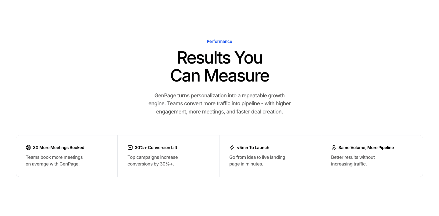
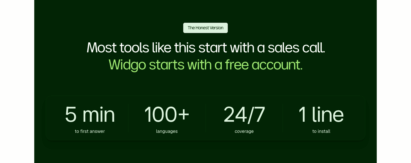
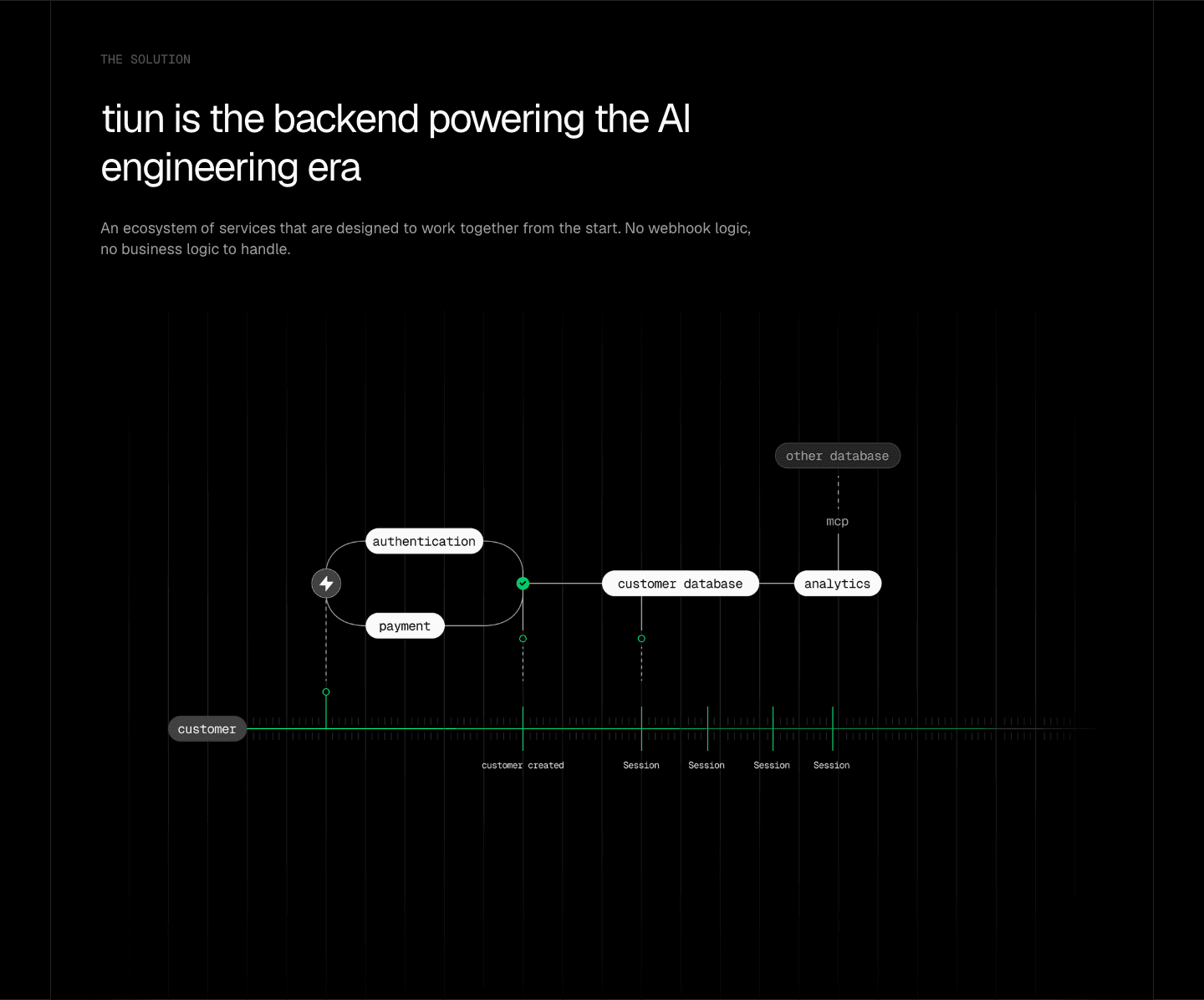
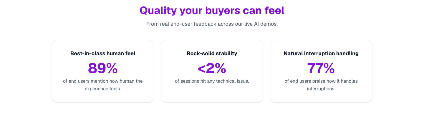
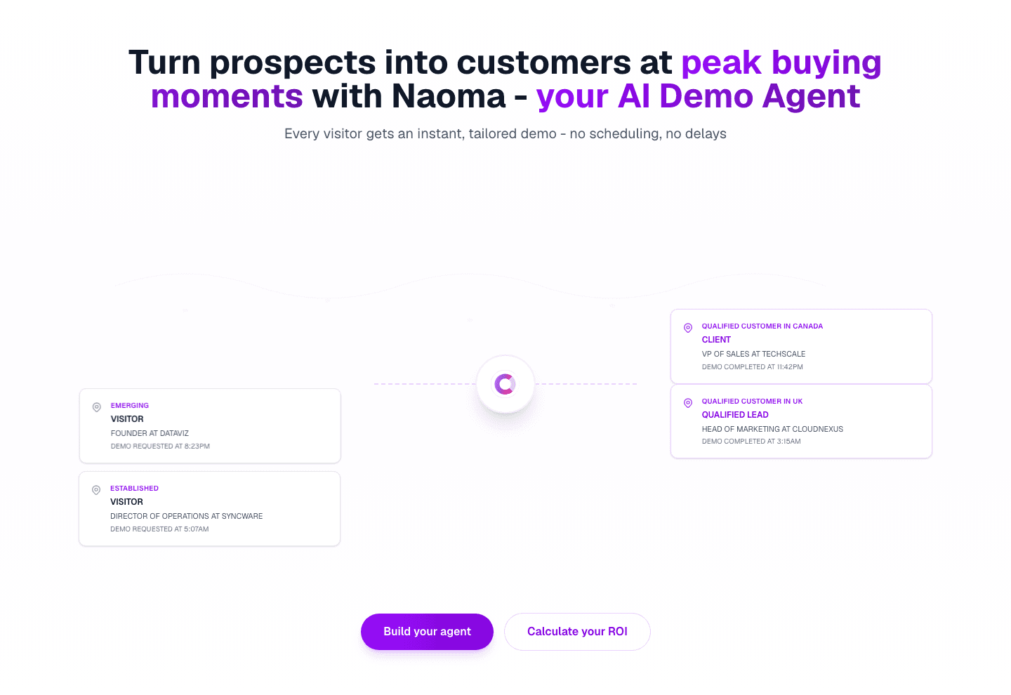

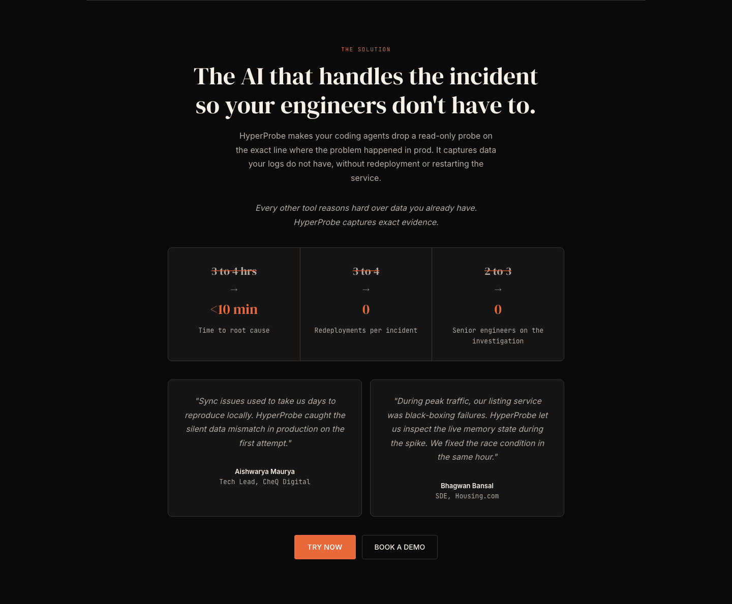
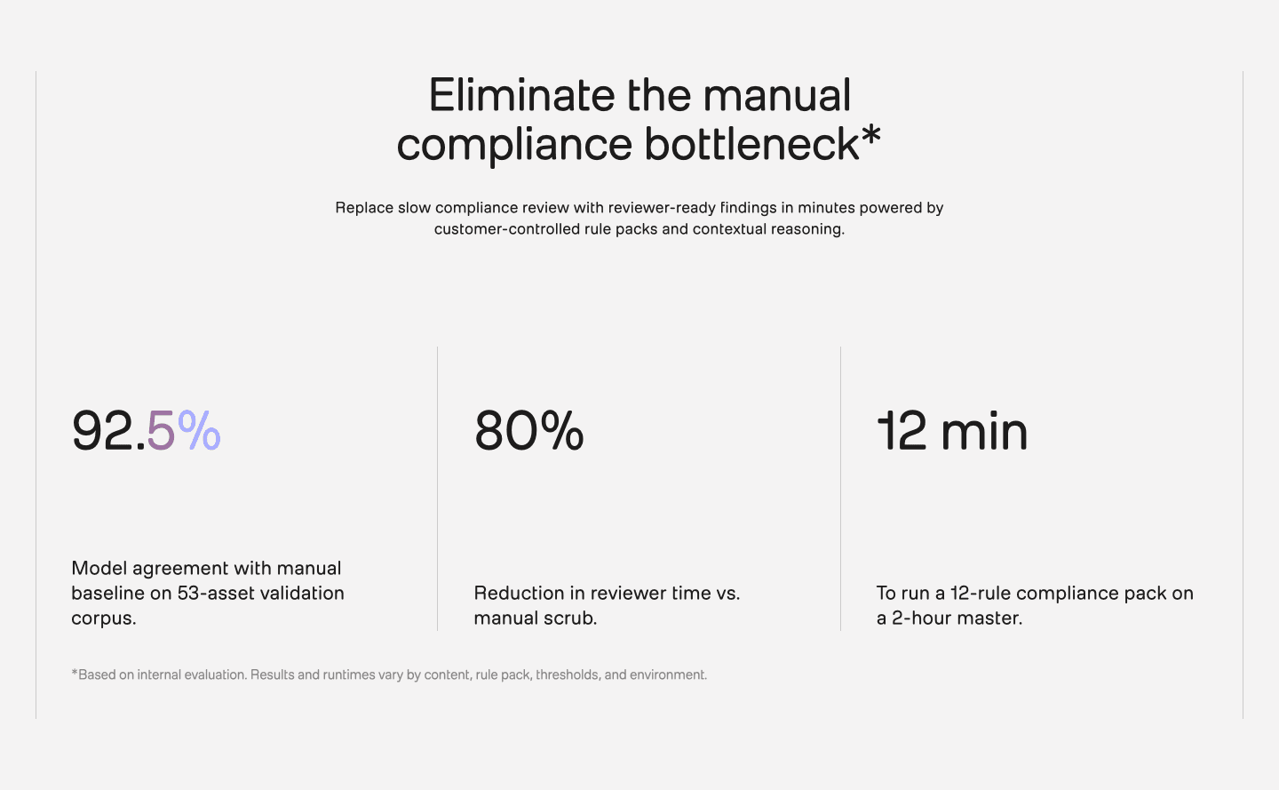
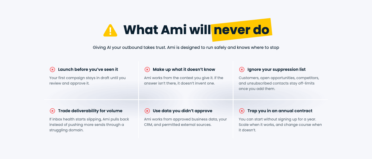
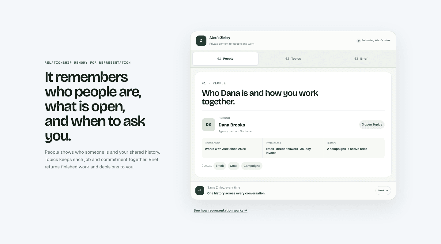
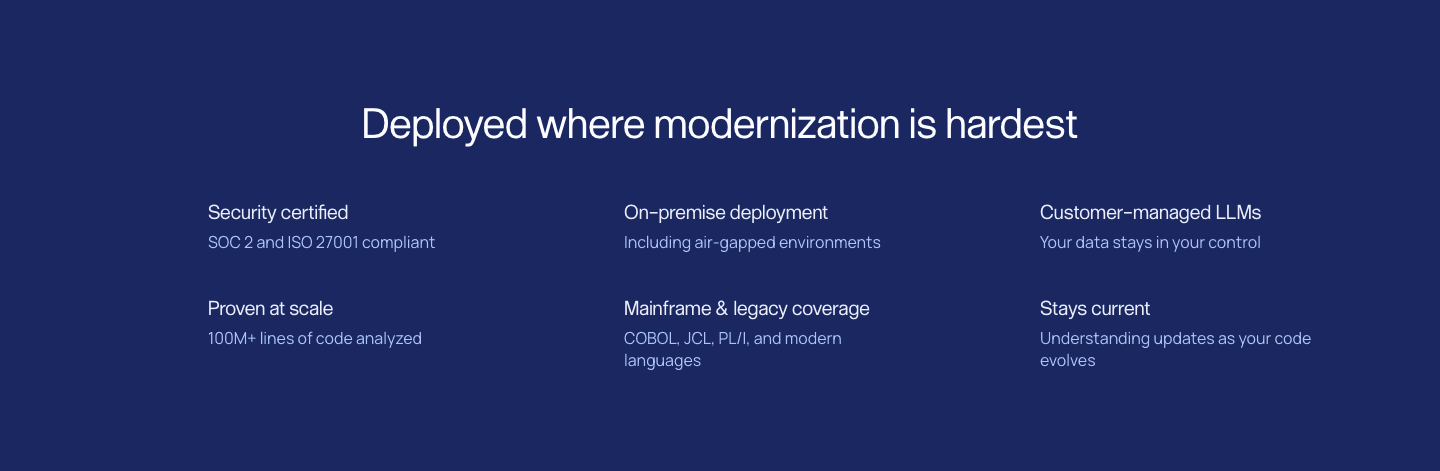
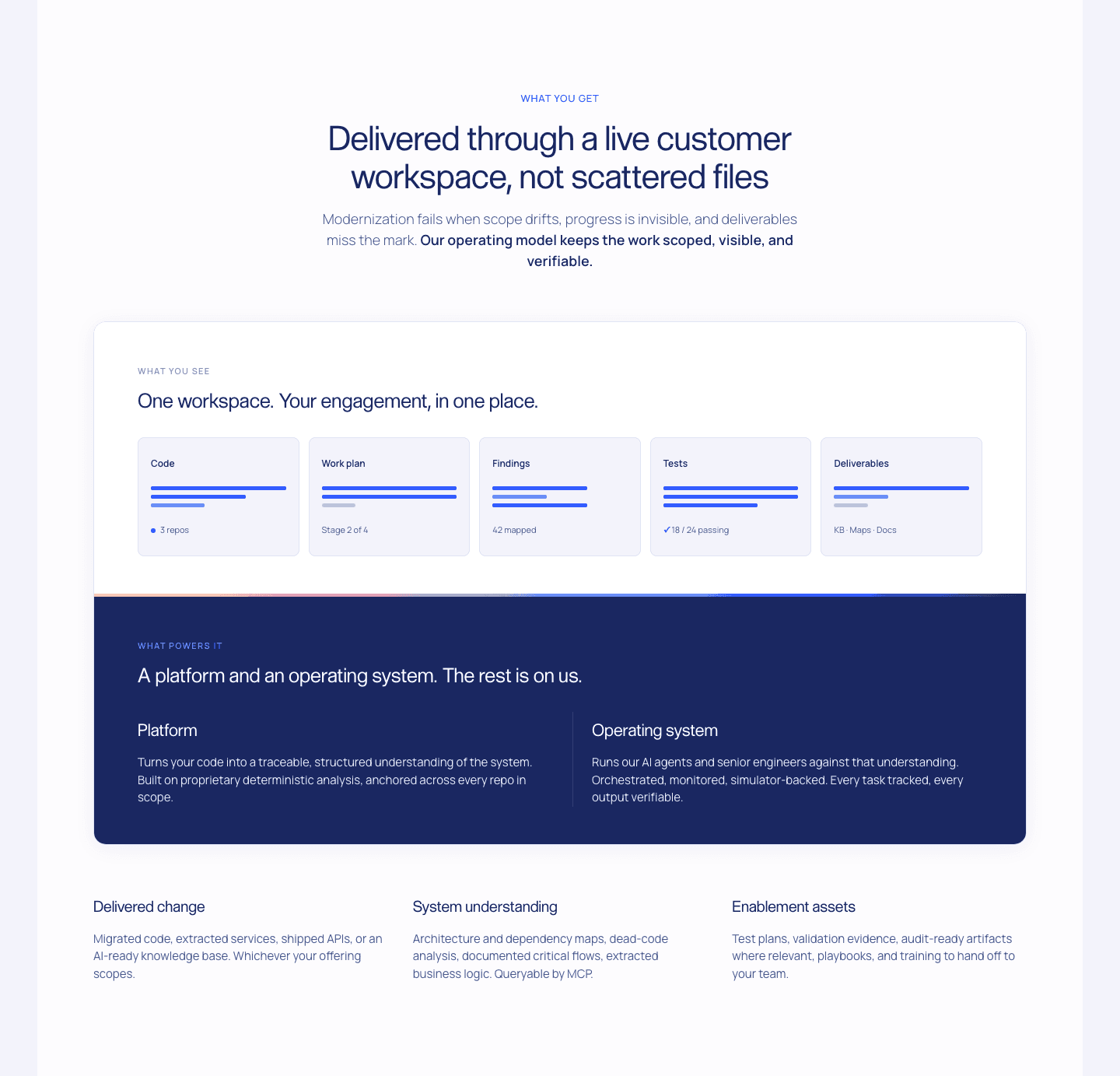
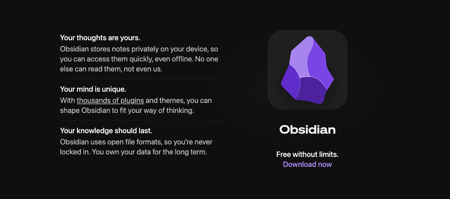
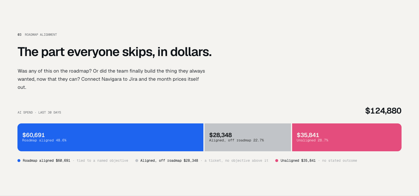
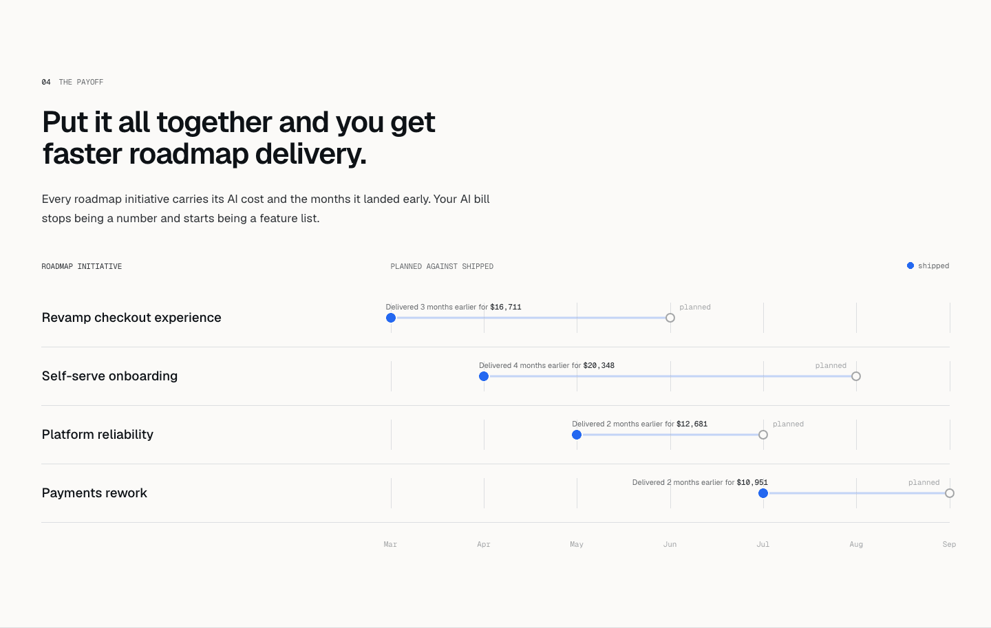
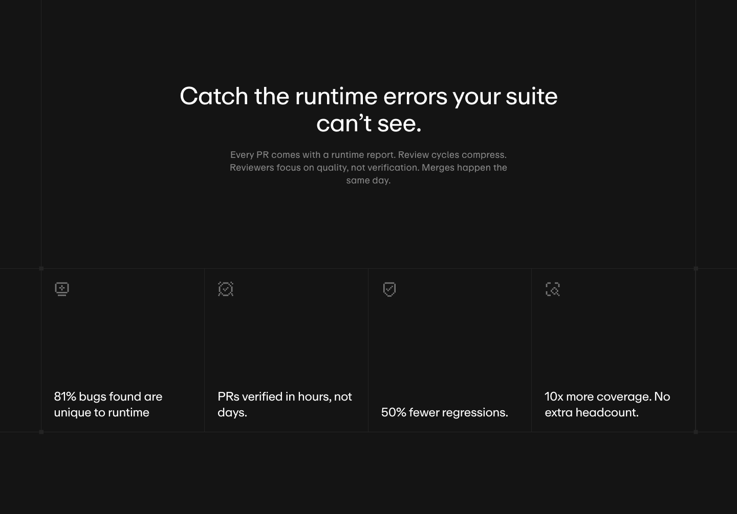
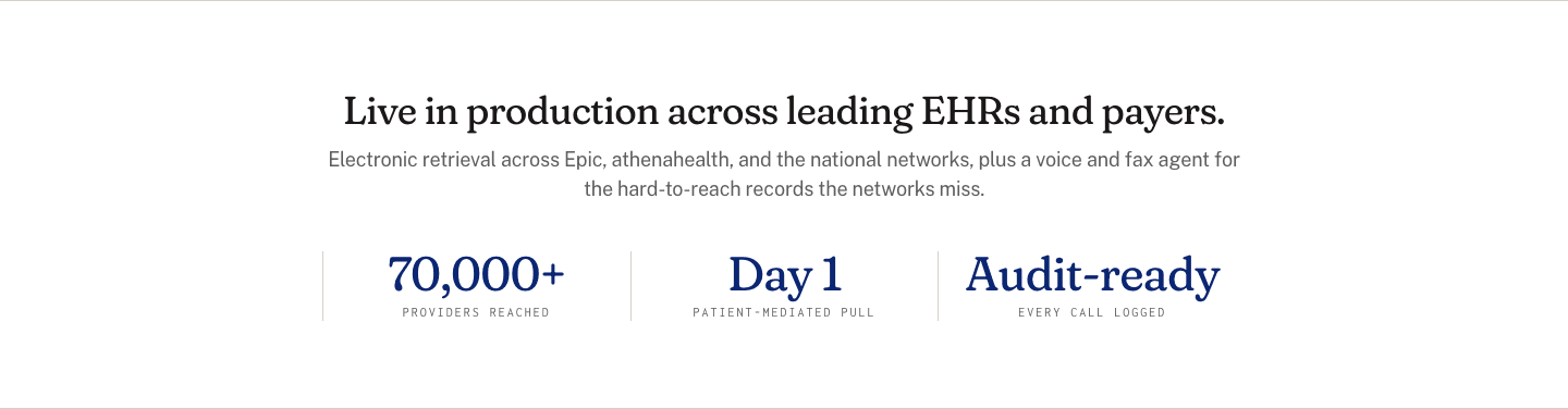
The value proposition section says why a visitor should choose you over every other option. On a landing page, it usually follows the hero and spells out the main benefits in a few short blocks.
What the best value proposition sections do:
We checked the value proposition sections in our library for the elements below. The lower the number, the fewer pages do it, and the bigger your edge when you add it.
An icon or illustration that reinforces the concept, not decoration
A link to a dedicated page that expands on this specific value prop
"Save 4 hrs/week," "3x faster deploys." A number that makes the promise tangible
Several value props presented together, not just one
"Powered by X" or "The only tool that Y." Explains why your approach works differently
"Ship 2x faster" not "Improve productivity." The reader can picture the outcome
| Element | What it means | Use it | Type |
|---|---|---|---|
| Visual metaphor | An icon or illustration that reinforces the concept, not decoration | 9% | Big opportunity |
| Deep-dive link | A link to a dedicated page that expands on this specific value prop | 15% | Big opportunity |
| Outcome quantification | "Save 4 hrs/week," "3x faster deploys." A number that makes the promise tangible | 28% | Big opportunity |
| Multiple propositions | Several value props presented together, not just one | 39% | Opportunity |
| Unique mechanism | "Powered by X" or "The only tool that Y." Explains why your approach works differently | 44% | Opportunity |
| Benefit specificity | "Ship 2x faster" not "Improve productivity." The reader can picture the outcome | 76% | Common |
A visual metaphor is the rarest element (9%), but it does not set the best apart: few best-in-class sections use one. Put the effort into numbers and several propositions before icons.
We check every value proposition section against a weighted checklist, from the page itself and its screenshot:
Specific benefits and a number on the outcome weigh the most, because the highest-scoring sections lean on them. Sections flagged best-in-class are picked by hand from the highest scores.
Interactive quiz
Can the reader picture the specific outcome?
"Ship 2x faster" not "Improve productivity"
3 value proposition sections in our library are flagged best-in-class. They do four things together:
Samsara, Deel and Ahrefs do all four.
 100/100
The weakest value proposition sections are vague. The benefit is there ("Save time") but nothing backs it up. 72% of all sections give no number. 56% never say how or why their solution is different, so the visitor wonders why it beats the alternatives. And 61% make a single argument for a product with several benefits.
The fix is not a redesign: add a number to each benefit, and show two to four propositions instead of one.
Want to know which best practices your value proposition is missing? Get your 3 free opportunities →
 10/100

Curated by
Gabriel Amzallag , Founder, Web Anatomy
5 years CRO + SEO at Qonto (2021–2025). After advising 15+ SaaS on their websites (Payfit, Pigment…), the same patterns kept breaking, so I decided to build the source of truth on what works on the web: the intelligence layer every tool, builder, and team uses to ship sites that perform.
Real examples from top landing pages, scored and analyzed.
Everything you need to know about value proposition section design, based on our analysis of real landing pages.
Start with the audience, the outcome, and the mechanism. Write one sentence for each. "For [audience], get [outcome], because [mechanism]." Then strip the template. "Sales teams close 30% more deals because every call is auto-logged and coached in real time" is that formula stitched into one line. If you can't fill in all three, your positioning isn't ready yet. The mechanism is usually the missing piece. Draft three variants, show them to five people in your ICP, and ship the one they can repeat back to you without re-reading.
A tagline is a brand slogan: short, memorable, often abstract ("Think different"). A value proposition explains what you do, for whom, and what concrete result the customer gets. "Cut your audit time from 4 hours to 2 minutes" is a value proposition. "Smart auditing" is a tagline.
Yes, if your page does more than a hero and a CTA. The value proposition section expands the hero's promise into concrete detail. If your product has several benefits or the offer isn't obvious in one sentence, you need one. Launch pages, product pages, and campaign landing pages almost always benefit from it.
Right after the hero, before social proof or features. The hero promises an outcome in one sentence; the value prop section is where you expand that promise into 2–4 concrete pieces before the visitor is asked to trust you. If social proof comes first, the promise is unclear. If features come first, you're explaining "how" before the visitor cares "why." Keep the order: hero, value props, social proof, features, pricing, CTA. The exception is post-click pages from ads, where a shorter path can skip features entirely.
The value prop section sells the outcome. The features section explains the mechanism. "Close deals 30% faster" belongs in value props. "Auto-logs every call and pulls CRM context into a call summary" belongs in features. The same product can appear in both. The value prop frames what the visitor gets, features show what ships. If your value props read like a feature list ("AI-powered," "Real-time sync"), you've skipped the outcome layer. Rewrite each one as the thing the customer will notice in their day, not the thing engineers built.
Check that the benefits are specific and that the section names how the product works. Then look for a number on the outcome and more than one proposition. Or get your 3 free opportunities, ranked with the evidence behind each.
Showing 1–29 of 393 examples