Best Productivity Website Examples (And Why They Convert)
We scored 76 productivity homepages on 60+ conversion criteria. See which sections separate the top performers, and what your page is probably missing.
What high-performing productivity website design gets right
Productivity pages compete in one of the most crowded software categories online, and most homepages fail to differentiate quickly enough. The strongest pages in this benchmark do four jobs early:
50.7/100
Avg. page score
Make the category and use case obvious in the first viewport so the buyer knows whether this is project management, knowledge management, collaboration, or workflow automation. Not a generic productivity pitch.
Use visual hierarchy to guide the eye to one clear promise and one clear action before anything else competes for attention.
Show the product as a real workflow so the visitor can picture their team using it. Pair interface screenshots with outcome-led headlines.
Give skeptical buyers a low-friction next step. Free trials, interactive demos, and specific CTA microcopy outperform generic "Get started" buttons.
6 best productivity homepages analyzed in detail
Each company below is paired with its strongest section and scored across 60+ conversion criteria. See what they get right, and what you can borrow.
01
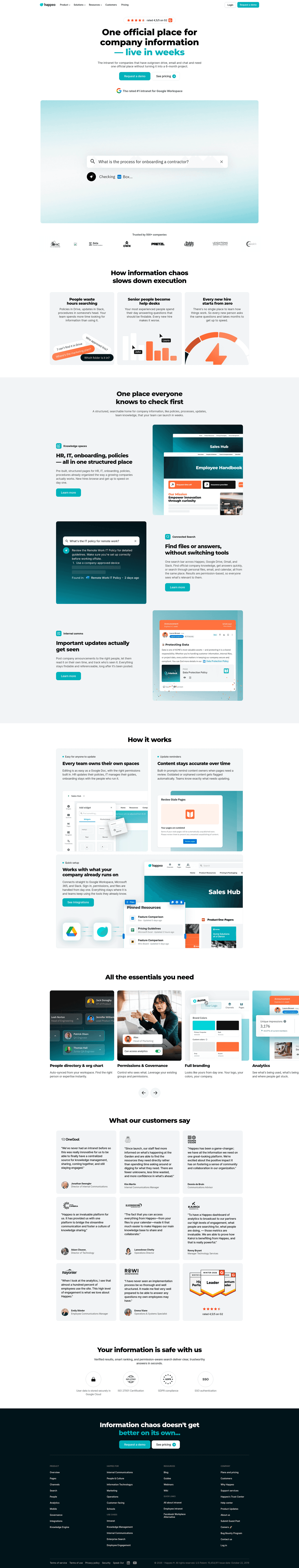
Happeo, The intranet that unifies communication, knowledge, and people search.
5 years CRO + SEO at Qonto (2021–2025). After advising 15+ SaaS on their websites (Payfit, Pigment…), the same patterns kept breaking, so I decided to build the source of truth on what works on the web: the intelligence layer every tool, builder, and team uses to ship sites that perform.
“Happeo earns the editor's pick by stacking double social proof (G2 4.5/5 plus Rated #1 Google Workspace) with a real intranet UI screenshot showing Channels, Pages, and People tabs. The hero (scored 78) pairs dual CTAs (Request demo and Watch demo) with a headline that personalizes with the company name, giving the visitor both credibility and a concrete product preview in one viewport.”
What makes this page stand out
"The intranet for companies that have outgrown drive, email and chat and need one official place without turning it into a 6-month project" — exceptionally specific pain point identification.
5 years CRO + SEO at Qonto (2021–2025). After advising 15+ SaaS on their websites (Payfit, Pigment…), the same patterns kept breaking, so I decided to build the source of truth on what works on the web: the intelligence layer every tool, builder, and team uses to ship sites that perform.
“Parabola's navbar (scored 100, top-scoring) turns navigation into a conversion asset. An Enterprise Experience highlight card with a See For Yourself CTA, Teams We Serve routing for Operations, Finance, and Data teams, and descriptive subtitles for each mega menu item mean buyers self-segment before they even reach the hero.”
What makes this page stand out
The "automate the work you thought would always be manual" tagline directly names the buyer's mental model and challenges it — creating an immediate "tell me more" reaction
Handling messy data sources (PDFs, emails, spreadsheets) addresses a real pain point that most automation tools ignore — they assume clean data inputs, while Parabola embraces the mess
"Turn plain English into automation" positions the AI capabilities in accessible, non-technical language — lowering the perceived barrier to entry for operations professionals
The "operators" ICP is clearly defined — Parabola isn't for developers or data engineers, it's for business operations people who currently do manual data work
Section we love
·NavbarBest in class
1The open menu splits into OVERVIEW and TEAMS WE SERVE columns for instant self-selection
2The TEAMS column targets Operations, Data and engineering, and Finance with clear value lines
3A featured Enterprise Experience card with a green visual anchors the dropdown
4Pricing sits as a top-level tab so cost-checkers reach it in one click
5Both Start for free and Get a demo CTAs appear, covering self-serve and sales paths
04
Scoro, End-to-end work management for consultancies and agencies.
5 years CRO + SEO at Qonto (2021–2025). After advising 15+ SaaS on their websites (Payfit, Pigment…), the same patterns kept breaking, so I decided to build the source of truth on what works on the web: the intelligence layer every tool, builder, and team uses to ship sites that perform.
“Scoro's hero (scored 89, top-scoring) stacks a social proof trifecta of 4.5 stars, 1000+ reviews, and Capterra/GetApp logos alongside product UI snippets showing real quote details, invoices, and budget health dashboards. Audience specificity for consultancies and agencies, plus dual CTAs with risk-reducing microcopy, make the value proposition precise and verifiable.”
What makes this page stand out
"Manage projects, resources, and finances in a single system" communicates the three pillars of PSA in one line — projects, people, and money.
"Built for consultancies, agencies, IT, architecture, engineering, and other professional services firms" names six specific verticals, demonstrating deep market understanding.
Product UI overlay showing Cost forecast, Time spent (28h), and Project profit ($200k) provides immediate quantitative proof of the platform's value.
Dual CTAs ("Try for free" + "Book a demo") with review badges (G2, Capterra, GetApp) combine self-serve access with third-party credibility.
5 years CRO + SEO at Qonto (2021–2025). After advising 15+ SaaS on their websites (Payfit, Pigment…), the same patterns kept breaking, so I decided to build the source of truth on what works on the web: the intelligence layer every tool, builder, and team uses to ship sites that perform.
“Slite's comparison section (scored 75) puts a structured 9-feature matrix against Notion, winning 7 of 9 rows. The narrative text on the left explains why teams outgrow Notion, turning a direct competitive comparison into a persuasive migration argument rather than a defensive feature list.”
What makes this page stand out
"Skip the software learning curve: beautiful documentation, hassle-free adoption, AI-powered search" addresses the three biggest knowledge management pain points in priority order.
"NEW: Knowledge base + enterprise search working together" announcement signals product evolution toward a more comprehensive platform.
Dual CTAs ("Start for free" + "Book a demo") serve both self-serve and enterprise evaluation pathways.
The strikethrough design treatment is visually arresting and creates an instant emotional connection with anyone who's experienced knowledge management frustration.
Section we love
·Pricing
1Three plans (Standard $8, Premium $12.5 per member/month, Enterprise custom) each with a one-line target description
2Billed yearly toggle on the paid plans signals annual savings at the point of decision
3Features stack with Everything in Standard and Everything in Slite Premium so each tier reads as a clear upgrade
4Standard offers Start free trial as a risk reducer while Enterprise routes to Book a demo for high-value buyers
06
Talknotes, Voice-to-text notes that turn rambling into structured content.
5 years CRO + SEO at Qonto (2021–2025). After advising 15+ SaaS on their websites (Payfit, Pigment…), the same patterns kept breaking, so I decided to build the source of truth on what works on the web: the intelligence layer every tool, builder, and team uses to ship sites that perform.
“Talknotes earns a top-scoring how-it-works section (scored 100) by keeping the explanation tight with an accordion UI and effort-reducing language like single tap and effortlessly. A prominent 7-day free trial CTA directly after the steps closes the loop, making the path from understanding to action feel obvious.”
What makes this page stand out
The "speak naturally and get structured notes" promise eliminates the cognitive overhead of typing and formatting — letting users capture ideas at the speed of thought
Targeted at professionals who think faster than they type: consultants, founders, sales reps capturing meeting notes, and creatives brainstorming — a broad but clearly defined ICP
AI-powered structuring (headings, bullet points, action items) differentiates from basic transcription tools that just convert speech to raw text without adding organizational intelligence
Multi-language support expands the addressable market globally — particularly valuable for international professionals who think in one language but need notes in another
Section we love
·How It WorksBest in class
1Four numbered steps (record with one button, select your style, transcribe and summarize, edit then share and export) cover the full flow
2The headline (take notes in seconds) plus record with one button stress how effortless and fast it is
3An animated recorder mockup with a live timer previews the actual capture experience
4Step 3 names a concrete outcome (transcribe and summarize with 99 percent accuracy)
5A prominent Try TalkNotes free for 7 days CTA sits directly under the steps
6The final step previews the payoff (edit, share and export your notes easily)
See how your page compares to the 50.7 average page score
Run a diagnostic on your productivity page and get a section-by-section breakdown of what to fix first to improve clarity, visual hierarchy, and product proof.
Design patterns we see across high-performing productivity pages
Across 76 productivity pages reviewed, the pages that convert tend to make the first screen do one job: clarify what kind of productivity tool this is and give the visitor a reason to explore further.
The strongest patterns pair outcome-led headlines with real product interfaces, then back those claims with social proof that feels easy to verify. The best pages remove clutter and guide attention to a single promise before introducing features. Use website section examples to compare how these building blocks show up across page types.
1Numbers run through the quotes (halved testing time, implementation sped up tenfold, saves at least 3-4 hrs per week)
2Voices span the org chart (Developer, Senior Product Designer, Project Manager, Director of Operations, CEO) for broad appeal
3Cards carry source logos (Capterra, Culture Amp, University of Melbourne) plus per-platform ratings like 4.8/5 from 140+ reviews
4Sasha Shevelev quote sets a before/after (clients once sent undecipherable screenshots) and links a Read case study for depth
Reviewed design-pattern pick from Bugherd’s testimonial section.
What I love about this section
Numbers run through the quotes (halved testing time, implementation sped up tenfold, saves at least 3-4 hrs per week)
Voices span the org chart (Developer, Senior Product Designer, Project Manager, Director of Operations, CEO) for broad appeal
Cards carry source logos (Capterra, Culture Amp, University of Melbourne) plus per-platform ratings like 4.8/5 from 140+ reviews
Sasha Shevelev quote sets a before/after (clients once sent undecipherable screenshots) and links a Read case study for depth
Overlooked sections that quietly drive adoption and trust
In this set, navigation and structural sections often do more conversion work than teams expect. Cta sections average 53.8, while Testimonial sections average just 33.8. This suggests many productivity pages invest in features but leave gaps in problem framing and wayfinding that slow decisions.
The biggest missed opportunities appear where the page should contextualize the product for a specific team or workflow. When those sections are thin, the hero carries all the differentiation work, and in a crowded category, that is rarely enough.
Suite cards describe real workflows (Calendly with Google Calendar, Meet, Analytics; Teams, Outlook, Azure SSO)
View all integrations link lets buyers confirm their own tools before committing
Use these examples as prompts for what to add or restructure, not just what to redesign visually.
Checklist: a practical audit for productivity website design
If you are iterating on a productivity homepage, this checklist helps you spot missing sections and messaging gaps quickly, especially around Cta, Hero, and Features sections.
Run it on your current page, then decide what to rewrite, what to reorder, and what proof to add before you touch visual polish. For a faster baseline, you can also try our landing page analysis.
Built from 213 sections across 59 productivity homepages in this benchmark. Each check below is a move the highest-scoring pages share, each paired with a real example from the benchmark.
Hero
Can a busy buyer tell what kind of tool this is in five seconds?
The hero makes it instantly clear what the product is and who it's for.
Example: Teamwork.com sharpens it further with "the only platform built for managing client projects, profitably" in the subtext.
The real product shows above the fold.
Example: Scoro pairs the hero with real UI snippets for "Quote details," "Invoices" with dollar amounts, and a "Budget health" chart instead of a hero graphic.
Proof is visible before the first scroll.
Example: Talknotes stacks Product of the Day, "+10000 happy users" at five stars, and media logos in the first screen.
Trust
Does the page earn belief with proof a skeptic can verify?
A hard number backs the trust claim.
Example: Databox leads with "Trusted by 20,000+ teams" paired with a sharp positioning line about not guessing.
Recognizable customer logos do the credibility work.
Example: UpSlide lines up blue-chip finance names like KPMG, Greenhill, and UniCredit.
The proof mixes more than one format instead of a single signal.
Example: Scribehow pairs logos like Artex, Cornells, and Paycor with named people, photos, and titles, each card led by a result like "50% less training time."
Value proposition
Is the value concrete, or just a stack of adjectives?
The value is broken into distinct, named propositions.
Example: Yousign splits the story into three icon columns, fast tools, dedicated experts, and a European solution.
Each benefit is specific.
Example: Edgee names low-friction benefits like "zero code changes" and "paste credentials once" so the value is tangible.
Features
Do features connect to outcomes the buyer cares about?
Feature copy leads with the outcome.
Example: Linear opens a feature block with "Understand progress at scale" before any of the mechanics.
The feature is shown working.
Example: Databox leads with "Your AI data analyst on demand" and embeds a demo video showing the AI clean a CSV and build a metrics table live.
Each feature maps a real pain to a measurable result.
Example: Asana leads each agent card with the outcome, like "Turns project goals into step-by-step timelines so you hit every deadline."
Call to action
Does the next click feel safe and obvious to a cautious buyer?
One primary action dominates, with action-led copy.
Example: Pitch lets "Start gaining insights" own the block with no competing action.
Reassuring microcopy sits next to the button.
Example: Talknotes bakes the reassurance into the button itself with "Try TalkNotes free for 7 days."
The trust most productivity pages skip is compliance proof.
Security and compliance badges are among the rarest trust signals in the set. Of 22 trust sections scored, only four surface real certifications, so the buyer with a security review on their checklist rarely gets an answer. PandaDoc does it right, stacking HIPAA, FDA 21 CFR Part 11, AICPA SOC 2, GDPR, and eIDAS seals in one badge row. In a category sold into teams and enterprises, leaving compliance unspoken cedes the most defensible trust on the page.
Interactive quiz
What would your productivity homepage score?
Question 1 of 5
0%
Can a visitor identify your specific productivity category in under 5 seconds?
"Project management for agencies" beats "the all-in-one productivity platform."
Reviewed by
Gabriel Amzallag , Founder, Web Anatomy
5 years CRO + SEO at Qonto (2021–2025). After advising 15+ SaaS on their websites (Payfit, Pigment…), the same patterns kept breaking, so I decided to build the source of truth on what works on the web: the intelligence layer every tool, builder, and team uses to ship sites that perform.
See how your page compares to the 50.7 average page score
Run a diagnostic on your productivity page and get a section-by-section breakdown of what to fix first to improve clarity, visual hierarchy, and product proof.
Quick answers based on our productivity website benchmark dataset of {count} pages scored on 60+ criteria.
What are the best productivity websites?
[01]
The strongest performers in this June 2026 benchmark are Happeo, Scoro, Parabola, Talknotes, Slite, and Atolio. Across 76 productivity homepages scored against 60+ criteria, these pages convert by replacing "all-in-one" positioning with concrete proof: Happeo pairs a G2 4.5/5 rating with a real intranet UI showing Channels and Pages, Scoro stacks 1000+ reviews with invoice and budget-health dashboards, and Talknotes closes its how-it-works with a 7-day free trial CTA.
What makes productivity websites harder to convert than other SaaS pages?
[02]
The category is extremely crowded, so visitors arrive already comparison-shopping against Notion, Asana, and Monday. Across 76 homepages reviewed, the pages that convert own the comparison directly: Slite runs a 9-feature matrix against Notion and wins 7 of 9 rows, Parabola uses the navbar to route Operations, Finance, and Data teams into separate paths, and Scoro narrows to consultancies and agencies rather than chasing every team.
What is the biggest design mistake on productivity homepages?
[03]
Leading with a generic "all-in-one" promise instead of naming the specific workflow or team the product serves. The average page in this June 2026 benchmark scored 50.7. Top performers replace abstraction with operators: Talknotes' accordion how-it-works uses "single tap" and "effortlessly" to cut perceived effort, Atolio splits capability into Security, Insights, and Search with product UI behind each block, and Happeo personalizes its headline with the company name.
What sections should a productivity homepage include?
[04]
A clear hero with one primary action, early social proof (logos, ratings, or user counts), a product preview showing the real interface, features framed as outcomes, a comparison or differentiation section, and a low-friction CTA like a free trial or interactive demo. Slite's competitive matrix and Parabola's persona-routing navbar are strong templates. Across 76 homepages, pages that stack these blocks convert most.
Why is visual hierarchy so important for productivity pages?
[05]
Productivity tools compete for attention in a saturated market. Visual hierarchy ensures the buyer sees the core promise and primary CTA before secondary elements create noise. Happeo eliminates clutter by pairing dual CTAs with a single product screenshot; Scoro uses a tight social proof trifecta (stars, review count, Capterra/GetApp logos) so the eye lands on the hero CTA. Only 3% of pages in this benchmark score top-tier, and layout discipline is the usual gap.
Where can I find great inspiration for my productivity website?
Use a structured rubric that checks clarity, differentiation, and friction instead of relying on subjective feedback. Run your page through the landing page analyzer for a section-by-section score.