Best Ecommerce Website Examples (And Why They Work)
We reviewed 15 ecommerce homepages to see what makes them clear and convincing. See which parts separate the top performers, and what your page is probably missing.
What high-performing ecommerce website design gets right
The best ecommerce websites sell a clear outcome while proving the product fits the way a store already runs. The strongest pages we reviewed do four jobs early:
51.5/100
Avg. page score
Name the category in the first viewport so a store owner knows exactly what job the product does for them.
Show that the product plugs into the shops, carriers, and channels the buyer already uses, with familiar logos and real counts.
Prove results with named customers and hard numbers instead of generic promises about growth.
Give a busy buyer a low-friction next step with specific button language and supportive microcopy.
6 best ecommerce homepages analyzed in detail
Each company below is paired with its strongest part of the page. See what they get right, and what you can borrow.
01
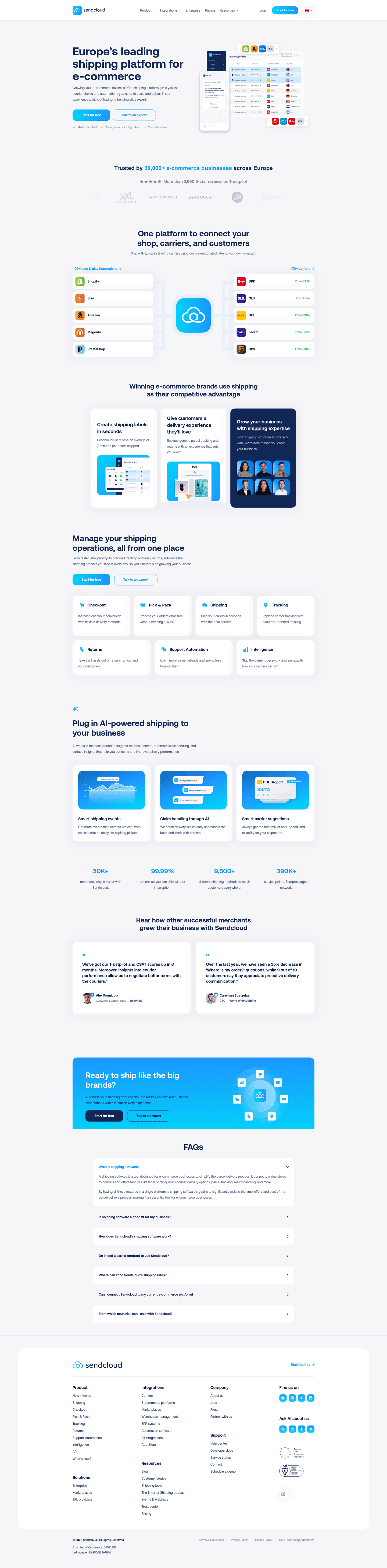
Sendcloud, An integration story that proves fit before features.
5 years CRO + SEO at Qonto (2021–2025). After advising 15+ SaaS on their websites (Payfit, Pigment…), the same patterns kept breaking, so I decided to build the source of truth on what works on the web: the intelligence layer every tool, builder, and team uses to ship sites that perform.
“Sendcloud makes its ecosystem the proof. Hard counts frame a mature platform on both sides, recognizable shop and carrier logos confirm it fits an existing stack, and carrier cards list starting rates so prospects gauge cost at a glance. Clickable column headers lead to full integration and carrier directories for buyers who want to check the details.”
What makes this page stand out
The hero uses two CTAs—“Start for free” and “Talk to an expert”—plus “14-day free trial” and “Cancel anytime.”
The trust band claims “Trusted by 30,000+” and links “More than 2,600 5-star reviews on Trustpilot.”
The integrations section quantifies breadth with “100+ plug & play integrations” and “170+ carriers,” backed by recognizable platform logos.
The carrier tiles show transparent starting prices like DPD “From €3.38” and UPS “From €9.00,” supporting the rates claim.
Section we love
·Integrations
1Two hard counts (100+ plug and play integrations, 170+ carriers) frame a mature ecosystem on both sides of the platform
2Recognizable shop logos (Shopify, Etsy, Amazon, Magento) and carriers (DHL, FedEx, UPS, DPD) confirm it fits existing stacks
3Carrier cards list starting rates (DPD from EUR 3.38, UPS from EUR 9.00) so prospects gauge cost at a glance
4Both column headers are clickable links with arrows that lead to full integration and carrier directories for deeper checks
02
Shipstation, Three clear benefits, each tied to how it actually works.
5 years CRO + SEO at Qonto (2021–2025). After advising 15+ SaaS on their websites (Payfit, Pigment…), the same patterns kept breaking, so I decided to build the source of truth on what works on the web: the intelligence layer every tool, builder, and team uses to ship sites that perform.
“Shipstation gives a full picture of the value in one pass. Three benefit pillars cover the range of the offer, hard numbers make the savings believable, and the cost claim names the mechanism behind it rather than promising vaguely. Distinct icons anchor each pillar so the section reads cleanly at a glance.”
What makes this page stand out
The header includes a globe language menu with US/UK/ANZ/CA flags and region-specific links.
A primary header CTA says “Start a Free Trial” beside “Login” and “ShipStation API” links.
The “Who We Help” layout splits into Small Businesses, Mid-size and Growing, and Enterprise with tailored benefit lists.
Benefit copy uses bold numbers like “80% – 90% discounts,” “200+ carriers,” and “24x7 support” to quantify value.
Section we love
·Value Proposition
1Three benefit pillars (Simplify Fulfillment, Cut Costs, Automate and Scale) give a full picture of the value
2Hard numbers make the savings believable (best rates across 200+ carriers, save up to 90% on every shipment)
3Cut Costs names the mechanism (automated rate shopping finds the best rates) instead of a vague promise
4Distinct icons per card (storefront, dollar, automation diagram) anchor each value prop visually
03
Webgility
69/100
What makes this page stand out
The hero line 'Software + Service, orders to close' reinforces trust with 'Experts close' and 'Specialists certify' messaging.
The platform cards emphasize precision with 'Every transaction posted individually — no batching, no black boxes.'
A primary CTA 'Schedule a Demo →' promises to show 'your channels, your accounting setup, and your close' before commitment.
The solutions segmentation calls out 'operators crossing $500K–$2M' and '10,000+ orders a month' to qualify visitors.
Section we love
·Features
1Explicit BEFORE WEBGILITY vs WITH WEBGILITY split makes the transformation from chaos to clarity tangible
2Pain (payout delays, fee escalation, inventory lockups) maps straight to outcomes like Revenue grew 38%
3Channel fee breakdown table shows the real dashboard output buyers get, not an abstract illustration
4Five workflow tabs (Scale Channels, Reorder Inventory, Raise Capital) reveal platform breadth in one view
04
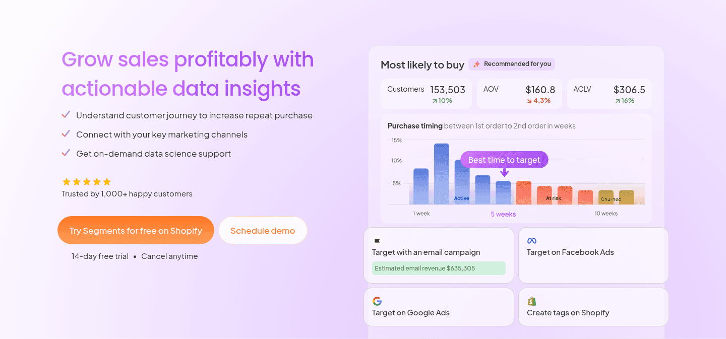
Tresl, An action-led button with proof and reassurance built in.
5 years CRO + SEO at Qonto (2021–2025). After advising 15+ SaaS on their websites (Payfit, Pigment…), the same patterns kept breaking, so I decided to build the source of truth on what works on the web: the intelligence layer every tool, builder, and team uses to ship sites that perform.
“Tresl removes hesitation right at the ask. The primary button names the action and the platform in one line, reassuring microcopy sits directly under it, and a real dashboard preview shows the exact insights a buyer gets. A secondary path captures visitors who want a guided look first.”
What makes this page stand out
Top navigation shows “Log in” and a “Try for free” CTA before any scrolling.
The CTAs “Try Segments for free on Shopify” and “Schedule demo” are reinforced by “14-day free trial • Cancel anytime”.
The dashboard mock shows “Estimated email revenue $635,305” alongside Klaviyo, Meta, Google, and Shopify targeting options.
Trust signals include “Trusted by 1,000+ happy customers” plus 2K+ installations, $5B+ GMV analyzed, 100M+ orders parsed.
Section we love
·Cta
1Action-oriented primary CTA (Try Segments for free on Shopify) names the action and the platform in one line
2Reassuring microcopy (14-day free trial, Cancel anytime) sits right under the button to kill signup hesitation
3Real dashboard preview (Customers 153,503, AOV $160.8, purchase-timing chart) shows the exact insights buyers get
4Secondary path (Schedule demo) next to the primary CTA captures visitors who want a guided look first
05
Uscreen, Stacked customer metrics tied to one real, named creator.
5 years CRO + SEO at Qonto (2021–2025). After advising 15+ SaaS on their websites (Payfit, Pigment…), the same patterns kept breaking, so I decided to build the source of truth on what works on the web: the intelligence layer every tool, builder, and team uses to ship sites that perform.
“Uscreen makes its proof both human and measurable. Hard metrics stack against one named creator, a customer logo and founder quote borrow that brand's credibility, and a case-study link with a live app mockup lets prospects go deeper. Large highlighted figures keep the key results scannable in a second.”
What makes this page stand out
The primary CTA is “Start free trial,” reinforced with “No card needed | Plans start at $49/mo.”
The secondary CTA “Book a demo” sits alongside the trial CTA, offering a higher-commitment path.
The social-proof strip shows recognizable creator thumbnails, including “Theory Verse with 45M subs” and “seven figure membership business.”
The credibility block quantifies impact with “4,000+ creators,” “15 MILLION users served,” “3,500+ apps launched,” and “$210M+ annual creator earnings.”
Section we love
·Testimonial
1Hard metrics stack the proof ($100K+ monthly revenue, 2X membership growth, 4.5 app store rating) tied to one customer
2Abundance+ logo paired with founder Justin Decker quote borrows the customer brand for credibility
3View case study link plus the live app mockup let prospects go deeper and picture the real product
4Large highlighted figures make the key results scannable in a second
06
ClawTeams
60/100
Section we love
·Hero
1Dual CTAs pair the action-led primary (Create AI team) with a lower-commitment secondary (Hire AI experts)
2Product Hunt badges (#1 Product of the Day, 749 upvotes) put social proof directly above the fold
3Subhead names the category plainly (an IM-native AI staff collaboration platform) and promises finished work sent back to your chat
4Real Slack-style product UI shows the AI team, channels, and roles so buyers see exactly what they get
5Three inline proof points (connected to Slack/Telegram, 30+ AI staff, actions logged and stoppable) pre-empt objections under the CTAs
See how your page compares to the 51.5 average page score
Run a quick check on your ecommerce page and get a part-by-part read of what to fix first to improve clarity, fit, and product proof.
Design patterns we see across the best ecommerce pages
Across 15 ecommerce pages we reviewed, the pages that work tend to make the first screen do one job: name the category and prove the product fits the way a store already sells.
The strongest patterns pair a single, clear action with proof a first-time visitor can check at a glance, whether that is a wall of recognizable carrier and marketplace logos, hard stat counters, or a downloadable report with named contributors. This matters in ecommerce website design, where a store owner is asking whether the tool slots into the stack they already run. Use best landing page examples to compare how these building blocks show up across page types.
1Headline plus eyebrow (Your store, on autopilot / The agent-first commerce OS) state outcome and category at once
2Start for free CTA backed by microcopy (Start with 500 free credits) removes the cost barrier to trying it
3Real agent chat UI shows the product working on live listings (Linen Tablecloth, Citronelle Candle) with tool calls
4Above-fold proof stacks a #1 Product of the Day badge with Shopify, Amazon, eBay, and Google Merchant logos
Reviewed design-pattern pick from SellerClaw’s hero section.
What I love about this section
Headline plus eyebrow (Your store, on autopilot / The agent-first commerce OS) state outcome and category at once
Start for free CTA backed by microcopy (Start with 500 free credits) removes the cost barrier to trying it
Real agent chat UI shows the product working on live listings (Linen Tablecloth, Citronelle Candle) with tool calls
Above-fold proof stacks a #1 Product of the Day badge with Shopify, Amazon, eBay, and Google Merchant logos
Overlooked sections that quietly drive clarity and trust
In this set, integration, how-it-works, and FAQ sections often do more work than teams expect: they show the product supports the carriers and channels the buyer already uses, make the setup feel easy, and answer the cost and developer questions before a buyer hesitates.
The biggest gaps usually show up where the page should tie the product to real outcomes in plain language. When those sections are thin, the hero is left to do all the trust work, and visitors are left guessing about fit.
1Three persona cards (Brand Owner, Amazon Seller Going DTC, New Seller) match the three biggest e-commerce buying segments
2Real lifestyle photo of a seller with a tablet on the Brand Owner card carries authenticity stock illustrations never do
3Each card carries a tagged pill (Brand Owner, Amazon → DTC, New Seller) reinforcing the persona at the click point
4See pricing link top-right gives the persona-curious a one-click jump to the buy page without forcing a scroll
Reviewed overlooked-section pick from StoreClaw’s use cases section.
What I love about this section
Three persona cards (Brand Owner, Amazon Seller Going DTC, New Seller) match the three biggest e-commerce buying segments
Real lifestyle photo of a seller with a tablet on the Brand Owner card carries authenticity stock illustrations never do
Each card carries a tagged pill (Brand Owner, Amazon → DTC, New Seller) reinforcing the persona at the click point
See pricing link top-right gives the persona-curious a one-click jump to the buy page without forcing a scroll
Use the examples below as prompts for what to standardize, not just what to redesign.
Checklist: a practical audit for ecommerce website design
If you are reworking an ecommerce homepage design, this checklist helps you spot missing parts and unclear messaging quickly, especially around Cta, Value Proposition, and Hero.
Built from 38 sections across 7 ecommerce homepages in this benchmark. Each check below is a move the highest-scoring pages share, each paired with a real example from the benchmark.
Hero
Can a shopper tell what you do and who it is for in five seconds?
The hero names the product category and the outcome at once.
Example: SellerClaw pairs an eyebrow and headline (The agent-first commerce OS, Your store on autopilot) so the category and the payoff read in one glance.
A primary action sits in the hero, above the fold.
Example: Shipstation puts a bold green Start Shipping Now button at the top of the hero with clear visual hierarchy.
Trust
Does the page earn belief before it asks for the sale?
Proof is quantified with a real number.
Example: Shipstation runs four stat counters (1.3M customers, 1.5T packages shipped, 195 countries, $5T customer revenue) that quantify scale at a glance.
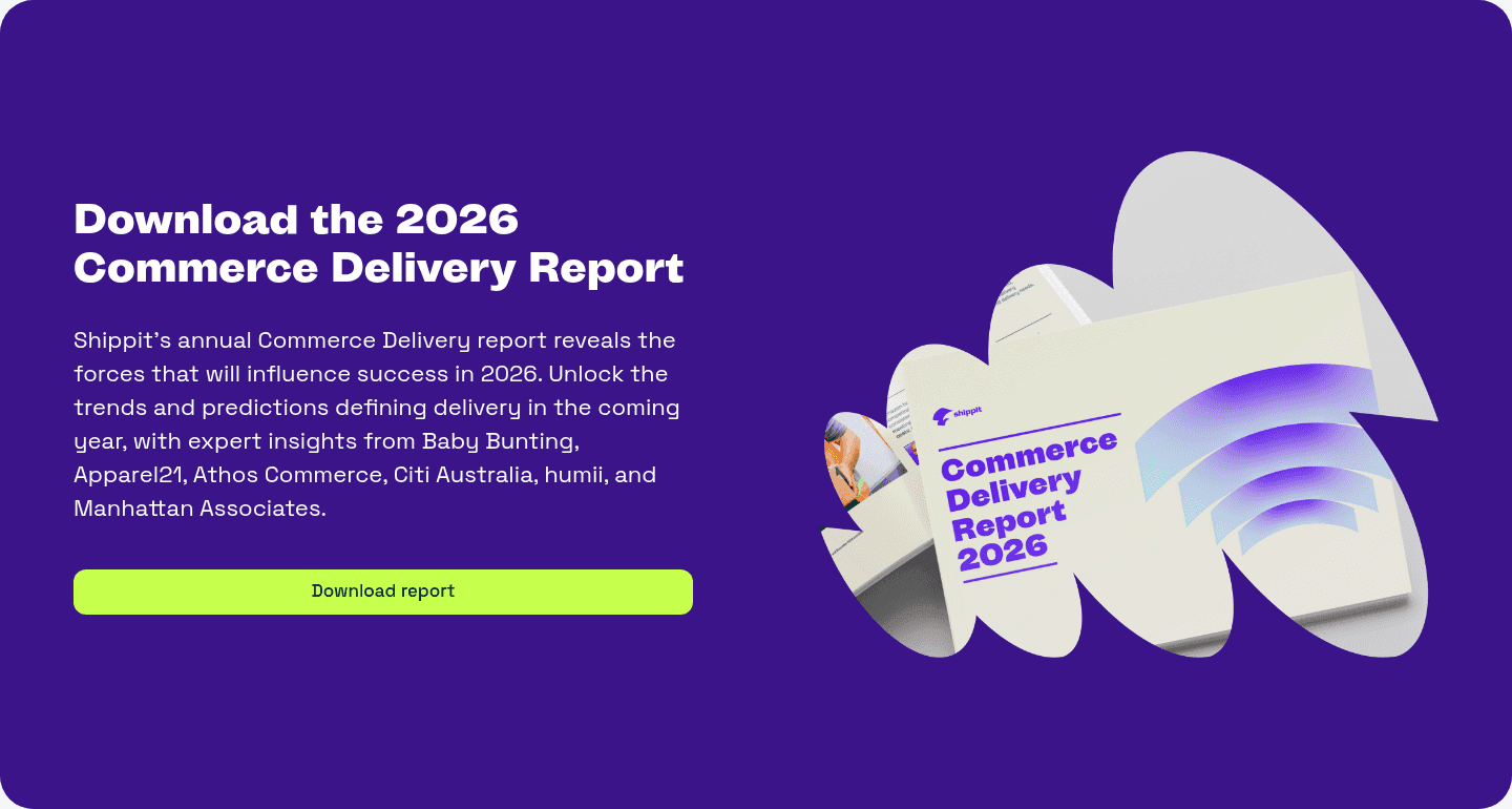
Example: Shippit lines up Harvey Norman and Kmart so visitors borrow trust from brands they already know.
Value proposition
Is the value concrete, or just adjectives?
The page breaks value into a few distinct pillars.
Example: Shipstation splits its value into three benefit pillars (Simplify Fulfillment, Cut Costs, and Automate and Scale).
Each benefit makes a specific, concrete claim.
Example: Uscreen names three distinct outcomes (Netflix-style video, a self-sustaining community, and easy live streaming), each in its own block.
Features
Do features connect to outcomes a store owner cares about?
Feature copy leads with the outcome, not the feature name.
Example: Shippit leads its feature copy with outcomes like plan smarter, dispatch faster, and reduce costs.
The page shows the result, not just describes it.
Example: Uscreen shows real product dashboards (an MRR growth chart and watch-time reports) so the outcome is visible.
Call to action
Does the next click feel safe and obvious?
One primary button owns the block with action-led copy.
Example: Shippit lets a single bright green Download report button stand out hard against a deep purple background, with no competing links.
A risk reducer sits with the button.
Example: StoreClaw bakes the reassurance into the button itself (Start Free, No credit card required).
The gap most ecommerce pages leave open is pricing.
Pricing is the rarest section in this ecommerce set. Of the 7 stores benchmarked, only 1 exposes a pricing block clear enough to score. Uscreen turns it into an interactive revenue calculator with three sliders (audience size, percent paying, monthly price) so earning potential feels personal. Pages that hide cost behind a sales call leave the easiest trust on the table.
Run it on your current page, then decide what to rewrite, what to reorder, and what proof to add before you touch visual polish. For a faster starting point, you can also analyze your ecommerce page.
Interactive quiz
What would your ecommerce homepage score?
Question 1 of 5
0%
Can a store owner identify what your product does in under 5 seconds?
"Shipping and fulfillment for online stores" beats "unlock the future of commerce."
Reviewed by
Gabriel Amzallag , Founder, Web Anatomy
5 years CRO + SEO at Qonto (2021–2025). After advising 15+ SaaS on their websites (Payfit, Pigment…), the same patterns kept breaking, so I decided to build the source of truth on what works on the web: the intelligence layer every tool, builder, and team uses to ship sites that perform.
Ecommerce homepage inspiration, grounded in real pages
Ecommerce FAQ
Quick answers based on the ecommerce websites we reviewed.
What are the best ecommerce websites?
[01]
The strongest performers we reviewed are Sendcloud, Shipstation, and Tresl, with Uscreen, StoreClaw, and SellerClaw rounding out the detailed analysis. Across 15 ecommerce homepages, these pages win by pairing a clear promise with fast proof: Sendcloud's ecosystem of shop and carrier logos, Shipstation's three benefit pillars with named savings, and Tresl's action-led button backed by a real dashboard.
What makes an ecommerce homepage harder to sell?
[02]
A store owner is judging whether the product fits the tools they already sell with, so fit has to land before the feature pitch. Across 15 homepages we looked at, the pages that win make that fit easy to see early: Sendcloud lines up the marketplace and carrier logos a seller recognizes, Shipstation names the mechanism behind its savings, and SellerClaw shows the product running on live listings above the fold.
What is the biggest design mistake on ecommerce homepages?
[03]
Leaning on polished visuals while leaving proof and fit thin. The average page we reviewed scored 51.5, and weak early proof is the most common gap. The pages that fix it answer "does this fit my store?" early: Sendcloud pairs familiar shop and carrier logos with starting rates, while Uscreen ties hard customer metrics to one named creator instead of anonymous claims.
What sections should an ecommerce homepage include?
[04]
A hero that names the category, an early layer that proves fit such as marketplace and carrier logos or integration counts, named customer proof, a real product or how-it-works visual, and a clear next step. The parts that work hardest are Cta, Value Proposition, and Hero. Across 15 pages, the ones that skip the fit layer lose buyers before they reach the product.
How does an ecommerce homepage build trust before the ask?
[05]
The strongest pages make proof and fit easy to see in the first screens instead of saving them for later. Sendcloud puts recognizable shop and carrier logos next to starting rates so the platform feels both proven and affordable. Uscreen stacks hard results against one named creator and a case-study link. Tresl sets reassuring microcopy right under its button. Trust is the part that does the most work across these 15 pages.
How many ecommerce examples should I review before redesigning?
[06]
Three to five is enough if you compare them part by part rather than saving full-page screenshots. The gap is concentrated in a few blocks, so study the pages that win each one: Sendcloud for ecosystem proof, Shipstation for benefit pillars, Tresl for an action-led button, Uscreen for named customer results, StoreClaw for a feature stepper, and SellerClaw for a first-screen product demo.
Where can I find great inspiration for my ecommerce website?
Use a simple checklist for clarity, fit, and friction instead of relying on gut feel. Run your page through the landing page audit for a part-by-part read against the same questions we used to review these pages.