Best Developer Tool Website Examples (And Why They Convert)
We scored 57 developer tool homepages on 60+ conversion criteria. See which sections separate the top performers, and what your page is probably missing.
What high-performing developer tool homepages get right
Developer tool pages face a unique challenge: they need to earn trust from technical buyers who evaluate products by reading docs and trying code, not by watching demo videos. The strongest pages in this benchmark do four jobs early:
53.1/100
Avg. page score
Make the outcome visible in the first viewport so the developer knows what the tool actually does, not just what category it belongs to.
Show the product as a real interface or code workflow, not an abstract illustration. Step-by-step implementation flows let developers evaluate the tool before signing up.
Layer proof that developers trust: GitHub stars, third-party review scores, quantified performance metrics, or verifiable comparison data.
Give builders a low-friction entry point with specific CTA language like "Start building," "See a live demo," or "Try it free," and supportive microcopy that removes signup anxiety.
6 best developer tool homepages analyzed in detail
Each company below is paired with its strongest section and scored across 60+ conversion criteria. See what they get right, and what you can borrow.
01
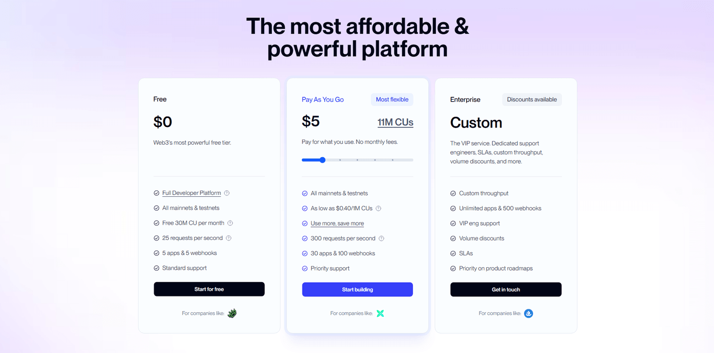
Octolens
Editor's pick83/100
Section we love
·PricingBest in class
1Three clear tiers (Pro $159, Scale $499, Enterprise Custom) each with a one-line description and target-brand label
2Monthly and Annual toggle with Save up to 20% plus USD/EUR switch removes pricing friction for global buyers
3Customer logos under each tier (PostHog, Prisma, Vercel, supabase) add social proof at the decision moment
4Free trial CTAs and usage add-ons (mentions from $0.01, keywords from $5/month) lower commitment and clarify overage cost
5Enterprise Book a call plus a pricing calculator link route high-value and unsure buyers appropriately
02
MentionDrop MCP
75/100
Section we love
·Hero
1Eyebrow (MCP server for AI agents) plus named agents (Claude, Cursor, Windsurf, Hermes) tells buyers exactly who and what it is
2Start 14-day PH trial sits beside a lower-commitment View setup docs so both ready and hesitant visitors have a path
314-day free trial plus free MCP setup help microcopy under the CTA removes setup and commitment risk
4Terminal mockup shows a real MCP tool call returning ranked mentions with relevance scores, proving the product works in an agent
03
Firma.dev
73/100
Section we love
·TrustBest in class
1Five compliance badges (SOC 2 Type II, ISO 27001, eIDAS, GDPR, Data residency) clear security objections in one strip
2G2 proof (4.9-star rating on g2.com with five stars) adds third-party validation a self-claim cannot match
3Ecosystem logos under Works perfectly with (bolt.new, Cloudflare, Replit, V0, Supabase) confirm it fits the dev stack
4Three proof types stacked together (certifications, review score, partner logos) make the trust case feel complete
04
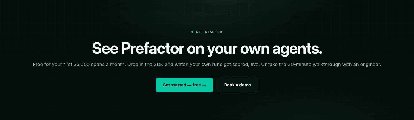
Prefactor
72/100
Section we love
·CtaBest in class
1Free for your first 25,000 spans a month puts an exact number on the free tier, not a vague free trial
2See Prefactor on your own agents frames the offer around the visitor own runs, not a generic signup
3Get started free and Book a demo split self-serve engineers from teams wanting the 30-minute walkthrough
4Mint button on near-black is the only saturated color in the section, so the primary action wins the eye
05
Atlaso
71/100
Section we love
·How It Works
1Three numbered steps (Pick your tool, Connect it, Just work) with 01 02 03 markers make setup look short
2The heading says it outright: Up and running in three simple steps
3A live panel on the left shows the actual tool picker for the open step, so the process is seen not just described
4START FOR FREE sits right after the last step, with the copyable install command (curl -fsSL atlaso.ai/install.sh) and macOS, Linux and Windows tabs under it
5The last step is the end state (Just work), not another task for the user
06
Cal.com, Open-source scheduling that handles the complexity so you don't have to.
5 years CRO + SEO at Qonto (2021–2025). After advising 15+ SaaS on their websites (Payfit, Pigment…), the same patterns kept breaking, so I decided to build the source of truth on what works on the web: the intelligence layer every tool, builder, and team uses to ship sites that perform.
“Cal.com turns scheduling infrastructure into a clear, step-by-step product story. The How It Works section (scored 100, top-scoring) pairs UI previews with effortless framing, "we handle the cross-referencing", so the value feels concrete before the visitor touches the product. Dual CTAs serve both self-serve and sales-led buyers.”
What makes this page stand out
Self-hosting option gives enterprises full control over their scheduling data
API-first design enables embedding scheduling into any application or workflow
Collective and round-robin scheduling handle complex team scheduling needs
Cal Atoms (UI components) allow custom-branded scheduling experiences
Section we love
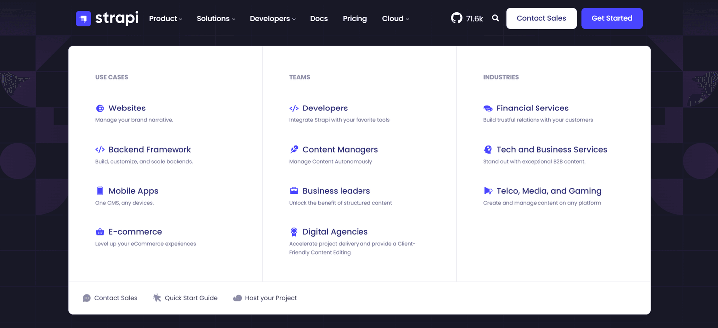
·NavbarBest in class
1Dark Get started button is the standout primary CTA, paired with a quieter Sign in link
2Pricing tab sits in the top nav for buyers ready to compare plans
3Solutions mega menu splits into By team size and By use case columns with clear headers
4Persona paths cover Individuals, Teams and Organizations while use case paths cover Recruiting, Sales, Support and more
5Featured purple Cal.ai card promotes AI-powered scheduling calls with a Try Cal.ai now badge
Design patterns we see across high-performing developer tool pages
Across 57 developer tool pages reviewed, the pages that convert make the first screen do one job: show what the tool does and prove it works.
The strongest patterns pair outcome-led visuals with real product UI, then back claims with proof developers actually trust, benchmarks, comparison data, open-source metrics, or third-party review scores. Features, CTA, and Hero sections are the most common top-performing section types, while How It Works sections averaged 88.6, the highest score in the benchmark. Use website section examples to compare how these building blocks show up across page types.
Product Hunt 484-upvote badge plus (API & MCP ready) pill stack social proof and category clarity above the fold
Overlooked sections that quietly drive adoption and trust
In this set, navigation and utility sections often do more conversion work than teams expect: they shape product understanding, route developer personas, and surface use cases before visitors reach the hero.
The biggest gaps appear where the page should address the problem the tool solves. Problem sections averaged just 24 (the weakest section type in the benchmark), which forces the hero to carry the entire persuasion load. Meanwhile, pages like DevStats (navbar scored 100, top-scoring) and Plivo (How It Works scored 100, top-scoring) show that structured navigation and step-by-step flows can quietly close the trust gap.
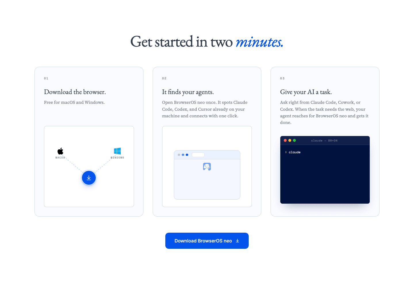
1Headline puts a number on the setup cost up front: Get started in two minutes
2Three numbered cards (01, 02, 03) with one short line each, so the whole process is read in a glance
3Friction is removed at every step: free for macOS and Windows, it finds Claude Code, Codex and Cursor by itself, connects with one click
4Each step carries its own small visual (OS icons, browser window, terminal) instead of a generic icon set
5Step 3 describes the finished state, the agent reaches for the browser and gets the task done, not just the last click
6Blue Download BrowserOS neo button sits right under the final step, while the process still feels easy
Reviewed overlooked-section pick from BrowserOS neo’s how it works section.
What I love about this section
Headline puts a number on the setup cost up front: Get started in two minutes
Three numbered cards (01, 02, 03) with one short line each, so the whole process is read in a glance
Friction is removed at every step: free for macOS and Windows, it finds Claude Code, Codex and Cursor by itself, connects with one click
Each step carries its own small visual (OS icons, browser window, terminal) instead of a generic icon set
Use the examples below as prompts for what to add or restructure, not just what to redesign visually.
Checklist: a practical audit for developer tool website design
If you are iterating on a developer tool homepage, this checklist helps you spot missing sections and messaging gaps quickly, especially around Features, CTA, and Hero sections.
Run it on your current page, then decide what to rewrite, what to reorder, and what proof to add before you touch visual polish. For a faster baseline, you can also try our landing page audit.
Built from 280 sections across 57 developer tool homepages in this benchmark. Each check below is a move the highest-scoring pages share, each paired with a real example from the benchmark.
Hero
Can a developer tell what you do and try it in five seconds?
The hero makes it instantly clear what the product is and who it's for.
Example: Bugherd backs the plain category line with a social proof trifecta, a 4.8 out of 5 rating, 350K+ users, and 10K+ companies.
The real product shows above the fold.
Example: CircleCI opens on a real pipeline UI showing build statuses "Running, Failed, Success" with timestamps instead of a hero illustration.
Proof is visible before the first scroll.
Example: mailX by mailwarm goes further and lets visitors run the core domain analyzer in the hero itself, so the hero is the product.
Trust
Does the page earn belief with proof a skeptic can check?
Recognizable customer or platform logos borrow credibility.
Example: Assemblyai runs a customer logo grid of CallRail, Ashby, Delphi, and Supernormal to borrow trust from known SaaS brands.
Claims are quantified with hard numbers.
Example: Semgrep states three hard metrics, 45+ enterprise customers, a 96% security research agree rate, and a 95% user agree rate.
Security and compliance signals reassure enterprise buyers.
Example: Plivo stacks five recognized seals, HIPAA, GDPR, SOC 2, PCI DSS, and STAR, in a single compliance row.
Value proposition
Is the value concrete, or just adjectives?
Benefits are specific, tied to a real capability.
Example: DataFlint names six supported platforms, AWS EMR, Databricks, Dataproc, Microsoft Fabric, Kubernetes, and On-Premises, each on its own card.
The promise is quantified with a number or a timeframe.
Example: SlimAI anchors its value in hard numbers, 2,000+ Zero-CVE base images and production-ready patches delivered in 15-40 minutes.
Features
Do features connect to outcomes a developer cares about?
Feature copy leads with the outcome.
Example: DevStats headlines with "find where work gets stuck" and "cut your time to production" instead of naming the metric.
Each feature maps a real pain to a measurable result.
Example: Pipeshift names the pain then promises the fix with headings like "unused GPU capacity? Not anymore."
Call to action
Does the next click feel like a natural step for a developer?
The copy is action-led.
Example: Firecrawl lets one dominant orange "Start for free" button lead, with a muted gray secondary beside it.
A clear secondary path serves the buyer who is not ready yet.
Example: Benchify leads with a green "Schedule a Demo" button and offers "Email Us" as the lighter second path.
Reassuring microcopy sits next to the button.
Example: Edgee Fallback Models stacks three reassurances under the button, "Install in 30 seconds. Works with your existing Claude Code setup. No credit card."
The gap most developer tool pages leave open is pricing.
Pricing is the rarest section in the developer tool set. Of 57 companies benchmarked, only 21 expose a pricing block clear enough to score. The ones that do make a developer's decision easy. Raycast lines up three named plans side by side, Free forever at zero dollars, Pro at 8 dollars, and Team Pro at 12 dollars per user, each with a one-line audience tagline. Pages that hide pricing behind "contact sales" leave the cheapest trust on the table.
Interactive quiz
What would your developer tool homepage score?
Question 1 of 5
0%
Can a developer identify what your tool does in under 5 seconds?
"Visual bug tracking on your live site" beats "streamline your development workflow."
Reviewed by
Gabriel Amzallag , Founder, Web Anatomy
5 years CRO + SEO at Qonto (2021–2025). After advising 15+ SaaS on their websites (Payfit, Pigment…), the same patterns kept breaking, so I decided to build the source of truth on what works on the web: the intelligence layer every tool, builder, and team uses to ship sites that perform.
Quick answers based on our 57-page developer tool website benchmark.
What are the best developer tool websites?
[01]
The strongest performers in this November 2026 benchmark are Cal.com, Bugherd, Benchify, Dyte, and Kinsta. Across 57 developer tool homepages scored against 60+ criteria, these pages convert by showing the actual workflow: Cal.com sequences its product story with UI previews in every step, Bugherd stacks 4.8/5 rating plus 350K+ users in the hero, and Benchify pairs side-by-side comparisons with a "No hallucinations" deterministic badge.
Why are developer tool websites harder to convert than generic SaaS pages?
[02]
Developers evaluate through docs, code samples, and hands-on trials, not marketing copy. Across 57 homepages reviewed, the pages that convert make outcomes verifiable fast: Benchify ships 10% vs 100% coverage deltas and a 87-days-to-less-than-1-second benchmark, Bitbucket shows real code repos and pipeline views instead of a diagram, and Cal.com handles the cross-referencing so scheduling complexity becomes concrete before signup.
What is the biggest design mistake on developer tool homepages?
[03]
Leading with abstract product messaging while hiding the actual interface and measurable outcomes. The average page in this November 2026 benchmark scored 49.8. Top performers replace abstraction with proof: Benchify shows the contract-to-executable comparison, Bitbucket surfaces pull requests and CI/CD in the hero, and Dyte routes Ed-tech and Telehealth buyers straight from the navbar before they ever read a headline.
What sections should a developer tool homepage include?
[04]
A hero with real product UI or code output, a How It Works flow sequencing the developer workflow, features tied to specific outcomes, trust signals developers value (GitHub stars, G2 and Trustpilot scores, benchmarks), and a low-friction CTA like "Start building" or "Try it free." Cal.com and Kinsta stack these well, while Bitbucket surfaces real pull requests and CI/CD pipelines in the hero to prove the workflow before asking for a signup.
How many developer tool examples do I need to review before redesigning?
[05]
Three to five is enough if you pick by developer category. Only 9% of sections in this benchmark score in the top tier, so the gap is concentrated in a few blocks. Study Cal.com for sequenced how-it-works flow, Bugherd for compressed trust in the hero, Benchify for verifiable comparison data, Dyte for navbar-level persona routing, and Kinsta for audience-specific scope.
Where can I find great inspiration for my developer tool website?
Use a structured rubric that checks clarity, proof, and friction instead of relying on subjective feedback. Run your page through the landing page analysis for a section-by-section score against the same 60+ criteria used in this benchmark.