Pricing pages with an email form (40)
The 40 pricing pages here that carry an email capture form beside or below the plans.
Key takeaways
- Show the price even when the page asks for an email. Most of these pages don't.
- Say what the visitor gets for their address, right next to the field.
- Keep describing the plans in full, even with a form on the page.
Showing 1–24 of 40 pricing pages
What the best pricing pages with an email form do
Most of these pages ask for an address before they show a price. The best ones show the price first and use the form for something extra.
Show the price next to the form
1% of the best pricing pages hide a price. When the price is missing, the visitor has to hand over an email address just to find out what the product costs.

Say what the email gets them
Ask for one field and say what comes back, such as an alert when a waitlisted plan opens or a copy of a quote. Those are good reasons to sign up once the price is already on the page.
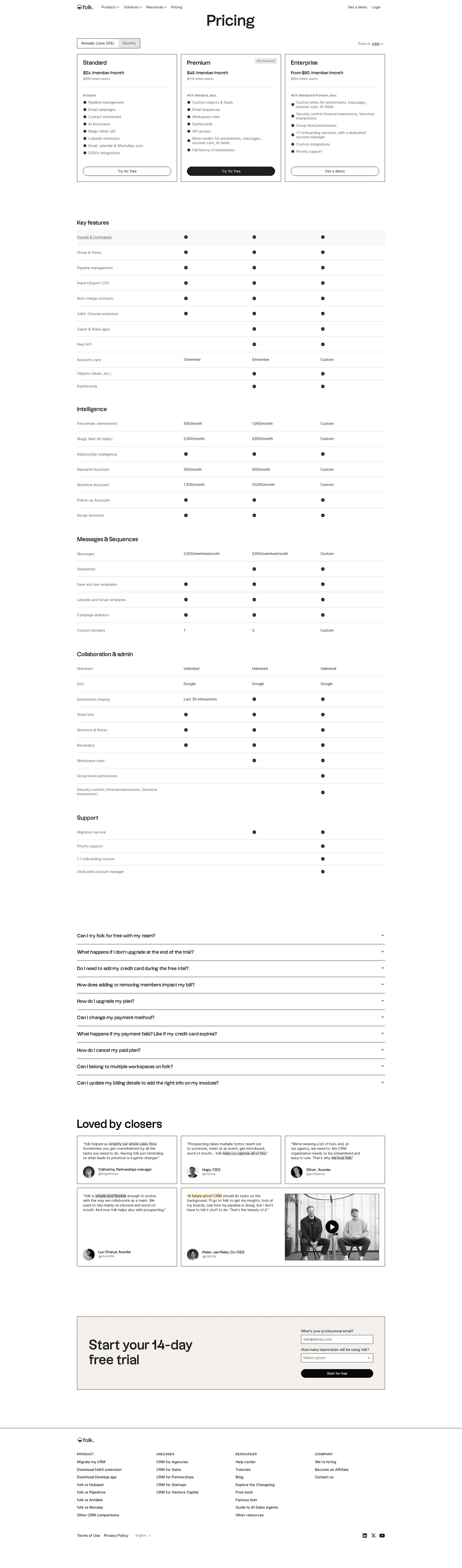
Keep describing the plans
82% of the best pricing pages carry a comparison table, and 47% explain features in a tooltip. They describe the product in full first and ask for the address after that.


Curated by
Gabriel Amzallag , Founder, Web Anatomy
5 years CRO + SEO at Qonto (2021–2025). After advising 15+ SaaS on their websites (Payfit, Pigment…), the same patterns kept breaking, so I decided to build the source of truth on what works on the web: the intelligence layer every tool, builder, and team uses to ship sites that perform.
Go further than pricing pages
MCP
Section ideas, from inside your editor
Ask your coding agent for the strongest sections of a pricing page in your industry. It answers from this benchmark, section by section.
Library
The analysis behind every page here
Each pricing page on this page, section by section, with what works and what does not. Free account.
Browse more pricing pages
Pick another group below, see every pricing page, or browse the sections these pages are built from.
Is your form standing where your price should be?
Paste your pricing page. Get a scored breakdown against the same best practices these pages were measured on, with the fixes ranked by impact. Free, no signup.
Email forms on a pricing page, answered
What the best pricing pages give in return for an address, from the 40 here.
How many pricing pages ask for an email?
01Very few. It's the rarest block in this benchmark, and more than half of the pages that use it hide their price.
What is different about a page with an email form?
02It's far more likely to hide the price. More than half of these pages hide one, while most pricing pages without a form show it, and they offer a free tier far less often. On a lot of these pages, the form sits where the price would normally go.
Is an email form on a pricing page ever a good idea?
03Yes, when it gives the visitor something extra, like an alert when a waitlisted plan opens, a copy of a detailed quote or a reminder before a trial ends. Ask whether the visitor could have seen the price without typing an address. If they couldn't, the form is there to collect leads.
What should the page still show?
04All of it. Almost all of the best pages here carry a comparison table, most name an enterprise tier and many explain features in a tooltip. Pages that stop describing the product once they add a form end up with addresses from people who never come back.
How much should the form ask for?
05One field, for the email address. The visitor hasn't seen a price yet, so each extra field is one more thing to fill in, and the company can ask for the rest later once the person has a reason to answer.