5 years CRO + SEO at Qonto (2021–2025). After advising 15+ SaaS on their websites (Payfit, Pigment…), the same patterns kept breaking, so I decided to build the source of truth on what works on the web: the intelligence layer every tool, builder, and team uses to ship sites that perform.
“Membership turns navigation into an active conversion tool. A featured event with dates and a Register Free CTA lives in the navbar, while each menu item includes an icon and description. The Partner Program link, "Make 30% every time they pay", transforms the header into a revenue channel before visitors even reach the hero.”
What makes this page stand out
The specific problem articulation — creators struggling to retain members and reduce churn — positions the platform around the business model's core challenge, not just content delivery
Competitive differentiation against specific alternatives (Patreon's limited tools, WordPress's complexity, all-in-one platforms' bloat) helps buyers self-select quickly
The all-in-one membership toolkit (content library, community, courses, mobile app) covers every element a membership business needs without requiring multiple subscriptions
Engagement and retention features (drip content, gamification, progress tracking) directly address the churn problem that kills most membership businesses within the first year
Section we love
·Features
1Headlines lead with the outcome (Everything you need in one place, All your scattered content in one profitable home) not feature names
2Pain-to-outcome framing is explicit (no more juggling tools, escape the algorithm) tying each frustration to the fix
3See more, See Community and See Automations links route curious visitors to deeper feature pages
4Real product mockups (community chat, content hub) show the result, and stacked rows cover several supporting features
03
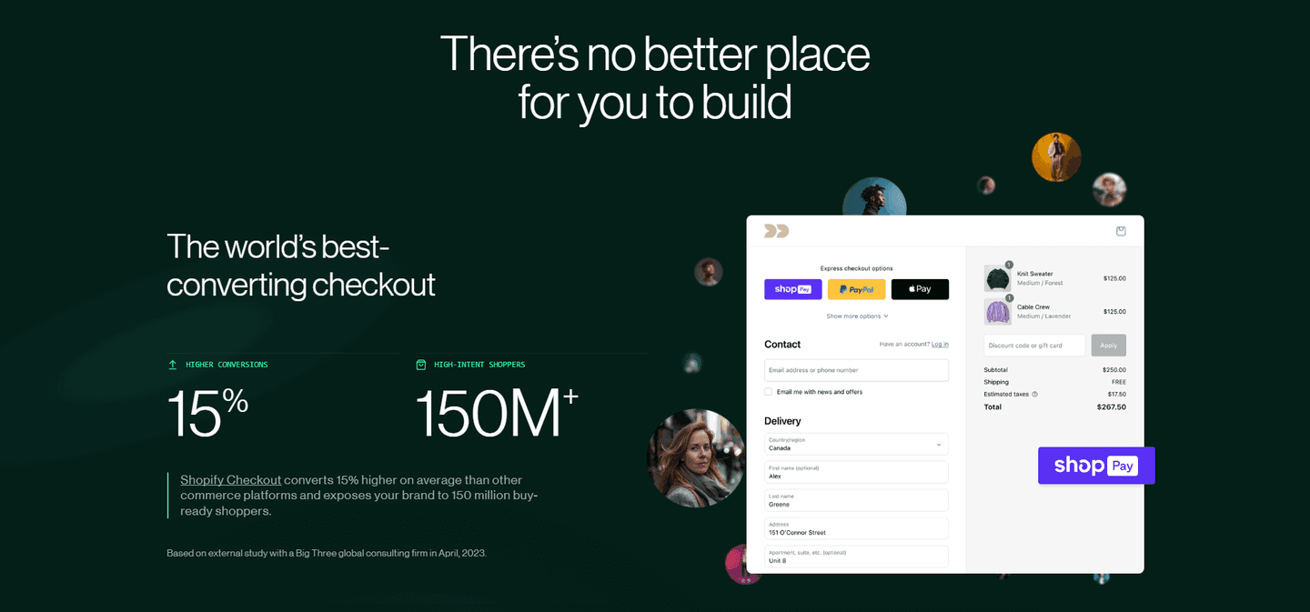
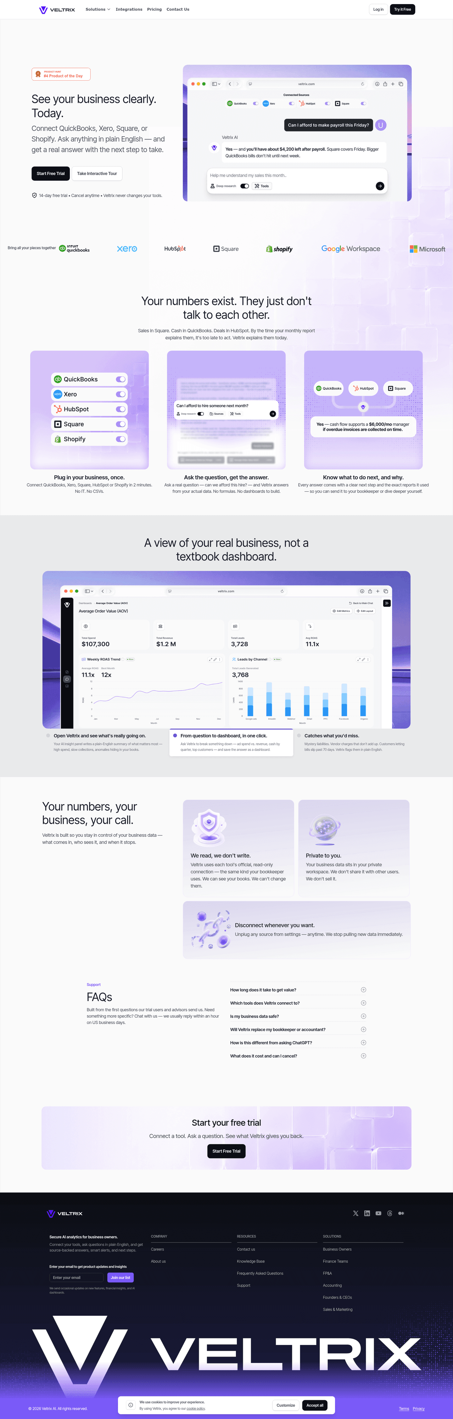
Qonto, Business banking with transparent proof and modern tools.
5 years CRO + SEO at Qonto (2021–2025). After advising 15+ SaaS on their websites (Payfit, Pigment…), the same patterns kept breaking, so I decided to build the source of truth on what works on the web: the intelligence layer every tool, builder, and team uses to ship sites that perform.
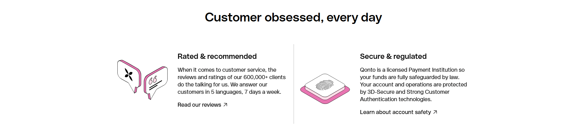
“Qonto leads with social proof at scale, 600,000+ clients, 5 languages, 7-day support, and backs it with named security protocols (3D-Secure, Strong Customer Auth). Deep-dive links handle objections without cluttering the first screen, supporting fast evaluation for cautious B2B buyers.”
What makes this page stand out
European banking foundation with regulatory compliance provides institutional trust for a fintech challenger
Clean, modern interface and transparent pricing differentiate from traditional banking aesthetics and opaque fee structures
500,000+ business customers social proof demonstrates massive European fintech market traction
Dual CTA serving both self-serve and enterprise buyer motions enables efficient conversion paths
Section we love
·Value PropositionBest in class
1Two distinct props side by side: Rated & recommended and Secure & regulated, each with its own icon
2Concrete proof numbers: 600,000+ clients, support in 5 languages, 7 days a week
3Security mechanism named: licensed Payment Institution plus 3D-Secure and Strong Customer Authentication
4Each prop ends with a deep-dive link (Read our reviews, Learn about account safety) for proof-seekers
04
Causo for Fundraising
59/100
What makes this page stand out
The hero headline promises “meetings with VC Investors while you sleep” and repeats a direct “Get me meetings” CTA.
The Product Hunt “Top Post” badge appears above the fold as third-party social proof.
The live demo walkthrough shows deck upload, criteria checkmarks, and a “✓ Verified” Accel contact with match reasoning.
The pricing table lists $0, $15, and $59 plans with “Start free →” and “No card needed” copy.
Section we love
·How It Works
1Three real product cards (Log in, Plan, Emails sent) mirror the actual screens a founder will see, not generic illustrations
2Headline (Probably the easiest tool you ever used) calibrates the effort expectation in plain English
3Strikethrough swap (Stop browsing Crunchbase, Start raising) under the steps reframes the alternative and the new path in one breath
4Single orange CTA (LET'S GO) capping the section converts the post-flow conviction into a click
05
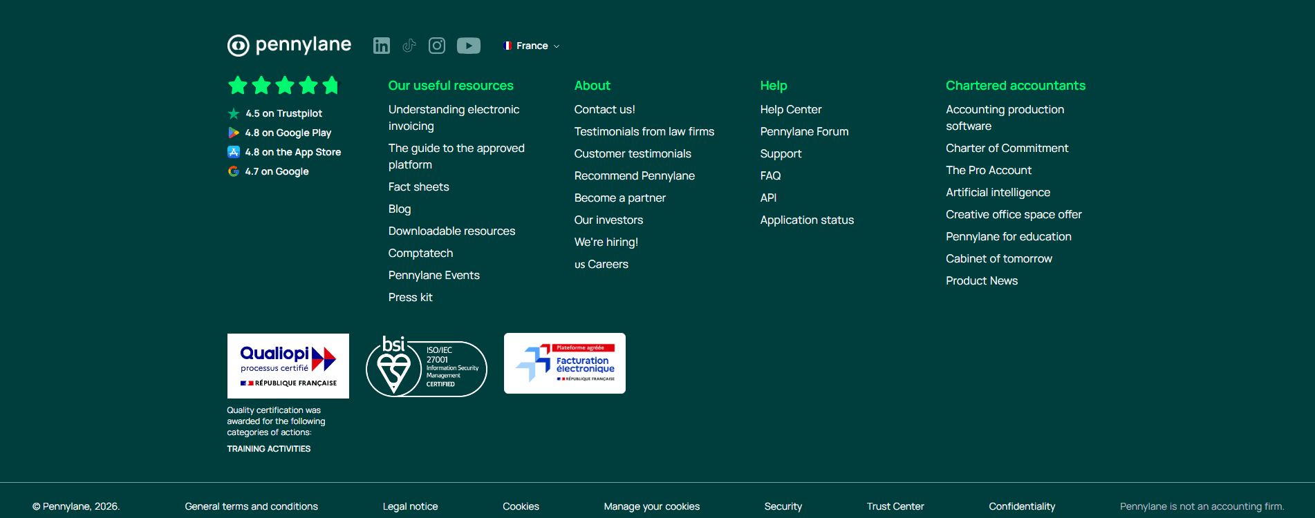
Pennylane, Multi-platform proof stacked where visitors actually look.
5 years CRO + SEO at Qonto (2021–2025). After advising 15+ SaaS on their websites (Payfit, Pigment…), the same patterns kept breaking, so I decided to build the source of truth on what works on the web: the intelligence layer every tool, builder, and team uses to ship sites that perform.
“Pennylane aggregates ratings from four platforms into one visible proof block, then pairs it with three certification badges (Qualiopi, ISO 27001, electronic invoicing). The footer does real trust work instead of being an afterthought, with four organized link columns that guide discovery.”
What makes this page stand out
Three-audience navigation (Indépendants et TPE, PME et ETI, Cabinet expertise comptable) segments the homepage for different buyer personas
Google 4.7/5 and Trustpilot 4.5/5 ratings prominently displayed provide dual third-party validation
Product UI mockups showing mobile and desktop dashboards, electronic invoicing badge, and treasury views demonstrate comprehensive platform capabilities
Feature bar (Facturation électronique, Facturation simplifiée, Gestion des achats, Trésorerie en temps réel, Comptabilité complète, Compte & carte pro) showcases platform breadth
Section we love
·Footer
1Footer links organized into 4 clear columns (Our useful resources, About, Help, Chartered accountants) for easy navigation
2ISO/IEC 27001, Qualiopi and Facturation electronique certification badges reinforce trust below the fold
3Review scores persist social proof: 4.5 on Trustpilot, 4.8 on Google Play, 4.8 on the App Store, 4.7 on Google
5 years CRO + SEO at Qonto (2021–2025). After advising 15+ SaaS on their websites (Payfit, Pigment…), the same patterns kept breaking, so I decided to build the source of truth on what works on the web: the intelligence layer every tool, builder, and team uses to ship sites that perform.
“Legalstart turns its resources section into a lead generation engine. Fact sheet cards with read time estimates (4-5 min) feel helpful rather than pushy, and a downloadable guide captures emails while topics align directly with core legal service offerings.”
What makes this page stand out
"Dès 0€ + frais légaux" (From €0 + legal fees) pricing transparency removes the cost uncertainty that prevents people from starting businesses
900,000+ entrepreneurs accompanied provides massive social proof that builds trust for a self-service legal platform
Google and Trustpilot star ratings displayed prominently provide third-party validation from recognized review platforms
"La solution complète pour lancer et piloter votre entreprise" (Complete solution to launch and manage your business) expands from creation to ongoing management
Section we love
·ResourcesBest in class
1Fact sheets organized into clear themes (Starting a business, Managing employees, Protecting IP, Getting paid) covering the full entrepreneur journey
2Every theme links out to many deep sub-topics plus See more buttons, pulling visitors into a large content library
3Sidebar offers a downloadable Guide Pratique with a Download CTA that gates the resource and captures leads
4Topics map tightly to Legalstart legal services and the published practical guide positions the brand as an expert authority
See how your page compares to the 49.8 average page score
Run a diagnostic on your startup page and get a section-by-section breakdown of what to fix first to improve benefit specificity, trust signals, and product proof.
Design patterns we see across high-performing startup pages
Across 13 startup pages reviewed, the pages that convert tend to make the first screen do one job: state a specific benefit and back it with proof that a first-time visitor can verify.
The strongest patterns pair quantified claims with real product UI, then layer trust signals, named security protocols, multi-platform ratings, or recognizable partner logos, before the primary CTA. With Value Proposition, CTA, and Footer as the top-performing section types, the best startup pages treat every section as a conversion opportunity, not just the hero. Use website section examples to compare how these building blocks show up across page types.
1Benefit-led blocks (Ship faster with purpose-built models, Build and deploy with complete control) lead with the outcome not the product name
2Each block carries a Discover CTA (Discover Le Chat, Vibe, Studio, Applied AI) opening a path to the dedicated product page
3Real product UI shown per block (Le Chat hub, code editor, agent dashboard with chart, training graphs) makes the result concrete
4Checkmarked capability pills under each block surface supporting features like enterprise search, observability and custom model training
Reviewed design-pattern pick from Mistral AI’s features section.
What I love about this section
Benefit-led blocks (Ship faster with purpose-built models, Build and deploy with complete control) lead with the outcome not the product name
Each block carries a Discover CTA (Discover Le Chat, Vibe, Studio, Applied AI) opening a path to the dedicated product page
Real product UI shown per block (Le Chat hub, code editor, agent dashboard with chart, training graphs) makes the result concrete
Checkmarked capability pills under each block surface supporting features like enterprise search, observability and custom model training
Overlooked sections that quietly drive clarity and trust
In this set, navigation and resource sections often do more conversion work than teams expect. Pennylane's navbar (scored 100) with nine product items, icons, descriptions, and a bold green Start now CTA. Legalstart's resources section covers seven themed categories spanning the full business lifecycle.
The biggest gaps usually appear where the page should explain the company story and the product workflow in plain language. When the Testimonial section, the weakest section type in this benchmark at a score of 23, is thin or absent, the hero gets forced to do all the trust work alone.
1Links grouped into 4 labeled columns (Offers, Features, Resources, About) for easy navigation
2Ratings persist proof: 4.8/5 App Store, 4.5/5 Google Play, 4.8/5 Trustpilot plus Elu Service Client 2026 award
3B Corp Certified badge and ACPR regulatory approval reinforce trust for a fintech buyer
4Legal links (Terms of Use, Data protection, Cookie Policy, Legal notice) are clearly listed at the bottom
Reviewed overlooked-section pick from Shine’s footer section.
What I love about this section
Links grouped into 4 labeled columns (Offers, Features, Resources, About) for easy navigation
Ratings persist proof: 4.8/5 App Store, 4.5/5 Google Play, 4.8/5 Trustpilot plus Elu Service Client 2026 award
B Corp Certified badge and ACPR regulatory approval reinforce trust for a fintech buyer
Legal links (Terms of Use, Data protection, Cookie Policy, Legal notice) are clearly listed at the bottom
Use the examples below as prompts for what to standardize, not just what to redesign.
Checklist: a practical audit for startup website design
If you are iterating on a startup homepage design, this checklist helps you spot missing sections and messaging gaps quickly, especially around Value Proposition, CTA, and Footer.
Run it on your current page, then decide what to rewrite, what to reorder, and what proof to add before you touch visual polish. For a faster baseline, you can also try our landing page analyzer.
Built from 53 sections across 11 startup homepages in this benchmark. Each check below is a move the highest-scoring pages share, each paired with a real example from the benchmark.
Value proposition
Is the value concrete, or just adjectives?
The benefits are specific.
Example: Qonto runs two precise props side by side, "Rated and recommended" and "Secure and regulated," each with its own icon.
The promise is quantified with a real number.
Example: Alan anchors three cards on hard figures, 30% engagement, 260k members, and 95% quality, instead of promising growth.
The page names the mechanism that makes the promise true.
Example: Shopify names the mechanism, "Shopify Shipping for faster cheaper delivery, Shopify Markets for localization," beside a world map and localized storefront.
Features
Do features connect to outcomes the buyer cares about?
The feature copy leads with the outcome.
Example: Mistral AI opens its blocks with "Ship faster" and "Build with complete control," not the model names.
A secondary feature layer supports the headline benefit.
Example: Back Market stacks savings-led cards under the main pitch, each headlined by the price benefit like "Save 99.95" and "Save 158.00."
Each feature maps a real pain to a measurable result.
Example: Membership ties scattered content to "one profitable home" so the fix is the headline, not the tool.
Call to action
Does the next click feel safe to a cautious buyer?
The button copy names the action.
Example: Pennylane lets a single "Start now" button own the block with no competing links.
One primary action dominates the block.
Example: Membership lets one green "Start free trial" button stand alone with no competing action.
Reassuring microcopy sits next to the button.
Example: Shine sits a reassurance row under its "Open my account" button, "First month free," "Opens in 5 minutes," and "No commitment."
The section most startup pages skip is a real trust block.
Trust is the rarest section in the startup set. Of 11 companies benchmarked, only three expose a trust block clear enough to score, and only one quantifies it. Causo leads in the founder voice with stat headlines like "100% of startups that used Causo got at least one investor pitch meeting," which turns a claim into proof. Pages that lean on the hero alone leave the cheapest credibility on the table.
Interactive quiz
What would your startup homepage score?
Question 1 of 5
0%
Does your hero state a specific, measurable benefit within the first viewport?
"Up to 50% customer acquisition savings" beats "grow your business faster."
Reviewed by
Gabriel Amzallag , Founder, Web Anatomy
5 years CRO + SEO at Qonto (2021–2025). After advising 15+ SaaS on their websites (Payfit, Pigment…), the same patterns kept breaking, so I decided to build the source of truth on what works on the web: the intelligence layer every tool, builder, and team uses to ship sites that perform.
See how your page compares to the 49.8 average page score
Run a diagnostic on your startup page and get a section-by-section breakdown of what to fix first to improve benefit specificity, trust signals, and product proof.
Quick answers based on our startup website benchmark dataset.
What are the best startup websites?
[01]
The strongest performers in this June 2026 benchmark are Qonto, Pennylane, Shopify, Alan, and Legalstart, with Membership leading on navbar-as-conversion and Shine on dual-CTA product proof. Across 13 startup homepages scored against 60+ criteria, these pages convert by naming the numbers: Qonto opens with 600,000+ clients and 3D-Secure, Shopify quantifies "up to 50% customer acquisition savings" next to a UI screenshot showing $12,129 in attributed sales.
Why do most startup homepages fail to convert?
[02]
They lead with vision instead of value. Across 13 homepages reviewed, the pages that convert make the benefit specific and easy to verify: Qonto names security protocols directly (3D-Secure, Strong Customer Auth) rather than showing a generic padlock, Pennylane stacks Trustpilot 4.5, Google Play 4.8, App Store 4.8, and Google 4.7 ratings in one block, and Alan pairs its "healthcare works best when not fragmented" thesis with a concrete business-model CTA.
What is the biggest design mistake on startup homepages?
[03]
Leading with brand storytelling while delaying concrete proof of what the product does and who it is for. The average page in this June 2026 benchmark scored 49.8. Top performers answer "what do you actually do?" before the fold: Shopify shows $12,129 in attributed sales next to a 50% acquisition-savings claim, Legalstart turns its resources section into fact-sheet cards with 4-5 minute read times, and Membership puts a Register Free event CTA inside the navbar.
What sections should a startup homepage include?
[04]
A clear hero with one specific benefit, an early trust layer (logos, user counts, security cues), a concise "how it works" section, features tied to outcomes, and a CTA with supportive microcopy that reduces perceived risk. Qonto's named-compliance hero and Pennylane's multi-platform rating block are strong templates. Across 13 homepages, pages that stack these blocks convert most, while pages that lead with brand storytelling instead of concrete proof fall into the bottom tier.
How important is the "How It Works" section for startup pages?
[05]
Critical. In this benchmark, How It Works was the strongest-performing section type with a score of 100. Visitors who do not yet know your brand need a clear, concise explanation of the product workflow before they will consider converting. Shine pairs dual CTAs with a real product screenshot so undecided visitors get a concrete preview, and Legalstart lets content cards with read time estimates carry the workflow for early-stage visitors who are not ready to buy.
Where can I find great inspiration for my startup website?
Use a structured rubric that checks clarity, trust, and friction instead of relying on subjective feedback. Run your page through the landing page audit for a section-by-section score.