AI pages face a unique challenge: the technology feels abstract, buyers worry about accuracy, and every competitor claims to be "intelligent." The strongest pages in this benchmark do four jobs early:
50.5/100
Avg. page score
Make the output concrete in the first viewport. Show a real product interface, a live demo, or actual results so the AI promise feels operational instead of theoretical.
Address trust and accuracy head-on. Surface compliance badges, deterministic logic claims, or "no hallucination" guarantees so buyers know you take reliability seriously before they evaluate anything else.
Show the workflow, not the model. Visitors care about what the product does for them, not how the neural network works. Pair clear outcomes with visual proof.
Give skeptical buyers a low-friction entry point. Interactive demos, free tiers, and risk-reducing CTAs outperform generic "Request Demo" buttons for AI tools where the product can speak for itself.
6 best AI homepages analyzed in detail
Each company below is paired with its strongest section and scored across 60+ conversion criteria. See what they get right, and what you can borrow.
01
Octolens
Editor's pick83/100
Section we love
·PricingBest in class
1Three clear tiers (Pro $159, Scale $499, Enterprise Custom) each with a one-line description and target-brand label
2Monthly and Annual toggle with Save up to 20% plus USD/EUR switch removes pricing friction for global buyers
3Customer logos under each tier (PostHog, Prisma, Vercel, supabase) add social proof at the decision moment
4Free trial CTAs and usage add-ons (mentions from $0.01, keywords from $5/month) lower commitment and clarify overage cost
5Enterprise Book a call plus a pricing calculator link route high-value and unsure buyers appropriately
02
VC Boom
81/100
What makes this page stand out
The hero stacks credibility and scale: “✓ 792 founders · $95M+ raised” plus “Your 100 right-fit investors out of 47,000.”
The primary CTA “Score my deck free →” is paired with a secondary “See a sample score” to reduce uncertainty.
The page visualizes outcomes with app-style widgets showing “71/100” scoring and investor matches like “First Round Capital 94% match.”
The trust section names specific logos (Google, Microsoft, Kleiner Perkins, Accel, Y Combinator, Sequoia) and shows founder faces plus raise amounts.
Section we love
·Testimonial
1Hard numbers everywhere (deck score 64 to 87, $1.2M seed closed) make the social proof verifiable
2Before and after story (why you became how fast can we move) frames the product as the turning point
3Per-category score bars (Market Opportunity 68 to 89, Ask Clarity 65 to 89) highlight exactly what improved
4Tabbed founders at different round sizes ($1.2M, $5M, $3M, $750K, $500K) show it works across deal stages
5Full case-study depth (named MD, company, quote, profile, LinkedIn link) ties the win to a real person
03
Crustdata Recruiter
75/100
Section we love
·How It Works
1Three checkmarked steps break the MCP connection into clear, actionable actions anyone can follow
2Headline (Connect it in a few minutes) sets a low-effort, fast expectation before the steps
3Time frame (a few minutes) tells users the whole setup is quick, reducing friction
4Preview card showing the Connected state with URL and Auth key makes the end result concrete
04
MentionDrop MCP
75/100
Section we love
·Hero
1Eyebrow (MCP server for AI agents) plus named agents (Claude, Cursor, Windsurf, Hermes) tells buyers exactly who and what it is
2Start 14-day PH trial sits beside a lower-commitment View setup docs so both ready and hesitant visitors have a path
314-day free trial plus free MCP setup help microcopy under the CTA removes setup and commitment risk
4Terminal mockup shows a real MCP tool call returning ranked mentions with relevance scores, proving the product works in an agent
05
Openline
75/100
What makes this page stand out
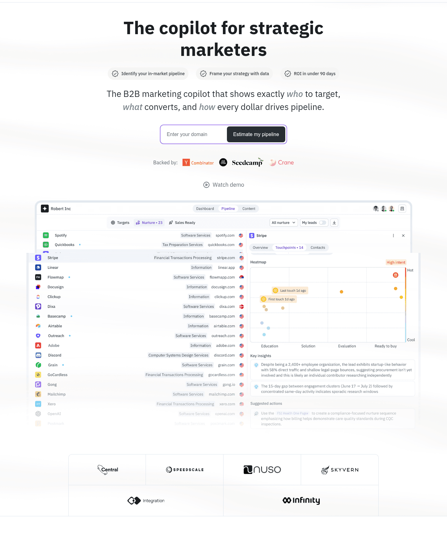
The primary CTA “Estimate my pipeline” sits above the fold, with a secondary “Watch demo” link.
The nav includes “Pricing,” “Sign in,” and a repeated “Start today” button to drive immediate action.
The “Backed by:” row shows Y Combinator, Cocoa, Seedcamp, and Crane logos as investor credibility.
A customer quote section ends with “Read full story” and names “Matt McGillicuddy, Marketing Director” plus Infinity logo.
Section we love
·Hero
1Inline domain capture (Enter your domain plus Estimate my pipeline) turns the hero CTA into a personalized, low-friction first step
2Names the audience and category outright (The B2B marketing copilot for strategic marketers) so the right visitor self-identifies fast
3Double social proof above the fold with investor logos (Y Combinator, Seedcamp) and a customer logo row (Nuso, Skyvern)
4Large real dashboard screenshot shows the actual pipeline and account scoring UI prospects will work in
06
Synapsa, An AI sales agent that proves its own pipeline.
5 years CRO + SEO at Qonto (2021–2025). After advising 15+ SaaS on their websites (Payfit, Pigment…), the same patterns kept breaking, so I decided to build the source of truth on what works on the web: the intelligence layer every tool, builder, and team uses to ship sites that perform.
“Synapsa embeds real product metrics directly into the navigation, showing 2,420 conversations and 1,762 leads in a dashboard screenshot before visitors even reach the hero. The navbar scored 100 with a top-scoring rating, with AI-prefixed feature items and a Compare tab that addresses competitive evaluation head-on.”
What makes this page stand out
The "AI Sales Agent" category is simple and immediately understood: this isn't a copilot or assistant, it's an autonomous agent that handles outreach end-to-end
Differentiation against traditional SDR tools is clear: while competitors help humans sell faster, Synapsa replaces the manual outreach workflow entirely with AI-driven execution
The value proposition for lean sales teams (startups, SMBs) is compelling: enterprise-grade outbound capability without hiring a team of SDRs
Personalization at scale — the core promise — addresses the fundamental tension in outbound sales: you can send volume OR you can personalize, but doing both requires AI
Design patterns we see across high-performing AI pages
Across 224 AI pages reviewed, the pages that convert make one thing clear immediately: what the product does and why you should believe it works.
The strongest patterns pair concrete product outputs with layered trust signals (compliance badges, quantified outcomes, and interactive demos), so visitors can verify the AI promise without taking it on faith. Use website section examples to compare how these building blocks show up across page types.
1Three persona cards (Payers, Providers, PBMs) each labeled with who it serves so every buyer self-selects fast
2Outcome visuals show real claim results like Verified payment $847.32 and Underpayment detected -$397, not abstract claims
3Benefit-led lines (Stop overpaying claims, Get paid what your contract guarantees) put the payoff before the feature
4Subhead maps the pain (spreadsheet reconciliation and payment disputes) straight to the verification fix
5Learn more links under each card route curious buyers to deeper persona pages without leaving the flow
Reviewed design-pattern pick from Benchify’s features section.
What I love about this section
Three persona cards (Payers, Providers, PBMs) each labeled with who it serves so every buyer self-selects fast
Outcome visuals show real claim results like Verified payment $847.32 and Underpayment detected -$397, not abstract claims
Benefit-led lines (Stop overpaying claims, Get paid what your contract guarantees) put the payoff before the feature
Subhead maps the pain (spreadsheet reconciliation and payment disputes) straight to the verification fix
Overlooked sections that quietly build trust on AI pages
In this set, Hero sections tend to outperform at 61.5 while Trust is the most fragile at 37.8. This suggests many AI pages invest in hero messaging but leave gaps in the sections that help buyers evaluate, compare, and feel safe.
The biggest misses appear where the page should address accuracy, data privacy, and competitive differentiation in plain language. When those sections are thin, the hero carries all the trust burden and skeptical buyers drop off before reaching the proof they need.
1Four numbered steps (record with one button, select your style, transcribe and summarize, edit then share and export) cover the full flow
2The headline (take notes in seconds) plus record with one button stress how effortless and fast it is
3An animated recorder mockup with a live timer previews the actual capture experience
4Step 3 names a concrete outcome (transcribe and summarize with 99 percent accuracy)
5A prominent Try TalkNotes free for 7 days CTA sits directly under the steps
6The final step previews the payoff (edit, share and export your notes easily)
Reviewed overlooked-section pick from Talknotes’s how it works section.
What I love about this section
Four numbered steps (record with one button, select your style, transcribe and summarize, edit then share and export) cover the full flow
The headline (take notes in seconds) plus record with one button stress how effortless and fast it is
An animated recorder mockup with a live timer previews the actual capture experience
Step 3 names a concrete outcome (transcribe and summarize with 99 percent accuracy)
Use the examples above as prompts for what to add, not just what to redesign.
Checklist: a practical audit for AI website design
If you are iterating on an AI homepage, this checklist helps you spot missing sections and messaging gaps quickly, especially around Hero, Cta, and Value Proposition.
Run it on your current page, then decide what to rewrite, what to reorder, and what proof to add before you touch visual polish. For a faster baseline, you can also try our landing page analyzer.
Built from 513 sections across 95 AI homepages in this benchmark. Each check below is a move the highest-scoring pages share, each paired with a real example from the benchmark.
Hero
Can a skeptical buyer tell what you do in five seconds?
The real product shows above the fold.
Example: Scout opens on a real lead table with contacts at Microsoft, Salesforce, and Stripe instead of a hero graphic.
Proof is visible before the first scroll.
Example: Talknotes stacks Product of the Day, a ten-thousand-user count, and media logos in the first screen.
The hero promises a concrete outcome.
Example: Synthesia leads with "save up to 90% of time and cost" rather than a vague AI claim.
Trust
Does the page earn belief before it asks for the click?
A quantified result anchors the trust section.
Example: Altura anchors on four outcome numbers, including a 50 percent win-rate lift and 95 percent time saved.
Recognizable customer logos carry authority.
Example: Tractian pairs named manufacturers like Kraft Heinz and Bosch with their own measured results.
Value proposition
Is the value concrete, or just adjectives?
The page runs more than one distinct value proposition.
Example: TaxGPT splits its promise into three color-coded flag cards for errors, savings, and resolved items.
Benefits are specific.
Example: SlimAI names three distinct pillars, "Root Image Catalog," "Root Library Catalog," and "Root Patches," each with its own icon and use case.
The outcome is quantified with a number.
Example: DataFlint names six supported platforms, AWS EMR, Databricks, Dataproc, Microsoft Fabric, Kubernetes, and On-Premises, each as a branded icon card.
Features
Do features connect to outcomes the buyer cares about?
Feature copy leads with the outcome.
Example: Databox MCP heads each block with an outcome, like "your AI data analyst on demand," before the mechanism.
Each feature maps a real pain to a measurable result.
Example: TaxGPT leads with "TaxGPT remembers, so you don't have to," tying manual context-gathering to research that auto-incorporates full client history.
Call to action
Does the next click feel safe to a cautious buyer?
One primary action dominates, with action-led copy.
Example: Submagic leads with "Get Started Now" and keeps a lighter "Try for free" link as the only second path.
A single focus keeps the block from competing with itself.
Example: Benchify lets one green "Schedule a Demo" button lead, with "Email Us" as a quiet secondary option.
Reassuring microcopy sits next to the button.
Example: Talknotes bakes the free-trial promise into the button itself with "Try TalkNotes free for 7 days," so the click feels low-stakes.
The trust gap most AI pages leave open is security and compliance.
AI buyers worry about where their data goes, yet only 24% of the AI trust sections in this benchmark surface a security or compliance signal. The pages that do make enterprise eligibility obvious. Theneo places four certification badges, SOC 2 Type II, ISO 27001, ISO 9001, and GDPR, in the section header so a cautious buyer clears the eligibility question without asking. Pages that hide compliance behind a sales call leave that reassurance on the table.
Interactive quiz
What would your AI homepage score?
Question 1 of 5
0%
Can a visitor see what your AI product actually does within 5 seconds?
A live demo, product screenshot, or real output beats "powered by advanced AI."
Reviewed by
Gabriel Amzallag , Founder, Web Anatomy
5 years CRO + SEO at Qonto (2021–2025). After advising 15+ SaaS on their websites (Payfit, Pigment…), the same patterns kept breaking, so I decided to build the source of truth on what works on the web: the intelligence layer every tool, builder, and team uses to ship sites that perform.
Quick answers based on our AI website benchmark dataset.
What are the best AI websites?
[01]
The strongest performers in this September 2026 benchmark are Synapsa, HeadshotPro, Tractian, Herdify, Talknotes, and Altura. Across 224 AI homepages scored against 60+ criteria, these pages convert by showing real product output: dashboard metrics, before-and-after contrasts, or live demos. They don't ask visitors to trust an abstract model claim.
What makes AI websites harder to convert than generic SaaS pages?
[02]
AI products feel abstract and buyers arrive worried about accuracy and hype. Across 224 homepages reviewed, the pages that convert make the output concrete in the first viewport: Synapsa embeds 2,420 conversations and 1,762 leads directly in the nav dropdown, Talknotes stacks Product of the Day, 10,000+ users, and media logos next to an interactive mic demo, and Altura anchors trust with a 50% higher win rate and 16 hours saved per week.
What is the biggest design mistake on AI homepages?
[03]
Leading with technology claims like "powered by GPT-4" or "advanced neural networks" instead of showing the actual output. The average page in this September 2026 benchmark scored 50.5. Top performers replace model language with visible proof: HeadshotPro contrasts three simple steps against eight tedious traditional ones, Herdify translates an abstract analytics concept into a four-step zigzag with GDPR addressed upfront, and Tractian pairs real worker photos with Vibration Analysis and AI Failure Detection specifics.
What sections should an AI homepage include?
[04]
A hero with a visible product demo or real output, an early trust layer with compliance badges, customer counts, or accuracy guarantees, a how-it-works or workflow section, use cases segmented by role or industry, and a low-friction CTA like a free trial or interactive demo. Talknotes stacks triple social proof plus a live mic demo; Tractian routes industrial buyers through department tabs and role cards. Across 224 homepages, pages that stack these blocks convert most.
How many AI website examples do I need to review before redesigning?
[05]
Three to five is enough if you pick by AI use case and compare section by section. Only 1% of pages in this benchmark score in the top tier, so the gap lives in a few blocks. Study Synapsa for embedded product metrics, HeadshotPro for before-and-after framing, Tractian for multi-persona routing, Herdify for making abstract analytics tangible, and Altura for quantified client outcomes in testimonials.
Where can I find great inspiration for my AI website?
[06]
Study pages section by section instead of saving full-page screenshots. Browse best landing page examples for the full gallery, then drill into hero section examples, trust section examples, and our AI-specific patterns on this page to see how Synapsa, HeadshotPro, and Tractian differ at each stage of the funnel.
How do I audit my AI homepage?
[07]
Use a structured rubric that checks clarity, trust, and friction instead of relying on subjective feedback. Run your page through the landing page audit for a section-by-section score against the same 60+ criteria used in this benchmark.