Pricing pages with one plan (21)
The 21 pricing pages here that offer exactly one plan, so the visitor decides yes or no rather than which.
Key takeaways
- Skip the comparison table and the billing toggle, since there's only one plan.
- Show testimonials and ratings, because there's no second plan to compare with.
- Show the price, since it's the only one on the page.
Showing 1–21 of 21 pricing pages
What these pages do differently
With one plan there's nothing to compare, so these pages give the visitor other reasons to decide.
Leave out comparison tools
10% of one-plan pages carry a comparison table, and 10% a billing toggle. Those tools help people tell plans apart, and a page with one plan doesn't need them.
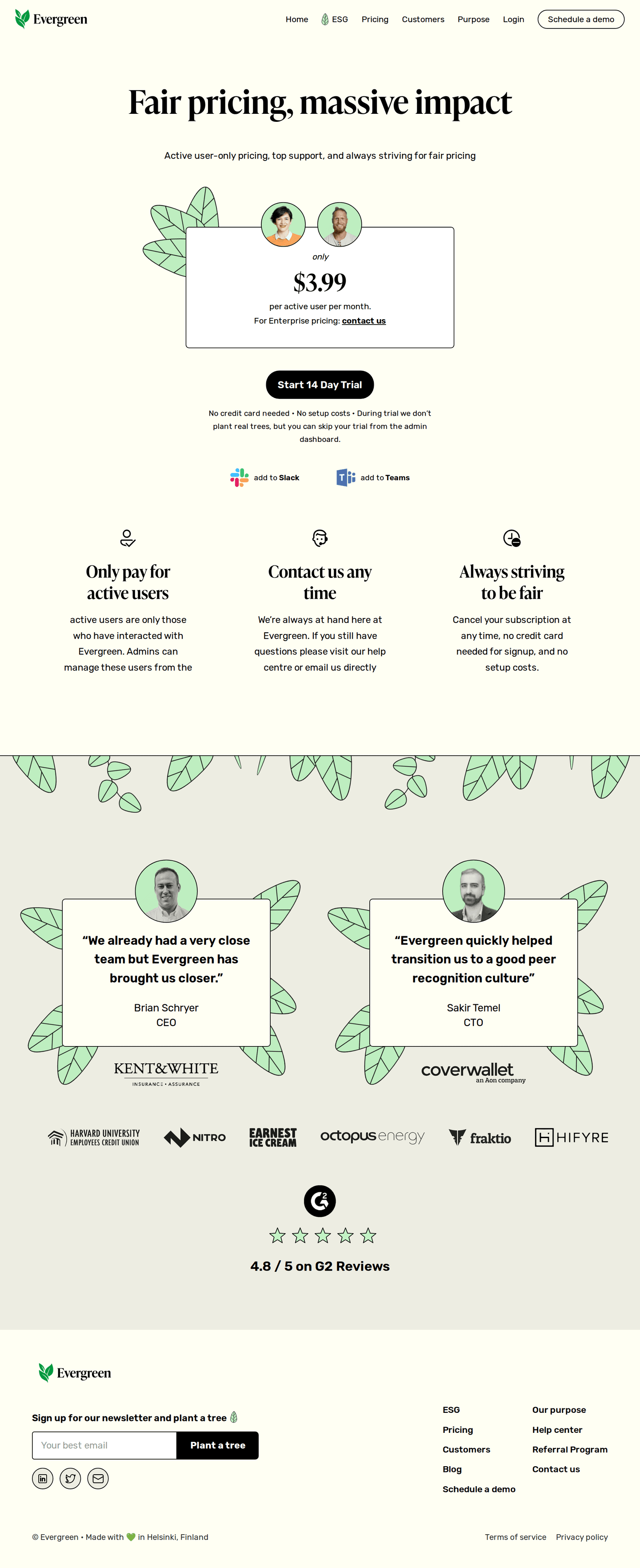
Show testimonials and ratings
47% of the best pricing pages show testimonials, and 30% show review-site ratings. With no plans to choose between, the visitor is mostly deciding whether to trust the product, and reviews from other customers help with that.
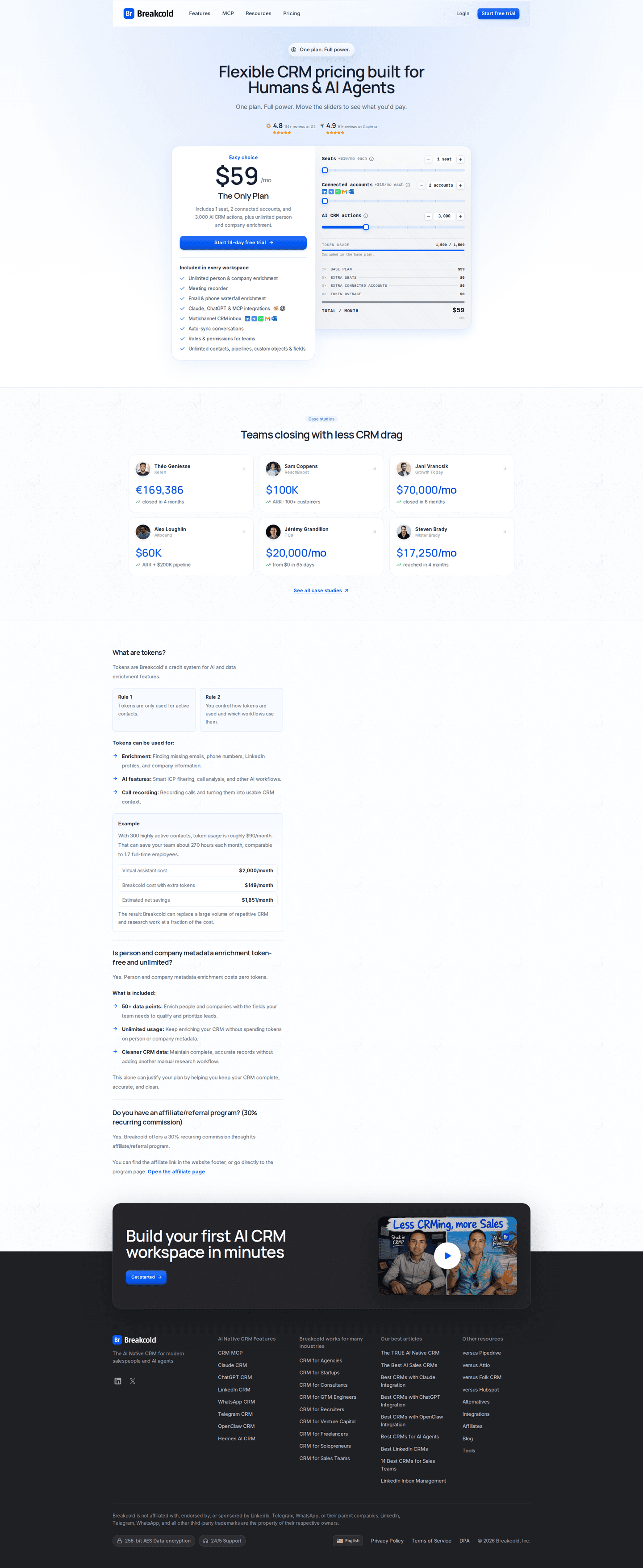
Show the price
1% of the best pricing pages hide a price. On a one-plan page it's the only price there is, so hiding it means the visitor sees no price at all.
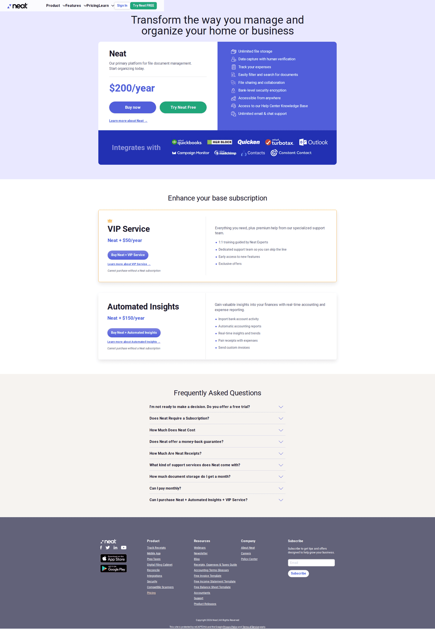

Curated by
Gabriel Amzallag , Founder, Web Anatomy
5 years CRO + SEO at Qonto (2021–2025). After advising 15+ SaaS on their websites (Payfit, Pigment…), the same patterns kept breaking, so I decided to build the source of truth on what works on the web: the intelligence layer every tool, builder, and team uses to ship sites that perform.
Go further than pricing pages
MCP
Section ideas, from inside your editor
Ask your coding agent for the strongest sections of a pricing page in your industry. It answers from this benchmark, section by section.
Library
The analysis behind every page here
Each pricing page on this page, section by section, with what works and what does not. Free account.
Browse more pricing pages
Pick another group below, see every pricing page, or browse the sections these pages are built from.
One plan, and one chance to make the case?
Paste your pricing page. Get a scored breakdown against the same best practices these pages were measured on, with the fixes ranked by impact. Free, no signup.
One-plan pricing pages, answered
What replaces the comparison when there is only one plan, from the 21 here.
Who sells on a single plan?
01Very few pricing pages here do, and it's the rarest shape in the benchmark. It suits products that do one clear job and treat small and large customers the same way. Companies that sell this way chose it on purpose, and the page isn't half-built.
What disappears from a one-plan page?
02The comparison tools. These pages rarely carry a comparison table, a billing toggle or tooltips, while many pricing pages with more plans carry all three. With only one plan on the page, there's nothing for them to compare.
What replaces the comparison?
03Testimonials and ratings. These pages show testimonials and review ratings more often than the rest. The visitor has no plans to choose between, so they're deciding whether to trust the product, and the page has to help with that.
Should a one-plan page hide its price?
04It's the worst page type to hide a price on, and these do it the most, far more often than pricing pages with more plans. A four-column grid with one missing price still shows three others, but a single plan with no price leaves the visitor with no price at all.
Does a single plan need a free tier?
05Most of them skip it, while nearly half of the rest offer one. A free plan next to a single paid plan would make it a two-plan page, so these companies usually offer a trial, which lets people try the product and keeps the page to one plan.