Skip to content

Best CRM Website Examples (And Why They Convert)

We scored 25 CRM homepages on 60+ conversion criteria. See which sections separate the top performers, and what your page is probably missing.

Updated April 202625 pages analyzed
#CompanyScore

Scored by AI across 60+ conversion criteria

Freckle landing page
#1
78/100
Scroll to explore
Analyze your CRM pageFree. Takes 2 minutes.

What the best CRM websites get right

CRM buyers arrive comparison-ready, demo-fatigued, and skeptical of feature claims they have heard before. The strongest CRM website design patterns in this benchmark do four things consistently:

55.7/100

Avg. page score

  • Show the product, not a promise. The strongest pages display real UI, deal pipelines, analytics dashboards, and enrichment flows so buyers can picture the tool in their workflow before signing up.
  • Stack risk reducers early. Free trials, no credit card, money-back guarantees, and customer counts appear above the fold on the strongest CRM pages, removing objections before the ask.
  • Lead with the buyer's problem, not the feature list. Benefit-first headlines like "easy and effective CRM for closing deals" outperform generic taglines because they name the outcome the visitor already wants.
  • Segment by persona. CRM tools serve sales, marketing, and support teams with different priorities. The strongest navigation and hero patterns let each audience self-select instead of forcing a one-size-fits-all pitch.

25 best CRM websites analyzed in detail

Each company below is paired with its strongest section and scored across 60+ conversion criteria. See what they get right, and what you can borrow for your own CRM homepage design.

01

Freckle, Data enrichment that turns raw sign-ups into scored, enriched profiles in three steps.

Editor's pick78/100
Gabriel AmzallagGabriel AmzallagFounder, Web Anatomy

Freckle's homepage turns data enrichment into a tangible three-step process. The how_it_works section (scored 100) maps the journey from raw sign-up to enriched profile using bold action verbs, Import, Clean and enrich, Sync, alongside a data flow diagram showing email-to-enriched-profile transformation. Multiple import options (CRM, webhooks, CSV) make integration feel frictionless.

What makes this page stand out

  • The clear product explanation — sits on top of your CRM, auto-enriches every record from any source — makes the integration model instantly understandable for RevOps buyers
  • "Ask for any attribute you can imagine" positions the AI enrichment as limitless and flexible, differentiating from rigid enrichment tools that only provide pre-defined data fields
  • 50+ data providers aggregated into a single enrichment layer creates a genuine data breadth advantage over tools that rely on a single proprietary database
  • Product screenshot showing real HubSpot integration with enrichment in action makes the value tangible — buyers can immediately see how Freckle fits into their existing workflow

Section we love

·How It Works
Freckle How It Works section
  1. 1The header promises enriching and scoring sign-ups in 3 simple steps, anchoring the whole flow
  2. 2Numbered cards 01 02 03 walk through import, clean and enrich, then sync back to your stack
  3. 3The header line sets a low-effort expectation while each step names the exact integrations (CRM, webhooks, CSV)
  4. 4The diagram visualizes raw inputs flowing into one enriched record then fanning out to Slack, CRM, Data Warehouse and more
  5. 5The sample record (LinkedIn, name, role, ICP and Buyer Persona fit scoring) previews exactly what you get back
02

ZoomInfo, Sales intelligence that pairs massive third-party proof with a clear revenue promise.

74/100
Gabriel AmzallagGabriel AmzallagFounder, Web Anatomy

ZoomInfo's hero section (scored 56) anchors credibility with a G2 badge citing 8,000+ reviews and 5 stars, then drives action with a red Free Trial button against a dark background for maximum contrast. The positioning ("B2B data and software"), is direct, and the revenue promise "connect and close your most valuable buyers" ties the product to a specific outcome.

What makes this page stand out

  • The "#1 GTM Platform" claim in the page title is bold category ownership — supported by G2 Grid leadership and Forrester Wave recognition
  • Social proof is exceptionally well-quantified: 35,000+ customers, 54% increase in customer engagement (Seismic), 43% more likely qualified pipeline, 4x pipeline growth, 40% increase in closed-won deals
  • The role-based solution navigation (Sales Development, Account Executive, Account Management, RevOps, Demand Generation) shows deep ICP understanding and personalized messaging paths
  • Named customer testimonials with specific titles and companies (Seismic CBO, Spekit RevOps Manager) add credibility through executive-level social proof

Section we love

·Hero
ZoomInfo Hero section
  1. 1G2 badge with 8,000+ reviews and 5 stars provides massive third-party validation
  2. 2Red Free Trial button on dark background creates the highest possible contrast for the CTA
  3. 3B2B data and software subtext clearly positions ZoomInfo as a sales intelligence platform
  4. 4Grow Yours headline combined with connect and close your most valuable buyers promises revenue outcomes
03

Hiver, Email-native help desk that turns an inbox teams already use into a shared support hub.

73/100
Gabriel AmzallagGabriel AmzallagFounder, Web Anatomy

Hiver's hero section (scored 67) repositions the inbox as a full help desk with dual CTAs (Start Free Trial + Get Demo) and a risk reducer. A real Analytics UI showing 104 new chats and Workload metrics proves the product works at scale, while the headline "Now your inbox is your help desk" reframes a familiar tool instead of introducing an unfamiliar one.

What makes this page stand out

  • "Legacy helpdesks slow you down" sub-copy creates a direct competitive wedge against Zendesk and Freshdesk, framing incumbents as outdated without naming them — smart antagonist positioning.
  • Dual CTAs ("Get a Demo" + "Start Free Trial") cater to different buyer readiness levels, lowering friction for self-serve while capturing enterprise leads.
  • "Unlimited users on Free plan" is a powerful differentiator that removes a key objection for growing teams, directly countering per-seat pricing models common in the helpdesk space.
  • The dark, modern design aesthetic with gradient accents signals a premium, tech-forward brand identity that aligns with the "modern" positioning claim.

Section we love

·Hero
Hiver Hero section
  1. 1Dual CTAs (Start Free Trial and Get a Demo) with risk reducer (free trial) cover both conversion paths
  2. 2Real Analytics UI showing Conversations dashboard with 104 new chats and Workload metrics proves the product
  3. 3Headline (Now your inbox is your help desk) repositions email as a support tool with clear differentiation
  4. 4Subtext (You dont need a conventional help desk anymore) directly challenges competitors in the category
04

Sierra Interactive, Real estate CRM whose navigation alone segments, educates, and qualifies visitors before they scroll.

68/100
Gabriel AmzallagGabriel AmzallagFounder, Web Anatomy

Sierra Interactive's navbar (scored 100) is a conversion asset in itself. A Who We Help persona tab segments buyers by role, while an Insights mega menu with five content columns (Resource Center, Case Studies, Blog, On Demand) and a Featured Insights card with visual keep visitors engaged. The Resource Center offers vertical hubs for Lead Management, Lead Generation, and NAR Settlement.

What makes this page stand out

  • Clear audience definition: broker-owners and team leaders who need a platform that generates, nurtures, and converts leads into transactions — the full real estate sales funnel
  • The website + CRM + IDX integration creates a unified lead generation ecosystem specifically for real estate — where property search (IDX) drives lead capture that flows directly into CRM workflows
  • Lead nurturing automation (drip campaigns, behavioral triggers, AI-powered follow-up) addresses the reality that real estate leads have long conversion cycles and require persistent, personalized touchpoints
  • The competitive positioning against legacy platforms (BoomTown, CINC, Real Geeks) targets agents frustrated with outdated UX, limited customization, and inflexible pricing models

Section we love

·Navbar
Sierra Interactive Navbar section
  1. 1A bold orange Schedule a Demo button anchors the right side of the nav as the single primary action
  2. 2The open Insights mega menu splits into Resource Center, Case Studies, Sierra Blog and On Demand columns
  3. 3A featured Insights panel with an Explore Insights arrow link headlines the dropdown
  4. 4Hub links (Lead Management, Lead Generation, NAR Settlement Resources) guide visitors to deep content
  5. 5Each column carries a short benefit line (Need more proof, See our customers results) under its title
05

Pipedrive, Sales CRM that shows the pipeline in action and removes every reason not to try it.

66/100
Gabriel AmzallagGabriel AmzallagFounder, Web Anatomy

Pipedrive's hero section (scored 78) shows the product doing the work, a real deal pipeline UI (Qualified, Contact Made, Demo Scheduled) next to a Sales Assistant chat window. A triple risk reducer (Full access, No CC, 100,000+ companies) stacks below dual CTAs, making the trial feel genuinely risk-free. The headline "easy and effective CRM for closing deals" names the exact outcome buyers want.

What makes this page stand out

  • Five checkmark benefits (14-day free trial, 100,000+ businesses, 500+ integrations, integrated AI, GDPR compliance) create a compelling feature stack that addresses key European buyer concerns.
  • The product screenshot showing a Kanban pipeline view with deals and notifications provides immediate visual proof of the CRM workflow.
  • "Essayer gratuitement" (Try for free) prominent CTA with no credit card requirement lowers the barrier for self-serve adoption.
  • "La référence pour plus de 100 000 entreprises" (The reference for more than 100,000 businesses) provides massive social proof that establishes market leadership.

Section we love

·Hero
Pipedrive Hero section
  1. 1Real deal pipeline UI (Qualified, Contact Made, Demo Scheduled) with Sales Assistant chat proves the CRM experience
  2. 2Triple risk reducer (Full access, No credit card required, Used by over 100000 companies) eliminates signup friction
  3. 3Headline (The easy and effective CRM for closing deals) combines product category with a clear outcome promise
  4. 4Dual CTAs (Try it free and Contact sales) cover both self-serve and enterprise sales paths
06

UserGems, Signal-based selling platform that leads with buyer outcomes and backs every claim with real product UI.

64/100
Gabriel AmzallagGabriel AmzallagFounder, Web Anatomy

UserGems' features section (scored 83) leads with benefit-first headlines like "One place for all your signals" and pain-to-outcome copy ("No more siloed tools"). Each CTA links to a dedicated feature page, and dashboard visuals display real data fields so the product feels tangible, not theoretical.

What makes this page stand out

  • The money-back pipeline guarantee ($100K spend = $100K revenue guaranteed) is an extraordinary risk-reversal move that instantly eliminates the biggest buyer objection: "will this actually generate pipeline?"
  • Direct competitive positioning against 6sense with a dedicated switching guide shows confidence and captures buyers actively evaluating the category leader
  • "Better data than anyone else — we'll prove it" with a free data test offer transforms a bold claim into a verifiable, no-risk proposition that sales teams can greenlight without committee approval
  • The AI agent "Gem-E" is clearly explained with specific reply rate metrics (6-20%), making the automation tangible rather than abstract — buyers can model the ROI immediately

Section we love

·Features
UserGems Features section
  1. 1Benefit-led headlines (One place for all your signals) frame the outcome before the feature mechanics
  2. 2Pain-to-outcome mapping (No more siloed tools or scattered data, scoring that is not a black box) names the frustration then resolves it
  3. 3Product UI shows real scored accounts (a 91 fit score) and signal grids so the result is concrete, not abstract
  4. 4Humans-in-the-loop copy preempts the AI trust objection by letting admins adjust weights and preview before saving

See how your page compares to the 55.7 CRM average

Run a section-by-section diagnostic on your CRM page and get prioritized fixes, then see how you stack up against these CRM website examples.

Design patterns across these CRM pages

Across 25 CRM homepage examples, the strongest CRM website design removes comparison fatigue fast: what the tool does, how it looks in action, and why trying it is risk-free.

The clearest CRM website examples treat product visibility as the primary trust signal, showing real pipelines, dashboards, and enrichment flows so visitors don't have to imagine value from a tagline alone. Explore our best landing page examples to compare how other industries resolve similar trust friction.

Trust Attio

80/100

How Attio builds credibility early

Attio trust section
  1. 1The stat grid leads with hard scale numbers: 200,000,000 customer records and 2,000+ customers
  2. 2Reliability and reach are quantified (99.9% uptime, 132+ countries)
  3. 3A sub-50ms latency claim backs the built for scale message with a concrete figure
  4. 4The Scale with security row shows named badges: GDPR, CCPA, and ISO 27001
  5. 5Combining scale stats with compliance badges delivers two distinct proof types

Reviewed design-pattern pick from Attio’s trust section.

What I love about this section

  • The stat grid leads with hard scale numbers: 200,000,000 customer records and 2,000+ customers
  • Reliability and reach are quantified (99.9% uptime, 132+ countries)
  • A sub-50ms latency claim backs the built for scale message with a concrete figure
  • The Scale with security row shows named badges: GDPR, CCPA, and ISO 27001

Cta ActiveCampaign

80/100

How ActiveCampaign drives action without pressure

ActiveCampaign cta section
  1. 1Risk-reversal headline (See results in 30 days or get your money back) removes the fear of wasting money
  2. 2Primary button (Start your free trial) stays dominant with See details as a low-key text link
  3. 3Refund guarantee microcopy (full refund if you are not satisfied after 30 days) kills last-minute hesitation
  4. 4See details link gives unsure visitors a path to learn more without leaving the trial offer

Reviewed design-pattern pick from ActiveCampaign’s cta section.

What I love about this section

  • Risk-reversal headline (See results in 30 days or get your money back) removes the fear of wasting money
  • Primary button (Start your free trial) stays dominant with See details as a low-key text link
  • Refund guarantee microcopy (full refund if you are not satisfied after 30 days) kills last-minute hesitation
  • See details link gives unsure visitors a path to learn more without leaving the trial offer

Features Surfe

50/100

How Surfe showcases their product

Surfe features section
  1. 1Benefit-led headlines (One click Done, Ice-breakers that Convert) put the outcome before the feature name
  2. 2Each feature pairs with a real product screenshot showing the actual LinkedIn-to-CRM result in action
  3. 3How it works links beside every feature let prospects dig into deeper pages without leaving the flow
  4. 4Numbered Step 1 to 3 framing turns the feature list into a guided workflow that is easy to scan

Reviewed design-pattern pick from Surfe’s features section.

What I love about this section

  • Benefit-led headlines (One click Done, Ice-breakers that Convert) put the outcome before the feature name
  • Each feature pairs with a real product screenshot showing the actual LinkedIn-to-CRM result in action
  • How it works links beside every feature let prospects dig into deeper pages without leaving the flow
  • Numbered Step 1 to 3 framing turns the feature list into a guided workflow that is easy to scan

Sections CRM teams underuse (but visitors still look for)

Even with a strong hero, secondary sections often decide whether someone keeps reading, especially in a crowded category where every CRM claims to be easy and all-in-one.

In this dataset, How It Works tends to outperform at 100 while Faq is the most fragile at 31.3, suggesting many CRM pages invest in messaging but leave gaps in wayfinding and education that slow decisions. See how best fintech websites handle similar trust gaps in adjacent software categories.

Navbar Folk

86/100

Why this navbar works

Folk navbar section
  1. 1A Pricing tab sits in the top nav next to Products, Solutions and Resources
  2. 2The open Products menu splits into Features and Platforms column headers
  3. 3Platforms frames clear use cases (CRM for LinkedIn, Gmail, Outlook, WhatsApp)
  4. 4A Watch product demo video thumbnail anchors the right side of the menu
  5. 5Get a demo and Login sit top-right, giving both a conversion path and a returning-user entry

Reviewed overlooked-section pick from Folk’s navbar section.

What I love about this section

  • A Pricing tab sits in the top nav next to Products, Solutions and Resources
  • The open Products menu splits into Features and Platforms column headers
  • Platforms frames clear use cases (CRM for LinkedIn, Gmail, Outlook, WhatsApp)
  • A Watch product demo video thumbnail anchors the right side of the menu

How It Works Freckle

67/100

How Freckle simplifies the process

Freckle how it works section
  1. 1Three numbered steps (01 Connect, 02 Clean and enrich, 03 Sync) frame the whole data flow
  2. 2A central flow diagram visualizes sources (CRM, webhooks, CSV) routing through Freckle out to tools
  3. 3The output side previews the payoff: enriched data synced into HubSpot, Slack, Zapier and the CRM
  4. 4Low-effort framing (we meet your data where it lives) with multiple connect options reduces setup worry
  5. 5The Freckle hub card lists concrete capabilities (40+ enrichment tools, clean and format, lookup records)

Reviewed overlooked-section pick from Freckle’s how it works section.

What I love about this section

  • Three numbered steps (01 Connect, 02 Clean and enrich, 03 Sync) frame the whole data flow
  • A central flow diagram visualizes sources (CRM, webhooks, CSV) routing through Freckle out to tools
  • The output side previews the payoff: enriched data synced into HubSpot, Slack, Zapier and the CRM
  • Low-effort framing (we meet your data where it lives) with multiple connect options reduces setup worry

Use Cases Aircall

25/100

How Aircall makes the product feel relevant

Aircall use cases section
  1. 1The menu segments solutions three ways (By Team, By Business Size, By Industry) for fast self-identification
  2. 2By Team lists named roles (Sales, IT and Operations, Customer Service and Support)
  3. 3By Industry routes verticals directly (Education and E-learning, Financial Services, Healthcare, Marketing and Advertising)
  4. 4A Top Uses column surfaces concrete jobs (Call Center, Phone System, AI Voice Agent, AI Assist)
  5. 5Clear column headers plus a (Discover more industries) link make navigating to the right use case effortless

Reviewed overlooked-section pick from Aircall’s use cases section.

What I love about this section

  • The menu segments solutions three ways (By Team, By Business Size, By Industry) for fast self-identification
  • By Team lists named roles (Sales, IT and Operations, Customer Service and Support)
  • By Industry routes verticals directly (Education and E-learning, Financial Services, Healthcare, Marketing and Advertising)
  • A Top Uses column surfaces concrete jobs (Call Center, Phone System, AI Voice Agent, AI Assist)

If you're refreshing a CRM landing page design, treat these "unsexy" blocks as conversion infrastructure, not filler.

How does your CRM homepage compare?

Five quick questions to see where your page stands against this CRM benchmark. For a full section-by-section audit, try our landing page audit.

Interactive quiz

What would your CRM homepage score?

Question 1 of 5
0%

Does your CRM homepage show real product UI above the fold?

Deal pipeline, analytics dashboard, contact cards, or enrichment flow.

Gabriel Amzallag

Reviewed by

Gabriel Amzallag , Founder, Web Anatomy

5 years CRO + SEO at Qonto (2021–2025). After advising 15+ SaaS on their websites (Payfit, Pigment…), the same patterns kept breaking, so I decided to build the source of truth on what works on the web: the intelligence layer every tool, builder, and team uses to ship sites that perform.

See how your page compares to the 55.7 CRM average

Run a section-by-section diagnostic on your CRM page and get prioritized fixes, then see how you stack up against these CRM website examples.

Analyze your CRM pageFree. Takes 2 minutes.

Explore other industries

See how conversion patterns differ across verticals. Each page scores real homepages on the same framework.

See all industries
Benchmark-backed answers for CRM website design

FAQ: Best CRM Websites (CRM Benchmarks)

Quick answers to common questions about what makes the best CRM websites convert, based on section-level benchmark data from this CRM review.

What are CRM websites?
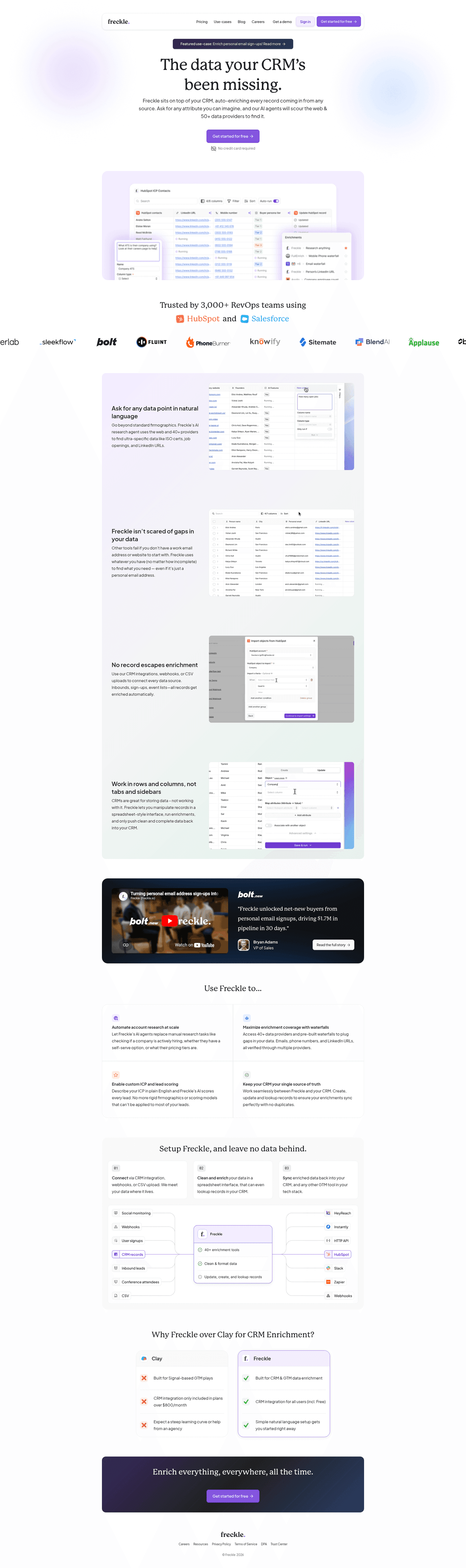
[01]

CRM websites are the marketing homepages of customer relationship management platforms. These tools help teams manage contacts, deals, and communication in one place. The strongest performers in this April 2026 benchmark are Freckle, ZoomInfo, Hiver, Sierra Interactive, Pipedrive, and UserGems. Across 25 CRM pages scored on 60+ criteria, these sites make the product tangible fast by showing real UI, stacking risk reducers, and leading with outcomes instead of feature lists.

What are the top 10 CRMs?

[02]

The top CRMs depend on your use case, but this benchmark scores homepages on conversion design, not market share. Across 25 CRM websites reviewed, the highest-scoring pages come from teams like Freckle (three-step enrichment story), Pipedrive (real deal pipeline UI with triple risk reducers), ZoomInfo (G2 badge citing 8,000+ reviews), and Sierra Interactive (persona-routing navbar). Browse the full leaderboard above for the complete ranking.

What makes the best CRM websites convert better than average?

[03]

They show the product in action, reduce risk before the ask, and name a specific outcome in the headline. The average page in this benchmark scored 55.7 across 25 pages reviewed. Pipedrive pairs a real pipeline (Qualified, Contact Made, Demo Scheduled) with Full access, No CC, and 100,000+ companies; ZoomInfo anchors trust with 8,000+ G2 reviews; UserGems leads every feature card with a buyer outcome like "One place for all your signals."

How do you find the best CRM websites to review before a redesign?

[04]

Compare multiple real examples side by side and focus on repeatable conversion patterns, not just visual style. This page analyzes 25 CRM homepages and picks winners across hero, navigation, and features. Pipedrive does product-in-hero clarity with a real pipeline UI, Sierra Interactive does persona-routing nav, Hiver does risk-reducing dual CTAs, and Freckle does three-step workflow visuals. Only 12% of pages reach the top tier, so focus study on the sections where that gap lives.

How should a CRM team scope a homepage redesign?

[05]

Start with buyer interviews, not wireframes. Five calls with recent closed-won deals will surface the two or three questions they asked sales that the homepage could have answered. Map those to sections: most CRM buyers want product visuals like Pipedrive's pipeline or Hiver's Analytics UI, a pricing mental model within the first scroll, and at least one integration they care about named in the hero. Only 12% of pages reach the top tier, so scope around those gaps. Design polish belongs in the final sprint.

What are the 4 types of CRM?

[06]

The four types of CRM are operational (automating sales, marketing, and service), analytical (mining customer data for insights), collaborative (sharing data across teams), and strategic (long-term customer-centric planning). This April 2026 benchmark covers pages across all four types. The strongest conversion patterns apply regardless of CRM category: real product UI, stacked risk reducers, and outcome-led headlines. Pipedrive, Freckle, and UserGems each show this in different sub-verticals.

Where can I find great CRM website design inspiration?

[07]

Study CRM website examples section by section instead of saving full-page screenshots. Browse best landing page examples for the full gallery, then drill into hero section examples, trust section examples, to see how Pipedrive, ZoomInfo, and Sierra Interactive differ at each stage of the funnel.