Website design library
The UI/UX library of websites, analyzed for you.
10,000 real website screens from 750+ companies, captured live. Search by what a page contains, like a logo wall, a free trial line or a pricing toggle, and read why each one works.
Free to use. No credit card needed.
Browse website UI design three ways
Start from the block you are designing, the page you are building, or the market you sell in.
By section (19 section types)
Heroes, pricing tables, testimonials, FAQs. One block at a time, cropped from the page it came from.
Browse by section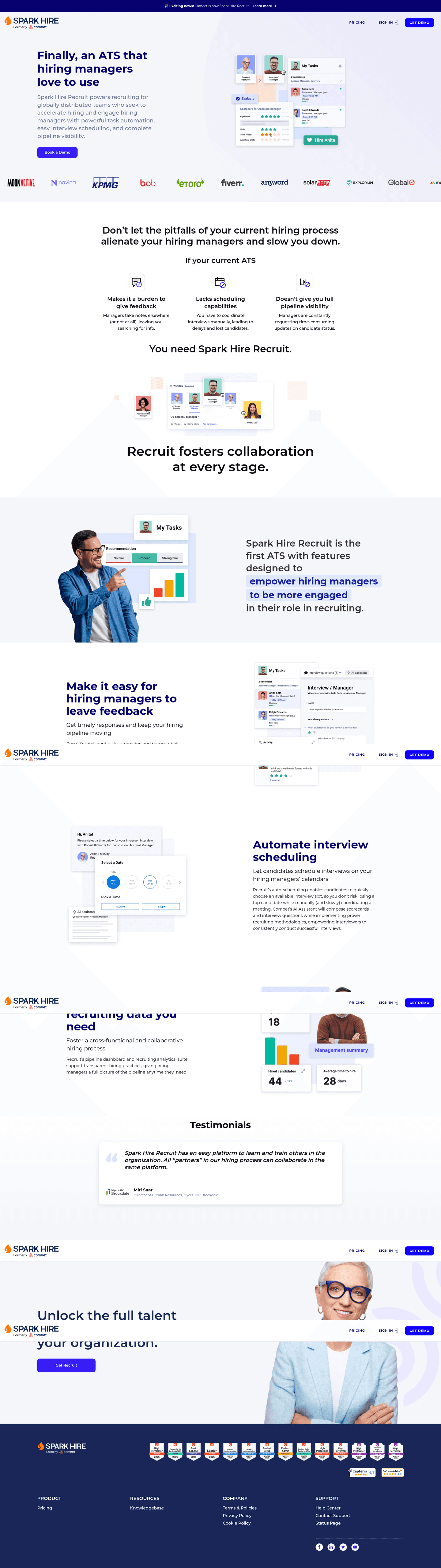
By page type (19 page types)
Homepages, pricing pages, about pages, signup pages. The whole page, top to bottom.
Browse by page type
By industry (41 industries)
Fintech, AI, cybersecurity, CRM. What the sites in one market have in common.
Browse by industry
Popular collections
Search website UX design by what's on the page
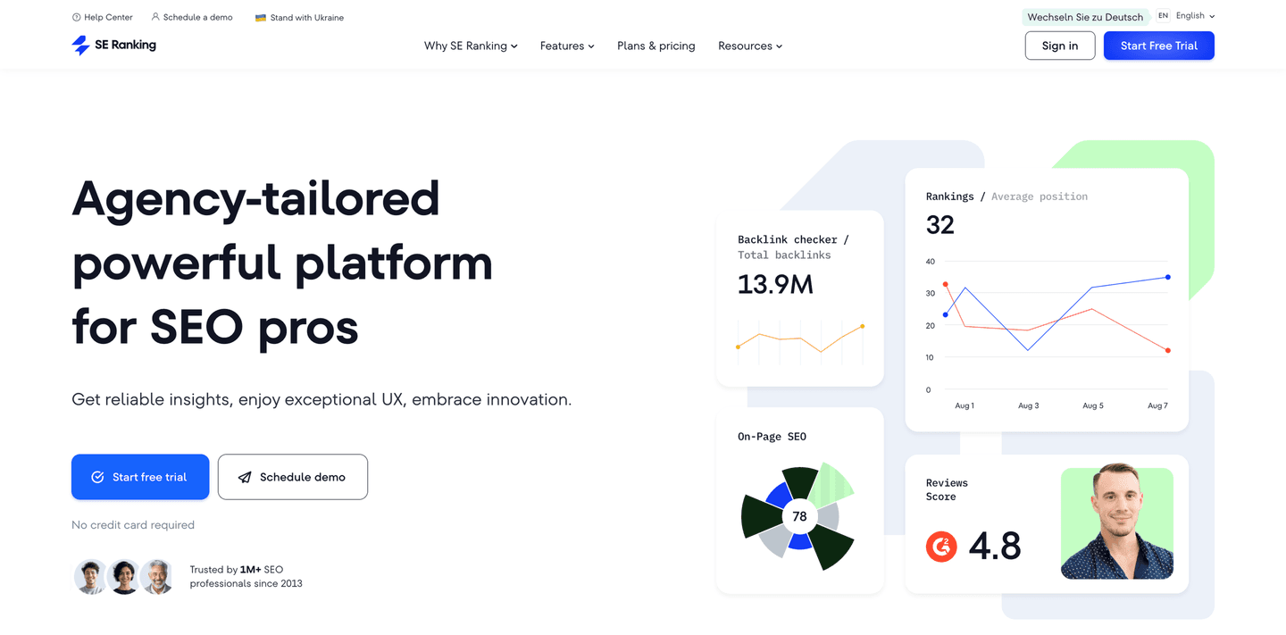
Most galleries sort by colour and style. This library tags what each section contains, so you can pull up every hero with social proof above the fold, or every pricing page with a calculator.
The UX design of every website, analyzed
A screenshot shows what a page looks like. The analysis beside it says what the page does and which UX best practices it meets, so you know what to take from it.

Synthesia
What the section has
- A review badge above the headline: over 2,000 five-star reviews on G2
- A number in the subhead: save up to 90% of time and cost
- A risk reducer under the button: no credit card required
- The real product, with its workflow tabs: Create, Edit, Collaborate, Translate, Publish
- A logo wall with an adoption claim: trusted by over 90% of Fortune 100 companies
UX best practices it meets
What people use it for
Before a redesign
Pull ten real examples of the section you are about to rebuild and see what they share before you open Figma.
Pitching a client
Show a client how companies in their market handle the same page, with screenshots instead of opinions.
Briefing an AI tool
Give Claude, Cursor or Lovable real references instead of a vague prompt, and get a first draft that starts from what works.
How it compares to other UI/UX design websites
Galleries are good at looks. This library is built for the question that comes after: what does the page actually do?
| Capability | Web Anatomy | Most galleries |
|---|---|---|
| Real screenshots of live sites | ||
| Browse by section type | ||
| Browse by industry | ||
| Filter by what a section contains | ||
| A UX analysis of every example | ||
| Available to AI agents |
The library, answered
What it holds, who it is for, and how it differs from other inspiration sites.
What is a website design library?
01A collection of real website screenshots, organised so you can find a reference fast. This one holds 10,000 screens from 750+ companies, sorted by section type, page type and industry.
What are the best UI and UX design websites for inspiration?
02It depends on the job. Awwwards and Godly are good for visual taste, Mobbin and Refero for app screens, Land-book and Lapa Ninja for full landing pages. Web Anatomy is the user experience site for marketing pages, when you want to know what a section contains and why it works, not only how it looks.
How is this different from Mobbin?
03Mobbin is mostly app screens, with marketing sites as a smaller collection. Web Anatomy is only marketing sites: homepages, pricing pages and the sections inside them, each with a UX analysis and filters for what it contains.
Is it free?
04Browsing the public galleries is free, with no account. A free account opens the full library, where you can filter every collection and save examples to boards.
How often is it updated?
05Every week. New companies join in each weekly batch: their pages are captured, cut into sections and analyzed.
Open the full library, free
A free account filters every collection and saves examples to boards.

Curated by
Gabriel Amzallag , Founder, Web Anatomy
5 years CRO + SEO at Qonto (2021–2025). After advising 15+ SaaS on their websites (Payfit, Pigment…), the same patterns kept breaking, so I decided to build the source of truth on what works on the web: the intelligence layer every tool, builder, and team uses to ship sites that perform.