Skip to content

Best Marketing Website Examples (And Why They Convert)

We scored 84 marketing homepages on 60+ conversion criteria. See which sections separate the top performers, and what your page is probably missing.

Updated April 202684 pages analyzed
#CompanyScore

Scored by AI across 60+ conversion criteria

Perspective landing page
#1
75/100
Scroll to explore
Analyze your marketing pageFree. Takes 2 minutes.

What the best marketing websites get right

Marketing buyers arrive already skeptical of marketing. They know the playbook. The strongest marketing website design patterns in this benchmark do four things consistently:

53.6/100

Avg. page score

  • Lead with a specific outcome, not a category label. Pair a concrete benefit with quantified proof so the visitor knows what changes if they sign up.
  • Show the product working, not just described. Pages that include real UI, workflow diagrams, or dashboards outperform those that rely on stock imagery or abstract promises.
  • Use visual hierarchy to move the eye from promise to proof to action without friction. The strongest pages organize information so nothing competes with the primary message.
  • Back claims with third-party proof early. Review badges and external validation establish credibility before the visitor is asked to commit, reducing the "trust tax" marketing tools face in a crowded market.

6 best marketing homepages analyzed in detail

Each company below is paired with its strongest section and scored across 60+ conversion criteria. See what they get right, and what you can borrow.

01

Perspective, Marketing platform with layered educational resources and human proof.

Editor's pick75/100
Gabriel AmzallagGabriel AmzallagFounder, Web Anatomy

Perspective builds trust through resource depth: community access, a crash course, and an academy create three entry points for different buyer readiness levels. A named team member humanizes the brand, and the wider bottom card uses visual weight to steer attention toward the highest-value action. The resources section scored 60, showing that breadth of educational content can differentiate a marketing platform even when the core product is not shown.

What makes this page stand out

  • "Easily create mobile-first, interactive, and personalized lead gen and sales funnels with market-leading conversion rates in just 30 minutes" packs multiple differentiators into one sentence: mobile-first, interactive, personalized, fast time-to-value.
  • "No design or coding skills required" removes the primary adoption barrier for the target audience (SMBs and agencies).
  • "Create free funnel in 30 min" CTA is brilliantly specific — the time commitment sets concrete expectations and makes the action feel achievable.
  • Dual review scores (G2 4.9, OMG 4.8) provide exceptionally high ratings that build immediate trust, complemented by "1k+ growth community" showing ecosystem engagement.

Section we love

·Resources
Perspective Resources section
  1. 1Heading Not sure where to start meets beginner anxiety and routes new users to the right resource
  2. 2All three resources (Community, Funnel Crash Course, Marketing Academy) center on funnel marketing, Perspective's core use case
  3. 3Original formats like a 60-minute live crash course and an Academy led by Head of Content Leni build real authority
  4. 4Each card carries a Learn more CTA that links into the deeper resource
02

Comet Rocks, Conversational marketing with a nav that does the selling.

74/100
Gabriel AmzallagGabriel AmzallagFounder, Web Anatomy

Comet Rocks earns a top-scoring navbar with product feature tabs covering Micro-storefronts, Conversational UI, and Dynamic FAQs. Dual CTAs (Start Free and Book Demo) let visitors self-select by intent, and pricing visibility in the dropdown removes a common friction point. The navigation does the positioning work that most marketing pages leave to the hero alone.

What makes this page stand out

  • "Micro-storefronts" concept creates a new product category — not landing pages, not full stores, but personalized shopping funnels
  • Price anchoring ($49/mo starting) in the hero removes a major objection early and signals accessibility
  • Brand logos (NARS, Supercilium, Qure) provide social proof from recognizable beauty/lifestyle brands
  • "From ad click to checkout" clearly maps the user journey, making the value proposition immediately tangible

Section we love

·Navbar
Comet Rocks Navbar section
  1. 1The nav carries two clear actions, a Start Free link and a white Book a Demo pill
  2. 2The open More dropdown groups secondary pages (Blog, Case Studies, Pricing, Use Cases)
  3. 3Top-level items name the product capabilities directly (Micro-storefronts, Conversational UI, Dynamic FAQs)
  4. 4The dropdown tucks Pricing and Use Cases away to keep the primary bar focused on the demo
  5. 5Compact pill-shaped nav keeps the dark hero uncluttered around the Book a Demo button
03

Rampmetrics, Marketing attribution with cost-objection handling built into the pitch.

74/100
Gabriel AmzallagGabriel AmzallagFounder, Web Anatomy

Rampmetrics scores 67 on its value proposition by drawing a clear line between Consulting and Embedded Services. The copy addresses the cost objection head-on with "without the overhead of an in-house ops team," and accordion UI lets evaluators drill into service details without leaving the page. This is a strong model for marketing agencies and platforms with tiered offerings.

What makes this page stand out

  • The detailed breakdown of homegrown attribution weaknesses (data gaps, cross-channel blind spots, maintenance burden, stale models) validates the buyer's existing frustration with specific evidence
  • Clear differentiation through automated multi-touch attribution eliminates the manual data wrangling that makes homegrown solutions unsustainable as marketing channels multiply
  • The "single source of truth" promise addresses the organizational pain of marketing and sales teams arguing over which channels actually drive revenue
  • Real-time attribution visibility transforms marketing from a monthly reporting exercise into a continuous optimization loop — enabling faster budget reallocation decisions

Section we love

·Value Proposition
Rampmetrics Value Proposition section
  1. 1Two distinct propositions (Consulting and Embedded Services) each in its own card with icon and benefit copy
  2. 2Unique mechanism spelled out: the team embeds directly into your workflow with a dedicated white-glove team
  3. 3Mock UI panels (Strategy Review checklist, Your Dedicated Team roster) make the abstract service tangible
  4. 4Live in 24 hours timeframe sets a concrete delivery expectation instead of a vague fast promise
04

ZoomInfo, B2B data platform with review-count authority in the hero.

74/100
Gabriel AmzallagGabriel AmzallagFounder, Web Anatomy

ZoomInfo leads with a G2 badge citing 8,000+ reviews and a red Free Trial button that creates immediate visual contrast. The "B2B data and software" positioning is blunt and effective: it tells the buyer exactly what category they are in. The hero scored 56, lifted by the combination of social proof density and a single, clear action.

What makes this page stand out

  • The "#1 GTM Platform" claim in the page title is bold category ownership — supported by G2 Grid leadership and Forrester Wave recognition
  • Social proof is exceptionally well-quantified: 35,000+ customers, 54% increase in customer engagement (Seismic), 43% more likely qualified pipeline, 4x pipeline growth, 40% increase in closed-won deals
  • The role-based solution navigation (Sales Development, Account Executive, Account Management, RevOps, Demand Generation) shows deep ICP understanding and personalized messaging paths
  • Named customer testimonials with specific titles and companies (Seismic CBO, Spekit RevOps Manager) add credibility through executive-level social proof

Section we love

·Hero
ZoomInfo Hero section
  1. 1G2 badge with 8,000+ reviews and 5 stars provides massive third-party validation
  2. 2Red Free Trial button on dark background creates the highest possible contrast for the CTA
  3. 3B2B data and software subtext clearly positions ZoomInfo as a sales intelligence platform
  4. 4Grow Yours headline combined with connect and close your most valuable buyers promises revenue outcomes
05

Beamly, No-code marketing builder with a top-scoring how-it-works section.

72/100
Gabriel AmzallagGabriel AmzallagFounder, Web Anatomy

Beamly earns a top-scoring how-it-works score with "Four easy steps" framing that turns a potentially complex workflow into a scannable sequence. No-code drag-and-drop messaging reduces effort perception, and an upload UI mockup shows the product in action before the visitor has to commit. This is how marketing tools should explain themselves to non-technical buyers.

What makes this page stand out

  • Key features and capabilities are highlighted upfront: creator discovery, campaign management, content approval workflows, and performance analytics — the full brand-creator collaboration lifecycle
  • The product explanation makes the workflow tangible: brands find creators, brief them, review content, approve deliverables, and measure results — all within one platform
  • Creator economy positioning taps into a massive growth market where brands are shifting budget from traditional advertising to influencer and creator partnerships at an accelerating rate
  • The brand-side focus (helping brands manage creator relationships) rather than creator-side (helping creators monetize) creates a clearer monetization model: brands have bigger budgets than individual creators

Section we love

·How It Works
Beamly How It Works section
  1. 1The headline frames the whole flow as 4 easy steps, lowering perceived effort up front
  2. 2The four numbered steps (Create website, Upload content, Connect Stripe, Publish on domain) read as a clear linear path
  3. 3The no-code drag-and-drop builder note reinforces how little work each step takes
  4. 4The Uploading panel (Podcasts, Notes, Transcripts, Reviews) gives a concrete visual of the product in motion
06

Whatagraph, Marketing data workflows shown visually with dual-intent CTAs.

72/100
Gabriel AmzallagGabriel AmzallagFounder, Web Anatomy

Whatagraph pairs dual CTAs (Learn more and Get walkthrough) with a product workflow diagram that maps Connect, Organize, Share, and Visualize stages. The 1,000+ marketing teams claim and integration icons for Google Ads and Facebook make the platform feel immediately familiar. The hero scored 44 but is strengthened by the workflow visual doing the work that copy alone cannot.

What makes this page stand out

  • The value proposition flow (connects, cleans, delivers instant insights — all in one place) addresses the three biggest pain points in marketing reporting: data fragmentation, data quality, and time to insight
  • Social proof is agency-focused and ROI-driven: 1,000+ agencies and brands, with case studies showing 100 hours saved/month, 65% cost savings, and 63 hours/month saved — all quantified time/money metrics
  • The "AI workflow" positioning shows modern market awareness, but the core promise remains simplicity and ease of use — a smart balance between innovation and accessibility
  • "Designed for marketers, not data teams" is an implicit competitive positioning against tools like Looker, Tableau, or Power BI that require technical expertise

Section we love

·Hero
Whatagraph Hero section
  1. 1Dual CTAs (Learn more and Get a personal walkthrough) let visitors self-serve or get guided tour
  2. 2Social proof (1000+ marketing teams) with specific benefit (saves you dozens of hours) in body text
  3. 3Product workflow diagram (Connect, Organize, Share, Visualize) shows the full data pipeline at a glance
  4. 4Clear product category (fast and easy-to-use marketing data platform) stated in bold subtext
  5. 5Integration icons (Google Ads, Facebook, Instagram, TikTok, LinkedIn) show connector breadth visually

See how your page compares to the 53.6 marketing average

Run a section-by-section diagnostic on your marketing page and get prioritized fixes, then see how you stack up against these marketing website examples.

Design patterns across high-performing marketing pages

Across 84 marketing pages reviewed, the strongest pages earn attention by proving their value before asking for commitment. Something marketing buyers demand because they already know the tricks.

The clearest marketing website examples treat visual hierarchy as a strategic choice, not a design preference. The best pages structure information so the eye moves from a specific promise to verifiable proof to a single clear action. Design patterns from Determ (84x faster reaction time and 20 hours saved per week) and ActiveCampaign (30-day money-back guarantee alongside a revenue dashboard showing $421k) show how quantified proof and risk reducers work together. Explore best landing page examples to see how other industries handle similar trust friction.

Trust Determ

40/100

How Determ builds credibility early

Determ trust section
  1. 1The three stats are concrete and outcome-focused (84x faster crisis reaction, 20h saved per week).
  2. 2The 78% stat frames Determ as better in coverage and data accuracy than similar tools.
  3. 3Bold color-blocked numbers make each metric scannable and high-impact.

Reviewed design-pattern pick from Determ’s trust section.

What I love about this section

  • The three stats are concrete and outcome-focused (84x faster crisis reaction, 20h saved per week).
  • The 78% stat frames Determ as better in coverage and data accuracy than similar tools.
  • Bold color-blocked numbers make each metric scannable and high-impact.

Cta ActiveCampaign

80/100

How ActiveCampaign drives action without pressure

ActiveCampaign cta section
  1. 1Risk-reversal headline (See results in 30 days or get your money back) removes the fear of wasting money
  2. 2Primary button (Start your free trial) stays dominant with See details as a low-key text link
  3. 3Refund guarantee microcopy (full refund if you are not satisfied after 30 days) kills last-minute hesitation
  4. 4See details link gives unsure visitors a path to learn more without leaving the trial offer

Reviewed design-pattern pick from ActiveCampaign’s cta section.

What I love about this section

  • Risk-reversal headline (See results in 30 days or get your money back) removes the fear of wasting money
  • Primary button (Start your free trial) stays dominant with See details as a low-key text link
  • Refund guarantee microcopy (full refund if you are not satisfied after 30 days) kills last-minute hesitation
  • See details link gives unsure visitors a path to learn more without leaving the trial offer

Value Proposition Attribuly

100/100

How Attribuly presents their value

Attribuly value proposition section
  1. 1Four growth levers as separate cards, each headline carrying a number: retarget 2x, attribute 99%, grow email list 10x, richer analytics
  2. 2Every card has a custom data visual (50 to 90% donuts, channel journey graph, bar charts, funnel) that shows the lift, not decoration
  3. 3Mechanism is named, not vague: unifies Shopify, Meta, Google, Klaviyo and pushes server-side data into GA4, Looker Studio, BigQuery
  4. 4A Learn More link sits under every card so high-intent merchants can dig into a single lever

Reviewed design-pattern pick from Attribuly’s value proposition section.

What I love about this section

  • Four growth levers as separate cards, each headline carrying a number: retarget 2x, attribute 99%, grow email list 10x, richer analytics
  • Every card has a custom data visual (50 to 90% donuts, channel journey graph, bar charts, funnel) that shows the lift, not decoration
  • Mechanism is named, not vague: unifies Shopify, Meta, Google, Klaviyo and pushes server-side data into GA4, Looker Studio, BigQuery
  • A Learn More link sits under every card so high-intent merchants can dig into a single lever

Overlooked sections that quietly drive signups

Even with a strong hero, secondary sections often decide whether a marketing buyer keeps scrolling, especially when they are comparing multiple tools and need confirmation that yours fits their workflow.

In this dataset, Use Cases tends to outperform at 89.8 while Comparison is the most fragile at 0, suggesting many marketing pages invest in headline messaging but leave gaps in navigation, use-case routing, and workflow explanation that slow decisions. Concierge AI's action-oriented navbar labels (Engage, Convert, Understand, Amplify) and BlinkMetrics' Day 1/15/30 timeline with done-for-you framing show how underused sections can do heavy conversion work. See how best fintech websites handle similar clarity gaps in adjacent categories.

Navbar Concierge AI

43/100

Why this navbar works

Concierge AI navbar section
  1. 1The open Product dropdown is framed around use cases (Engage, Convert, Understand, Amplify) with distinct icons
  2. 2The black Book a Demo CTA anchors the top-right corner
  3. 3A Dashboard link gives existing users a clear utility entry
  4. 4Top-level tabs stay minimal (Product, Manifesto, Company) for a clean bar
  5. 5The lowercase concierge.ai wordmark sits left for instant brand orientation

Reviewed overlooked-section pick from Concierge AI’s navbar section.

What I love about this section

  • The open Product dropdown is framed around use cases (Engage, Convert, Understand, Amplify) with distinct icons
  • The black Book a Demo CTA anchors the top-right corner
  • A Dashboard link gives existing users a clear utility entry
  • Top-level tabs stay minimal (Product, Manifesto, Company) for a clean bar

How It Works BlinkMetrics

67/100

How BlinkMetrics simplifies the process

BlinkMetrics how it works section
  1. 1A visual timeline (Day 1, Day 15, Day 30) anchors each step to a concrete date on a connected progress line
  2. 2Three plotted steps (kick-off call, we build it for you, you finally have answers) show the full journey
  3. 3Concrete 30-day frame in the headline sets a clear expectation for time to value
  4. 4The final step previews the outcome (confident data-driven decisions with reporting that makes sense)
  5. 5Done-for-you step 2 (we build your dashboards and scorecards) reduces perceived buyer effort

Reviewed overlooked-section pick from BlinkMetrics’s how it works section.

What I love about this section

  • A visual timeline (Day 1, Day 15, Day 30) anchors each step to a concrete date on a connected progress line
  • Three plotted steps (kick-off call, we build it for you, you finally have answers) show the full journey
  • Concrete 30-day frame in the headline sets a clear expectation for time to value
  • The final step previews the outcome (confident data-driven decisions with reporting that makes sense)

Use Cases Agorapulse

25/100

How Agorapulse makes the product feel relevant

Agorapulse use cases section
  1. 1The three cards name concrete jobs (Streamline content management, Enhance team collaboration, Empower team with insights)
  2. 2The collaboration card targets a real pain (removing the friction of email approval chains)
  3. 3The insights card promises measurable results (metrics that matter, data to craft posts)
  4. 4The testimonial is role-specific (Joanne Watt, Marketing Lead at StreamYard)
  5. 5The quote backs the cross-team angle (everyone from marketing to product management on one platform)

Reviewed overlooked-section pick from Agorapulse’s use cases section.

What I love about this section

  • The three cards name concrete jobs (Streamline content management, Enhance team collaboration, Empower team with insights)
  • The collaboration card targets a real pain (removing the friction of email approval chains)
  • The insights card promises measurable results (metrics that matter, data to craft posts)
  • The testimonial is role-specific (Joanne Watt, Marketing Lead at StreamYard)

If you are refreshing a marketing landing page design, treat these "unsexy" blocks as conversion infrastructure, not filler.

How does your marketing homepage compare?

Five quick questions to see where your page stands against this marketing benchmark. For a full section-by-section audit, try our landing page analyzer.

Interactive quiz

What would your marketing homepage score?

Question 1 of 5
0%

Can a marketing buyer identify your core outcome in under 5 seconds?

"Get 3x more demos from your landing pages" beats "the all-in-one marketing platform."

Gabriel Amzallag

Reviewed by

Gabriel Amzallag , Founder, Web Anatomy

5 years CRO + SEO at Qonto (2021–2025). After advising 15+ SaaS on their websites (Payfit, Pigment…), the same patterns kept breaking, so I decided to build the source of truth on what works on the web: the intelligence layer every tool, builder, and team uses to ship sites that perform.

See how your page compares to the 53.6 marketing average

Run a section-by-section diagnostic on your marketing page and get prioritized fixes, then see how you stack up against these marketing website examples.

Analyze your marketing pageFree. Takes 2 minutes.

Explore other industries

See how conversion patterns differ across verticals. Each page scores real homepages on the same framework.

See all industries
Benchmark-backed answers for marketing website design

FAQ: Best Marketing Websites (Marketing Benchmarks)

Quick answers to common questions about what makes the best marketing websites convert, based on section-level benchmark data from this review.

What are the best marketing websites?
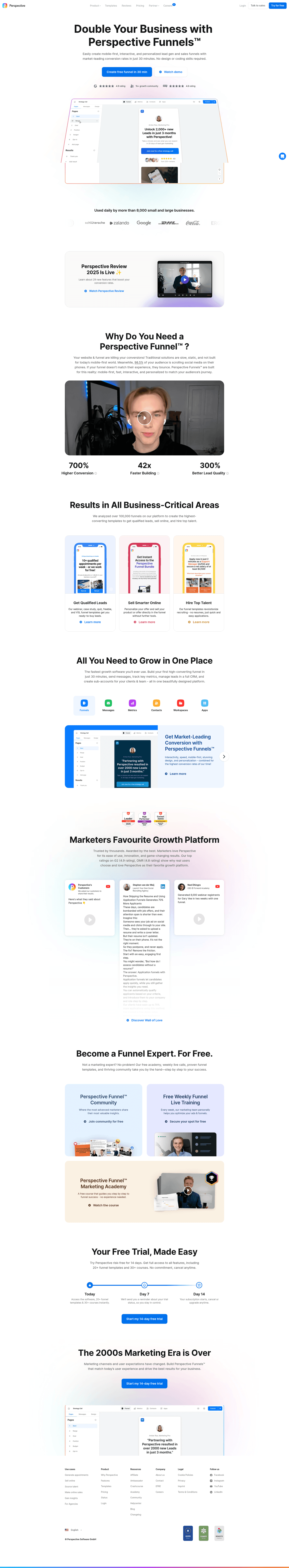
[01]

The strongest performers in this April 2026 benchmark are Perspective, Comet Rocks, Rampmetrics, ZoomInfo, Beamly, and Whatagraph. Across 84 marketing homepages scored against 60+ criteria, these pages convert by treating proof as the product: ZoomInfo anchors its hero on a G2 badge citing 8,000+ reviews, Rampmetrics names the cost objection directly ("without the overhead of an in-house ops team"), and Beamly turns the workflow into "Four easy steps" before asking for a signup.

What makes marketing websites harder to convert than other categories?

[02]

Marketing buyers already know the persuasion playbook, so generic promises feel hollow faster. Across 84 homepages reviewed, the pages that convert make proof the headline: ZoomInfo leads with 8,000+ G2 reviews and a red Free Trial button, Whatagraph pairs dual CTAs with a Connect-Organize-Share-Visualize workflow diagram, and Perspective layers three resource formats (community, crash course, academy) with a named team member to humanize the brand.

What is the biggest design mistake on marketing homepages?

[03]

Relying on category labels like "all-in-one marketing platform" instead of specific outcomes. The average page in this April 2026 benchmark scored 53.6. Top performers replace abstraction with proof: Beamly shows an upload UI mockup before asking for commitment, Comet Rocks exposes Micro-storefronts and Dynamic FAQs in the nav so evaluators self-qualify, and Whatagraph cites 1,000+ marketing teams in the first viewport.

What sections should a marketing homepage include?

[04]

A clear hero with one primary action, an early trust layer (review badges, customer counts, integration logos), a visual product overview or workflow, use cases tied to measurable outcomes, and a low-friction CTA with supportive microcopy. Whatagraph's Connect-Organize-Share workflow and Comet Rocks' nav-level product tabs are strong templates. Across 84 homepages, pages that stack these blocks convert most.

How important is visual hierarchy for marketing website design?

[05]

Critical. The strongest pages guide the eye from headline to proof to CTA using contrast, whitespace, and typographic weight. ZoomInfo uses a red Free Trial button against a clean hero to make the action obvious; Rampmetrics uses accordion UI so buyers drill into service tiers without leaving the page. Layout clarity is the single most consistent differentiator between high- and low-performing marketing pages.

Where can I find great marketing website design inspiration?

[06]

Study pages section by section instead of saving full-page screenshots. Browse best landing page examples for the full gallery, then drill into hero section examples, trust section examples, and CTA section examples to see what the strongest marketing pages do differently at each stage of the funnel.

How do I audit my marketing homepage?

[07]

Use a structured rubric that checks clarity, trust, and friction instead of relying on subjective feedback. Run your page through the landing page audit for a section-by-section score.