Skip to content

Best HR Website Examples (And Why They Convert)

We scored 21 HR tech homepages on 60+ conversion criteria. See which sections separate the top performers, and what your page is probably missing.

Updated April 202621 pages analyzed
#CompanyScore

Scored by AI across 60+ conversion criteria

Deel landing page
#1
50/100
Scroll to explore
Analyze your HR pageFree. Takes 2 minutes.

What the best HR websites get right

HR tech pages sell to committees, not individuals. The buyer is often an HR leader evaluating tools alongside IT, finance, and end users. The strongest HR website design patterns in this benchmark do four things consistently:

49.5/100

Avg. page score

  • Make the product scope obvious in the first viewport. HR is a broad category (payroll, performance, onboarding, benefits), and visitors need to know which job this product owns before they invest attention.
  • Show the real interface early. HR buyers are evaluating for daily use by their team, not just themselves. Pair specific benefits with visible product proof so the promise feels operational.
  • Layer trust before the ask. Compliance, data security, and switching costs make HR buyers cautious. The best pages surface review badges, customer counts, or named-brand proof before requesting a demo.
  • Give different stakeholders a clear path. Persona-based navigation, use-case tabs, or segmented CTAs let the HR director, the IT buyer, and the end user each find their entry point.

21 best HR websites analyzed in detail

Each company below is paired with its strongest section and scored across 60+ conversion criteria. See what they get right, and what you can borrow for your own HR homepage design.

01

Deel, One platform for global HR, payroll, and compliance.

Editor's pick50/100
Gabriel AmzallagGabriel AmzallagFounder, Web Anatomy

Enterprise-scale structure that stays navigable. A mega menu with four categories and persona-based navigation (By Business Size + By Teams) routes intent cleanly, while a utility bar with Book a Demo and Compare Deel links keeps evaluation paths visible. The page builds a single-partner narrative across global hiring, payroll, and compliance without overwhelming the first screen.

What makes this page stand out

  • The hero headline reads “Hire, manage, pay, & equip anyone, anywhere.” with a single “Book a demo” CTA.
  • The subhead spells out “Payroll, HR, IT, and immigration” and “every worker type” to broaden use cases.
  • Customer proof rotates quotes from Ramp, ElevenLabs, and Robinhood, each with name and title.
  • A trust block claims “Trusted by 40,000+ companies,” shows “480+ hrs” saved, and offers “175 STORIES” link.

Section we love

·Navbar
Deel Navbar section
  1. 1The Pricing tab sits in the top nav next to Solutions, Use cases and Resources for fast plan checks
  2. 2The Book a demo CTA pairs with a Log in button to capture both prospects and existing users
  3. 3The open Who we serve menu splits into four columns (By Business Size, By Teams, By Industry, Partners)
  4. 4The By Teams column targets personas directly (HR teams, Finance teams, Legal teams, IT teams) with one-line benefits
  5. 5An EN language switcher plus footer links (Compare Deel, Help center) round out utility navigation
02

Gusto, Payroll, HR, and benefits that feel simple for small businesses.

71/100
Gabriel AmzallagGabriel AmzallagFounder, Web Anatomy

Approachable design for a high-trust workflow. "Payroll, HR, benefits. Simplified." compresses three products into four words, then "Join 300,000+ small and medium-sized businesses" anchors trust to a specific audience. Dual CTAs (How Gusto works + Create account) let visitors self-select their comfort level.

What makes this page stand out

  • "Join 400,000+ small and medium-sized businesses that take care of their people with Gusto" — massive social proof number with clear ICP callout (SMBs).
  • Dual CTAs "Create free account" and "How Gusto works" accommodate ready-to-buy and research-phase visitors.
  • Clean, teal-accented design conveys trustworthiness appropriate for a payroll/HR product handling sensitive data.
  • Navigation targeting both Businesses and Accountants signals a partner-driven growth strategy.

Section we love

·Hero
Gusto Hero section
  1. 1Massive bold headline (Payroll, HR, benefits. Simplified.) states 3 product categories in 4 words
  2. 2Social proof (Join 300,000+ small and medium-sized businesses) doubles as audience targeting
  3. 3Dual CTAs (How Gusto works) and (Create account) serve both research and signup intent
  4. 4Ultra-clean layout with generous whitespace lets the headline dominate without distraction
03

PerformYard, Performance management with real reviews and visible goal tracking.

67/100
Gabriel AmzallagGabriel AmzallagFounder, Web Anatomy

Proof-heavy hero that sells the evaluation experience. Dual CTAs (Get A Demo + Product Overview 2-minute video) lower the friction for different buyer readiness levels, while triple review platform badges (G2, Capterra, TrustRadius with 1,000+ reviews) create immediate credibility. A real dashboard showing employee goals at 41% makes the product tangible.

What makes this page stand out

  • "AI Performance Management Platform" label above the headline clearly categorizes the product while the AI modifier signals modern capability.
  • "PerformYard unifies reviews, goals, meetings, and engagement in one AI-driven platform so your data tells a complete story, not a scattered one" directly addresses the fragmentation pain point in HR tech.
  • Star ratings from G2 Crowd and Capterra ("From 1000+ Reviews") provide strong third-party validation with impressive review volume.
  • Client logos (Paytronix, Mitsubishi Chemical, Berkshire Grey, NFLPA, Crunch, Visit Philadelphia) show impressive cross-industry adoption including recognizable enterprise brands.

Section we love

·Hero
PerformYard Hero section
  1. 1Dual CTAs (Get A Demo + Product Overview 2 min video) let visitors choose between live demo and quick self-serve preview
  2. 2Triple review platform badges (G2 Crowd, Capterra, TrustRadius) with 1000+ reviews and star ratings stack credibility
  3. 3Real performance review dashboard showing employee names, review forms, goals at 41%, and feedback threads proves the product
  4. 4Enterprise logos (Paytronix, Mitsubishi Chemical, Berkshire Grey, NFLPA) span multiple industries
04

Frankli, Performance and feedback tools built around the data HR leaders already know.

65/100
Gabriel AmzallagGabriel AmzallagFounder, Web Anatomy

Problem-first positioning that earns attention before selling. Three data points ("70% lack feedback," "52% say right behaviors go unrewarded," "45% want more precise metrics") make the status quo feel broken and measurable. The page targets people managers and HR leaders who already know the pain but need a structured fix.

What makes this page stand out

  • The replacement of annual reviews with continuous feedback loops positions Frankli on the progressive side of the performance management debate — aligned with modern HR thought leadership
  • Bringing OKRs, feedback, and one-to-ones into one unified platform eliminates the tool fragmentation that forces managers to juggle separate goal-tracking, feedback, and meeting tools
  • Automated meeting reminders for 1-on-1s solve a practical problem: managers who intend to have regular check-ins but let them slip — nudge-based behavior change built into the product
  • G2's top-rated for support is a powerful trust signal for HR buyers who know that implementation and ongoing support quality can make or break a people platform

Section we love

·Problem
Frankli Problem section
  1. 1Three big stats (70%, 52%, 45% of HR leaders) quantify how often performance management breaks down
  2. 2Social validation framing (most HR leaders believe) shows the pain is shared across the field
  3. 3Persona tag (For managers) and HR-leader data target the exact buyer who feels this gap
  4. 4Each stat pairs a number with a plain-language consequence so the problem feels concrete not vague
05

PayFit, Payroll automation with a step-by-step process you can see before you buy.

64/100
Gabriel AmzallagGabriel AmzallagFounder, Web Anatomy

Crisp, conversion-oriented layout built for payroll operators. Three numbered steps with real UI screenshots walk through the workflow, culminating in a dated timeline (day 21, 26, 28) showing the payroll closing process. Plain language and visible steps reduce perceived complexity for a high-stakes, recurring task.

What makes this page stand out

  • "LOGICIEL DE PAIE ET RH" category label above the headline immediately establishes the product category
  • "Fiable, rapide, automatisé et accessible à tous" (Reliable, fast, automated, and accessible to all) four-attribute sub-headline addresses key buyer concerns
  • 4.5/5 rating among 20,000+ enterprises provides strong social proof with both quality and quantity metrics
  • Dual CTA (Essayez maintenant + Demandez une démo) serves both self-serve and guided buyer journeys

Section we love

·How It Works
PayFit How It Works section
  1. 1Three numbered cards frame it as payroll sorted in 3 simple steps, each with a real product screenshot
  2. 2Effort framing is strong: plug in your numbers and watch payslips instantly update right up till payday
  3. 3Step 3 includes a dated timeline (21, 26, 28 June) for prep, closing and payslips sent to employees
  4. 4Outcome preview is concrete: run payroll, review payments, and a breakdown of everything due from HMRC
  5. 5The mockups show actual flows (add a bonus, approve pay elements) so the progression stays visual
06

Administrate, Training management that removes scheduling fear with visible conflict resolution.

63/100
Gabriel AmzallagGabriel AmzallagFounder, Web Anatomy

Feature section that leads with the operational fear instead of the feature name. "Get every training session on the calendar in minutes without fear of double booking" is pain-to-outcome framing backed by a calendar UI with color-coded rooms, conflict detection, and a Solve button that makes the resolution feel instant.

What makes this page stand out

  • AI-powered scheduling that builds draft schedules with "perfect fill rates, zero conflicts, and no overbookings" addresses the most time-consuming, error-prone task in training operations — a clear, quantifiable efficiency gain
  • Two-way integration with LMS, LXP, HRIS, and ERP systems positions Administrate as the operational backbone that connects to existing learning infrastructure rather than replacing it
  • The "instructor-led training can be as easy as eLearning" tagline reframes ILT's biggest weakness (operational complexity) as a solvable problem — aspirational messaging for training operations managers
  • Multi-modality management (classroom, virtual, blended) from a single interface addresses the hybrid training reality that emerged post-pandemic — no longer just physical classroom scheduling

Section we love

·Features
Administrate Features section
  1. 1Benefit-led headline (Get every training session on the calendar in minutes without fear of double booking) leads with speed and outcome
  2. 2Pain-to-outcome mapping ties the fear of double booking directly to the scheduler that flags Booking Conflict automatically
  3. 3Detailed product UI shows the real scheduler with rooms, bookings and a Solve button, the concrete result of using it
  4. 4Explore AI Scheduler link lets interested buyers dig into this single feature without leaving the page

See how your page compares to the 49.5 HR tech average

Run a section-by-section diagnostic on your HR page and get prioritized fixes, then see how you stack up against these HR website examples.

Design patterns we see across high-performing HR tech pages

Across 21 HR tech homepage examples, the pages that convert make the first screen do one job: state which HR workflow they own and remove the biggest doubt a committee buyer carries in.

The strongest patterns pair benefit-led claims with single-focus layouts, then back those claims with real product interfaces and third-party proof. In HR, where switching costs are high and multiple stakeholders evaluate the page, visible workflows and named-brand trust signals do more work than polished branding. Use website section examples to compare how these building blocks show up across page types.

Trust Mo

80/100

How Mo builds credibility early

Mo trust section
  1. 1The headline results pair hard metrics (Employee Turnover -37%, Recognition +30%, eNPS +57%) with named customers
  2. 2The figures are concrete: 10,054 employees recognised and 96% of managers engaged
  3. 3The 85% first-year engagement stat is tied to an Outstanding Workplace Award
  4. 4Recognizable brands (Crowne Plaza, William Hill, AXOL) anchor each result to a real customer
  5. 5The mix of customer logos and outcome stats gives two distinct proof types in one block

Reviewed design-pattern pick from Mo’s trust section.

What I love about this section

  • The headline results pair hard metrics (Employee Turnover -37%, Recognition +30%, eNPS +57%) with named customers
  • The figures are concrete: 10,054 employees recognised and 96% of managers engaged
  • The 85% first-year engagement stat is tied to an Outstanding Workplace Award
  • Recognizable brands (Crowne Plaza, William Hill, AXOL) anchor each result to a real customer

Hero Rippling

78/100

How Rippling captures attention above the fold

Rippling hero section
  1. 1Email input with Create free account CTA plus Take a product tour secondary path cover both conversion types
  2. 2Social proof row (4.8 stars, 2.9K+ reviews, G2 and PC Magazine Editors Choice badges) stacks credibility
  3. 3Product UI on tablet showing workforce management dashboard with employee profiles proves real functionality
  4. 4Headline (Manage your entire workforce on one system) clearly covers HR, Payroll, IT, and Finance in the subtext

Reviewed design-pattern pick from Rippling’s hero section.

What I love about this section

  • Email input with Create free account CTA plus Take a product tour secondary path cover both conversion types
  • Social proof row (4.8 stars, 2.9K+ reviews, G2 and PC Magazine Editors Choice badges) stacks credibility
  • Product UI on tablet showing workforce management dashboard with employee profiles proves real functionality
  • Headline (Manage your entire workforce on one system) clearly covers HR, Payroll, IT, and Finance in the subtext

Features Brighterway

50/100

How Brighterway showcases their product

Brighterway features section
  1. 1Difference cards lead with a credibility outcome (Trained on over 5M pages of medical records, Fine-tuned by a team of MDs and AI researchers) not raw feature names
  2. 2Real product UI screenshots show the Sorting and Summary review output, making the review experience tangible
  3. 3Supporting capability cards (High touch support, Highly customizable) round out the core pitch
  4. 4Schedule a Demo CTA sits directly under the feature differentiators to capture intent

Reviewed design-pattern pick from Brighterway’s features section.

What I love about this section

  • Difference cards lead with a credibility outcome (Trained on over 5M pages of medical records, Fine-tuned by a team of MDs and AI researchers) not raw feature names
  • Real product UI screenshots show the Sorting and Summary review output, making the review experience tangible
  • Supporting capability cards (High touch support, Highly customizable) round out the core pitch
  • Schedule a Demo CTA sits directly under the feature differentiators to capture intent

Overlooked sections that quietly drive demos and signups

In this set, navigation and persona routing often do more conversion work than teams expect. Deel's mega menu with persona-based tabs, Comet's customer-vs-freelancer navigation, and Lattice's switching-focused How It Works section all show that "utility" blocks shape product understanding before the buyer reaches any feature section.

The biggest gaps appear where pages should explain the onboarding experience and competitive positioning in plain language. When those sections are thin, the hero gets forced to do all the trust work, and committee buyers are left guessing about fit, migration effort, and how the tool compares to what they already use.

Navbar Comet

43/100

Why this navbar works

Comet navbar section
  1. 1The nav splits by persona with separate Customers and Freelancers top-level tabs
  2. 2The open Customers dropdown surfaces Why trust us, Pricing and Customers in one column
  3. 3The blue Contact CTA pops against the dark space-themed bar
  4. 4A globe icon offers a language switcher alongside Log In for utility access
  5. 5The playful comet wordmark on black sets a distinct brand tone on the left

Reviewed overlooked-section pick from Comet’s navbar section.

What I love about this section

  • The nav splits by persona with separate Customers and Freelancers top-level tabs
  • The open Customers dropdown surfaces Why trust us, Pricing and Customers in one column
  • The blue Contact CTA pops against the dark space-themed bar
  • A globe icon offers a language switcher alongside Log In for utility access

How It Works Lattice

33/100

How Lattice simplifies the process

Lattice how it works section
  1. 1The three numbered steps (dedicated onboarding manager, seamless data transfer, award-winning support) make switching feel structured
  2. 2The headline (as easy as 1-2-3) frames the whole migration as low-effort and approachable
  3. 3Step 1 reassures buyers they are never alone with a specialist onboarding team designing a custom configuration
  4. 4Each step pairs a bold action title with a short plain-language explanation so the path is scannable

Reviewed overlooked-section pick from Lattice’s how it works section.

What I love about this section

  • The three numbered steps (dedicated onboarding manager, seamless data transfer, award-winning support) make switching feel structured
  • The headline (as easy as 1-2-3) frames the whole migration as low-effort and approachable
  • Step 1 reassures buyers they are never alone with a specialist onboarding team designing a custom configuration
  • Each step pairs a bold action title with a short plain-language explanation so the path is scannable

Use Cases Malt

25/100

How Malt makes the product feel relevant

Malt use cases section
  1. 1The grid splits freelancers into five named categories (Management Consultants, IT/Tech/Data, Marketing, Design/UX, Business/Finance)
  2. 2Each card lists concrete roles (Back-End Developers, SEO Consultant, Talent Acquisition Managers, Supply Chain specialists)
  3. 3The persona avatars make every category feel staffed by real top-tier people
  4. 4The subhead reassures any project type or length is covered, widening the addressable buyer

Reviewed overlooked-section pick from Malt’s use cases section.

What I love about this section

  • The grid splits freelancers into five named categories (Management Consultants, IT/Tech/Data, Marketing, Design/UX, Business/Finance)
  • Each card lists concrete roles (Back-End Developers, SEO Consultant, Talent Acquisition Managers, Supply Chain specialists)
  • The persona avatars make every category feel staffed by real top-tier people
  • The subhead reassures any project type or length is covered, widening the addressable buyer

Use the examples above as prompts for what to standardize, not just what to redesign.

How does your HR homepage compare?

Five quick questions to see where your page stands against this HR tech benchmark. For a full section-by-section audit, try our landing page analysis.

Interactive quiz

What would your HR homepage score?

Question 1 of 5
0%

Can an HR buyer identify what your product does in under 5 seconds?

"Payroll for small businesses" or "Performance reviews for remote teams" beats "the people platform for modern work."

Gabriel Amzallag

Reviewed by

Gabriel Amzallag , Founder, Web Anatomy

5 years CRO + SEO at Qonto (2021–2025). After advising 15+ SaaS on their websites (Payfit, Pigment…), the same patterns kept breaking, so I decided to build the source of truth on what works on the web: the intelligence layer every tool, builder, and team uses to ship sites that perform.

See how your page compares to the 49.5 HR tech average

Run a section-by-section diagnostic on your HR page and get prioritized fixes, then see how you stack up against these HR website examples.

Analyze your HR pageFree. Takes 2 minutes.

Explore other industries

See how conversion patterns differ across verticals. Each page scores real homepages on the same framework.

See all industries
Benchmark-backed answers for HR website design

FAQ: Best HR Websites (HR Tech Benchmarks)

Quick answers to common questions about what makes the best HR websites convert, based on section-level benchmark data from this HR tech review.

What are the best HR websites?
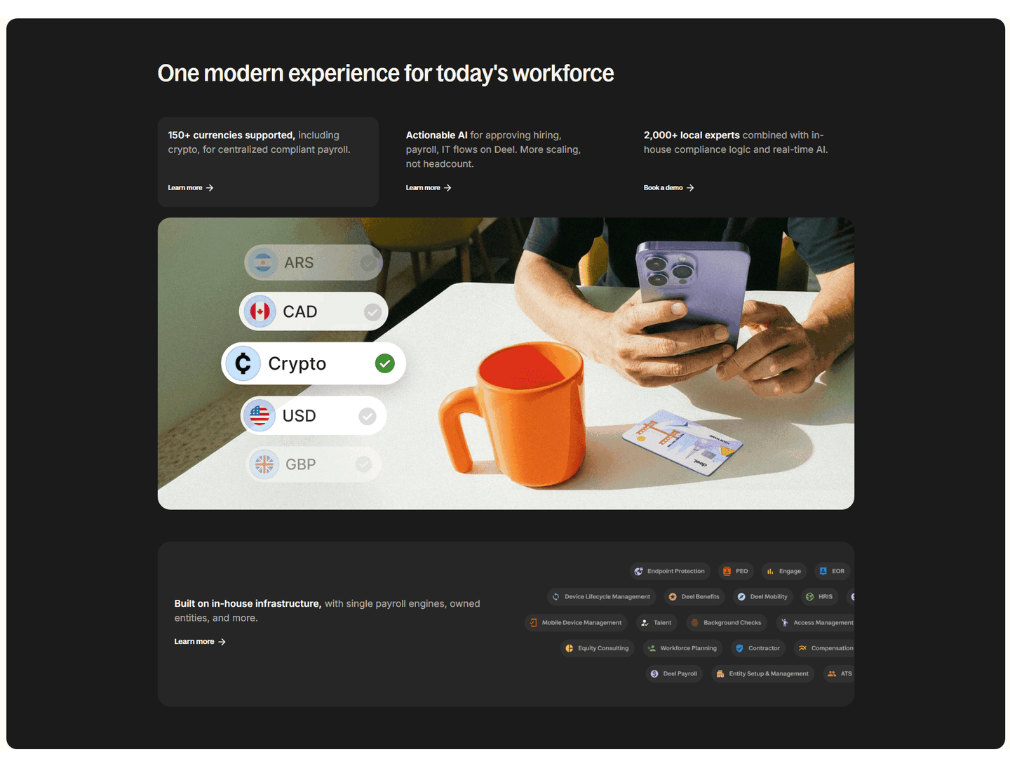
[01]

The strongest performers in this April 2026 benchmark are Deel, Gusto, PerformYard, Frankli, PayFit, and Administrate. Across 21 HR tech homepages scored against 60+ criteria, these pages convert by making multi-stakeholder categories feel concrete: Deel routes by business size and team, Gusto compresses three products into "Payroll, HR, benefits. Simplified.", and PerformYard stacks G2, Capterra, and TrustRadius badges with 1,000+ reviews.

What makes HR websites harder to convert than generic SaaS pages?

[02]

HR pages sell to committees. HR, IT, finance, and end users all weigh in on the decision. Across 21 homepages reviewed, the pages that convert keep one outcome in the hero and let navigation handle the complexity. Deel's mega menu splits By Business Size and By Teams. Frankli opens with "70% of HR leaders say employees lack feedback" to make the status quo feel broken. PayFit anchors trust to a specific day-21-to-day-28 payroll timeline.

What is the biggest design mistake on HR homepages?

[03]

Leading with a vague "people platform" promise while hiding the workflow. The average page in this April 2026 benchmark scored 49.5. Top performers show real UI: PerformYard surfaces a dashboard with employee names and goals at 41%, Administrate names the fear ("get every training session on the calendar without fear of double booking") and shows a calendar with conflict detection, and PayFit walks through three numbered steps with screenshots.

What sections should an HR homepage include?

[04]

A hero stating the specific workflow it owns, an early trust layer (review badges, customer counts, compliance cues), a How It Works section with real UI steps, features tied to outcomes rather than labels, and a committee-safe CTA. Gusto's "Join 300,000+ small and medium-sized businesses" anchors audience trust; Deel layers Book a Demo alongside Compare Deel; PerformYard stacks G2, Capterra, and TrustRadius badges with 1,000+ reviews.

How many HR website examples do I need to review before redesigning?

[05]

Three to five is enough if you pick by HR segment and compare section by section. Only 10% of pages in this benchmark score in the top tier, so the gap is concentrated in a few blocks. Study Deel for multi-region scope, Gusto for SMB compression, PerformYard for review-stacked trust, Frankli for stat-driven problem framing, and PayFit for visible payroll workflow.

Where can I find great inspiration for my HR website?

[06]

Study HR website examples section by section instead of saving full-page screenshots. Browse best landing page examples for the full gallery, then drill into hero section examples, trust section examples, and how it works section examples to see how Deel, PerformYard, and PayFit differ at each stage of the funnel.

How do I audit my HR homepage?

[07]

Run a structured section-by-section audit instead of relying on subjective feedback. Use our landing page analyzer to score your page against the same 60+ criteria used in this benchmark.