New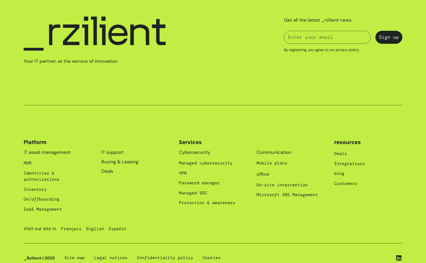
Footer|
The footer is the last section on the page, collecting navigation, secondary links, and final calls to action into a conversion asset. Explore 355 scored examples and see what the best do differently.
Updated November 2026
Showing 1–29 of 355 examples
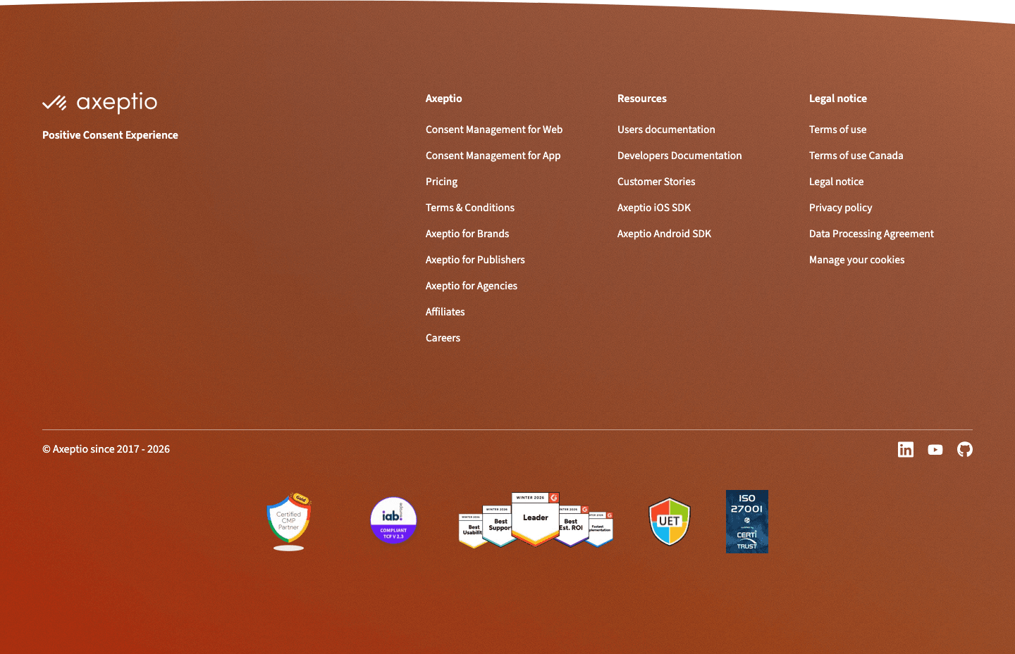
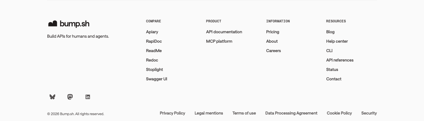
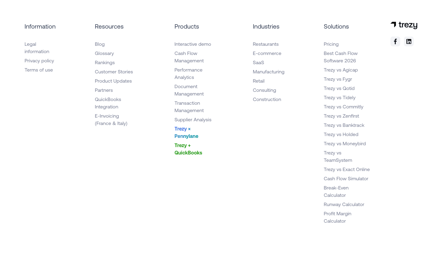
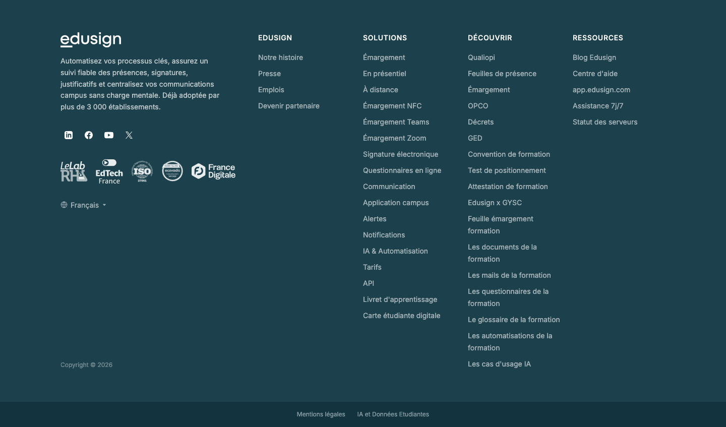
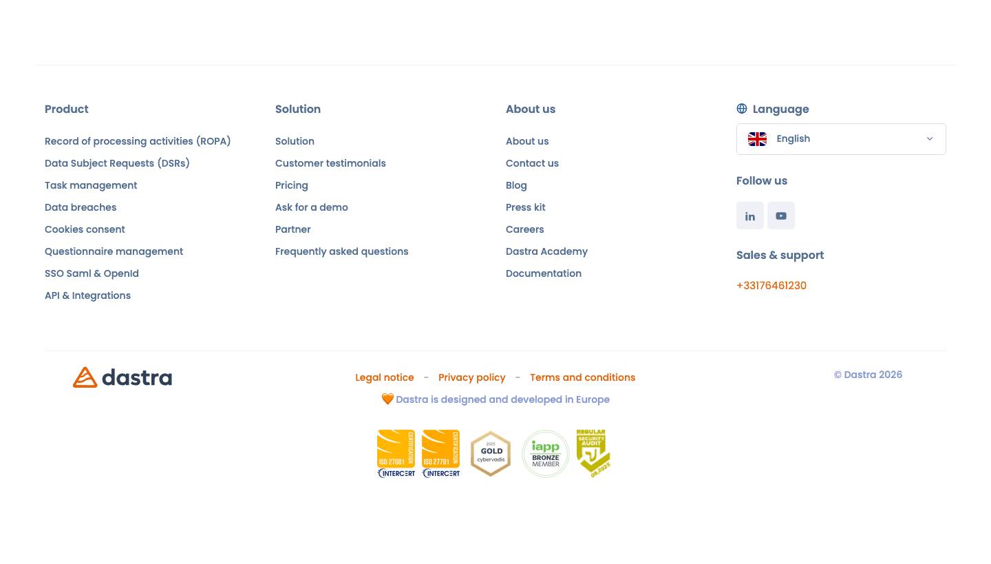
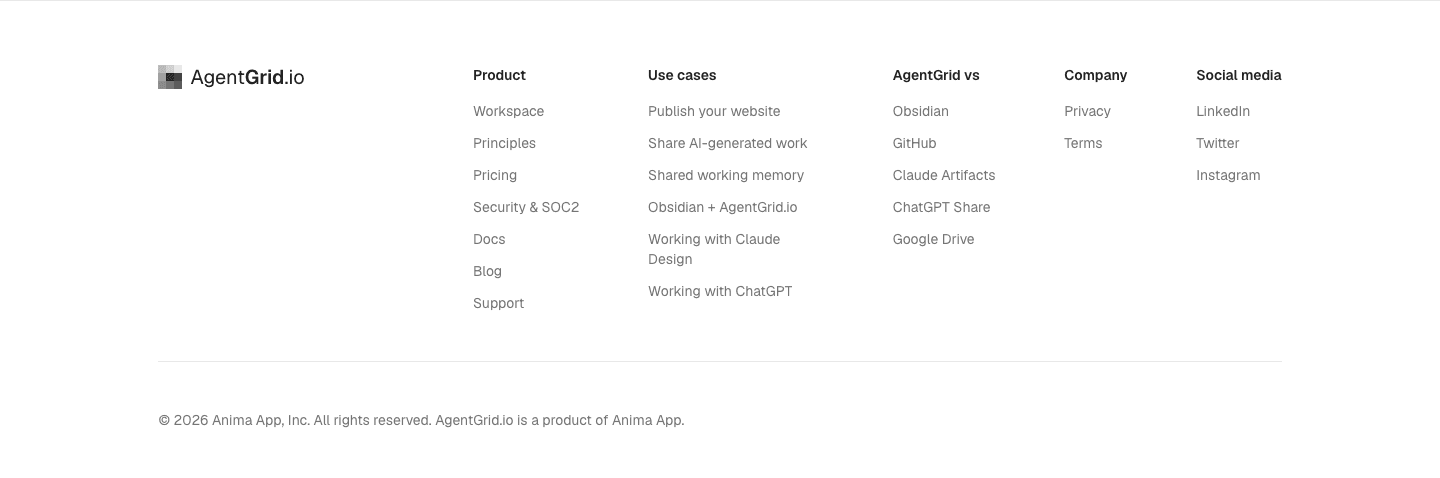
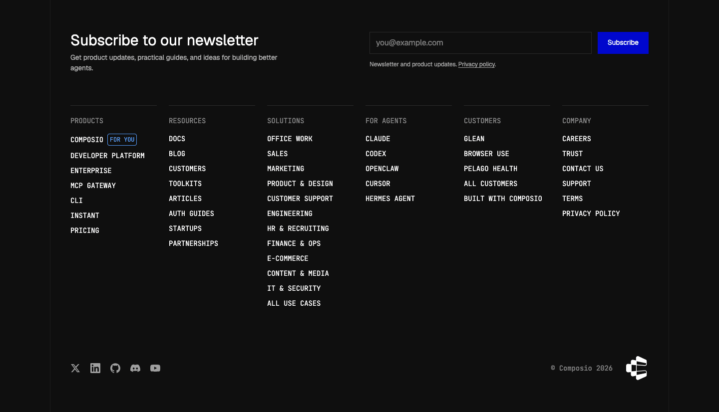
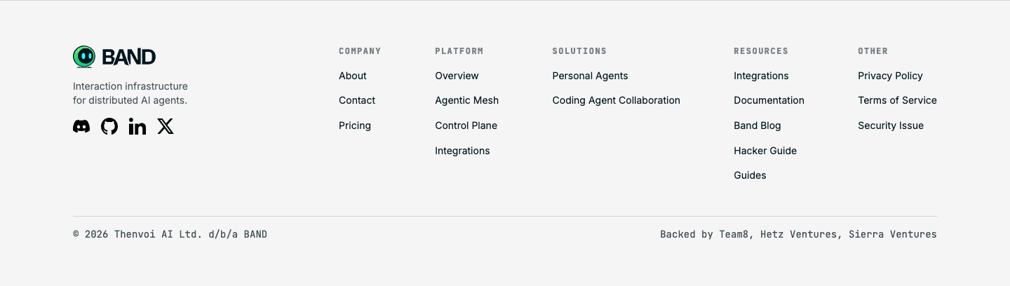
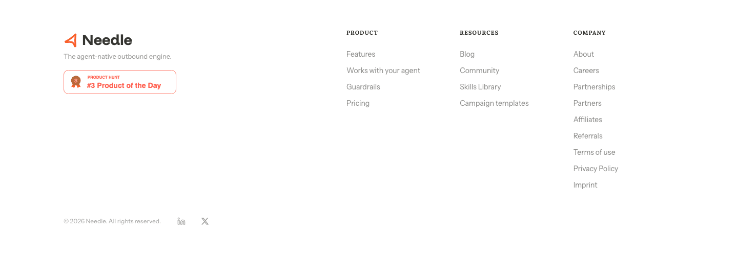
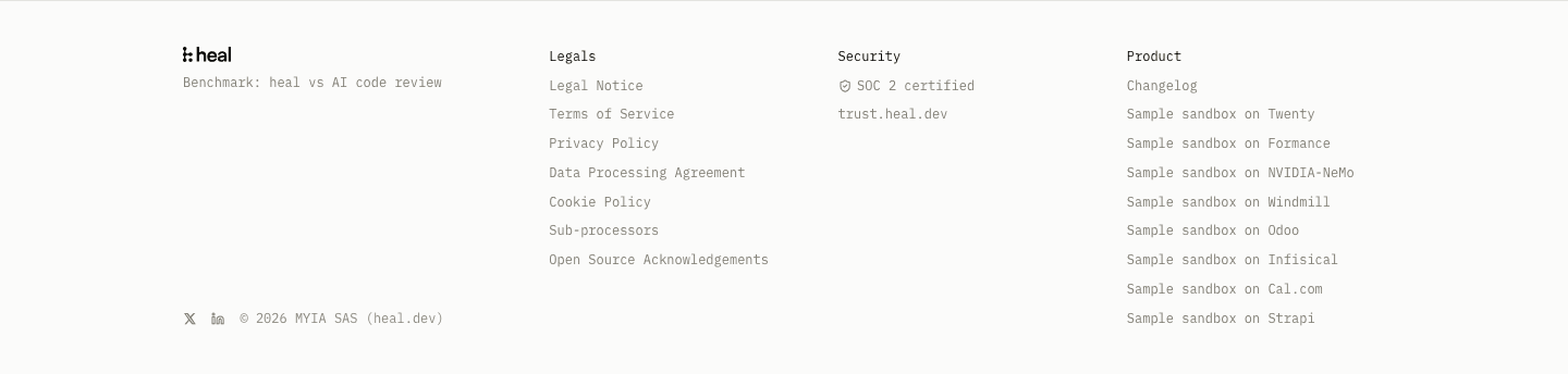
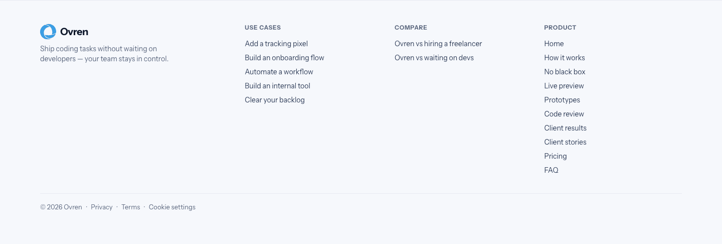

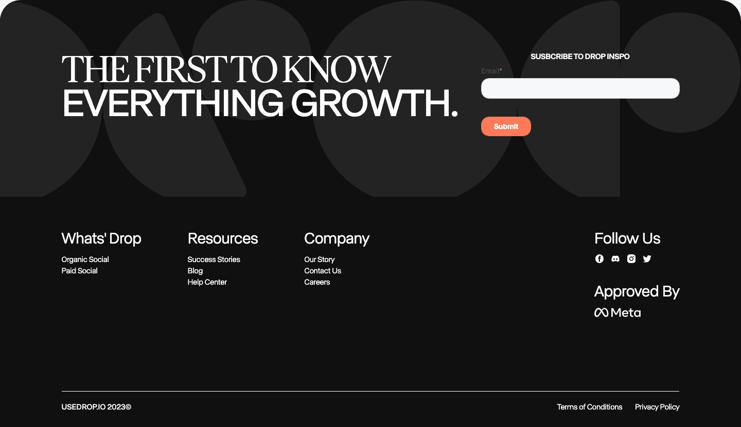
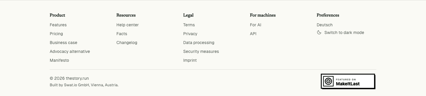
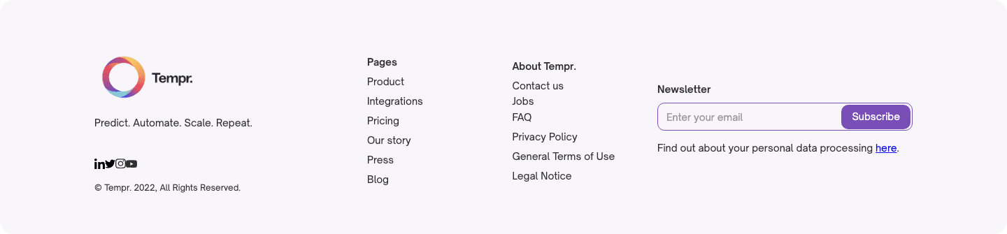
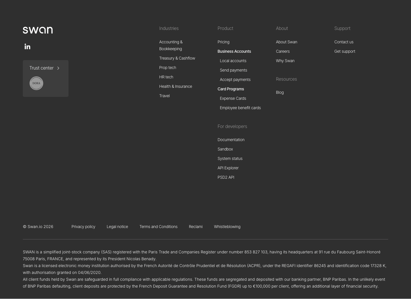
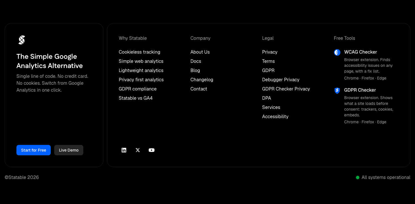
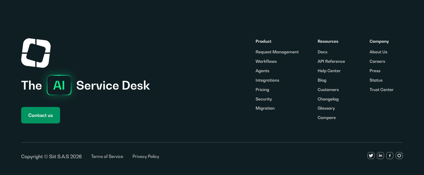
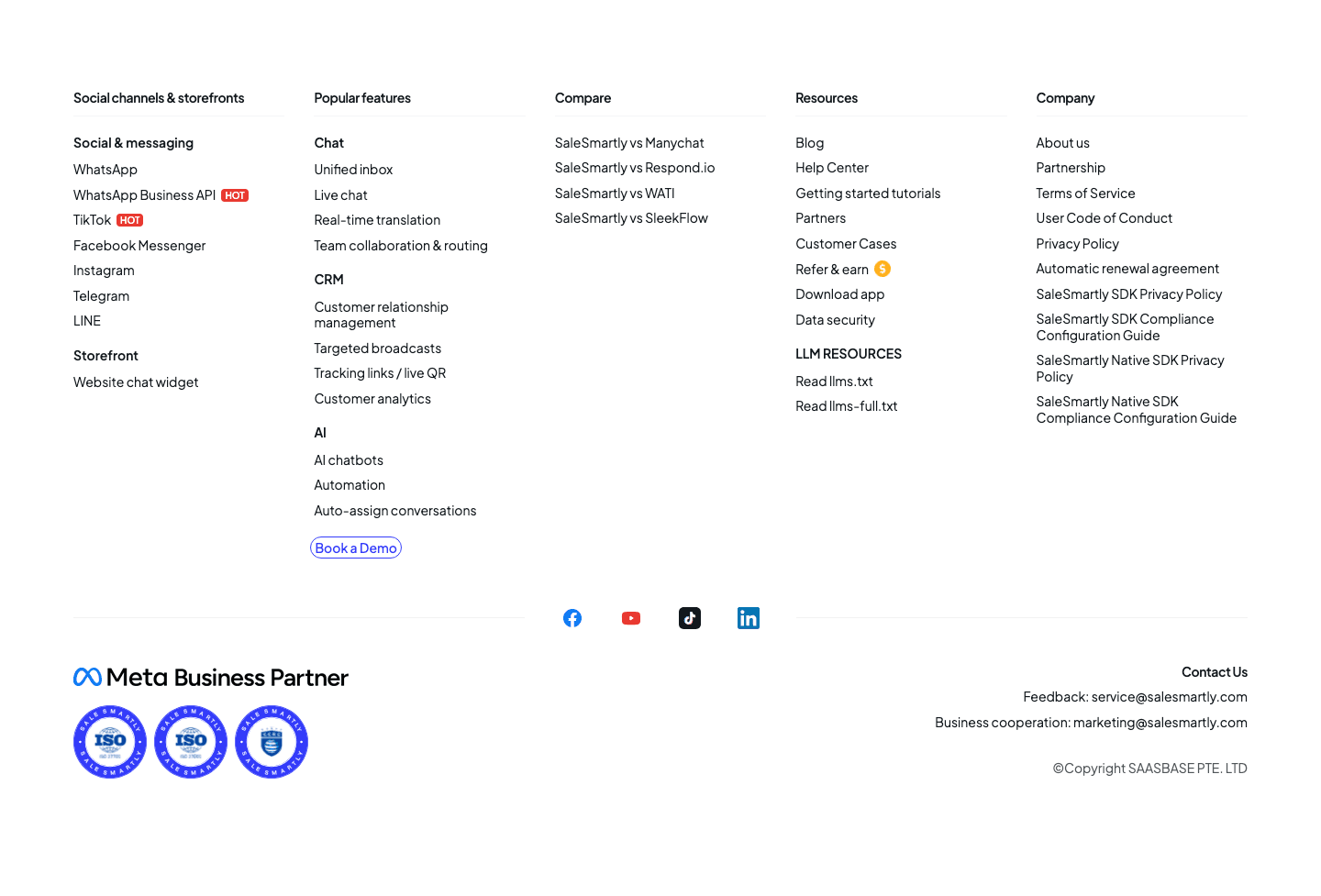
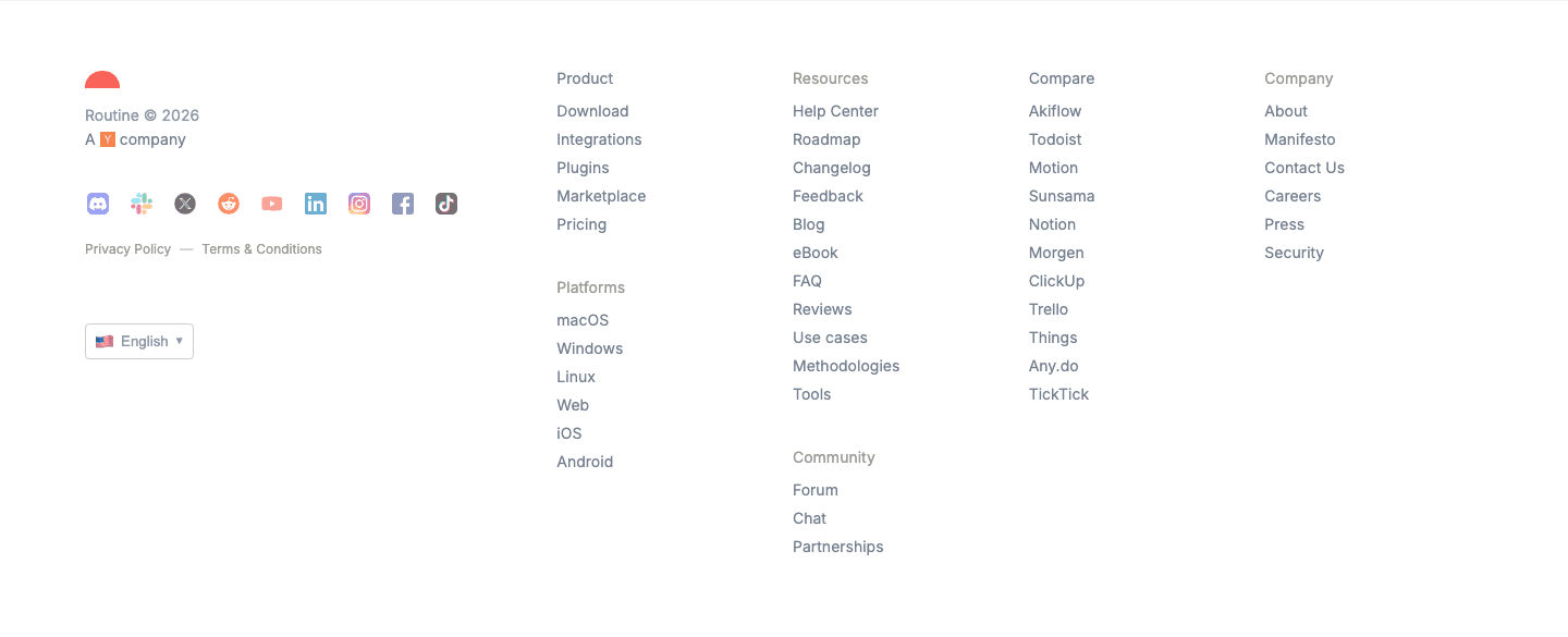
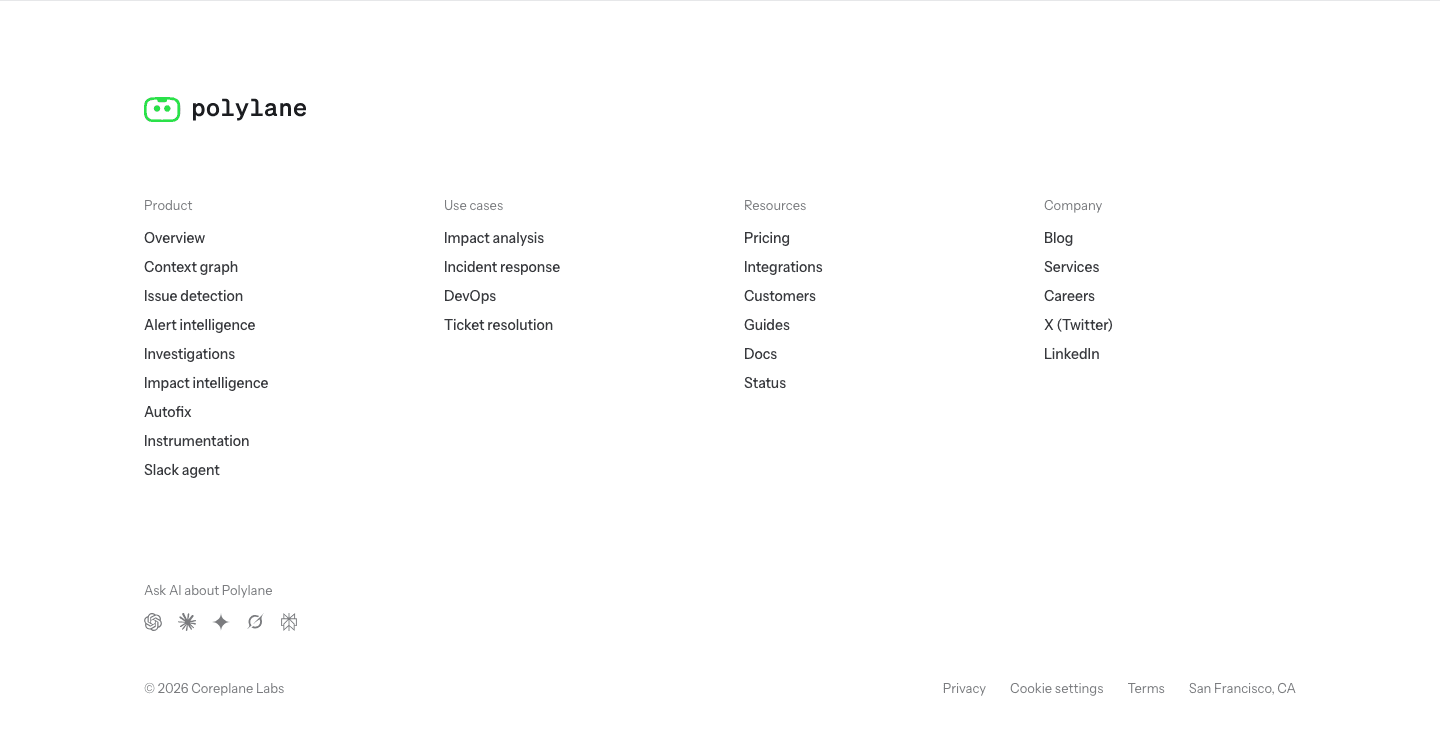
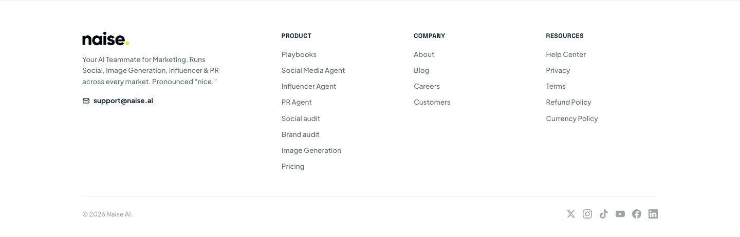
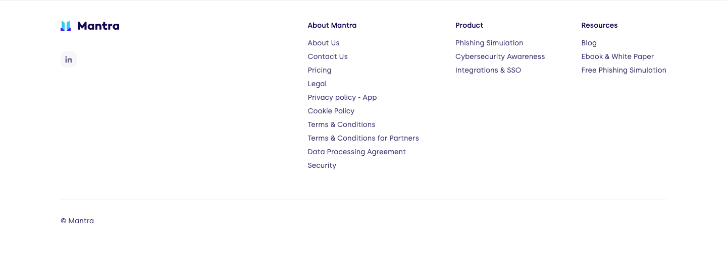
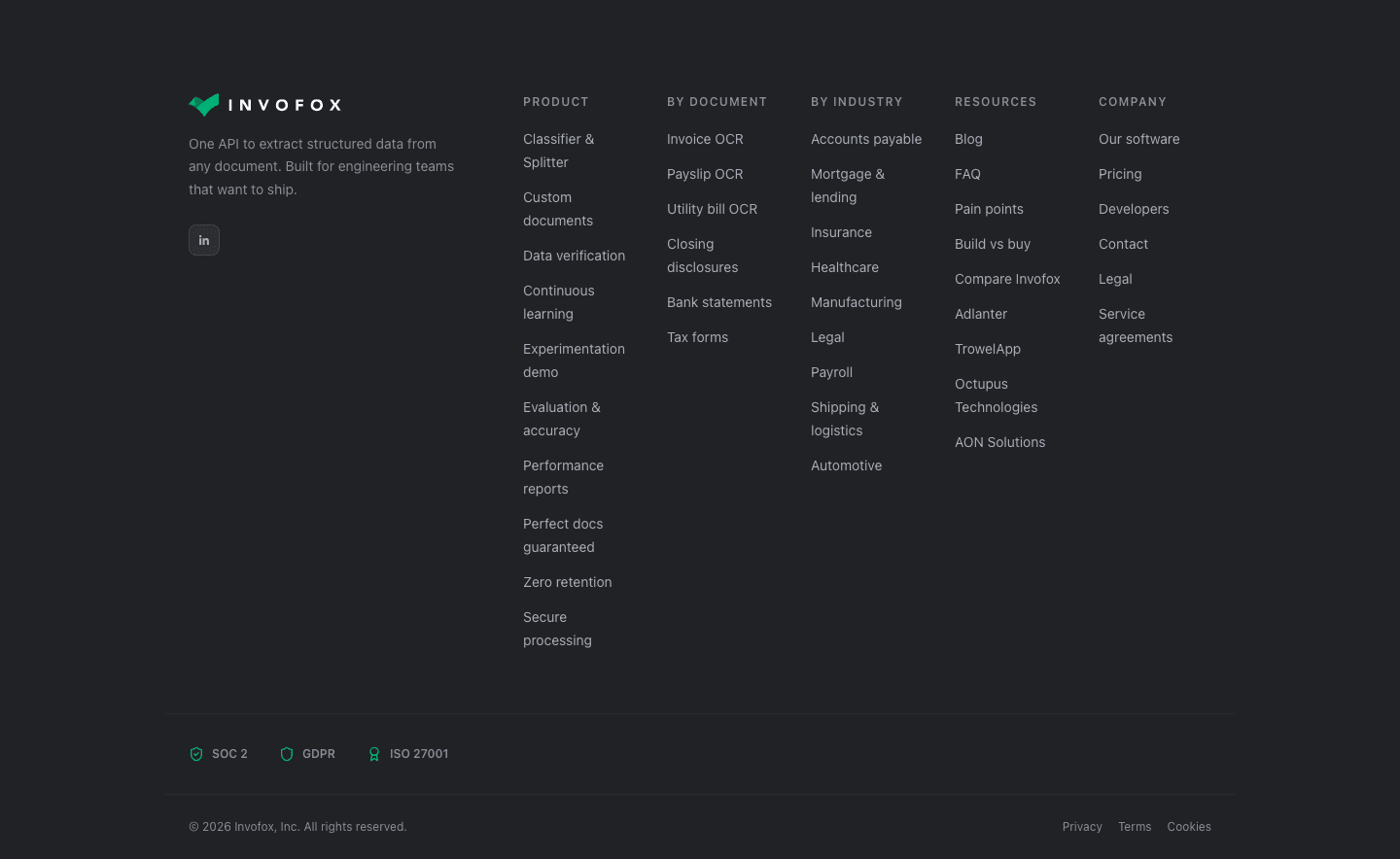
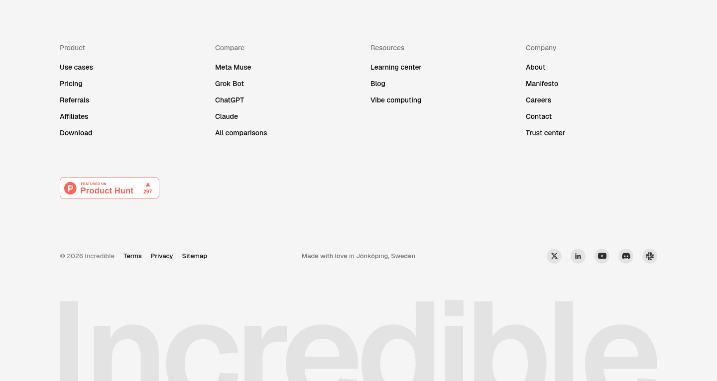
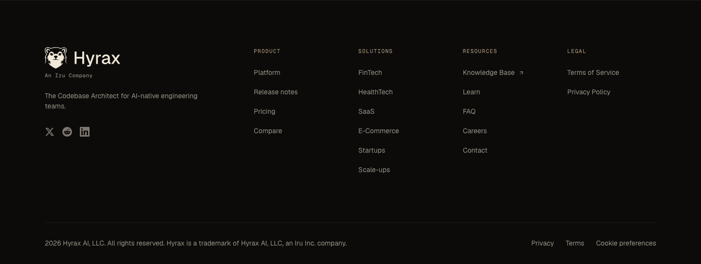
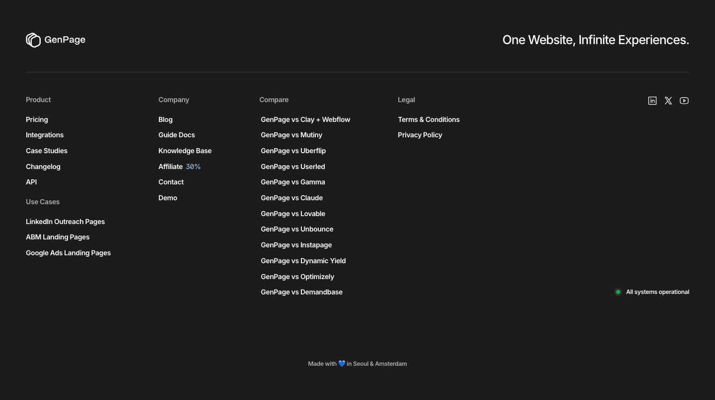
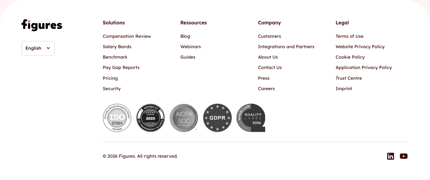
The footer is the last block of the page: links in columns, legal pages, and often a final way to stay in touch. For a visitor who scrolled to the end without converting, it is the last chance to catch them.
What the best footers do:
We checked the footers in our library for the elements below. The lower the number, the fewer pages do it, and the bigger your edge when you add it.
Badges, certifications, or partner logos repeated at the bottom of the page. Last-chance credibility before the visitor leaves
Award badges, rating stars, or "trusted by X teams." A credibility echo at the bottom of the page
Newsletter signup, social follow, or resource download. Captures visitors who aren't ready to buy
Privacy policy, terms, GDPR, cookie links. Compliance confidence for cautious buyers
Links organized in clear columns: Product, Resources, Company, Legal. Structured navigation that helps visitors find what they missed
| Element | What it means | Use it | Type |
|---|---|---|---|
| Trust reinforcement | Badges, certifications, or partner logos repeated at the bottom of the page. Last-chance credibility before the visitor leaves | 29% | Big opportunity |
| Social proof persistence | Award badges, rating stars, or "trusted by X teams." A credibility echo at the bottom of the page | 34% | Opportunity |
| Secondary conversion | Newsletter signup, social follow, or resource download. Captures visitors who aren't ready to buy | 52% | Common |
| Legal transparency | Privacy policy, terms, GDPR, cookie links. Compliance confidence for cautious buyers | 87% | Table stakes |
| Categorized links | Links organized in clear columns: Product, Resources, Company, Legal. Structured navigation that helps visitors find what they missed | 89% | Table stakes |
Footers are more alike than most sections, since nearly all of them sort their links and show the legal pages. The difference comes from the last two rows of the table: the proof and the reassurance most footers leave out.
We check every footer against a weighted checklist, from the page itself and its screenshot:
A second way to convert and a reassurance badge weigh the most, because the highest-scoring footers lean on them. Sections flagged best-in-class are picked by hand from the highest scores.
Interactive quiz
Are your footer links organized in clear columns?
Product, Resources, Company, Legal. Structured navigation
14 footers in our library are flagged best-in-class. They don't treat the footer as an afterthought:
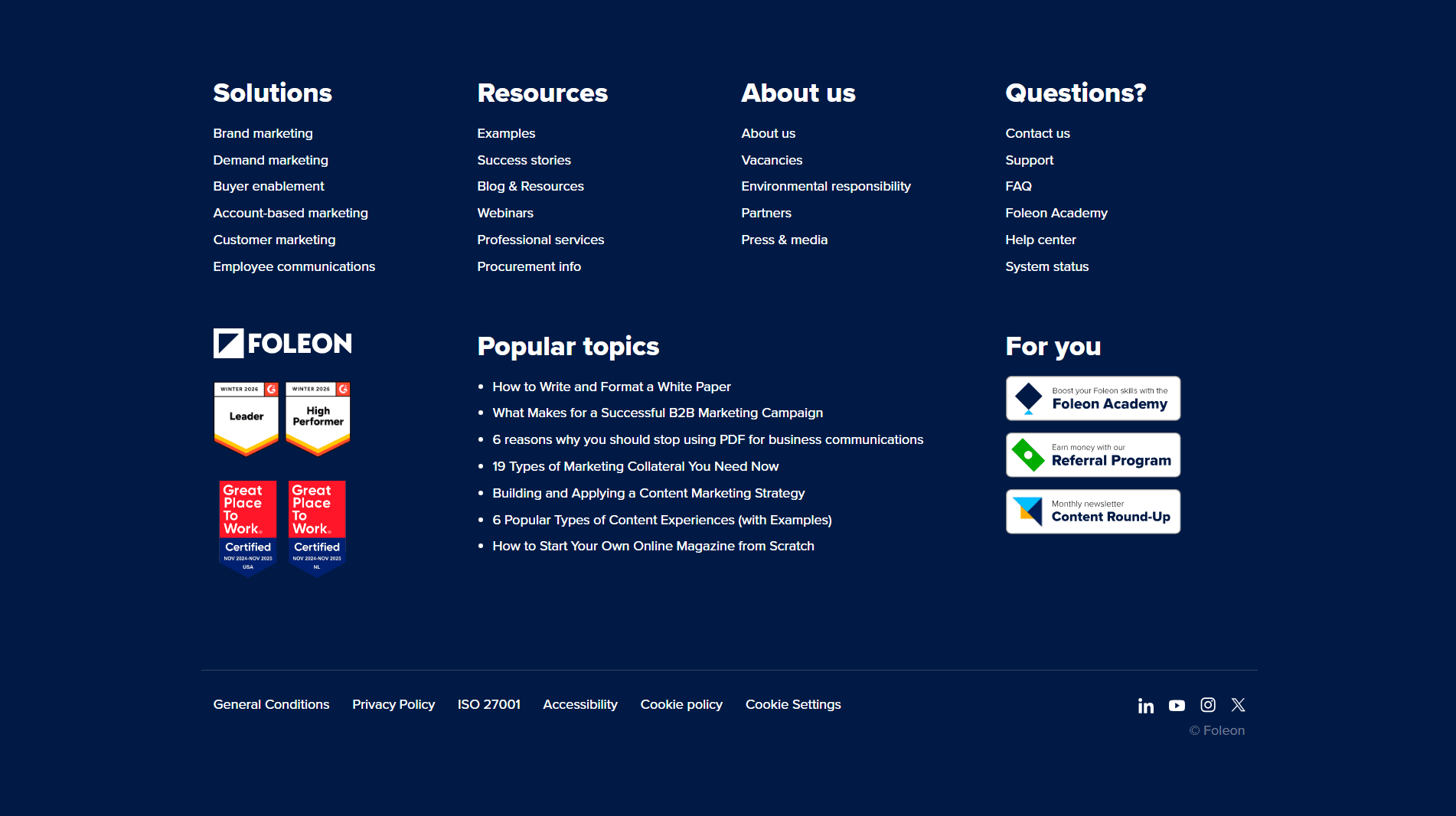
Greenly, Arrows, Agorapulse and Foleon do all four.
 100/100
The weakest footers have columns of links and the legal pages, the minimum to look professional, and stop. 71% of all footers show no reassurance badge, so the last screen gives no reason to trust the company. 48% offer no second way to convert, so a visitor who isn't ready to buy can only close the tab.
The fix is two additions: a trust badge and an email field.
Want to know which best practices your footer is missing? Get your 3 free opportunities →
 0/100

Curated by
Gabriel Amzallag , Founder, Web Anatomy
5 years CRO + SEO at Qonto (2021–2025). After advising 15+ SaaS on their websites (Payfit, Pigment…), the same patterns kept breaking, so I decided to build the source of truth on what works on the web: the intelligence layer every tool, builder, and team uses to ship sites that perform.
Real examples from top landing pages, scored and analyzed.
Everything you need to know about footer design, based on our analysis of real landing pages.
There's no fixed ideal height. Most good footers are between 200 and 400px tall. What matters is that all content is readable and link columns are well-spaced. A footer that's too short usually signals missing content (no legal links, no secondary conversion). A footer that's too tall signals an information architecture problem.
The navbar guides visitors at the start of their visit: it points them toward main pages (product, pricing, resources). The footer catches people who scrolled all the way down without converting. It holds secondary links (legal, careers, blog), residual trust signals, and often a secondary conversion like a newsletter signup. Both are navigation, but they serve different intents.
Yes. Visitors who scroll to the footer are either highly interested (they read the whole page) or lost (they're looking for specific info). Either way, no footer means a dead end. You need legal links for GDPR compliance, and it's the ideal spot for a secondary conversion. 87% of the 355 footers in our library have legal links. 52% have a secondary conversion.
Four columns covers most footers: Product, Company, Resources, Legal. Sort links by visitor intent, not internal org chart. "Pricing" and "Security" sit under Product, not Company, because that's where buyers look for them. Cap each column at 5-7 links; if a column grows longer, it probably needs splitting into two. Put Legal last (right-most or bottom row): it's required but nobody's scanning for it first. Keep labels short: "Careers" beats "Join Our Team."
A specific payoff, not "stay updated." "One tactical CRO teardown every Tuesday" gives a reason to sign up. "Subscribe to our newsletter" doesn't. It sounds like spam bait because the visitor can't picture what lands in their inbox. Name the cadence (weekly, monthly), the format (teardown, checklist, data drop), and the topic. One field (email), one button, one line of copy underneath: "No spam, unsubscribe in one click." That's the whole recipe.
Check that links sit in clear categories and that legal pages are easy to find. Then look for a second way to convert, trust badges, and social proof that carries down to the bottom of the page. Or get your 3 free opportunities, ranked with the evidence behind each.
Showing 1–29 of 355 examples