Integrations page design (265)
An integrations page is the directory of every tool a product connects to. Its job is to let a buyer check in seconds that their own tools are on the list. See 265 real examples.
Showing 1–24 of 265 integrations pages
How to build an integrations page, by the numbers
The questions a team asks when it designs an integrations directory, answered from the 265 here.
Can a visitor find their tool in seconds?
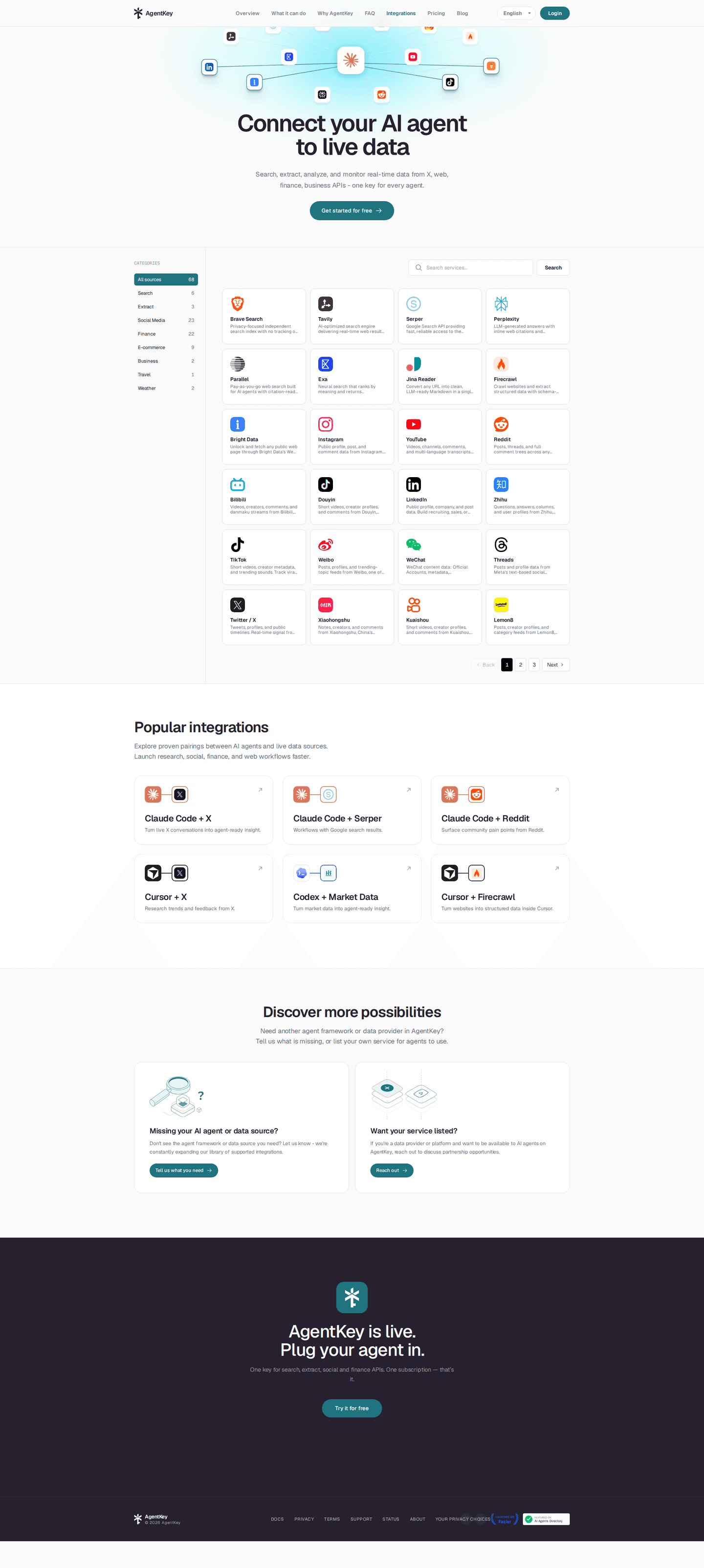
53% put a search box or filters on the page. It's the widest split in the set: 85% of the strongest pages have one, against 19% of the weakest.
Should the list be split into categories?
54% group the integrations under named headings such as CRM, analytics or communication. The rest show one long list.

Should a few integrations come first?
58% pull a handful of the most used ones ahead of the full directory, so the common answer is on screen before any search.
What should each entry say?
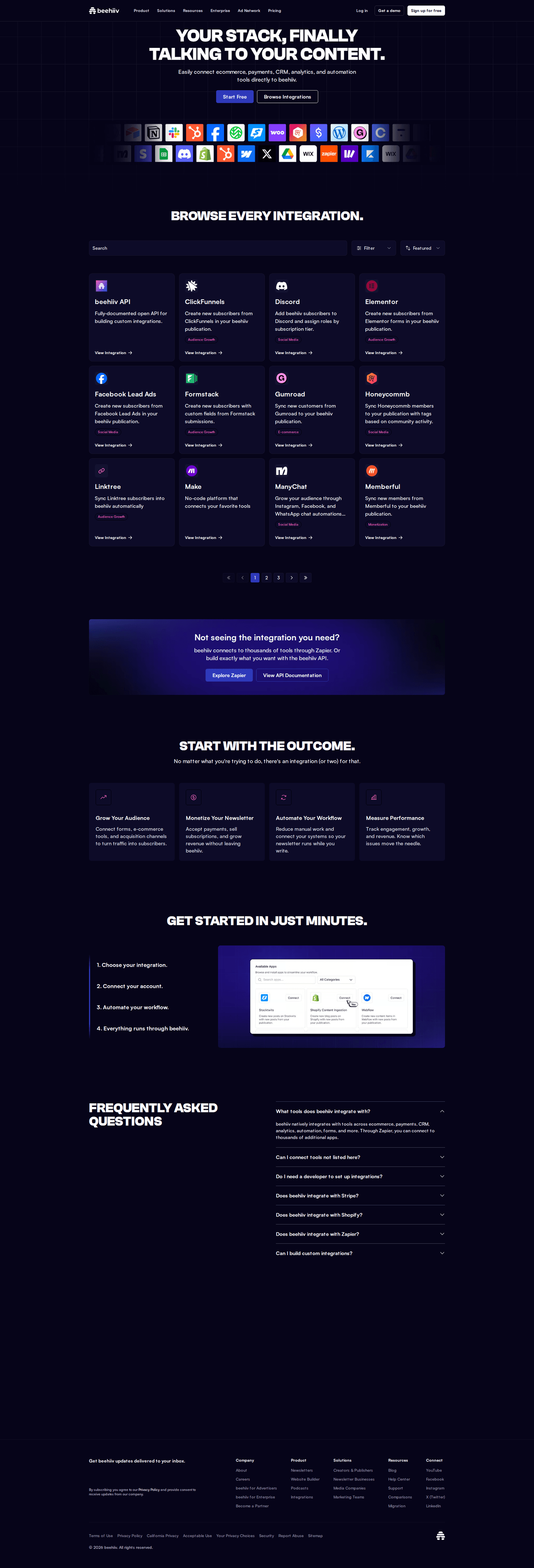
- A logo on 97%
- A line saying what it does on 70%
- A link to somewhere real on 78%
The logo is close to universal. The line of text is what tells a visitor what connecting it would actually do.
What if the tool is not on the list?
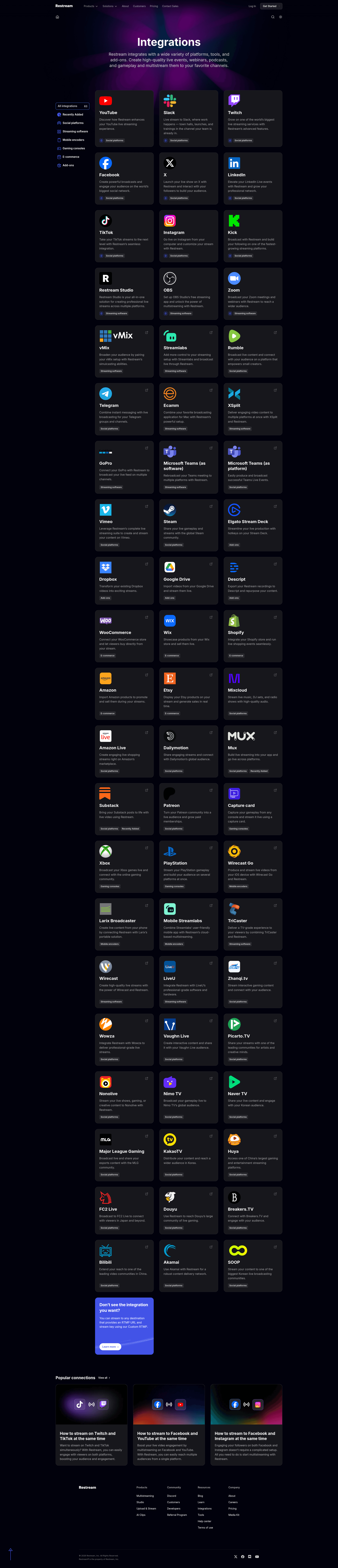
- An API on 54%
- Zapier, Make or a similar connector on 39%
- Webhooks on 19%
What does the page ask for?
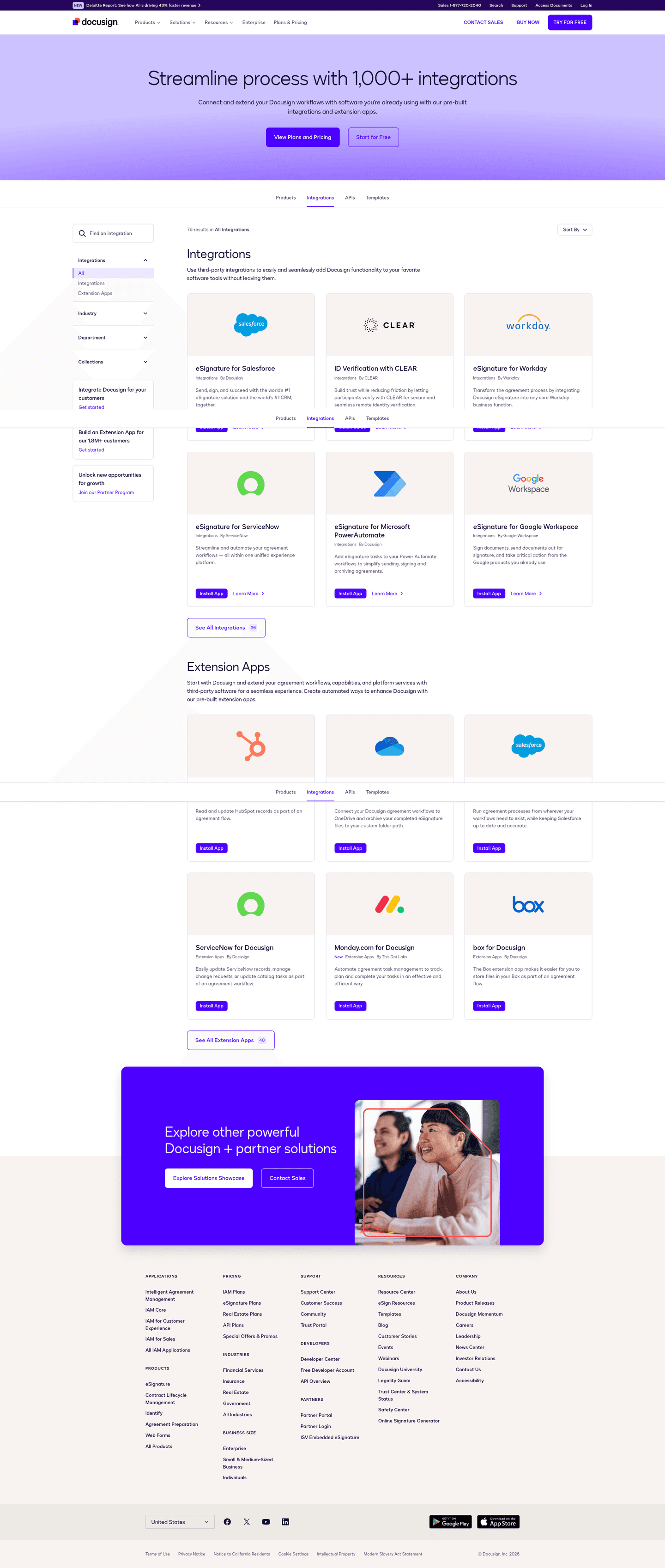
What the primary button asks for
- Sign up86 integrations pages
- Start a free trial75 integrations pages
- Request a demo66 integrations pages
- Contact sales23 integrations pages
- One ask, repeated 2 times down the page
- 68% close on a call to action band before the footer
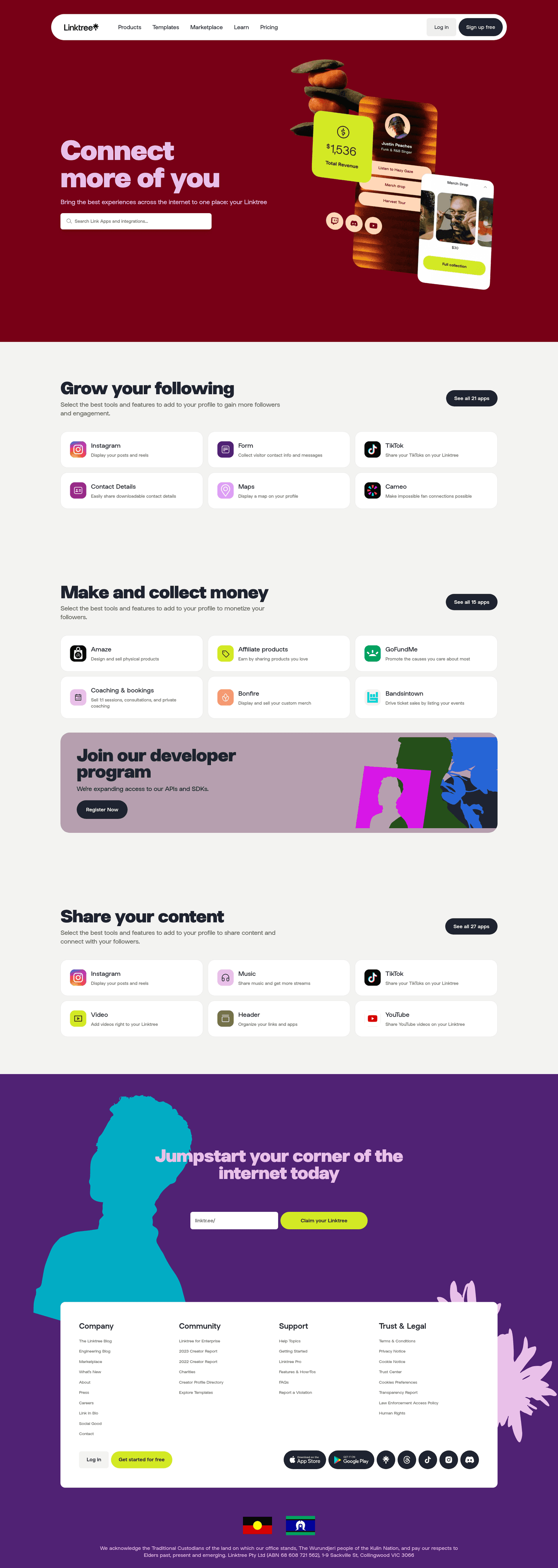
The moves almost nobody makes
These sit at the bottom of the list, with the strongest integrations page that makes each one.
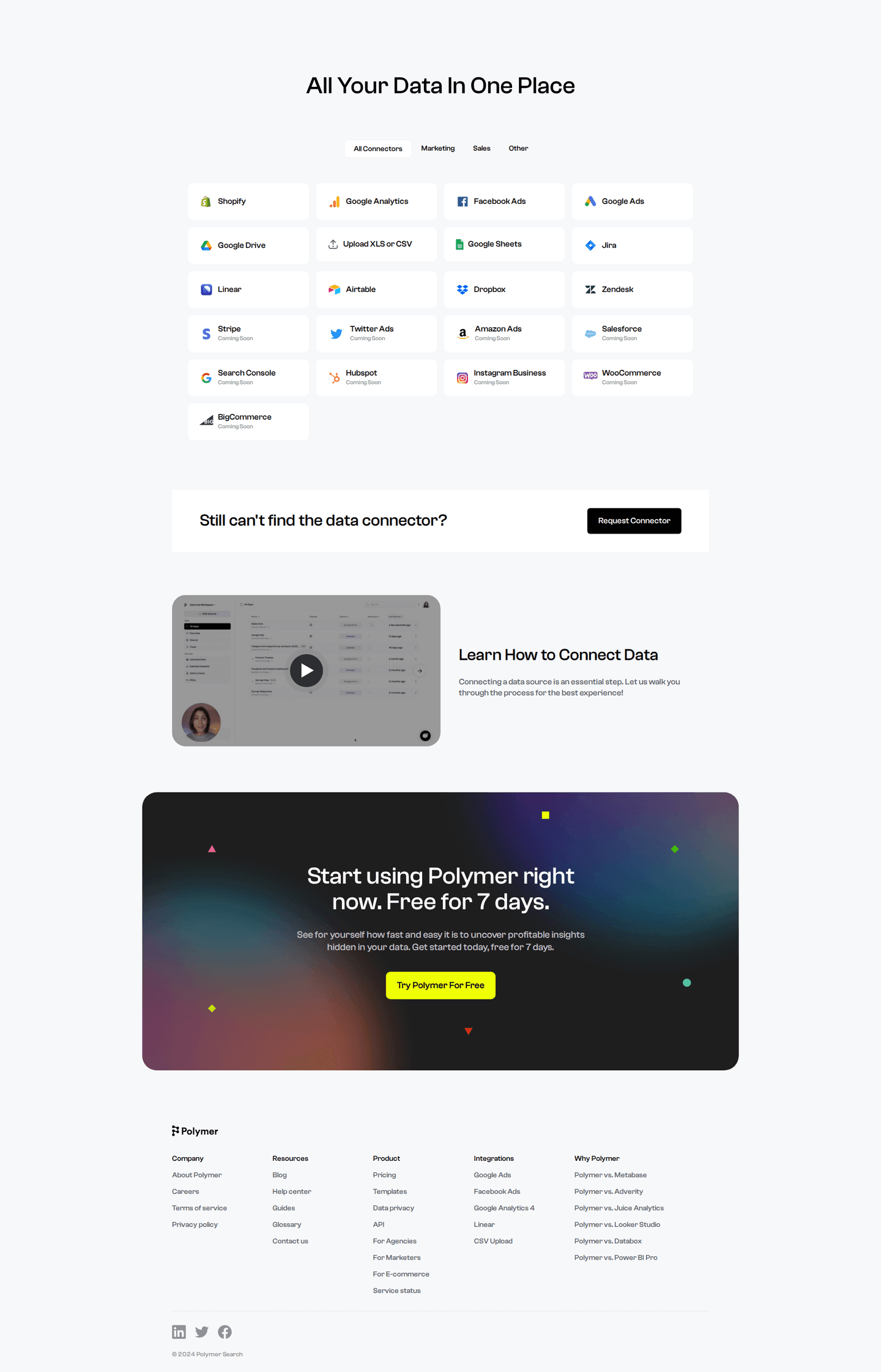
A button to request a missing integration
23% let a visitor ask for a tool that isn't there yet, which turns a dead end into a lead.
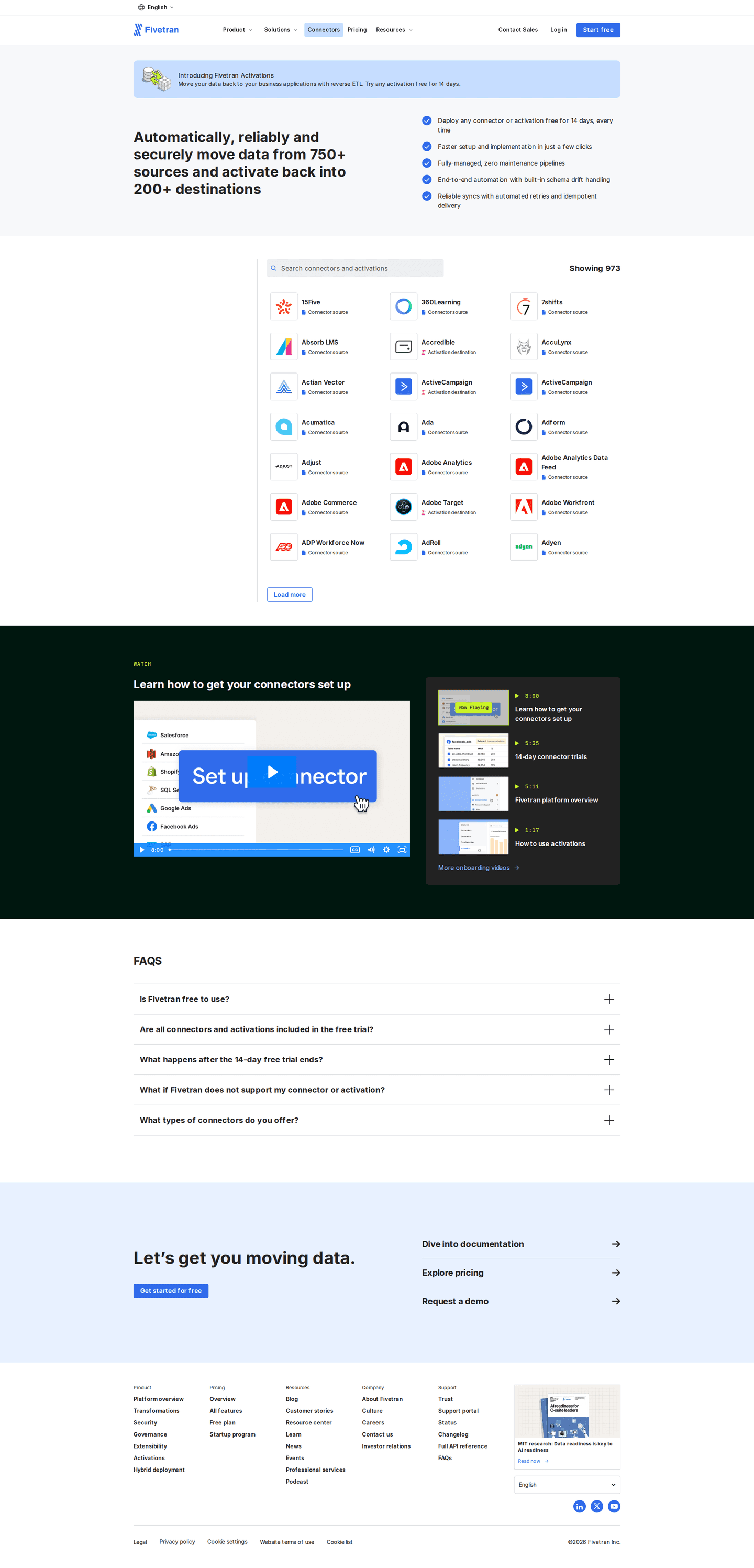
A video on how to connect
5% show a video of the setup, the shortest way to show what connecting takes.

Curated by
Gabriel Amzallag , Founder, Web Anatomy
5 years CRO + SEO at Qonto (2021–2025). After advising 15+ SaaS on their websites (Payfit, Pigment…), the same patterns kept breaking, so I decided to build the source of truth on what works on the web: the intelligence layer every tool, builder, and team uses to ship sites that perform.
Go further than integrations pages
Growth Engine
Your top 3 opportunities for more revenue.
We find every way to grow your website’s visibility and conversions: SEO, AI search (AEO), backlinks and mentions, and UX/UI. 3 free opportunities, delivered by email.
Library
The analysis behind every page here
Each integrations page on this page, section by section, with what works and what does not. Free account.
Didn't find the integrations page you were looking for?
Every other page type has its own gallery. Start from all page types.
- Homepages
- Pricing pages
- About pages
- Contact pages
- Feature pages
- Security pages
- Enterprise pages
- Industry pages
- Persona pages
- Why us pages
- Case study pages
- Comparison pages
- Blog pages
- Signup pages
- Webinar pages
- SEO landing pages
- Free tool pages
- PPC landing pages
- Careers pages
- Login pages
- 404 pages
- AI product pages
- Press pages
- Partner program pages
- Download pages
- Resource libraries
- Developer pages
- Solutions pages
- Template galleries
- Glossary pages
- Startup program pages
- Community pages
- ROI calculators
- Newsletter pages
- Programmatic SEO pages
- Blog posts
- Customer stories pages
- Alternatives pages
- Features overview pages
- Product tours
- AI agent pages
- Affiliate program pages
- Team pages
- Conference pages
Your top 3 opportunities for more revenue.
We find every way to grow your website’s visibility and conversions: SEO, AI search (AEO), backlinks and mentions, and UX/UI. 3 free opportunities, delivered by email.
Integrations page design, answered
The questions people ask before rebuilding an integrations directory, answered from 265 real ones.
What should an integrations page include?
01Four things show up on most of them: a logo on every tile (almost all), a link on every entry (about four in five), a line saying what each integration does (seven in ten), and a search box or filters (about half). Only about one in three states how many integrations there are in total.
Does an integrations page need a search box?
02About half have one, and it's the clearest split in the set: about four in five of the strongest fifth let a visitor search or filter, against about one in seven of the weakest. A long wall of logos with no way to search it is the weak pattern.
Should integrations be grouped into categories?
03About half split the list into named groups such as CRM, analytics or communication, and a bit over half put a handful of featured integrations ahead of the full list. Categories are far more common on the strongest pages: about seven in ten, against about one in three of the weakest.
What should a directory offer when a tool is missing?
04About half point to an API, about two in five offer Zapier, Make or a similar connector, and fewer than one in five mention webhooks. About one in four let a visitor request an integration that does not exist yet.
What should the button on an integrations page ask for?
05A signup leads at about a third, with a free trial and a demo close behind at under three in ten each. Fewer than one in ten send the visitor to sales.
How is this different from the best landing pages leaderboard?
06This gallery is a visual browse: what integrations pages look like and what they contain. The best landing pages benchmark is the graded view, where pages are scored against conversion best practices and ranked by industry. Same companies, different question.