5 years CRO + SEO at Qonto (2021–2025). After advising 15+ SaaS on their websites (Payfit, Pigment…), the same patterns kept breaking, so I decided to build the source of truth on what works on the web: the intelligence layer every tool, builder, and team uses to ship sites that perform.
“Approachable design for a high-trust workflow. The page balances warmth with practicality, pairing clear product framing with reassurance for visitors who need to feel confident about sensitive payroll operations.”
What makes this page stand out
"Join 400,000+ small and medium-sized businesses that take care of their people with Gusto" — massive social proof number with clear ICP callout (SMBs).
Dual CTAs "Create free account" and "How Gusto works" accommodate ready-to-buy and research-phase visitors.
Clean, teal-accented design conveys trustworthiness appropriate for a payroll/HR product handling sensitive data.
Navigation targeting both Businesses and Accountants signals a partner-driven growth strategy.
Section we love
·Hero
1Massive bold headline (Payroll, HR, benefits. Simplified.) states 3 product categories in 4 words
2Social proof (Join 300,000+ small and medium-sized businesses) doubles as audience targeting
3Dual CTAs (How Gusto works) and (Create account) serve both research and signup intent
4Ultra-clean layout with generous whitespace lets the headline dominate without distraction
03
TaxGPT, An AI tax assistant built for accuracy and explainability.
5 years CRO + SEO at Qonto (2021–2025). After advising 15+ SaaS on their websites (Payfit, Pigment…), the same patterns kept breaking, so I decided to build the source of truth on what works on the web: the intelligence layer every tool, builder, and team uses to ship sites that perform.
“Credibility-first presentation that stays focused on reducing perceived risk. The page reads like a careful case for trust in AI, using straightforward language and transparency cues to support the promise.”
What makes this page stand out
Natural language tax question answering makes tax knowledge accessible to non-experts
Real-time tax law updates ensure accuracy in a constantly changing regulatory environment
Professional and consumer versions address both tax preparers and individual filers
Source citation and explanation transparency build trust in AI-generated tax advice
Section we love
·Features
1Benefit-led headline (TaxGPT remembers, so you dont have to) leads with the outcome instead of a feature name
2Pain-to-outcome mapping ties manual context-gathering to research that auto-incorporates full client history
3Tabs (Client Profiles, Document Management) reveal secondary capabilities without crowding the active view
4Entity Summary panel showing Tax Year 2024 and 2023 files makes the product output concrete and credible
5Learn more link plus AICPA SOC badge add a deeper exploration path and trust right next to Get access
04
PayFit, Payroll and HR automation that’s ready to run.
5 years CRO + SEO at Qonto (2021–2025). After advising 15+ SaaS on their websites (Payfit, Pigment…), the same patterns kept breaking, so I decided to build the source of truth on what works on the web: the intelligence layer every tool, builder, and team uses to ship sites that perform.
“Crisp, conversion-oriented layout built for busy operators. It keeps momentum with clear sequencing, strong reassurance, and parallel paths for self-serve sign-up versus demo-led evaluation.”
What makes this page stand out
"LOGICIEL DE PAIE ET RH" category label above the headline immediately establishes the product category
"Fiable, rapide, automatisé et accessible à tous" (Reliable, fast, automated, and accessible to all) four-attribute sub-headline addresses key buyer concerns
4.5/5 rating among 20,000+ enterprises provides strong social proof with both quality and quantity metrics
Dual CTA (Essayez maintenant + Demandez une démo) serves both self-serve and guided buyer journeys
Section we love
·How It Works
1Three numbered cards frame it as payroll sorted in 3 simple steps, each with a real product screenshot
2Effort framing is strong: plug in your numbers and watch payslips instantly update right up till payday
3Step 3 includes a dated timeline (21, 26, 28 June) for prep, closing and payslips sent to employees
4Outcome preview is concrete: run payroll, review payments, and a breakdown of everything due from HMRC
5The mockups show actual flows (add a bonus, approve pay elements) so the progression stays visual
05
Qonto, Business banking with transparent plans and modern tools.
5 years CRO + SEO at Qonto (2021–2025). After advising 15+ SaaS on their websites (Payfit, Pigment…), the same patterns kept breaking, so I decided to build the source of truth on what works on the web: the intelligence layer every tool, builder, and team uses to ship sites that perform.
“Minimal, regulated-feeling fintech design that leans on clarity over hype. The all-in-one story stays cohesive through consistent product proof and straightforward pricing that supports fast comparison.”
What makes this page stand out
European banking foundation with regulatory compliance provides institutional trust for a fintech challenger
Clean, modern interface and transparent pricing differentiate from traditional banking aesthetics and opaque fee structures
500,000+ business customers social proof demonstrates massive European fintech market traction
Dual CTA serving both self-serve and enterprise buyer motions enables efficient conversion paths
Section we love
·Value PropositionBest in class
1Two distinct props side by side: Rated & recommended and Secure & regulated, each with its own icon
2Concrete proof numbers: 600,000+ clients, support in 5 languages, 7 days a week
3Security mechanism named: licensed Payment Institution plus 3D-Secure and Strong Customer Authentication
4Each prop ends with a deep-dive link (Read our reviews, Learn about account safety) for proof-seekers
06
Hyperline
63/100
What makes this page stand out
The product shortcuts list CPQ, Billing, and Usage-based with two-line benefit blurbs under each link.
Customer logos appear above the fold and a G2 link shows ★★★★★ and “4.9/5”.
The feature grid quantifies credibility with “< 10 min” support, “100+ countries” compliance, and “99.997% uptime”.
The Integrations section promises “one source of truth” and shows app icons on a black background with “Discover integrations” CTA.
Section we love
·Testimonial
1Recognizable customer logos (Formance, lemlist, Gladia) sit at the top of each card to borrow their credibility
2Each card links to a full Case study, signaling depth beyond a one-line quote
3Use-case-specific headlines (manage custom pricing, handle pay-as-you-go billing) tie the proof to concrete billing problems
4The lemlist card frames a transformation (shift from PLG to Enterprise deals) making the before and after state tangible
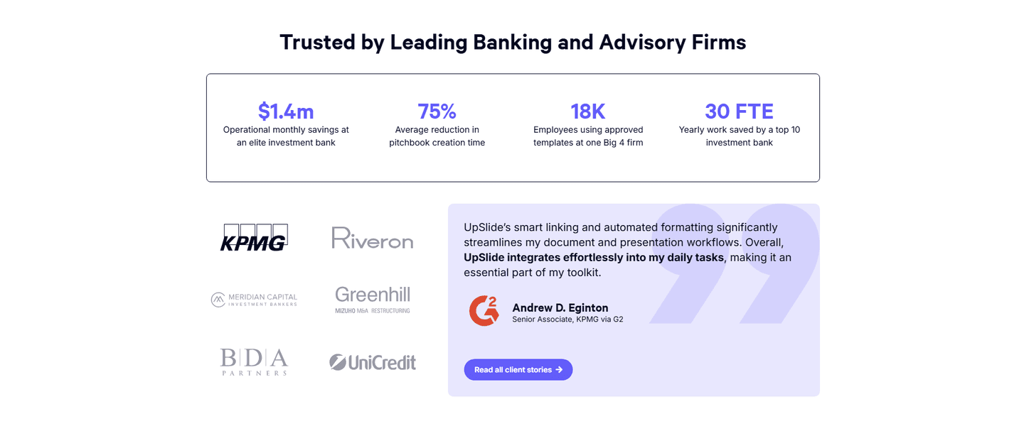
See how your page compares to the 52.4 average page score
Run a diagnostic on your fintech page and get a section-by-section breakdown of what to fix first to improve clarity, trust, and product proof.
Design patterns we see across high-performing fintech pages
Across 43 fintech pages reviewed, the pages that convert tend to make the first screen do one job: state a clear promise and remove obvious doubt.
The strongest patterns pair specific, outcome-led claims with single-focus layouts, then back those claims with proof that feels easy to verify for a first-time visitor, especially important in fintech UX design where perceived risk is high. Use website section examples to compare how these building blocks show up across page types.
1One dominant button (GET STARTED FOR FREE) with no competing links keeps the action clear
2Reassuring microcopy (Try Origin for free, then $12.99/month or $99/year) sets price upfront and lowers risk
3Real app UI in a phone mockup shows the net worth dashboard with assets and liabilities so users see what they get
4Action verb CTA paired with the question headline (Ready to manage your money) nudges a yes
Reviewed design-pattern pick from Origin’s cta section.
What I love about this section
One dominant button (GET STARTED FOR FREE) with no competing links keeps the action clear
Reassuring microcopy (Try Origin for free, then $12.99/month or $99/year) sets price upfront and lowers risk
Real app UI in a phone mockup shows the net worth dashboard with assets and liabilities so users see what they get
Action verb CTA paired with the question headline (Ready to manage your money) nudges a yes
Overlooked sections that quietly drive clarity and trust
In this set, navigation and other “utility” sections often do more conversion work than teams expect: they shape product understanding, reduce decision friction, and keep regulated messaging consistent as visitors explore.
The biggest gaps usually appear where the page should explain the company story and credibility in plain language. When those sections are thin, the hero gets forced to do all the trust work, and visitors are left guessing about fit.
1Head-to-head bar chart puts Leni at 91.25% against Shortcut.ai, Claude Opus 4.6, Copilot in Excel and ChatGPT Agent
2Five independent benchmark tabs (SpreadsheetBench, GAIA, SlidesBench, DRACO, Bullshit Bench) let buyers verify each claim
3Independently evaluated framing plus named benchmarks signals third-party data, not self-reported marketing numbers
4Exact percentage scores beside every competitor make the gap concrete and scannable in one glance
Reviewed overlooked-section pick from Leni’s comparison section.
What I love about this section
Head-to-head bar chart puts Leni at 91.25% against Shortcut.ai, Claude Opus 4.6, Copilot in Excel and ChatGPT Agent
Five independent benchmark tabs (SpreadsheetBench, GAIA, SlidesBench, DRACO, Bullshit Bench) let buyers verify each claim
Independently evaluated framing plus named benchmarks signals third-party data, not self-reported marketing numbers
Exact percentage scores beside every competitor make the gap concrete and scannable in one glance
Use the examples below as prompts for what to standardize, not just what to redesign.
Checklist: a practical audit for fintech website design
If you’re iterating on a fintech homepage design, this checklist helps you spot missing sections and messaging gaps quickly, especially around Value Proposition, Hero, and Cta.
Built from 126 sections across 30 fintech homepages in this June 2026 benchmark. Each check below is a move the highest-scoring pages share, each paired with a real example from the benchmark.
Hero
Can a skeptical buyer tell what you do in five seconds?
The hero makes it instantly clear what the product is and who it's for.
Example: Rippling's headline "Manage your entire workforce on one system" pairs a "Create free account" field with a "Take a product tour" path.
The real product shows above the fold.
Example: Spendesk opens on an "Integrated budgeting" interface with a Marketing Budget progress bar, and Bestow shows real dashboard and mobile UI.
Proof is visible before the first scroll.
Example: PayFit shows logos for marshmallow, UniDAYS, MUJI, and Huel, and Ramp runs a logo bar with Visa, Stripe, and Shopify above the fold.
Value proposition
Is the value concrete, or just adjectives?
Benefits are specific.
Example: Qonto runs two precise props side by side, "Rated and recommended" and "Secure and regulated," each with its own icon.
The promise is quantified with a number or a timeframe.
Example: Deel anchors its props with "150+ currencies" and "2,000+ local experts," and Finary cites "setup in 5 minutes" and "800,000+ users."
Features
Do features connect to outcomes the buyer cares about?
Feature copy leads with the outcome.
Example: TaxGPT leads with the outcome, "TaxGPT remembers, so you don't have to," mapping manual digging to "context-aware answers."
Each feature maps a real pain to a measurable result.
Example: UpSlide pairs outcome headlines like "Accurate Data Every Time" with pain framing such as "Say Goodbye to pls fix at 2am."
Call to action
Does the next click feel safe to a cautious buyer?
One primary action dominates, with action-led copy.
Example: Ruul lets one bold "Open an account" button own the block with no competing CTA.
Reassuring microcopy sits next to the button.
Example: Shine pairs its CTA with "First month free, Opens in 5 minutes, No commitment," and Origin notes "Try Origin for free, then $12.99/month."
The gap most fintech pages leave open is pricing.
Pricing is the rarest section in the fintech set. Of 30 companies benchmarked, only five expose a pricing block clear enough to score. The ones that do make the cautious buyer's job easy. PayFit lines up three named plans side by side with stacked feature lists, so a visitor can compare without booking a call. Pages that bury pricing behind "contact sales" leave the cheapest trust on the table.
Run it on your current page, then decide what to rewrite, what to reorder, and what proof to add before you touch visual polish. Score your own page against the same framework below, or try our landing page analyzer for a faster baseline.
Interactive quiz
What would your fintech homepage score?
Question 1 of 5
0%
Can a fintech buyer identify what you do in under 5 seconds?
"Embedded lending for SaaS platforms" beats "unlock growth with capital solutions."
Reviewed by
Gabriel Amzallag , Founder, Web Anatomy
5 years CRO + SEO at Qonto (2021–2025). After advising 15+ SaaS on their websites (Payfit, Pigment…), the same patterns kept breaking, so I decided to build the source of truth on what works on the web: the intelligence layer every tool, builder, and team uses to ship sites that perform.
Quick answers based on our fintech website benchmark dataset.
What are the best fintech websites?
[01]
The strongest performers in this June 2026 benchmark are Ramp, Deel, Gusto, PayFit, and Qonto, with TaxGPT standing out on AI-tax credibility. Across 43 fintech homepages scored against 60+ criteria, these pages convert by pairing an economic promise with fast proof: Ramp's two-minute signup with animated walkthroughs, Deel's single global-workforce narrative, and Qonto's transparent plan comparison.
What makes fintech websites harder to convert than generic SaaS pages?
[02]
Fintech buyers arrive skeptical and will not click until they see trust baked into the offer. Across 43 homepages reviewed, the pages that convert make the value claim specific and verifiable: Ramp leads with concrete savings numbers and recognizable partner logos, Gusto balances warmth with reassurance for sensitive payroll, and TaxGPT uses plain language and transparency cues to make the AI tax case defensible.
What is the biggest design mistake on fintech homepages?
[03]
Leading with polished branding while delaying concrete proof of legitimacy. The average page in this June 2026 benchmark scored 52.4. Top performers answer "why trust you?" in the hero: Ramp shows quantified partner value, PayFit sequences self-serve and demo paths for busy operators, and Qonto leans on minimal regulated design with straightforward pricing instead of hype.
What sections should a fintech homepage include?
[04]
A hero with one primary action, an early trust layer (logos, compliance cues, or transparent pricing), a how-it-works or product overview, features tied to financial outcomes, and a clear next step like a free trial or demo. Ramp and Deel stack these well. Ramp replaces a demo form with a free trial, and Deel routes intents without overwhelming. Across 43 pages, the ones that skip the trust layer lose buyers before they reach features.
How many fintech examples do I need to review before redesigning?
[05]
Three to five is enough if you pick by fintech segment and compare section by section. Only 2% of pages in this benchmark score in the top tier, so the gap is concentrated in a few blocks. Study Ramp for spend management, Deel for global payroll, Gusto for SMB warmth, TaxGPT for AI credibility, and Qonto for regulated business banking.
Where can I find great inspiration for my fintech website?
Use a structured rubric that checks clarity, trust, and friction instead of relying on subjective feedback. Run your page through the landing page audit for a section-by-section score against the same 60+ criteria used in this benchmark.