Conference landing page examples (17)
A conference landing page sells a named event, in person or online, often from its own site. Its job is to answer when, where and who, then sell the ticket or the seat. See 17 real examples.
Showing 1–17 of 17 conference pages
How to build a conference landing page, by the numbers
The questions a team asks when it designs a conference or summit page, answered from the 17 here. Single online sessions have their own gallery.
What goes in the first screen?
- The date on 71%
- The place on 82%
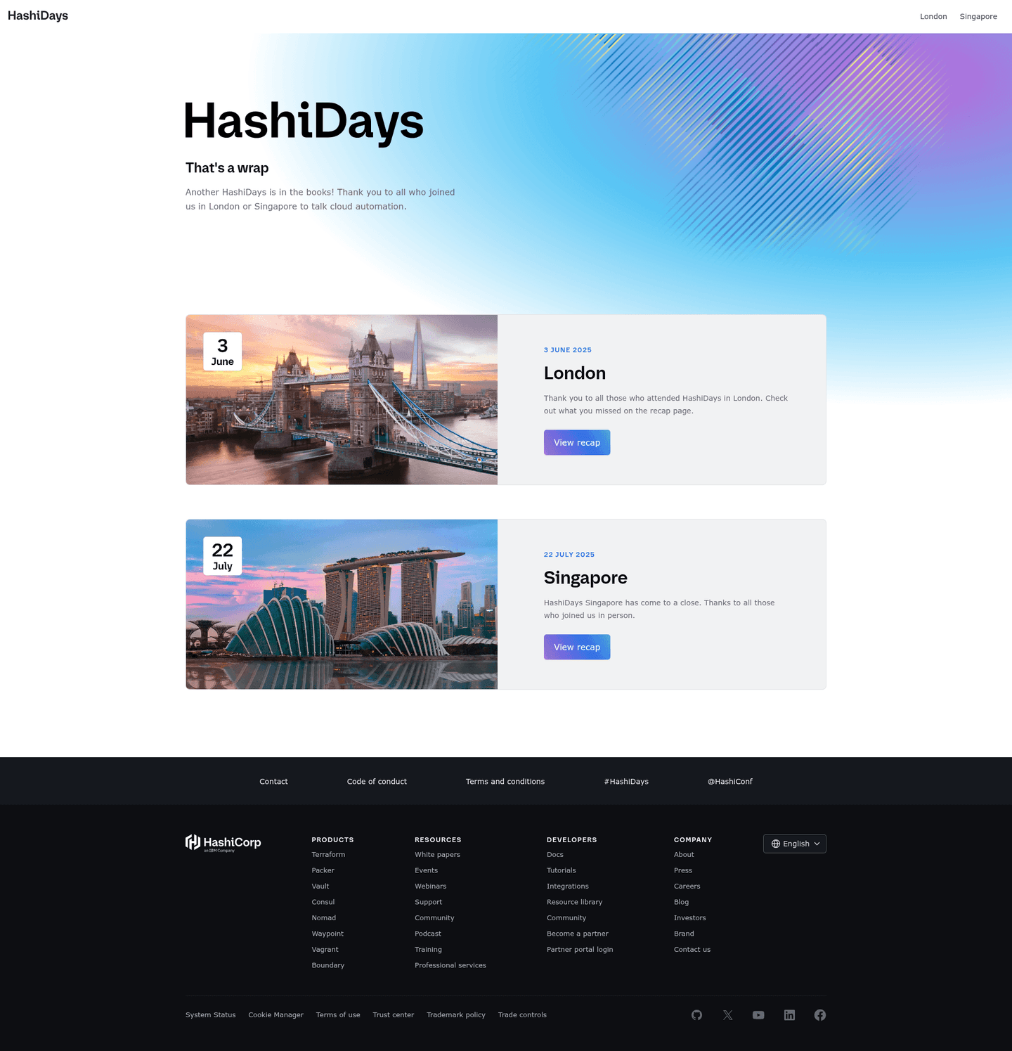
In person, online or both?
How the conferences run
- In person11 conference pages
Most are in person. An online event can put the registration form right in the first screen, since there is no trip to plan.

Should the page show the ticket price?
35% state what a ticket costs. Showing it next to the dates lets a visitor ask for the budget without writing to anyone.

Who is speaking, and when?
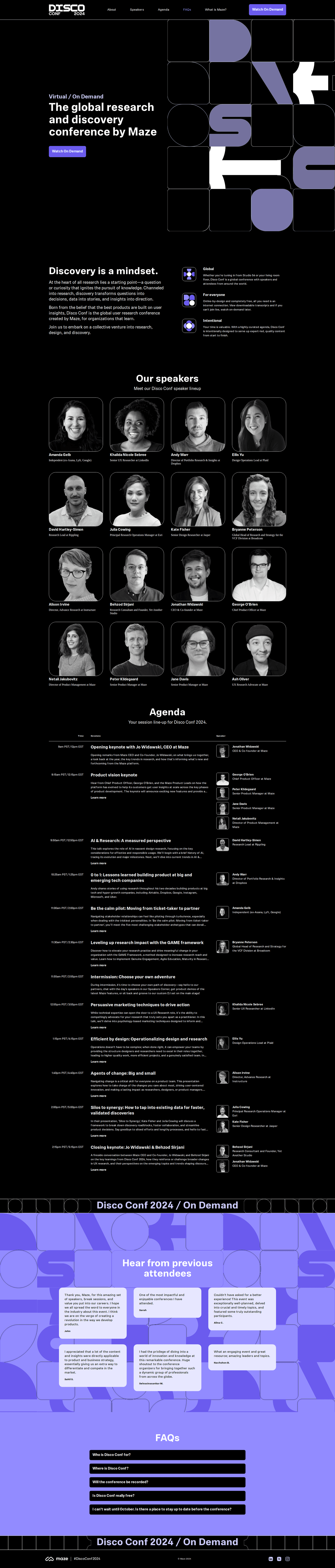
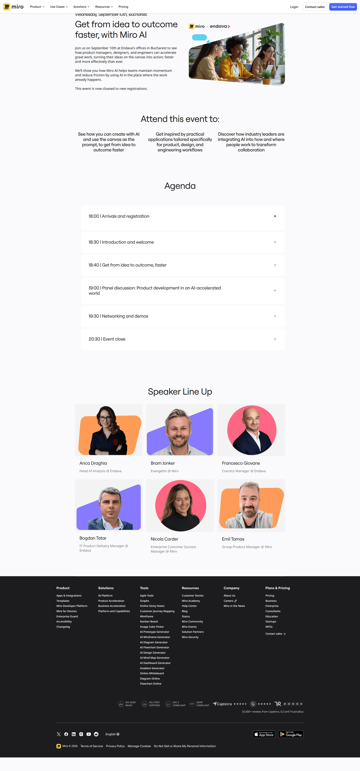
- Named speakers on 41%
- A published agenda on 41%
How do you prove the event is worth it?
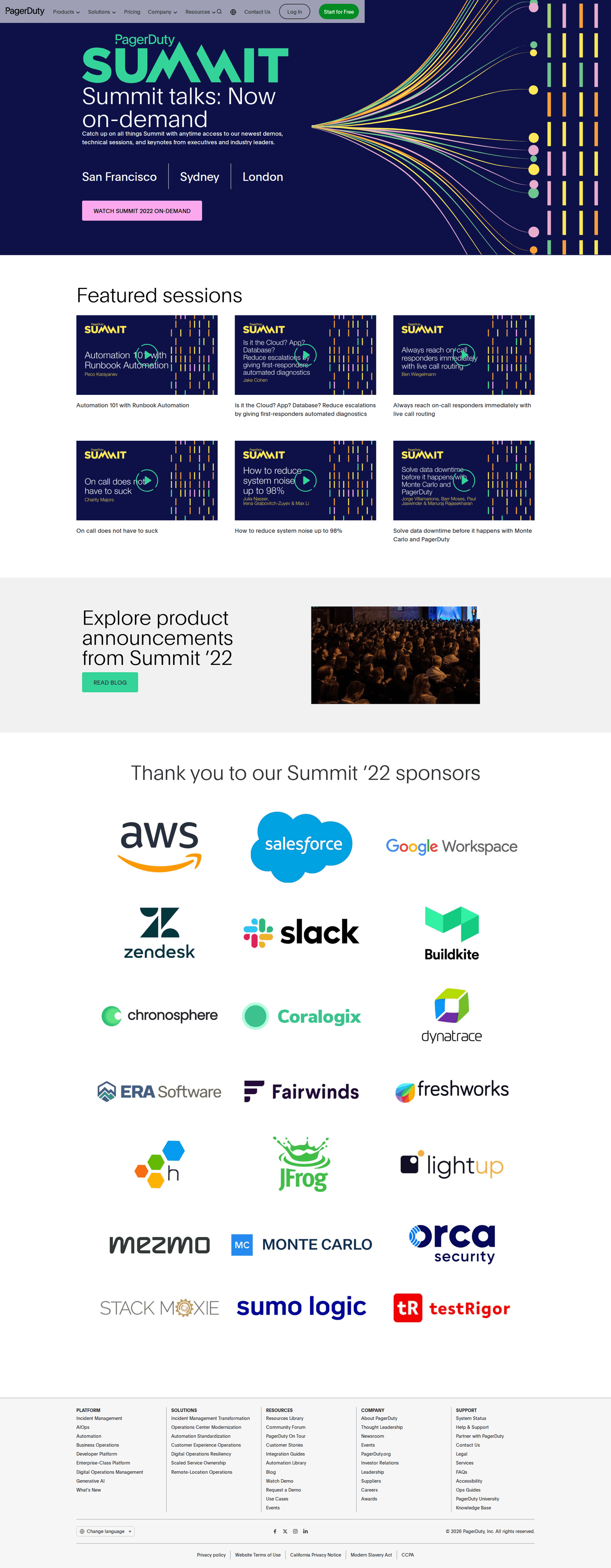
35% show photos, recordings or numbers from earlier editions.
The moves almost nobody makes
Each sits under 15% of the market, with the strongest conference page that uses it.
An early-bird deadline
6% put a dated early-bird price on the page, and 6% say how many seats there are. Both give a visitor a reason to buy now rather than later.


Curated by
Gabriel Amzallag , Founder, Web Anatomy
5 years CRO + SEO at Qonto (2021–2025). After advising 15+ SaaS on their websites (Payfit, Pigment…), the same patterns kept breaking, so I decided to build the source of truth on what works on the web: the intelligence layer every tool, builder, and team uses to ship sites that perform.
Go further than conference pages
Growth Engine
Your top 3 opportunities for more revenue.
We find every way to grow your website’s visibility and conversions: SEO, AI search (AEO), backlinks and mentions, and UX/UI. 3 free opportunities, delivered by email.
Library
The analysis behind every page here
Each conference page on this page, section by section, with what works and what does not. Free account.
Didn't find the conference page you were looking for?
Every other page type has its own gallery. Start from all page types.
- Homepages
- Pricing pages
- About pages
- Contact pages
- Feature pages
- Integrations pages
- Security pages
- Enterprise pages
- Industry pages
- Persona pages
- Why us pages
- Case study pages
- Comparison pages
- Blog pages
- Signup pages
- SEO landing pages
- Free tool pages
- PPC landing pages
- Careers pages
- Login pages
- 404 pages
- AI product pages
- Press pages
- Partner program pages
- Download pages
- Resource libraries
- Developer pages
- Solutions pages
- Template galleries
- Glossary pages
- Startup program pages
- Community pages
- ROI calculators
- Newsletter pages
- Programmatic SEO pages
- Blog posts
- Customer stories pages
- Alternatives pages
- Features overview pages
- Product tours
- Integration pages
- AI agent pages
- Affiliate program pages
- Team pages
Your top 3 opportunities for more revenue.
We find every way to grow your website’s visibility and conversions: SEO, AI search (AEO), backlinks and mentions, and UX/UI. 3 free opportunities, delivered by email.
Conference landing page design, answered
The questions people ask before building a conference or summit page, answered from 17 real ones.
What should a conference landing page show first?
01The date and the place. About three in four show the date and about four in five the city or venue. The pages that skip one often do so because the event has several cities or has already happened.
Should a conference page show the ticket price?
02Only about one in three do. Most send the visitor to a registration form first, or the event is free or by invitation. An early-bird deadline is rarer still: almost none show one.
Should the page name the speakers and publish the agenda?
03Fewer than two in five do either. The ones that do usually show a photo grid of speakers with names and titles, then the schedule by day.
Should a conference be in person, online or both?
04About two in three in the set are in person only. Online only and hybrid split the rest about evenly, at roughly one in six each.
How does a conference page prove the event is worth it?
05About two in five show something from past editions: photos of the crowd, recordings of last year's talks, or attendee numbers. It is the closest thing an event has to customer proof.
How is this different from the best landing pages leaderboard?
06This gallery is a visual browse: what conference pages look like and what they contain. The best landing pages benchmark is the graded view, where pages are scored against conversion best practices and ranked by industry. Same companies, different question.