Best Lead Generation Landing Pages (And Why They Convert)
We scored 33 lead gen landing pages on 60+ conversion criteria. See which sections separate the top performers, and what your page is probably missing.
What high-performing lead generation landing pages get right
Lead gen pages have to convince visitors that the tool will deliver real pipeline, not just more contacts. The strongest pages in this benchmark do four jobs early:
53.1/100
Avg. page score
Show the product generating real leads so the promise feels operational instead of abstract. Pages that structure information clearly outperform those that rely on dense feature lists.
Stack proof before the ask. Pair quantified outcomes with recognizable names so the visitor trusts the numbers before clicking.
Make the first step feel instant with specific CTA language, risk reducers (free trial, no credit card), and supportive microcopy that removes friction from the signup moment.
Turn a complex product into a simple story. Numbered steps and transformation diagrams reduce perceived complexity and help visitors picture the path from signup to pipeline.
6 best lead generation landing pages analyzed in detail
Each company below is paired with its strongest section and scored across 60+ conversion criteria. See what they get right, and what you can borrow.
01
VC Boom
Editor's pick81/100
What makes this page stand out
The hero stacks credibility and scale: “✓ 792 founders · $95M+ raised” plus “Your 100 right-fit investors out of 47,000.”
The primary CTA “Score my deck free →” is paired with a secondary “See a sample score” to reduce uncertainty.
The page visualizes outcomes with app-style widgets showing “71/100” scoring and investor matches like “First Round Capital 94% match.”
The trust section names specific logos (Google, Microsoft, Kleiner Perkins, Accel, Y Combinator, Sequoia) and shows founder faces plus raise amounts.
Section we love
·Testimonial
1Hard numbers everywhere (deck score 64 to 87, $1.2M seed closed) make the social proof verifiable
2Before and after story (why you became how fast can we move) frames the product as the turning point
3Per-category score bars (Market Opportunity 68 to 89, Ask Clarity 65 to 89) highlight exactly what improved
4Tabbed founders at different round sizes ($1.2M, $5M, $3M, $750K, $500K) show it works across deal stages
5Full case-study depth (named MD, company, quote, profile, LinkedIn link) ties the win to a real person
02
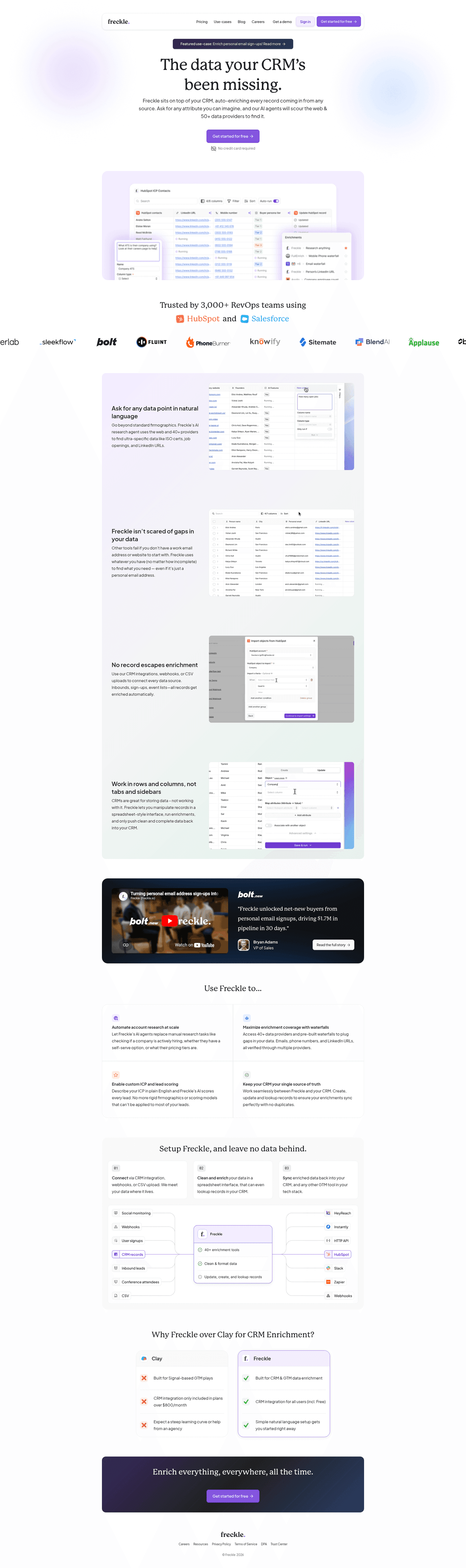
Freckle, Data enrichment that turns raw sign-ups into scored, enriched profiles in three steps.
5 years CRO + SEO at Qonto (2021–2025). After advising 15+ SaaS on their websites (Payfit, Pigment…), the same patterns kept breaking, so I decided to build the source of truth on what works on the web: the intelligence layer every tool, builder, and team uses to ship sites that perform.
“Freckle's how_it_works section (scored 100) maps the journey from raw sign-up to enriched profile using bold action verbs (Import, Clean and enrich, Sync) alongside a data flow diagram showing email-to-enriched-profile transformation. Multiple import options (CRM, webhooks, CSV) make integration feel frictionless.”
What makes this page stand out
The clear product explanation — sits on top of your CRM, auto-enriches every record from any source — makes the integration model instantly understandable for RevOps buyers
"Ask for any attribute you can imagine" positions the AI enrichment as limitless and flexible, differentiating from rigid enrichment tools that only provide pre-defined data fields
50+ data providers aggregated into a single enrichment layer creates a genuine data breadth advantage over tools that rely on a single proprietary database
Product screenshot showing real HubSpot integration with enrichment in action makes the value tangible — buyers can immediately see how Freckle fits into their existing workflow
Section we love
·Cta
1Single dominant CTA (Enrich 2.5k sign-ups for free) with no competing buttons keeps the action focused
2Outcome-driven copy names a concrete deliverable (enrich 2.5k sign-ups) so the visitor knows exactly what they get
3The word free in the button lowers the commitment barrier right at the decision point
4Real product UI (enriched sign-ups table with LinkedIn, persona, job title, company columns) shows the actual output
03
Perspective, Lead generation funnel builder that educates before it sells, with layered resources for every stage.
5 years CRO + SEO at Qonto (2021–2025). After advising 15+ SaaS on their websites (Payfit, Pigment…), the same patterns kept breaking, so I decided to build the source of truth on what works on the web: the intelligence layer every tool, builder, and team uses to ship sites that perform.
“Perspective's resources section (scored 60) offers three resource types (community, crash course, and academy) with a named team member adding personal trust. A wider bottom card creates visual priority for the most important resource, guiding attention without overwhelming the page.”
What makes this page stand out
"Easily create mobile-first, interactive, and personalized lead gen and sales funnels with market-leading conversion rates in just 30 minutes" packs multiple differentiators into one sentence: mobile-first, interactive, personalized, fast time-to-value.
"No design or coding skills required" removes the primary adoption barrier for the target audience (SMBs and agencies).
"Create free funnel in 30 min" CTA is brilliantly specific — the time commitment sets concrete expectations and makes the action feel achievable.
Dual review scores (G2 4.9, OMG 4.8) provide exceptionally high ratings that build immediate trust, complemented by "1k+ growth community" showing ecosystem engagement.
Section we love
·Resources
1Heading Not sure where to start meets beginner anxiety and routes new users to the right resource
2All three resources (Community, Funnel Crash Course, Marketing Academy) center on funnel marketing, Perspective's core use case
3Original formats like a 60-minute live crash course and an Academy led by Head of Content Leni build real authority
4Each card carries a Learn more CTA that links into the deeper resource
04
Synapsa, AI-powered lead generation platform that proves scale with real dashboard data and invites comparison.
5 years CRO + SEO at Qonto (2021–2025). After advising 15+ SaaS on their websites (Payfit, Pigment…), the same patterns kept breaking, so I decided to build the source of truth on what works on the web: the intelligence layer every tool, builder, and team uses to ship sites that perform.
“Synapsa's navbar (scored 100) leads with a product dashboard screenshot showing 2,420 conversations and 1,762 leads. AI-prefixed features differentiate from legacy tools, while a Compare tab lets visitors evaluate competitors without leaving the page.”
What makes this page stand out
The "AI Sales Agent" category is simple and immediately understood: this isn't a copilot or assistant, it's an autonomous agent that handles outreach end-to-end
Differentiation against traditional SDR tools is clear: while competitors help humans sell faster, Synapsa replaces the manual outreach workflow entirely with AI-driven execution
The value proposition for lean sales teams (startups, SMBs) is compelling: enterprise-grade outbound capability without hiring a team of SDRs
Personalization at scale — the core promise — addresses the fundamental tension in outbound sales: you can send volume OR you can personalize, but doing both requires AI
Section we love
·Problem
1Quantified pain (for every 10 buyers who show interest, 7 never reach a conversation) makes the leak feel real
2Persona-specific framing speaks to sales reps who cannot tell good leads from bad ones until they are on the call
3Cost of inaction is concrete: paying for traffic that converts to nothing and warm leads choosing a competitor
4Emotional language (deals die, good leads get ignored, the system is broken) names the daily frustration
05
Mailwarm
74/100
What makes this page stand out
The hero headline “Email warmup tool to avoid the spam folder” pairs with the blunt subline “Don’t land in spam anymore.”
The hero uses two CTAs—“Start Email Warmup” and “Talk to an Email Expert”—covering self-serve and assisted paths.
The “Mailwarm Warming Process” section visualizes results with large percentages like “Opens 75%” and “Reputation 88%.”
The trust layer stacks a Y Combinator logo, a Product Hunt top-post badge, and “Trusted by 10,000+ teams” plus brand logos.
Section we love
·How It Works
1Three numbered steps (Sign Up Now, Link your email account, Start the email warmer) each carry a one-line description
2Low-effort framing (Ready in Minutes, Easy 2-min setup, Get started in seconds) shrinks perceived friction before signup
3Concrete 2-min timeline sets a clear expectation for how fast warmup goes live
4Inline Create Account form with a Continue button lets visitors start the moment the process feels easy, with a hand-drawn arrow guiding the eye to it
06
ZoomInfo, Sales intelligence that pairs massive third-party proof with a direct revenue promise.
5 years CRO + SEO at Qonto (2021–2025). After advising 15+ SaaS on their websites (Payfit, Pigment…), the same patterns kept breaking, so I decided to build the source of truth on what works on the web: the intelligence layer every tool, builder, and team uses to ship sites that perform.
“ZoomInfo's hero section (scored 56) anchors credibility with a G2 badge citing 8,000+ reviews and 5 stars, then drives action with a red Free Trial button against a dark background. The positioning ("B2B data and software") is direct, tying the product to a revenue promise.”
What makes this page stand out
The "#1 GTM Platform" claim in the page title is bold category ownership — supported by G2 Grid leadership and Forrester Wave recognition
Social proof is exceptionally well-quantified: 35,000+ customers, 54% increase in customer engagement (Seismic), 43% more likely qualified pipeline, 4x pipeline growth, 40% increase in closed-won deals
The role-based solution navigation (Sales Development, Account Executive, Account Management, RevOps, Demand Generation) shows deep ICP understanding and personalized messaging paths
Named customer testimonials with specific titles and companies (Seismic CBO, Spekit RevOps Manager) add credibility through executive-level social proof
Section we love
·Hero
1G2 badge with 8,000+ reviews and 5 stars provides massive third-party validation
2Red Free Trial button on dark background creates the highest possible contrast for the CTA
3B2B data and software subtext clearly positions ZoomInfo as a sales intelligence platform
4Grow Yours headline combined with connect and close your most valuable buyers promises revenue outcomes
See how your page compares to the 55.3 average page score
Run a diagnostic on your lead gen page and get a section-by-section breakdown of what to fix first to improve clarity, proof, and conversion flow.
Design patterns we see across high-performing lead generation pages
Across 25 lead generation landing pages reviewed, the pages that convert tend to make the first screen do one job: prove the tool delivers real leads, not just promise it.
The strongest patterns pair quantified outcomes with product visibility: showing dashboards with real numbers, transformation diagrams, and before-after metrics that make the value concrete before the visitor scrolls. Visual clarity separates the pages that convert from the pages that just look good. Use website section examples to compare how these building blocks show up across page types.
1Named customers (Cate McCafferty at HubSpot, Kalvin Richan at Forecastr) put real faces and titles on the proof
2Hard numbers stack up: 30 percent faster activation, 1,500+ app installs, 58 percent less implementation time
3The 4.8 G2 average from an independent review site adds third-party validation
4The 2.5x increase in onboarding capacity ties the product directly to a business outcome
5The customer logo row (Circle, ProjectWorks, KitchenSync) broadens the proof beyond a single vertical
Reviewed design-pattern pick from Arrows’s trust section.
What I love about this section
Named customers (Cate McCafferty at HubSpot, Kalvin Richan at Forecastr) put real faces and titles on the proof
Hard numbers stack up: 30 percent faster activation, 1,500+ app installs, 58 percent less implementation time
The 4.8 G2 average from an independent review site adds third-party validation
The 2.5x increase in onboarding capacity ties the product directly to a business outcome
Overlooked sections that quietly drive captures and pipeline
In this set, navigation and resource sections often do more conversion work than teams expect: they shape product understanding, enable competitive evaluation, and keep visitors engaged longer before the conversion ask.
The biggest gaps appear where the page should explain the lead generation process in plain steps. When How It Works sections are thin or missing, the hero gets forced to do all the trust work, and visitors leave without understanding how the tool actually generates leads. Comparison sections averaged just 25 in this benchmark, the weakest of any section type, suggesting most pages skip competitive positioning entirely.
1Free ebook on marketing automation maps directly to Brevo's core marketing platform audience
2Download the ebook CTA gates the guide behind a form, capturing leads from high-intent readers
3FREE EBOOK label plus a polished ebook mockup signals a substantive, original resource
4Single Download CTA sends visitors to a dedicated landing page to grab the guide
Reviewed overlooked-section pick from Brevo’s resources section.
What I love about this section
Free ebook on marketing automation maps directly to Brevo's core marketing platform audience
Download the ebook CTA gates the guide behind a form, capturing leads from high-intent readers
FREE EBOOK label plus a polished ebook mockup signals a substantive, original resource
Single Download CTA sends visitors to a dedicated landing page to grab the guide
Use the examples below as prompts for what to standardize, not just what to redesign.
Checklist: a practical audit for your lead gen landing page
If you are iterating on a lead generation page, this checklist helps you spot missing sections and messaging gaps quickly, especially around Testimonial, Hero, and CTA sections.
Run it on your current page, then decide what to rewrite, what to reorder, and what proof to add before you touch visual polish. For a faster baseline, you can also try our landing page analysis.
Built from 110 sections across 28 lead generation homepages in this benchmark. Each check below is a move the highest-scoring pages share, each paired with a real example from the benchmark.
Hero
Can a skeptical buyer tell what you do in five seconds?
The hero makes it instantly clear what the product is and who it's for.
Example: Breakcold names the category and the payoff in one line, "The CRM that kills admin work so you can sell more."
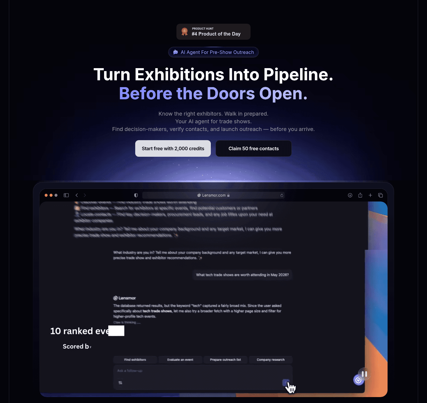
The hero promises an outcome.
Example: Lensmor opens on the result, "Turn exhibitions into pipeline, before the doors open," instead of describing the tool.
Proof is visible before the first scroll.
Example: Scout shows a real lead table with contacts at Microsoft, Salesforce, and Stripe in the first screen.
Trust
Does the page earn belief before it asks for anything?
Recognizable customer logos carry the trust strip.
Example: Surfe runs a "Trusted by top-performing sales teams" row with blue-chip logos like AWS, Google, and Personio.
The proof is quantified with real numbers.
Example: Mailchimp cites specific case-study stats, 632% ROI on SMS and 2.7x open rates versus Klaviyo.
Proof comes in more than one form.
Example: Arrows pairs named customers, Cate McCafferty at HubSpot and Kalvin Richan at Forecastr, with titles and faces.
Features
Do features connect to outcomes the buyer cares about?
Feature copy leads with the outcome.
Example: Mailchimp opens every card on a result, "Reach more customers with SMS," not a feature name.
Each feature shows the outcome.
Example: Ava frames blocks around results, "Put your CRM to work" and "Grow the accounts you already have."
Features map a real pain to a measurable result.
Example: HubSpot sets up the grid with the pain first, "Disconnected tools slow you down, HubSpot connects everything."
Call to action
Does the next click feel safe to a cautious buyer?
The CTA copy is action-led.
Example: Freckle spells out the action and the value, "Enrich 2.5k sign-ups for free," in one button.
Reassuring microcopy sits next to the button.
Example: ActiveCampaign backs its CTA with a risk-reversal line, "See results in 30 days or get your money back."
The gap most lead gen pages leave open is pricing.
Pricing is the rarest section in the lead gen set. Of 28 companies benchmarked, only ten expose a pricing block clear enough to score. The ones that do make the cautious buyer's job easy. Lemlist lines up three named plans side by side, "Email Pro," "Multichannel Expert," and "Enterprise," each with a one-line use case so a visitor can compare without booking a call. Pages that hide pricing behind "contact sales" leave the cheapest trust on the table.
Interactive quiz
What would your lead gen landing page score?
Question 1 of 5
0%
Can a visitor identify what leads your tool generates in under 5 seconds?
"Turn website visitors into enriched contacts" beats "grow your pipeline with AI."
Reviewed by
Gabriel Amzallag , Founder, Web Anatomy
5 years CRO + SEO at Qonto (2021–2025). After advising 15+ SaaS on their websites (Payfit, Pigment…), the same patterns kept breaking, so I decided to build the source of truth on what works on the web: the intelligence layer every tool, builder, and team uses to ship sites that perform.
Benchmark-backed answers for lead generation page design
FAQ: Best Lead Generation Landing Pages
Quick answers to common questions about what makes the best lead gen landing pages convert, based on section-level benchmark data from 25 reviewed pages.
What are the best lead generation landing pages?
[01]
The strongest performers in this June 2026 benchmark are Freckle, Perspective, Synapsa, ZoomInfo, Lemlist, and Popupsmart. Across 25 lead generation pages scored against 60+ criteria, these pages convert by showing the product generating real leads: Synapsa's dashboard with 2,420 conversations and 1,762 leads, Lemlist's "From 5% to 30% pipeline" framing, and ZoomInfo's G2 badge citing 8,000+ reviews.
What makes lead gen landing pages harder to convert than generic SaaS pages?
[02]
Lead gen pages have to prove the tool delivers pipeline, not just contacts. Across 25 pages reviewed, the pages that convert stack operational proof before the ask: Freckle maps Import, Clean and enrich, Sync to a data flow diagram that shows email-to-enriched profile, Lemlist pairs 6x outbound success with a video testimonial thumbnail, and Synapsa drops AI-prefixed features and a Compare tab directly on the page.
What is the biggest design mistake on lead generation pages?
[03]
Burying proof below the fold and leading with feature lists instead of outcomes. The average page in this June 2026 benchmark scored 55.3. Top performers flip that: ZoomInfo opens with a red Free Trial button and 8,000+ G2 reviews against a dark background, Popupsmart turns the FAQ into a competitive objection handler ("Why choose Popupsmart over similar apps?"), and Freckle shows the raw-to-enriched transformation before asking for a sign-up.
What sections should a lead generation landing page include?
[04]
A hero with one primary action, an early proof layer (metrics, logos, testimonials), a How It Works section showing how leads get generated, features tied to outcomes, and an FAQ that handles objections. Freckle and Lemlist stack these well, with Freckle's three-step diagram and Lemlist's before-after framing. Popupsmart turns its FAQ into a competitive objection handler, and ZoomInfo opens with a red Free Trial button against 8,000+ G2 reviews.
How many lead gen page examples do I need to review before redesigning?
[05]
Three to five is enough if you pick by use case and compare section by section. Only 13% of sections in this benchmark score in the top tier, so the gap is concentrated in a few blocks. Study Freckle for transformation diagrams, Perspective for layered resource paths, Synapsa for real dashboard data, Lemlist for quantified outcomes, and Popupsmart for competitive FAQs.
Where can I find great inspiration for my lead generation page?
Use a structured rubric that checks clarity, proof, and friction instead of relying on subjective feedback. Run your page through the landing page analyzer for a section-by-section score against the same 60+ criteria used in this benchmark.