New
Resources|
The resources section showcases your content, articles, videos, and guides to keep visitors engaged. Explore 121 scored examples and see what the best do differently.
Updated November 2026
Showing 1–29 of 121 examples
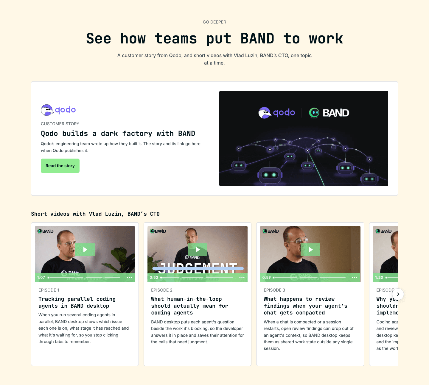
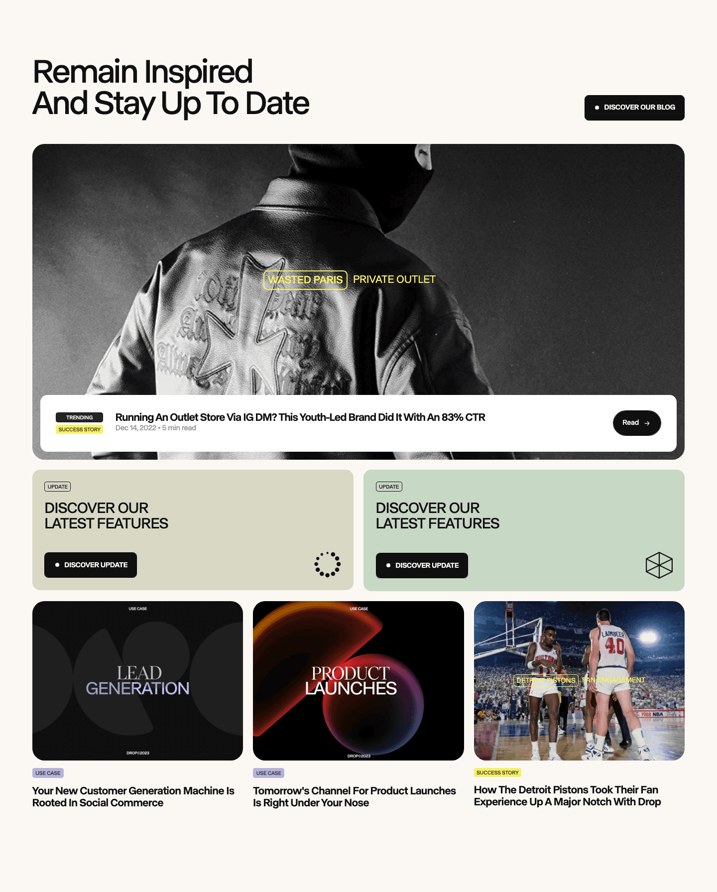
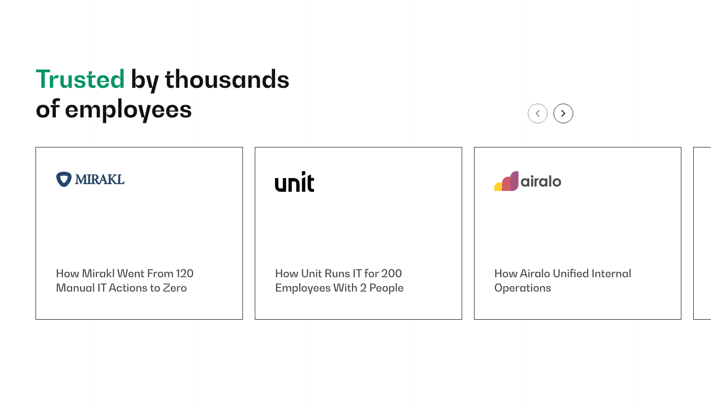
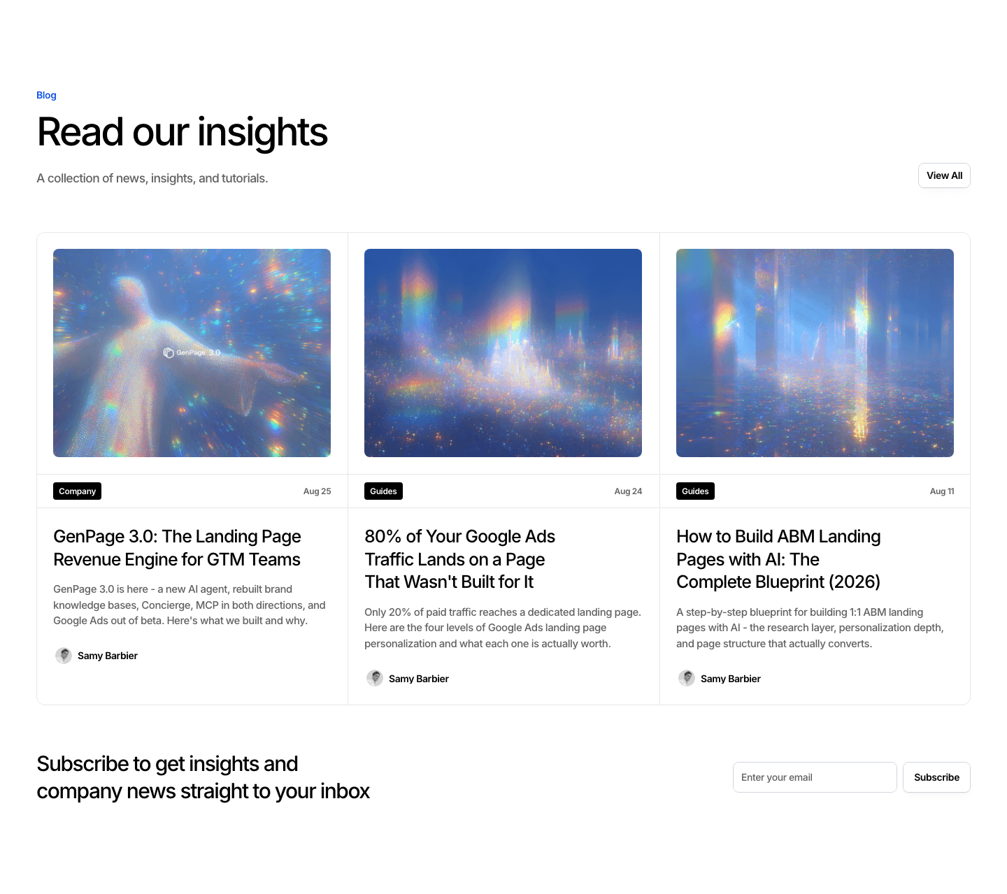
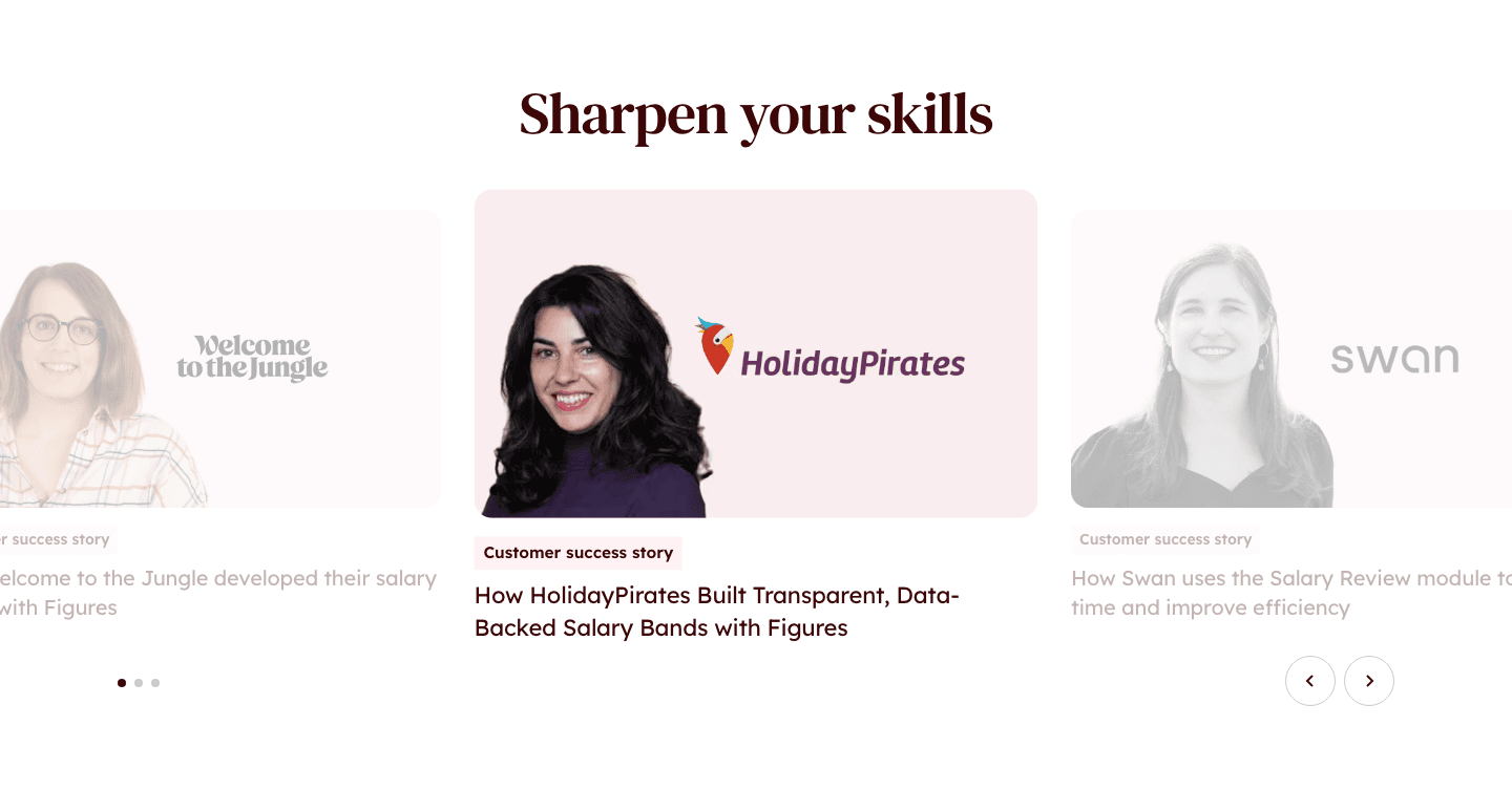
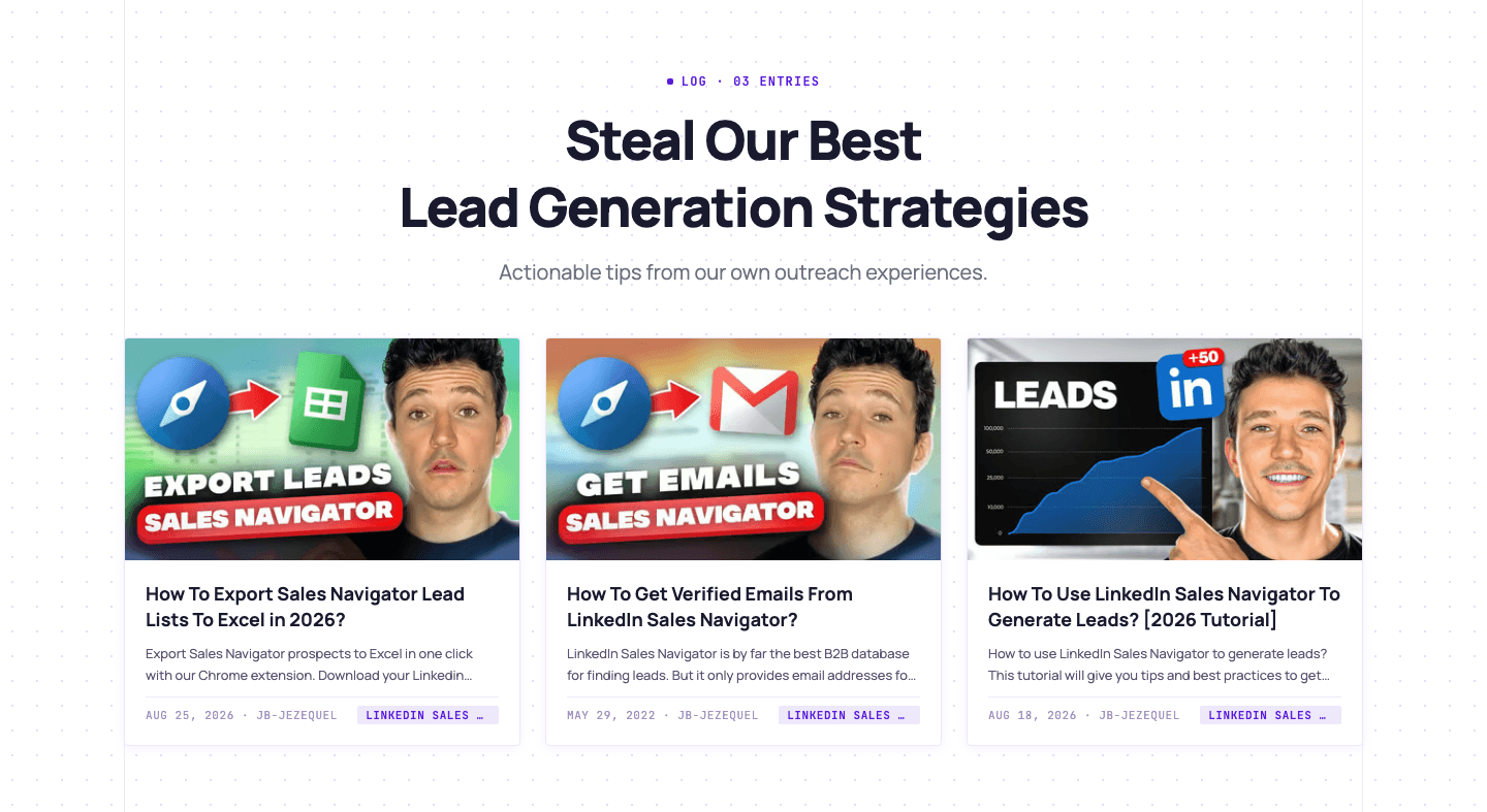
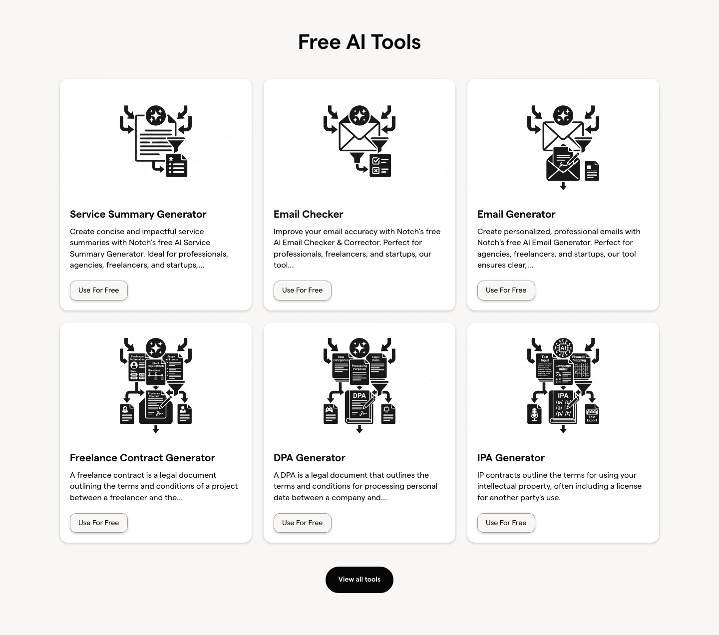
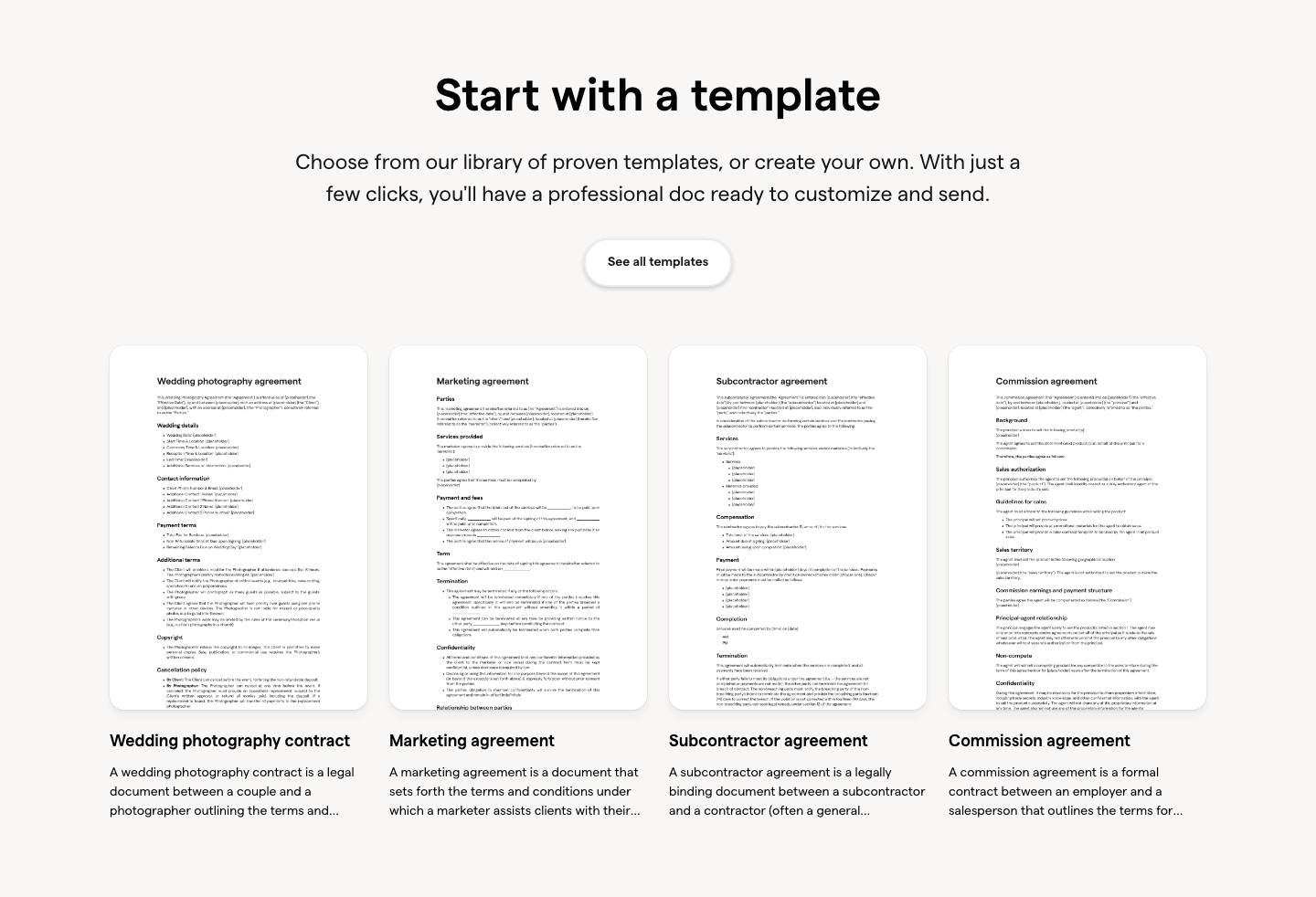
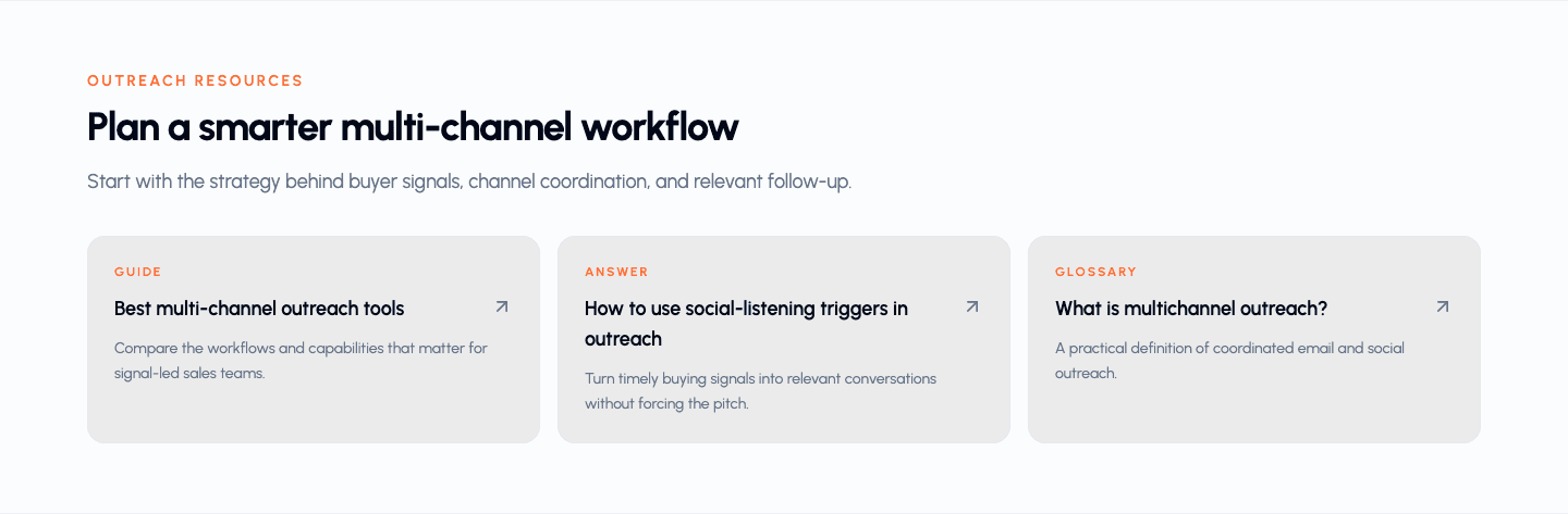
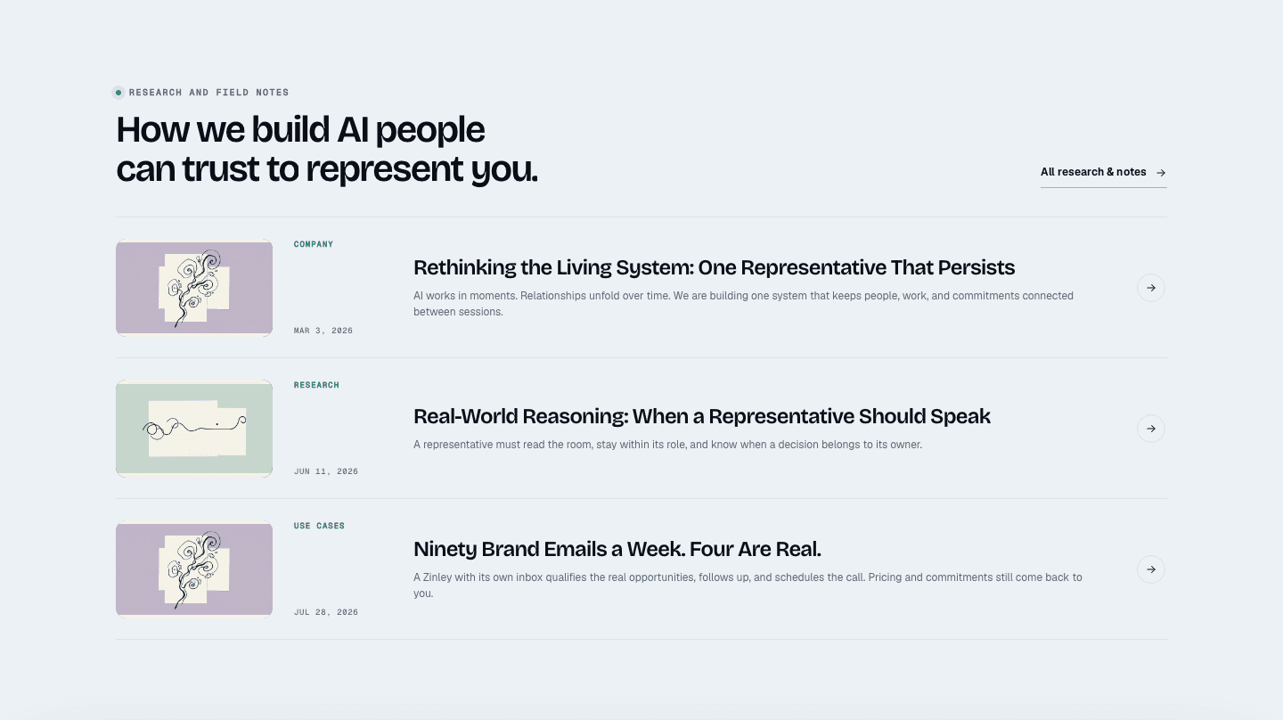
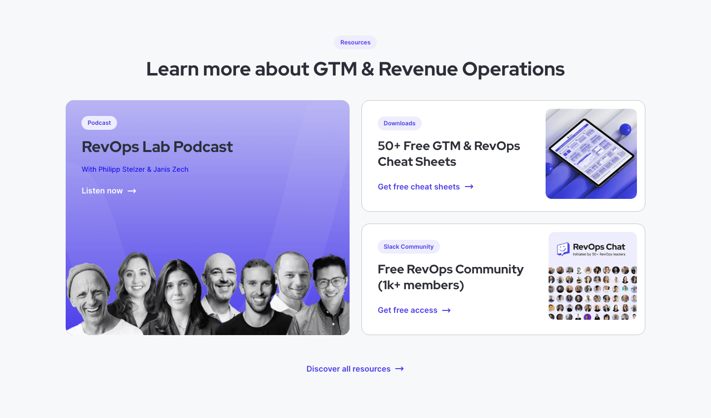
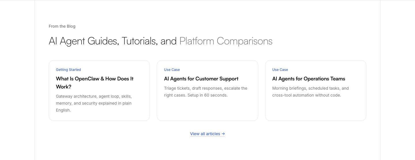
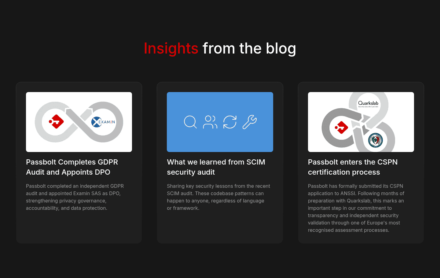

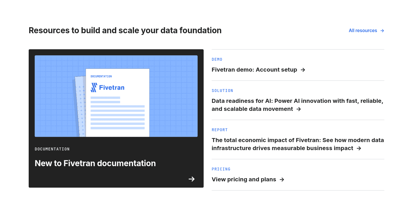


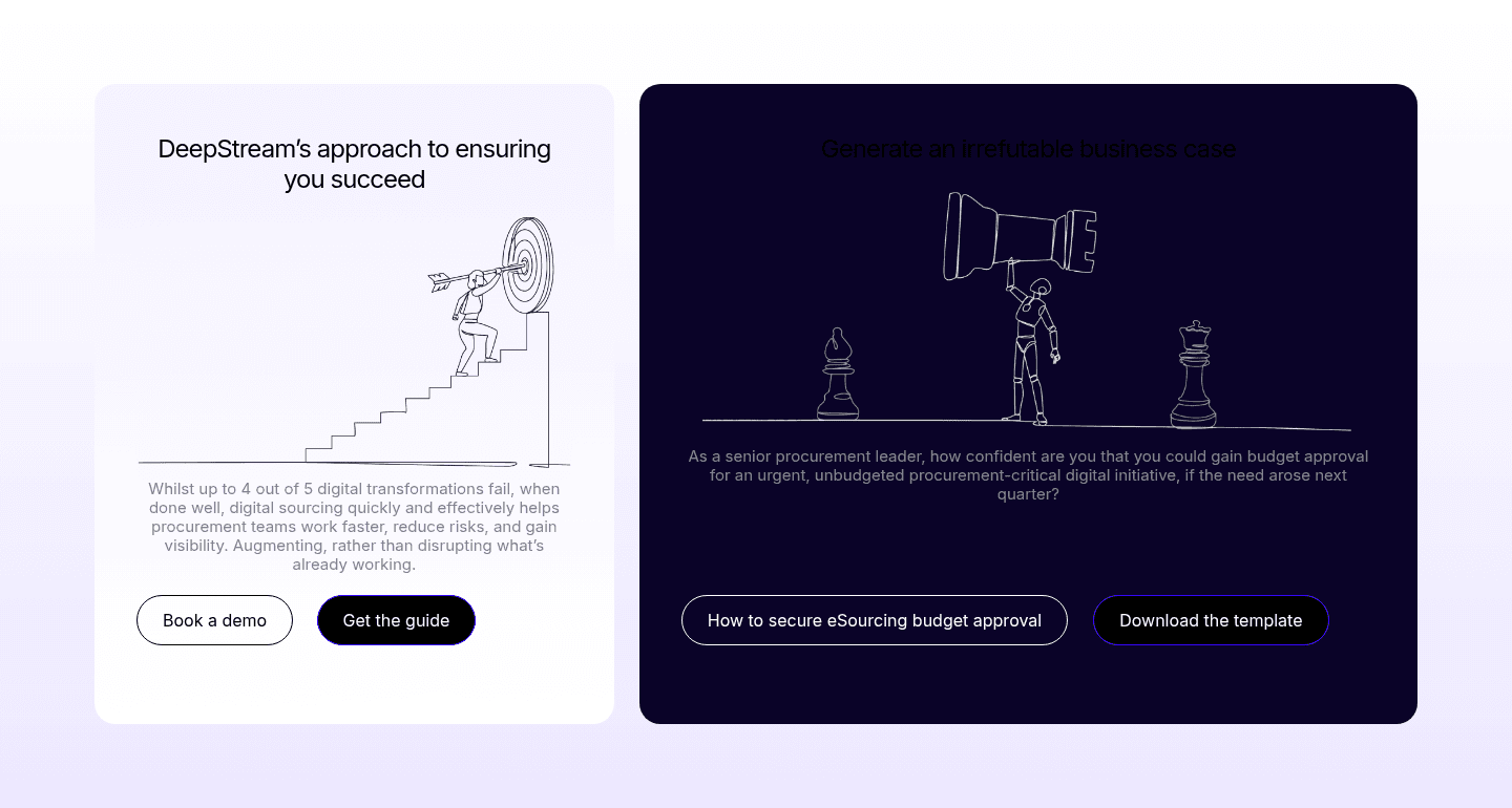


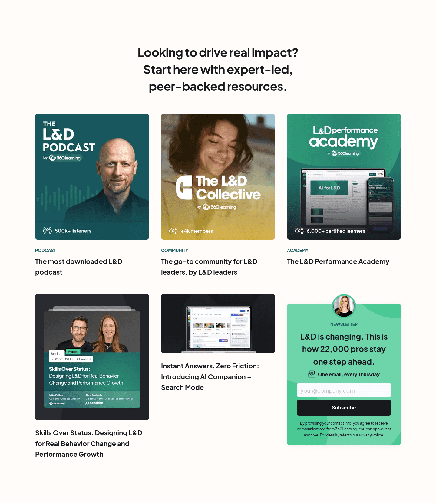


A resources section shows your content (articles, guides, videos, case studies) to keep visitors learning and bring them back to the product. The best ones work as a path to the product, not a library.
What the best resources sections do:
We checked the resources sections in our library for the elements below. The lower the number, the fewer pages do it, and the bigger your edge when you add it.
Links from content back to product pages, pricing, or signup. Keeps visitors in the conversion funnel
Multiple resource types (blog, video, webinar, case study) rather than one format
Resources organized by topic, type, or audience. Categories and filters that help visitors find what matters
Gated whitepapers, email signup for updates, or free tool access tied to content
Original research, data-backed guides, expert insights that position the brand as the go-to source
Blog posts, guides, and webinars that address your audience's actual problems, not generic filler
| Element | What it means | Use it | Type |
|---|---|---|---|
| Internal linking | Links from content back to product pages, pricing, or signup. Keeps visitors in the conversion funnel | 29% | Big opportunity |
| Content depth | Multiple resource types (blog, video, webinar, case study) rather than one format | 29% | Big opportunity |
| Visual hierarchy | Resources organized by topic, type, or audience. Categories and filters that help visitors find what matters | 32% | Opportunity |
| Lead capture strategy | Gated whitepapers, email signup for updates, or free tool access tied to content | 56% | Common |
| Authority building | Original research, data-backed guides, expert insights that position the brand as the go-to source | 91% | Table stakes |
| Content relevance | Blog posts, guides, and webinars that address your audience's actual problems, not generic filler | 97% | Table stakes |
Linking back to the product is the rarest element, at 29%. It is what turns content that brings traffic into content that brings customers.
We check every resources section against a weighted checklist, from the page itself and its screenshot:
Links back to the product and an email capture weigh the most, because they connect the content to the product. Sections flagged best-in-class are picked by hand from the highest scores.
Interactive quiz
Do your resources address your audience's actual problems?
Guides and posts about their pain points, not generic filler
The highest-scoring resources sections in our library share four habits:
 75/100
The weakest resources sections have relevant content and stop there. 71% of all resources sections never link back to the product, so the reader has no path from the article to what you sell. 68% put everything in one feed with no categories. 71% offer a single format, usually articles.
The fix: add categories, link each piece to the product page it relates to, and add one or two other formats.
Want to know which best practices your resources section is missing? Get your 3 free opportunities →
 0/100

Curated by
Gabriel Amzallag , Founder, Web Anatomy
5 years CRO + SEO at Qonto (2021–2025). After advising 15+ SaaS on their websites (Payfit, Pigment…), the same patterns kept breaking, so I decided to build the source of truth on what works on the web: the intelligence layer every tool, builder, and team uses to ship sites that perform.
Real examples from top landing pages, scored and analyzed.
Everything you need to know about resources section design, based on our analysis of real landing pages.
A resources section should show 6-12 items above the fold with clear category filters. If you have more than 20 resources, add search and topic filtering. In our library of 121 resources sections, the top-scoring ones display 8-12 featured items with a "view all" option rather than showing everything at once.
A blog is a chronological feed of articles. A resources section curates multiple content types (guides, webinars, case studies, tools) organized by topic or audience. In our data, 29% of resources sections include multiple content formats. The ones that do score higher because they serve more visitor needs from one page.
Yes, if you sell to an audience that researches before buying. B2B SaaS, enterprise tools, anything with a sales cycle longer than one visit. A resources section builds trust and captures leads from visitors who aren't ready to buy yet. If your product is impulse-buy simple, skip it.
Two placements do the work. First, a homepage block with 3-6 featured resources near the bottom. It catches visitors who scrolled past the main CTA without converting. Second, a dedicated /resources hub linked from your top nav, usually under a "Resources" or "Learn" menu. Avoid burying it under a footer-only link; high-intent research visitors need to find it from the header. If you run content-led growth, the hub belongs in the primary nav, not tucked three clicks deep.
56% of resources sections in our library include some form of lead capture. Gate high-value content (whitepapers, original research, tools) and keep educational content free. The best ones gate 20-30% of content and leave the rest open. Gating everything kills SEO and trust. Gating nothing leaves leads on the table.
Check that the content fits the visitor and that the layout is easy to scan. Then look for a way to capture leads, links to other pages, and proof of expertise. Or get your 3 free opportunities, ranked with the evidence behind each.
Showing 1–29 of 121 examples