Webinar landing page examples (125)
A webinar landing page is where people sign up for a live session or watch a recorded one. Its job is to show what the session covers, who runs it and when, so the hour feels worth it. See 125 real examples.
Showing 1–24 of 125 webinar pages
How to structure a webinar page, by the numbers
The questions a team asks when it rebuilds a webinar page, answered from the 125 here.
Who is speaking, and what does the page show about them?
- Named speakers on 54%
- A photo for each speaker on 52%
- The role and company next to the name on 48%
The speaker block is the widest gap in the set: 88% of the strongest pages show a photo for each speaker, against 8% of the weakest. Visitors are giving up an hour to listen to a person, so the page has to show them who that person is.
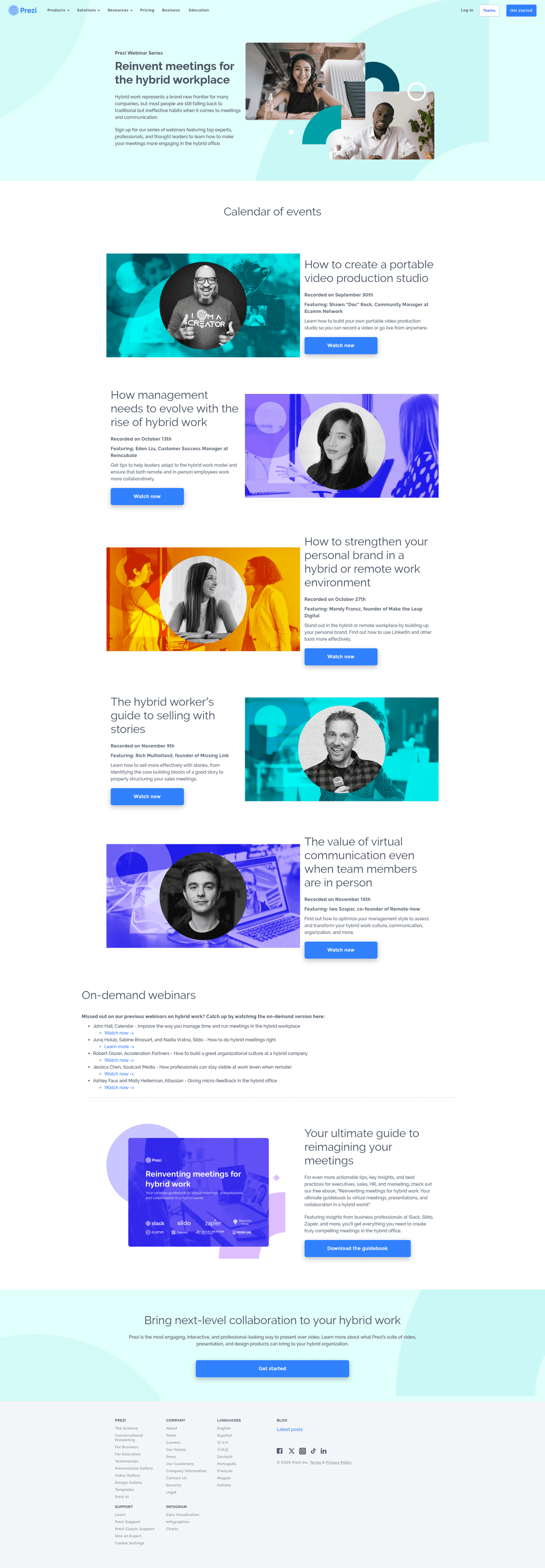
A live session or an on-demand replay?
- 55% sell a recording rather than a scheduled live slot
- 47% promise registrants the recording
The replay promise is one line of copy and half the market leaves it off. It answers the only real objection to a live time slot, which is that the visitor might be busy.
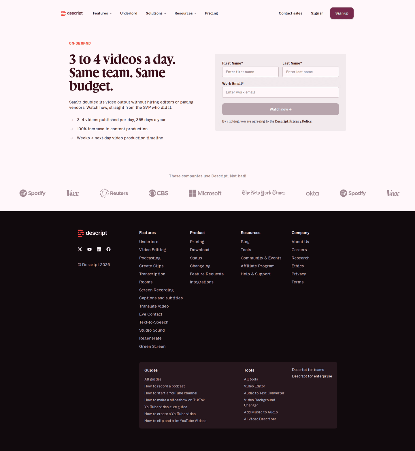
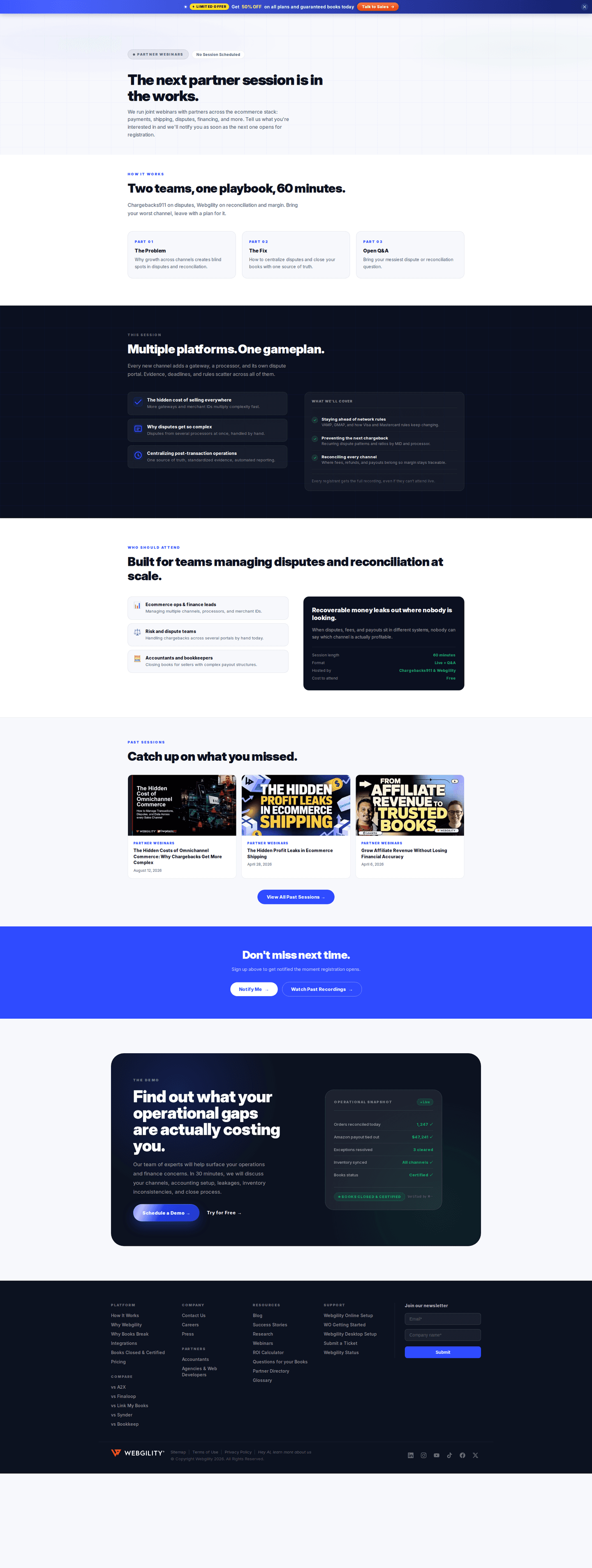
Does the page say when, and in which timezone?
- A start time on 42%
- A timezone next to the time on 38%
If the page runs a live session, write the time and the timezone in the hero. A visitor who has to work out whether 2pm is their 2pm usually closes the tab instead.

What does the page promise the visitor will learn?
How many takeaways the page lists
- Three takeaways listed17 webinar pages
- Four takeaways listed10 webinar pages
- A title that says the topic on its own on 90%
- Concrete takeaways listed on 27%
Three is the usual number of takeaways. Only one page in five lists any at all, so a short specific list is still a way to stand out.

One session, or a series?
- A series framing on 64%
- Links to past sessions on 61%
Past sessions do two jobs on one page. They show the series is real, and they give the visitor something to watch while they wait for the next one.
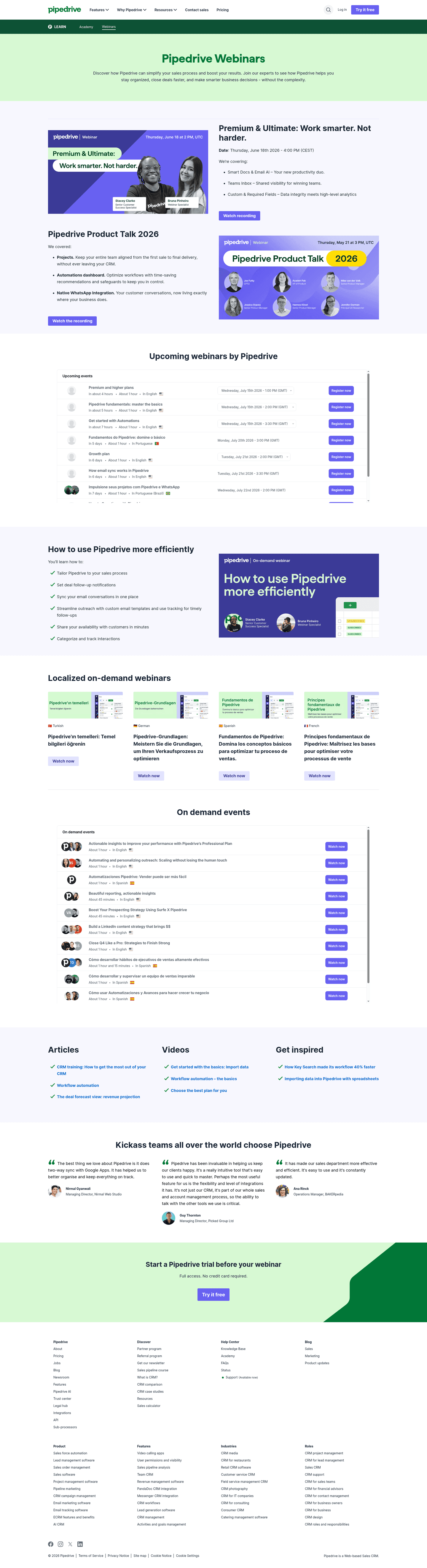
How does the page ask for the signup?
What the main button says
- Watch now19 webinar pages
- Register Now17 webinar pages
- Register13 webinar pages
- A registration form on the page itself on 22%. The rest hand the visitor off to a form somewhere else
- A sticky header carrying the button on 75%
- A chat widget on 25%
The button wording follows the format. "Watch now" is the honest label on a recording, "Register" on a session that has not happened yet.
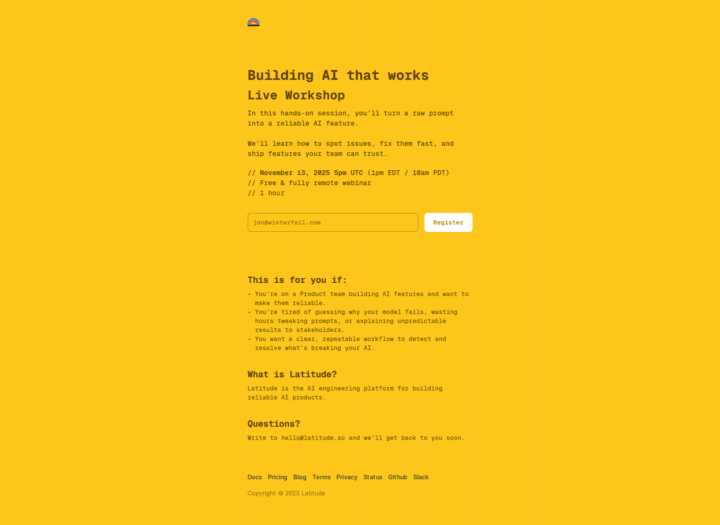
How many sections, and which ones?
Share of webinar pages carrying each section
- Resources98 webinar pages
- Closing CTA band81 webinar pages
- Value proposition21 webinar pages
- Logo wall or trust bar16 webinar pages
- About16 webinar pages
- Contact16 webinar pages
- Features9 webinar pages
- Testimonials6 webinar pages
3 sections between the navigation and the footer, half of them between 3 and 4. A webinar page is short by design, so every section has to earn its place.
The last section before the footer
- Closing CTA band67 webinar pages
- Resources30 webinar pages
- Logo wall or trust bar9 webinar pages
- Contact8 webinar pages
The moves almost nobody makes
Each sits under 15% of the market, with a webinar page that uses it.
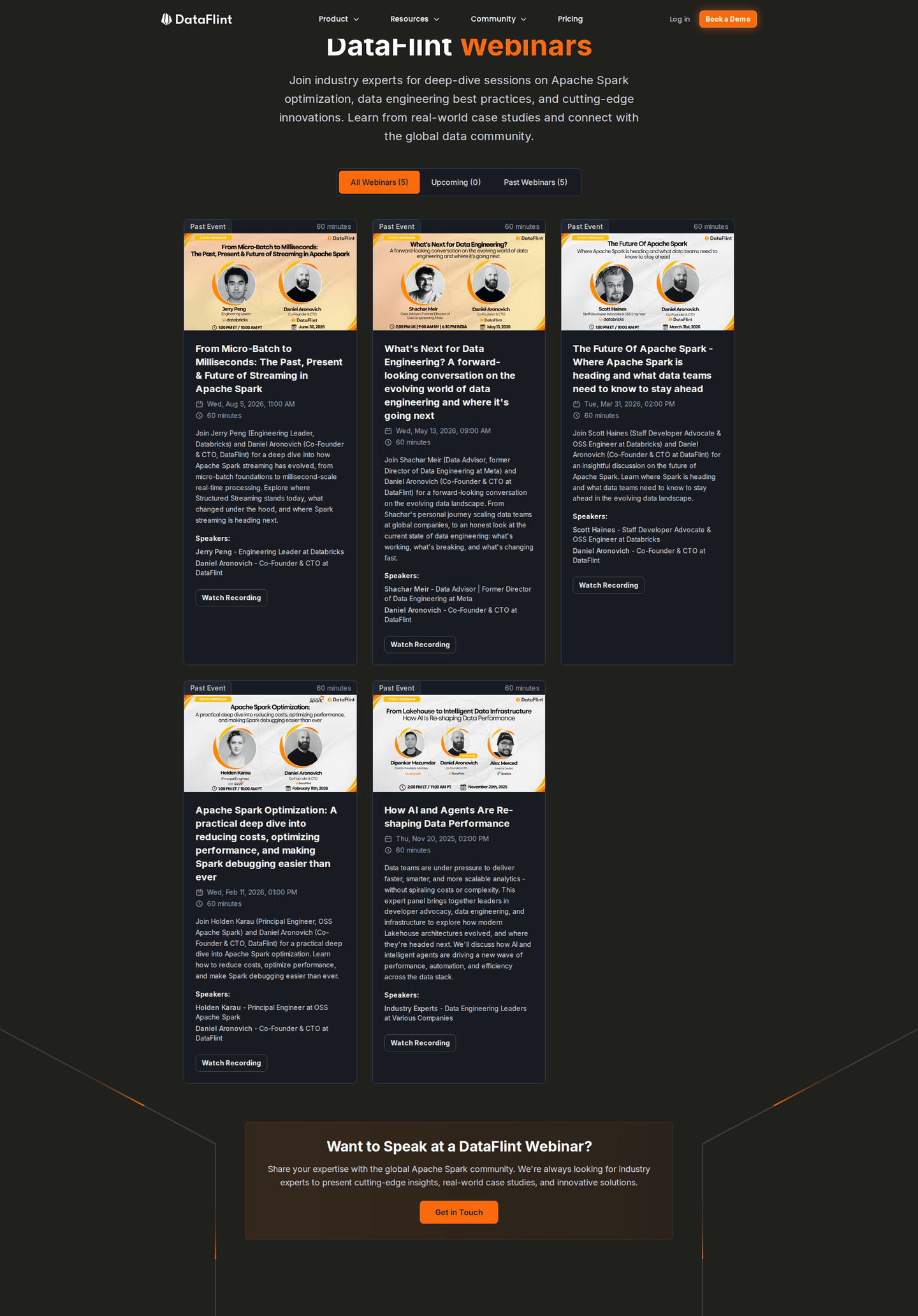
An agenda for the session
3% publish a running order for the hour, so the visitor can see which part is worth showing up for.
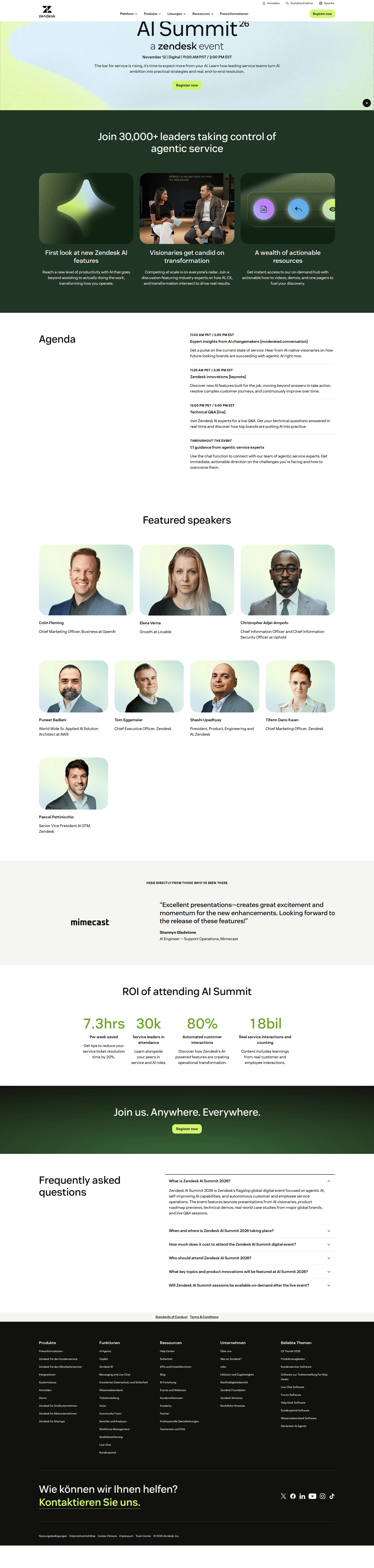
A video on the page
13% embed a video, usually a clip from an earlier session or a short pitch from the host.
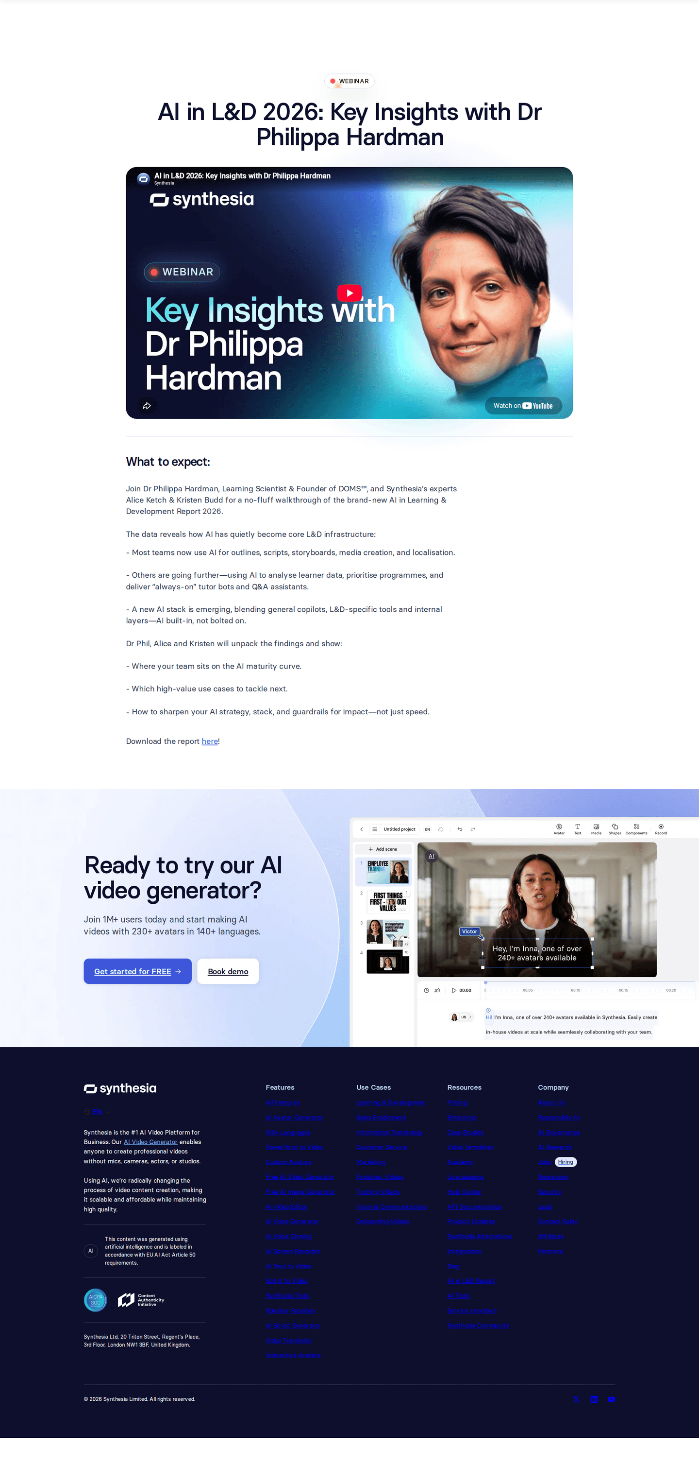
A customer logo wall
8% carry a logo wall on the webinar page, borrowed from the product pages, to say who else is in the room.


Curated by
Gabriel Amzallag , Founder, Web Anatomy
5 years CRO + SEO at Qonto (2021–2025). After advising 15+ SaaS on their websites (Payfit, Pigment…), the same patterns kept breaking, so I decided to build the source of truth on what works on the web: the intelligence layer every tool, builder, and team uses to ship sites that perform.
Go further than webinar pages
Growth Engine
Your top 3 opportunities for more revenue.
We find every way to grow your website’s visibility and conversions: SEO, AI search (AEO), backlinks and mentions, and UX/UI. 3 free opportunities, delivered by email.
Library
The analysis behind every page here
Each webinar page on this page, section by section, with what works and what does not. Free account.
Didn't find the webinar page you were looking for?
Every other page type has its own gallery. Start from all page types.
- Homepages
- Pricing pages
- About pages
- Contact pages
- Feature pages
- Integrations pages
- Security pages
- Enterprise pages
- Industry pages
- Persona pages
- Why us pages
- Case study pages
- Comparison pages
- Blog pages
- Signup pages
- SEO landing pages
- Free tool pages
- PPC landing pages
- Careers pages
- Login pages
- 404 pages
- AI product pages
- Press pages
- Partner program pages
- Download pages
- Resource libraries
- Developer pages
- Solutions pages
- Template galleries
- Glossary pages
- Startup program pages
- Community pages
- ROI calculators
- Newsletter pages
- Programmatic SEO pages
- Blog posts
- Customer stories pages
- Alternatives pages
- Features overview pages
- Product tours
- Integration pages
- AI agent pages
- Affiliate program pages
- Team pages
Your top 3 opportunities for more revenue.
We find every way to grow your website’s visibility and conversions: SEO, AI search (AEO), backlinks and mentions, and UX/UI. 3 free opportunities, delivered by email.
Webinar landing page design, answered
The questions people ask before rebuilding a webinar page, answered from 125 real ones.
What should a webinar landing page include?
01Four things carry most of the weight. Close to nine in ten of these webinar pages have a title that says the topic on its own, just over half name the speakers, and about half show a photo of each one and put the speaker's role and company next to the name. The speaker block is the widest split in the whole set: close to nine in ten of the strongest pages show speaker photos, against almost none of the weakest.
Should a webinar page show the date and the time?
02More of them should. Only about two in five state a start time, and a bit more than one in three put a timezone next to it. More than a third of the strongest pages state the timezone, against about one in ten of the weakest. A time with no timezone is not a time for most of the audience.
Should the registration form sit on the webinar page itself?
03Usually not. Only about one in four of these pages host the form, and the rest send the visitor to a form somewhere else, often a modal or a separate registration step. Where the form is on the page, one field is the most common length, on about two in five of them.
Is a live session or an on-demand replay better?
04The market has moved to recordings. More than half of these pages sell an on-demand session rather than a scheduled live one, and seven in ten of the strongest pages do, against under two in five of the weakest. Close to half promise registrants the recording, which is about three in four of the strongest pages against about one in seven of the weakest.
What does the main button on a webinar page say?
05'Watch now' leads on about one in six, then 'Register now' on about one in eight and 'Register' on about one in ten. The rest is a long tail of different labels, most of them written once.
How is this different from the best landing pages leaderboard?
06This gallery is a visual browse: what webinar pages look like and what they contain. The best landing pages benchmark is the graded view, where pages are scored against conversion best practices and ranked by industry. Same companies, different question.