Best Software Website Examples (And Why They Convert)
We scored 118 software homepages on 60+ conversion criteria. See which sections separate the top 10% from the rest, and what your page is probably missing.
What high-performing software website design gets right
Software pages have to show value fast, buyers expect to see the product, understand the workflow, and feel confident in the next step before they scroll past the fold. The strongest pages in this benchmark do four jobs early:
50/100
Avg. page score
Show the product in the first viewport so the visitor understands what they are evaluating, not just reading about.
Layer proof into the page before the ask, using customer counts, ratings, logos, or quantified outcomes that let the visitor verify the claim without leaving the page.
Structure a clear how-it-works flow that ties each step to a business outcome, not just a feature. Step-by-step clarity is the strongest pattern across software pages.
Make the CTA feel like a natural, low-risk next step with specific language and supportive microcopy that reduces commitment anxiety.
6 best software websites analyzed in detail
Each company below is paired with its strongest section and scored across 60+ conversion criteria. See what they get right, and what you can borrow.
01
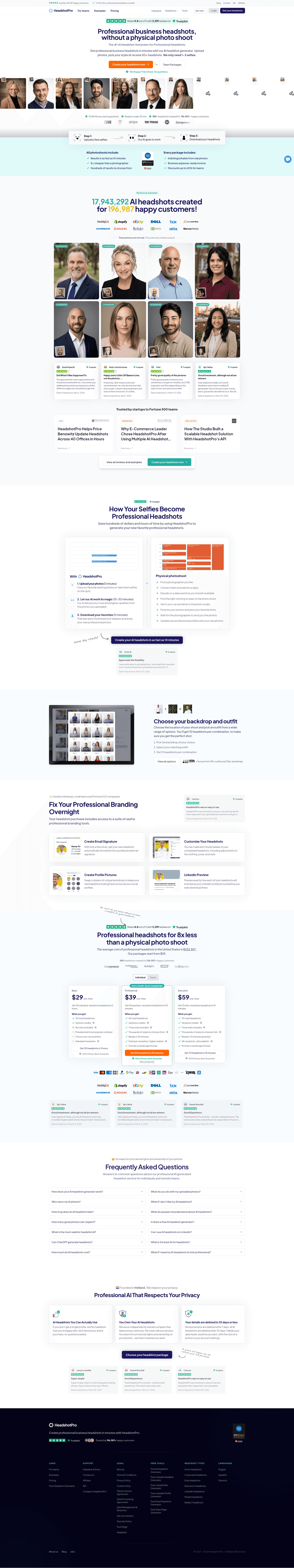
HeadshotPro, Professional headshots without the photoshoot.
5 years CRO + SEO at Qonto (2021–2025). After advising 15+ SaaS on their websites (Payfit, Pigment…), the same patterns kept breaking, so I decided to build the source of truth on what works on the web: the intelligence layer every tool, builder, and team uses to ship sites that perform.
“HeadshotPro makes the value comparison impossible to ignore. A side-by-side layout pits 3 simple steps against 8 tedious photoshoot steps, while "Save hundreds of dollars and hours" quantifies the switch. Trustpilot badge and customer testimonials close the trust loop before the page asks for anything. The problem section scored 60, which still outperforms most competitors on clarity and contrast.”
What makes this page stand out
"The #1 AI Headshot Generator for Professional Headshots" — strong SEO-driven category leadership claim.
Trustpilot 4.8/5 with 3293 reviews and "Used by 196,987 happy customers" + "17,943,292+ professional headshots created" — overwhelming social proof from multiple angles.
"We only need 1-3 selfies" makes the process feel incredibly simple and accessible.
"Not happy? Full refund. No questions." eliminates risk completely, addressing the trust barrier for AI-generated content.
Section we love
·Problem
1Side-by-side layout contrasts the 3-step HeadshotPro flow against the long painful physical photoshoot checklist
2Quantified pain in the headline (save thousands of dollars and hours of time) makes the cost of the old way tangible
3Physical photoshoot column lists every chore (find photographer, drive to location, pose) exposing the real effort cost
4Outcome timeframe (your headshots within 2 hours) sharpens the contrast against the slow traditional route
02
Parabola, Drag-and-drop data workflows for operations teams.
5 years CRO + SEO at Qonto (2021–2025). After advising 15+ SaaS on their websites (Payfit, Pigment…), the same patterns kept breaking, so I decided to build the source of truth on what works on the web: the intelligence layer every tool, builder, and team uses to ship sites that perform.
“Parabola earns a top-scoring navbar score of 100 by solving a real navigation problem: routing Operations, Finance, and Data teams through one clean entry point. The Enterprise Experience card with a "See For Yourself" CTA gives serious buyers a dedicated path without cluttering the page for self-serve visitors.”
What makes this page stand out
The "automate the work you thought would always be manual" tagline directly names the buyer's mental model and challenges it — creating an immediate "tell me more" reaction
Handling messy data sources (PDFs, emails, spreadsheets) addresses a real pain point that most automation tools ignore — they assume clean data inputs, while Parabola embraces the mess
"Turn plain English into automation" positions the AI capabilities in accessible, non-technical language — lowering the perceived barrier to entry for operations professionals
The "operators" ICP is clearly defined — Parabola isn't for developers or data engineers, it's for business operations people who currently do manual data work
Section we love
·NavbarBest in class
1The open menu splits into OVERVIEW and TEAMS WE SERVE columns for instant self-selection
2The TEAMS column targets Operations, Data and engineering, and Finance with clear value lines
3A featured Enterprise Experience card with a green visual anchors the dropdown
4Pricing sits as a top-level tab so cost-checkers reach it in one click
5Both Start for free and Get a demo CTAs appear, covering self-serve and sales paths
03
Pretty Damn Quick, AI-powered checkout optimization for e-commerce.
5 years CRO + SEO at Qonto (2021–2025). After advising 15+ SaaS on their websites (Payfit, Pigment…), the same patterns kept breaking, so I decided to build the source of truth on what works on the web: the intelligence layer every tool, builder, and team uses to ship sites that perform.
“Pretty Damn Quick builds a top-scoring how-it-works section (100) by tying every step to a revenue outcome. Step 3 lands on "most profitable checkout", an outcome metric, not a feature label. AI-first language and product screenshots with real data make the automation promise feel credible.”
What makes this page stand out
5.0 Shopify rating and 1B+ checkouts served provide instant credibility at scale
Visual product demo showing personalized checkout options (protect order, faster delivery, free shipping) makes the value immediately tangible
Problem framing hits hard: "Your one-size-fits-all checkout is losing you sales" with specific pain points
ROI guarantee messaging reduces buyer risk
Section we love
·Testimonial
1Three hard metric cards ($984K added revenue, 14% fewer abandoned first-time shoppers, 3bps conversion uplift) make impact undeniable
2Full case-study arc for Underoutfit shows the challenge, the tactics tested, and the seven-figure result
3Logo switcher (Groove Life, Laura Geller, Obvi, Gains in Bulk) lets buyers find a brand like theirs
4Bold pull quote from the Co-founder and CEO (close to a million dollars, no operational changes) anchors the story
04
Atolio, Enterprise search that connects your tools and surfaces answers.
5 years CRO + SEO at Qonto (2021–2025). After advising 15+ SaaS on their websites (Payfit, Pigment…), the same patterns kept breaking, so I decided to build the source of truth on what works on the web: the intelligence layer every tool, builder, and team uses to ship sites that perform.
“Atolio leads with outcome framing, "getting answers and relevant context", then organizes three feature blocks (Security, Insights, Search) around what the buyer gets, not what the product does. Real product UI screenshots make the features verifiable. The features section scored 67.”
What makes this page stand out
The sharpened problem framing resonates immediately: employees spend hours searching across Slack, Confluence, Google Drive, Notion, and Jira to find the one document they need
Product clarity is strong: Atolio connects to your existing tools and creates a unified search layer that finds information across all of them simultaneously
The AI-powered search differentiation goes beyond keyword matching to understanding context and intent — a necessary evolution as enterprise content becomes increasingly unstructured
Connector breadth (Slack, Confluence, Jira, Google Workspace, Notion, GitHub, etc.) signals that Atolio works with the tools teams already use rather than requiring migration
Section we love
·Contact
1Embedded calendar lets prospects self-book an Atolio Demo on a chosen day instead of waiting on a form reply
2Booking copy clarifies the outcome: a personalized demo from a member of the team
3Product video of the actual search interface sits beside the scheduler so visitors see the tool before booking
4Book time with us to bullets (see a live demo, ask questions, learn how it works) frame the value of the call
05
Bugherd, Visual bug tracking that lives on your website.
5 years CRO + SEO at Qonto (2021–2025). After advising 15+ SaaS on their websites (Payfit, Pigment…), the same patterns kept breaking, so I decided to build the source of truth on what works on the web: the intelligence layer every tool, builder, and team uses to ship sites that perform.
“Bugherd packs multiple conversion levers into a single hero: a social proof trifecta (4.8/5, 350K+ users, 10K+ companies), a real kanban board screenshot, and dual risk reducers (no credit card required plus a 60-day money-back guarantee). The hero section scored 78, well above the benchmark average.”
What makes this page stand out
Product UI screenshot showing point-click-comment workflow provides immediate visual comprehension of the tool's simplicity
Google SSO signup reduces friction to near-zero — smart for a tool targeting agencies and web teams
"Goodbye endless emails" tagline directly names the pain point being eliminated
Social proof trifecta (4.8/5 rating, 350k+ users, 10k+ companies) builds credibility across multiple dimensions
Section we love
·How It Works
1Three numbered steps (Create a project, Get the extension or install JS, Invite team and clients) cover the full setup
2Each step has a matching illustration (the board, the website snippet, a pinned feedback card) showing the real product
3The headline (Get started with BugHerd in minutes) sets a fast concrete timeframe to onboard
4Step 2 offers a low-effort path (browser extension or a single JavaScript snippet) so anyone can install it
5Step 3 previews the outcome of clients leaving pinned feedback like Make the logo bigger right on the page
06
Bitbucket, Code and CI/CD built for teams on Atlassian.
5 years CRO + SEO at Qonto (2021–2025). After advising 15+ SaaS on their websites (Payfit, Pigment…), the same patterns kept breaking, so I decided to build the source of truth on what works on the web: the intelligence layer every tool, builder, and team uses to ship sites that perform.
“Bitbucket anchors credibility with platform parentage, "powered by Atlassian platform", then shows real product UI (code repo and pull request views) so developer buyers see the workflow, not a marketing render. The "Try it now free" CTA keeps the entry friction near zero. Hero scored 56 but the platform trust signal does heavy lifting.”
What makes this page stand out
Deep integration with Jira creates a unique project-to-code traceability advantage
Pipelines (CI/CD) built directly into the repository platform streamline the development workflow
Free tier for small teams creates a low-barrier entry point
Code review with pull requests and inline commenting enable collaborative development
Section we love
·Hero
1Headline (Code and CI/CD powered by the Atlassian platform) nails product category in one clear line
2Real product UI showing code repository with pull requests and pipeline visualization
3Try it now CTA with free access lowers the barrier for developers to start immediately
4Differentiation claim (best-in-class Jira integration) leverages the Atlassian ecosystem advantage
See how your page compares to the 50 software average
Run a section-by-section diagnostic on your software page and get prioritized fixes for clarity, trust, and product proof.
Design patterns we see across high-performing software pages
Across 118 software pages reviewed, the pages that convert tend to make the first screen do one job: show the product clearly and remove the biggest reason to leave.
The strongest patterns pair visual clarity with outcome-led copy, showing the actual interface alongside a specific, quantified promise. Pages that nail their How It Works flow consistently outperform those that rely on abstract benefit language. Use website section examples to compare how these building blocks show up across page types.
2Unique mechanism spelled out (AI picks one of 200+ proven templates and auto-generates schema, auth, REST APIs, hosting)
3Hard numbers anchor each claim (app in 60 seconds, live in 24 to 48 hours, starts at $16/month vs Replit $20, Lovable $25)
4Sharp differentiation (other AI generators produce web wrappers, Appy Pie ships true native apps to both stores)
5Distinct icon per card (phone, database, lightning, rocket, shield, money bag) makes the six benefits instantly scannable
Reviewed design-pattern pick from Appypie’s value proposition section.
What I love about this section
Six distinct value-prop cards (native output, backend included, speed, publishing, compliance, price) cover every buyer concern
Unique mechanism spelled out (AI picks one of 200+ proven templates and auto-generates schema, auth, REST APIs, hosting)
Hard numbers anchor each claim (app in 60 seconds, live in 24 to 48 hours, starts at $16/month vs Replit $20, Lovable $25)
Sharp differentiation (other AI generators produce web wrappers, Appy Pie ships true native apps to both stores)
Overlooked sections that quietly lift conversions
In this benchmark, navigation and structural sections often do more conversion work than teams expect. A well-organized navbar routes different buyer personas cleanly; a strong use-case section prevents the hero from carrying every audience alone.
The biggest gaps usually appear in Testimonial sections, which average just 36. The lowest in the dataset. When these sections are thin or missing, visitors are left with unanswered questions that even a strong hero cannot resolve.
1Four team tabs (Product, Marketing, Data, Engineering) each carry their own outcome line (Fuel faster growth, Build customers for life, Unlock trusted data, Ship faster)
2The active Product teams tab shows a scenario (trusted insights about user engagement to build better products)
3A role-matched testimonial from Damien Delautier (Chief Product Officer, Groupe Canal+) backs the product persona
4The black active-tab state makes the current selection and switching obvious
5Each persona gets a distinct promise rather than one generic benefit reused across teams
Reviewed overlooked-section pick from Amplitude’s use cases section.
What I love about this section
Four team tabs (Product, Marketing, Data, Engineering) each carry their own outcome line (Fuel faster growth, Build customers for life, Unlock trusted data, Ship faster)
The active Product teams tab shows a scenario (trusted insights about user engagement to build better products)
A role-matched testimonial from Damien Delautier (Chief Product Officer, Groupe Canal+) backs the product persona
The black active-tab state makes the current selection and switching obvious
Use the examples above as prompts for what to add or restructure, not just what to redesign visually.
Checklist: a practical audit for software website design
If you are iterating on a software homepage, this checklist helps you spot missing sections and messaging gaps quickly, especially around Value Proposition, Hero, and Cta.
Run it on your current page, then decide what to rewrite, what to reorder, and what proof to add before you touch visual polish. For a faster baseline, you can also try our landing page analysis.
Built from 424 sections across 80 software homepages in this benchmark. Each check below is a move the highest-scoring pages share, each paired with a real example from the benchmark.
Hero
Can a skeptical buyer tell what you do in five seconds?
The hero makes it instantly clear what the product is and who it's for.
Example: General Compute's hero headline reads "GPUs were built for graphics, we are built for inference," calling out repurposed-GPU rivals.
The real product shows above the fold.
Example: ComboCurve opens on a product screenshot that carries the (10x Faster) claim instead of a hero graphic.
Proof is visible before the first scroll.
Example: Bugherd surfaces a 4.8/5 rating, 350K+ users, and 10K+ companies right below the hero.
Trust
Does the page earn belief before it asks for anything?
Recognizable customer logos anchor the trust strip.
Example: Samsara lines up DHL, Estes, Werner, and the City of New Orleans so a buyer recognizes the company they would be joining.
The claim is quantified.
Example: Benchling states 200,000 scientists and half of the world's top 50 biopharma companies instead of a vague reach claim.
Proof comes in more than one form.
Example: UpSlide lines up blue-chip finance logos (KPMG, Greenhill, UniCredit, Riveron) so the trust reads from recognizable brands.
Value proposition
Is the value concrete, or just adjectives?
Benefits are specific.
Example: Clay runs three bolded props ("act on data at scale," "build dynamic audiences," "time outreach perfectly"), each with its own supporting line.
The promise is quantified with a number or a timeframe.
Example: ZeBeyond anchors credibility with 99.9% reliability and 10+ years rather than promising vague growth.
Features
Do features connect to outcomes the buyer cares about?
Feature copy leads with the outcome.
Example: Linear heads its section with "Understand progress at scale," putting the outcome ahead of the feature mechanics.
The section shows the outcome.
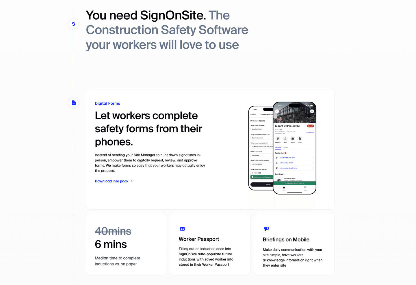
Example: SignOnSite leads with "Let workers complete safety forms from their phones" and shows inductions dropping from 40 mins to 6 mins.
Each feature maps a real pain to a measurable result.
Example: Webflow frames hosting as "Focus on building, not maintenance," naming the chore it removes.
Call to action
Does the next click feel safe to a cautious buyer?
One primary action dominates, with action-led copy.
Example: GotPhoto lets one "Create your free account" button own the block with no competing action.
Reassuring microcopy sits next to the button.
Example: Clay leads with "Start building for free" and keeps the demo path clearly secondary instead of leaving the ask bare.
The gap most software pages leave open is pricing.
Pricing is the rarest funnel section in the software set. Of 80 companies benchmarked, only 23 expose a pricing block clear enough to score. The ones that do make the cautious buyer's job easy. Raycast lines up three named plans, Free forever at $0, Pro at $8, and Team Pro at $12, each with a one-line audience tagline so a visitor can compare without booking a call. Pages that hide pricing behind "contact sales" leave the cheapest trust on the table.
Interactive quiz
What would your software homepage score?
Question 1 of 5
0%
Does your page show the product or workflow in the first viewport?
A dashboard, UI screenshot, or step-by-step visual. Not a stock photo or abstract illustration.
Reviewed by
Gabriel Amzallag , Founder, Web Anatomy
5 years CRO + SEO at Qonto (2021–2025). After advising 15+ SaaS on their websites (Payfit, Pigment…), the same patterns kept breaking, so I decided to build the source of truth on what works on the web: the intelligence layer every tool, builder, and team uses to ship sites that perform.
Quick answers based on our software website benchmark dataset of {count} scored pages.
What are the best software websites?
[01]
The strongest performers in this June 2026 benchmark are HeadshotPro, Parabola, Pretty Damn Quick, Atolio, Bugherd, and Bitbucket. Across 118 software homepages scored against 60+ criteria, these pages convert by showing the product early: Bugherd pairs a 4.8/5 rating, 350K+ users, and 10K+ companies with a real kanban board and a 60-day money-back guarantee, while HeadshotPro frames the old way as 8 tedious photoshoot steps next to its 3-step product.
What makes a software website convert better than average?
[02]
Showing the product early, quantifying the value, and reducing commitment. Across 118 homepages reviewed, the pages that convert make every step earn trust: Pretty Damn Quick ties step 3 of its how-it-works to "most profitable checkout" rather than a feature label, Bitbucket displays a real code repo and pull request view next to "Try it now free," and Parabola routes Operations, Finance, and Data teams through a single top-scoring navbar.
What is the biggest design mistake on software homepages?
[03]
Leading with abstract benefit language while hiding the actual product below the fold. The average page in this June 2026 benchmark scored 50 across 118 pages. Top performers replace abstraction with verifiable proof: HeadshotPro lets a side-by-side comparison do the selling, Atolio splits capability into Security, Insights, and Search with product UI behind each, and Bugherd's hero delivers the social proof trifecta before a CTA.
What sections should a software homepage include?
[04]
A hero with a clear product visual, an early social proof layer (logos, ratings, customer counts), a how-it-works or product walkthrough section, features tied to outcomes rather than specs, and a low-friction CTA. Pretty Damn Quick's outcome-led steps and Bugherd's hero stack are strong templates. Across 118 homepages, pages that stack these blocks convert most, while pages that hide the product below the fold consistently land in the bottom tier.
How many software website examples should I study before redesigning?
[05]
Three to five is enough if you pick by theme and compare section by section. Only 3% of pages in this benchmark score in the top tier, so the gap is concentrated in a few blocks. Study HeadshotPro for problem-framing, Parabola for persona-routing navigation, Pretty Damn Quick for outcome-led how-it-works, Bugherd for hero-level risk reduction, and Bitbucket for developer-tool clarity.
Where can I find great software website design inspiration?
Use a structured rubric that checks product visibility, proof, and friction instead of relying on subjective feedback. Run your page through the landing page analyzer for a section-by-section score.