Pricing pages with three plans (170)
The 170 pricing pages here that show exactly three plans, the classic shape: one to start on, one to pick, one to grow into.
Key takeaways
- Expect to charge from the first column, since three-plan pages have a free plan less often than the rest.
- Use a comparison table for the feature differences, because three cards can't fit them.
- Add customer testimonials to support the middle plan, which is the one the page recommends.
Showing 1–24 of 170 pricing pages
What the best pricing pages with three plans do
With only three plans there's no spare column, so each one needs a clear purpose.
Charge from the first plan
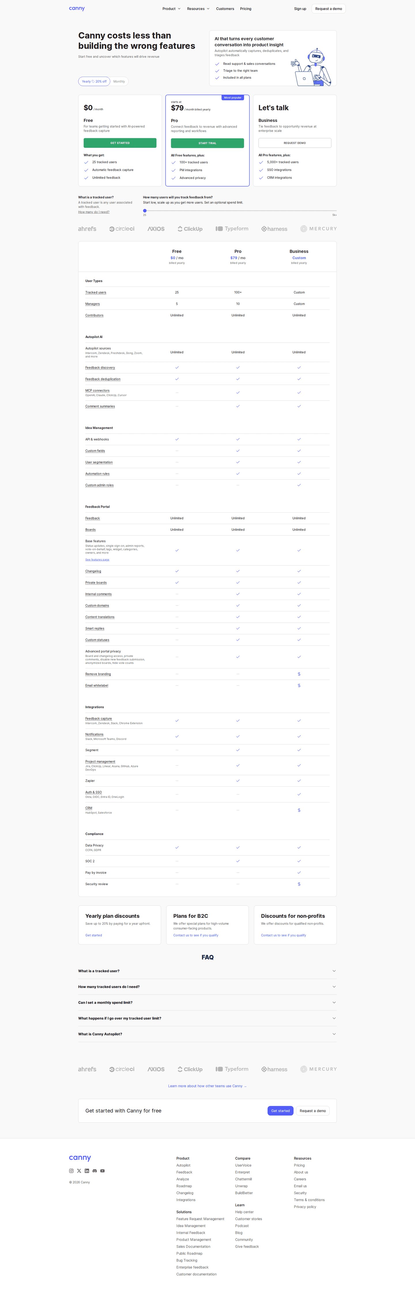
34% of three-plan pages have a free plan. A free plan would use one of the three columns and leave just two paid ones, and pages that want a free plan add a fourth column.
Put the details in a table
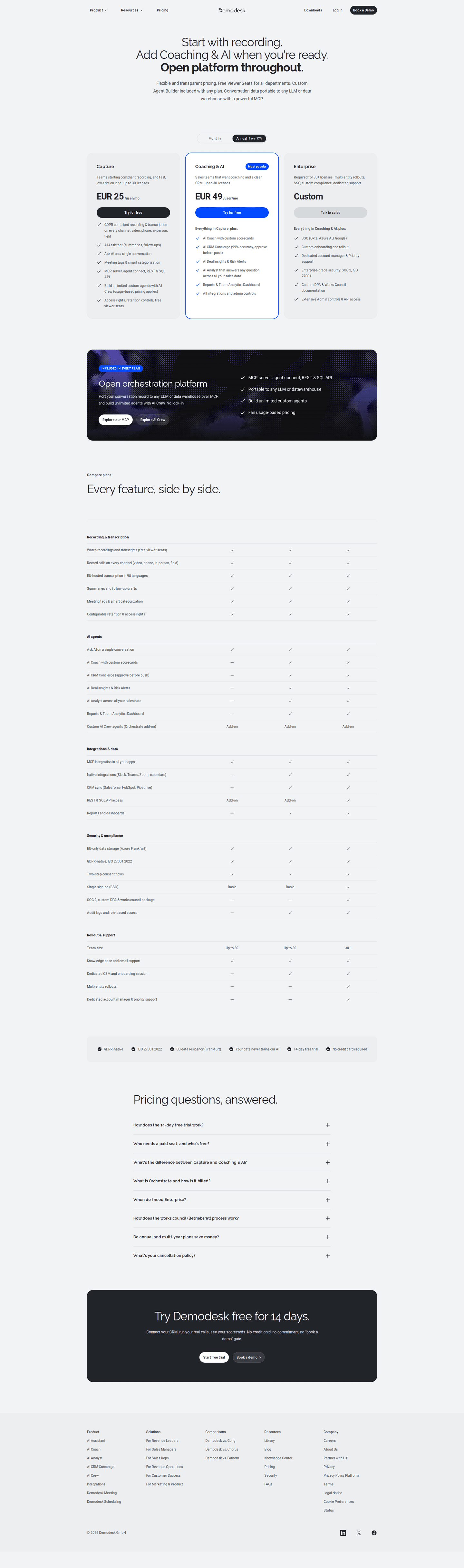
82% of the best pricing pages have a comparison table. Each card only fits a few feature rows, and the features people actually decide on tend to be further down the list. The table shows what the middle plan adds, so visitors can check it's the right pick.
Show testimonials near the plans
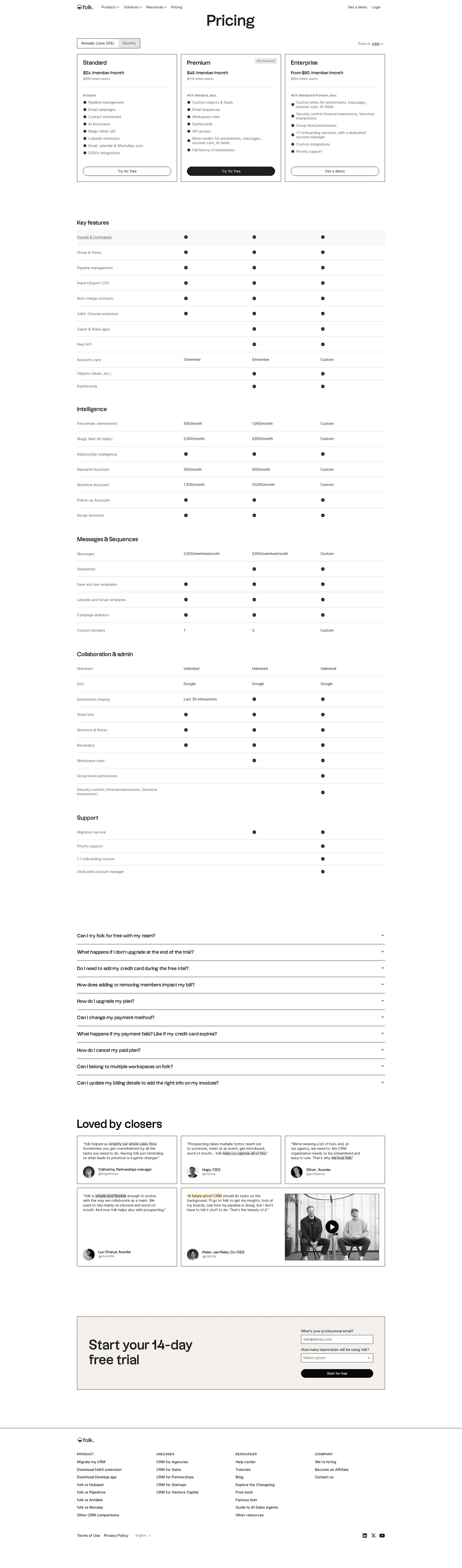
47% of the best pricing pages run testimonials. The page points visitors to the middle plan with a most popular badge, and quotes from customers give them a reason to trust that pick.

Curated by
Gabriel Amzallag , Founder, Web Anatomy
5 years CRO + SEO at Qonto (2021–2025). After advising 15+ SaaS on their websites (Payfit, Pigment…), the same patterns kept breaking, so I decided to build the source of truth on what works on the web: the intelligence layer every tool, builder, and team uses to ship sites that perform.
Go further than pricing pages
MCP
Section ideas, from inside your editor
Ask your coding agent for the strongest sections of a pricing page in your industry. It answers from this benchmark, section by section.
Library
The analysis behind every page here
Each pricing page on this page, section by section, with what works and what does not. Free account.
Browse more pricing pages
Pick another group below, see every pricing page, or browse the sections these pages are built from.
Does your middle plan earn the recommendation?
Paste your pricing page. Get a scored breakdown against the same best practices these pages were measured on, with the fixes ranked by impact. Free, no signup.
Three-plan pricing pages, answered
How the three columns are usually spent, from the 170 here.
Is three the right number of plans?
01It's the shape most people picture, and the second most common here, just behind four. Three works when each column has a clear purpose and none is there only to fill space.
What does a three-plan page give up?
02Usually the free plan. These pages have a free tier less often than pricing pages with a different number of plans. With only three columns, a free plan would leave two paid ones, so most of them charge from the first column.
Which plan should the page recommend?
03The middle one, in almost every case. It's the only plan with a cheaper option on one side and a more expensive one on the other. Recommending the cheapest plan looks like steering people down, and recommending the most expensive looks like a hard sell.
Do three plans still need a comparison table?
04Yes. Most of the best pages here have one. A card gets hard to scan after about six feature rows, and the features that decide the purchase are usually further down than that.
What goes in the third column?
05A named plan with a way to contact sales. Most of the best pages here have an enterprise plan. That column is where bigger customers look, and a box that only says contact us leaves them unsure it's meant for them.