Pricing pages with a monthly and annual toggle (212)
The 212 pricing pages here that carry a switch between monthly and annual billing, so the visitor can see both numbers without leaving the page.
Key takeaways
- Show the monthly and the annual price, so nobody has to guess the discount.
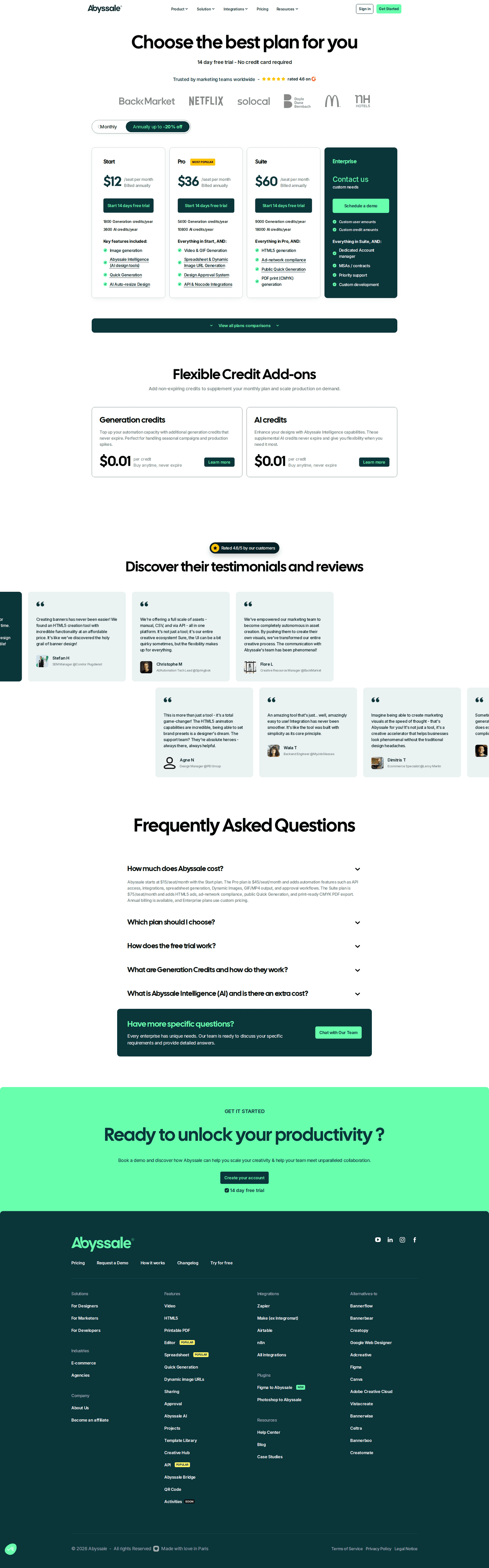
- Put logos or ratings near the switch. That's where the best pages differ most.
- Offer a free trial or a free plan, so people can start before picking a billing period.
Showing 1–24 of 212 pricing pages
What the best pricing pages with a toggle do
A billing toggle lets visitors switch between the monthly and the annual price. Choosing annual means paying for a year up front, so the best pages give people reasons to trust that choice.
Show both prices clearly
1% of the best pricing pages hide a price. If a page shows an annual price as a monthly figure and doesn't say it's billed yearly, the visitor only finds out at checkout.

Show proof near the switch
70% of the best pricing pages carry a logo wall, and 30% add review-site ratings. Someone paying for a full year usually hasn't used the product for long, so the logos and ratings sit close to the annual price.

Offer a way to start first
69% of the best pricing pages offer a free trial, and 66% have a free tier. Some visitors aren't ready to pick monthly or annual yet. A trial lets them start using the product today and decide on billing later.

Curated by
Gabriel Amzallag , Founder, Web Anatomy
5 years CRO + SEO at Qonto (2021–2025). After advising 15+ SaaS on their websites (Payfit, Pigment…), the same patterns kept breaking, so I decided to build the source of truth on what works on the web: the intelligence layer every tool, builder, and team uses to ship sites that perform.
Go further than pricing pages
MCP
Section ideas, from inside your editor
Ask your coding agent for the strongest sections of a pricing page in your industry. It answers from this benchmark, section by section.
Library
The analysis behind every page here
Each pricing page on this page, section by section, with what works and what does not. Free account.
Browse more pricing pages
Pick another group below, see every pricing page, or browse the sections these pages are built from.
Does your annual price earn the year?
Paste your pricing page. Get a scored breakdown against the same best practices these pages were measured on, with the fixes ranked by impact. Free, no signup.
Billing toggles, answered
What the best pricing pages put around a monthly and annual switch, from the 212 here.
How many pricing pages have a billing toggle?
01Many of them. After the plan grid itself, it's one of the most common things you'll find on a pricing page.
What is different about a page with a toggle?
02These pages almost never hide a price, while other pricing pages often do. They also have a free tier and a comparison table more often. That makes sense, because a toggle needs published prices to switch between.
Should the toggle default to monthly or annual?
03Either is fine, as long as the other price is easy to find. What goes wrong is an annual price shown as a monthly figure with no note that it's billed yearly. Visitors find that out at checkout, and they remember it.
What separates the best pages with a toggle?
04Proof, by a wide margin. Most of the best pages here have a logo wall, and many also show review-site ratings or award badges. An annual plan asks someone to pay for a whole year, so it helps to show who already uses the product right next to the switch.
What should the annual side actually say?
05How much the visitor saves, for example two months free or a lower price per seat. If the page changes the number without naming the discount, the reader has to work out the saving on their own.