Best Accounting Website Examples (And Why They Convert)
We scored 13 accounting homepages on 60+ conversion criteria. See which sections help cautious buyers trust your product faster, and where most pages lose them.
What high-performing accounting website design gets right
Accounting pages have to make complex financial workflows feel simple without losing credibility. The strongest pages in this benchmark do four jobs early:
57.3/100
Avg. page score
Name the specific financial workflow the product owns, invoicing, AR, tax, or expense management, so the buyer never has to guess.
Stack external proof early: compliance badges, third-party review scores, and customer counts create trust that internal copy alone cannot.
Show the actual product interface handling real financial data so the promise feels operational, not abstract.
Offer parallel conversion paths, self-serve signup alongside guided demo, so both evaluators and ready buyers have a natural next step.
6 best accounting homepages analyzed in detail
Each company below is paired with its strongest section and scored across 60+ conversion criteria. See what they get right, and what you can borrow.
01
TaxGPT, AI tax assistant built for accuracy across every filer type.
5 years CRO + SEO at Qonto (2021–2025). After advising 15+ SaaS on their websites (Payfit, Pigment…), the same patterns kept breaking, so I decided to build the source of truth on what works on the web: the intelligence layer every tool, builder, and team uses to ship sites that perform.
“TaxGPT builds its entire navigation around audience segmentation, tax firms, businesses, and individuals each get their own entry point. The mega menu pairs persona tabs with product discovery, and a high-contrast sign-up CTA makes the primary action impossible to miss. The page earns trust by letting AI transparency do the selling instead of hype.”
What makes this page stand out
Natural language tax question answering makes tax knowledge accessible to non-experts
Real-time tax law updates ensure accuracy in a constantly changing regulatory environment
Professional and consumer versions address both tax preparers and individual filers
Source citation and explanation transparency build trust in AI-generated tax advice
Section we love
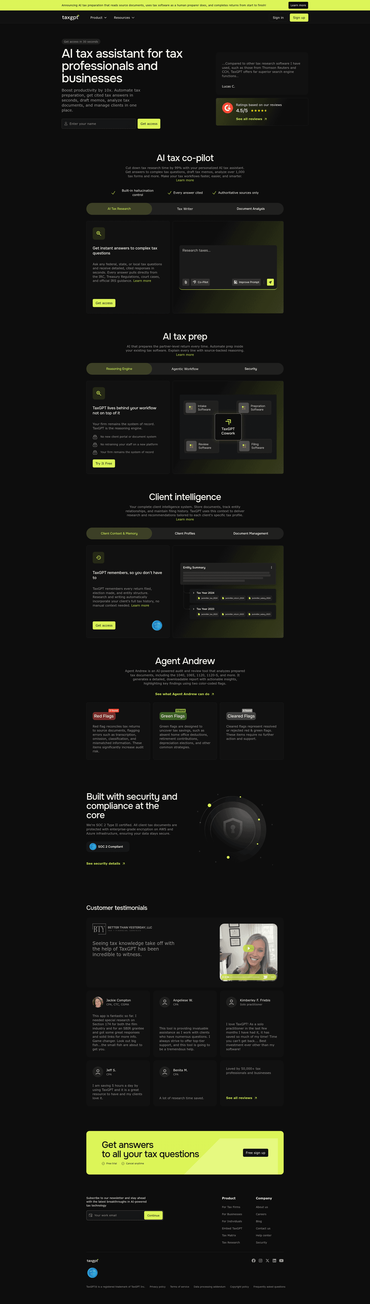
·Features
1Benefit-led headline (TaxGPT remembers, so you dont have to) leads with the outcome instead of a feature name
2Pain-to-outcome mapping ties manual context-gathering to research that auto-incorporates full client history
3Tabs (Client Profiles, Document Management) reveal secondary capabilities without crowding the active view
4Entity Summary panel showing Tax Year 2024 and 2023 files makes the product output concrete and credible
5Learn more link plus AICPA SOC badge add a deeper exploration path and trust right next to Get access
02
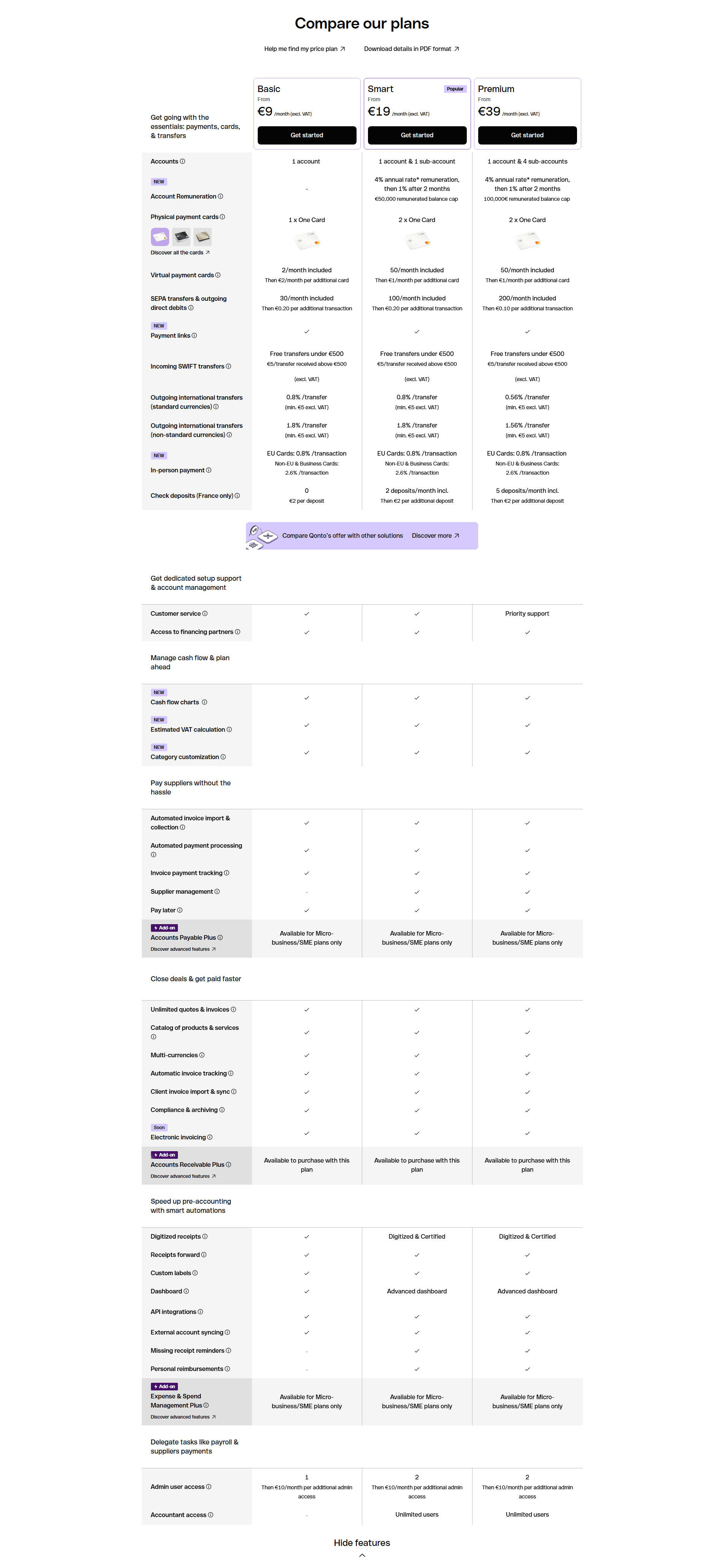
Qonto, European business banking with transparent compliance built in.
5 years CRO + SEO at Qonto (2021–2025). After advising 15+ SaaS on their websites (Payfit, Pigment…), the same patterns kept breaking, so I decided to build the source of truth on what works on the web: the intelligence layer every tool, builder, and team uses to ship sites that perform.
“Qonto leads with quantified social proof, 600,000+ clients and round-the-clock multilingual support, then backs it with named security protocols and licensed payment institution status. The value proposition section uses deep-dive links for objection handling, letting skeptical buyers self-serve their own due diligence without cluttering the page.”
What makes this page stand out
European banking foundation with regulatory compliance provides institutional trust for a fintech challenger
Clean, modern interface and transparent pricing differentiate from traditional banking aesthetics and opaque fee structures
500,000+ business customers social proof demonstrates massive European fintech market traction
Dual CTA serving both self-serve and enterprise buyer motions enables efficient conversion paths
Section we love
·Value PropositionBest in class
1Two distinct props side by side: Rated & recommended and Secure & regulated, each with its own icon
2Concrete proof numbers: 600,000+ clients, support in 5 languages, 7 days a week
3Security mechanism named: licensed Payment Institution plus 3D-Secure and Strong Customer Authentication
4Each prop ends with a deep-dive link (Read our reviews, Learn about account safety) for proof-seekers
03
Hyperline
63/100
What makes this page stand out
The product shortcuts list CPQ, Billing, and Usage-based with two-line benefit blurbs under each link.
Customer logos appear above the fold and a G2 link shows ★★★★★ and “4.9/5”.
The feature grid quantifies credibility with “< 10 min” support, “100+ countries” compliance, and “99.997% uptime”.
The Integrations section promises “one source of truth” and shows app icons on a black background with “Discover integrations” CTA.
Section we love
·Testimonial
1Recognizable customer logos (Formance, lemlist, Gladia) sit at the top of each card to borrow their credibility
2Each card links to a full Case study, signaling depth beyond a one-line quote
3Use-case-specific headlines (manage custom pricing, handle pay-as-you-go billing) tie the proof to concrete billing problems
4The lemlist card frames a transformation (shift from PLG to Enterprise deals) making the before and after state tangible
04
Ramp
63/100
What makes this page stand out
The “AGENTS AT WORK TODAY” panel shows live metrics like “Receipts processed” and “Total AI actions” with rolling counters.
The social proof line says “Join 50,000…” and links to a report claiming customers grow “3.2x faster”.
The product grid lists five modules, including “Cards & Expenses” and “200+ Integrations,” each with an outward-arrow link.
The testimonial section “We’ve got the receipts.” stacks logos (Notion, Shopify, Eight Sleep) with named roles and quotes.
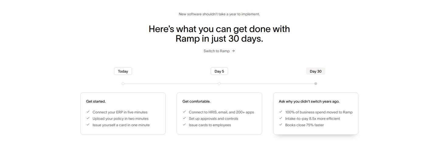
Section we love
·How It WorksBest in class
1A Today to Day 5 to Day 30 timeline breaks onboarding into three discrete, dated milestone cards
2Timeframes are everywhere and specific (just 30 days, connect ERP in five minutes, issue a card in one minute)
3Effort framing leads the section (new software shouldnt take a year to implement) and per-task minute claims
4Day 30 previews hard outcomes (100% of spend moved, books close 75% faster, intake-to-pay 8.5x more efficient)
5A Switch to Ramp link is embedded right under the headline as the section CTA
05
Fazeshift, AI agents for accounts receivable that eliminate bottlenecks.
5 years CRO + SEO at Qonto (2021–2025). After advising 15+ SaaS on their websites (Payfit, Pigment…), the same patterns kept breaking, so I decided to build the source of truth on what works on the web: the intelligence layer every tool, builder, and team uses to ship sites that perform.
“Fazeshift turns abstract AI claims into four measurable outcomes: 90% AR cost reduction, 90% time savings, 50% DSO reduction, and 5x cashflow uplift. Each metric targets a distinct accounts receivable pain point, making ROI immediately calculable. The dark, focused design keeps attention on the value proposition without visual distraction.”
What makes this page stand out
"Eliminate AR bottlenecks with AI agents that automate your existing processes, no rip-and-replace required" addresses the biggest objection (switching costs) directly in the sub-headline.
Product UI showing an invoice, email confirmation, and AI Agent chat creates a narrative of the automated AR workflow.
Dark, modern design conveys sophistication appropriate for a finance-focused AI product.
Single "Get started" CTA keeps the conversion focused.
Section we love
·Cta
1Single amber CTA (Speak to an expert) stands out against the dark band with no competing buttons
2Action copy (Speak to an expert) sets a clear, low-pressure next step for a sales conversation
3Pain-led headline (Every Business Faces Unique AR Challenges) plus tailored subcopy makes the demo feel personalized
06
Pennylane, All-in-one accounting with multi-platform trust proof.
5 years CRO + SEO at Qonto (2021–2025). After advising 15+ SaaS on their websites (Payfit, Pigment…), the same patterns kept breaking, so I decided to build the source of truth on what works on the web: the intelligence layer every tool, builder, and team uses to ship sites that perform.
“Pennylane reinforces credibility through four external rating platforms and three certification badges visible in the footer. The structured link architecture covers resources, company info, help, and chartered accountant needs in distinct columns, turning the footer into a trust layer and navigation tool rather than an afterthought.”
What makes this page stand out
Three-audience navigation (Indépendants et TPE, PME et ETI, Cabinet expertise comptable) segments the homepage for different buyer personas
Google 4.7/5 and Trustpilot 4.5/5 ratings prominently displayed provide dual third-party validation
Product UI mockups showing mobile and desktop dashboards, electronic invoicing badge, and treasury views demonstrate comprehensive platform capabilities
Feature bar (Facturation électronique, Facturation simplifiée, Gestion des achats, Trésorerie en temps réel, Comptabilité complète, Compte & carte pro) showcases platform breadth
Section we love
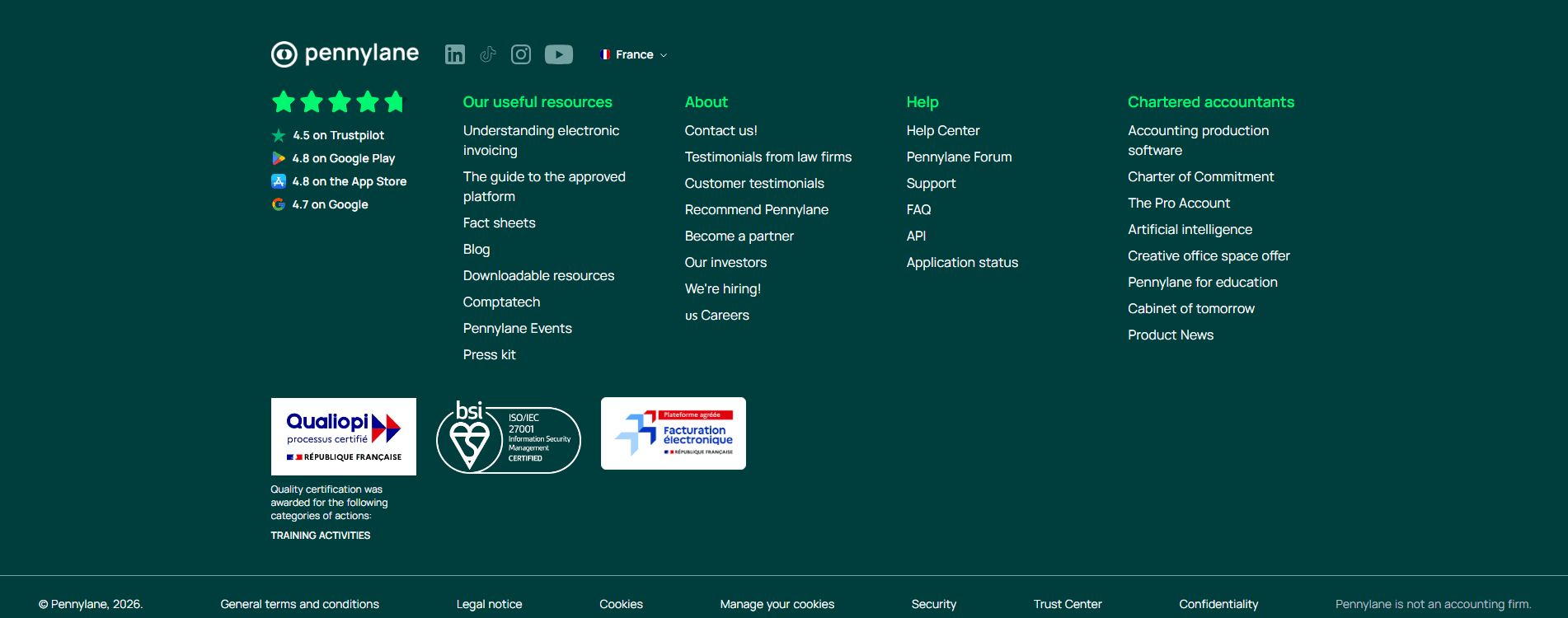
·Footer
1Footer links organized into 4 clear columns (Our useful resources, About, Help, Chartered accountants) for easy navigation
2ISO/IEC 27001, Qualiopi and Facturation electronique certification badges reinforce trust below the fold
3Review scores persist social proof: 4.5 on Trustpilot, 4.8 on Google Play, 4.8 on the App Store, 4.7 on Google
See how your page compares to the 57.3 average page score
Run a diagnostic on your accounting page and get a section-by-section breakdown of what to fix first to improve trust, workflow clarity, and product proof.
Design patterns we see across high-performing accounting pages
Across 13 accounting pages reviewed, the pages that convert share one trait: they name the financial workflow they own within seconds and back it with proof that a cautious buyer can verify without leaving the page.
The strongest patterns pair quantified outcomes with specific product visuals, then reinforce credibility through external validation, compliance badges, third-party ratings, or named security protocols. These trust layers matter more in accounting website design than in most SaaS categories because buyers are evaluating whether to hand over sensitive financial data. Use website section examples to compare how these building blocks show up across page types.
1Dual CTAs (Start Trial and Watch a demo) with free trial risk reducer cover both exploration and commitment
2Pain-point subtext (chasing late payments, scope creep) validates real frustrations of professional services firms
3Headline (Reclaim time. Unlock your firms revenue.) promises two specific outcomes in one punchy statement
4Audience specificity (accounting and professional services businesses) directly names the target buyer
Reviewed design-pattern pick from Ignition’s hero section.
What I love about this section
Dual CTAs (Start Trial and Watch a demo) with free trial risk reducer cover both exploration and commitment
Pain-point subtext (chasing late payments, scope creep) validates real frustrations of professional services firms
Headline (Reclaim time. Unlock your firms revenue.) promises two specific outcomes in one punchy statement
Audience specificity (accounting and professional services businesses) directly names the target buyer
Overlooked sections that quietly drive trust and navigation
In this set, navigation structures and footer layers do more conversion work than teams expect. A well-organized mega menu with persona-based entry points shapes product understanding before the visitor even scrolls, while a trust-reinforced footer keeps compliance signals visible throughout the evaluation.
The biggest gaps appear where the page should explain onboarding effort and time-to-value in concrete terms. When "how it works" is vague or missing, the hero gets forced to carry the entire trust burden, and financial buyers are left wondering how hard the switch will be.
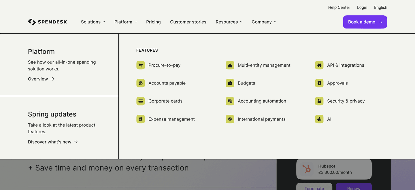
1The open Platform menu shows a 12-tile feature grid (Procure-to-pay, Budgets, Corporate cards, Expense management, AI)
2A left highlight column promotes Platform Overview and Spring updates with Discover what is new
3A standalone Pricing tab plus Customer stories balance cost clarity with social proof
4The purple Book a demo button anchors the bar as the primary conversion action
5Help Center, Login, and an English language switcher form a full utility cluster up top
Reviewed overlooked-section pick from Spendesk’s navbar section.
What I love about this section
The open Platform menu shows a 12-tile feature grid (Procure-to-pay, Budgets, Corporate cards, Expense management, AI)
A left highlight column promotes Platform Overview and Spring updates with Discover what is new
A standalone Pricing tab plus Customer stories balance cost clarity with social proof
The purple Book a demo button anchors the bar as the primary conversion action
Use the examples above as prompts for what to standardize, not just what to redesign.
Checklist: a practical audit for accounting website design
If you are iterating on an accounting homepage, this checklist helps you spot missing sections and messaging gaps quickly, especially around Value Proposition, Cta, and Hero.
Run it on your current page, then decide what to rewrite, what to reorder, and what proof to add before you touch visual polish. For a faster baseline, you can also try our landing page analysis.
Built from 42 sections across 11 accounting homepages in this benchmark. Each check below is a move the highest-scoring pages share, each paired with a real example from the benchmark.
Hero
Can a cautious buyer tell what financial job you do in five seconds?
The hero makes it instantly clear what the product is and who it's for.
Example: Spendesk states the category outright and pairs a "Book a demo" path with a "Tour the Spendesk app" walkthrough.
The hero makes an explicit outcome promise.
Example: TaxGPT leads with "Cut down tax research time by 99%" instead of describing the tool.
The real product shows above the fold.
Example: Spendesk opens on its budgeting UI with a "Marketing Budget" progress bar and Ramp on a dashboard charting "Spend by payee," not a hero graphic.
Value proposition
Is the value concrete, or just adjectives?
The value prop makes a specific claim.
Example: Qonto runs two precise props side by side, "Rated and recommended" and "Secure and regulated," each with its own icon.
The outcome is quantified with a number or a percentage.
Example: Fazeshift carries the section on four hard metrics, including 90% AR cost reduction and 50% DSO reduction.
A unique mechanism explains why the product works.
Example: TaxGPT frames its props as color-coded flag cards, red flags catch errors and green flags surface tax savings.
Features
Do features connect to outcomes the buyer cares about?
Feature copy leads with the outcome.
Example: Ramp puts the result first with cards like "Process bills in seconds" and "Travel that is always in policy."
Each feature maps a real pain to a measurable result.
Example: TaxGPT leads with "TaxGPT remembers, so you don't have to," tying the memory feature to research that auto-incorporates full client history.
Features show the outcome visually.
Example: Shine shows a real product visual on each card, the app balance, an actual invoice, the supplier e-invoice inbox.
Call to action
Does the next click feel safe to a cautious buyer?
One primary action dominates, with action-led copy.
Example: Pennylane lets one dark green "Start now" button own the block with no competing links.
Reassuring microcopy sits next to the button.
Example: Shine backs its button with "First month free, Opens in 5 minutes, No commitment" and TaxGPT with "No signup required, Takes just 2 minutes."
A product visual or asset supports the final ask.
Example: Qonto invites a low-commitment "Explore the Qonto app" tour beside the block instead of a bare signup.
The gap most accounting pages leave open is pricing.
Pricing is by far the rarest section in the accounting set. Of 11 companies benchmarked, only one, Ramp, exposes a pricing block clear enough to score. Ramp lines up three named plans, Free at $0 per user, Plus at $15 per user, and Enterprise, each with a one-line note on who it fits, so a visitor can compare without booking a call. Trust sections are nearly as scarce, with just two scorable in the set. Pages that bury pricing behind "contact sales" leave the cheapest trust on the table.
Interactive quiz
What would your accounting homepage score?
Question 1 of 5
0%
Can a visitor name the specific financial workflow you own in under 5 seconds?
"AI-powered accounts receivable" beats "streamline your financial operations."
Reviewed by
Gabriel Amzallag , Founder, Web Anatomy
5 years CRO + SEO at Qonto (2021–2025). After advising 15+ SaaS on their websites (Payfit, Pigment…), the same patterns kept breaking, so I decided to build the source of truth on what works on the web: the intelligence layer every tool, builder, and team uses to ship sites that perform.
See how your page compares to the 57.3 average page score
Run a diagnostic on your accounting page and get a section-by-section breakdown of what to fix first to improve trust, workflow clarity, and product proof.
Quick answers based on our accounting website benchmark dataset.
What are the best accounting websites?
[01]
The strongest performers in this June 2026 benchmark are TaxGPT, Qonto, Fazeshift, Bill, Pennylane, and Ramp. Across 13 accounting homepages scored against 60+ criteria, these pages convert by naming the specific financial workflow (AR, tax, invoicing, expense) in the hero, then stacking external proof (licensed status, third-party review scores, quantified outcomes) before a cautious buyer has to ask.
What makes accounting websites harder to convert than typical SaaS pages?
[02]
Buyers are handing over sensitive financial data, so they will not act until the page feels safe and specific. Across 13 homepages reviewed, the pages that convert swap abstract claims for verifiable proof: Qonto leads with 600,000+ clients and licensed payment institution status, Fazeshift anchors ROI with 90% AR cost reduction and 50% DSO reduction, and Ramp promises full ROI in 30 days with minute-level onboarding estimates.
What is the biggest design mistake on accounting homepages?
[03]
Leading with a broad platform narrative while delaying regulatory proof and concrete outcomes. The average page in this June 2026 benchmark scored 57.3. Top performers answer "what financial job do you do?" in the hero: Fazeshift names accounts receivable and kills the rip-and-replace objection in the sub-headline, TaxGPT splits the nav by filer persona, and Pennylane surfaces Google 4.7 and Trustpilot 4.5 before the first scroll.
What sections should an accounting homepage include?
[04]
A hero naming the financial workflow, an early trust layer with compliance badges and third-party review scores, a how-it-works section showing the real product UI, features tied to measurable outcomes, and parallel conversion paths for self-serve and enterprise buyers. Bill splits the hero into a self-serve email form and a guided demo link; TaxGPT segments by filer in the nav itself. Across 13 pages, these blocks separate top performers from the rest.
How many accounting website examples should I study before redesigning?
[05]
Three to five is enough if you pick by workflow and compare section by section. Only 4% of pages in this benchmark score in the top tier, so the gap lives in a few blocks. Study TaxGPT for persona segmentation, Qonto for regulatory trust stacking, Fazeshift for quantified AR outcomes, Pennylane for external-rating credibility, and Ramp for onboarding transparency with 30-day ROI timelines.
Where can I find inspiration for my accounting website design?
Use a structured rubric that checks clarity, trust, and friction instead of relying on subjective feedback. Run your page through the landing page analyzer for a section-by-section score against the same 60+ criteria used in this benchmark.