Skip to content

Biotech website design examples, ranked by benchmark

We scored 3 biotech homepages on 60+ conversion criteria. See which sections separate the top performers, and what your page is probably missing.

Updated April 20263 pages analyzed
#CompanyScore

Scored by AI across 60+ conversion criteria

Benchling landing page
#1
43/100
Scroll to explore
Analyze your pageFree. Takes 2 minutes.

What high-performing biotech homepage design gets right

Biotech pages have to earn scientific credibility and explain complex products to buyers who range from researchers to investors. The strongest pages in this benchmark do four jobs early:

41.6/100

Avg. page score

  • Lead with scientific credibility in the first viewport. Show published data, pipeline stages, or peer-reviewed results so the visitor trusts the science before evaluating the business.
  • Make the product story concrete. Translate complex biology into a clear problem-solution narrative that a non-specialist stakeholder can follow in under ten seconds.
  • Surface regulatory and compliance proof early. FDA status, GMP certifications, or partner logos build the institutional trust that biotech buyers require before engaging further.
  • Give different audiences a clear path. Researchers, investors, and commercial partners evaluate biotech pages with different priorities, so the strongest pages route each audience to relevant proof fast.

Biotech website design examples

A benchmark-backed look at biotech website design, focused on what today’s best biotech websites do to communicate credibility, clarity, and conversion intent across the full page experience.

01

Benchling, Product-led lab software with platform credibility

Editor's pick43/100
Gabriel AmzallagGabriel AmzallagFounder, Web Anatomy

Clean, corporate, and UI-forward, Benchling balances platform positioning with concrete proof and workflow specificity. The experience feels enterprise-ready, with clear messaging, credible validation, and detailed segmentation that stays coherent.

What makes this page stand out

  • Three core value pillars — digitize your lab, automate workflows, increase productivity with AI — address the complete lab modernization journey
  • "Loved by 200,000 scientists" and "more than half of the world's top 50 biopharma companies" provide dual social proof across individual adoption and enterprise validation
  • Concrete ROI metrics (63% reduction in data capture time, 10x throughput increase, 4 hours/week saved per scientist) quantify tangible productivity gains
  • Solutions segmented by workflow (Bioresearch, Bioprocess, In Vivo, Connect) and modality (gene therapy, cell therapy, antibodies, RNA therapeutics) demonstrate deep scientific specialization

Section we love

·Resources
Benchling Resources section
  1. 1Original research front and center: 2026 Biotech AI Report built from a survey of 100 biotech and biopharma orgs
  2. 2Report topic (how teams use AI in R&D) maps directly to Benchling's core lab and research audience
  3. 3Single Read more CTA drives the visitor into the full report and deeper site content
02

Recursion, Platform narrative for AI-driven drug discovery

35/100
Gabriel AmzallagGabriel AmzallagFounder, Web Anatomy

Bold and modern with a tech-forward, editorial feel, Recursion tells a cohesive platform story backed by credible partnerships and real pipeline signals. The page stays structured, helping visitors grasp complex work quickly.

What makes this page stand out

  • Massive proprietary dataset (biological, chemical, clinical) creates a defensible data advantage
  • Partnership model with major pharma companies (Roche, Bayer) validates the technology
  • Automated robotic lab capabilities differentiate from purely computational approaches
  • OS (Operating System) for drug discovery positioning creates a platform narrative

Section we love

·Navbar
Recursion Navbar section
  1. 1The top nav spans Our Platform, Clinical Trials, Investors and About Us for a biotech audience
  2. 2An open dropdown under the first nav item reveals a stacked list of sub-pages
  3. 3The bar keeps a clean dark-on-gradient treatment that lets the menu items stand out
  4. 4A right-aligned button sits at the end of the nav for the primary next step

Compare your biotech page score to the 41.6 average

Run your page through the same section-level rubric used in this benchmark to find what to fix first, and which patterns to keep.

Biotech design trends we keep seeing

In biotech website design, the strongest pages reduce ambiguity quickly by stating what the product is, who it’s for, and what outcome it drives in plain language.

High-performing biotech homepage design shows concrete product evidence early (especially in the hero); for reference, see our best hero section examples. Use-case segmentation also tends to outperform generic feature lists when audiences span multiple modalities and workflows.

Hero Benchling

56/100

How Benchling captures attention above the fold

Benchling hero section
  1. 1Real lab UI showing Fragment Analysis with Plate ID, Well, Entity ID, and Range columns proves scientific tooling
  2. 2Pharma logo bar (Sanofi, Moderna, Beam Therapeutics, Novonesis, Altos) builds massive biotech credibility
  3. 3Headline (AI for every scientist. Breakthroughs for all.) combines audience targeting with aspirational positioning
  4. 4Typing animation (Benchling your hub for Lab aut...) hints at lab automation without cluttering the hero

Reviewed design-pattern pick from Benchling’s hero section.

What I love about this section

  • Real lab UI showing Fragment Analysis with Plate ID, Well, Entity ID, and Range columns proves scientific tooling
  • Pharma logo bar (Sanofi, Moderna, Beam Therapeutics, Novonesis, Altos) builds massive biotech credibility
  • Headline (AI for every scientist. Breakthroughs for all.) combines audience targeting with aspirational positioning
  • Typing animation (Benchling your hub for Lab aut...) hints at lab automation without cluttering the hero

Features Benchling

50/100

How Benchling showcases their product

Benchling features section
  1. 1Features organized by science modality (Gene therapy, Cell therapy, Antibodies and proteins, RNA therapeutics, Agritech) so each research team self-identifies
  2. 2Every modality carries its own Learn more link to a dedicated page, giving specialists a deeper exploration path
  3. 3Benefit-led framing (Everything you need for cutting-edge science, plus best practices, templates and models for next-gen modalities) leads with the outcome
  4. 4Distinct icon per modality makes the seven-domain list scannable at a glance

Reviewed design-pattern pick from Benchling’s features section.

What I love about this section

  • Features organized by science modality (Gene therapy, Cell therapy, Antibodies and proteins, RNA therapeutics, Agritech) so each research team self-identifies
  • Every modality carries its own Learn more link to a dedicated page, giving specialists a deeper exploration path
  • Benefit-led framing (Everything you need for cutting-edge science, plus best practices, templates and models for next-gen modalities) leads with the outcome
  • Distinct icon per modality makes the seven-domain list scannable at a glance

Value Proposition Benchling

67/100

How Benchling presents their value

Benchling value proposition section
  1. 1Three distinct pillars (AI automation, unified data model, open platform) each with icon, copy, and product UI
  2. 2Every prop shows a real Benchling screenshot (AI notebook checks, molecule modeling, titer results chart) proving the claim
  3. 3Read more link under each pillar gives prospects a path to technical depth without cluttering the section
  4. 4Concrete capabilities named: model biomolecules, cell lines and reagents; out-of-the-box and custom integrations

Reviewed design-pattern pick from Benchling’s value proposition section.

What I love about this section

  • Three distinct pillars (AI automation, unified data model, open platform) each with icon, copy, and product UI
  • Every prop shows a real Benchling screenshot (AI notebook checks, molecule modeling, titer results chart) proving the claim
  • Read more link under each pillar gives prospects a path to technical depth without cluttering the section
  • Concrete capabilities named: model biomolecules, cell lines and reagents; out-of-the-box and custom integrations

Sections biotech teams underuse (but should not)

A clear “how it works” flow often separates casual interest from real intent, especially when the science is complex and trust needs to build step by step.

Resource hubs and footers are easy to treat as housekeeping, but they often carry the diligence load: answering questions, guiding exploration, and reinforcing credibility without disrupting the main path.

How It Works Recursion

50/100

How Recursion simplifies the process

Recursion how it works section
  1. 1The patient journey maps six discrete stops from screening to Baseline endoscopy to On treatment to Week 13 to Off treatment to Week 25
  2. 2Concrete timeframes anchor every phase (REC-4881 4mg once a day for 12 weeks, then 12 weeks off treatment)
  3. 3A horizontal timeline with hexagon node markers makes the sequence read left to right at a glance
  4. 4Each milestone carries a plain label so the trial structure is legible without medical jargon

Reviewed overlooked-section pick from Recursion’s how it works section.

What I love about this section

  • The patient journey maps six discrete stops from screening to Baseline endoscopy to On treatment to Week 13 to Off treatment to Week 25
  • Concrete timeframes anchor every phase (REC-4881 4mg once a day for 12 weeks, then 12 weeks off treatment)
  • A horizontal timeline with hexagon node markers makes the sequence read left to right at a glance
  • Each milestone carries a plain label so the trial structure is legible without medical jargon

Footer Benchling

60/100

How Benchling closes the page with confidence

Benchling footer section
  1. 1Four labeled columns (Product, Resources, Contact, Legal) group links by intent for quick scanning
  2. 2AICPA SOC and HIPAA Compliant badges sit in the footer to reinforce security for healthcare buyers
  3. 3Legal column lists Terms, SOC 2 Type II, Privacy and Security for clear policy and compliance access
  4. 4Contact column points to Contact Sales and Get Support so late-stage visitors find a path to talk

Reviewed overlooked-section pick from Benchling’s footer section.

What I love about this section

  • Four labeled columns (Product, Resources, Contact, Legal) group links by intent for quick scanning
  • AICPA SOC and HIPAA Compliant badges sit in the footer to reinforce security for healthcare buyers
  • Legal column lists Terms, SOC 2 Type II, Privacy and Security for clear policy and compliance access
  • Contact column points to Contact Sales and Get Support so late-stage visitors find a path to talk

Resources Recursion

60/100

How Recursion educates before they sell

Recursion resources section
  1. 1The latest from Recursion mixes an original clinical milestone (First Patient Dosed in Phase 1 of REC-3565) with thought leadership on AI drug discovery
  2. 2Article topics (AI drug discovery, will AI cure cancer) sit squarely in the company's AI biotech domain
  3. 3Read more links on every card plus LinkedIn, X, and YouTube icons route visitors to deeper owned and social channels

Reviewed overlooked-section pick from Recursion’s resources section.

What I love about this section

  • The latest from Recursion mixes an original clinical milestone (First Patient Dosed in Phase 1 of REC-3565) with thought leadership on AI drug discovery
  • Article topics (AI drug discovery, will AI cure cancer) sit squarely in the company's AI biotech domain
  • Read more links on every card plus LinkedIn, X, and YouTube icons route visitors to deeper owned and social channels

If you’re refreshing your page, treat the section types below as quick-win candidates before rewriting core messaging.

Checklist to apply these patterns to your page

Use the checklist to audit your page against the same section framework used in this review, then turn gaps into a short, testable set of edits.

For a faster baseline, try our landing page analyzer to benchmark your sections and see what to fix first.

Interactive quiz

How strong is your biotech homepage?

Question 1 of 5
0%

Can a biotech buyer identify what you do in under five seconds?

The headline should name the job, buyer, or workflow directly.

Gabriel Amzallag

Reviewed by

Gabriel Amzallag , Founder, Web Anatomy

5 years CRO + SEO at Qonto (2021–2025). After advising 15+ SaaS on their websites (Payfit, Pigment…), the same patterns kept breaking, so I decided to build the source of truth on what works on the web: the intelligence layer every tool, builder, and team uses to ship sites that perform.

Compare your biotech page score to the 41.6 average

Run your page through the same section-level rubric used in this benchmark to find what to fix first, and which patterns to keep.

Analyze your biotech pageFree. Takes 2 minutes.
Benchmark-backed biotech website design FAQs

Biotech website design: FAQ

Answers based on a benchmark review of {count} biotech websites.

What are the best Biotech websites?

[01]

The strongest performers in this April 2026 benchmark are Benchling and Recursion, alongside other top pages from the 3-page leaderboard. Rankings come from a section-by-section scoring audit against 60+ conversion criteria, hero, value proposition, trust, features, CTA, rolled up into an overall score, not a subjective favorites list.

What makes Biotech websites harder to convert than generic SaaS pages?
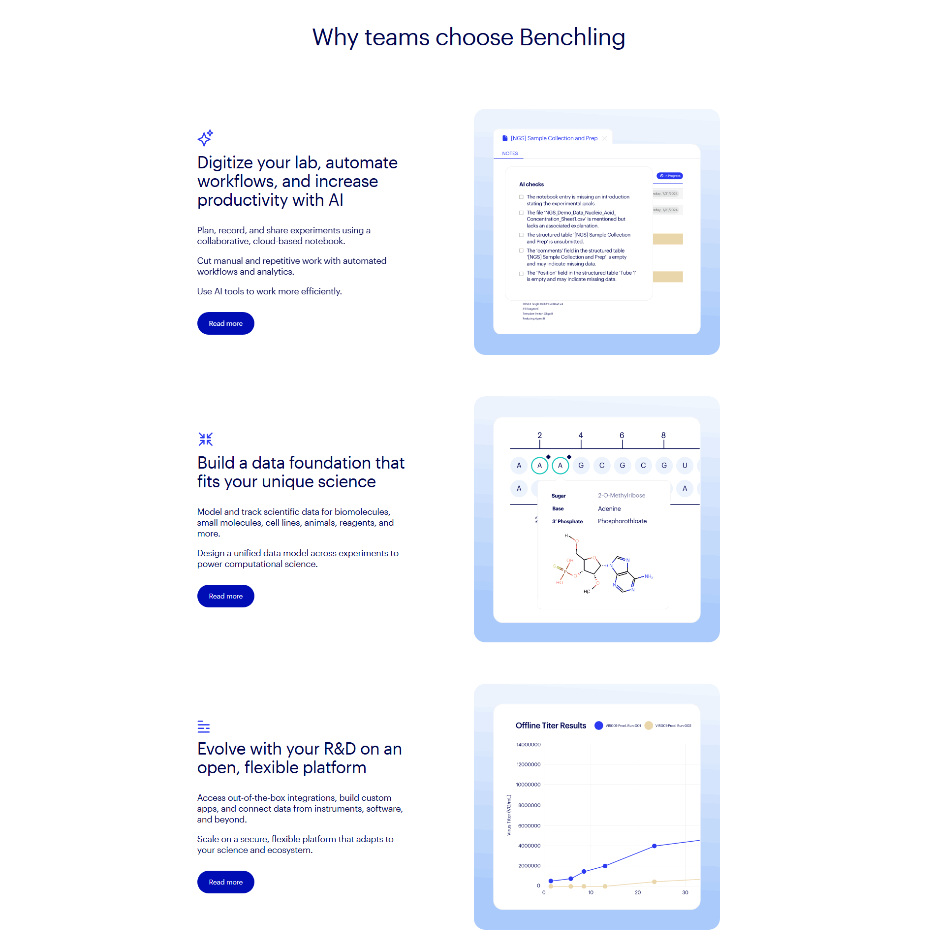
[02]

Biotech buyers need scientific credibility and risk reduction before they'll take a "book a demo" step. Across 3 homepages reviewed, the pages that convert anchor the viewport with verifiable proof: Benchling opens with three concrete product pillars (digitize your lab, automate workflows, accelerate discovery with AI); Recursion leads with its proprietary biological, chemical, and clinical dataset as a defensible data advantage. Abstract language loses; specific assets win.

What is the biggest design mistake on Biotech homepages?

[03]

Vague "accelerate discovery" headlines instead of a specific outcome tied to a named buyer and a visible proof asset. The average page scored 41.6 across 3 homepages reviewed. Top performers replace abstraction with concrete evidence, Benchling's workflow-specific value pillars, Recursion's named partnerships and pipeline signals, so a skeptical researcher or investor has something verifiable to anchor on in the first viewport.

What sections should a Biotech homepage include?

[04]

A strong biotech homepage includes a clear hero (audience plus outcome), a proof layer (logos, publications, partnerships, or pipeline stages), a simple "how it works" explanation, key use cases with visuals, and a clear next step (demo, contact, or talk to an expert). Benchling's three value pillars and Recursion's partnership-led platform story are concrete templates. Each section earns the next scroll with a specific, verifiable claim.

How many Biotech examples do I need to review before redesigning?

[05]

Three to five strong examples are usually enough. With 3 biotech pages benchmarked and only 7% reaching top-scoring, section-level comparison (hero vs hero, proof vs proof) matters more than collecting full-page references. Study Benchling for platform clarity and Recursion for data-asset positioning, then audit yours against the same rubric.

Where can I find great inspiration for my Biotech website?

[06]

Study pages section by section, not as full-page moodboards. Browse best landing page examples for the full gallery, then drill into hero section examples, trust section examples, and pricing section examples to see how Benchling and Recursion differ at each funnel stage.

How do I audit my Biotech homepage?

[07]

Use a structured rubric that checks clarity, trust, and friction instead of relying on subjective feedback. Run your page through the landing page audit for a section-by-section score.