Comparison page design (235)
A comparison page sets one product against a single rival, side by side. Its job is to help a visitor torn between the two make the call. See 235 real examples.
Showing 1–24 of 235 comparison pages
How to build a comparison page, by the numbers
The questions a team asks when it designs an X vs Y page, answered from the 235 here.
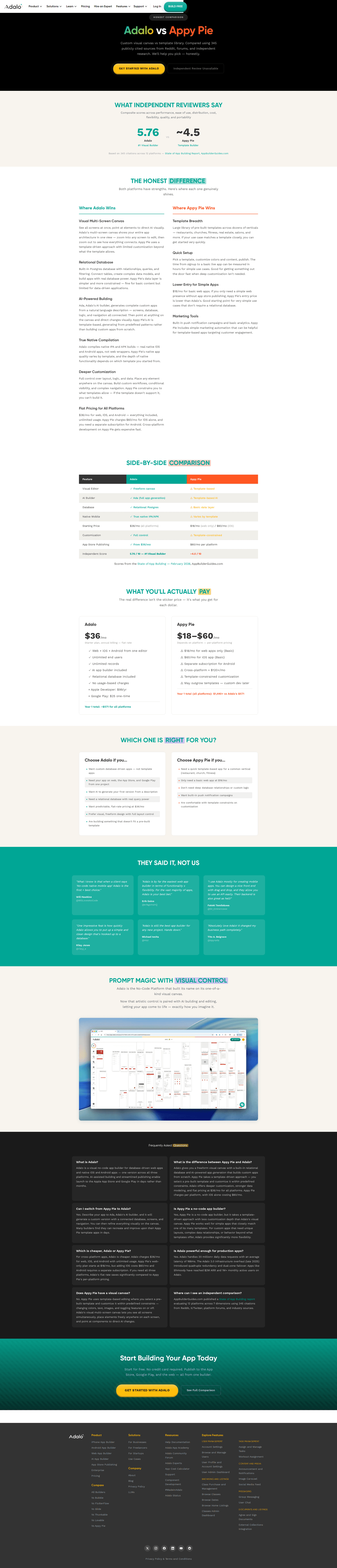
How fair does the page have to be?
- A concession to the competitor on 46%
- An explicit "pick them if" on 32%
Fairness is what separates them: 87% of the strongest admit something the competitor does better, against 17% of the weakest.

What goes in the comparison table?
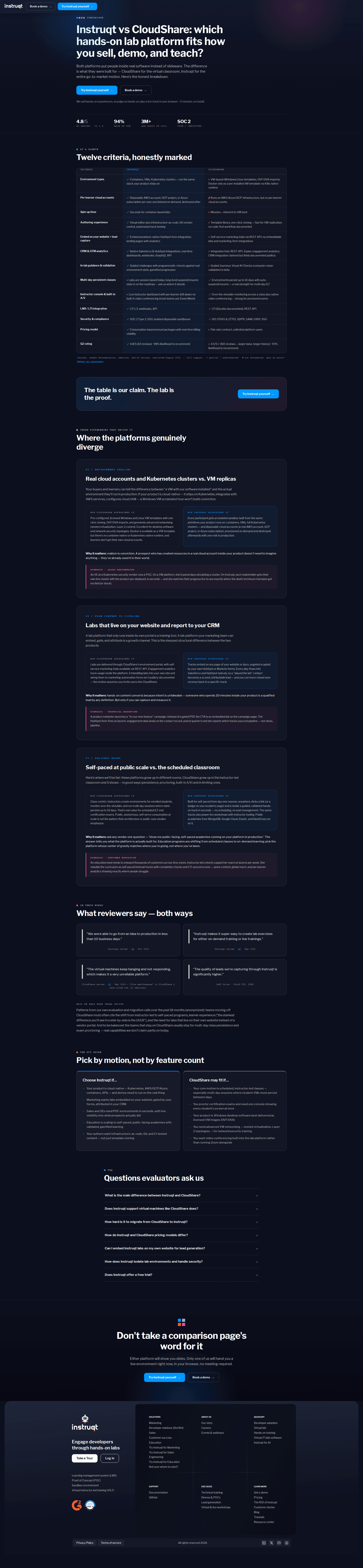
- A side-by-side table on 85%
- Ticks and crosses marking who has what on 60%
How many rows the table compares
- 722 comparison pages
- 619 comparison pages
- 815 comparison pages
- 1215 comparison pages
- 914 comparison pages
- 1013 comparison pages

Should the page show both prices?
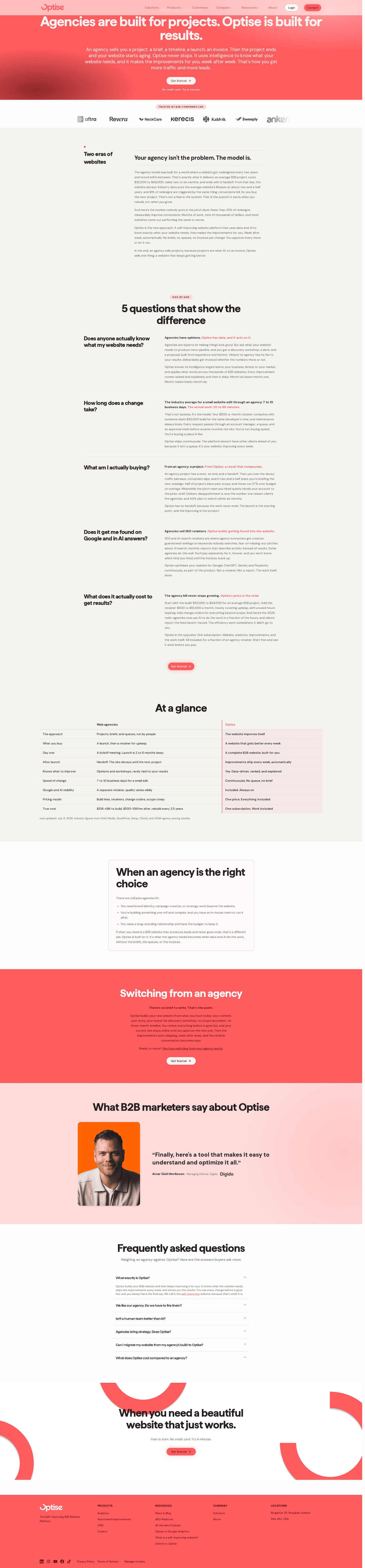
43% put the competitor's price next to their own. 70% of the strongest pages do it, against 9% of the weakest.
How do you make the claims believable?
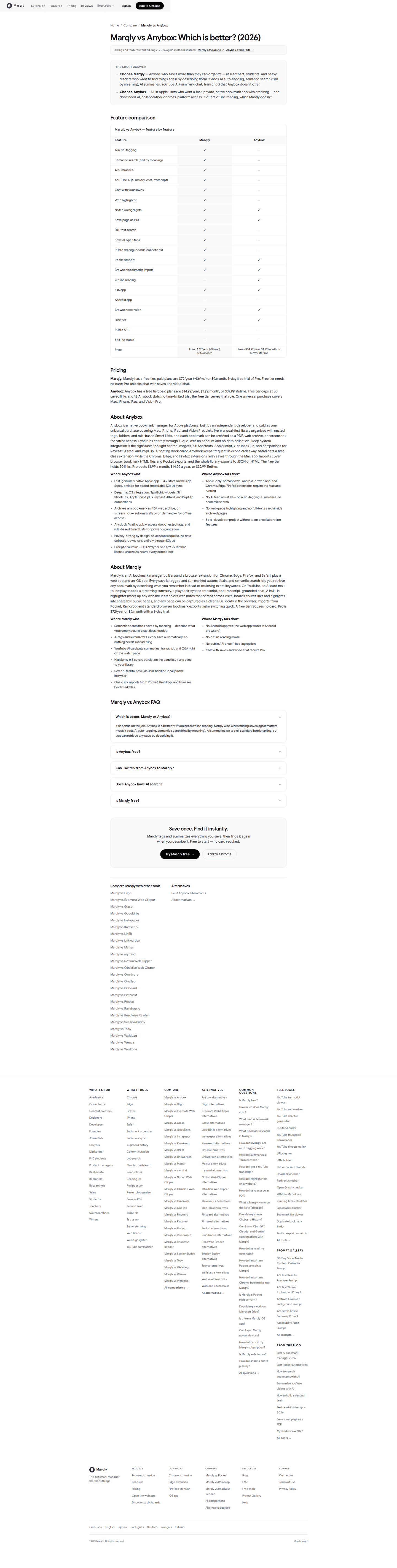
- A date showing when the comparison was last checked on 30%
- A source cited for the claims on 28%
What helps someone actually switch?
- A migration section on 20%, covering the import, the help and the contract
- Customer quotes with a real name attached on 57%
- A number attached to a customer result on 18%


What is the page asking for?
What the primary button asks for
- Start a free trial114 comparison pages
- Request a demo70 comparison pages
- Sign up23 comparison pages
- Contact sales17 comparison pages
- Download8 comparison pages
- One ask, repeated 3 times down the page
- 74% close on a CTA band

The moves almost nobody makes
Each sits under 15% of the market, with the strongest comparison page that uses it.
An offer for people leaving the competitor
12% put something on the table for a switcher, such as free migration or a credit for the contract still running.
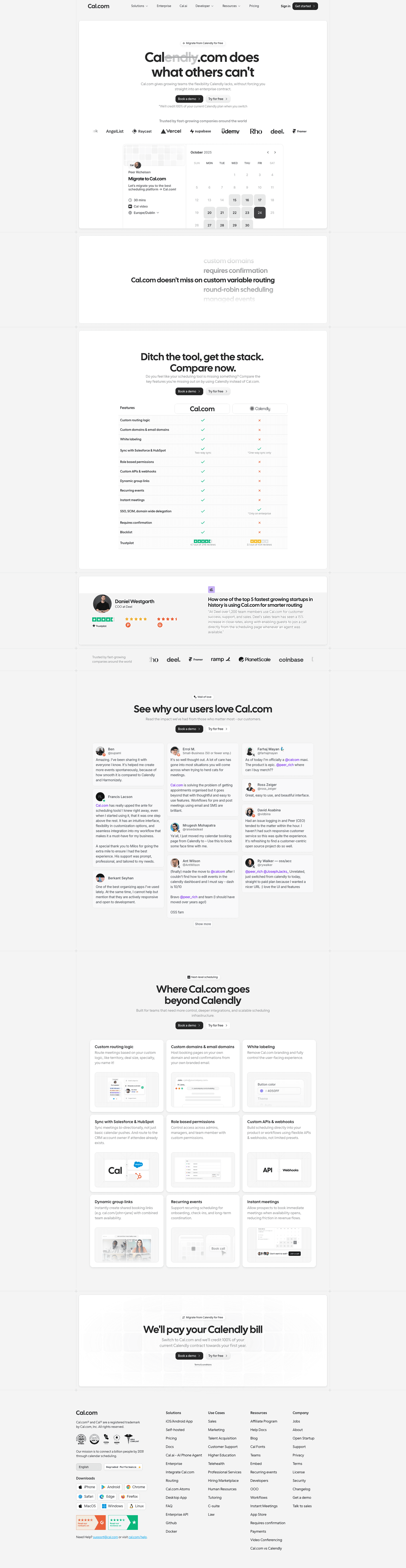
Quotes from people who actually switched
10% quote customers who moved from this exact competitor, rather than reusing the usual customer quotes.


Curated by
Gabriel Amzallag , Founder, Web Anatomy
5 years CRO + SEO at Qonto (2021–2025). After advising 15+ SaaS on their websites (Payfit, Pigment…), the same patterns kept breaking, so I decided to build the source of truth on what works on the web: the intelligence layer every tool, builder, and team uses to ship sites that perform.
Go further than comparison pages
Growth Engine
Your top 3 opportunities for more revenue.
We find every way to grow your website’s visibility and conversions: SEO, AI search (AEO), backlinks and mentions, and UX/UI. 3 free opportunities, delivered by email.
Library
The analysis behind every page here
Each comparison page on this page, section by section, with what works and what does not. Free account.
Didn't find the comparison page you were looking for?
Every other page type has its own gallery. Start from all page types.
- Homepages
- Pricing pages
- About pages
- Contact pages
- Feature pages
- Integrations pages
- Security pages
- Enterprise pages
- Industry pages
- Persona pages
- Why us pages
- Case study pages
- Blog pages
- Signup pages
- Webinar pages
- SEO landing pages
- Free tool pages
- PPC landing pages
- Careers pages
- Login pages
- 404 pages
- AI product pages
- Press pages
- Partner program pages
- Download pages
- Resource libraries
- Developer pages
- Solutions pages
- Template galleries
- Glossary pages
- Startup program pages
- Community pages
- ROI calculators
- Newsletter pages
- Programmatic SEO pages
- Blog posts
- Customer stories pages
- Features overview pages
- Product tours
- Integration pages
- AI agent pages
- Affiliate program pages
- Team pages
- Conference pages
Your top 3 opportunities for more revenue.
We find every way to grow your website’s visibility and conversions: SEO, AI search (AEO), backlinks and mentions, and UX/UI. 3 free opportunities, delivered by email.
Comparison page design, answered
The questions people ask before rebuilding an X vs Y page, answered from 235 real ones.
What should a comparison page include?
01More than four in five carry a side-by-side table. About three in five mark the features with ticks and crosses, about as many quote customers, and a little over half answer an FAQ under the table.
Should a comparison page admit what the competitor does better?
02Yes. Close to half name at least one thing the competitor genuinely does better, and it ties for the widest split in the set: nearly nine in ten of the strongest pages do it, against about one in six of the weakest. About one in three go further and say outright who should pick the competitor, which is three in four of the strongest against almost none of the weakest.
Should a comparison page show both prices?
03About two in five put the competitor's price next to their own. Seven in ten of the strongest pages do, against one in ten of the weakest.
How many rows should the comparison table have?
04Ten is the middle of the set, and half of the tables run between seven and sixteen rows. Fewer than one in forty compare three things or less, and about one in six go to twenty rows or more.
How do I make a comparison page credible?
05Date it and source it. About three in ten say when the comparison was last checked, and a little over one in four cite a source for their claims. Half of the strongest pages carry a date, against about one in six of the weakest.
How is this different from the best landing pages leaderboard?
06This gallery is a visual browse: what comparison pages look like and what they contain. The best landing pages benchmark is the graded view, where pages are scored against conversion best practices and ranked by industry. Same companies, different question.