Pricing|
The pricing section is where visitors decide whether the product is worth paying for. Explore 114 scored examples and see what the best do differently.
Updated October 2026
Showing 1–29 of 114 examples
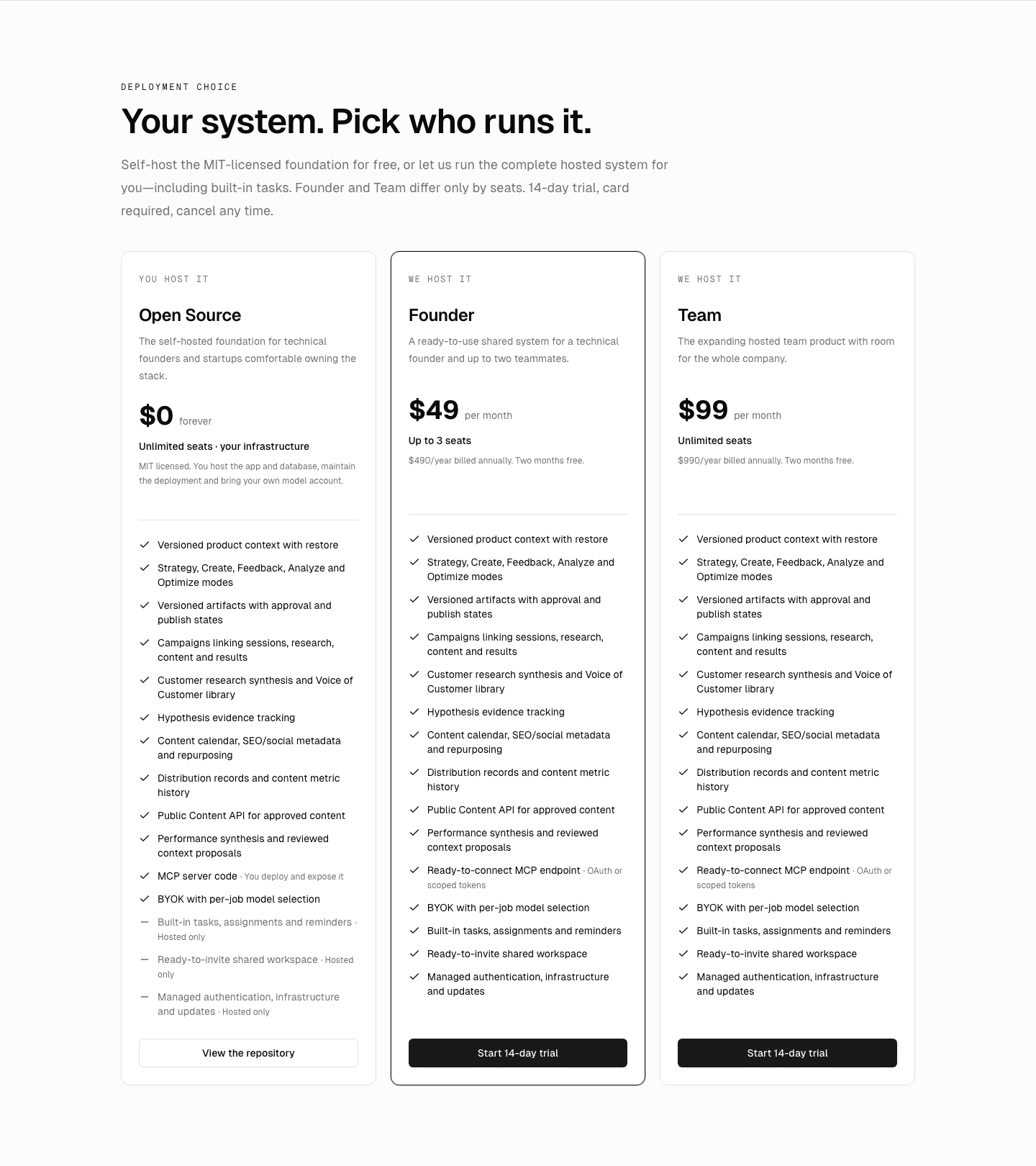
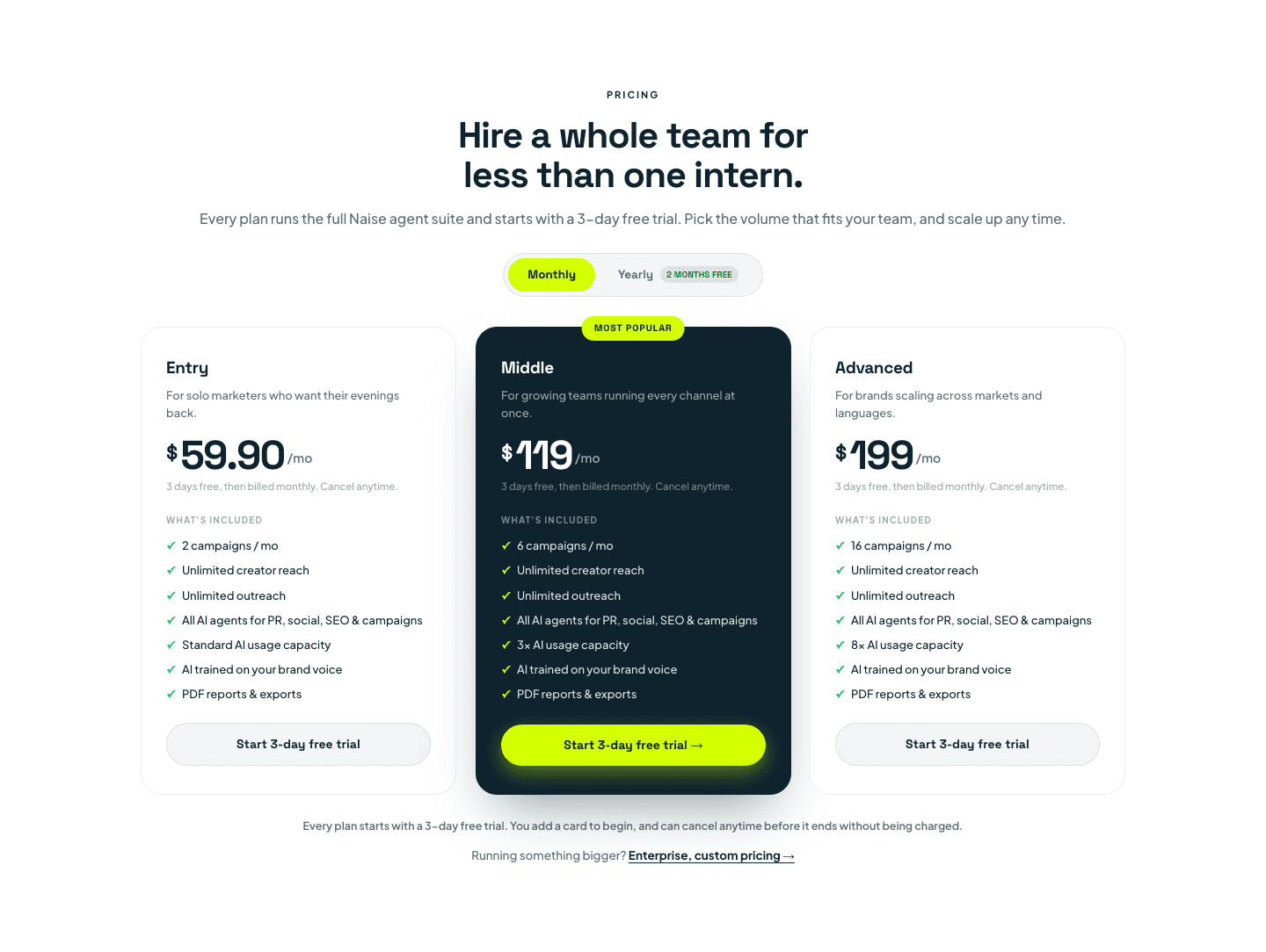
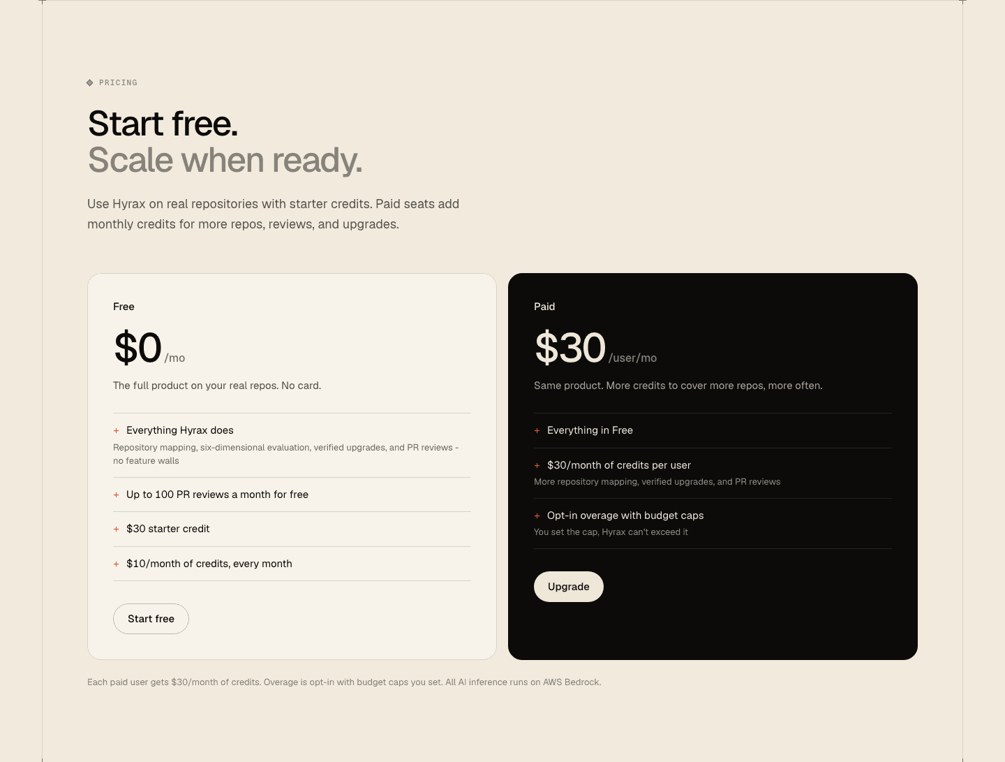
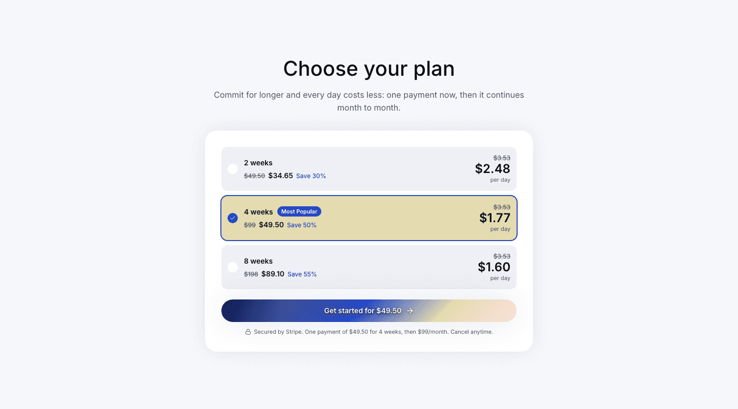
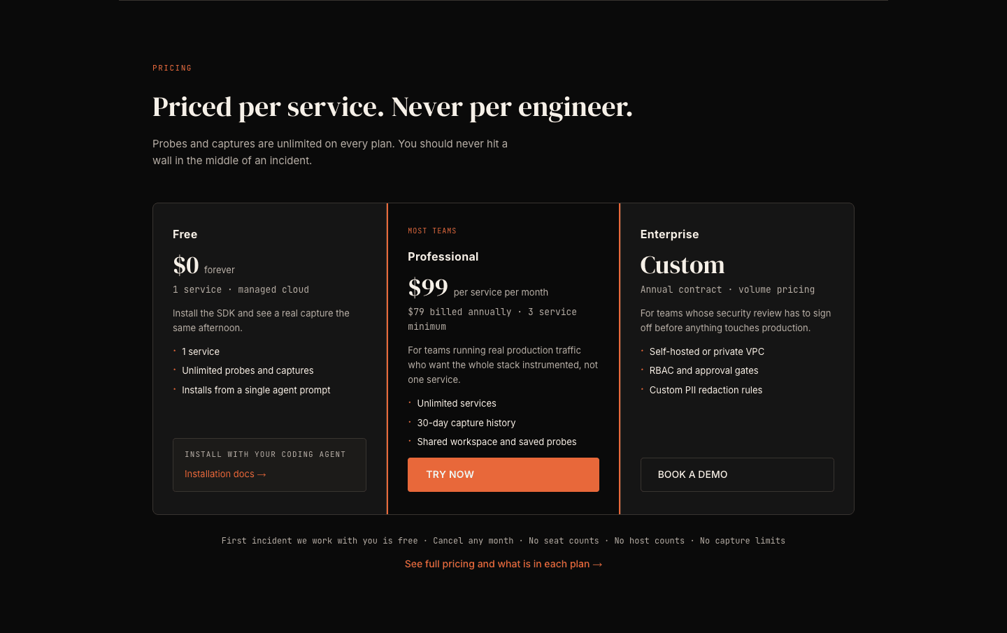
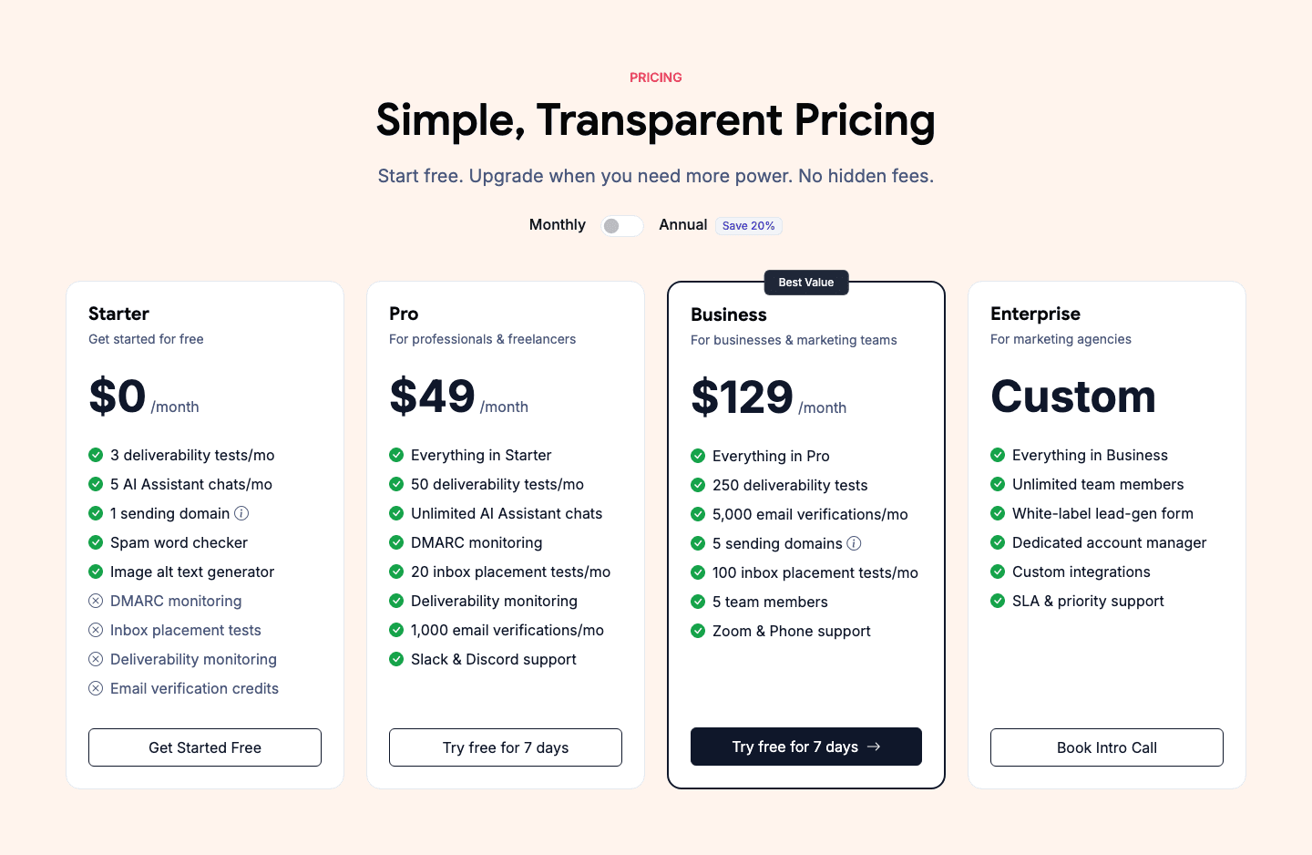
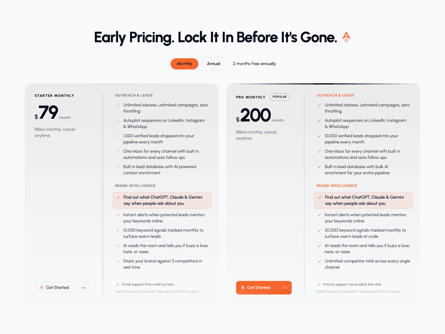
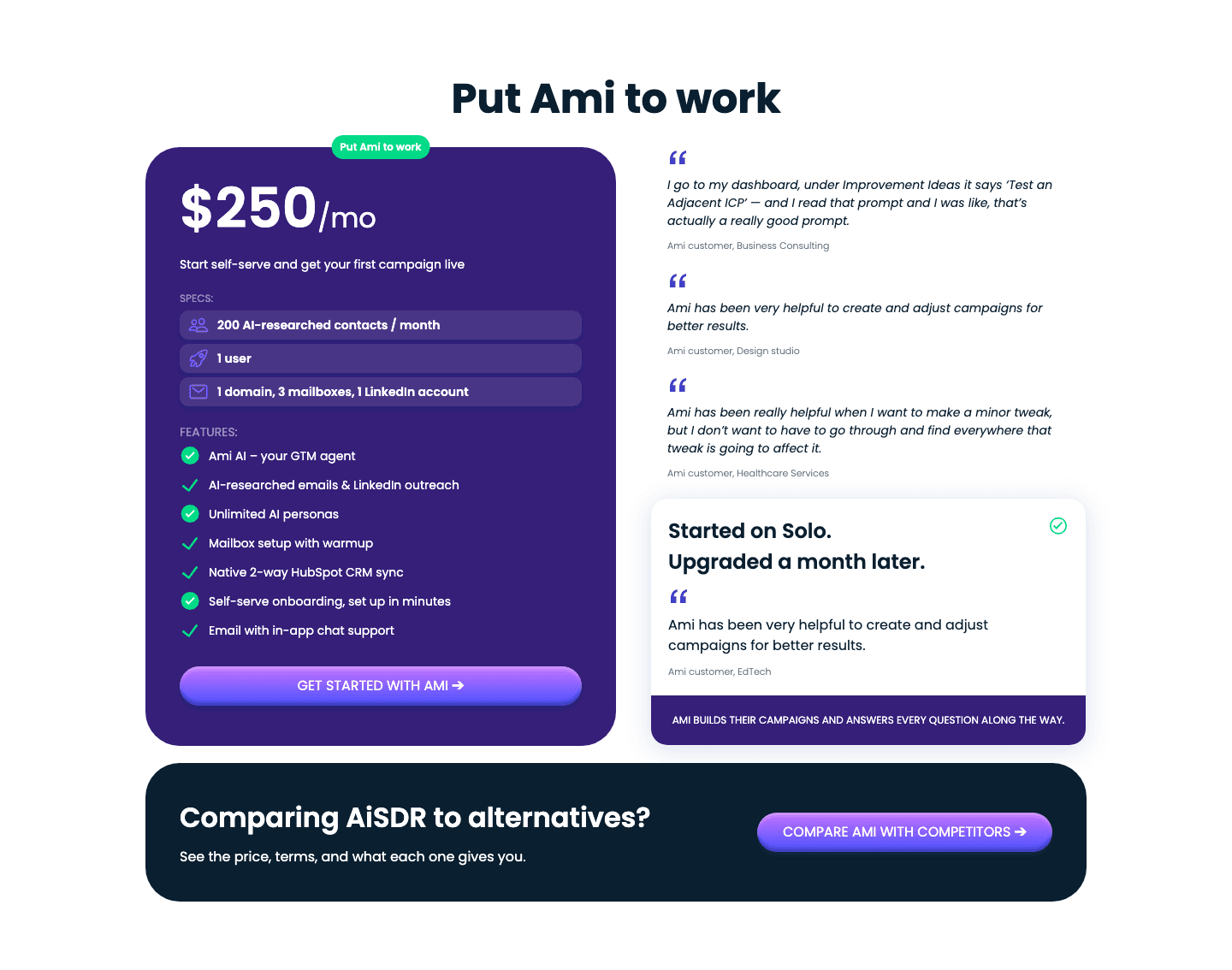
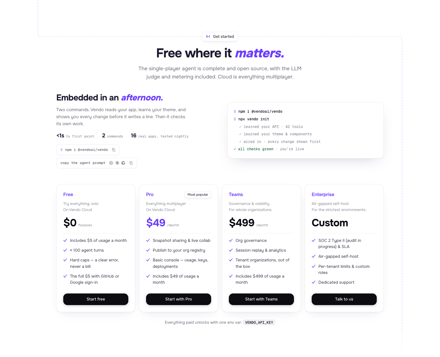
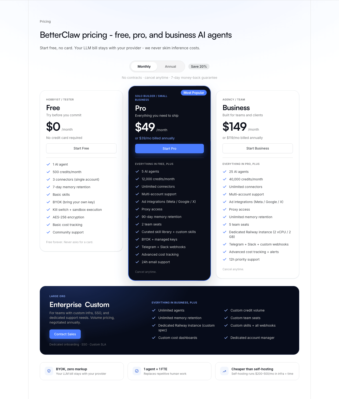
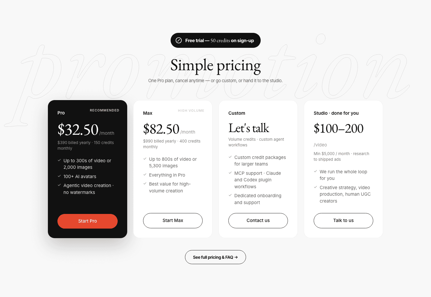
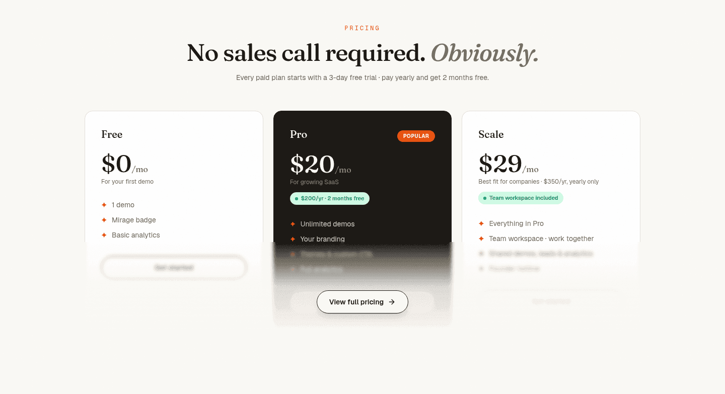
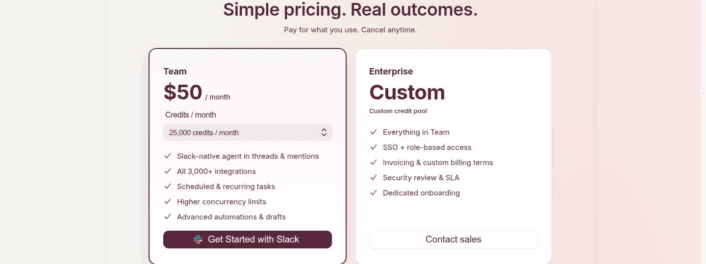

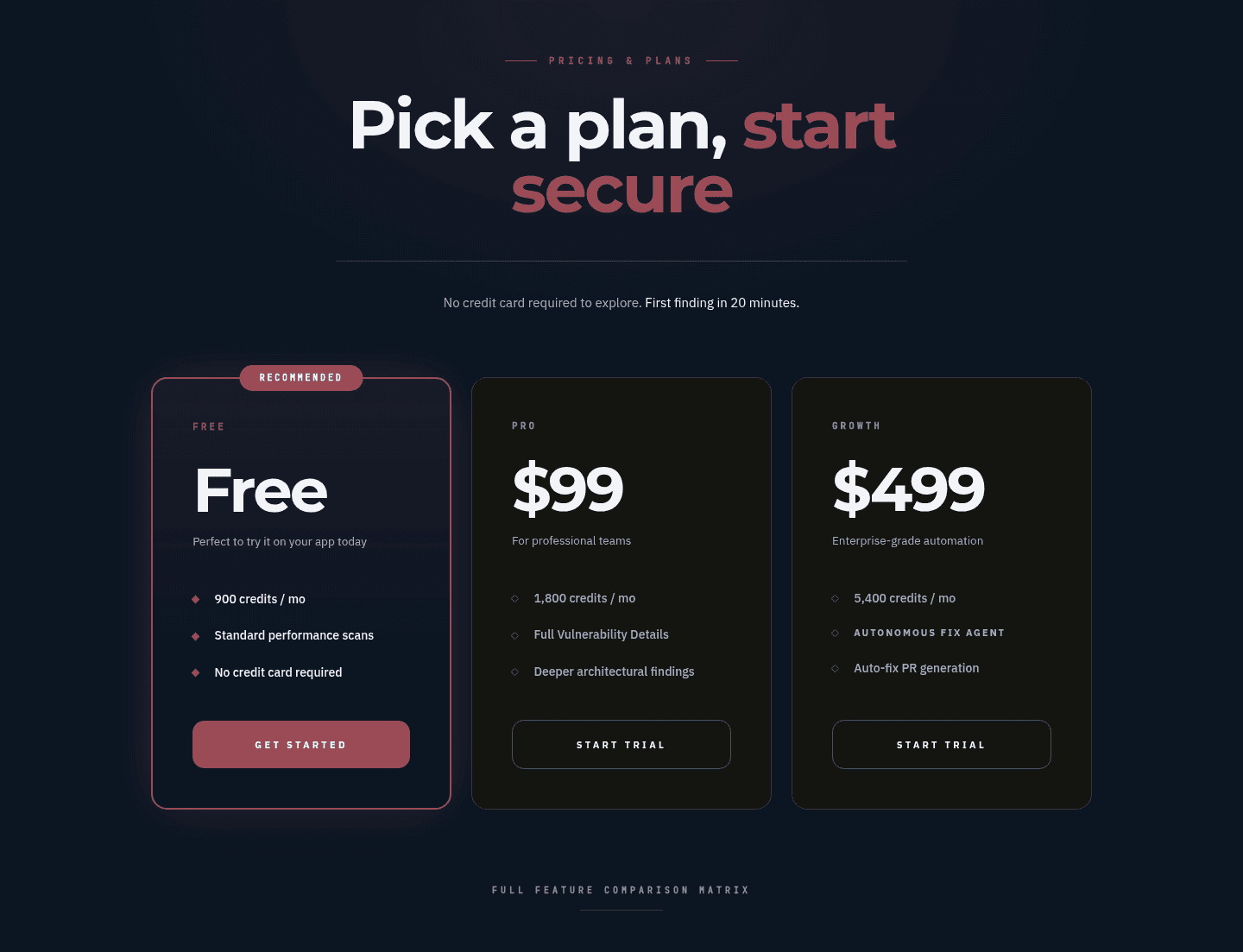
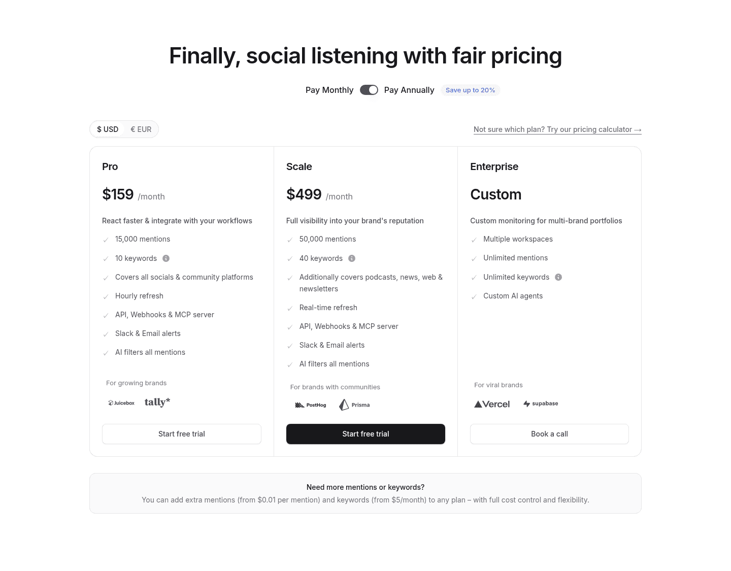
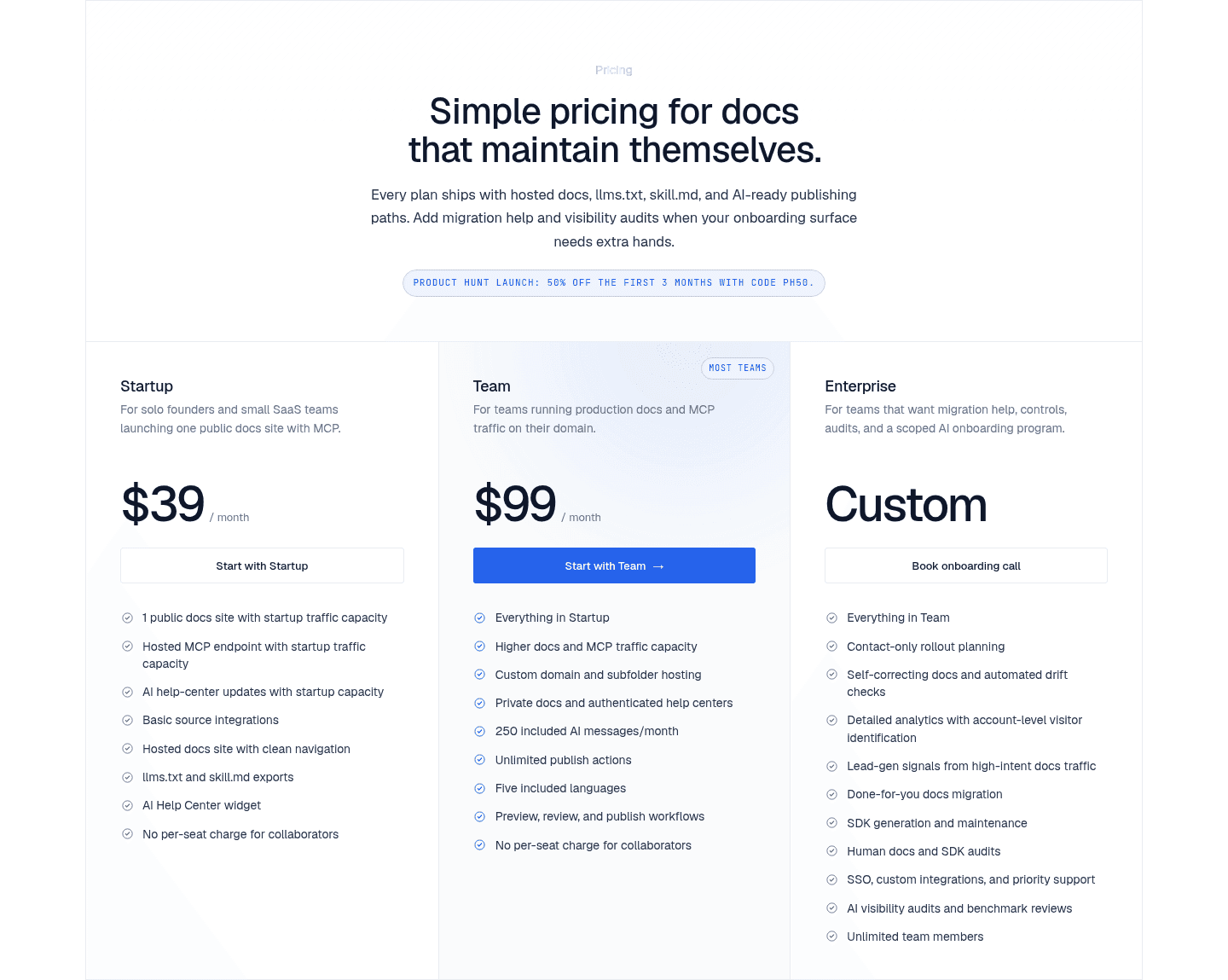
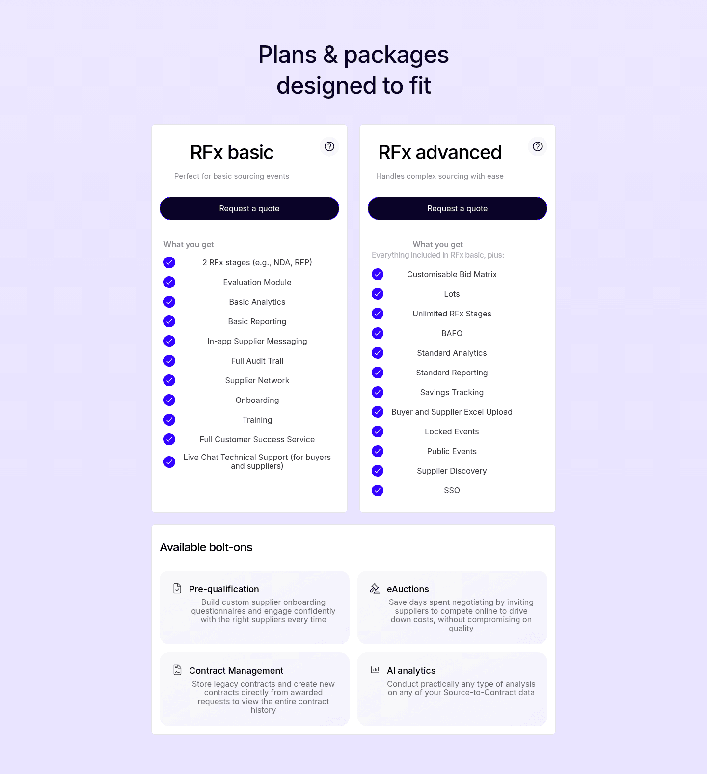
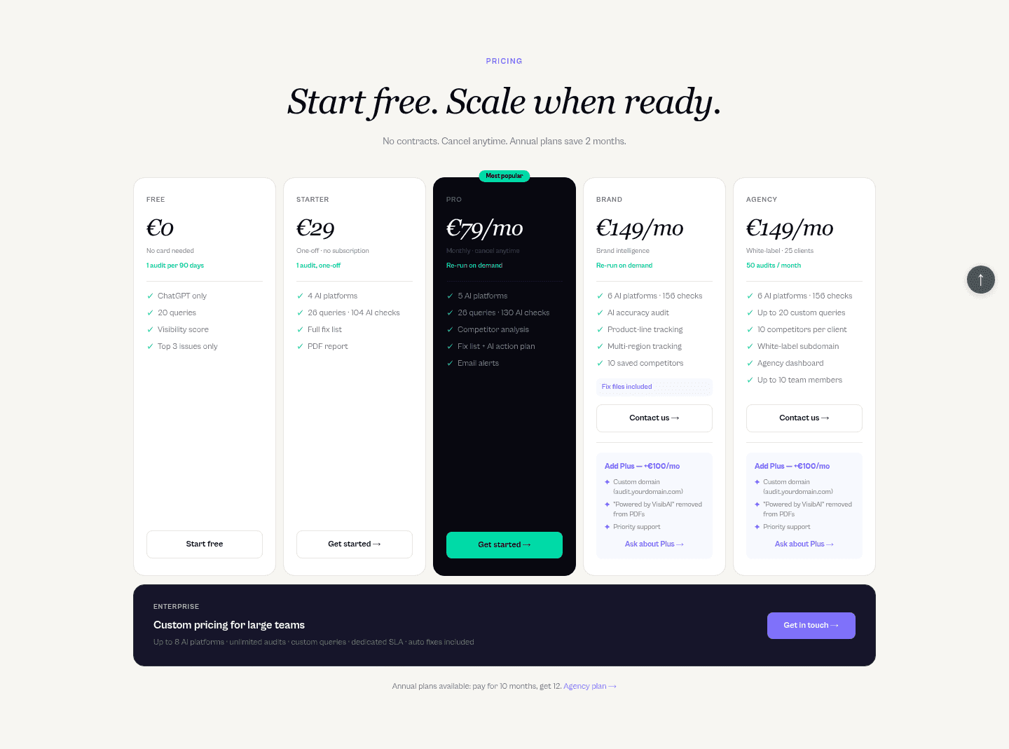
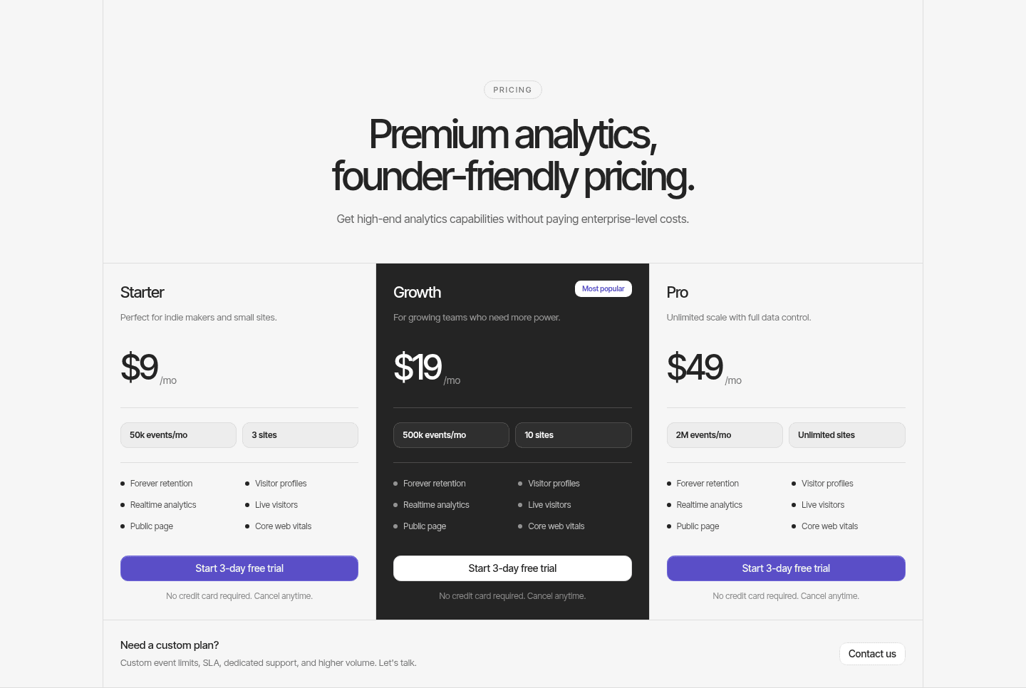
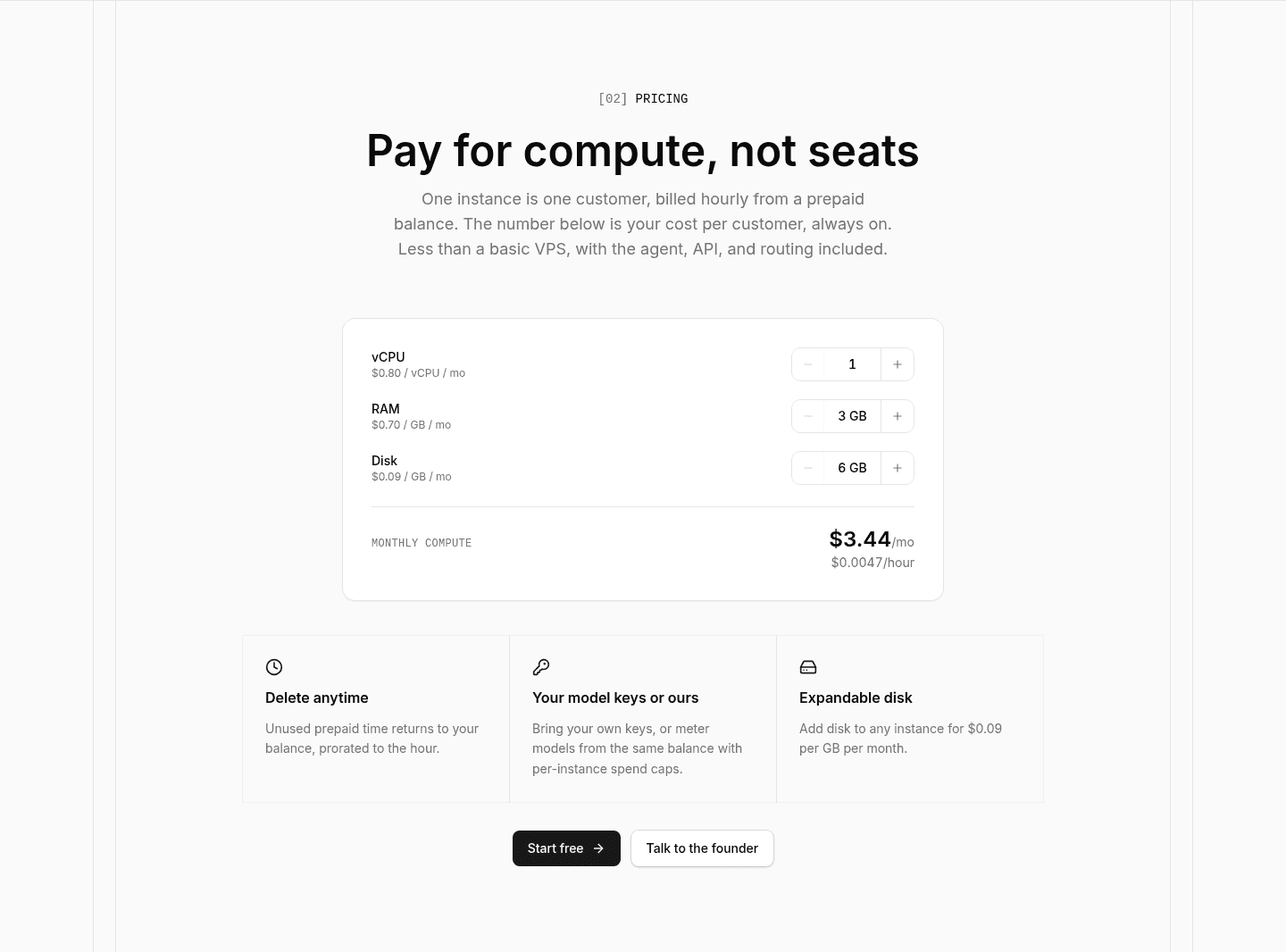
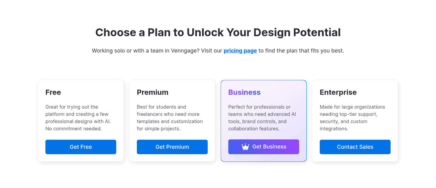
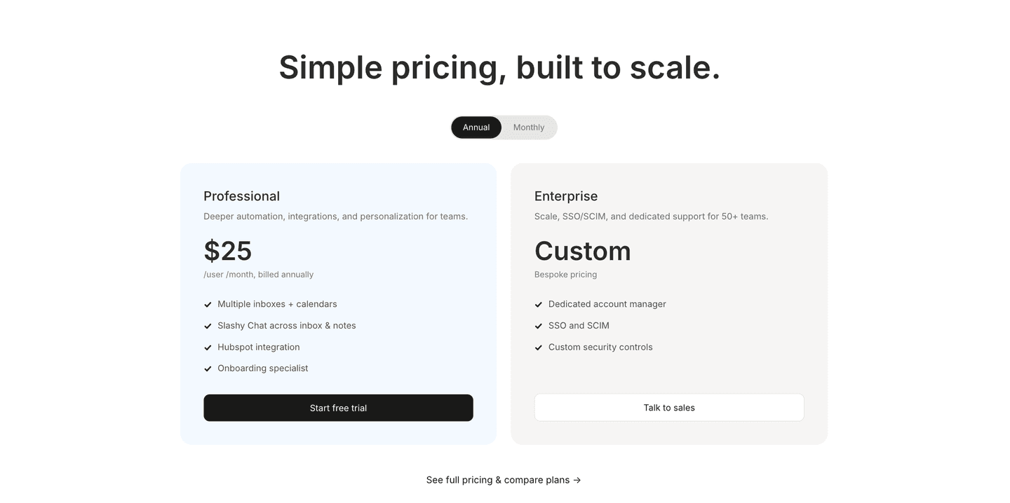
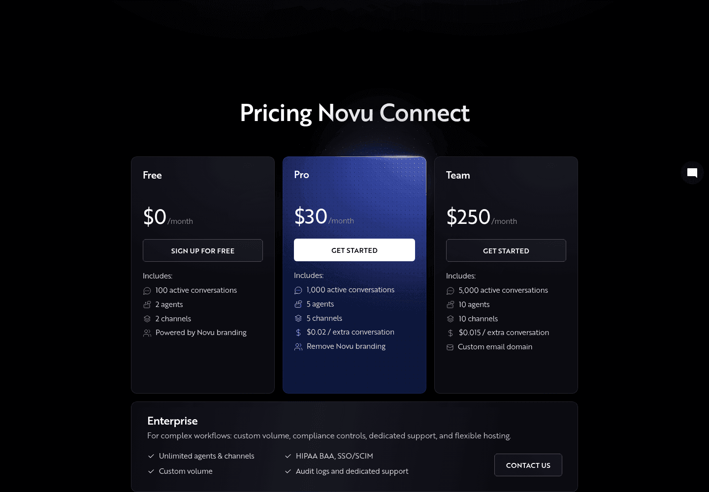

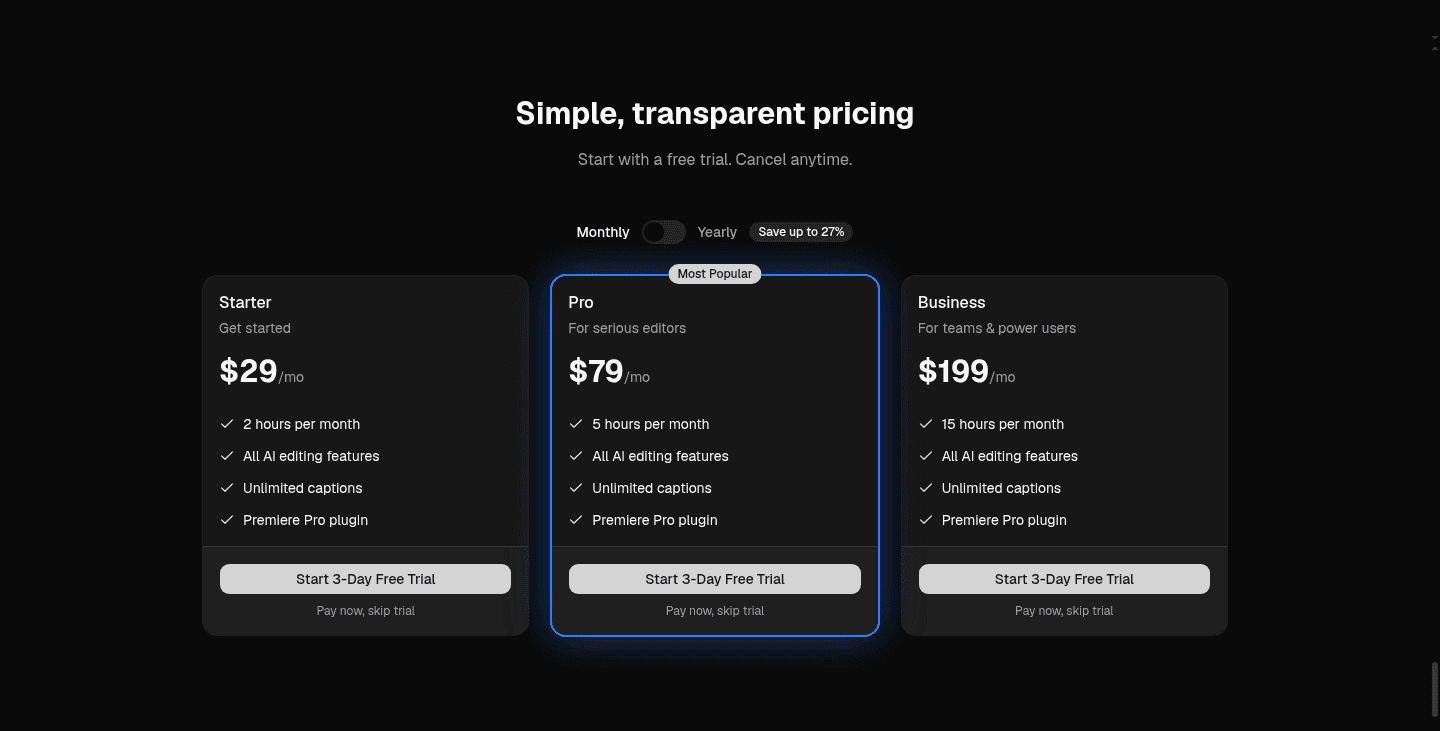
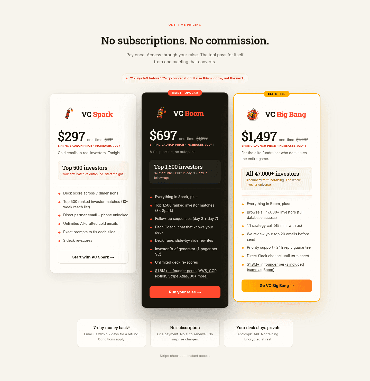
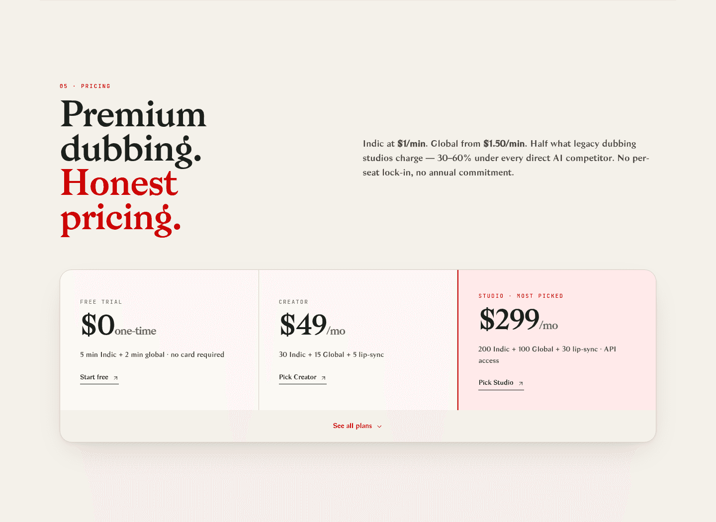
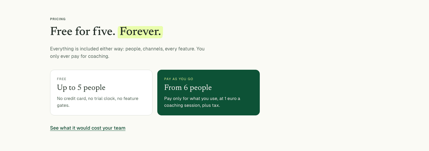
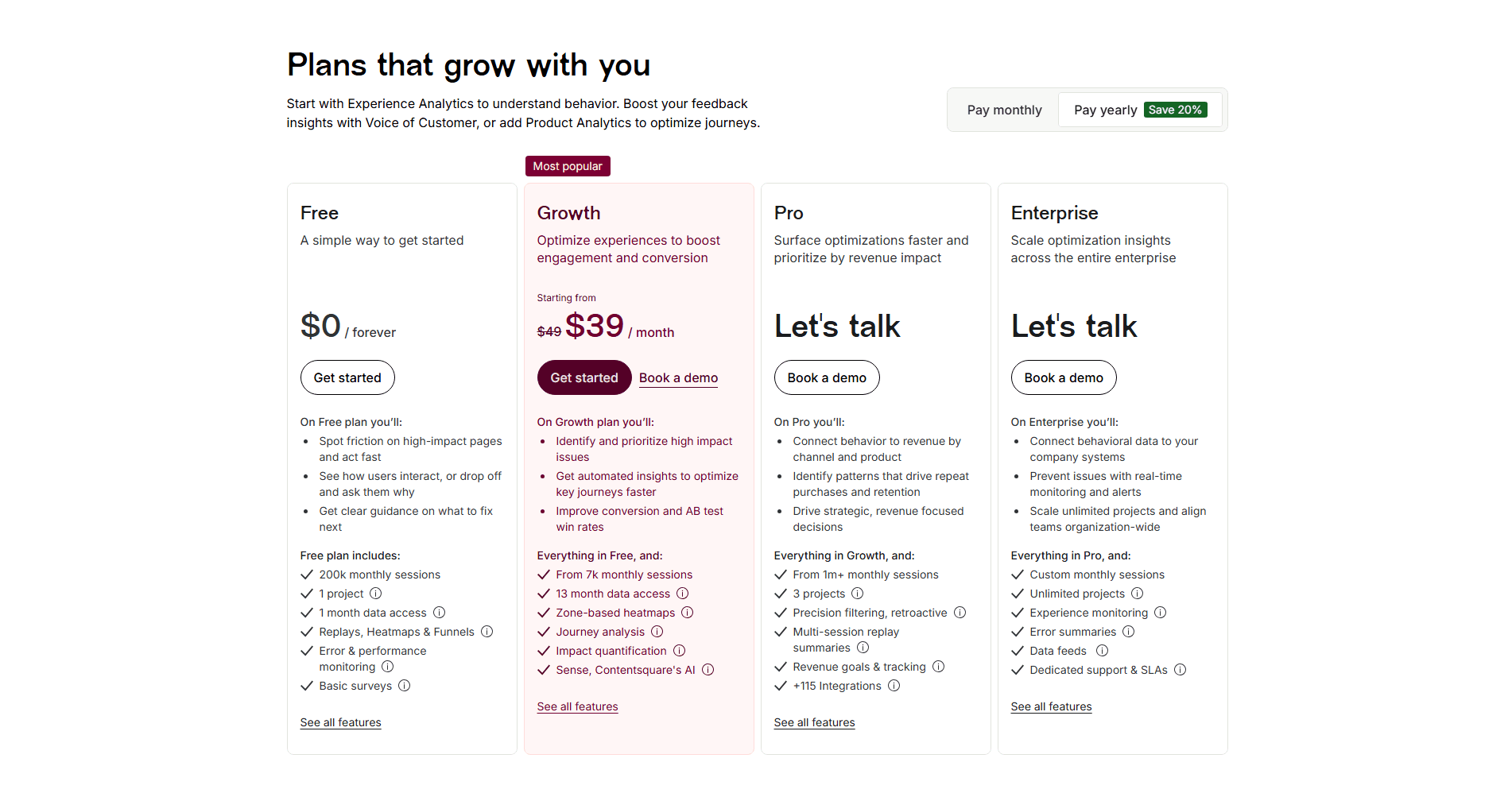
The pricing section is where a visitor decides whether the product is worth paying for. It shows the plans, what each includes and what it costs, and should let them pick one without talking to sales.
What the best pricing sections do:
We checked the pricing sections in our library for the elements below. The lower the number, the fewer pages do it, and the bigger your edge when you add it.
Hover or click to expand a feature description inside the comparison table
For usage-based or complex pricing: a slider or input that estimates total cost
A switch showing monthly vs annual pricing with the savings displayed
"Growth" not "Tier 2," "Pro" not "Plan B." Names that map to an aspiration, not an internal SKU
"14-day free trial," "Cancel anytime," "Money-back guarantee" near the CTA button
"Most Popular," "Best Value," "Recommended." A visual nudge toward the plan you want them to pick
Side-by-side columns with a feature matrix. The visitor can scan horizontally without scrolling or opening tabs
"Starter," "Growth," "Enterprise" with a one-liner under each. The visitor knows what they're buying in 5 seconds
| Element | What it means | Use it | Type |
|---|---|---|---|
| Tooltip explanations | Hover or click to expand a feature description inside the comparison table | 6% | Big opportunity |
| Calculator/estimator | For usage-based or complex pricing: a slider or input that estimates total cost | 15% | Big opportunity |
| Annual/monthly toggle | A switch showing monthly vs annual pricing with the savings displayed | 31% | Opportunity |
| Value-based naming | "Growth" not "Tier 2," "Pro" not "Plan B." Names that map to an aspiration, not an internal SKU | 56% | Common |
| Risk reducer | "14-day free trial," "Cancel anytime," "Money-back guarantee" near the CTA button | 60% | Common |
| Anchoring tags | "Most Popular," "Best Value," "Recommended." A visual nudge toward the plan you want them to pick | 73% | Common |
| Easy comparison | Side-by-side columns with a feature matrix. The visitor can scan horizontally without scrolling or opening tabs | 90% | Table stakes |
| Plan clarity | "Starter," "Growth," "Enterprise" with a one-liner under each. The visitor knows what they're buying in 5 seconds | 100% | Table stakes |
Tooltips are the rarest element: only 6% of pricing sections explain features on hover. When feature names are vague ("Advanced analytics", "Priority support"), a tooltip turns doubt into an answer.
We check every pricing section against a weighted checklist, from the page itself and its screenshot:
A recommended plan and a risk reducer weigh the most, because the highest-scoring pricing sections lean on them. Sections flagged best-in-class are picked by hand from the highest scores.
Interactive quiz
Can a visitor understand all plan options in under 5 seconds?
"Starter," "Growth," "Enterprise" with a one-liner under each
5 pricing sections in our library are flagged best-in-class. All start with clear plans and an easy comparison. What sets them apart is what they add:
MongoDB, Calendly, PayFit and ActiveCampaign do all four.
 100/100
The weakest pricing sections are not confusing. They stop at the basics. 27% of all pricing sections show three or four columns of equal weight with no recommended plan, so the visitor has no place to start. 40% have nothing next to the button to lower the risk. And 10% offer no side-by-side view at all, so the visitor opens each plan one by one.
The fix is not a redesign: add a "Most popular" badge to one plan, and a "Cancel anytime" line under the button.
Want to know which best practices your pricing section is missing? Get your 3 free opportunities →
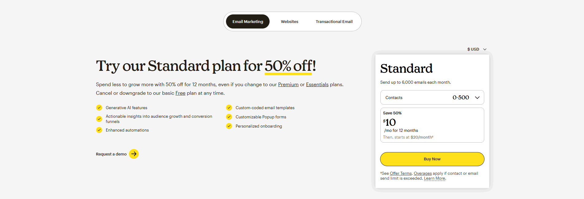 10/100
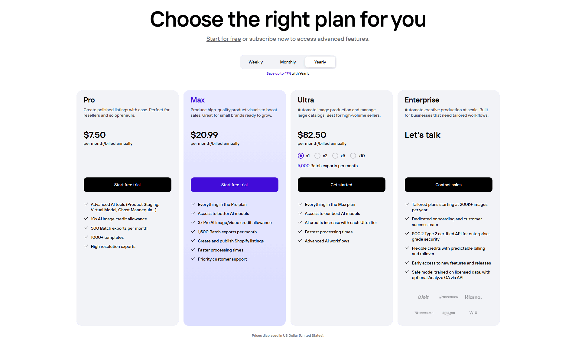
A dedicated enterprise tier priced Custom or Let's talk, with a Contact sales CTA that routes large buyers to a human instead of a self-serve checkout.
Price broken down per capability or per unit of usage, so the total reads as the sum of parts a buyer can add up, not a flat number taken on faith.

Curated by
Gabriel Amzallag , Founder, Web Anatomy
5 years CRO + SEO at Qonto (2021–2025). After advising 15+ SaaS on their websites (Payfit, Pigment…), the same patterns kept breaking, so I decided to build the source of truth on what works on the web: the intelligence layer every tool, builder, and team uses to ship sites that perform.
Real examples from top landing pages, scored and analyzed.
Everything you need to know about pricing section design, based on our analysis of real landing pages.
For SMB and self-serve, show the price, the plan names, and a free trial or "no credit card" line next to every CTA. The goal is decision speed. For enterprise, pricing often stays gated, but the section should still name the tier, list the flagship capabilities, and replace "Start trial" with "Talk to sales" or "Get a custom quote." Never mix them in one column without a clear handoff. If you sell both, keep three columns for self-serve pricing and a fourth Enterprise card with "Contact us." Same layout, different CTA.
A pricing page is a standalone page (like /pricing) dedicated entirely to plans, features, and purchase decisions. A pricing section is one section within a landing page or homepage. Both use the same conversion best practices (plan clarity, comparison, anchoring tags), but a pricing page typically goes deeper with FAQs, feature matrices, and enterprise CTAs. We score both.
Yes, if your pricing is public and your page has a conversion goal. SaaS homepages, campaign landing pages, product pages with a free tier or trial. Showing pricing on the landing page removes a click from the conversion path. The exception: enterprise or custom-quote products where pricing is gated behind a "Contact Sales" form.
Map each name to a stage the buyer recognizes, not an internal SKU. "Starter, Growth, Scale" works because those are stages of a business. "For learning, For production" works because those are use cases. "Tier 1, Tier 2, Tier 3" forces the visitor to decode. A good test: read the name out loud and ask "would my target customer say that's me?" If the answer is maybe, rename. Three or four tiers max. Five starts to look like you haven't figured out your packaging.
Any time you change the packaging, and at minimum once every 12 months even if you don't. Pricing pages drift: plan features get added quietly, limits change, the old "Most Popular" badge sits on a tier nobody buys anymore. Put a calendar reminder. On each review, check three things: does the recommended tier still match where most new customers land, do the feature bullets reflect what's actually shipped, and does the annual savings math still hold. Five minutes, twice a year, prevents a pricing page that silently misrepresents the product.
Check that each plan is clear and that plans are easy to compare. Then look for a "Most Popular" tag, a risk reducer, plan names based on value, a billing toggle, a calculator, and tooltips. Or get your 3 free opportunities, ranked with the evidence behind each.
Showing 1–29 of 114 examples
Put social proof next to the price
Customer logos, star ratings, and customer counts placed right at the pricing tiers, so the buyer sees who already trusts the product at the moment they decide.