New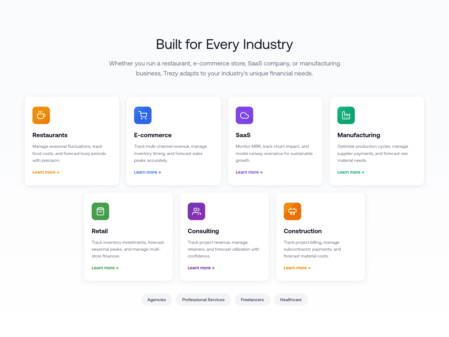
Use Cases|
The use-cases section shows how different audiences or teams use the product. Explore 134 scored examples and see what the best do differently.
Updated November 2026
Showing 1–29 of 134 examples
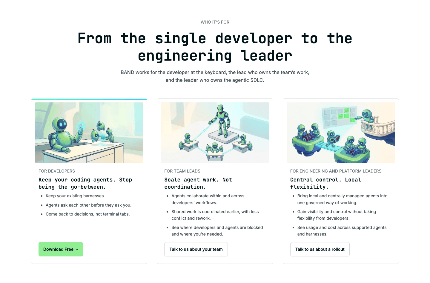
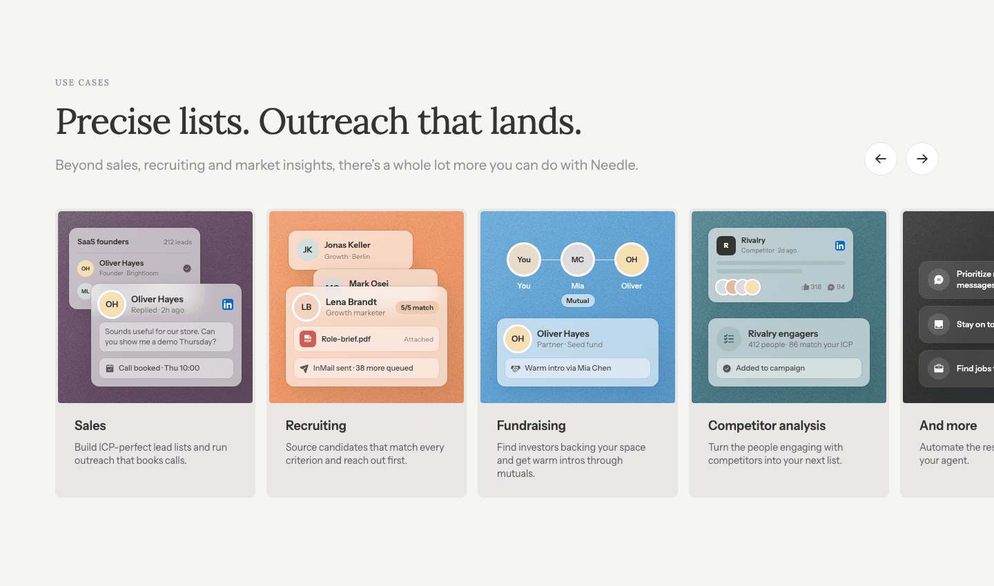
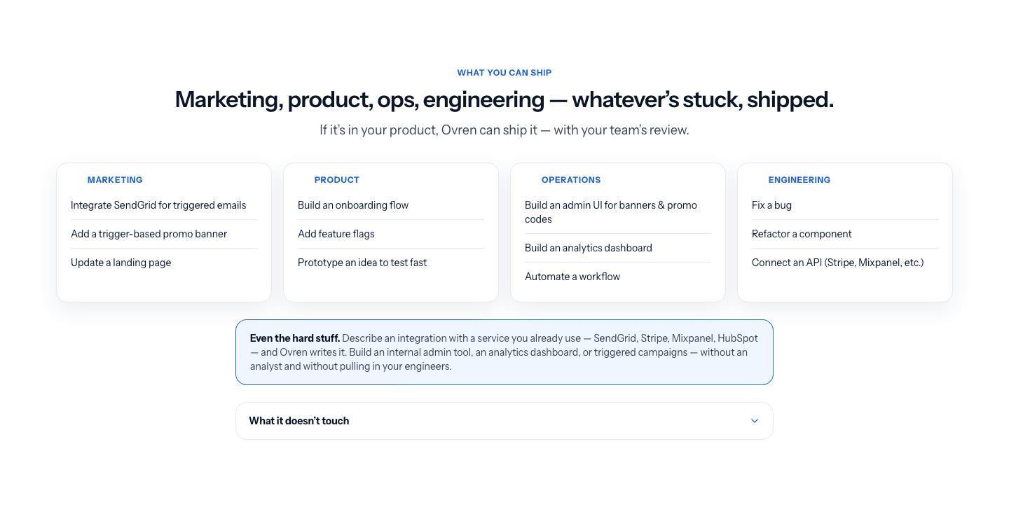
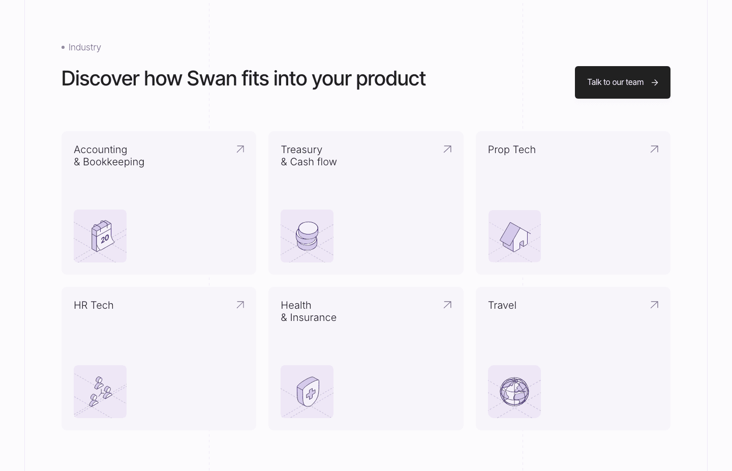

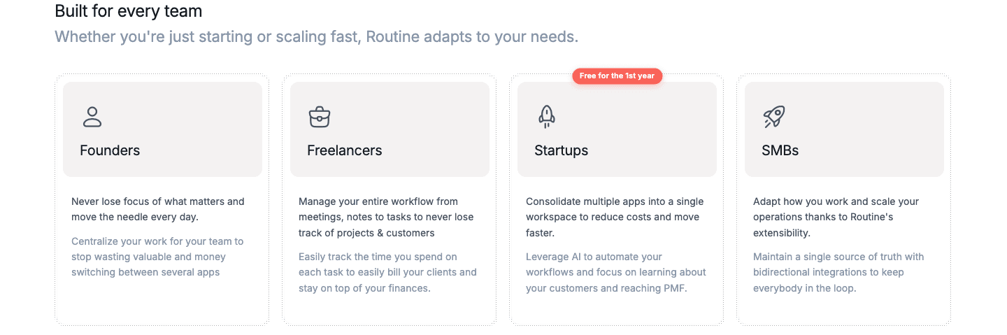
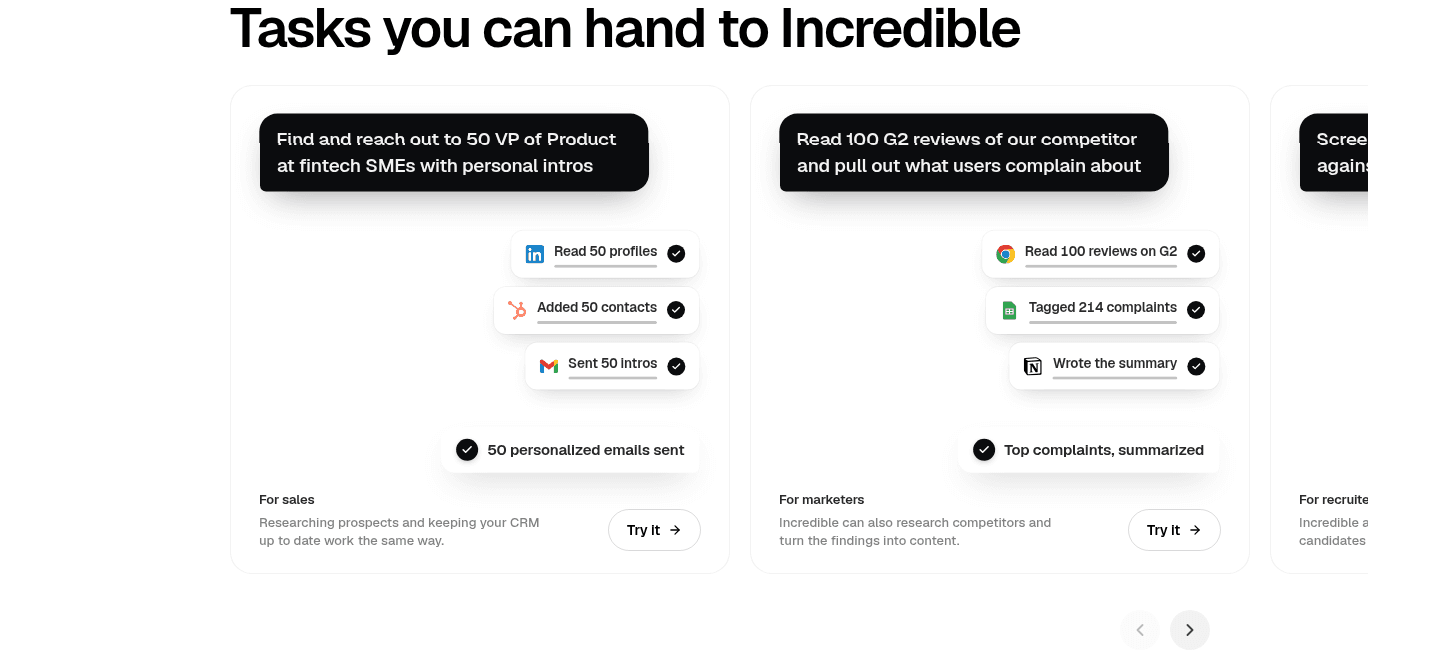
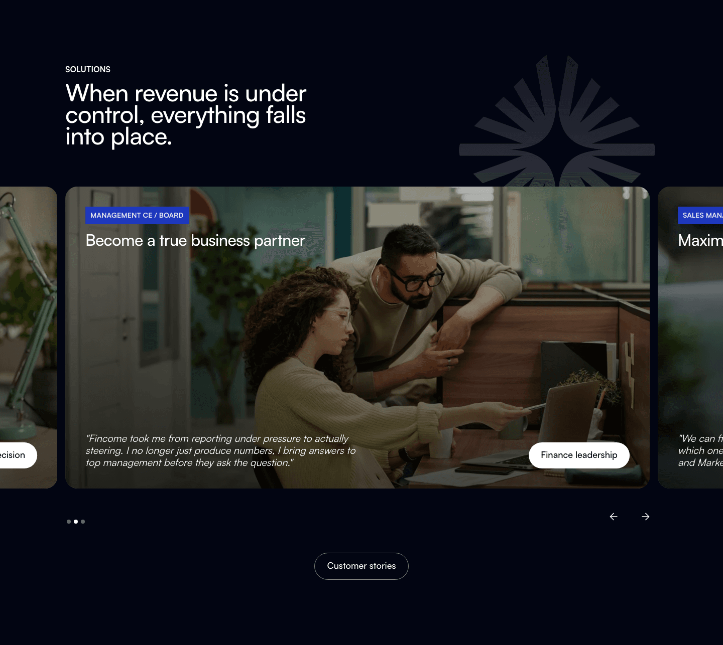
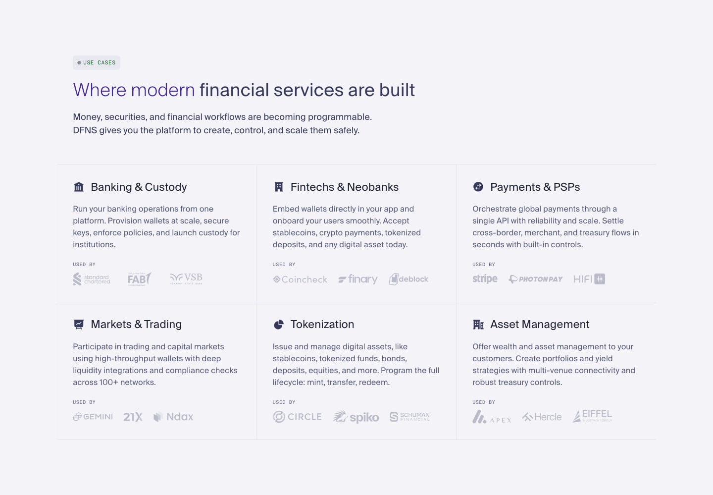
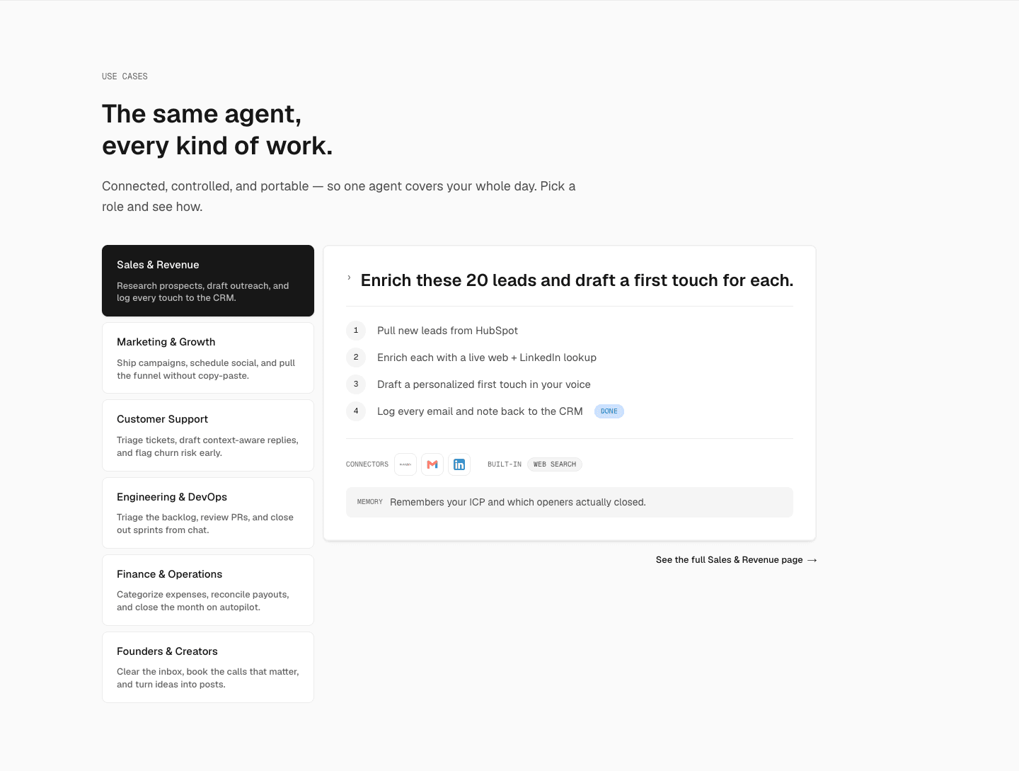
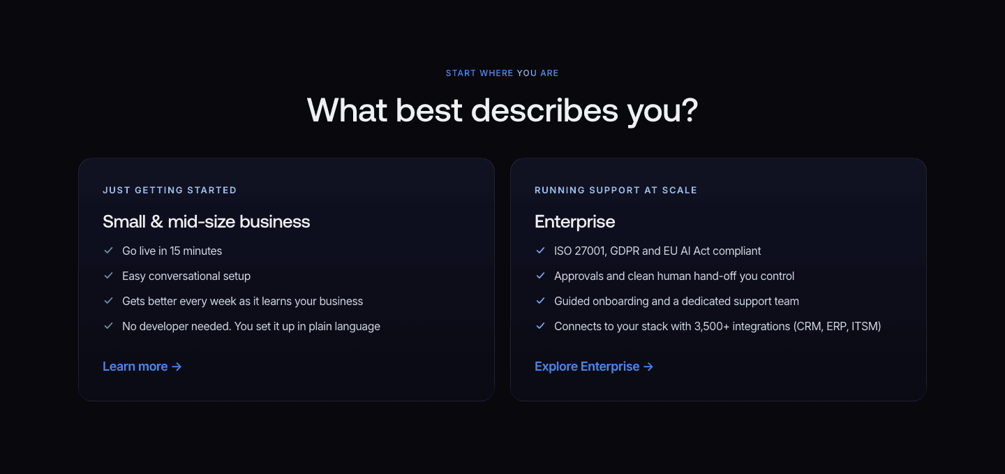
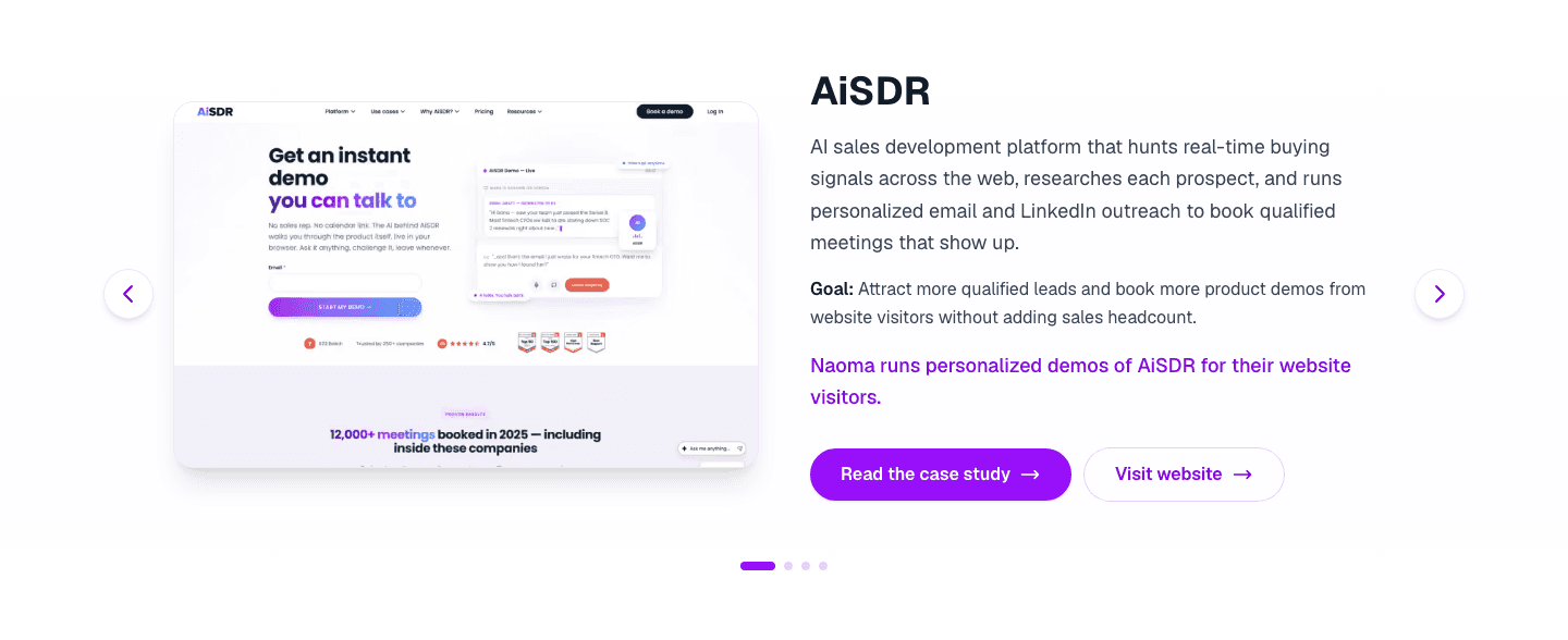
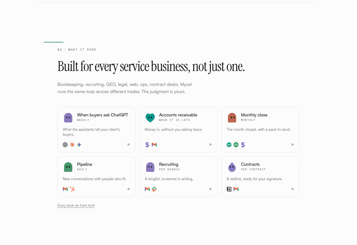
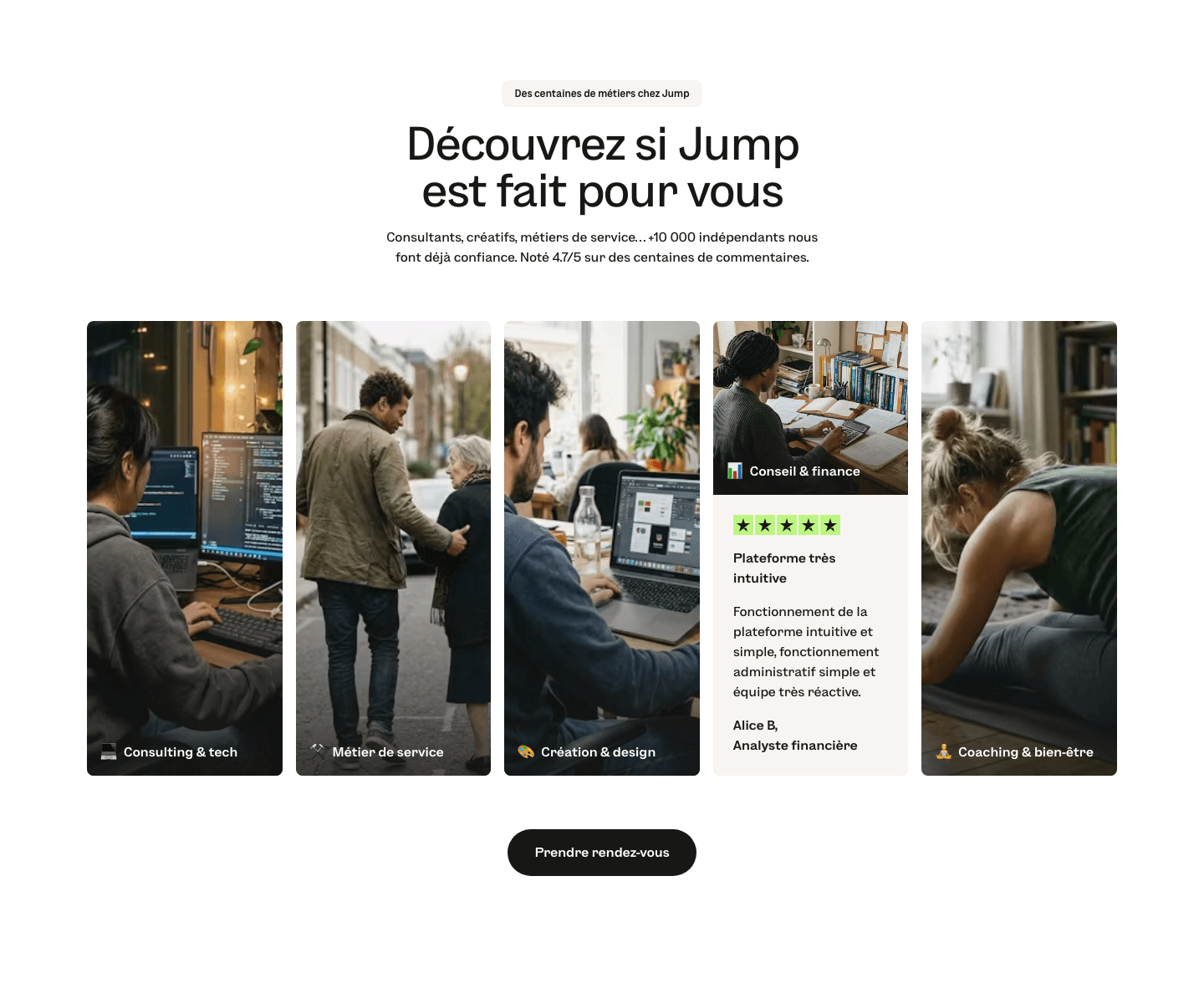
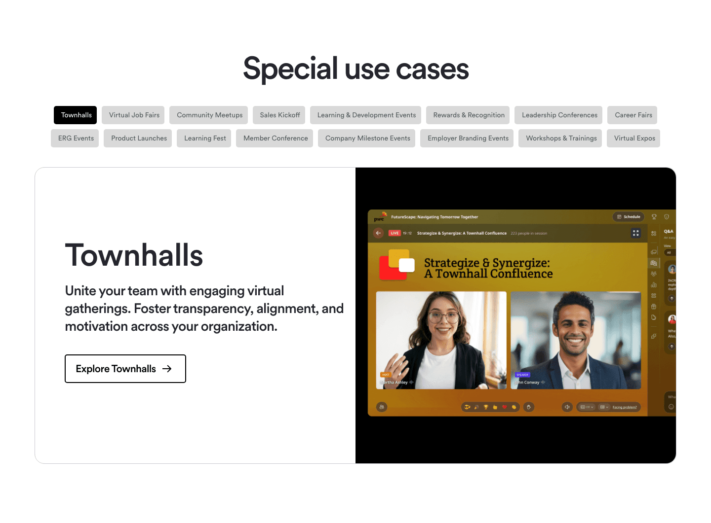
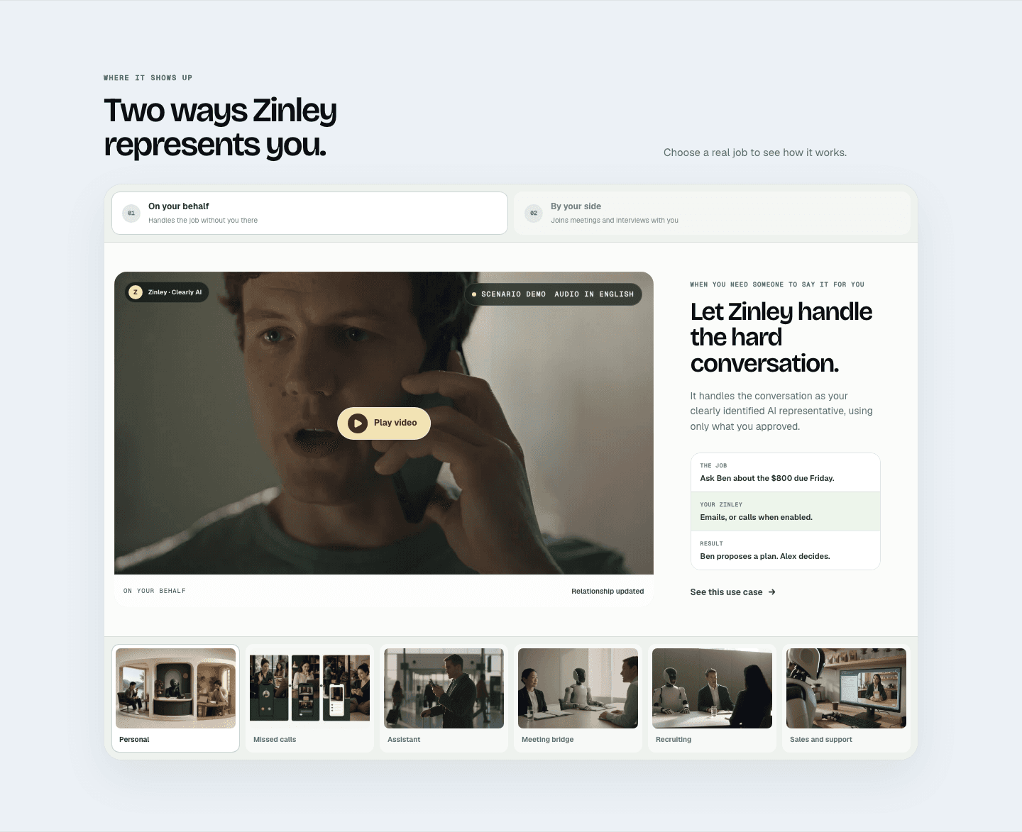
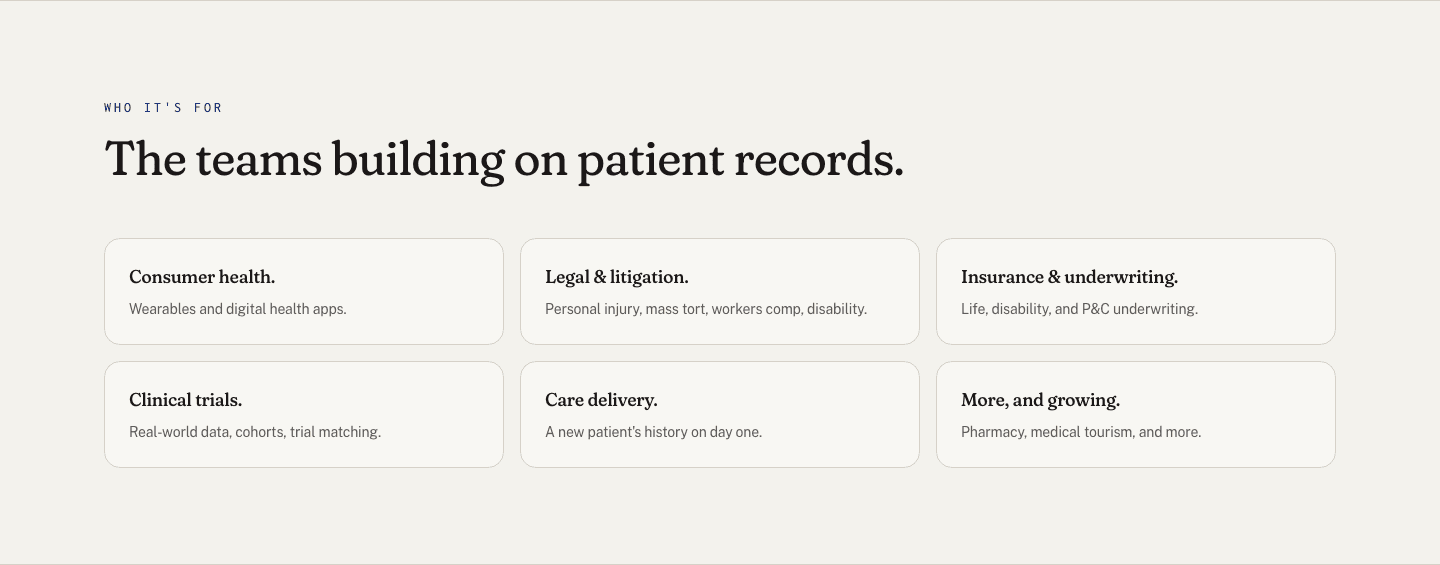

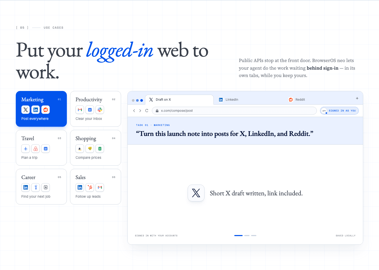
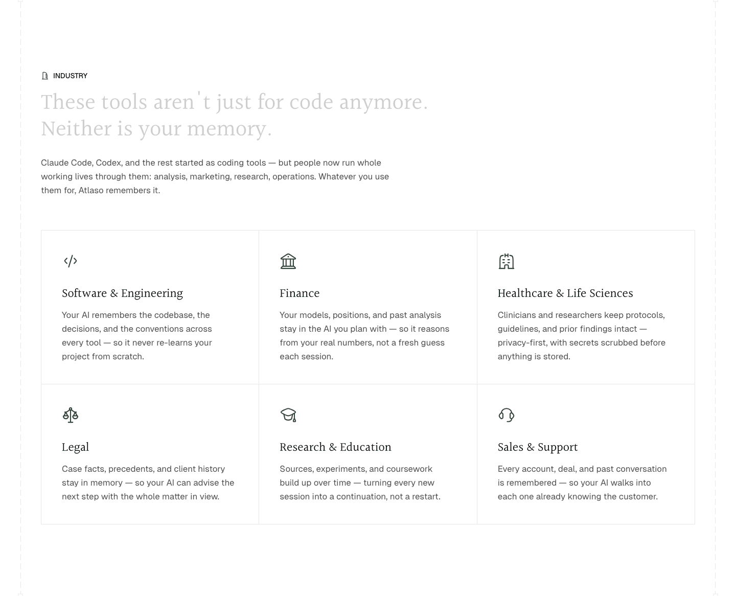
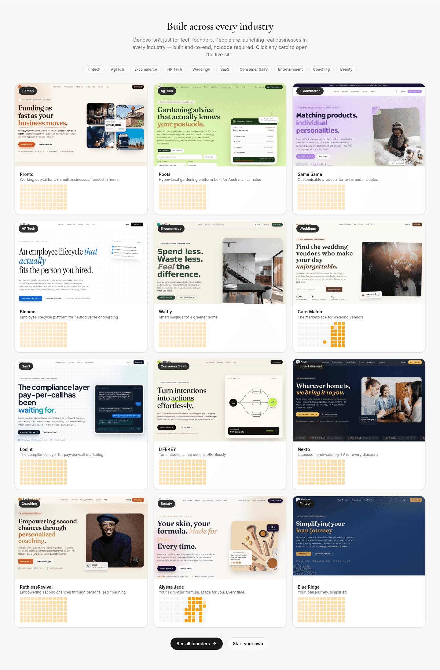


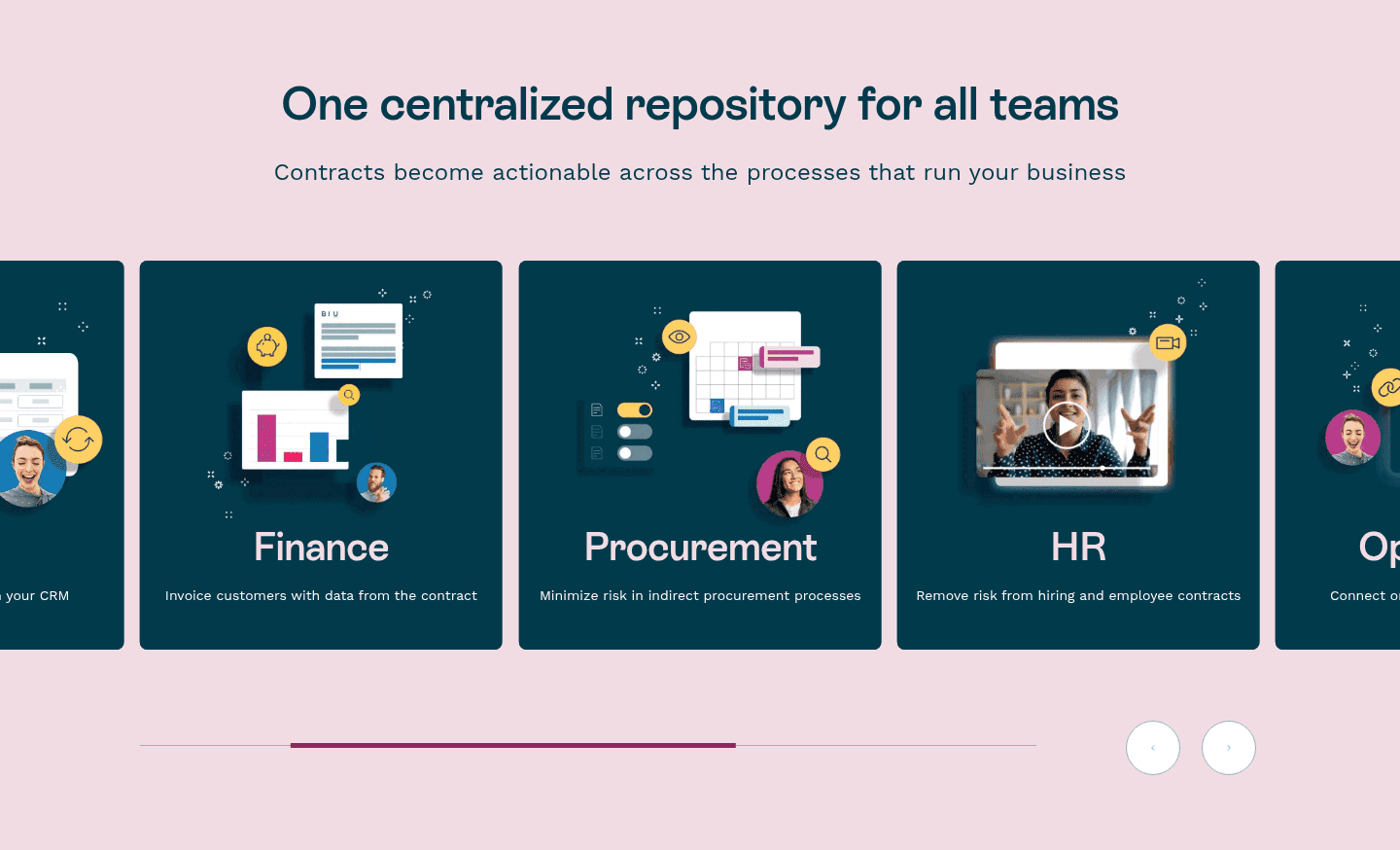

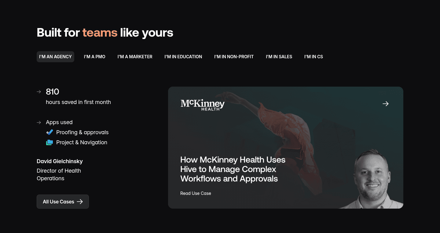

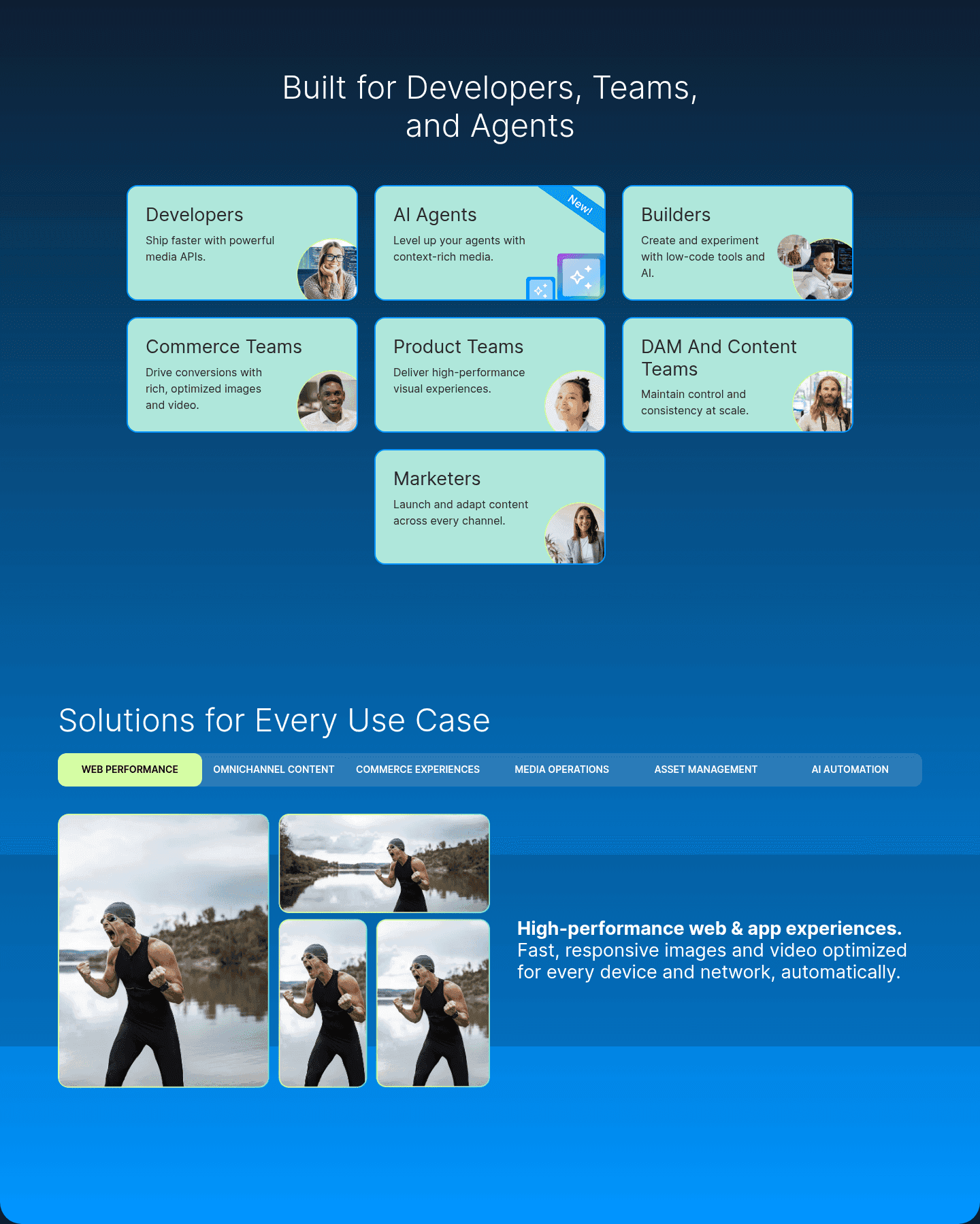
A use cases section shows how different audiences or teams use the product: agencies, startups, enterprise, or tasks like reporting and onboarding. It lets each visitor find their own case instead of reading a pitch meant for everyone.
What the best use cases sections do:
We checked the use cases sections in our library for the elements below. The lower the number, the fewer pages do it, and the bigger your edge when you add it.
Role-specific social proof. A quote from someone in the exact role browsing this section
Easy switching between personas with tabs or cards. Browsable without scrolling back
"Agencies save 4 hrs/week," "Enterprise cuts churn 30%." Different metrics per audience
Tabs or cards organized by role (Agencies, Enterprise, Startups). Visitor finds their path
Named workflows or outcomes per persona, not vague "works for everyone" copy
| Element | What it means | Use it | Type |
|---|---|---|---|
| Persona testimonial | Role-specific social proof. A quote from someone in the exact role browsing this section | 12% | Big opportunity |
| Navigation clarity | Easy switching between personas with tabs or cards. Browsable without scrolling back | 26% | Big opportunity |
| Outcome per persona | "Agencies save 4 hrs/week," "Enterprise cuts churn 30%." Different metrics per audience | 53% | Common |
| Persona segmentation | Tabs or cards organized by role (Agencies, Enterprise, Startups). Visitor finds their path | 65% | Common |
| Scenario specificity | Named workflows or outcomes per persona, not vague "works for everyone" copy | 70% | Common |
One surprise: splitting by role is common, but it is not what sets the best apart. Having a tab for each audience is not enough. What matters is how specific the content behind each tab is.
We check every use cases section against a weighted checklist, from the page itself and its screenshot:
A specific scenario and a result for each audience weigh the most, because the highest-scoring sections have both, not just the split by role. Sections flagged best-in-class are picked by hand from the highest scores.
Interactive quiz
Do you name specific workflows or outcomes per persona?
Named scenarios, not vague "works for everyone" copy
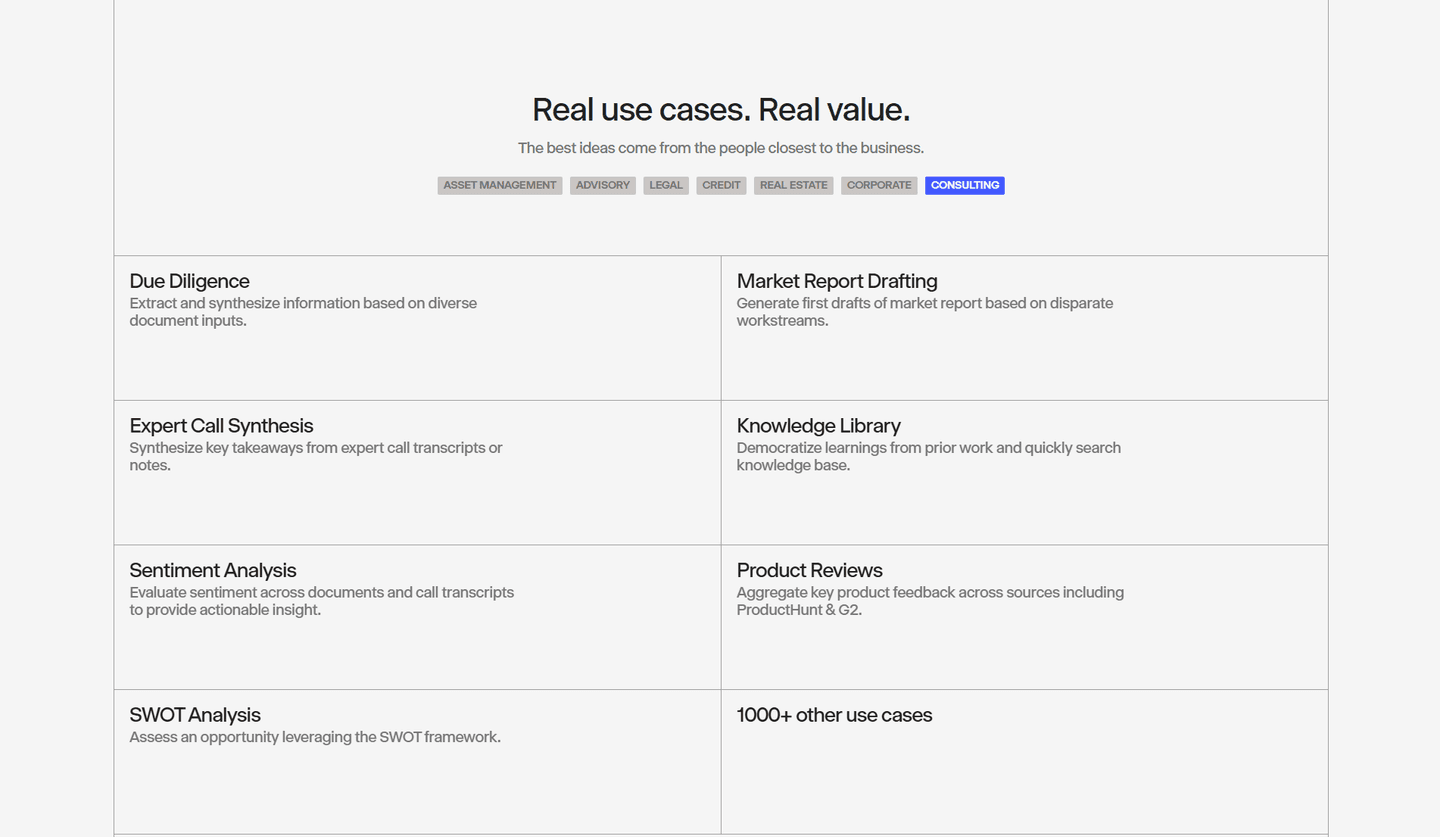
4 use cases sections in our library are flagged best-in-class, with Xenia and Pitch among them. Behind every tab or card is a concrete workflow with its own numbers:
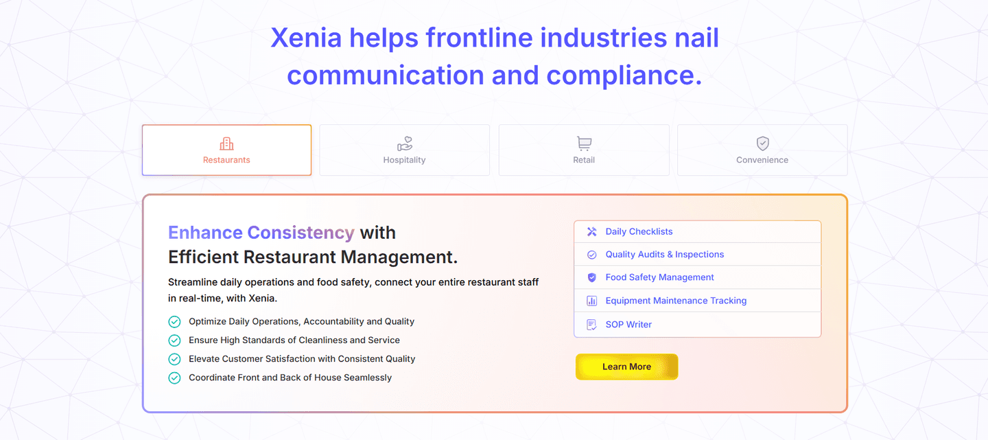 100/100
The weakest use cases sections show a label for each audience ("For startups", "For enterprises") with nothing concrete behind it. 88% of all use cases sections never quote someone in the visitor's role. 74% make switching between audiences hard: four or five cases in a vertical list, of which most visitors only see the first two.
The fix: give each audience a specific result and one quote from someone in that role, and put the cases in tabs.
Want to know which best practices your use case section is missing? Get your 3 free opportunities →
 10/100

Curated by
Gabriel Amzallag , Founder, Web Anatomy
5 years CRO + SEO at Qonto (2021–2025). After advising 15+ SaaS on their websites (Payfit, Pigment…), the same patterns kept breaking, so I decided to build the source of truth on what works on the web: the intelligence layer every tool, builder, and team uses to ship sites that perform.
Real examples from top landing pages, scored and analyzed.
Everything you need to know about use case section design, based on our analysis of real landing pages.
Between 3 and 5. Fewer than 3, and the section feels thin. More than 5, and visitors won't browse them all. Across the 134 use case sections in our library, the top-scoring ones show 3 or 4, each with a specific outcome per persona. Better to have 3 precise use cases than 7 generic ones.
The features section answers "what does the product do." The use case section answers "how does MY team use it." Features are product-centric. Use cases are persona-centric. In our library, 65% of use case sections segment by role (agencies, enterprise, startups). 0% of features sections do that.
Tabs work better for 3-5 personas because the visitor sees all options at once. Cards work better for 6+ scenarios or when each use case needs its own visual. In our library, 26% of use case sections have clear navigation between personas. The top-scoring ones use tabs with content that updates without reloading the page.
Every 6-12 months, and whenever you expand into a new segment. Two triggers matter more than the calendar: a new ICP moving into your pipeline, and a workflow you've added that unlocks a new outcome. Refresh the outcome metric in each tab every quarter. "Save 4 hrs/week" gets stale if the product has gotten 2x faster. Kill any use case that no longer drives revenue, even if it reads well. A use case section that names yesterday's workflows quietly tells buyers you've lost touch with your own product.
By persona if your audiences are distinct (agencies vs. enterprise vs. startups). By workflow if your audiences overlap but do different things with the product. The 2 best-scoring sections in our library (Xenia, Pitch) organize by persona and show specific workflows inside each tab.
Check that each scenario is specific and that each persona sees its own outcome. Then look for clear segments by persona, easy navigation between them, and a testimonial from that persona. Or get your 3 free opportunities, ranked with the evidence behind each.
Showing 1–29 of 134 examples