Signup page examples (160)
A signup page is where a visitor creates an account. Its job is to make that step quick and give no reason to stop halfway. See 160 real examples.
Showing 1–24 of 160 signup pages
How to build a signup page, by the numbers
The questions a team asks when it rebuilds a signup page, answered from the 160 here.
How many fields should the form ask for?
How many fields the form asks for
- A one-field form43 signup pages
- No form fields29 signup pages
- A two-field form26 signup pages
- A three-field form19 signup pages
- A four-field form14 signup pages
- A five-field form10 signup pages
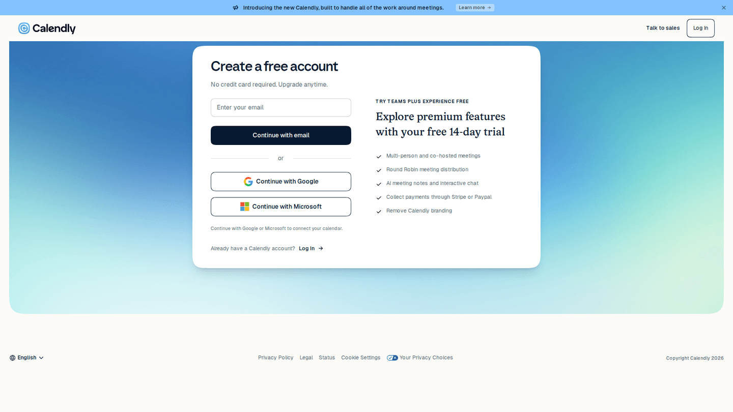
- One field on 27% of signup pages, the most common form there is
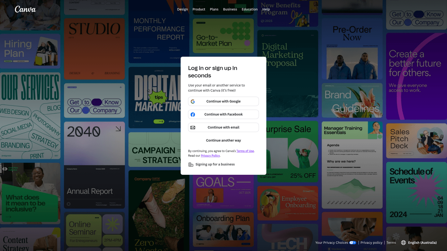
- No fields at all on 18%, where the page opens with single sign-on buttons
- Two fields on 16%
- Three fields on 12%
Email first, or the whole form at once?
- An email-only first step on 34%
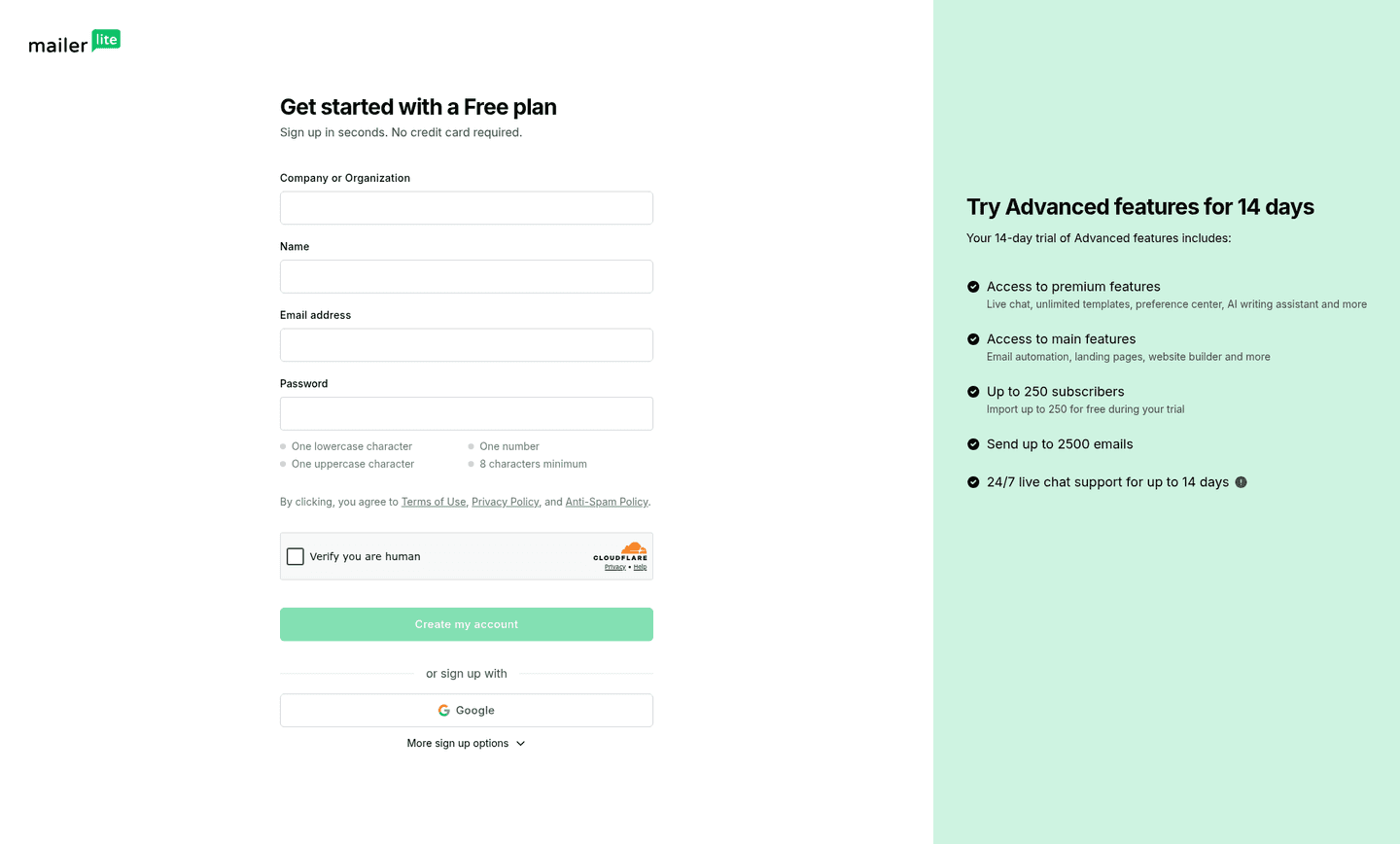
- A password to set on this page on 43%
Here the strongest pages lean the other way: 32% of them ask for a password up front, against 61% of the weakest.
How many single sign-on buttons?
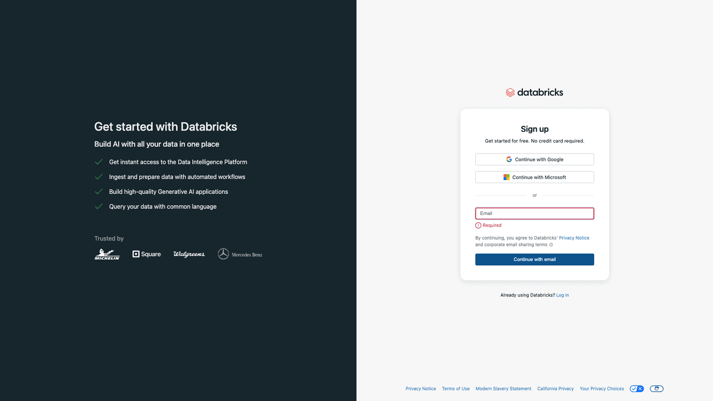
How many single sign-on buttons the page offers
- No single sign-on50 signup pages
- Two providers41 signup pages
- One provider39 signup pages
- Three providers21 signup pages
- Four providers7 signup pages
31% offer none, and that is what separates them most: 3% of the strongest against 69% of the weakest. Among the pages that offer any, one and two providers are about equally common.
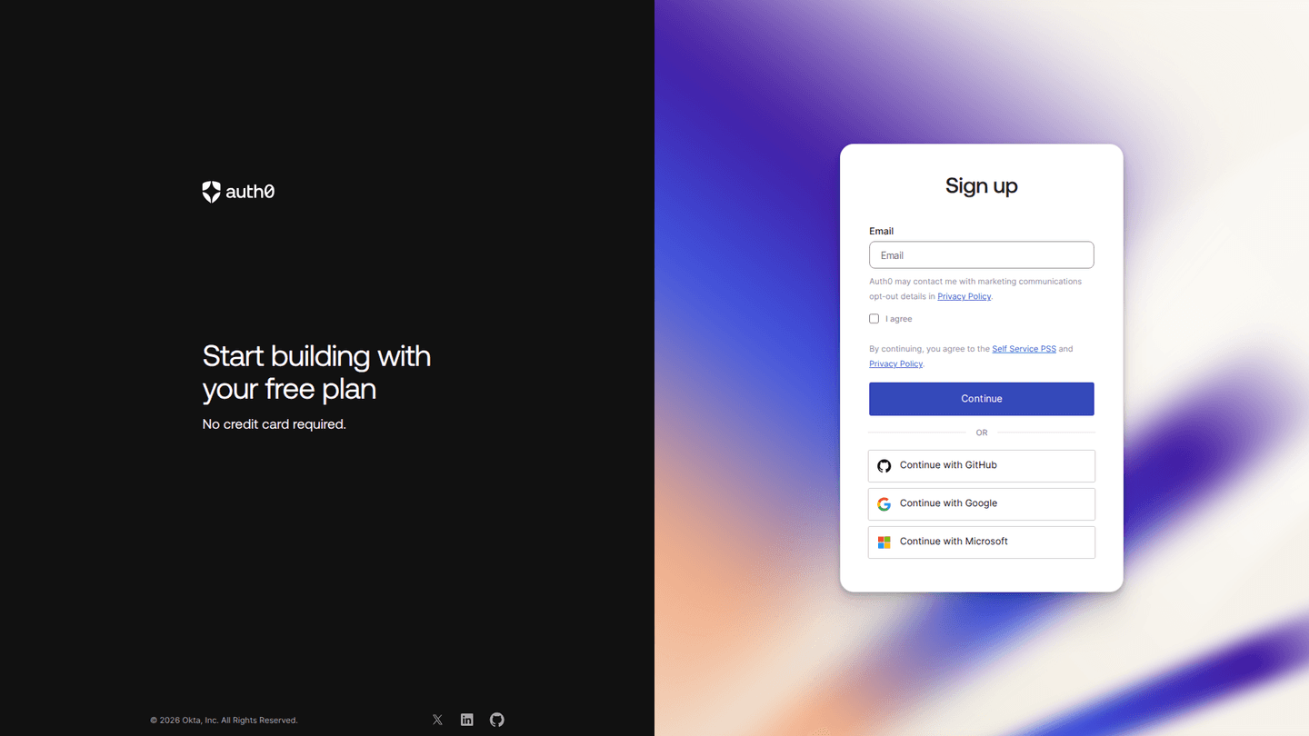
What does the page say about price?
- A free tier named on 36%
- A clear answer on the card question on 20%
- 39 of the 160 pages write a reassuring line near the button, usually that it is free or that no card is needed
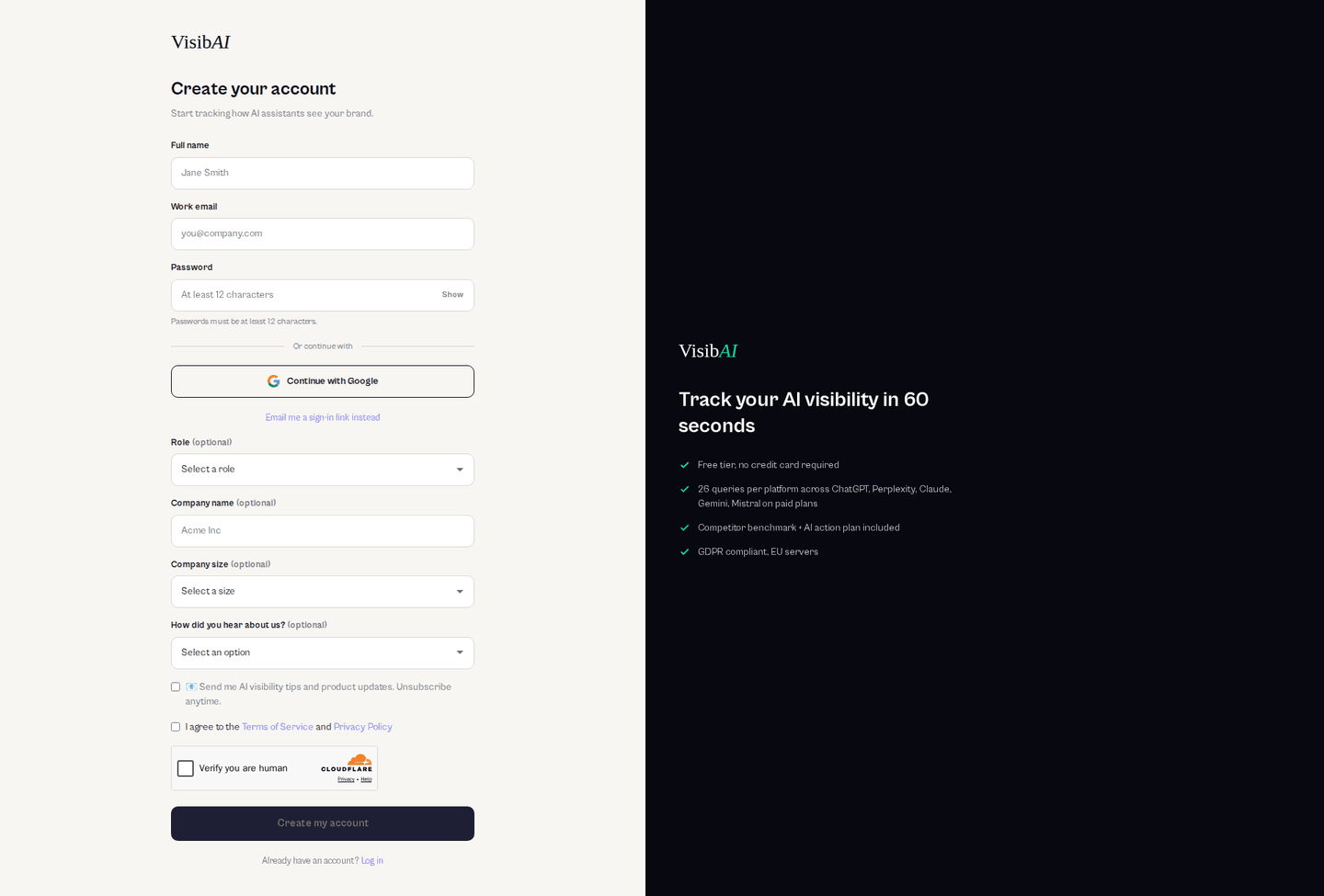
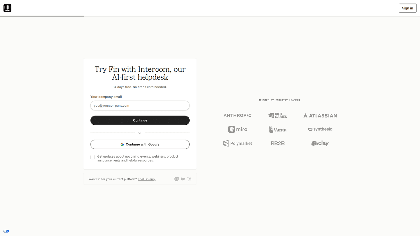
What goes beside the form?
- A reminder of the product on 60%
- Customer logos on 18%
- Testimonials on 14%
The product reminder is the one that splits them: 91% of the strongest show it, against 28% of the weakest.
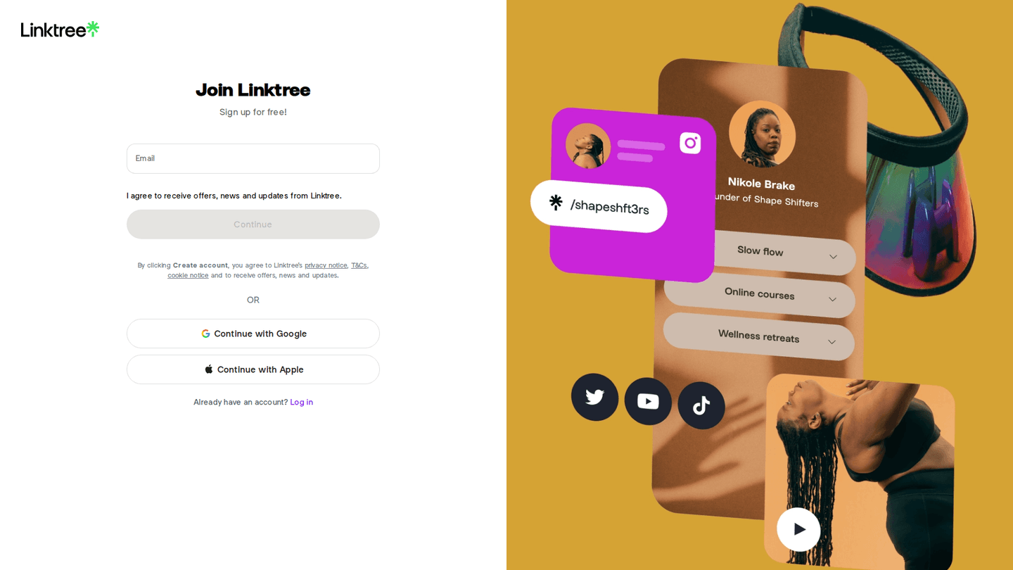
What about the terms, and the way back?
- A log in link on 78%, for the visitor who already has an account
- A link to the terms on 77%
- A terms checkbox, which is one more required input, on 16%
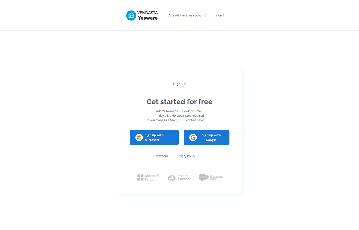
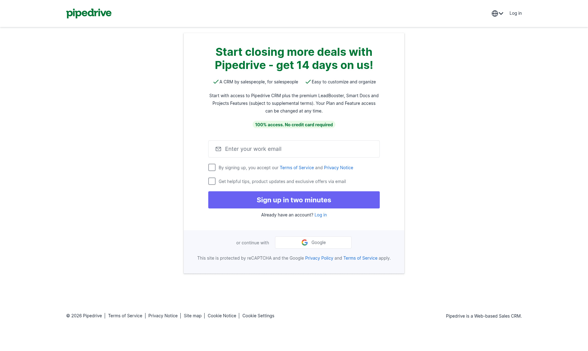
The moves almost nobody makes
Each is on 15% of signup pages or fewer, shown here with the strongest page that uses it.
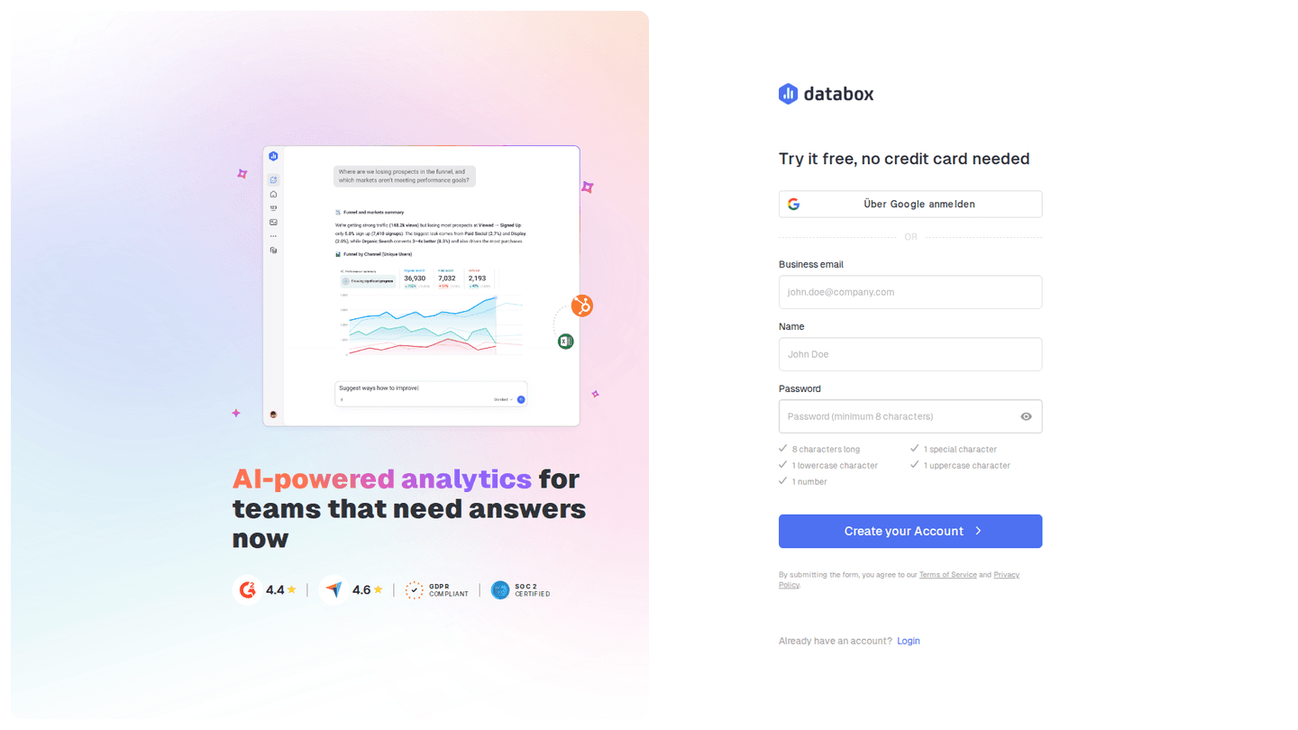
Password rules shown before the button
9% show the password requirements up front, instead of returning them as an error after the first attempt.
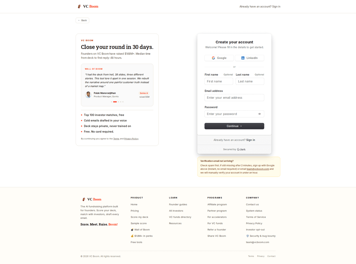
A testimonial beside the form
14% put a quote next to the signup form, at the moment the visitor is deciding whether to hand over an email.

Curated by
Gabriel Amzallag , Founder, Web Anatomy
5 years CRO + SEO at Qonto (2021–2025). After advising 15+ SaaS on their websites (Payfit, Pigment…), the same patterns kept breaking, so I decided to build the source of truth on what works on the web: the intelligence layer every tool, builder, and team uses to ship sites that perform.
Go further than signup pages
Growth Engine
Your top 3 opportunities for more revenue.
We find every way to grow your website’s visibility and conversions: SEO, AI search (AEO), backlinks and mentions, and UX/UI. 3 free opportunities, delivered by email.
Library
The analysis behind every page here
Each signup page on this page, section by section, with what works and what does not. Free account.
Didn't find the signup page you were looking for?
Every other page type has its own gallery. Start from all page types.
- Homepages
- Pricing pages
- About pages
- Contact pages
- Feature pages
- Integrations pages
- Security pages
- Enterprise pages
- Industry pages
- Persona pages
- Why us pages
- Case study pages
- Comparison pages
- Blog pages
- Webinar pages
- SEO landing pages
- Free tool pages
- PPC landing pages
- Careers pages
- Login pages
- 404 pages
- AI product pages
- Press pages
- Partner program pages
- Download pages
- Resource libraries
- Developer pages
- Solutions pages
- Template galleries
- Glossary pages
- Startup program pages
- Community pages
- ROI calculators
- Newsletter pages
- Programmatic SEO pages
- Blog posts
- Customer stories pages
- Alternatives pages
- Features overview pages
- Product tours
- Integration pages
- AI agent pages
- Affiliate program pages
- Team pages
- Conference pages
Your top 3 opportunities for more revenue.
We find every way to grow your website’s visibility and conversions: SEO, AI search (AEO), backlinks and mentions, and UX/UI. 3 free opportunities, delivered by email.
Signup page design, answered
The questions people ask before rebuilding a signup page, answered from 160 real ones.
What should a signup page include?
01Across 160 signup pages, three things are common: about four in five show a log in link, about three in four link to the terms, and three in five show something about the product beside the form. A bare form on an empty page is the minority choice, and it is far more common among the weakest pages here.
How many fields should a signup form have?
02One is the most common answer, on about a quarter of these pages. Almost one in five ask for nothing at all, because they open with single sign-on buttons. Two and three fields come next, and about one page in five still asks for five fields or more.
Should a signup page ask for a password?
03About two in five of these signup pages make the visitor choose a password on the page. The strongest pages are much less likely to ask for one: about one in three of them do, against about seven in ten of the weakest. The common alternative is an email-only first step, on about one in three.
How many single sign-on buttons should a signup page offer?
04Most offer at least one. About a third of these pages have no single sign-on at all, a quarter offer one provider, another quarter offer two, and about one in eight offer three. Offering none is rare at the top: almost every one of the strongest pages has at least one button.
Should the signup page mention the price?
05About one in three name a free tier on the signup page, and that rises to three in four among the strongest pages against about one in six of the weakest. One in five answer the credit card question one way or the other, and none of the 160 pages require a card to create the account.
How is this different from the best landing pages leaderboard?
06This gallery is a visual browse: what signup pages look like and what they contain. The best landing pages benchmark is the graded view, where pages are scored against conversion best practices and ranked by industry. Same companies, different question.