Pricing pages with a calculator (97)
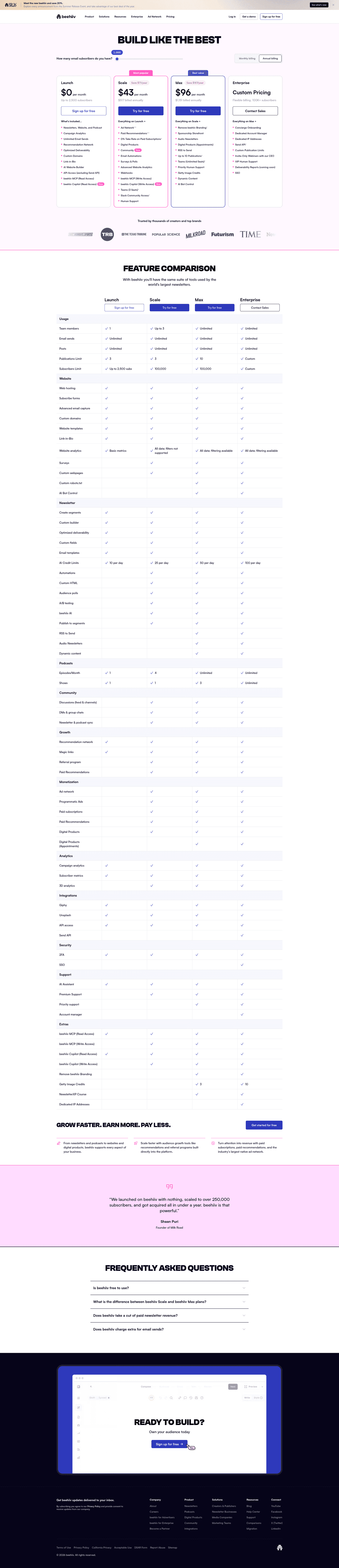
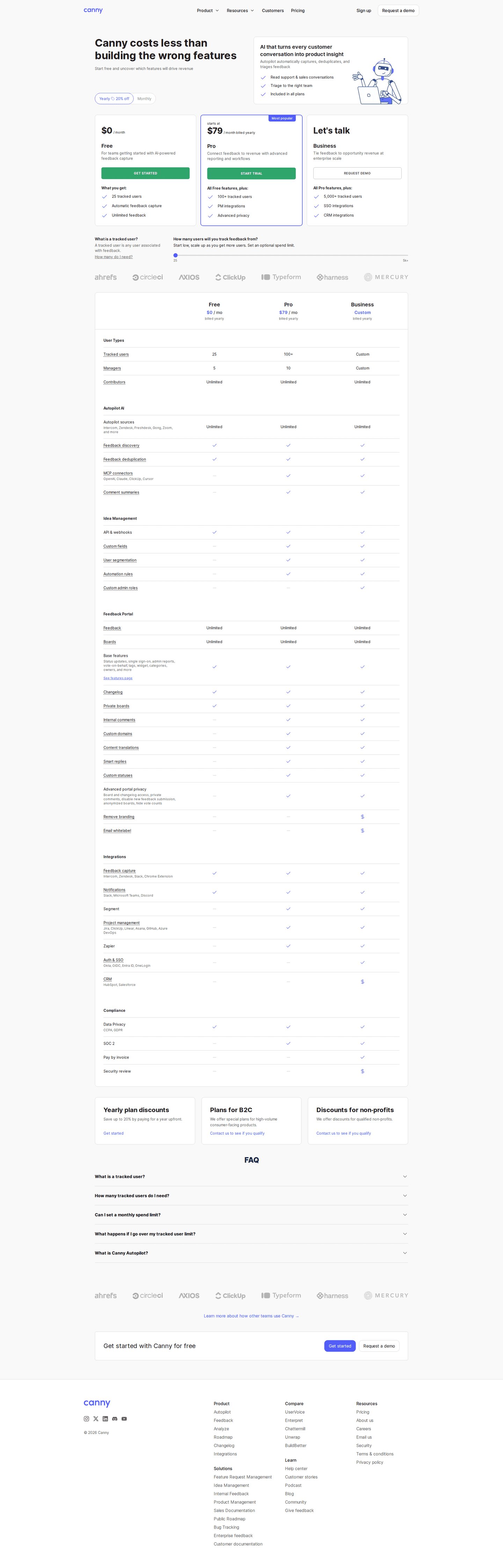
The 97 pricing pages here that carry a calculator or a slider, so a visitor can move their own numbers and watch the price change.
Key takeaways
- Make the slider end on a price. If it ends in a contact form, the visitor still doesn't know the cost.
- Put a free trial next to the calculator, so visitors can start as soon as they see their price.
- Say what the slider counts, in a tooltip and again in the FAQ.
Showing 1–24 of 97 pricing pages
What the best pricing pages with a calculator do
The price on these pages depends on usage, so visitors need to be extra sure what they'll pay.
Show a real price
1% of the best pricing pages hide a price, and 75% have a monthly and annual toggle. If the slider ends in a "contact us" button, visitors have to fill in a form to learn what the calculator was supposed to tell them.

Put the trial button next to it
69% of the best pricing pages offer a free trial. The calculator is where a visitor first sees a price for their own usage, so put the trial button right there.
Say what the slider counts
47% of the best pricing pages use tooltips, and 91% have an FAQ. A slider is hard to use until the page says what it counts, like seats, emails or API calls, so put the unit on the input and answer the rest in the FAQ.

Curated by
Gabriel Amzallag , Founder, Web Anatomy
5 years CRO + SEO at Qonto (2021–2025). After advising 15+ SaaS on their websites (Payfit, Pigment…), the same patterns kept breaking, so I decided to build the source of truth on what works on the web: the intelligence layer every tool, builder, and team uses to ship sites that perform.
Go further than pricing pages
MCP
Section ideas, from inside your editor
Ask your coding agent for the strongest sections of a pricing page in your industry. It answers from this benchmark, section by section.
Library
The analysis behind every page here
Each pricing page on this page, section by section, with what works and what does not. Free account.
Browse more pricing pages
Pick another group below, see every pricing page, or browse the sections these pages are built from.
Does your calculator end on a number or a contact form?
Paste your pricing page. Get a scored breakdown against the same best practices these pages were measured on, with the fixes ranked by impact. Free, no signup.
Pricing calculators, answered
What the best pricing pages put around a calculator, answered from the 97 here.
When does a pricing page need a calculator?
01When the price changes with usage. Pricing pages with a calculator charge by usage far more often than pages without one. A plan priced by usage can't show one fixed price, and a slider lets the visitor see the price for their own case.
Can a calculator replace showing a price?
02No. None of the best pages here hide a price. If the slider ends in 'contact us', the visitor has moved it around and still has no idea what they'd pay.
What goes next to a pricing calculator?
03A way to act on the price. Most of the best pages offer a free trial and have a monthly and annual toggle, so the visitor can work out their price, see what a year costs and start the trial on the same page.
How do you stop a calculator confusing people?
04Say what each input counts, and say it everywhere the input appears. Most of the best pages here put tooltips on the inputs, and almost all have an FAQ under the pricing grid. If a slider shows a number without saying what it counts, the visitor can't compare it with their own usage.
Do pages with a calculator show more or less than other pricing pages?
05More. Compared with pricing pages without one, they more often have a free tier, tooltips, a billing toggle and a currency selector. Pages that add a calculator usually have most of the other parts of a pricing page in place already.
How is this different from the pricing calculator section gallery?
06This page collects whole pricing pages that have a calculator, and looks at what's around it. The calculator pattern gallery collects the calculator block itself, cropped out of the page, and grades how it's built. The companies are the same in both.