Best InsurTech Website Examples (And Why They Convert)

We scored 7 insurtech homepages on 60+ conversion criteria. See which sections separate the top performers, and what your page is probably missing.

Updated April 20267 pages analyzed
#CompanyScore

Scored by AI across 60+ conversion criteria

Hippo landing page
#1
63/100
Scroll to explore
Analyze your insurance pageFree. Takes 2 minutes.

What the best insurance websites get right

Insurance buyers arrive skeptical, comparison-ready, and unlikely to share personal data until they feel safe. The strongest insurtech website design patterns in this benchmark do four things consistently:

39/100

Avg. page score

Highlights

  • Build trust before the ask. Show regulatory badges, customer counts, or carrier logos so visitors feel safe before sharing personal data.
  • Make coverage simple. Break complex insurance products into plain language so a buyer understands what they get in under five seconds. Pair specific benefits with quantified proof.
  • Remove the biggest friction. Surface instant quotes, no-exam messaging, or cancel-anytime terms so the next step feels low-risk.
  • Anticipate cautious buyers. Design for people who comparison-shop and need reassurance at every scroll depth, not just in the hero.

7 best insurtech websites analyzed in detail

Each company below is paired with its strongest section and scored across 60+ conversion criteria. See what they get right, and what you can borrow for your own insurance homepage design.

01

AlanA prevention-first health model that blends insurance, care, and everyday wellness into one platform.

Editor's pick51/100
Gabriel AmzallagGabriel AmzallagFounder, LPA

Alan's homepage turns a prevention-first health insurance model into a concrete, measurable story. The value proposition section (scored 83) layers three quantified proof points (30%+ weekly active users, 260k medical chats, and 95% quality rating), so the promise of digital-first care feels verifiable, not aspirational. A 3D mascot and card-based layout make the product feel approachable without sacrificing credibility.

What makes this page stand out

  • 1 million members across France, Belgium, Spain, and Canada demonstrates significant international scale for a European health-tech company
  • Friendly purple bear mascot character with doctor outfit creates a distinctive, approachable brand identity that humanizes healthcare
  • Visual UI elements showing reimbursement notifications, breath exercises, and meditation demonstrate the product's daily wellness engagement
  • "Our unique model" CTA invites curiosity about the differentiated approach rather than pushing a generic signup

Section we love

·Value Proposition
Alan Value Proposition section
  1. 1Quantifies AI accuracy with 95%+ good or excellent feedback from doctors providing strong clinical credibility
  2. 2Explains four distinct mechanisms: AI risk pricing, 24/7 medical assistant, care team support, and future AI products
  3. 33D mascot character with headphones and chat bubbles visually conveys the always-on support concept immediately
  4. 4Specifies concrete benefits like fair pricing, faster claims, and human support at scale rather than vague promises
  5. 5Four clearly separated propositions address different healthcare stakeholder needs from risk to care delivery

See how your page compares to the 39 insurtech average

Run a section-by-section diagnostic on your insurance page and get prioritized fixes, then see how you stack up against these insurtech website examples.

Design patterns across these insurtech pages

Across 7 insurtech homepage examples, the strongest insurance web design removes ambiguity fast: who it's for, what's covered, and what to do next.

The clearest insurance website examples treat trust as a product feature, using quantified proof, regulatory transparency, and plain-language constraints so visitors don't have to infer credibility from polish alone. Explore our best landing page examples to compare how other industries resolve similar trust friction.

Value Proposition Alan

67/100

Turn abstract benefits into measurable proof

Insurance buyers rarely trust claims they can't verify. This value proposition section layers three quantified metrics—weekly active users, medical chat volume, and quality ratings—so each benefit maps to a concrete number, not a vague promise. For insurtech companies selling digital-first care, this approach makes the intangible feel auditable.

Alan value proposition section
  1. 1Three specific metrics (30%+ weekly active, 260k medical chats, 95% quality rating) create layered quantified proof
  2. 23D illustrations pair wellness items with stats making abstract health engagement feel tangible and approachable
  3. 3Positions 260k medical chats as each equal to a doctors visit reframing digital care as equivalent to in-person
  4. 4Weekly active user metric of 30%+ proves ongoing engagement rather than just initial signups or downloads
  5. 5Three distinct cards cover engagement, medical access, and quality assurance as separate measurable propositions

Reviewed design-pattern pick from Alan’s value proposition section.

What I love about this section

  • Three specific metrics (30%+ weekly active, 260k medical chats, 95% quality rating) create layered quantified proof
  • 3D illustrations pair wellness items with stats making abstract health engagement feel tangible and approachable
  • Positions 260k medical chats as each equal to a doctors visit reframing digital care as equivalent to in-person
  • Weekly active user metric of 30%+ proves ongoing engagement rather than just initial signups or downloads

Testimonial Alan

17/100

Use before-and-after framing to make the switch feel real

A single testimonial that contrasts the old insurance experience with the new one does more than generic praise. This section pairs a before/after narrative with a visible loyalty badge, showing how long the customer has stayed—proof that the switch was worth it, not just the trial.

Alan testimonial section
  1. 1Includes a before/after comparison contrasting the product with old-school bureaucratic insurance companies
  2. 2Uses an avatar and Happy Member since 2019 badge to show long-term customer loyalty and retention
  3. 3Quote covers multiple product dimensions (speed, simplicity, transparency, coverage) in a single testimonial

Reviewed design-pattern pick from Alan’s testimonial section.

What I love about this section

  • Includes a before/after comparison contrasting the product with old-school bureaucratic insurance companies
  • Uses an avatar and Happy Member since 2019 badge to show long-term customer loyalty and retention
  • Quote covers multiple product dimensions (speed, simplicity, transparency, coverage) in a single testimonial

Sections insurance teams underuse (but visitors still look for)

Even with a strong hero, secondary sections often decide whether someone keeps reading, especially in regulated categories where reassurance matters as much as benefits.

In this dataset, About tends to outperform at 67 while Navbar is the most fragile at 10, suggesting many insurance pages invest in messaging but leave gaps in wayfinding and confirmation that slow decisions. See how best fintech websites handle similar trust gaps in adjacent financial services.

About Alan

67/100

Anchor the company mission in a clear founding thesis

Most insurance about sections default to generic origin stories. This one leads with a bold founding thesis—healthcare works best when not fragmented—then offers two deeper paths: a business model breakdown and a video. For insurtech companies, explaining why you exist reduces the "is this legit?" question faster than logos alone.

Alan about section
  1. 1Bold founding thesis (healthcare works best when not fragmented) frames the company mission clearly
  2. 2Our business model CTA button invites visitors to explore the business logic deeper
  3. 3Discover Alan in video CTA provides an engaging alternative for visual learners
  4. 4Integrated model diagram (Healthcare + Insurance + Prevention) visualizes the approach

Reviewed overlooked-section pick from Alan’s about section.

What I love about this section

  • Bold founding thesis (healthcare works best when not fragmented) frames the company mission clearly
  • Our business model CTA button invites visitors to explore the business logic deeper
  • Discover Alan in video CTA provides an engaging alternative for visual learners
  • Integrated model diagram (Healthcare + Insurance + Prevention) visualizes the approach

Footer Alan

20/100

Make regulatory compliance visible, not buried

In insurance, regulatory disclosure isn't just legal—it's a trust signal. This footer surfaces ACPR supervision details, a CNIL data protection declaration, and a privacy contact email in plain view. Visitors in regulated markets read footers more than most teams assume.

Alan footer section
  1. 1Detailed regulatory disclosure mentioning ACPR supervision and SIREN registration number
  2. 2CNIL data protection declaration with privacy contact email (privacy@alan.com)
  3. 3Cookie preferences link and Edit cookie preferences option for compliance
  4. 4App download buttons for App Store and Google Play provide mobile conversion path

Reviewed overlooked-section pick from Alan’s footer section.

What I love about this section

  • Detailed regulatory disclosure mentioning ACPR supervision and SIREN registration number
  • CNIL data protection declaration with privacy contact email (privacy@alan.com)
  • Cookie preferences link and Edit cookie preferences option for compliance
  • App download buttons for App Store and Google Play provide mobile conversion path

Resources Alan

20/100

Give secondary audiences a clear next path

Not every visitor is a buyer. This resources section routes press, job seekers, and ESG-minded visitors to the right destination with dedicated cards and clear CTAs. For insurance companies, this reduces dead-end browsing and signals organizational maturity.

Alan resources section
  1. 1Each resource card has a clear CTA button linking to deeper pages
  2. 2Covers company culture, press, careers, and ESG in one section
  3. 3Friendly mascot illustrations make the section feel approachable
  4. 4Short descriptions under each card clarify what visitors will find

Reviewed overlooked-section pick from Alan’s resources section.

What I love about this section

  • Each resource card has a clear CTA button linking to deeper pages
  • Covers company culture, press, careers, and ESG in one section
  • Friendly mascot illustrations make the section feel approachable
  • Short descriptions under each card clarify what visitors will find

If you're refreshing an insurance landing page design, treat these "unsexy" blocks as conversion infrastructure, not filler.

How does your insurance homepage compare?

Five quick questions to see where your page stands against this insurtech benchmark. For a full section-by-section audit, try our landing page analyzer.

Interactive quiz

What would your insurance homepage score?

Question 1 of 5
0%

Does your insurance page show a trust signal before the first scroll?

Customer count, carrier logos, regulatory badges, or transparent pricing.

Gabriel Amzallag

Reviewed by

Gabriel Amzallag , Founder, LPA

5 years CRO + SEO at Qonto (2021–2025). After advising 15+ SaaS on their websites (Payfit, Pigment…), the same patterns kept breaking — so I decided to build the source of truth on what works on the web: the intelligence layer every tool, builder, and team uses to ship sites that perform.

See how your page compares to the 39 insurtech average

Run a section-by-section diagnostic on your insurance page and get prioritized fixes, then see how you stack up against these insurtech website examples.

Analyze your insurance pageFree. Takes 2 minutes.

Explore other industries

See how conversion patterns differ across verticals. Each page scores real homepages on the same framework.

See all industries
Benchmark-backed answers for insurtech website design

FAQ: Best Insurance Websites (InsurTech Benchmarks)

Quick answers to common questions about what makes the best insurance websites convert, based on section-level benchmark data from this insurtech review.

What makes insurance websites harder to convert than other industries?
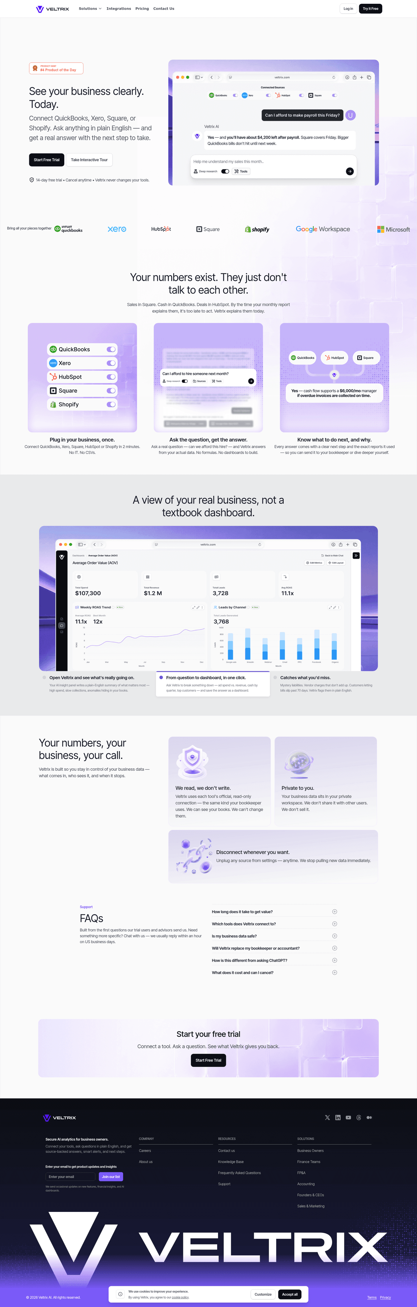
[01]

Insurance is a high-stakes, low-frequency purchase. Buyers arrive skeptical and refuse to share personal data until they feel safe. Across 7 homepages reviewed in April 2026, the pages that convert — Alan, Hippo, Ladder, and Policygenius — treat every section as a trust checkpoint and remove a concrete friction in the first pitch: "no medical exam," "quote in 60 seconds," or "compare carriers side by side."

Should an insurance homepage lead with price or trust?

[02]

Trust first, price second. Ladder opens with "term life that fits your life" before showing any premium; Alan leads with its prevention-first category claim; Policygenius lets buyers compare carriers before any one pitches them. Across 7 homepages reviewed, the pages that delayed pricing scored higher on value-proposition clarity — the buyer had a reason to care about the number by the time they saw it.

What is the biggest messaging mistake on insurance homepages?

[03]

Generic "protect what matters" headlines with no specific benefit and no low-friction next step. The average page scored 39 across 7 homepages reviewed. Top performers replace abstract promises with verifiable proof: Ladder's no-medical-exam promise, Hippo's smart-home-first prevention, and Alan's quantified usage — 30%+ weekly active users, 260k medical chats, 95% quality rating. Visitors need something real to evaluate in the first ten seconds.

How do you find the best insurance websites to review before a redesign?

[04]

Compare real pages side by side, section by section — not as full-page screenshots. This review scores 7 insurance homepages in April 2026 against 60+ criteria. The strongest performers are Alan (health insurance), Hippo (home), Ladder (life), and Policygenius (carrier comparison). Benchmark each against the trust band and how-it-works sections first, since those load-bearing blocks decide whether a risk-averse buyer keeps reading.

Which insurance homepage sections should you fix first?

[05]

Fix the trust band and the how-it-works section before touching the hero. Insurance buyers are risk-averse; they scroll for proof before they read headlines. A trust row with carrier logos, regulator references, and a coverage amount earns the next scroll. A three-step how-it-works section with concrete details ("bind a policy in 4 minutes", "file a claim via SMS") converts more than any headline rewrite. Hero and pricing are polish. The mid-page sections are the load-bearing wall.

What is the best website for insurance?

[06]

There is no single best — it depends on your product line. For digital-first life insurance, Ladder is the template (no medical exam, instant decisions). For home, Hippo leads with prevention and smart-home technology. For health, Alan quantifies product usage to make a category-defining claim. For carrier comparison, Policygenius is the model. All 7 homepages in this April 2026 review are scored on the same rubric.

Where can I find great insurtech website design inspiration?

[07]

Study insurance homepages section by section, not as full-page moodboards. Browse best landing page examples for the full gallery, then drill into hero section examples, trust section examples, and pricing section examples to see how Alan, Hippo, and Ladder differ at each funnel stage.