Contact page examples (497)
A contact page is where a visitor asks to talk to the company, often to book a demo with sales. Its job is to make that request easy to send. See 497 real examples.
Showing 1–24 of 497 contact pages
How to structure a contact page, by the numbers
The questions a team asks when it rebuilds a contact page, answered from the 497 here.
Should the page carry a form at all?
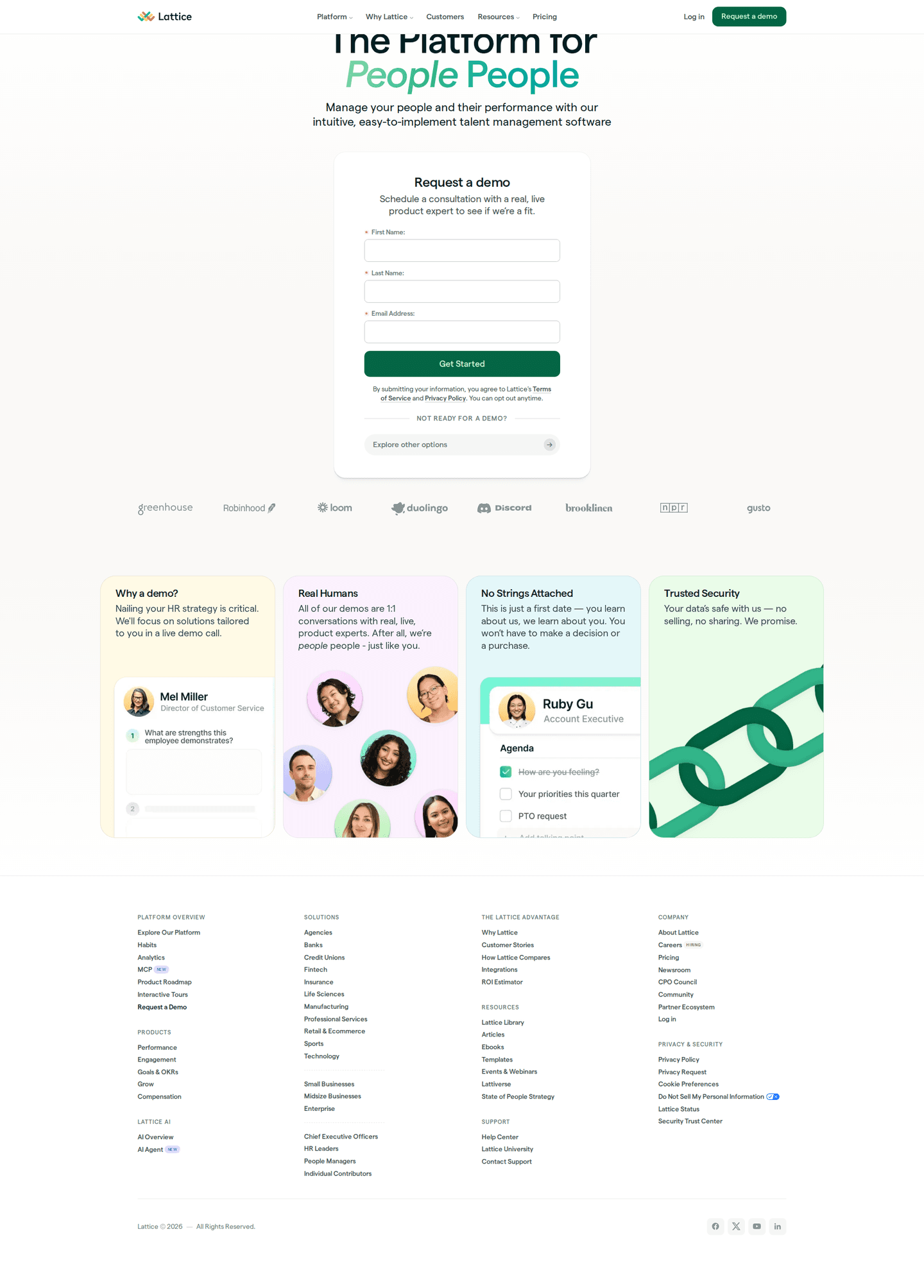
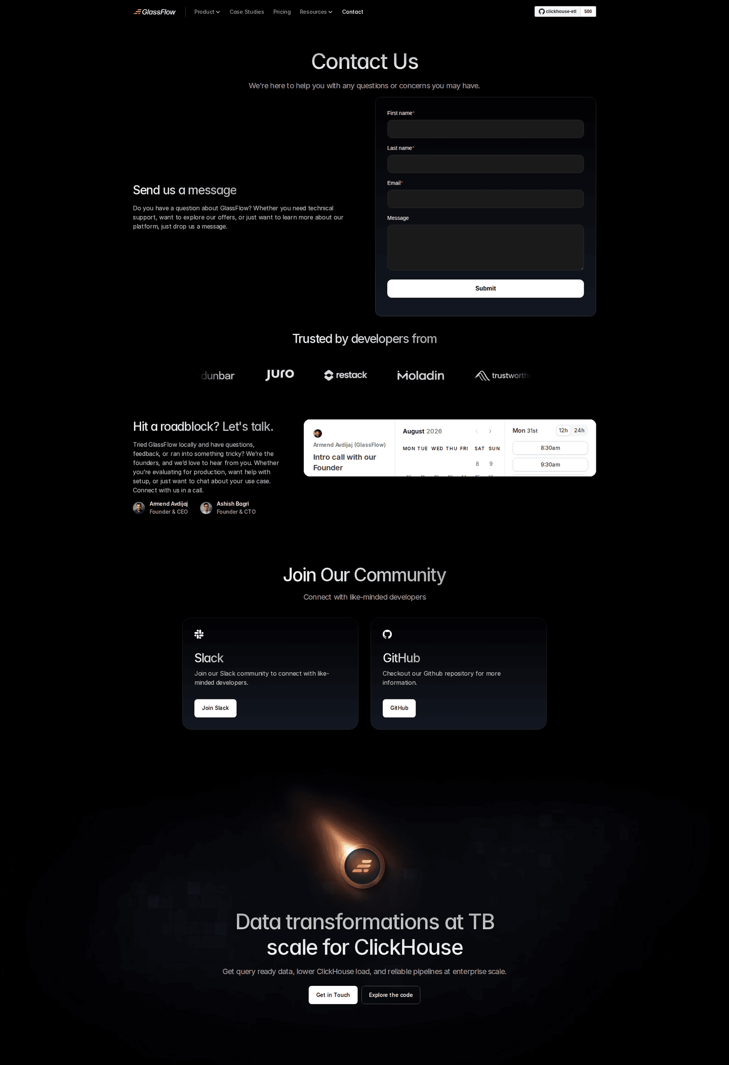
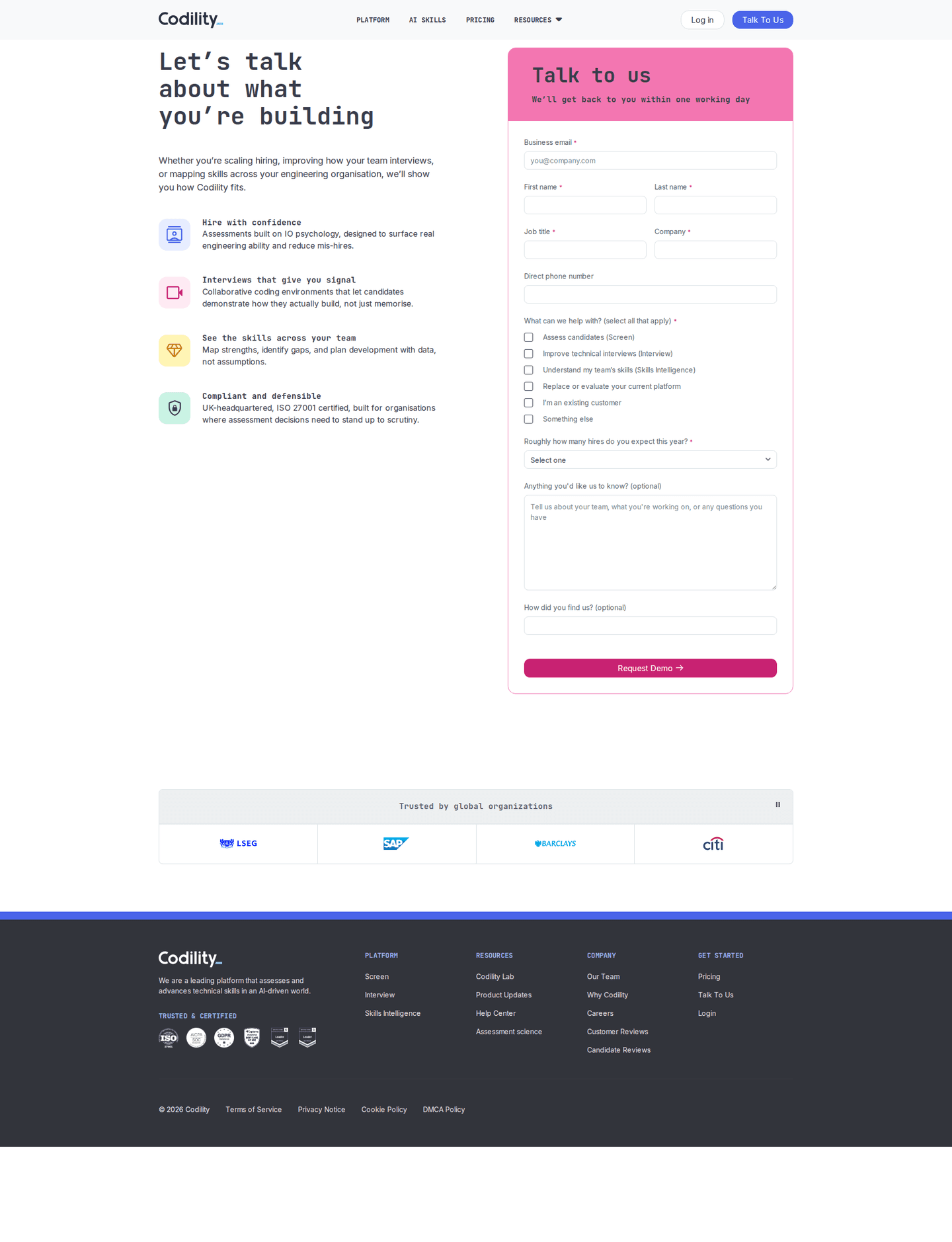
- A form on the page itself on 69%
- An email-only form on 3%, for products that route the lead later
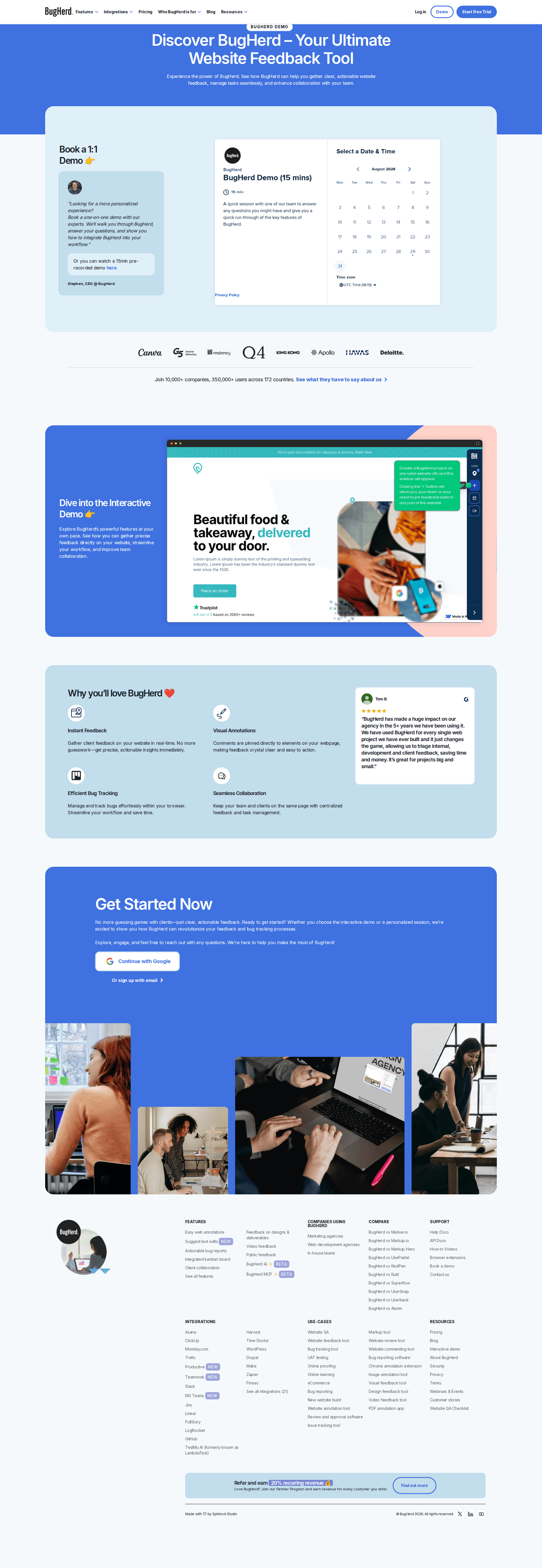
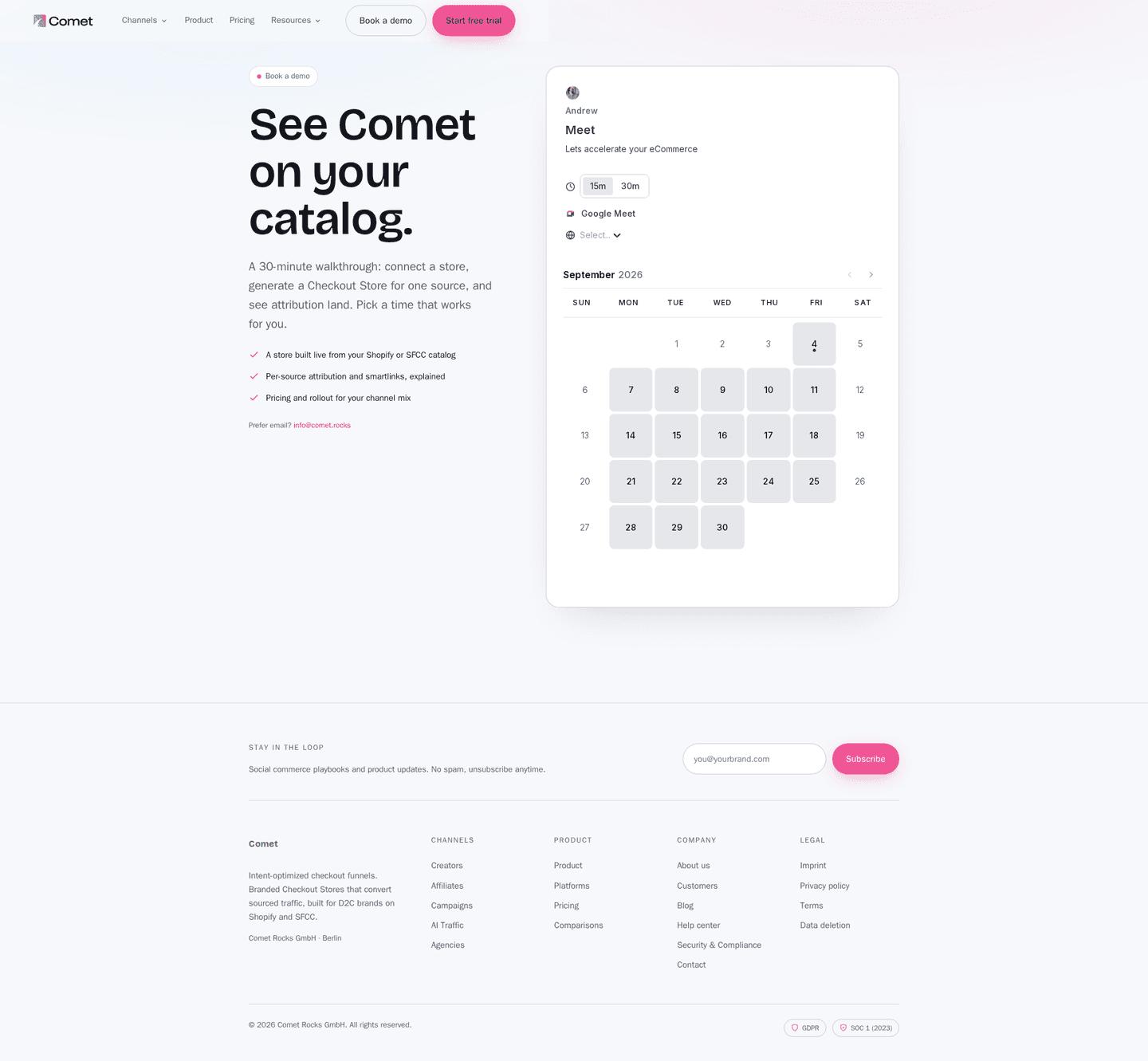
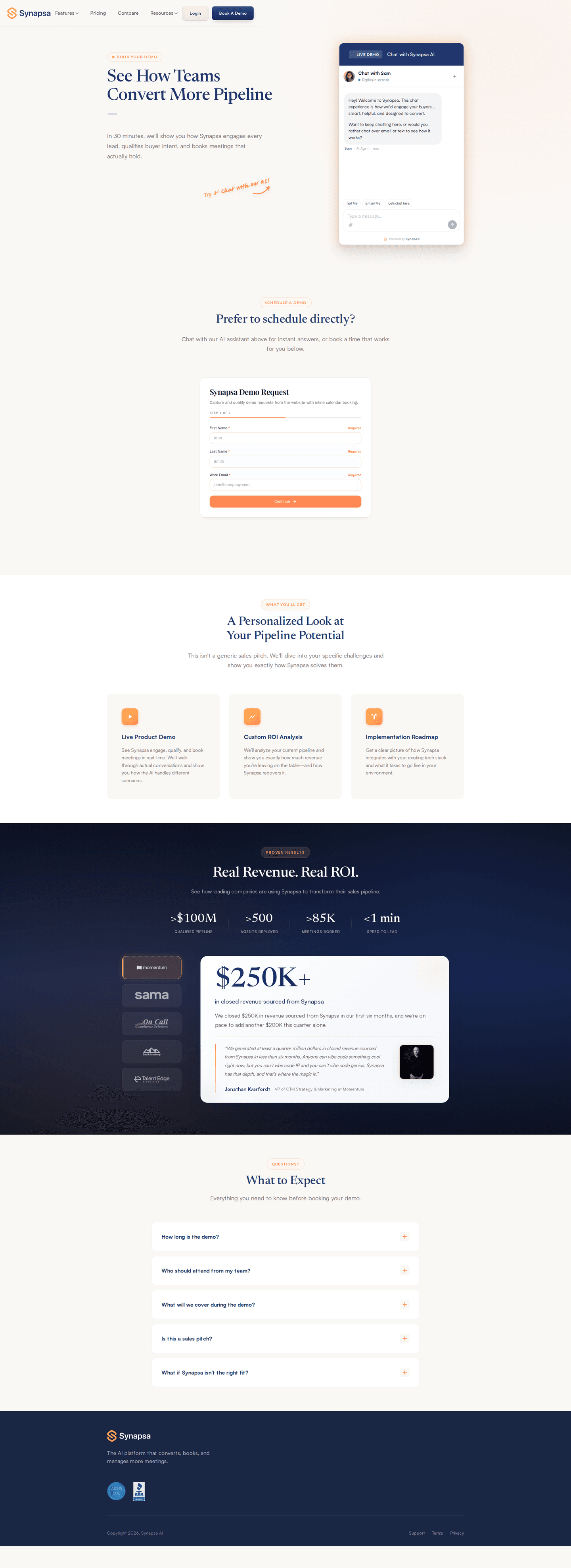
- A booking calendar on 4%, which lets the visitor pick a slot instead of waiting
How many fields should the form ask for?
How many fields the form asks for
- A five-field form54 contact pages
- A seven-field form48 contact pages
- A six-field form43 contact pages
- An eight-field form41 contact pages
- A four-field form35 contact pages
- A three-field form26 contact pages
A privacy line next to the form, saying what happens to the details entered, is on 31%: 43% of the strongest pages against 23% of the weakest.
What happens after the visitor hits send?
- The page says what follows and roughly when on 50%
- The agenda of the call is printed on 19%
- How long the call takes is stated on 12%
This is the widest gap in the set: 84% of the strongest pages say it, against 20% of the weakest. One line above the button does it: who replies, in what form, and how soon.
Should the page offer a way around the form?
- A self-serve route out of sales on 73%
- A pricing link on 65%
- A direct email address on 31%, a phone number on 16%, a chat widget on 18%
- A sticky header on 70%, so the rest of the site stays one click away
What proof belongs next to the form?
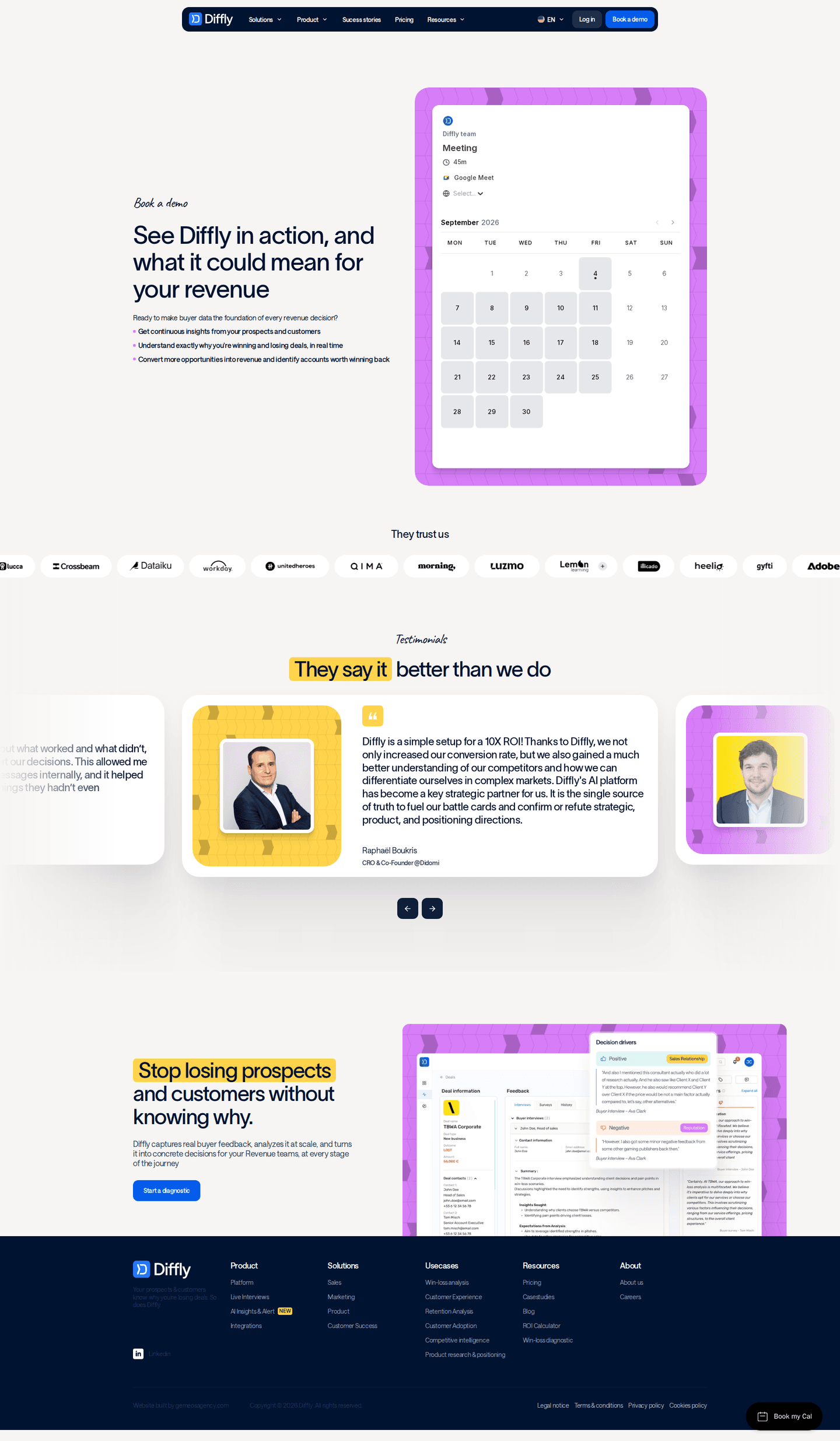
- A logo wall on 39%
- Testimonials on 22%
- Testimonials with a real name attached on 20%, an embedded video on 4%
How long is a contact page?
3 sections between the navigation and the footer, half of them between 2 and 4. The form is the page, and the rest of the sections are there to make it easy to fill in.
The section right after the hero
- Contact401 contact pages
- Logo wall or trust bar27 contact pages
- Closing CTA band10 contact pages
- Resources6 contact pages
The last section before the footer
- Contact144 contact pages
- Logo wall or trust bar136 contact pages
- Closing CTA band119 contact pages
- Testimonials32 contact pages
Share of contact pages carrying each section
- Contact468 contact pages
- Logo wall or trust bar245 contact pages
- Closing CTA band141 contact pages
- Testimonials102 contact pages
- Resources55 contact pages
- FAQ45 contact pages
- Features23 contact pages
The moves almost nobody makes
Each sits under 15% of the market, with the strongest contact page that uses it.
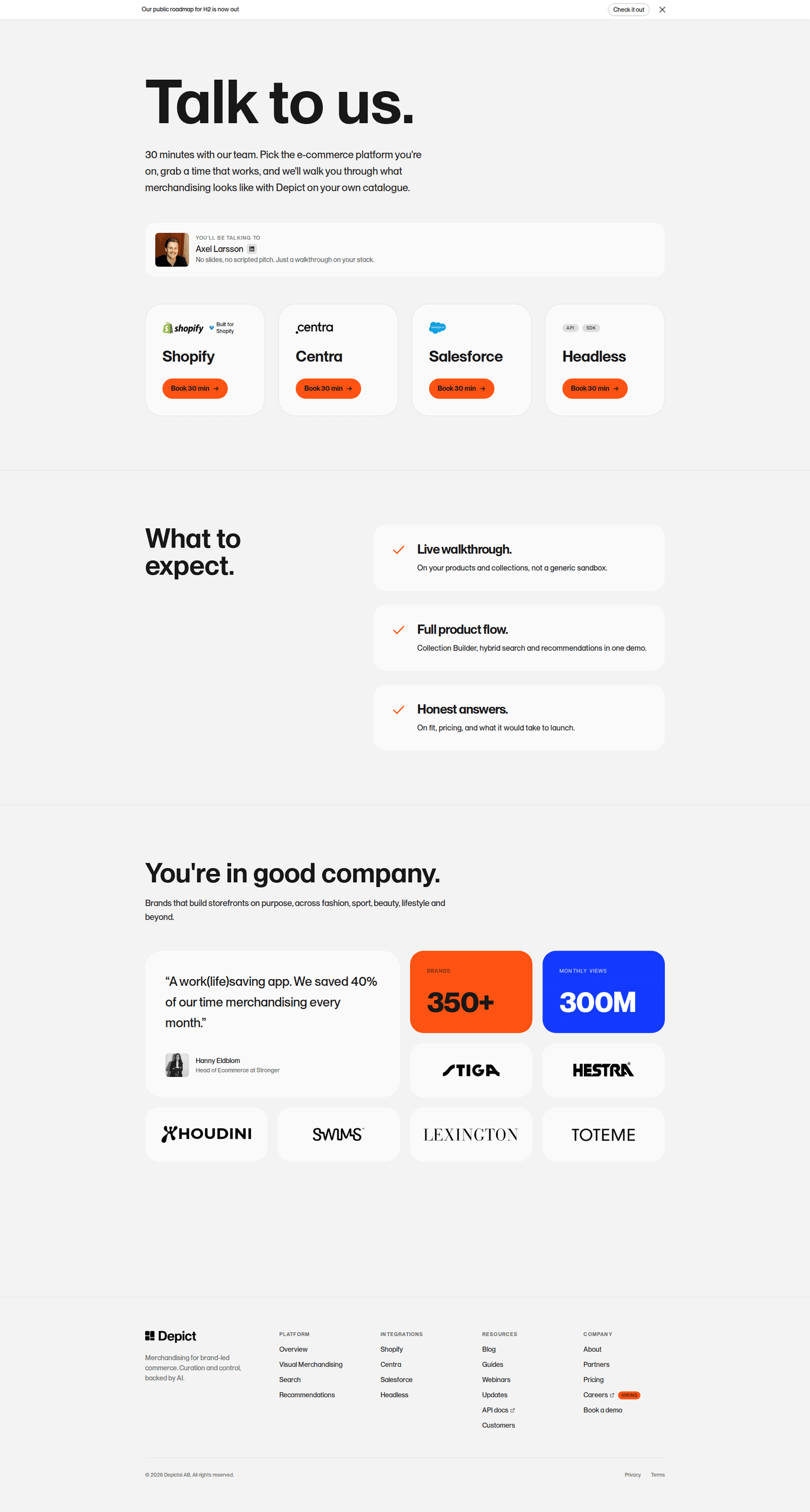
A named face on the page
8% show who the visitor will actually talk to, by name or by photo. That is 27% of the strongest pages.
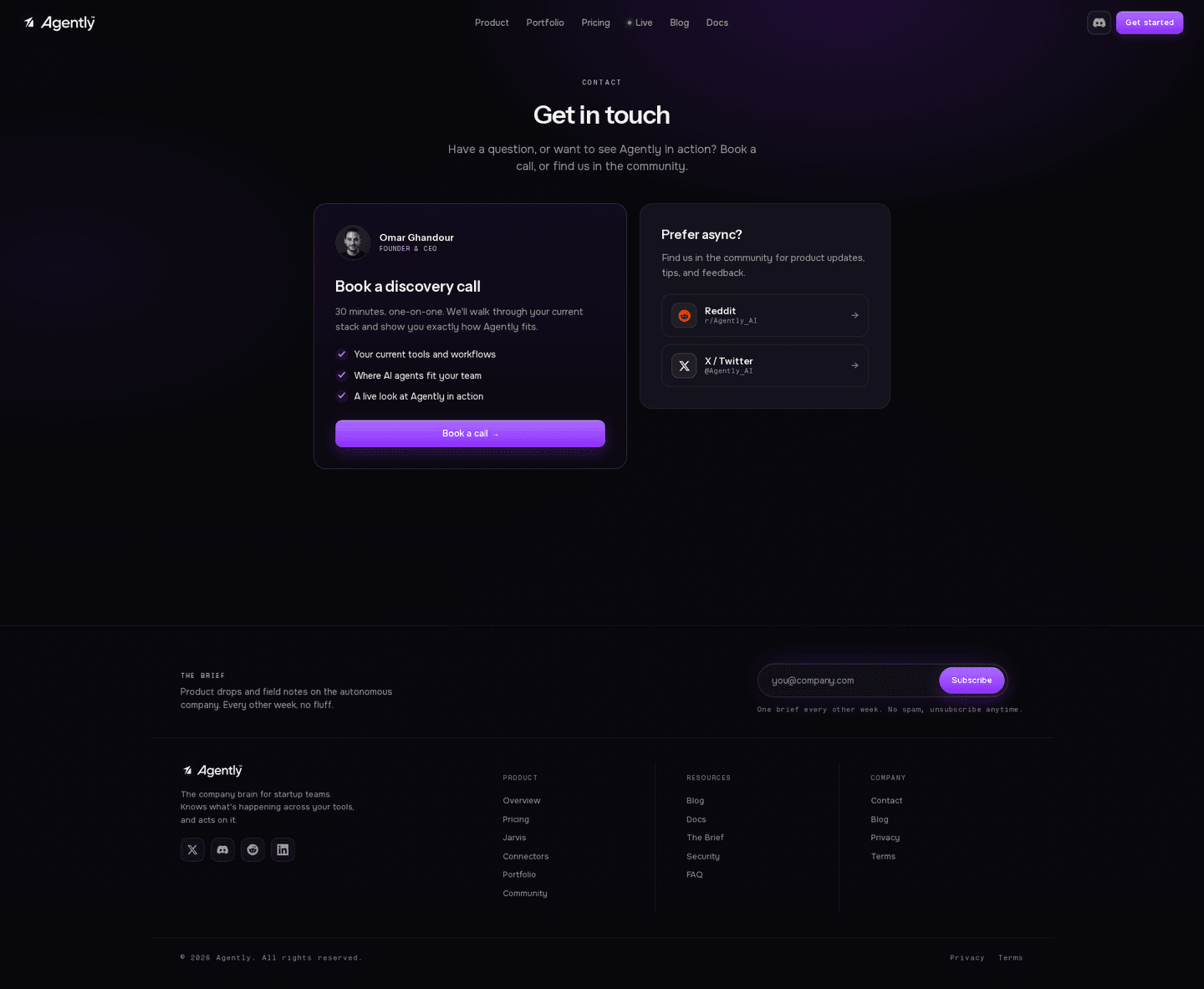
A stated call length
12% say how long the call takes, so the visitor knows what they are booking before they hand over an email address.
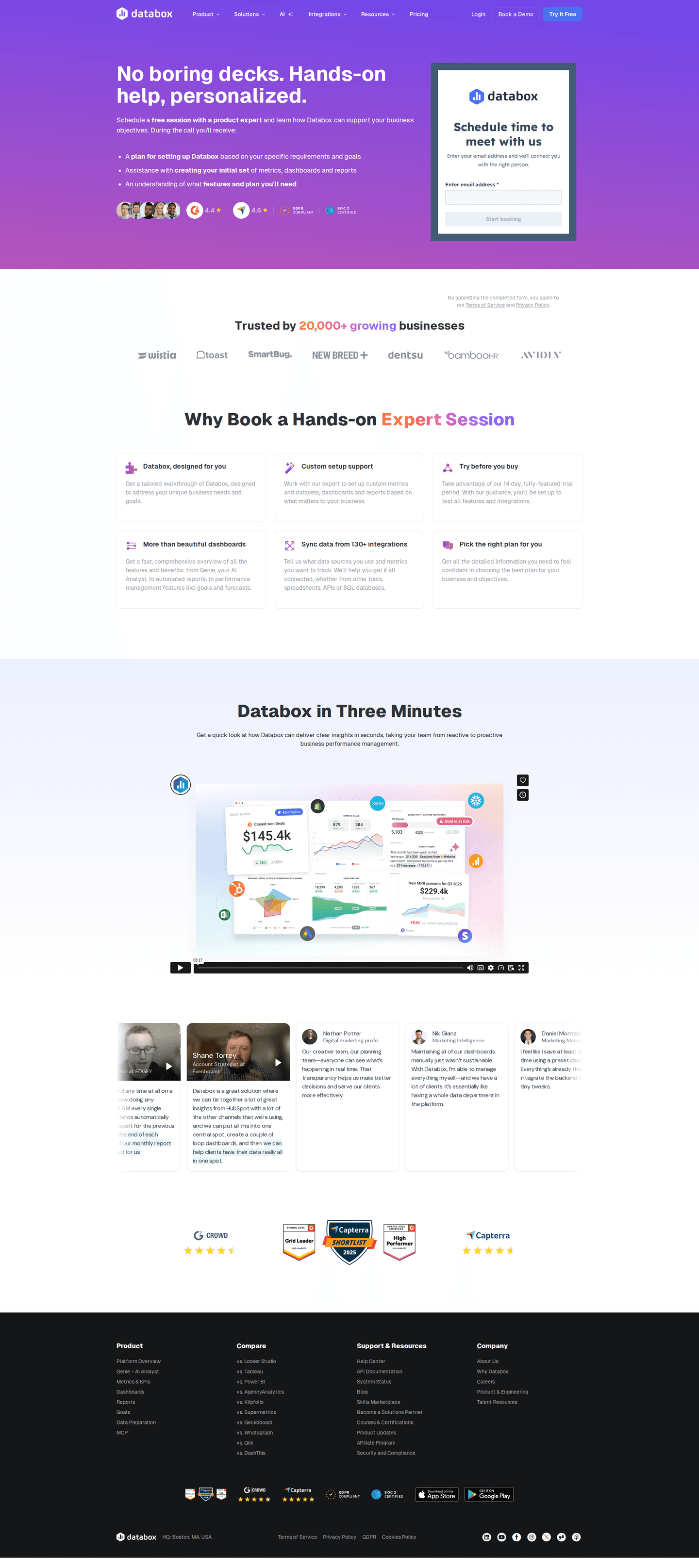
An email-only form
3% ask for an email address and nothing else, then qualify the lead in the reply.

Curated by
Gabriel Amzallag , Founder, Web Anatomy
5 years CRO + SEO at Qonto (2021–2025). After advising 15+ SaaS on their websites (Payfit, Pigment…), the same patterns kept breaking, so I decided to build the source of truth on what works on the web: the intelligence layer every tool, builder, and team uses to ship sites that perform.
Go further than contact pages
Growth Engine
Your top 3 opportunities for more revenue.
We find every way to grow your website’s visibility and conversions: SEO, AI search (AEO), backlinks and mentions, and UX/UI. 3 free opportunities, delivered by email.
Library
The analysis behind every page here
Each contact page on this page, section by section, with what works and what does not. Free account.
Didn't find the contact page you were looking for?
Every other page type has its own gallery. Start from all page types.
- Homepages
- Pricing pages
- About pages
- Feature pages
- Integrations pages
- Security pages
- Enterprise pages
- Industry pages
- Persona pages
- Why us pages
- Case study pages
- Comparison pages
- Blog pages
- Signup pages
- Webinar pages
- SEO landing pages
- Free tool pages
- PPC landing pages
- Careers pages
- Login pages
- 404 pages
- AI product pages
- Press pages
- Partner program pages
- Download pages
- Resource libraries
- Developer pages
- Solutions pages
- Template galleries
- Glossary pages
- Startup program pages
- Community pages
- ROI calculators
- Newsletter pages
- Programmatic SEO pages
- Blog posts
- Customer stories pages
- Alternatives pages
- Features overview pages
- Product tours
- Integration pages
- AI agent pages
- Affiliate program pages
- Team pages
- Conference pages
Your top 3 opportunities for more revenue.
We find every way to grow your website’s visibility and conversions: SEO, AI search (AEO), backlinks and mentions, and UX/UI. 3 free opportunities, delivered by email.
Contact page design, answered
The questions people ask before rebuilding a contact page, answered from 497 real ones.
What should a contact page include?
01Four things carry most of these pages. Nearly three in four offer a route that avoids sales altogether, a trial, pricing, docs or a plain email address. About seven in ten put a real form on the page rather than a link out to one, about seven in ten keep the header stuck to the top of the screen, and about two in three keep a pricing link one click away.
How many fields should a contact form have?
02Most sit between four and eight, about two in three of the forms here. Five and seven fields are the most common counts, each on about one form in seven, then six and eight. A one-field form is rare, and very few ask for an email address and nothing else.
What should a contact page say happens after the form?
03It should say what follows and roughly when, which only about half of these pages do. It is the widest split in the set: more than four in five of the strongest pages explain what happens next against about one in five of the weakest. Fewer than one in five also print the agenda of the call, and about one in eight say how long it takes.
Should a contact page show a phone number?
04Only if someone answers it. About one in six of these pages show a phone number and about three in ten a direct email address, so a form is still the default door. About one in six run a chat widget instead, and very few embed a booking calendar so the visitor picks a slot without waiting for a reply.
What proof belongs on a contact page?
05A logo wall first. About two in five carry one, and it is on close to three in five of the strongest pages against about one in four of the weakest. Testimonials are on about one in five, and most of those carry a real name. A named or pictured sales rep, the cheapest way to make the call feel human, is on fewer than one in ten.
How is this different from the best landing pages leaderboard?
06This gallery is a visual browse: what contact pages look like and what they contain. The best landing pages benchmark is the graded view, where pages are scored against conversion best practices and ranked by industry. Same companies, different question.