Pricing pages with add-ons (138)
The 138 pricing pages here that carry an add-ons section, where extras are sold on top of the plan price.
Key takeaways
- Put the add-ons inside the comparison table, next to the plans they go with.
- Explain each add-on in its own row, because visitors often won't know what it is.
- Show the base price, so visitors can work out what they'll pay in total.
Showing 1–24 of 138 pricing pages
What the best pricing pages with add-ons do
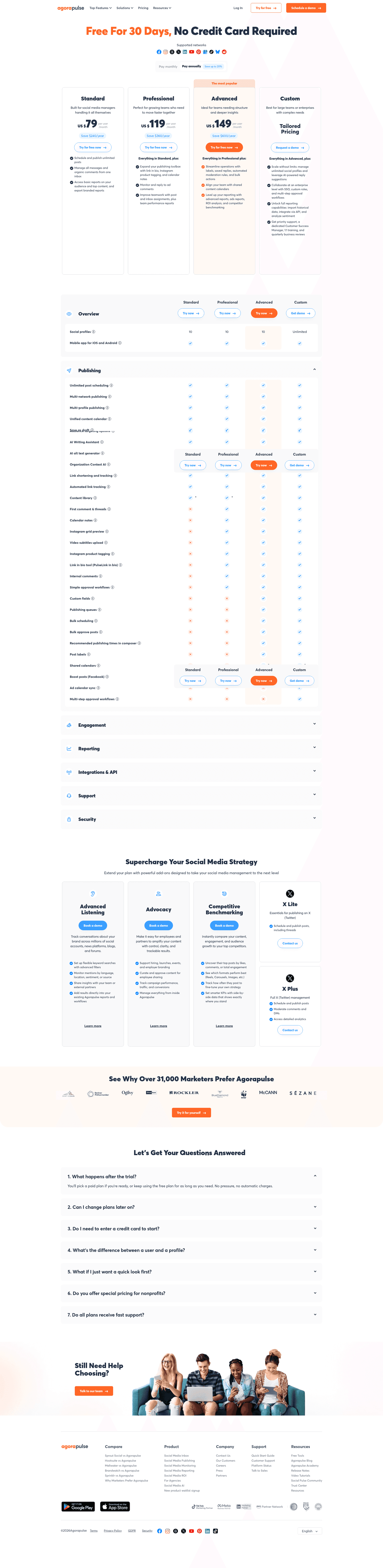
With add-ons, the price on the plan card isn't always what the customer pays. The best pages make the full total easy to work out.
Put them in the table
82% of the best pricing pages carry a comparison table. When extras sit in a separate block under the plans, visitors have to add prices up themselves, so the best pages list each add-on next to the plan it goes with.

Explain each add-on
47% of the best pricing pages explain features in a tooltip. Visitors often don't know an add-on exists, so its row has to say what it does and how it's charged. A tooltip fits that into a small space.
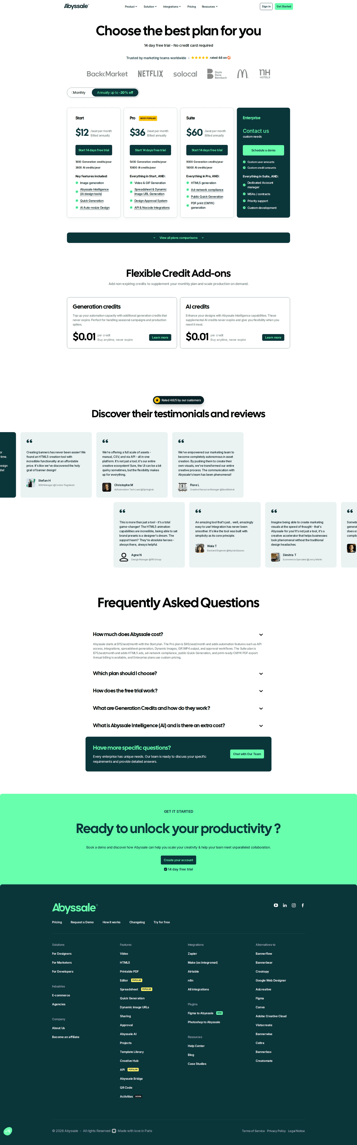
Show the base price
1% of the best pricing pages hide a price. When the price is hidden and there are extras on top, the total is hard to guess and visitors may think costs are being kept from them. With the base price shown, add-ons look like options.

Curated by
Gabriel Amzallag , Founder, Web Anatomy
5 years CRO + SEO at Qonto (2021–2025). After advising 15+ SaaS on their websites (Payfit, Pigment…), the same patterns kept breaking, so I decided to build the source of truth on what works on the web: the intelligence layer every tool, builder, and team uses to ship sites that perform.
Go further than pricing pages
MCP
Section ideas, from inside your editor
Ask your coding agent for the strongest sections of a pricing page in your industry. It answers from this benchmark, section by section.
Library
The analysis behind every page here
Each pricing page on this page, section by section, with what works and what does not. Free account.
Browse more pricing pages
Pick another group below, see every pricing page, or browse the sections these pages are built from.
Is the price on your card the price?
Paste your pricing page. Get a scored breakdown against the same best practices these pages were measured on, with the fixes ranked by impact. Free, no signup.
Add-ons on a pricing page, answered
How the best pricing pages keep a total legible, from the 138 here.
How many pricing pages sell add-ons?
01A fair number of them, mostly on longer pages. These pages carry a comparison table more often than pricing pages without extras.
Where should the add-ons go?
02Inside the table, next to the plans they go with. Most of the best pages here carry a comparison table. When the extras sit in a separate block at the bottom of the page, the visitor has to remember two prices and add them up themselves.
Do add-ons need explaining?
03More than plan features do. These pages carry tooltips more often than the rest. Visitors usually don't know an add-on exists, so its row has to say what it is and whether it's charged per seat or per account.
Can add-ons work on a page with no visible price?
04Badly. Almost none of the best pages here hide a price. If the visitor can't see the base price, an extra on top of it is a second number they don't know, and the page starts to look like it's hiding costs.
Are add-ons a substitute for a higher tier?
05They're an alternative to one, and each option has a downside. Add-ons keep the number of plans small and let a small team buy just the one thing they need. They also mean the price on the plan card isn't the full price, so the page should say that before the visitor finds out at checkout.