Skip to content

Best EdTech Websites: 11 Examples (And Why They Convert)

We scored 11 edtech homepages on 60+ conversion criteria. See which sections separate the top performers, and what your page is probably missing.

Updated April 202611 pages analyzed
#CompanyScore

Scored by AI across 60+ conversion criteria

ProductLed landing page
#1
79/100
Scroll to explore
Analyze your edtech pageFree. Takes 2 minutes.

What the best edtech websites get right

EdTech buyers are comparison-heavy and outcome-obsessed. Free alternatives are one tab away, so the strongest edtech website design patterns in this benchmark do four things consistently:

50.9/100

Avg. page score

  • Put the CTA above the fold. The strongest pages make the next step visible before any scrolling, pairing a clear action with an outcome promise.
  • Nail visual hierarchy. The best edtech pages guide the eye from headline to proof to CTA in a single scan so the visitor never has to search for what to do next.
  • Make How It Works carry the page. Structured step-by-step flows turn abstract learning products into concrete experiences that buyers can picture using.
  • Invest in integrations and ecosystem proof. Pages that show where the product fits into existing workflows close a gap most edtech competitors ignore.

11 best edtech websites analyzed in detail

Each company below is paired with its strongest section and scored across 60+ conversion criteria. See what they get right, and what you can borrow for your own edtech homepage design.

01

ProductLed, Product-led growth education and coaching for SaaS founders who want to build self-serve acquisition engines.

Editor's pick79/100
Gabriel AmzallagGabriel AmzallagFounder, Web Anatomy

ProductLed earns the editor's pick with a navbar scored 100, best in class. A Free Tools mega menu surfaces six tools with descriptions under a TOOLS header, while nav labels map the buyer journey (About PLG, Learn PLG, Implement PLG). The bold yellow APPLY NOW CTA creates urgency without clutter. The how-it-works section (also scored 100) uses five-step tab navigation with a homework deliverable per step, starting with problem validation to build trust before asking for commitment.

What makes this page stand out

  • Wes Bush as the instructor brings strong personal brand authority as bestselling author of "Product-Led Growth" and "The Product-Led Playbook" — the definitive books in the PLG space
  • The 9-week structured program with live sessions and certification creates commitment and completion incentives that typical self-paced courses lack
  • The $549 price point positions the program as accessible for individual contributors while being easy to expense for team purchases — smart pricing strategy
  • The PLG Scorecard diagnostic tool gives participants an immediate, personalized assessment — driving engagement before the program even begins

Section we love

·Navbar
ProductLed Navbar section
  1. 1The yellow Apply Now button stands out as the single high-contrast conversion action in the bar
  2. 2The open Free Tools mega-menu lays out six utilities like Audit Your PLG Flow and Website Analyzer
  3. 3Each tool entry carries a one-line description so visitors grasp the value before clicking
  4. 4A topic-based nav (About PLG, Learn PLG, Implement PLG) maps the buyer journey across the bar
  5. 5Free lead magnets (Product Led Assessment, Templates, AI Onboarding Examples) pull visitors deeper into the funnel
02

Administrate, A training management system for instructor-led programs with AI-powered scheduling and resource management.

63/100
Gabriel AmzallagGabriel AmzallagFounder, Web Anatomy

Administrate's features section (scored 67) leads with a benefit-first headline, "Get every training session on the calendar in minutes without fear of double booking", and backs it with a calendar UI showing color-coded rooms, conflict detection, and a Solve button. The navbar includes a Pricing tab and a green Book a Demo CTA, while the Product dropdown splits Use Cases from Industries. A three-column pricing table with colored dot checkmarks across nine named categories makes comparison effortless.

What makes this page stand out

  • AI-powered scheduling that builds draft schedules with "perfect fill rates, zero conflicts, and no overbookings" addresses the most time-consuming, error-prone task in training operations — a clear, quantifiable efficiency gain
  • Two-way integration with LMS, LXP, HRIS, and ERP systems positions Administrate as the operational backbone that connects to existing learning infrastructure rather than replacing it
  • The "instructor-led training can be as easy as eLearning" tagline reframes ILT's biggest weakness (operational complexity) as a solvable problem — aspirational messaging for training operations managers
  • Multi-modality management (classroom, virtual, blended) from a single interface addresses the hybrid training reality that emerged post-pandemic — no longer just physical classroom scheduling

Section we love

·Features
Administrate Features section
  1. 1Benefit-led headline (Get every training session on the calendar in minutes without fear of double booking) leads with speed and outcome
  2. 2Pain-to-outcome mapping ties the fear of double booking directly to the scheduler that flags Booking Conflict automatically
  3. 3Detailed product UI shows the real scheduler with rooms, bookings and a Solve button, the concrete result of using it
  4. 4Explore AI Scheduler link lets interested buyers dig into this single feature without leaving the page
03

Guild, A skills training and professional development platform that connects employers to education programs for their workforce.

59/100
Gabriel AmzallagGabriel AmzallagFounder, Web Anatomy

Guild's hero (scored 44) features a real testimonial card from Jarryn R., a Floor Associate who advanced to Recruiting at Walmart, showing tangible career impact. Dual CTAs (Watch Video and Get in touch) paired with an aspirational headline and human-centered hero photo make the promise feel achievable rather than abstract.

What makes this page stand out

  • "Shape an education benefits program that lifts your people up and moves your business forward" — dual stakeholder messaging that appeals to both HR leaders and C-suite.
  • Enterprise customer logos (Providence, Spectrum, UCHealth, Sunrun) demonstrate adoption by major employers.
  • "Guild is an Official Provider of Team USA" banner adds unexpected prestige credibility.
  • "Let's Talk Talent Strategy" CTA frames the sales conversation around strategy, not product features.

Section we love

·Hero
Guild Hero section
  1. 1Real testimonial card (Jarryn R., Floor Associate to Recruiting at Walmart) shows tangible career impact
  2. 2Dual CTAs (Watch Video + Get in touch) serve both explorers and high-intent visitors
  3. 3Aspirational headline (a future of work that works for everyone) signals inclusive mission
  4. 4Human-centered hero photo with named testimonial builds emotional connection over stock imagery
  5. 5Clean two-column layout balances the value prop on the left with social proof on the right
04

Panopto, An AI-powered video platform for lecture capture, training, and knowledge management across organizations.

55/100
Gabriel AmzallagGabriel AmzallagFounder, Web Anatomy

Panopto's hero (scored 44) opens with a category leadership claim, "The Market Leader in Video Learning and Training", and shows real product UI with a video library with University Videos. The "See for yourself" CTA uses curiosity to pull clicks rather than pushing a generic demo request.

What makes this page stand out

  • "From campuses to corporations" elegantly communicates the dual-market strategy (education + enterprise) in three words, maximizing ICP coverage.
  • "Give everyone in your organization the power to create dynamic, adaptable teaching and training content with Panopto's AI-powered video learning platform" clearly articulates the democratization value prop.
  • "Generative AI Video" navigation item prominently featured signals cutting-edge capability and differentiates from legacy video platforms.
  • The welcome chat popup reinforces the platform's accessibility and customer support orientation, important for educational buyers who may be less tech-savvy.

Section we love

·Hero
Panopto Hero section
  1. 1Bold differentiation (The Market Leader in Video Learning and Training) stakes a clear category leadership claim
  2. 2Real product UI showing video library with University Videos thumbnails and search bar proves the platform
  3. 3See for yourself CTA is curiosity-driven and invites hands-on exploration of the product
  4. 4Subtext covers key use cases (on-demand video sharing across teams, classrooms, and locations) showing breadth
05

Pluralsight, A skills platform that turns tech training into measurable career progress for individuals and teams.

51/100
Gabriel AmzallagGabriel AmzallagFounder, Web Anatomy

Pluralsight's hero (scored 44) segments visitors with audience tabs for individuals, businesses, and public sector. Dual CTAs (Get started and Learn AI) sit on a dark gradient with a pink accent that draws the eye. Outcome promises like "Cut cycle times" and "Build happier tech teams" replace generic feature lists with concrete buyer language.

What makes this page stand out

  • The dual "Business" and "Individuals" navigation items clearly segment two distinct buyer personas with different needs and purchasing models.
  • "What do you want to learn?" search bar as a hero element demonstrates the vast content library and empowers self-directed learning — a UX decision that builds platform confidence.
  • The course card visible in the background (An Introduction to CSS) shows practical, hands-on content that appeals to developers seeking skill development.
  • "Sign in" and "Sign up" dual CTAs in the header serve both existing users and new prospects, maintaining a simple conversion path.

Section we love

·Hero
Pluralsight Hero section
  1. 1Dual CTAs (Get started and Learn AI) in hero body offer broad and AI-specific entry points
  2. 2Audience tabs (For individuals, For businesses, For public sector) let visitors self-segment immediately
  3. 3Outcome promises (Cut cycle times, Build happier healthier tech teams) speak to business impact
  4. 4Pink Get started button on dark gradient background creates strong visual contrast
  5. 5Clean centered layout with headline flowing to subtext to dual CTAs creates clear reading path
06

ClassDojo, A classroom communication platform that connects teachers, students, and families around everyday learning moments.

47/100
Gabriel AmzallagGabriel AmzallagFounder, Web Anatomy

ClassDojo's hero (scored 56) stacks three differentiators, number one most loved community app, schools and families, and free forever, above a centered Get Started CTA. An excited children photo drives emotional resonance, and the "ClassDojo in 90 seconds" video gives hesitant visitors a low-commitment entry point.

What makes this page stand out

  • Behavior management with points and rewards gamifies positive classroom behavior
  • Translation into 36+ languages addresses the needs of diverse, multilingual school communities
  • School-wide messaging and communication tools create an institutional communication platform
  • Student portfolios and digital citizenship features expand beyond behavior into holistic student development

Section we love

·Hero
ClassDojo Hero section
  1. 1Triple differentiator (#1 most loved community app) with audience (schools and families) and risk reducer (free forever)
  2. 2Get Started CTA centered in hero body with clear black button on light background
  3. 3Photo of excited children creates emotional resonance for teacher and parent audience
  4. 4ClassDojo in 90 seconds video thumbnail provides a quick secondary learning path
  5. 5Clean centered layout with large headline flowing to subtext to CTA creates strong visual hierarchy

See how your page compares to the 50.9 edtech average

Run a section-by-section diagnostic on your edtech page and get prioritized fixes, then see how you stack up against these edtech website examples.

Design patterns across these edtech pages

Across 11 edtech homepage examples, the strongest pages make the learning outcome obvious before they ask for anything. Pages that pair a visible next step with a scannable layout consistently outperform those that bury the CTA or overwhelm the first screen.

The clearest edtech website examples treat proof of outcomes as a conversion tool. Instruqt's trust section (scored 100) turns ten enterprise logos into clickable case study links, while its value proposition section cites 225% ROI with a sourced study and a problem-solution-proof arc. Whatfix pairs a "50% improved time to productivity" stat with dual CTAs to reduce risk. Explore our best landing page examples to compare how other industries handle similar trust friction.

Trust Instruqt

20/100

How Instruqt builds credibility early

Instruqt trust section
  1. 1The customer wall pairs recognizable names (TOSHIBA, MongoDB, Google Cloud, HashiCorp, SUSE) for instant credibility.
  2. 2Each logo links to a Case study, turning brand recognition into clickable proof.
  3. 3Enterprise and dev-tool logos (Harness, Cloudsmith, Solo.io, Kasten by Veeam) signal a technical buyer base.

Reviewed design-pattern pick from Instruqt’s trust section.

What I love about this section

  • The customer wall pairs recognizable names (TOSHIBA, MongoDB, Google Cloud, HashiCorp, SUSE) for instant credibility.
  • Each logo links to a Case study, turning brand recognition into clickable proof.
  • Enterprise and dev-tool logos (Harness, Cloudsmith, Solo.io, Kasten by Veeam) signal a technical buyer base.

Value Proposition Instruqt

67/100

How Instruqt presents their value

Instruqt value proposition section
  1. 1Three stacked value blocks move from problem (hard to drive adoption) to product to results
  2. 2Sourced stats carry weight: 22% cite product complexity as a blocker and 225% ROI from hands-on labs
  3. 3Mechanism is explicit: labs run right in the browser so developers get hands-on fast and learn by doing
  4. 4Embedded founder video and cited State of Developer Adoption report add credibility to the claims

Reviewed design-pattern pick from Instruqt’s value proposition section.

What I love about this section

  • Three stacked value blocks move from problem (hard to drive adoption) to product to results
  • Sourced stats carry weight: 22% cite product complexity as a blocker and 225% ROI from hands-on labs
  • Mechanism is explicit: labs run right in the browser so developers get hands-on fast and learn by doing
  • Embedded founder video and cited State of Developer Adoption report add credibility to the claims

Hero Whatfix

78/100

How Whatfix captures attention above the fold

Whatfix hero section
  1. 1Two hero CTAs (Get a Demo and Start Your Free Trial) give visitors both high and low commitment paths
  2. 2Concrete stat (50% improved time to productivity) with REG logo provides measurable outcome proof
  3. 3Free trial CTA acts as risk reducer while the outcome timeframe (50% improvement) sets clear expectations
  4. 4Strong visual hierarchy flows from headline to subtext to dual CTAs with consistent orange brand color

Reviewed design-pattern pick from Whatfix’s hero section.

What I love about this section

  • Two hero CTAs (Get a Demo and Start Your Free Trial) give visitors both high and low commitment paths
  • Concrete stat (50% improved time to productivity) with REG logo provides measurable outcome proof
  • Free trial CTA acts as risk reducer while the outcome timeframe (50% improvement) sets clear expectations
  • Strong visual hierarchy flows from headline to subtext to dual CTAs with consistent orange brand color

Sections edtech teams underuse (but learners still look for)

Even with a strong hero, secondary sections often decide whether someone keeps scrolling, especially when free alternatives are one click away and attention is the real currency.

In this dataset, How It Works tends to outperform at 100 while Integrations is the most fragile at 25. ProductLed's how-it-works section (scored 100) uses five-step tab navigation with a homework deliverable per step, starting with problem validation, proof that structured walkthroughs convert better than feature dumps. Administrate's pricing table with three plan columns and nine named categories shows that even "boring" sections can do heavy lifting when designed with care. See how best fintech websites handle similar trust gaps in adjacent financial services.

How It Works ProductLed

33/100

How ProductLed simplifies the process

ProductLed how it works section
  1. 1The header promises an explicit 5-step path (5 Steps to Building a Product That Thrives in the AI Era) with a Step 1 through Step 5 tab selector
  2. 2Selecting Step 1 reveals exactly what the live session covers (map friction points, run the Pervasive Pain Checklist, meet your cohort)
  3. 3A Homework callout previews the concrete deliverable (a Pervasive Pain evidence file) and the payoff of knowing before wasting months
  4. 4The full schedule is browsable up front so learners see the whole arc before committing

Reviewed overlooked-section pick from ProductLed’s how it works section.

What I love about this section

  • The header promises an explicit 5-step path (5 Steps to Building a Product That Thrives in the AI Era) with a Step 1 through Step 5 tab selector
  • Selecting Step 1 reveals exactly what the live session covers (map friction points, run the Pervasive Pain Checklist, meet your cohort)
  • A Homework callout previews the concrete deliverable (a Pervasive Pain evidence file) and the payoff of knowing before wasting months
  • The full schedule is browsable up front so learners see the whole arc before committing

Navbar Administrate

100/100

Why this navbar works

Administrate navbar section
  1. 1Blue Book a demo button gives the navbar a clear, persistent primary conversion action
  2. 2Solutions mega menu splits into a USECASES column (Streamline operations, Compliance) and an INDUSTRIES column (Manufacturing, Healthcare and Medical) so visitors browse by task or vertical
  3. 3Featured SOLUTION and blog cards with images on the right of the dropdown add a richer content hierarchy
  4. 4Pricing link plus a Call sales phone number cover both self-serve and high-touch buyer paths

Reviewed overlooked-section pick from Administrate’s navbar section.

What I love about this section

  • Blue Book a demo button gives the navbar a clear, persistent primary conversion action
  • Solutions mega menu splits into a USECASES column (Streamline operations, Compliance) and an INDUSTRIES column (Manufacturing, Healthcare and Medical) so visitors browse by task or vertical
  • Featured SOLUTION and blog cards with images on the right of the dropdown add a richer content hierarchy
  • Pricing link plus a Call sales phone number cover both self-serve and high-touch buyer paths

Pricing Administrate

80/100

How Administrate creates pricing transparency

Administrate pricing section
  1. 1Detailed matrix across 3 plans (Essentials, Essentials Plus, Enterprise) with green checks, blank cells and values (1, Unlimited, Ask our team) makes comparison clear
  2. 2Nine labeled categories (Planning, Scheduling, Communicating, Financials, Analytics, Support, Privacy and security, AI and Workflows) structure a long feature list
  3. 3Color-coded plan headers (green, orange, teal) plus check versus empty cell make it easy to spot what each tier unlocks
  4. 4Info icons on many rows (Full API access, AI Scheduler, Training credits) let buyers clarify terms inline

Reviewed overlooked-section pick from Administrate’s pricing section.

What I love about this section

  • Detailed matrix across 3 plans (Essentials, Essentials Plus, Enterprise) with green checks, blank cells and values (1, Unlimited, Ask our team) makes comparison clear
  • Nine labeled categories (Planning, Scheduling, Communicating, Financials, Analytics, Support, Privacy and security, AI and Workflows) structure a long feature list
  • Color-coded plan headers (green, orange, teal) plus check versus empty cell make it easy to spot what each tier unlocks
  • Info icons on many rows (Full API access, AI Scheduler, Training credits) let buyers clarify terms inline

If you are refreshing an edtech landing page design, treat these overlooked blocks as conversion infrastructure, not filler.

How does your edtech homepage compare?

Five quick questions to see where your page stands against this edtech benchmark. For a full section-by-section audit, try our landing page analysis.

Interactive quiz

What would your edtech homepage score?

Question 1 of 5
0%

Does your edtech page show a learning outcome before the first scroll?

Completion rates, career placements, skill gains, or score improvements.

Gabriel Amzallag

Reviewed by

Gabriel Amzallag , Founder, Web Anatomy

5 years CRO + SEO at Qonto (2021–2025). After advising 15+ SaaS on their websites (Payfit, Pigment…), the same patterns kept breaking, so I decided to build the source of truth on what works on the web: the intelligence layer every tool, builder, and team uses to ship sites that perform.

See how your page compares to the 50.9 edtech average

Run a section-by-section diagnostic on your edtech page and get prioritized fixes, then see how you stack up against these edtech website examples.

Analyze your edtech pageFree. Takes 2 minutes.

Explore other industries

See how conversion patterns differ across verticals. Each page scores real homepages on the same framework.

See all industries
Benchmark-backed answers for edtech website design

FAQ: Best EdTech Websites (EdTech Benchmarks)

Quick answers to common questions about what makes the best edtech websites convert, based on section-level benchmark data from this edtech review.

What are the best edtech websites?
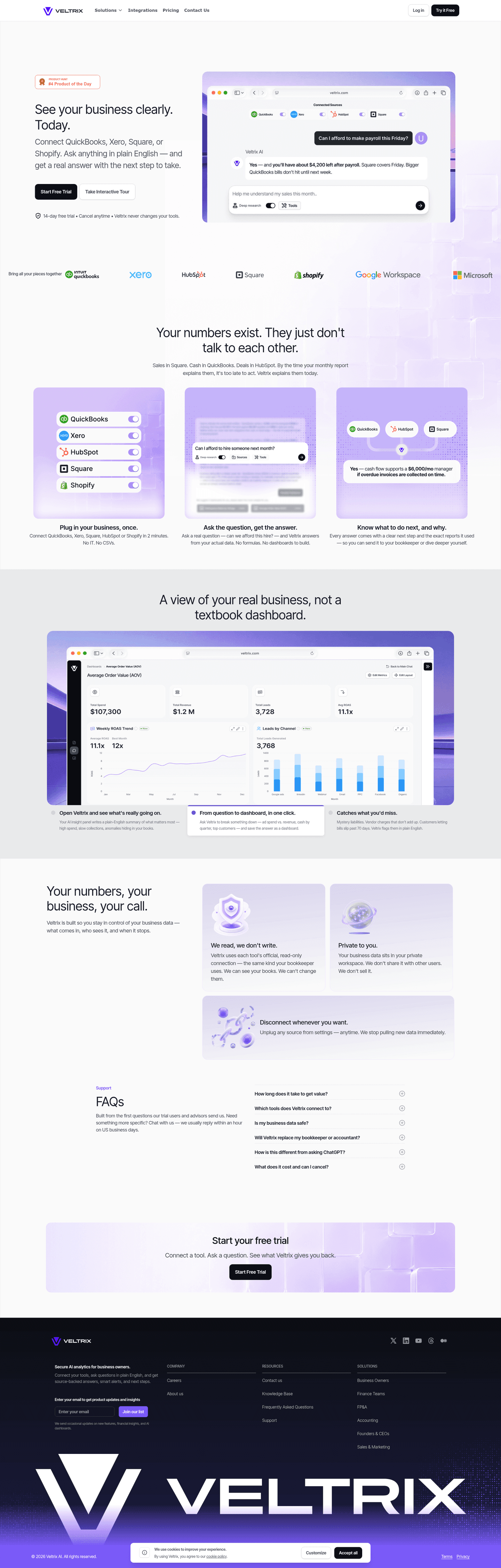
[01]

The strongest performers in this April 2026 benchmark are ProductLed, ClassDojo, Pluralsight, Panopto, Guild, Administrate, and Instruqt. Across 11 edtech homepages scored against 60+ criteria, these pages convert by making learning outcomes tangible: ProductLed maps nav labels to buyer-journey stages, Instruqt turns ten enterprise logos into clickable case study links, and Guild opens with Jarryn R.'s Walmart career transition instead of abstract benefits.

What makes edtech websites harder to convert than generic SaaS pages?

[02]

EdTech pages compete against free content and buyers who need proof that learning leads to outcomes. Across 11 homepages reviewed, the pages that convert lead with verifiable results: Instruqt cites 225% ROI from a sourced study and builds a 22%-blocker-rate to Instruqt-solution arc, Whatfix pairs dual CTAs with a "50% improved time to productivity" stat from REG, and Pluralsight swaps feature lists for "cut cycle times" and "build happier tech teams."

What is the biggest design mistake on edtech homepages?

[03]

Burying outcomes behind curriculum details and skipping the ecosystem proof enterprise buyers need. The average page in this April 2026 benchmark scored 50.9. Top performers flip that: Administrate's features section leads with "get every training session on the calendar in minutes without fear of double booking" and shows a calendar UI with conflict detection, and Panopto anchors the hero with a "Market Leader in Video Learning" claim plus real product UI.

What sections should an edtech homepage include?

[04]

A hero with a concrete outcome, a How It Works section that sequences the learning experience, a trust layer with employer logos or completion stats, an interactive product preview, and a low-friction CTA. ProductLed's five-step tab walkthrough with homework deliverables and Administrate's nine-category pricing table show how far structured blocks can carry the page. Instruqt turns ten enterprise logos into clickable case study links so passive social proof becomes evidence.

How many edtech examples do I need to review before redesigning?

[05]

Three to five is enough if you pick by theme and compare section by section. Only 8% of pages in this benchmark score in the top tier, so the gap is concentrated in a few blocks. Study ProductLed for nav-as-value-menu, ClassDojo for triple-stacked differentiators, Guild for career-transformation proof, Instruqt for clickable social proof, and Administrate for pain-relief framing.

Where can I find great inspiration for my edtech website?

[06]

Study edtech website examples section by section instead of saving full-page screenshots. Browse best landing page examples for the full gallery, then drill into hero section examples, trust section examples, and pricing section examples to see how ProductLed, ClassDojo, and Instruqt differ at each scroll depth.

How do I audit my edtech homepage?

[07]

Run a structured section-by-section audit instead of relying on gut feel. Use our landing page analyzer to score your page against the same 60+ criteria used in this benchmark.