Feature page design (473)
A feature page explains one thing a product does, so a visitor can tell whether it solves their problem. See 473 real examples.
Showing 1–24 of 473 feature pages
How to build a feature page, by the numbers
The questions a team asks when it designs a page for one feature, answered from the 473 here.
What should the headline say?
- The feature named in the headline on 69%
- A headline that leads with the outcome on 71%
- The problem stated before anything is explained on 79%


How much should the page explain?
- A how it works block on 96%
- Named use cases on 73%, so a visitor can find their own situation
- The tools it connects to on 78%
- An FAQ on 50%
What proof belongs on the page?
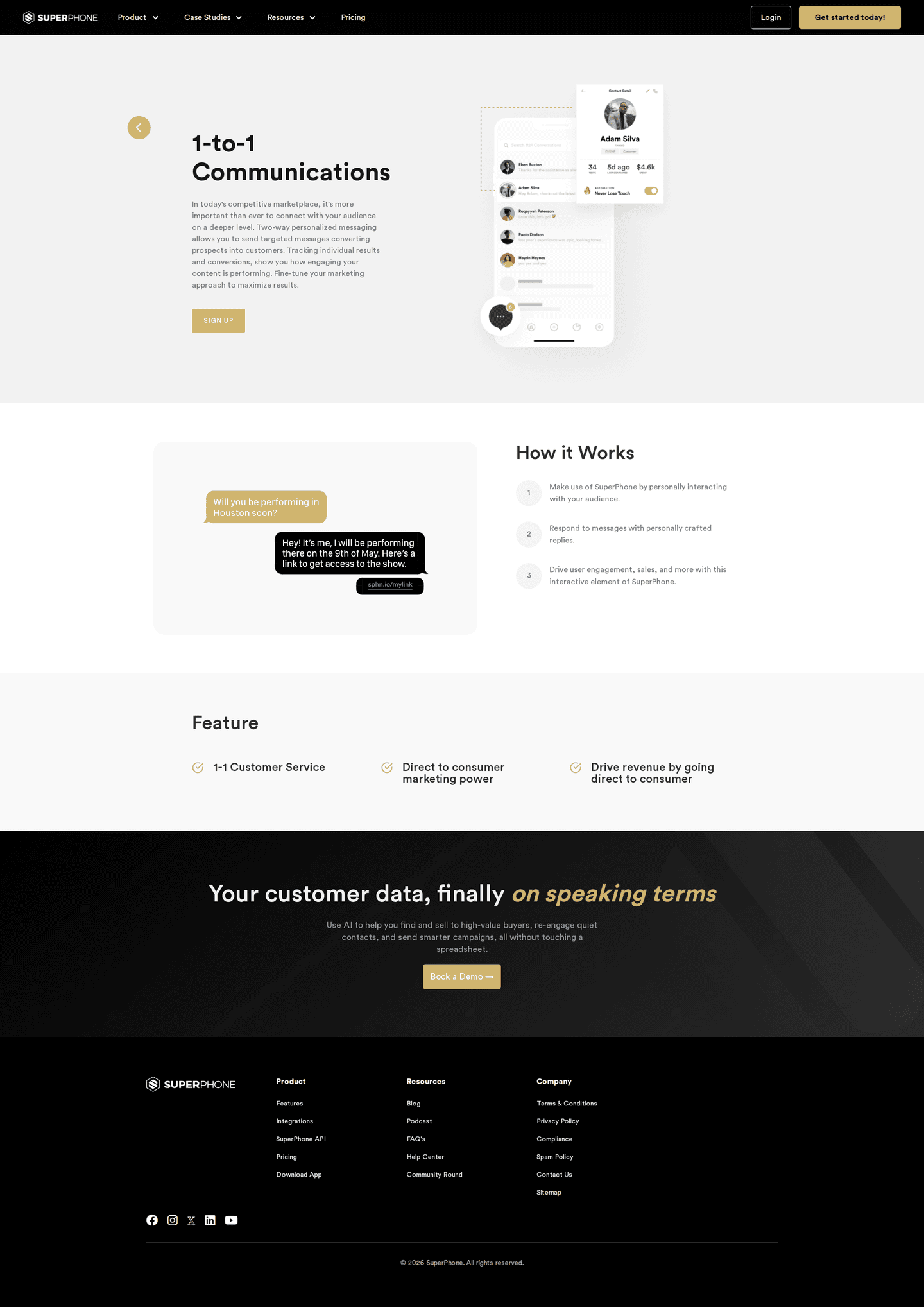
- A screenshot of the real product on 86%
- Testimonials on 49%, and a real name on them on 47%
- Customer logos on 47%
The named testimonial is where the strongest pages pull away: 70% of them carry one, against 21% of the weakest.


How does the page connect to the rest of the product?
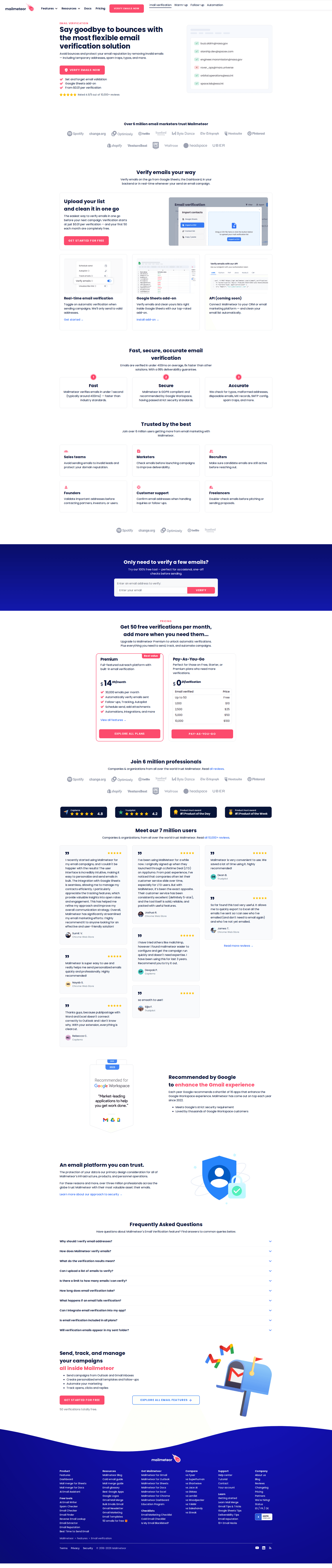
- Links to related features on 93%
- A pricing link in sight on 80%
What does the page ask for, and how often?
What the primary button asks for
- Start a free trial196 feature pages
- Request a demo131 feature pages
- Sign up71 feature pages
- Contact sales33 feature pages
- Download17 feature pages
- Buy12 feature pages
- One ask, repeated 3 times down the page
- 75% bring it back three times or more
- 72% close on a CTA band before the footer

The moves almost nobody makes
Each is on one feature page in five or fewer, with the strongest one that makes the move.
Saying what the feature needs
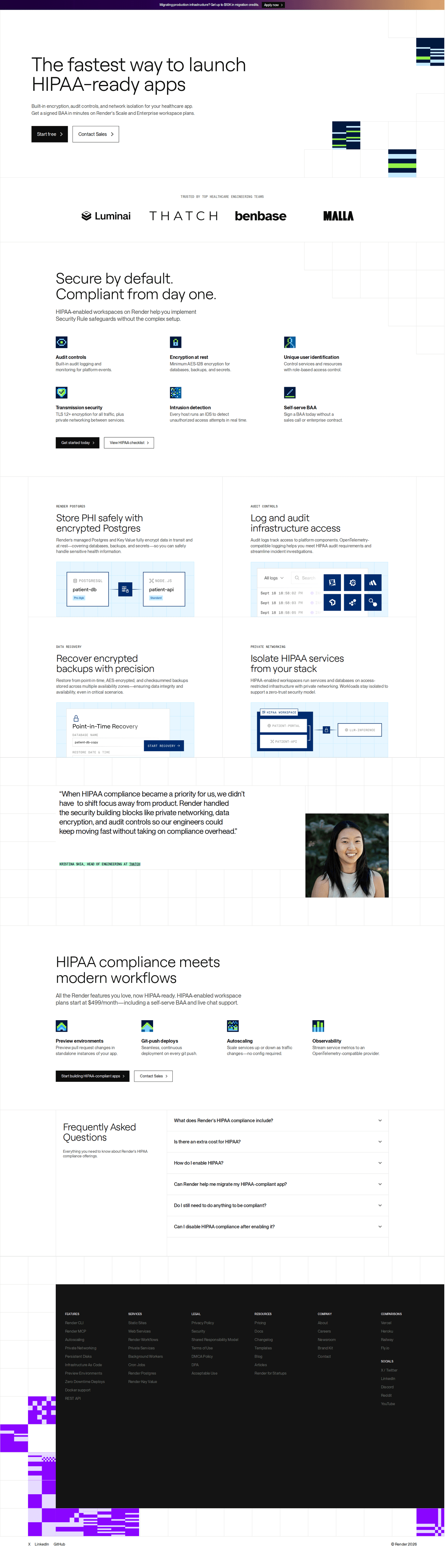
20% state a limit or a requirement: the plan it needs, the setup it takes, the platforms it supports.
Numbers from a real customer
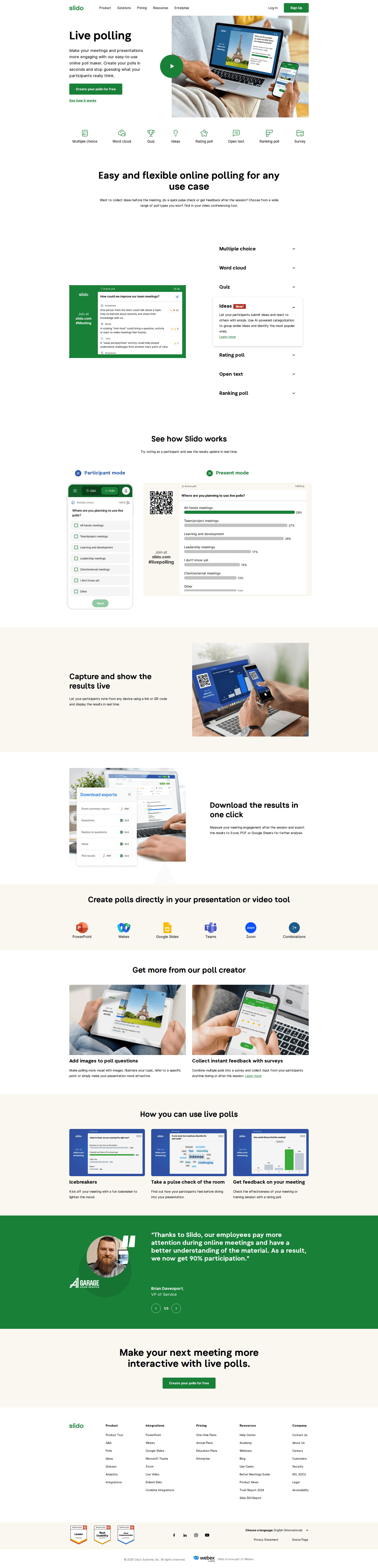
20% put a measured result from a customer on the page.
A before and after
8% set the old way of doing the job beside the new one.


Curated by
Gabriel Amzallag , Founder, Web Anatomy
5 years CRO + SEO at Qonto (2021–2025). After advising 15+ SaaS on their websites (Payfit, Pigment…), the same patterns kept breaking, so I decided to build the source of truth on what works on the web: the intelligence layer every tool, builder, and team uses to ship sites that perform.
Go further than feature pages
Growth Engine
Your top 3 opportunities for more revenue.
We find every way to grow your website’s visibility and conversions: SEO, AI search (AEO), backlinks and mentions, and UX/UI. 3 free opportunities, delivered by email.
Library
The analysis behind every page here
Each feature page on this page, section by section, with what works and what does not. Free account.
Didn't find the feature page you were looking for?
Every other page type has its own gallery. Start from all page types.
- Homepages
- Pricing pages
- About pages
- Contact pages
- Integrations pages
- Security pages
- Enterprise pages
- Industry pages
- Persona pages
- Why us pages
- Case study pages
- Comparison pages
- Blog pages
- Signup pages
- Webinar pages
- SEO landing pages
- Free tool pages
- PPC landing pages
- Careers pages
- Login pages
- 404 pages
- AI product pages
- Press pages
- Partner program pages
- Download pages
- Resource libraries
- Developer pages
- Solutions pages
- Template galleries
- Glossary pages
- Startup program pages
- Community pages
- ROI calculators
- Newsletter pages
- Programmatic SEO pages
- Blog posts
- Customer stories pages
- Alternatives pages
- Integration pages
- AI agent pages
- Affiliate program pages
- Team pages
- Conference pages
Your top 3 opportunities for more revenue.
We find every way to grow your website’s visibility and conversions: SEO, AI search (AEO), backlinks and mentions, and UX/UI. 3 free opportunities, delivered by email.
Feature page design, answered
The questions people ask before rebuilding a feature page, answered from 473 real ones.
What should a feature page include?
01Four things are close to universal: an explanation of how the feature works (almost all of them), links to related features (more than nine in ten), a screenshot of the real product (nearly nine in ten) and a visible pricing link (four in five). A visitor notices when one is missing, so the decisions that matter sit further down the list.
Should the headline name the feature or the outcome?
02Both, and most pages manage it. About two in three name the capability in the headline and about seven in ten lead with what the visitor gets. Naming the feature barely separates the strongest pages from the weakest. Leading with the outcome does: three in four of the strongest against three in five of the weakest.
What proof belongs on a feature page?
03A testimonial with a real name on it. A bit under half of feature pages carry one, and it is one of the widest splits in the set: about seven in ten of the strongest against one in five of the weakest. Customer logos split the same way, on nearly three in four of the strongest and one in six of the weakest.
Should a feature page have an FAQ?
04About half do. It is more common on the stronger pages: about two in three of the strongest carry one, against one in four of the weakest.
What should the button on a feature page ask for?
05A free trial leads at about two in five, a demo follows at nearly three in ten, and a plain signup takes about one in seven. Four in five pages repeat the ask two to four times on the way down.
How is this different from the best landing pages leaderboard?
06This gallery is a visual browse: what feature pages look like and what they contain. The best landing pages benchmark is the graded view, where pages are scored against conversion best practices and ranked by industry. Same companies, different question.