Pricing pages with a feature comparison table (281)
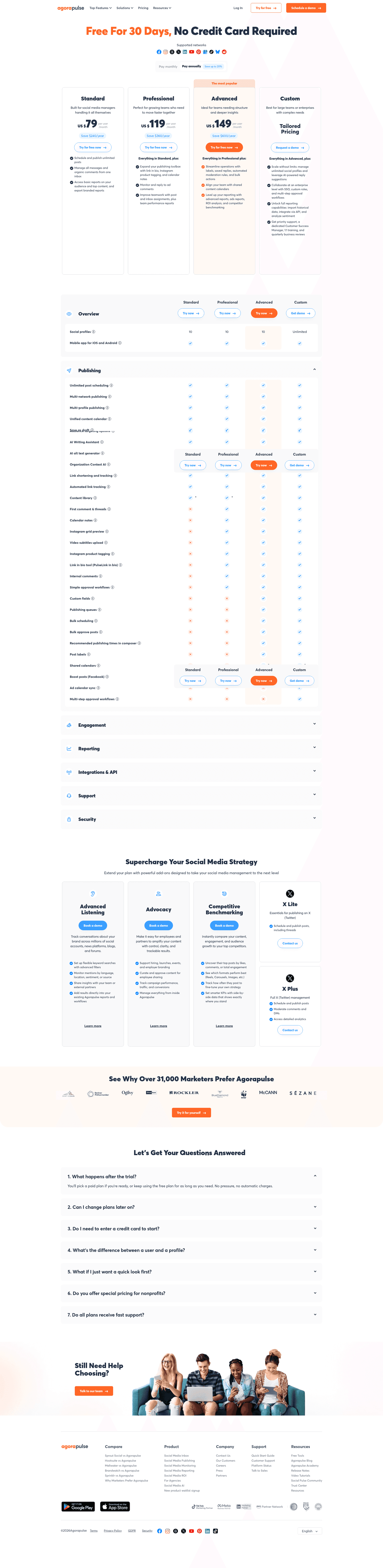
The 281 pricing pages here that put a full feature grid under the plan cards, one row per feature and one column per plan.
Key takeaways
- Show a real price above the table, so every column has a number at the top.
- Add a monthly and annual toggle above the table.
- Give visitors a way to start before the table, like a free tier or a free trial.
- Explain the feature rows with tooltips.
Showing 1–24 of 281 pricing pages
What the best pages with a table do
Every page here has a feature comparison table, so this section looks at what the best ones put around it.
Put a real price above it
1% of the best pricing pages hide a price, and 75% add a monthly and annual toggle. Without a price on each column, visitors can see the features but can't tell what they cost.

Add a trial or proof above it
69% of the best pricing pages offer a free trial, and 70% show customer logos. Nobody reads a long table without a reason, so the best pages put one above it: a free trial, a free tier, customer logos or testimonials. Logos show at a glance that other companies use the product.

Explain the feature names
47% of the best pricing pages put tooltips on feature names, and 91% have an FAQ. Some feature names only make sense to people who already use the product, and a table cell has no room to explain them.

Curated by
Gabriel Amzallag , Founder, Web Anatomy
5 years CRO + SEO at Qonto (2021–2025). After advising 15+ SaaS on their websites (Payfit, Pigment…), the same patterns kept breaking, so I decided to build the source of truth on what works on the web: the intelligence layer every tool, builder, and team uses to ship sites that perform.
Go further than pricing pages
MCP
Section ideas, from inside your editor
Ask your coding agent for the strongest sections of a pricing page in your industry. It answers from this benchmark, section by section.
Library
The analysis behind every page here
Each pricing page on this page, section by section, with what works and what does not. Free account.
Browse more pricing pages
Pick another group below, see every pricing page, or browse the sections these pages are built from.
Is your comparison table doing the work, or covering for the page?
Paste your pricing page. Get a scored breakdown against the same best practices these pages were measured on, with the fixes ranked by impact. Free, no signup.
Feature comparison tables, answered
What a comparison table sits next to on a real pricing page, answered from the 281 here.
How common is a feature comparison table on a pricing page?
01Very common. More than half the pricing pages in this benchmark have one, and the FAQ is the only block below the plan cards that shows up more often. Since so many pages have a table, this page looks at what else is on the pages around it.
What else is on a pricing page that has a comparison table?
02Usually more of everything. Compared with pricing pages without one, these more often have a free tier, a billing toggle, an enterprise tier and tooltips on individual rows. They also hide a price less often.
Should the table have tooltips on the feature names?
03Yes, if the table is long. Many of the best pages here use them. The table is where a buyer runs into feature names that only people inside the company use, and a short tooltip answers the question before they have to email support.
Does a comparison table work when prices are hidden?
04Badly. None of the best pages here hide a price. If two columns of ticks end in a contact form where the price should be, the buyer can see which features each plan has but can't tell what either one costs.
How long should a feature comparison table be?
05The data here doesn't count rows, so there's no benchmark figure for length and it's up to you. What the data does show is that the best pages put something useful above the table: a real price, a billing toggle and a way to start. Buyers usually scroll down to the table to check a plan they're already leaning towards, so a long table works best once the page has already shown them the prices.
How is this different from the pricing table section gallery?
06This page collects whole pricing pages that contain a comparison table, and looks at the rest of the page around it. The pricing table section gallery collects the table block itself, cropped out of the page, and grades how it's built row by row. The companies are the same in both.