NewA human UX report in 24 hours.
Skip to content

BEST LANDING PAGES FOR CONVERSION

Hand-picked by our team, updated every week. Each page runs through our AI conversion agent so you can see exactly what works, and why.

Updated April 2026566 pages analyzed
#CompanyScore

Scored by AI across 60+ conversion criteria

VC Boom landing page
#1
81/100
Scroll to explore
Analyze your landing pageFree. Takes 2 minutes.
[WHY THIS GALLERY]

BEYOND DESIGN GALLERIES

SCR
[01]

Scored, Not Curated by Taste

Every landing page is scored section by section across 60+ conversion angles. Copy the pattern stack, not the design. See what converts and why.

DB
[02]

400+ Real Companies

Hand-picked across SaaS, fintech, ecommerce, and more. Analyzed by our AI conversion agent across 13 section types. Every entry earns its spot.

VS
[03]

Benchmark Your Own Page

Found a page you admire? Run yours through the same scoring engine. See where you stand on the same 60+ angles, and what to fix first.

What 400+ scored landing pages reveal

We scored every page in this gallery section by section across 60+ conversion angles. Here's what the data shows about the gap between pages that convert and pages that just look good.

51.9/100

Avg. page score

Key patterns

  • Messaging clarity is the strongest predictor of hero score. Top-scoring hero sections lead with a specific claim for a specific buyer, not a generic tagline that could describe any product.
  • Design quality alone doesn't predict conversion. The gap comes from how well design serves the copy, visual hierarchy that guides the eye to the right message at the right time.
  • Pages that stack 4–5 conversion patterns per section outscore pages that use 1–2, regardless of visual polish.
  • Top CTA sections reduce friction rather than manufacture urgency. "No credit card required" outperforms countdown timers in 90% of top scorers.

Why this isn't another landing page gallery

There are dozens of landing page galleries, Dribbble, Awwwards, Landingfolio, Lapa Ninja. They optimize for design. We optimize for conversion. Every page in this collection is scored section by section across 60+ conversion angles by our AI agent, so you see exactly why each landing page example works, not just how it looks.

What separates this from other galleries: we break each page into 13 section types, each scored independently. A screenshot gives you inspiration. A scored breakdown gives you a checklist. We browse the web every week, keep only pages that get the fundamentals right, then run each through our landing page analyzer to explain what works, with evidence pulled from the actual page.

In the era of AI, most landing pages look identical. Same hero, same logo bar, same vague headline. The high-converting landing page examples in our gallery break that pattern. Their copy speaks to a specific person. Their design choices serve the conversion goal. That's what we look for: not "does this look modern?" but "would this make someone pull out their credit card?"

See how your landing page compares

Paste your URL. Get a scored analysis across 13 section types with specific fixes. Takes 2 minutes.

Analyze my landing pageFree. Takes 2 minutes.

Design patterns across 566+ landing pages

These are the conversion patterns that appear most often in the highest-scoring sections across all industries. Each example below is annotated with the specific angles our AI agent identified.

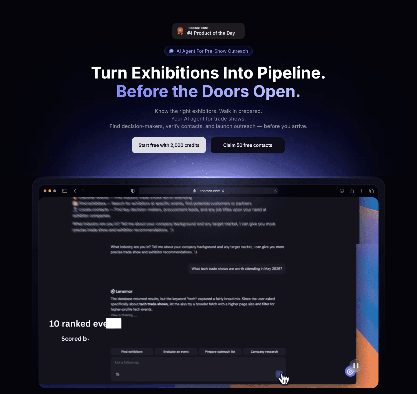
Hero Lensmor

100/100

Lensmor captures attention above the fold

Lensmor hero section
  1. 1Headline (Turn Exhibitions Into Pipeline. Before the Doors Open.) packages the entire pre-event positioning in one line
  2. 2Two free-tier CTAs (Start free with 2,000 credits + Claim 50 free contacts) bake the risk reducer into the button labels
  3. 3#4 Product of the Day badge + AI Agent For Pre-Show Outreach pill stack social proof and category clarity right under the headline
  4. 4Real ranked-events UI mockup shows the scoring/ranking workflow, anchoring the abstract AI-agent promise in a concrete artifact

Reviewed design-pattern pick from Lensmor, hero section.

What I love about this section

  • Headline (Turn Exhibitions Into Pipeline. Before the Doors Open.) packages the entire pre-event positioning in one line
  • Two free-tier CTAs (Start free with 2,000 credits + Claim 50 free contacts) bake the risk reducer into the button labels
  • #4 Product of the Day badge + AI Agent For Pre-Show Outreach pill stack social proof and category clarity right under the headline
  • Real ranked-events UI mockup shows the scoring/ranking workflow, anchoring the abstract AI-agent promise in a concrete artifact

Value Proposition Attribuly

100/100

Attribuly presents their value

Attribuly value proposition section
  1. 1Four growth levers as separate cards, each headline carrying a number: retarget 2x, attribute 99%, grow email list 10x, richer analytics
  2. 2Every card has a custom data visual (50 to 90% donuts, channel journey graph, bar charts, funnel) that shows the lift, not decoration
  3. 3Mechanism is named, not vague: unifies Shopify, Meta, Google, Klaviyo and pushes server-side data into GA4, Looker Studio, BigQuery
  4. 4A Learn More link sits under every card so high-intent merchants can dig into a single lever

Reviewed design-pattern pick from Attribuly, value proposition section.

What I love about this section

  • Four growth levers as separate cards, each headline carrying a number: retarget 2x, attribute 99%, grow email list 10x, richer analytics
  • Every card has a custom data visual (50 to 90% donuts, channel journey graph, bar charts, funnel) that shows the lift, not decoration
  • Mechanism is named, not vague: unifies Shopify, Meta, Google, Klaviyo and pushes server-side data into GA4, Looker Studio, BigQuery
  • A Learn More link sits under every card so high-intent merchants can dig into a single lever

Testimonial Lemlist

100/100

Lemlist lets customers do the selling

Lemlist testimonial section
  1. 1Hard metrics headline each card (6x outbound, 5% to 30% of pipeline, 1.5x open rate) so the proof is verifiable
  2. 2The bold metric callouts (6x, 1,5x) are highlighted as the eye-catch above each story
  3. 3Customer logos (ElevenLabs, Airporting) sit on each card to tie the win to a known brand
  4. 4Before-after framing (from spam to strategy in 90 days) makes the transformation concrete and time-bound
  5. 5Discover full story links open the complete case study and the play icon adds a video testimonial

Reviewed design-pattern pick from Lemlist, testimonial section.

What I love about this section

  • Hard metrics headline each card (6x outbound, 5% to 30% of pipeline, 1.5x open rate) so the proof is verifiable
  • The bold metric callouts (6x, 1,5x) are highlighted as the eye-catch above each story
  • Customer logos (ElevenLabs, Airporting) sit on each card to tie the win to a known brand
  • Before-after framing (from spam to strategy in 90 days) makes the transformation concrete and time-bound

Features SignOnSite

100/100

SignOnSite showcases their product

SignOnSite features section
  1. 1Benefit-led headline (Let workers complete safety forms from their phones) leads with the outcome not the tool
  2. 2Pain-to-outcome copy contrasts chasing Site Managers for signatures against workers self-completing on mobile
  3. 3Before/after stat (40mins struck through to 6 mins) makes the time saving on inductions tangible
  4. 4Mobile app screenshots show the real form-completion flow as concrete outcome visualization
  5. 5Secondary features (Worker Passport, Briefings on Mobile) plus Download info pack link extend the story

Reviewed design-pattern pick from SignOnSite, features section.

What I love about this section

  • Benefit-led headline (Let workers complete safety forms from their phones) leads with the outcome not the tool
  • Pain-to-outcome copy contrasts chasing Site Managers for signatures against workers self-completing on mobile
  • Before/after stat (40mins struck through to 6 mins) makes the time saving on inductions tangible
  • Mobile app screenshots show the real form-completion flow as concrete outcome visualization

Sections most landing pages underuse

Even strong pages leave gaps. These section types score lower across our database, which means they're opportunities if you get them right.

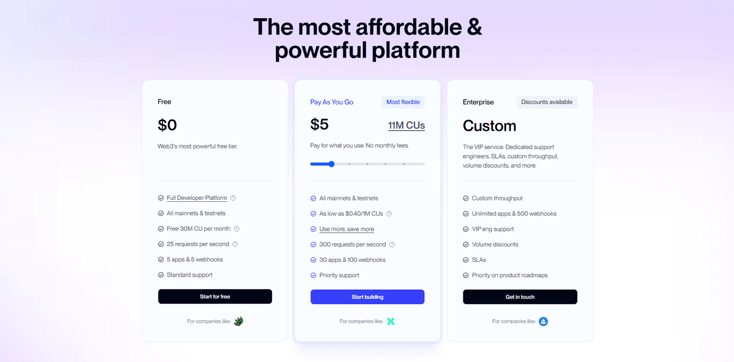
Pricing Alchemy

100/100

Alchemy creates pricing transparency

Alchemy pricing section
  1. 1Three clear tiers (Free $0, Pay As You Go $5, Enterprise Custom) each with a one-line description and target audience
  2. 2Interactive usage slider on the Pay As You Go card estimates cost across compute units (11M CUs) in real time
  3. 3Usage-based pricing spelled out (as low as $0.40/1M CUs, Use more save more) justifies the per-unit cost
  4. 4Most flexible badge plus a highlighted middle card anchors attention to the usage plan
  5. 5Tooltip icons on feature rows clarify CUs and limits, and For companies like logos add social proof per tier

Reviewed overlooked-section pick from Alchemy, pricing section.

What I love about this section

  • Three clear tiers (Free $0, Pay As You Go $5, Enterprise Custom) each with a one-line description and target audience
  • Interactive usage slider on the Pay As You Go card estimates cost across compute units (11M CUs) in real time
  • Usage-based pricing spelled out (as low as $0.40/1M CUs, Use more save more) justifies the per-unit cost
  • Most flexible badge plus a highlighted middle card anchors attention to the usage plan

Navbar Administrate

100/100

Navbar

Administrate navbar section
  1. 1Blue Book a demo button gives the navbar a clear, persistent primary conversion action
  2. 2Solutions mega menu splits into a USECASES column (Streamline operations, Compliance) and an INDUSTRIES column (Manufacturing, Healthcare and Medical) so visitors browse by task or vertical
  3. 3Featured SOLUTION and blog cards with images on the right of the dropdown add a richer content hierarchy
  4. 4Pricing link plus a Call sales phone number cover both self-serve and high-touch buyer paths

Reviewed overlooked-section pick from Administrate, navbar section.

What I love about this section

  • Blue Book a demo button gives the navbar a clear, persistent primary conversion action
  • Solutions mega menu splits into a USECASES column (Streamline operations, Compliance) and an INDUSTRIES column (Manufacturing, Healthcare and Medical) so visitors browse by task or vertical
  • Featured SOLUTION and blog cards with images on the right of the dropdown add a richer content hierarchy
  • Pricing link plus a Call sales phone number cover both self-serve and high-touch buyer paths

How It Works Finary

100/100

Finary simplifies the process

Finary how it works section
  1. 1The header Get started in 3 simple steps sets up a clean numbered 1 2 3 path
  2. 2Step 1 promises it is totally free and wont take more than three minutes, a concrete time commitment
  3. 3Step 2 notes connectors sync over 20,000 banks and institutions in the blink of an eye to stress how easy linking is
  4. 4Step 3 names the payoff (a clear overview of your finances plus investment tracking and insights)
  5. 5The phone mockup of the Link an Account screen shows real institutions (Revolut, Binance, HSBC) being connected
  6. 6A Lets start for free button sits right under the steps as the next action

Reviewed overlooked-section pick from Finary, how it works section.

What I love about this section

  • The header Get started in 3 simple steps sets up a clean numbered 1 2 3 path
  • Step 1 promises it is totally free and wont take more than three minutes, a concrete time commitment
  • Step 2 notes connectors sync over 20,000 banks and institutions in the blink of an eye to stress how easy linking is
  • Step 3 names the payoff (a clear overview of your finances plus investment tracking and insights)

What would your landing page score?

Ten quick questions to see where your page stands against this benchmark. For a full section-by-section audit, try our landing page audit.

Interactive quiz

What would your landing page score?

Question 1 of 10
0%

Can a visitor read your headline and know what you do?

e.g. "Ship 2x faster" not "Welcome to our platform"

Gabriel Amzallag

Curated by

Gabriel Amzallag , Founder, Web Anatomy

5 years CRO + SEO at Qonto (2021–2025). After advising 15+ SaaS on their websites (Payfit, Pigment…), the same patterns kept breaking, so I decided to build the source of truth on what works on the web: the intelligence layer every tool, builder, and team uses to ship sites that perform.

See how your landing page compares

Paste your URL. Get a scored analysis across 13 section types with specific fixes. Takes 2 minutes.

Analyze my landing pageFree. Takes 2 minutes.
[FAQ]

BEST LANDING PAGES: FREQUENTLY ASKED QUESTIONS

Everything you need to know about our scored landing page gallery, based on data from 400+ companies.

What are the best landing pages?

[01]

We define "best" as pages that convert, not pages that win design awards. Three landing pages that score consistently high across our AI agent's 60+ conversion angles: ProductLed (productled.com) scored 79/100 overall with a perfect 100 on value proposition. The page leads with a crystal-clear positioning statement and backs it with strong design and credibility signals. Freckle (freckle.io) scored 78/100 overall with a perfect 100 on its hero section. The hero grabs attention immediately and carries strong conversion and value proposition scores throughout. Happeo (happeo.com) scored 76/100 overall with a 92 on design & UX. Happeo pairs polished visuals with solid conversion copy and a clear value proposition. These three share a pattern: they prioritize clarity over creativity.

How do you find and select these landing pages?

[02]

We browse the web every week to identify websites that stand apart, from companies with strong conversion reputations across SaaS, ecommerce, fintech, and other industries. We keep only the ones that get the fundamentals right, then run each page through our AI conversion agent. The agent scores every section individually on specific conversion angles: value proposition clarity, friction reduction, social proof placement, and 60+ more. If the fundamentals aren't there, the page doesn't make the cut. We add 7 new websites every week.

What does your AI agent actually score?

[03]

The agent evaluates 13 section types: hero, CTA, pricing, testimonials, trust signals, features, FAQ, and 6 more. Each section type has its own conversion angles. Hero sections are scored on value proposition clarity, differentiation, social proof placement, product visuals, and risk reducers. CTA sections on friction reduction, microcopy quality, urgency signals, and secondary paths. There are 60+ angles total. For each angle, the agent provides evidence pulled from the actual page: the specific headline, the exact badge, the button copy.

Beautiful pages don't always convert, really?

[04]

Our data confirms it. Some of the flashiest pages in our gallery score poorly because the hero buries the value proposition under an animation, or the CTA competes with 4 other buttons, or trust signals are nowhere near the fold. Meanwhile, pages with plain backgrounds, standard fonts, and zero animations score in the top tier because they nail the conversion fundamentals. "Best" in our gallery means "brings clients," not "wins design awards."

How is this different from Dribbble or Landingfolio?

[05]

Design galleries filter for aesthetics. We filter for conversion. Every page here has been scored by our AI conversion agent, section by section, on 60+ conversion angles. You don't just see a screenshot. You see why the page works, backed by data. We also break each page down into 13 section types so you can compare how different companies handle their hero, CTA, or pricing section specifically.

What if I want to see how my page scores vs. the industry?

[06]

You can. Paste your URL into our analyzer and get a full scored audit in 2 minutes, with section-by-section scores compared against 2,469 benchmarked sections from 400+ companies. The free plan includes 3 analyses per month. You can also browse landing page examples by industry to see how top companies in your vertical design pages that convert.

How often do you add new pages?

[07]

Every week. We add 7 new websites and rescore existing ones. The gallery currently includes 396 landing pages from 400+ companies. Each update recalculates best-in-class thresholds, so the bar keeps rising.