Skip to content

Best Healthcare Website Examples (And Why They Convert)

We scored 6 healthcare homepages on 60+ conversion criteria. See which sections separate the top performers, and what your page is probably missing.

Updated April 20266 pages analyzed
#CompanyScore

Scored by AI across 60+ conversion criteria

Lucis landing page
#1
62/100
Scroll to explore
Analyze your healthcare pageFree. Takes 2 minutes.

What the best healthcare websites get right

Healthcare buyers arrive skeptical, privacy-conscious, and unlikely to share sensitive data until they feel safe. The strongest healthcare website design patterns in this benchmark do four things consistently:

45/100

Avg. page score

  • Build trust before the ask. Show compliance badges, clinical validation, or partner logos so visitors feel safe before sharing personal health data.
  • Make the value specific. Break complex healthcare products into plain language so a buyer understands what they get in under five seconds. Pair specific benefits with quantified proof.
  • Remove the biggest friction. Surface HIPAA compliance, data protection guarantees, or transparent timelines so the next step feels low-risk.
  • Anticipate cautious buyers. Design for people who need clinical evidence and regulatory reassurance at every scroll depth, not just in the hero.

5 best healthcare homepages analyzed in detail

Each company below is paired with its strongest section and scored across 60+ conversion criteria. See what they get right, and what you can borrow for your own healthcare homepage design.

01

Lucis, A health data platform that makes compliance the headline, not the footnote.

Editor's pick62/100
Gabriel AmzallagGabriel AmzallagFounder, Web Anatomy

Lucis earns trust before asking for anything. Its trust section (scored 100) pairs GDPR and ISO 27001 badges with clear icons and a "Data protection is our absolute priority" headline that contextualizes compliance within health data sensitivity. When your product handles patient information, leading with verifiable security credentials removes the first barrier to engagement.

What makes this page stand out

  • 110+ biomarkers analyzed demonstrates comprehensive health assessment depth
  • 400 partner laboratories across Europe provides accessibility and geographic coverage
  • Bi-annual wellness check-up model (15 min sessions every 6 months) creates a recurring engagement framework
  • 5,000+ users tracking their markers provides early social proof for a growing health-tech brand

Section we love

·Trust
Lucis Trust section
  1. 1The section names two concrete standards (GDPR compliant and ISO 27001 certified) instead of vague (secure).
  2. 2Drawn GDPR and ISO 27001 seals on the right give the claim a visual badge, not just body copy.
  3. 3The (Data protection is our absolute priority) framing speaks directly to health-data anxiety.
  4. 4A (More details about data security) button invites verification rather than asking for blind trust.
02

Doseform, A pharmacy platform that extends compliance signals all the way to the footer.

61/100
Gabriel AmzallagGabriel AmzallagFounder, Web Anatomy

Doseform's footer section (scored 60) anchors credibility with AICPA SOC and HIPAA Compliant badges alongside a dedicated Legal column with Terms, SOC 2 Type II, Privacy, and Security links. Four clean link groups make navigation intuitive even at the bottom of the page, proof that trust signals should persist through the last scroll.

What makes this page stand out

  • The HIPAA-compliant two-way messaging focus addresses the critical regulatory constraint that prevents pharmacies from using generic messaging tools — a barrier that becomes Doseform's competitive moat
  • The "get pharmacists off the phone" mission statement is viscerally relatable for the target buyer — pharmacy owners and managers who see their clinical staff wasting time on routine calls
  • Multi-channel personalization engine (SMS, email, intake forms) within a unified mobile-first experience shows platform sophistication beyond simple text reminders
  • The white-label approach lets pharmacies maintain their own brand identity while leveraging Doseform's technology — reducing adoption friction for brand-conscious independent pharmacies

Section we love

·Footer
Doseform Footer section
  1. 1Links grouped into 4 labeled columns (Product, Resources, Contact, Legal) for easy navigation
  2. 2AICPA SOC and HIPAA Compliant badges shown under the logo reinforce healthcare security trust
  3. 3Legal column lists Terms, SOC 2 Type II, Privacy and Security for strong policy transparency
  4. 4Contact column surfaces Contact Sales and Get Support to route buyers to a human
03

Alan, A prevention-first health model that blends insurance, care, and everyday wellness into one platform.

51/100
Gabriel AmzallagGabriel AmzallagFounder, Web Anatomy

Alan's value proposition section (scored 83) layers quantified proof (95%+ good/excellent feedback from doctors), across four distinct mechanisms: AI risk pricing, 24/7 medical assistant, care team support, and fraud detection. A 3D mascot and card-based layout make a complex health insurance model feel approachable without sacrificing credibility.

What makes this page stand out

  • 1 million members across France, Belgium, Spain, and Canada demonstrates significant international scale for a European health-tech company
  • Friendly purple bear mascot character with doctor outfit creates a distinctive, approachable brand identity that humanizes healthcare
  • Visual UI elements showing reimbursement notifications, breath exercises, and meditation demonstrate the product's daily wellness engagement
  • "Our unique model" CTA invites curiosity about the differentiated approach rather than pushing a generic signup

Section we love

·Value Proposition
Alan Value Proposition section
  1. 1Four distinct props (smart risk management, always-on medical help, care team support, AI roadmap) each with its own icon
  2. 2Hard numbers anchor the claim: 24/7 AI medical assistant with 95%+ good or excellent feedbacks by doctors
  3. 3Unique mechanism named: proprietary AI powering fair pricing, smarter risk management, and faster claims
  4. 4Concrete benefits over adjectives: instant answers, faster claims, timely human support at scale
04

Anterior, A clinical AI platform where navigation clarity matches the precision of the product itself.

43/100
Gabriel AmzallagGabriel AmzallagFounder, Web Anatomy

Anterior's navbar (scored 100) demonstrates that navigation clarity matters as much as hero copy. A clearly styled Book Demo CTA, clean three-item nav (Solutions, Technology, Resources), and a flat-list Resources dropdown reduce cognitive load and keep visitors oriented. Three precise stats (6M reviews, 99.24% accuracy, 92 NPS) with KLAS verification make the trust layer feel thorough and verified.

What makes this page stand out

  • The vertical AI strategy means every model, workflow, and compliance feature is optimized for clinical review rather than adapted from generic AI — creating a depth advantage that horizontal tools can't match
  • Prior authorization automation addresses a $31B+ administrative cost burden in US healthcare — positioning Anterior in a massive, clearly quantifiable market
  • Clinical accuracy emphasis is critical in healthcare AI: incorrect prior auth decisions directly impact patient care, making Anterior's accuracy and safety positioning non-negotiable for buyers
  • Speed-to-decision metrics (minutes vs. days for prior auth reviews) create a clear before/after value story that both payers and providers can quantify in their own operations

Section we love

·Navbar
Anterior Navbar section
  1. 1A white Book Demo button gives the dark bar one clear primary action
  2. 2The open Resources dropdown surfaces Insights and Careers in one place
  3. 3Solutions and Technology keep the top bar short and buyer-oriented
  4. 4The minimal nav matches the Clinical AI thats ready to deploy positioning
05

Recursion, A drug discovery platform that turns complex clinical timelines into scannable visual proof.

35/100
Gabriel AmzallagGabriel AmzallagFounder, Web Anatomy

Recursion's How It Works section (scored 100) uses a precise week-by-week timeline (Week 13, Week 25) with horizontal dot connectors and on/off treatment labels. For a biotech audience evaluating drug discovery, this level of specificity replaces vague promises with verifiable milestones.

What makes this page stand out

  • Massive proprietary dataset (biological, chemical, clinical) creates a defensible data advantage
  • Partnership model with major pharma companies (Roche, Bayer) validates the technology
  • Automated robotic lab capabilities differentiate from purely computational approaches
  • OS (Operating System) for drug discovery positioning creates a platform narrative

Section we love

·How It Works
Recursion How It Works section
  1. 1The patient journey maps six discrete stops from screening to Baseline endoscopy to On treatment to Week 13 to Off treatment to Week 25
  2. 2Concrete timeframes anchor every phase (REC-4881 4mg once a day for 12 weeks, then 12 weeks off treatment)
  3. 3A horizontal timeline with hexagon node markers makes the sequence read left to right at a glance
  4. 4Each milestone carries a plain label so the trial structure is legible without medical jargon

See how your page compares to the 45 healthcare average

Run a section-by-section diagnostic on your healthcare page and get prioritized fixes, then see how you stack up against these healthcare website examples.

Design patterns across these healthcare pages

Across 6 healthcare homepage examples, the strongest medical website design removes ambiguity fast: who it serves, what it does, and what to do next.

The clearest healthcare website examples treat trust as a product feature, using compliance badges, clinical validation, and quantified outcomes so visitors do not have to infer credibility from polish alone. Explore our best landing page examples to compare how other industries resolve similar trust friction.

Trust Anterior

40/100

How Anterior builds credibility early

Anterior trust section
  1. 1The case study quantifies impact precisely (6M prior authorizations a year, 99.24% clinical accuracy, 92 CSAT).
  2. 2(KLAS-verified) next to the 99.24% accuracy figure adds third-party validation healthcare buyers trust.
  3. 3Naming a (large payer enterprise) deployment signals the numbers come from real production scale.
  4. 4Cinematic mountain backdrop keeps three precise metrics readable while feeling premium, not spreadsheet-dry.

Reviewed design-pattern pick from Anterior’s trust section.

What I love about this section

  • The case study quantifies impact precisely (6M prior authorizations a year, 99.24% clinical accuracy, 92 CSAT).
  • (KLAS-verified) next to the 99.24% accuracy figure adds third-party validation healthcare buyers trust.
  • Naming a (large payer enterprise) deployment signals the numbers come from real production scale.
  • Cinematic mountain backdrop keeps three precise metrics readable while feeling premium, not spreadsheet-dry.

Value Proposition Anterior

33/100

How Anterior presents their value

Anterior value proposition section
  1. 1Three distinct pillars (compliance and observability, FHIR-native and API-first, composable intelligence) split into cards
  2. 2Unique mechanism named: pre-defined failure mode ontologies plus FHIR-native, API-first Actions you compose with your own agents
  3. 3Opens by contrasting generic, unsafe AI tools to position Anterior as purpose-built for healthcare
  4. 4Each pillar carries a one-line proof of how it works, not just a label

Reviewed design-pattern pick from Anterior’s value proposition section.

What I love about this section

  • Three distinct pillars (compliance and observability, FHIR-native and API-first, composable intelligence) split into cards
  • Unique mechanism named: pre-defined failure mode ontologies plus FHIR-native, API-first Actions you compose with your own agents
  • Opens by contrasting generic, unsafe AI tools to position Anterior as purpose-built for healthcare
  • Each pillar carries a one-line proof of how it works, not just a label

Hero Doseform

56/100

How Doseform captures attention above the fold

Doseform hero section
  1. 1Product visual showing pharmacy chat interface (Hello John, prescription order assist) demonstrates real use case
  2. 2Audience specificity (pharmacies) combined with three benefit bullets (view details, answer FAQs, send surveys) is clear
  3. 3Trusted by pharmacy ecosystems with logos (Revive Health, Cloud9, White Label, ManifestRx) builds niche credibility
  4. 4Headline (Automate effective patient engagement) nails the product category and outcome in one line

Reviewed design-pattern pick from Doseform’s hero section.

What I love about this section

  • Product visual showing pharmacy chat interface (Hello John, prescription order assist) demonstrates real use case
  • Audience specificity (pharmacies) combined with three benefit bullets (view details, answer FAQs, send surveys) is clear
  • Trusted by pharmacy ecosystems with logos (Revive Health, Cloud9, White Label, ManifestRx) builds niche credibility
  • Headline (Automate effective patient engagement) nails the product category and outcome in one line

Sections healthcare teams underuse (but visitors still look for)

Even with a strong hero, secondary sections often decide whether someone keeps reading, especially in regulated categories where compliance and clinical proof matter as much as benefits.

In this dataset, How It Works tends to outperform at 100 while Pricing is the most fragile at 10, suggesting many healthcare pages invest in messaging but leave gaps in transparency and confirmation that slow decisions. See how best insurtech websites handle similar trust gaps in adjacent regulated industries.

Navbar Recursion

14/100

Why this navbar works

Recursion navbar section
  1. 1The top nav spans Our Platform, Clinical Trials, Investors and About Us for a biotech audience
  2. 2An open dropdown under the first nav item reveals a stacked list of sub-pages
  3. 3The bar keeps a clean dark-on-gradient treatment that lets the menu items stand out
  4. 4A right-aligned button sits at the end of the nav for the primary next step

Reviewed overlooked-section pick from Recursion’s navbar section.

What I love about this section

  • The top nav spans Our Platform, Clinical Trials, Investors and About Us for a biotech audience
  • An open dropdown under the first nav item reveals a stacked list of sub-pages
  • The bar keeps a clean dark-on-gradient treatment that lets the menu items stand out
  • A right-aligned button sits at the end of the nav for the primary next step

How It Works Lucis

83/100

How Lucis simplifies the process

Lucis how it works section
  1. 1Header labels the flow explicitly (How it works in 4 steps) with a numbered carousel showing step 04
  2. 2Concrete timeframe anchors the step (Follow-up in six months, 6 months after your first test)
  3. 3A progress chart visualizes improvement from 6 months ago to Now, making the payoff visual
  4. 4Outcome preview is clear: re-test to track progress and refine the wellness plan around your needs
  5. 5A Get started CTA button sits in the section header, ready at the end of the walkthrough

Reviewed overlooked-section pick from Lucis’s how it works section.

What I love about this section

  • Header labels the flow explicitly (How it works in 4 steps) with a numbered carousel showing step 04
  • Concrete timeframe anchors the step (Follow-up in six months, 6 months after your first test)
  • A progress chart visualizes improvement from 6 months ago to Now, making the payoff visual
  • Outcome preview is clear: re-test to track progress and refine the wellness plan around your needs

About Alan

67/100

How Alan tells their story to build connection

Alan about section
  1. 1Mission statement frames a clear vision: the first truly integrated healthcare partner where insurance, care and prevention reinforce each other
  2. 2Our business model button gives curious visitors a direct path to deeper company detail
  3. 3Discover Alan in video CTA on a thumbnail invites a richer, low-effort way to learn about the company

Reviewed overlooked-section pick from Alan’s about section.

What I love about this section

  • Mission statement frames a clear vision: the first truly integrated healthcare partner where insurance, care and prevention reinforce each other
  • Our business model button gives curious visitors a direct path to deeper company detail
  • Discover Alan in video CTA on a thumbnail invites a richer, low-effort way to learn about the company

If you are refreshing a healthcare landing page design, treat these "unsexy" blocks as conversion infrastructure, not filler.

How does your healthcare homepage compare?

Five quick questions to see where your page stands against this healthcare benchmark. For a full section-by-section audit, try our landing page audit.

Interactive quiz

What would your healthcare homepage score?

Question 1 of 5
0%

Does your healthcare page show a trust signal before the first scroll?

HIPAA badge, ISO certification, clinical validation stats, or partner logos.

Gabriel Amzallag

Reviewed by

Gabriel Amzallag , Founder, Web Anatomy

5 years CRO + SEO at Qonto (2021–2025). After advising 15+ SaaS on their websites (Payfit, Pigment…), the same patterns kept breaking, so I decided to build the source of truth on what works on the web: the intelligence layer every tool, builder, and team uses to ship sites that perform.

See how your page compares to the 45 healthcare average

Run a section-by-section diagnostic on your healthcare page and get prioritized fixes, then see how you stack up against these healthcare website examples.

Analyze your healthcare pageFree. Takes 2 minutes.

Explore other industries

See how conversion patterns differ across verticals. Each page scores real homepages on the same framework.

See all industries
Benchmark-backed answers for healthcare website design

FAQ: Best Healthcare Websites (Healthcare Benchmarks)

Quick answers to common questions about what makes the best healthcare websites convert, based on section-level benchmark data from this healthcare review.

What makes healthcare websites harder to convert than other industries?
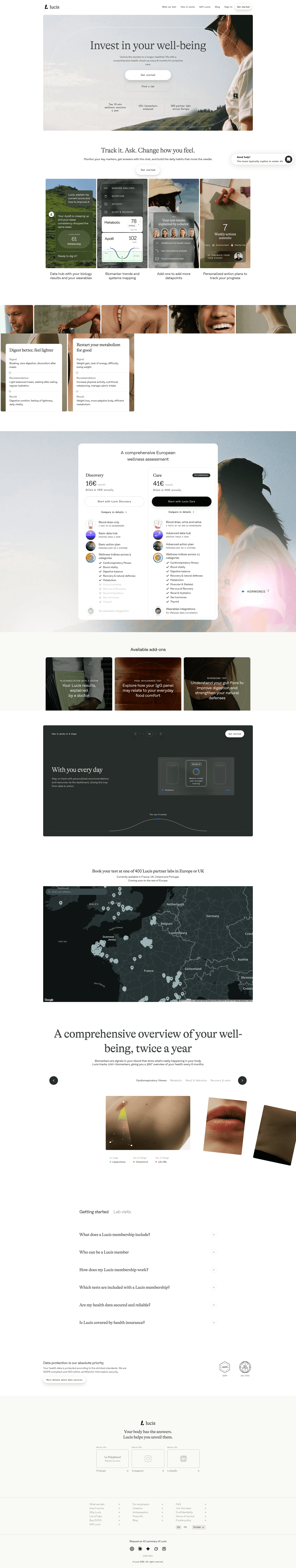
[01]

Healthcare buyers arrive skeptical and will not share sensitive health data until they feel safe. Across 6 homepages reviewed in this April 2026 benchmark, the pages that convert treat every section as a trust checkpoint. Lucis leads with GDPR and ISO 27001 badges under "data protection is our absolute priority," Alan quantifies AI accuracy at 95%+ doctor feedback, and Anterior verifies stats through KLAS (6M reviews, 99.24% accuracy, 92 NPS).

Should a healthcare homepage lead with features or trust?

[02]

Trust and specificity first, features second. Lucis opens with compliance badges before a single feature claim. Anterior leads with a clearly styled Book Demo CTA and a three-item nav that reduces cognitive load. Alan layers four distinct mechanisms (AI risk pricing, 24/7 medical assistant, care team support, and fraud detection) only after establishing clinical credibility. Across 6 pages reviewed, the buyer needs a reason to care about features before they see them.

What is the biggest messaging mistake on healthcare homepages?

[03]

Generic "transforming healthcare" promises with no specific benefit and no low-risk next step. The average page scored 45 across 6 homepages reviewed in April 2026. Top performers replace abstraction with verifiable proof: Alan's quantified 95% doctor rating, Recursion's week-by-week clinical timeline (Week 13, Week 25) with on/off treatment labels, and Doseform's AICPA SOC and HIPAA Compliant badges anchored in the footer. Visitors need something real to evaluate in the first ten seconds.

How do you find the best healthcare websites to review before a redesign?

[04]

Compare real pages side by side, section by section, not as full-page screenshots. This review scores 6 healthcare homepages in April 2026 against 60+ criteria. The strongest performers are Lucis (compliance-first), Alan (quantified prevention), Anterior (navigation and clinical AI), Doseform (pharmacy compliance), and Recursion (drug discovery proof). Benchmark each against compliance badges, clinical validation, and quantified outcomes rather than visual polish.

What signals tell you a healthcare homepage needs more than a copy refresh?

[05]

Three patterns point to a structural rewrite. First, compliance claims read as disclaimers rather than reassurance. Visitors parse "HIPAA compliant" as a warning, not proof. Lucis avoids this by anchoring GDPR and ISO 27001 badges under a clear data-protection headline. Second, the hero speaks to clinicians but traffic is patients, or the reverse. Third, a "contact us" CTA that used to work stops converting because enterprise buyers now expect a demo or case-study path, not a form.

What is the best website for healthcare?

[06]

There is no single best. It depends on your product line and compliance posture. For health-data platforms, Lucis is the template (compliance-first hero). For prevention-focused insurance, Alan quantifies product usage. For clinical AI, Anterior pairs verified stats with minimal navigation. For pharmacy infrastructure, Doseform extends compliance signals into the footer. For drug discovery, Recursion shows week-by-week clinical milestones. All 6 homepages in this April 2026 review are scored on the same rubric.

Where can I find great healthcare website design inspiration?

[07]

Study healthcare homepages section by section instead of saving full-page screenshots. Browse best landing page examples for the full gallery, then drill into hero section examples, trust section examples, and pricing section examples to see how Lucis, Alan, Anterior, and Recursion differ at each funnel stage.