5 years CRO + SEO at Qonto (2021–2025). After advising 15+ SaaS on their websites (Payfit, Pigment…), the same patterns kept breaking, so I decided to build the source of truth on what works on the web: the intelligence layer every tool, builder, and team uses to ship sites that perform.
“Industrial IoT made tangible. Tractian leads with a specific maintenance and reliability problem, then backs it with product visuals and quantified outcomes that make the platform feel real for plant operations teams.”
What makes this page stand out
Predictive maintenance using vibration sensors and AI prevents costly unplanned downtime
Hardware + software integrated solution creates a differentiated full-stack offering
5 years CRO + SEO at Qonto (2021–2025). After advising 15+ SaaS on their websites (Payfit, Pigment…), the same patterns kept breaking, so I decided to build the source of truth on what works on the web: the intelligence layer every tool, builder, and team uses to ship sites that perform.
“Supply chain IoT with a clear value proposition. Safecube narrows the story to logistics visibility and makes sensor-based monitoring feel like a concrete workflow upgrade rather than a generic IoT pitch.”
What makes this page stand out
The messaging speaks directly to the real pain point: tracking containers manually through carrier websites, email chains, and spreadsheets — a universal frustration for small and mid-size importers
The simplicity and speed positioning — "simple, fast, and made for small teams" — differentiates against complex enterprise solutions that require months of onboarding and dedicated IT support
Real-time container tracking visibility across multiple carriers and shipping lines consolidates fragmented information into a single dashboard, eliminating the multi-tab browser workflow
Automated milestone alerts (vessel departure, port arrival, customs clearance, delivery) replace the manual check-in cadence that operations teams currently perform multiple times per day
Section we love
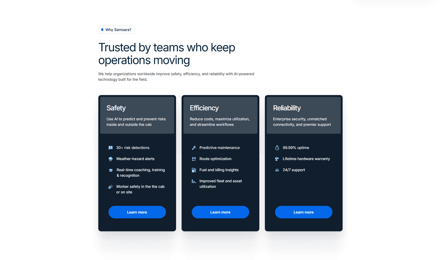
·Pricing
1Two clear plans (Basic $15/month up to 10 shipments, Enterprise Custom) each with a one-line description of who it fits
2Interactive shipments dropdown (10 Shipments) acts as a usage estimator that recalculates the plan price
3Usage-based transparency with per-unit line items (Additional shipment $1.60, 1 year commitment, Email support)
4Risk reducers in the copy and CTA (pay as you go with no surprises, Start Free Trial) lower commitment fear
5Enterprise path (Contact Sales, Custom pricing) captures high-volume buyers and payment logos reassure on checkout
03
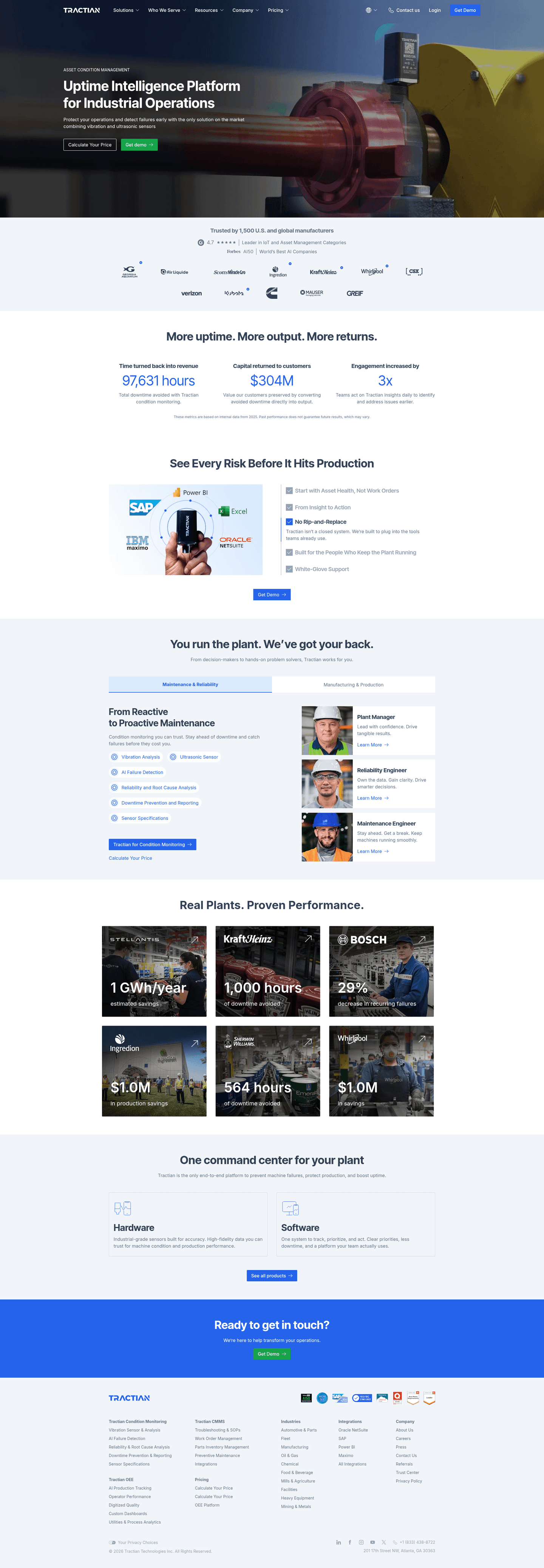
Samsara, Connected operations for fleet, safety, and equipment.
5 years CRO + SEO at Qonto (2021–2025). After advising 15+ SaaS on their websites (Payfit, Pigment…), the same patterns kept breaking, so I decided to build the source of truth on what works on the web: the intelligence layer every tool, builder, and team uses to ship sites that perform.
“Multi-product IoT platform with smart navigation. The page balances breadth with clarity by routing different operations personas to relevant use cases without overwhelming the first screen.”
What makes this page stand out
IoT sensor data from vehicles, equipment, and sites provides real-time operational visibility
AI-powered insights transform raw sensor data into actionable operational intelligence
Enterprise customers (major fleets, construction, utilities) provide strong vertical social proof
Video-based safety and dash cam integration expand beyond telematics into safety management
Section we love
·TrustBest in class
1Customer logos include DHL, Estes, Sterling Crane, Sunrun, Werner, and City of New Orleans
2Each logo card pairs a brand with a hard result (50% less driver turnover, 3M dollars fuel saved)
3Headline stats stack 8X ROI, 4.7/5 app rating, 20T+ data points, and #1 trusted brand
44.7/5 driver app rating ranked #1 in the App Store and Google Play adds platform proof
5The mix of named brands and quantified outcomes delivers layered, diverse proof
5 years CRO + SEO at Qonto (2021–2025). After advising 15+ SaaS on their websites (Payfit, Pigment…), the same patterns kept breaking, so I decided to build the source of truth on what works on the web: the intelligence layer every tool, builder, and team uses to ship sites that perform.
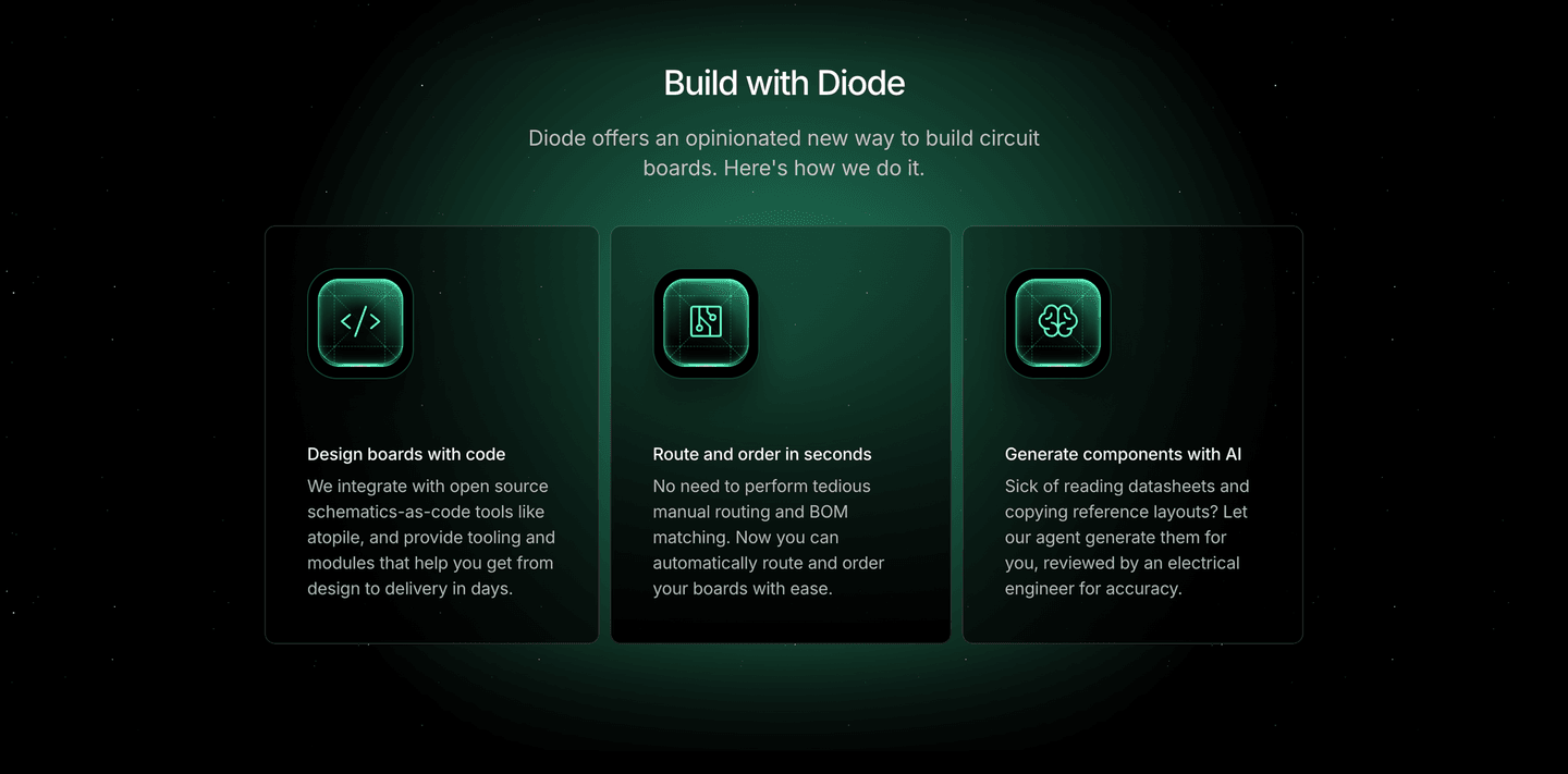
“Security-first messaging for connected devices. Diode leads with trust and protection, making device security the main story rather than burying it as a feature bullet point.”
What makes this page stand out
The stark, monospace typography on a black background conveys a technical, engineering-first brand identity that resonates with the hardware/electronics ICP.
Announcements banner highlighting "Our Work with Anthropic" and "Series A with a16z" provides powerful credibility signals from recognizable names.
Extreme simplicity in the page design — no clutter, no competing CTAs — forces attention on the core message and creates a premium, confident feel.
Positioning as AI-powered PCB design taps into the current AI wave while solving a real engineering bottleneck, differentiating from traditional PCB manufacturers.
Section we love
·Features
1Pain-to-outcome copy on two cards (No need for tedious manual routing, Sick of reading datasheets) ties the pain to the fix
2Benefit-led headings like Route and order in seconds and design to delivery in days lead with the result not the feature
3Three capability cards (Design with code, Route and order, Generate with AI) lay out the supporting features clearly
4Each card adds a trust detail (reviewed by an electrical engineer for accuracy) to back the AI generation claim
See how your page compares to the 54.7 average page score
Run a diagnostic on your IoT page and get a section-by-section breakdown of what to fix first to improve clarity, trust, and product proof.
Design patterns we see across high-performing IoT pages
Across 4 IoT pages reviewed, the pages that convert tend to make the first screen do one job: state a clear use case and remove the abstraction that plagues most IoT messaging.
The strongest patterns pair specific, outcome-led claims with product visuals that feel real, then back those claims with deployment proof that a technical buyer can verify. IoT website design works best when it bridges the gap between sensor technology and business outcomes. Use website section examples to compare how these building blocks show up across page types.
1Start Free - Track Your First Container In 5 Minutes combines risk reducer and time-bound promise in one CTA
2Real analytics dashboard shows In Transit (4), Delivered (65), Delayed (1) with carrier delay rates
3For SMBs targeting plus 180+ carriers coverage defines the audience and proves breadth
4Right now in the headline emphasizes real-time tracking, the core product value
Reviewed design-pattern pick from Safecube’s hero section.
What I love about this section
Start Free - Track Your First Container In 5 Minutes combines risk reducer and time-bound promise in one CTA
Real analytics dashboard shows In Transit (4), Delivered (65), Delayed (1) with carrier delay rates
For SMBs targeting plus 180+ carriers coverage defines the audience and proves breadth
Right now in the headline emphasizes real-time tracking, the core product value
Overlooked sections that quietly drive clarity and trust
In this set, use-case navigation and resource sections often do more conversion work than teams expect: they shape product understanding, help different buyer personas self-select, and keep complex multi-product stories coherent as visitors explore.
The biggest gaps usually appear where the page should route different operations roles to relevant content. When those sections are thin, the hero gets forced to do all the explanation work, and visitors leave before finding their use case.
1Links grouped into 6 labeled columns (Condition Monitoring, OEE, CMMS, Pricing, Industries, Integrations, Company) for easy navigation
2Row of certification badges (AICPA SOC, ISO/IEC 27001:2022, SAP Silver Partner) reinforces security and compliance trust
3Multiple G2 award badges (Best Meets Requirements, Leader) persist social proof at the bottom of the page
4Trust Center and Policies and Terms links give clear access to legal and compliance information
Reviewed overlooked-section pick from Tractian’s footer section.
What I love about this section
Links grouped into 6 labeled columns (Condition Monitoring, OEE, CMMS, Pricing, Industries, Integrations, Company) for easy navigation
Row of certification badges (AICPA SOC, ISO/IEC 27001:2022, SAP Silver Partner) reinforces security and compliance trust
Multiple G2 award badges (Best Meets Requirements, Leader) persist social proof at the bottom of the page
Trust Center and Policies and Terms links give clear access to legal and compliance information
Use the examples below as prompts for what to standardize, not just what to redesign.
Checklist: a practical audit for IoT website design
If you are iterating on an IoT homepage design, this checklist helps you spot missing sections and messaging gaps quickly, especially around Trust, Value Proposition, and Hero.
Run it on your current page, then decide what to rewrite, what to reorder, and what proof to add before you touch visual polish. For a faster baseline, you can also try our landing page audit.
Interactive quiz
What would your IoT homepage score?
Question 1 of 5
0%
Can an IoT buyer identify what you do in under 5 seconds?
"Predictive maintenance for industrial equipment" beats "smart connected solutions for the future."
Reviewed by
Gabriel Amzallag , Founder, Web Anatomy
5 years CRO + SEO at Qonto (2021–2025). After advising 15+ SaaS on their websites (Payfit, Pigment…), the same patterns kept breaking, so I decided to build the source of truth on what works on the web: the intelligence layer every tool, builder, and team uses to ship sites that perform.
Quick answers based on our IoT website benchmark dataset.
What are the best IoT websites?
[01]
The strongest performers in this June 2026 benchmark are Tractian, Safecube, Samsara, and Diode. Each makes abstract sensor technology feel concrete: Tractian with predictive maintenance for plant operators, Safecube with supply chain visibility, Samsara with fleet-plus-safety-plus-ops routing, and Diode with a security-first lead. Across 4 IoT homepages scored against 60+ criteria, these pages convert by naming the operational problem before any features.
What makes IoT websites harder to convert than generic SaaS pages?
[02]
IoT buyers are operations and engineering teams who distrust vague "connected solutions" language and need concrete deployment proof. Across 4 homepages reviewed, the pages that convert name the workflow: Tractian shows predictive maintenance for reliability teams, Safecube narrows to logistics visibility with real sensor data, and Diode makes device security the lead story instead of a footnote.
What is the biggest design mistake on IoT homepages?
[03]
Leading with vague "smart connected solutions" while delaying concrete use cases and deployment proof. The average page in this June 2026 benchmark scored 54.7. Top performers replace abstraction with operational specificity: Tractian names the maintenance workflow, Safecube shows logistics visibility, and Samsara routes personas to their use case. Buyers should be able to answer "what does this actually do?" in ten seconds.
What sections should an IoT homepage include?
[04]
A hero with one primary use case named in operations language, an early trust layer with customer logos, deployment numbers, or security certs, a product walkthrough or dashboard preview, use-case routing for different buyer personas, and a clear next step like a demo, trial, or consultation. Tractian and Samsara both stack these well. Across 4 homepages, pages that skip use-case routing convert least.
How many IoT examples do I need to review before redesigning?
[05]
Three to five is enough if you pick by IoT vertical. Only 2% of homepages in this benchmark score in the top tier, so the gap is concentrated in a few blocks. Study Tractian for industrial-pain framing, Safecube for vertical specificity, Samsara for multi-use-case navigation, and Diode for security-first positioning.
Where can I find great inspiration for my IoT website?
Use a structured rubric that checks clarity, trust, and friction instead of relying on subjective feedback. Run your page through the landing page analysis for a section-by-section score against the same 60+ criteria used in this benchmark.