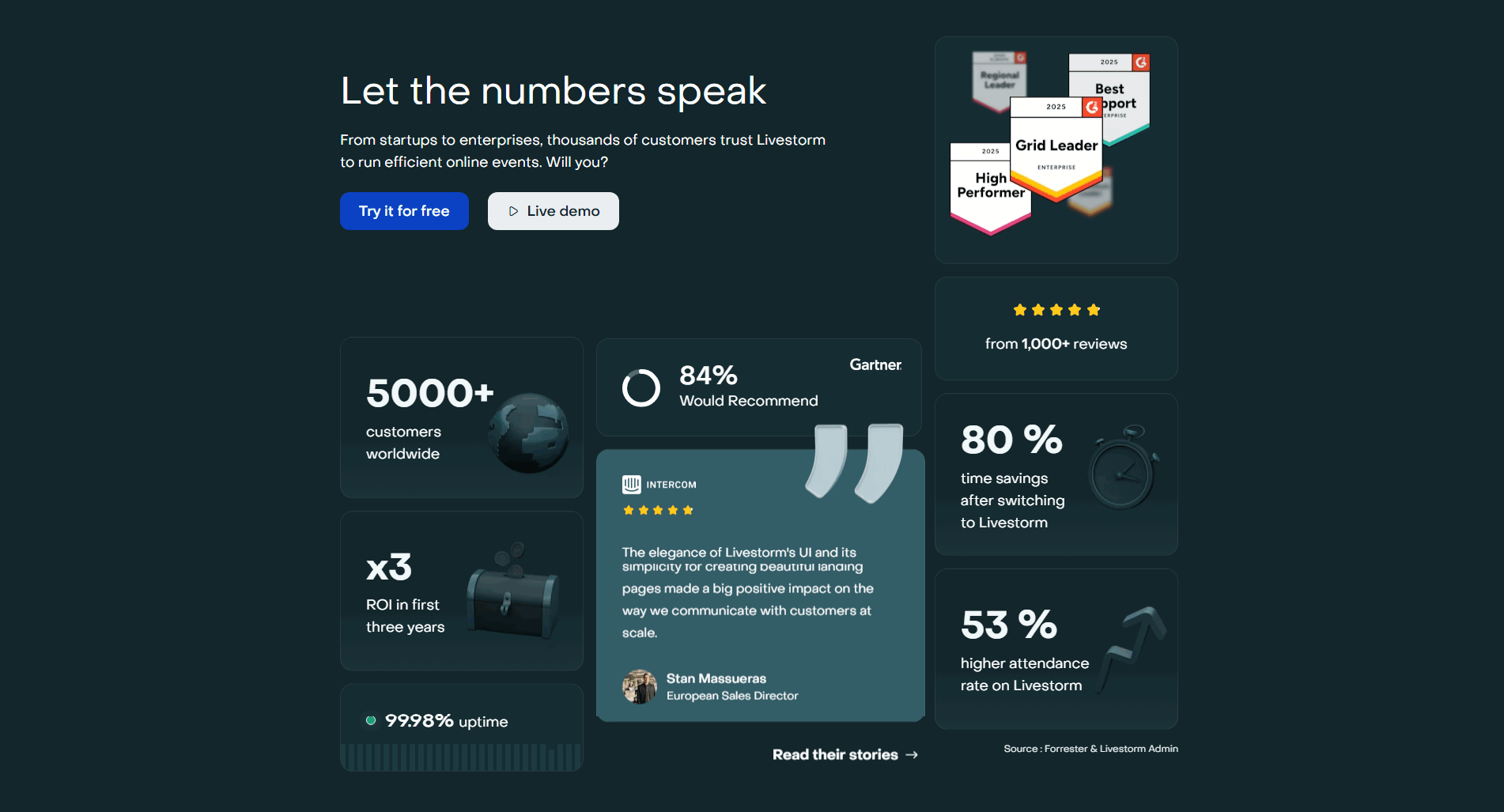
Skip to content

Best Event Tech Website Examples (And Why They Convert)

We scored 5 event tech homepages on 60+ conversion criteria. See which sections separate the top performers, and what your page is probably missing.

Updated April 20265 pages analyzed
#CompanyScore

Scored by AI across 60+ conversion criteria

Deltic landing page
#1
68/100
Scroll to explore
Analyze your event tech pageFree. Takes 2 minutes.

What high-performing event tech homepage design gets right

Event tech pages have to make complex logistics feel simple and inspire confidence in a platform buyers will bet their next event on. The strongest pages in this benchmark do four jobs early:

58.8/100

Avg. page score

  • Make the event format obvious in the first viewport so the organizer knows whether the platform fits their in-person, virtual, or hybrid needs.
  • Show the product as a real event workflow so the promise feels operational instead of aspirational.
  • Layer trust cues early with customer logos, event scale numbers, or recognizable client events.
  • Give organizers a low-friction next step with a free trial, demo, or interactive product tour.

4 best event tech homepages analyzed in detail

Each company below is paired with its strongest section and scored across 60+ conversion criteria. See what they get right, and what you can borrow.

01

Deltic, Venue management software for nightlife and hospitality.

Editor's pick68/100
Gabriel AmzallagGabriel AmzallagFounder, Web Anatomy

Venue-first event tech done right. Deltic leads with the nightlife and hospitality management problem, then backs it with product visuals that make the platform feel tangible for venue operators.

What makes this page stand out

  • 4.9/5 star rating prominently displayed provides immediate credibility
  • Certified electronic invoicing platform (PA - Plateformes Agréées) addresses mandatory French regulatory compliance
  • Supplier, client, and HR process digitization creates a comprehensive document management narrative
  • Sector-based navigation helps different industries find relevant solutions quickly

Section we love

·Navbar
Deltic Navbar section
  1. 1The open Resources mega-menu splits content into clear TOOLS and WHITE PAPERS columns
  2. 2A featured white paper card (Comparison of Approved Platforms) anchors the menu with a Discover link
  3. 3The red Get a quote pill stays high-contrast and persistent in the top-right nav
  4. 4Contact us with a phone icon gives a direct utility path next to the CTA
  5. 5Top-level tabs (Solutions, Sectors, Resources, Why Deltic) keep the bar focused and scannable
02

Livestorm, Video engagement platform for webinars and virtual events.

60/100
Gabriel AmzallagGabriel AmzallagFounder, Web Anatomy

Virtual event platform with a trust-forward approach. Livestorm pairs clear webinar and event hosting messaging with strong social proof and a free trial CTA that reduces every layer of buying friction.

What makes this page stand out

  • "Le leader des webinars conçu en Europe" creates a strong European champion positioning with ISO 27001 and RGPD compliance badges as trust signals
  • 1000+ reviews social proof combined with enterprise logos (ElevenLabs, Airbus, Air Liquide, Bouygues, Engie) validates both SMB and enterprise adoption
  • Four pillars — Intuitif, Personnalisable, Connecté, Sécurisé — address the key buyer concerns in a structured, scannable format
  • Use-case segmentation (webinars, product demos, internal training, external training, internal comms) expands the TAM beyond just marketing teams

Section we love

·Trust
Livestorm Trust section
  1. 1The metrics are concrete (5000+ customers, x3 ROI in three years, 99.98% uptime, 53% higher attendance).
  2. 2A 5-star rating from 1,000+ reviews plus G2 badges (Grid Leader, High Performer, Best Support) add third-party validation.
  3. 3The Intercom testimonial names Stan Massueras (European Sales Director) with a real photo and 5 stars.
  4. 4The 84% would-recommend stat is sourced to Gartner, lending analyst credibility.
  5. 5Stacking hard numbers, named reviewers, and award badges delivers broad proof diversity.
03

Eventmobi, Event management for in-person, virtual, and hybrid events.

49/100
Gabriel AmzallagGabriel AmzallagFounder, Web Anatomy

Multi-format event platform with smart resource navigation. The page balances in-person and virtual event management with content that helps different organizer types find their entry point.

What makes this page stand out

  • Strong trust metrics: 16+ years, 17M+ attendees, 40,000+ events establish market leadership
  • Anti-enterprise positioning: "Unlike enterprise event management software, EventMobi avoids unnecessary complexity, long contracts, and heavy configuration"
  • Transparent pricing with no hidden fees — directly addresses common industry frustration
  • Full event lifecycle coverage (website, registration, check-in, engagement, community) in one platform

Section we love

·Resources
Eventmobi Resources section
  1. 1Every topic (name badges, event integrations, AI in events) speaks straight to event planners
  2. 2Content-type labels (Cheat Sheet, Blog, Guide) tell visitors the format and depth before they click
  3. 3Each card opens a dedicated article, pulling readers deeper into the learning hub
  4. 4Substantive pieces like the Event Technology Buyer Guide for Associations build category authority
04

Bizzabo, The event experience operating system for enterprise teams.

38/100
Gabriel AmzallagGabriel AmzallagFounder, Web Anatomy

Enterprise event management positioned as a strategic outcome. Bizzabo elevates event tech from logistics to business impact with hero messaging that speaks to VP-level buyers.

What makes this page stand out

  • AI-powered networking and matchmaking enhance attendee engagement and connection quality
  • Event marketing and registration tools provide end-to-end event lifecycle management
  • Analytics and ROI measurement help event marketers prove business impact
  • Sponsor management and monetization features address the revenue side of events

Section we love

·Hero
Bizzabo Hero section
  1. 1Event Experience OS label positions Bizzabo as a platform, not just a tool
  2. 2B2B event professionals audience targeting is explicit in both headline and subtitle
  3. 3Boost event ROI year-round promises a measurable business outcome for event managers
  4. 4Bold yellow background with black serif typography creates high contrast and brand recognition

See how your page compares to the 58.8 average page score

Run a diagnostic on your event tech page and get a section-by-section breakdown of what to fix first to improve clarity, trust, and product proof.

Design patterns we see across high-performing event tech pages

Across 5 event tech pages reviewed, the pages that convert tend to make the first screen do one job: name the event format and show what the platform makes possible.

The strongest patterns pair clear format-specific claims with product visuals that feel like a real event workflow, then back those claims with recognizable client events and attendee numbers. Use website section examples to compare how these building blocks show up across page types.

Hero Livestorm

89/100

How Livestorm captures attention above the fold

Livestorm hero section
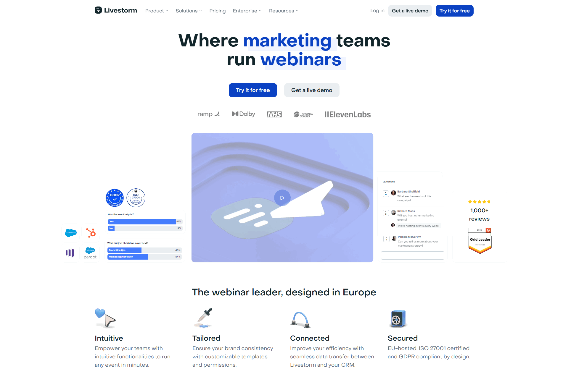
  1. 1Dual CTAs (Try it for free) and (Get a live demo) with logos (ramp, Dolby, NHS, ElevenLabs) right below
  2. 2Real webinar UI showing polls, Q and A panel, HubSpot and Pardot integrations proves the platform works
  3. 3Claims (The webinar leader, designed in Europe) for clear category leadership and regional identity
  4. 4Targets marketing teams explicitly in the headline for sharp audience specificity
  5. 51,000+ reviews badge and Grid Leader award add third-party credibility beyond just logos

Reviewed design-pattern pick from Livestorm’s hero section.

What I love about this section

  • Dual CTAs (Try it for free) and (Get a live demo) with logos (ramp, Dolby, NHS, ElevenLabs) right below
  • Real webinar UI showing polls, Q and A panel, HubSpot and Pardot integrations proves the platform works
  • Claims (The webinar leader, designed in Europe) for clear category leadership and regional identity
  • Targets marketing teams explicitly in the headline for sharp audience specificity

Cta Livestorm

80/100

How Livestorm drives action without pressure

Livestorm cta section
  1. 1Clear primary button (Try it for free) in solid blue dominates over the lighter secondary, so the main action stays obvious
  2. 2Action copy (Try it for free) plus the headline (Create a free account) make the no-cost path explicit
  3. 3Reassuring microcopy with checkmarks (No credit card needed, No installation required) kills last-minute friction
  4. 4Secondary path (Get a live demo) captures buyers who are not ready to self-serve

Reviewed design-pattern pick from Livestorm’s cta section.

What I love about this section

  • Clear primary button (Try it for free) in solid blue dominates over the lighter secondary, so the main action stays obvious
  • Action copy (Try it for free) plus the headline (Create a free account) make the no-cost path explicit
  • Reassuring microcopy with checkmarks (No credit card needed, No installation required) kills last-minute friction
  • Secondary path (Get a live demo) captures buyers who are not ready to self-serve

Value Proposition Deltic

67/100

How Deltic presents their value

Deltic value proposition section
  1. 1Six distinct value props in a 3x2 grid (all-in-one scope, e-invoicing readiness, security, time savings, refocus) cover every buyer angle
  2. 2Each card pairs a soft icon (notebook, shield, lock, clock, calendar) with the message for fast scanning
  3. 3Every card ends in its own deep-dive link so prospects can drill into the exact topic they care about
  4. 4Security card cites concrete certifications (ISO 27001, ISO 22301, ISO 50001, NF203 CCFN, NF 552) that make compliance credible

Reviewed design-pattern pick from Deltic’s value proposition section.

What I love about this section

  • Six distinct value props in a 3x2 grid (all-in-one scope, e-invoicing readiness, security, time savings, refocus) cover every buyer angle
  • Each card pairs a soft icon (notebook, shield, lock, clock, calendar) with the message for fast scanning
  • Every card ends in its own deep-dive link so prospects can drill into the exact topic they care about
  • Security card cites concrete certifications (ISO 27001, ISO 22301, ISO 50001, NF203 CCFN, NF 552) that make compliance credible

Overlooked sections that quietly drive clarity and trust

In this set, navigation and use-case sections often do more conversion work than teams expect: they help organizers self-select their event type, find relevant resources, and evaluate platform fit without feeling overwhelmed.

The biggest gaps usually appear where the page should route different organizer personas to relevant content. When those sections are thin, the hero gets forced to explain everything, and organizers leave before finding their format.

Navbar Eventmobi

57/100

Why this navbar works

Eventmobi navbar section
  1. 1The open mega-menu groups offerings into Core Products, Attendee Engagement, and Event Automation and Security
  2. 2Featured action cards (Get Pricing, Get a Demo, Watch the Product Tour) sit inside the dropdown to capture intent
  3. 3A Need extra help callout promotes Professional Services right in the menu
  4. 4Top nav stays lean with Products and Services, Customers, Resources, About EventMobi
  5. 5The EN language switcher plus a persistent Get a Demo button round out the utility nav

Reviewed overlooked-section pick from Eventmobi’s navbar section.

What I love about this section

  • The open mega-menu groups offerings into Core Products, Attendee Engagement, and Event Automation and Security
  • Featured action cards (Get Pricing, Get a Demo, Watch the Product Tour) sit inside the dropdown to capture intent
  • A Need extra help callout promotes Professional Services right in the menu
  • Top nav stays lean with Products and Services, Customers, Resources, About EventMobi

Use Cases Livestorm

50/100

How Livestorm makes the product feel relevant

Livestorm use cases section
  1. 1A carousel splits Livestorm into five named use cases (Audience training, Product demonstration, Marketing events, Staff enablement, Internal communication)
  2. 2The expanded Product demonstration panel carries its own scenario copy (stop boring product demos, deliver engaging personalized sales experiences)
  3. 3Collapsed vertical labels plus a See all use cases link make switching between scenarios easy
  4. 4The More than just webinars heading reframes the product around many jobs, widening who it is for

Reviewed overlooked-section pick from Livestorm’s use cases section.

What I love about this section

  • A carousel splits Livestorm into five named use cases (Audience training, Product demonstration, Marketing events, Staff enablement, Internal communication)
  • The expanded Product demonstration panel carries its own scenario copy (stop boring product demos, deliver engaging personalized sales experiences)
  • Collapsed vertical labels plus a See all use cases link make switching between scenarios easy
  • The More than just webinars heading reframes the product around many jobs, widening who it is for

Resources Livestorm

80/100

How Livestorm educates before they sell

Livestorm resources section
  1. 1Two-column layout separates featured blog cards (left) from a lightweight Our guides link list (right) for clear content priority
  2. 2Topics like 9 Best Virtual Event Platforms and 9 Best On-Demand Webinar Software map directly to Livestorm's webinar product
  3. 3Evergreen guides (What is a webinar?, What is Video Marketing?) position Livestorm as the category educator
  4. 4Every blog card has a Read more link and each guide is clickable, pulling visitors into deeper content

Reviewed overlooked-section pick from Livestorm’s resources section.

What I love about this section

  • Two-column layout separates featured blog cards (left) from a lightweight Our guides link list (right) for clear content priority
  • Topics like 9 Best Virtual Event Platforms and 9 Best On-Demand Webinar Software map directly to Livestorm's webinar product
  • Evergreen guides (What is a webinar?, What is Video Marketing?) position Livestorm as the category educator
  • Every blog card has a Read more link and each guide is clickable, pulling visitors into deeper content

Use the examples below as prompts for what to standardize, not just what to redesign.

Checklist: a practical audit for event tech website design

If you are iterating on an event tech homepage design, this checklist helps you spot missing sections and messaging gaps quickly, especially around Features, Hero, and Value Proposition.

Run it on your current page, then decide what to rewrite, what to reorder, and what proof to add before you touch visual polish. For a faster baseline, you can also try our landing page analysis.

Interactive quiz

What would your event tech homepage score?

Question 1 of 5
0%

Can an event organizer identify what you do in under 5 seconds?

"Virtual event platform for lead generation" beats "reimagine your event experience."

Gabriel Amzallag

Reviewed by

Gabriel Amzallag , Founder, Web Anatomy

5 years CRO + SEO at Qonto (2021–2025). After advising 15+ SaaS on their websites (Payfit, Pigment…), the same patterns kept breaking, so I decided to build the source of truth on what works on the web: the intelligence layer every tool, builder, and team uses to ship sites that perform.

See how your page compares to the 58.8 average page score

Run a diagnostic on your event tech page and get a section-by-section breakdown of what to fix first to improve clarity, trust, and product proof.

Analyze your event tech pageFree. Takes 2 minutes.

Explore other industries

See how conversion patterns differ across verticals. Each page scores real homepages on the same framework.

See all industries
Benchmark-backed event tech homepage inspiration

Event Tech FAQ

Quick answers based on our event tech website benchmark dataset.

What are the best event tech websites?

[01]

The strongest performers in this April 2026 benchmark are Deltic, Livestorm, Eventmobi, and Bizzabo. Each commits to a format: Deltic to venue operations (nightlife and hospitality), Livestorm to virtual events and webinars, Eventmobi to multi-format organizers, and Bizzabo to enterprise buyers. Across 5 event tech homepages scored against 60+ criteria, these pages convert by refusing to be everything to every organizer.

What makes event tech websites harder to convert than generic SaaS pages?

[02]

Event tech has to serve venue, virtual, in-person, and hybrid organizers, often on the same homepage. Across 5 homepages reviewed, the pages that convert commit to a primary persona: Deltic names the venue operator's specific pain, Livestorm leads with engagement and leads instead of "virtual event platform," and Bizzabo elevates the conversation to VP-level business impact rather than ticketing features.

What is the biggest design mistake on event tech homepages?

[03]

Trying to serve every event format in one hero with no clear segmentation. The average page in this April 2026 benchmark scored 58.8. Top performers pick a lane or route fast: Deltic commits to hospitality venues, Livestorm commits to virtual, and Eventmobi uses resource navigation to route hybrid organizers. Organizers should self-select their event type in ten seconds, not scroll searching for it.

What sections should an event tech homepage include?

[04]

A hero that names the event format and outcome in operator language, an early trust layer with client logos or event scale numbers, a product walkthrough showing the real event workflow, use-case routing for different event types, and a low-friction CTA like a free trial or interactive demo. Livestorm stacks these cleanly around free-trial conversion. Across 5 homepages, pages that skip format segmentation convert least.

How many event tech examples do I need to review before redesigning?

[05]

Three to five is enough if you pick by event format. Only 13% of homepages in this benchmark score in the top tier, so the gap is concentrated in a few blocks. Study Deltic for venue-operator framing, Livestorm for outcome-led virtual events, Eventmobi for multi-format routing, and Bizzabo for enterprise strategic positioning.

Where can I find great inspiration for my event tech website?

[06]

Study pages section by section instead of saving full-page screenshots. Browse best landing page examples for the full gallery, then drill into hero section examples and features section examples to see how Deltic, Livestorm, and Bizzabo differ at each funnel stage.

How do I audit my event tech homepage?

[07]

Use a structured rubric that checks clarity, trust, and friction instead of relying on subjective feedback. Run your page through the landing page analyzer for a section-by-section score against the same 60+ criteria used in this benchmark.