
Features • Strapi
67/100How Strapi showcases their product
- 1Benefit-led headline and copy (Simplify API Creation, Skip tedious setup) lead with the time saved not the feature
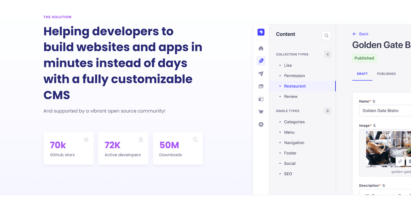
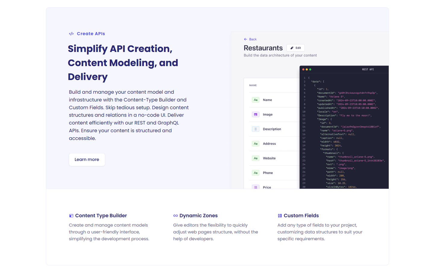
- 2Product UI screenshot shows the real Content-Type Builder with fields and a live REST API JSON response as the output
- 3Learn more link gives curious developers a path to deeper docs without leaving the page
- 4Three secondary feature blurbs (Content Type Builder, Dynamic Zones, Custom Fields) round out the capability picture
Reviewed design-pattern pick from Strapi’s features section.
What I love about this section
- Benefit-led headline and copy (Simplify API Creation, Skip tedious setup) lead with the time saved not the feature
- Product UI screenshot shows the real Content-Type Builder with fields and a live REST API JSON response as the output
- Learn more link gives curious developers a path to deeper docs without leaving the page
- Three secondary feature blurbs (Content Type Builder, Dynamic Zones, Custom Fields) round out the capability picture