


Hero • Kirki
73/100How Kirki captures attention above the fold

- 1Category line Website Builder for WordPress, reimagined names the product and audience before the bold headline
- 2The first freeform visual builder for WordPress claim stakes a clear differentiation against page builders
- 3Get started free primary CTA paired with low-commitment Watch it in action secondary path
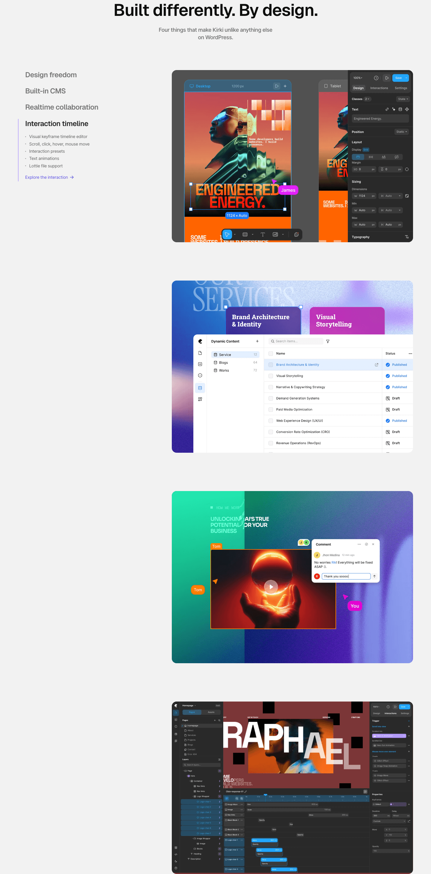
- 4Large real builder UI showing the infinite canvas editing the Petricia design proves the product is concrete
Reviewed design-pattern pick from Kirki’s hero section.
What I love about this section
- Category line Website Builder for WordPress, reimagined names the product and audience before the bold headline
- The first freeform visual builder for WordPress claim stakes a clear differentiation against page builders
- Get started free primary CTA paired with low-commitment Watch it in action secondary path
- Large real builder UI showing the infinite canvas editing the Petricia design proves the product is concrete