Best Product Management Website Examples (And Why They Convert)
We scored 13 product management homepages on the same criteria used across every industry benchmark. See which sections separate the top performers, and what a page is probably missing.
5 years CRO + SEO at Qonto (2021–2025). After advising 15+ SaaS on their websites (Payfit, Pigment…), the same patterns kept breaking, so I decided to build the source of truth on what works on the web: the intelligence layer every tool, builder, and team uses to ship sites that perform.
“Hive turns its homepage into a set of role-specific stories. First-person tabs let an agency lead, a PMO, or a marketer self-select, and each view leads with its own outcome, the apps that role touches, and a named customer whose story you can check.”
What makes this page stand out
The hero headline “Automateeverything.” pairs with “Get back to doing what you love.” for a clear benefit-led message.
The primary CTA “Get Started for Free” is reinforced by microcopy “Start for free. No credit card required.”
Customer logos from Google, Toyota, Egg Land's Best, NBA, and EA sit above-the-fold as immediate social proof.
The “Built for teams like yours” persona buttons and “810 hours saved in first month” stat add segmentation plus quantified credibility.
Section we love
·Use Cases
1Seven first-person tabs (I am an agency, I am a PMO, I am a marketer) let visitors self-select in one click
2Each persona view leads with its own number (810 hours saved in first month) instead of a shared generic claim
3Apps used list (Proofing and approvals, Project and Navigation) shows which parts of the product that role actually touches
4Named owner with title (David Gielchinsky, Director of Health Operations) plus the McKinney Health case card makes the story checkable
03
Productplan, Turn customer intelligence into a roadmap grounded in evidence.
5 years CRO + SEO at Qonto (2021–2025). After advising 15+ SaaS on their websites (Payfit, Pigment…), the same patterns kept breaking, so I decided to build the source of truth on what works on the web: the intelligence layer every tool, builder, and team uses to ship sites that perform.
“Productplan opens on the real roadmap board, quarters, priority tags, and percent-complete bars, so the promise looks operational before you read a word. Proof pills close the hero and mix raw volume with a third-party rating, and a single coral demo button keeps the path unambiguous.”
What makes this page stand out
The hero headline reads “Powering product innovation with the world's top teams.” and immediately labels “The Platform.”
The “One platform. Every capability your product team needs.” section breaks into four modules with icons and bullet lists.
The “BUILT FOR YOUR INDUSTRY” section uses tabs for “SaaS,” “FINANCE & BANKING,” “INSURANCE,” and “GOVERNMENT & NON-PROFIT.”
The comparison table claims “Time to first real, shareable roadmap” in “Hours” versus competitors’ “Weeks to months.”
Section we love
·Hero
1Four proof pills close the hero (23M+ initiatives planned, 860K roadmaps built, 1000+ customers, 4.3/5 stars on G2) and mix volume with a third-party rating
2Real roadmap board with quarters, priority tags and percent-complete bars shows the actual working surface, not a mockup
3Subhead links the input to the result, customer intelligence feeding a roadmap where every priority is grounded in evidence
4Single coral Book a Demo button is the only colored control above the product shot, so the path is unambiguous
04
Shortcut, Project management for software teams and their agents.
5 years CRO + SEO at Qonto (2021–2025). After advising 15+ SaaS on their websites (Payfit, Pigment…), the same patterns kept breaking, so I decided to build the source of truth on what works on the web: the intelligence layer every tool, builder, and team uses to ship sites that perform.
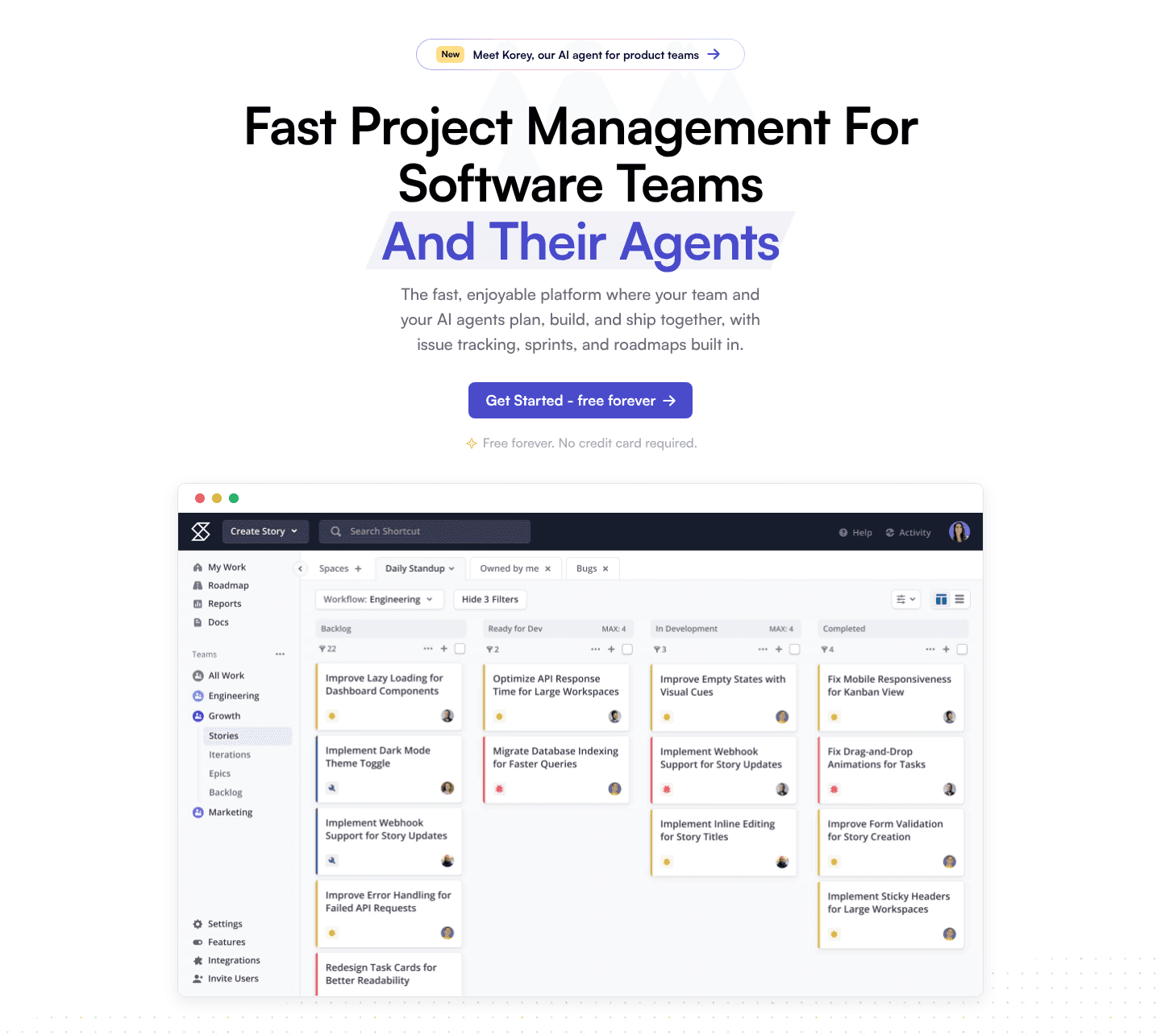
“Shortcut sells the result, not the tool. The headline promises visible progress from every teammate and agent, and a live roadmap table with health labels and written status updates proves the status is human context, not just a bar. A free-to-start path leads, with a lower-commitment route for researchers.”
What makes this page stand out
The hero headline says “Fast Project Management for Software Teams and their Agents” with a “Get Started - free forever” CTA.
The subline “Free forever. No credit card required.” sits beside a star icon, reducing signup friction.
Customer logos appear under “Trusted by thousands of software teams,” repeating in a long horizontal strip.
The security section lists “GDPR and SOC2 compliant,” “Google SSO included,” plus “SSO and SCIM,” and “HIPAA and BAA ready.”
Section we love
·Features
1Headline sells the result (See progress from every teammate and agent) rather than naming the roadmap tool
2Live roadmap table with 100%, 61% and 0% bars plus On Track, At Risk and Off Track labels shows the real output
3Callouts (Team Roadmaps, View Progress Indicators, Add Health Updates, Set Target Dates) label four capabilities on the screenshot
4Written health updates next to each row prove the status is human context, not just a percentage
5Get started it is free leads, with Discover Key Features as the low commitment path for researchers
05
Prodpad, A roadmap tool that ends the stakeholder tug-of-war.
5 years CRO + SEO at Qonto (2021–2025). After advising 15+ SaaS on their websites (Payfit, Pigment…), the same patterns kept breaking, so I decided to build the source of truth on what works on the web: the intelligence layer every tool, builder, and team uses to ship sites that perform.
“Prodpad leads with the cost of doing nothing. The headline names disconnected tools as the problem, each card is a scene from the product manager's week, and one card names exactly who pulls each way, the board wanting a timeline, sales wanting features, engineering wanting tickets. By the time the product appears, the reader already wants the fix.”
What makes this page stand out
The hero uses two CTAs side-by-side—“Try for free” and “Book a demo”—to capture different intent levels.
Customer logos and the line “Trusted by 1000’s of product people” add immediate social proof (Depop, Comcast, Target).
The pain section uses four blunt subheads like “Feedback is everywhere. Patterns are nowhere” to frame urgency before the solution.
The integrations block lists 18+ tool logos (Jira, Slack, Salesforce, SAML, Zapier) to signal workflow compatibility.
Section we love
·Problem
1Headline frames the price of doing nothing: your disconnected tools are costing you
2Backlog pain is quantified, 300 items and no system, so the reader can check it against their own
3Each card is a scene from the product manager week, from the stale slide deck roadmap to Friday rework
4One card names who pulls each way: the board wants a Gantt, sales wants features, engineering wants tickets
06
Roadmunk, Roadmapping that plugs into the tools teams already run.
5 years CRO + SEO at Qonto (2021–2025). After advising 15+ SaaS on their websites (Payfit, Pigment…), the same patterns kept breaking, so I decided to build the source of truth on what works on the web: the intelligence layer every tool, builder, and team uses to ship sites that perform.
“Roadmunk does the quiet work well. Its footer reads as a map rather than a wall of links, with labeled groups, a subscribe path for visitors who are not ready to buy, and product names that carry their host tool so a visitor already on another platform self-selects in one scan. Trust and legal links sit on the baseline where buyers look for them.”
What makes this page stand out
The hero headline reads “Roadmapping software for teams of all sizes” with subhead “Roadmapping Software (formerly Roadmunk)”.
The primary CTAs pair “Start a Free Trial” and “Talk to an Expert” side-by-side above a large product screenshot.
The trust strip claims “Tempo is trusted by 30,000+ global companies” alongside logos like Airbnb, Netflix, Cisco, Slack, Oracle.
The feature blocks use benefit-led microheadlines like “Roadmaps made in minutes” and “Create multiple roadmap views from the same dataset” with icons.
Section we love
·Footer
1Seven labeled groups turn a 40-link footer into a map instead of an undifferentiated wall of text
2Subscribe Now gives the footer its own conversion for visitors who are not ready to buy anything yet
3Terms, Privacy and Security sit on the baseline, with a Trust Center link in the support column
4Product names carry their host tool (for Jira, for monday.com), so visitors self-select in one scan
Your top 3 opportunities for more revenue.
We find every way to grow your website’s visibility and conversions: SEO, AI search (AEO), backlinks and mentions, and UX/UI. 3 free opportunities, delivered by email.
Design patterns we see across strong product management pages
Across 13 product management pages reviewed, the ones that win share a habit: they make the first screen do one job, name what the tool replaces, and back it with something the reader can check.
The strongest pages pair an outcome-led claim with a single clear action, then prove it with the real product surface instead of a stock illustration. Use website section examples to compare how these building blocks show up across page types.
1Headline claims the category and the new buyer in one breath: software teams and their agents
2Free forever. No credit card required sits right under one blue button, with nothing else competing
3Screenshot is the real board with named stories (Implement Dark Mode Theme Toggle) and WIP caps of MAX: 4
4New pill announcing Korey, their AI agent, gives a returning visitor a reason to click before the fold
5Purple highlight on And Their Agents makes the differentiating half of the H1 the thing you read first
Reviewed design-pattern pick from Shortcut’s hero section.
What I love about this section
Headline claims the category and the new buyer in one breath: software teams and their agents
Free forever. No credit card required sits right under one blue button, with nothing else competing
Screenshot is the real board with named stories (Implement Dark Mode Theme Toggle) and WIP caps of MAX: 4
New pill announcing Korey, their AI agent, gives a returning visitor a reason to click before the fold
Overlooked sections that quietly do the trust work
In this set, sections teams treat as filler, comparisons, integrations, and a well-built footer, often carry more weight than expected. They answer the switching question, show the tool fits an existing stack, and route each role to its own path.
The biggest gaps appear where a page should name the reader's problem in plain language and show which tools it plugs into. When those sections are thin, the hero is left to do all the work, and visitors are left guessing about fit.
Subhead names three jobs (gather feedback, share plans, track execution) instead of listing tools alone
Find out more about integrations button gives a clear path to the full catalogue
Wording about not breaking the team flow answers the switching-cost worry product teams raise
Use the examples below as prompts for what to standardize, not just what to redesign.
Checklist: a practical audit for product management website design
If you are iterating on a product management homepage, this checklist helps you spot missing sections and weak messaging fast, especially around Hero, Value Proposition, and Features.
Built from 28 sections across 6 product management homepages in this October 2026 benchmark. Each check below is a move the top-scoring pages share, each paired with a real example from the set.
Hero
Can a product lead tell what you do in five seconds?
The hero names the category and who it is for in plain words.
Example: Shortcut's headline claims the category and the new buyer in one breath, software teams and their agents.
A risk-reducing line sits right under the main button.
Example: Hive puts "Start for free. No credit card required." one line under the button, right where hesitation happens.
Trust
Does the page earn belief before it asks for anything?
A security or compliance cue answers the "is it safe" question.
Example: Shortcut shows four certification badges (GDPR, SSO, AICPA SOC 2, HIPAA) as real seals in white cards, not plain text claims.
Example: Productplan runs names across sectors, Michelin, Northwestern, and Schneider Electric.
Value proposition
Is the value concrete, or just adjectives?
The pitch splits into a few named, scannable claims.
Example: Hive uses three named pillars, Best in class, Best value, and Zero risk, one scannable line each.
One clear mechanism explains how the promise is delivered.
Example: Hive splits one promise into three claims, ask and act, connect tools, and turn talk into follow-through.
Features
Do features connect to outcomes the buyer cares about?
Feature copy leads with the outcome, not the feature name.
Example: Prodpad's headline sells the outcome, Stay outcome focused, and keeps the feature name in the eyebrow.
The section names the moment of pain before the product.
Example: Roadmunk's intro names the moment of pain, a last-minute request for upcoming projects, before naming the product.
Call to action
Does the next click feel safe to a cautious buyer?
One primary action dominates, with action-led copy.
Example: Productplan lets one Book a Demo button own the block with no competing links.
The button label answers the price question by itself.
Example: Shortcut's primary button, Get started - it is free, answers the price objection inside the label itself.
The gap most product management pages leave open is pricing.
Pricing is the rarest section in this set. Across the product management homepages reviewed, not one exposed a pricing block clear enough to score, so the cost question gets pushed to a sales call. The pages that come closest fold price into the pitch: Hive states that it starts from $5 per user per month right inside its value proposition, instead of hiding the number behind contact sales. Naming a price early is the cheapest trust a page can offer.
Run it on your current page, then decide what to rewrite, what to reorder, and what proof to add before you touch visual polish. Score your own page against the same framework below, or try our landing page analyzer for a faster baseline.
Interactive quiz
What would your product management homepage score?
Question 1 of 5
0%
Can a product lead tell what you do in under 5 seconds?
"Roadmaps your whole team can read" beats "the operating system for product excellence."
Reviewed by
Gabriel Amzallag , Founder, Web Anatomy
5 years CRO + SEO at Qonto (2021–2025). After advising 15+ SaaS on their websites (Payfit, Pigment…), the same patterns kept breaking, so I decided to build the source of truth on what works on the web: the intelligence layer every tool, builder, and team uses to ship sites that perform.
We find every way to grow your website’s visibility and conversions: SEO, AI search (AEO), backlinks and mentions, and UX/UI. 3 free opportunities, delivered by email.
Quick answers based on our product management website dataset.
What are the best product management websites?
[01]
The strongest performers in this October 2026 set are Hive, Productplan, and Shortcut, with Prodpad, Roadmunk, and Sprig close behind. Across 13 product management homepages, the pages that win pair a clear promise with proof you can check: Hive lets each role self-select into its own story, Productplan opens on the real roadmap board, and Shortcut names the buyer in its headline.
What makes a product management homepage hard to design?
[02]
Product management is a fuzzy category, so a homepage has to explain what the tool replaces and prove it works in the same breath. The pages that manage it lead with the reader's pain: Prodpad frames disconnected tools and a stale slide-deck roadmap as the weekly grind, then shows the roadmap that fixes it.
What is the biggest design mistake on product management homepages?
[03]
Leaning on polished branding while the page never shows the product. The average page in this October 2026 set scored 45.4, and the ones above it make the product tangible early: Productplan shows a live roadmap board above the fold and Shortcut puts a real board with named stories in the hero.
What sections should a product management homepage include?
[04]
A hero that names the category and the buyer, an early trust cue, a problem section that mirrors the reader's week, features tied to outcomes, and one clear next step. Prodpad and Hive stack these well: Prodpad opens on the pain, and Hive splits its pitch into named pillars and routes each role to its own use case.
How many product management website examples should I study before a redesign?
[05]
Three to five is plenty if you pick by the job your tool does and read each page part by part. Study Hive for role-based stories, Productplan for a proof-led hero, Prodpad for a problem section, and Sprig for an enterprise ask.
Where can I find inspiration for my product management website?
Use a structured rubric that checks clarity, proof, and friction instead of relying on taste. Run your page through the landing page audit for a part-by-part score against the same criteria used in this set.