We scored 4 ESG and sustainability homepages on 60+ conversion criteria. See which sections separate the top performers, and what your page is probably missing.
5 years CRO + SEO at Qonto (2021–2025). After advising 15+ SaaS on their websites (Payfit, Pigment…), the same patterns kept breaking, so I decided to build the source of truth on what works on the web: the intelligence layer every tool, builder, and team uses to ship sites that perform.
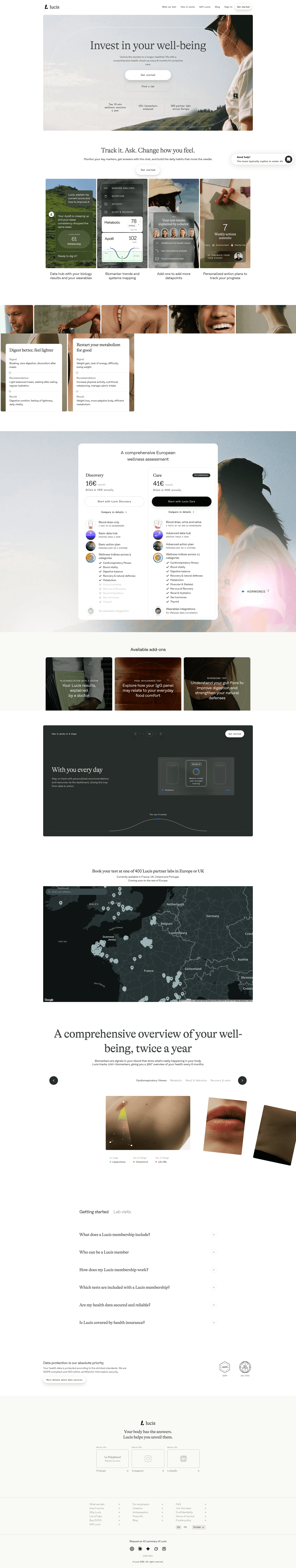
“Carbon accounting made actionable. Greenly leads with a clear compliance and measurement story, backed by product visuals that make ESG reporting feel like a concrete workflow, not a corporate checkbox.”
What makes this page stand out
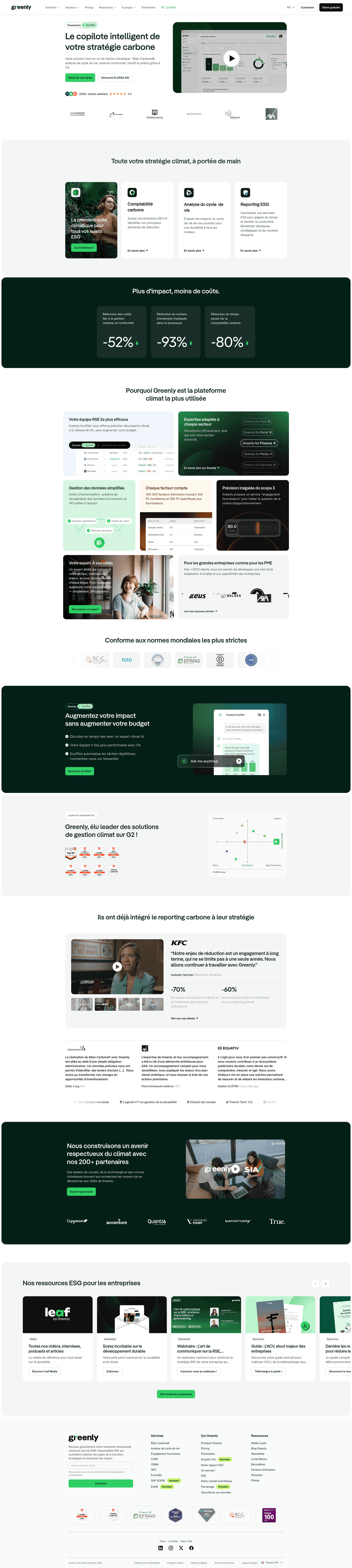
"Your all-in-one solution for your climate needs: GHG disclosure, product carbon footprint, ESG compliance" covers the complete sustainability workflow
"Powered by EcoPilot" AI branding creates an ownable, differentiated AI identity for carbon accounting
3,500+ happy clients social proof demonstrates significant market adoption in the growing sustainability software category
"New York joins California on climate reporting" news banner connects the product to urgent regulatory requirements
Section we love
·FooterBest in class
1Links grouped in 3 labeled columns (Services, About Greenly, Resources) with New tags flagging fresh pages
2Newsletter signup with email field and Subscribe button drives secondary conversion, backed by Trusted by 500k+ leaders count
3Row of accreditation seals (ADEME, CDP Accredited Provider 2023, CSRD, Ministere de la Transition Energetique) reinforces trust
5 years CRO + SEO at Qonto (2021–2025). After advising 15+ SaaS on their websites (Payfit, Pigment…), the same patterns kept breaking, so I decided to build the source of truth on what works on the web: the intelligence layer every tool, builder, and team uses to ship sites that perform.
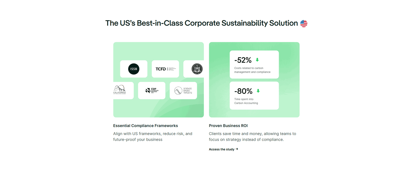
“Enterprise sustainability with clear conversion pathways. Evergreen pairs specific outcome messaging with trust signals and contact options that reduce enterprise buying friction.”
What makes this page stand out
The "only" claim — "Evergreen is the only peer-to-peer recognition software that lets teams recognise a job well done, while planting trees" — creates a clear differentiation moat.
"+500 000 trees planted by teams" provides a tangible, emotionally resonant metric that proves real-world impact.
Clean, warm design with green accents reinforces the environmental brand identity without being heavy-handed.
"Start 14 Day Trial" CTA is straightforward and low-commitment.
Section we love
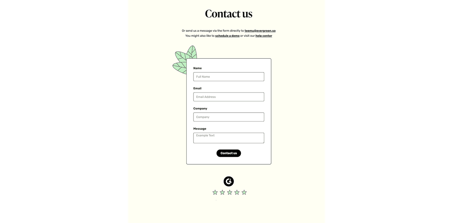
·Contact
1Three alternative paths above the form: direct email teemu@evergreen.so, schedule a demo, and the help center
2G2 logo with a five-star rating sits just below the form to reinforce credibility at decision point
3Compact four-field form (name, email, company, message) keeps the ask light
4Letting visitors email a founder directly signals a small, responsive team
03
Back Market, The trusted marketplace for refurbished tech.
5 years CRO + SEO at Qonto (2021–2025). After advising 15+ SaaS on their websites (Payfit, Pigment…), the same patterns kept breaking, so I decided to build the source of truth on what works on the web: the intelligence layer every tool, builder, and team uses to ship sites that perform.
“Consumer sustainability positioned as a smart purchase. Back Market makes refurbished tech feel premium with strong CTAs and a marketplace story that elevates the green choice.”
What makes this page stand out
"Where the world shops refurbished tech" sub-headline claims global marketplace leadership in the refurbished electronics category
Four-pillar Back Market Promise (best-in-class refurbishment, up to 100-point quality inspection, free 30-day returns, 1-year warranty) systematically eliminates refurbished purchase anxiety
17M+ customer reviews and 4.5+ star ratings provide extraordinary social proof at scale
"Get $15 off your first order" email signup offer creates an immediate conversion incentive for new visitors
Section we love
·Cta
1Inline email field with a Sign up button captures the lead right in the block with no redirect
2Outcome-led headline (Get $15 off your first order) gives a concrete dollar reason to sign up
3One primary email capture with only a small Learn more link below keeps focus on the signup
4Subcopy sets the terms up front (orders of $250 or more) so the offer feels clear
04
Too Good To Go, Save food, save money, save the planet.
5 years CRO + SEO at Qonto (2021–2025). After advising 15+ SaaS on their websites (Payfit, Pigment…), the same patterns kept breaking, so I decided to build the source of truth on what works on the web: the intelligence layer every tool, builder, and team uses to ship sites that perform.
“Environmental impact through consumer convenience. Too Good To Go combines food waste reduction with an effortless user experience, using how-it-works sections that make sustainability feel easy.”
What makes this page stand out
Four-step app workflow (Discover → Reserve & Pay → Pick up → You've rescued food) makes the user experience immediately understandable
"Enjoy good food at ½ price or less" quantifies the consumer value proposition in undeniable terms
180,000+ business partners (Aldi, Greggs, Morrisons, Starbucks, Burger King, Pret, GAIL's, Krispy Kreme) provide massive brand-name social proof
Surprise Bags concept creates a gamified, treasure-hunt experience that drives engagement and repeat usage
Design patterns we see across high-performing ESG pages
Across 4 ESG pages reviewed, the pages that convert tend to make the first screen do one job: name the sustainability outcome and show the product making it measurable.
The strongest patterns pair clear outcome claims with product visuals that feel real, then back those claims with impact metrics and enterprise client examples. Sustainability website design works best when it bridges the gap between mission-driven messaging and concrete product value. Use website section examples to compare how these building blocks show up across page types.
1Single green CTA (Start refering) stands out with no competing buttons in the band
2Action copy (Start refering) tells the visitor exactly what they will do
3Concrete reward in the headline (Recommend Greenly and earn 1000 euros) gives a clear payoff for clicking
Reviewed design-pattern pick from Greenly’s cta section.
What I love about this section
Single green CTA (Start refering) stands out with no competing buttons in the band
Action copy (Start refering) tells the visitor exactly what they will do
Concrete reward in the headline (Recommend Greenly and earn 1000 euros) gives a clear payoff for clicking
Overlooked sections that quietly drive clarity and trust
In this set, how-it-works and resource sections often do more conversion work than teams expect: they shape product understanding, explain the measurement methodology, and help buyers evaluate fit before committing.
The biggest gaps usually appear where the page should explain how the platform actually measures or reports on sustainability outcomes. When those sections are thin, enterprise buyers stall because they cannot verify the methodology.
1Tight set framed as The 4 questions people always ask zeroes in on the exact pre-purchase doubts
2Real buying objections covered (Can I pay over time?, Can I buy a protection plan?) ease price and risk worries
3Chevron accordion keeps the section minimal so the four answers never overwhelm the page
4Structured question-and-answer pairs give search engines an indexable format for FAQ rich results
Reviewed overlooked-section pick from Back Market’s faq section.
What I love about this section
Tight set framed as The 4 questions people always ask zeroes in on the exact pre-purchase doubts
Real buying objections covered (Can I pay over time?, Can I buy a protection plan?) ease price and risk worries
Chevron accordion keeps the section minimal so the four answers never overwhelm the page
Structured question-and-answer pairs give search engines an indexable format for FAQ rich results
Use the examples below as prompts for what to standardize, not just what to redesign.
Checklist: a practical audit for ESG website design
If you are iterating on an ESG homepage design, this checklist helps you spot missing sections and messaging gaps quickly, especially around Value Proposition, Cta, and Trust.
Run it on your current page, then decide what to rewrite, what to reorder, and what proof to add before you touch visual polish. For a faster baseline, you can also try our landing page audit.
Interactive quiz
What would your ESG homepage score?
Question 1 of 5
0%
Can an ESG buyer identify what you do in under 5 seconds?
"Carbon accounting for mid-market companies" beats "building a sustainable future together."
Reviewed by
Gabriel Amzallag , Founder, Web Anatomy
5 years CRO + SEO at Qonto (2021–2025). After advising 15+ SaaS on their websites (Payfit, Pigment…), the same patterns kept breaking, so I decided to build the source of truth on what works on the web: the intelligence layer every tool, builder, and team uses to ship sites that perform.
Quick answers based on our ESG website benchmark dataset.
What are the best ESG websites?
[01]
The strongest performers in this June 2026 benchmark are Greenly, Evergreen, Back Market, and Too Good To Go. Each escapes the virtue-signal trap differently: Greenly treats carbon accounting as a measurable workflow, Back Market makes refurbished tech feel premium, and Too Good To Go leads with consumer convenience. Across 4 ESG homepages scored against 60+ criteria, these pages convert because the outcome is visible, not aspirational.
What makes ESG websites harder to convert than other B2B pages?
[02]
ESG pages balance mission-driven messaging with concrete product value, and the ones that convert tilt hard toward concrete. Across 4 homepages reviewed, the pages that convert show the workflow: Greenly pairs compliance language with a carbon accounting dashboard, Evergreen signals enterprise buying with specific outcome metrics, and Back Market reframes sustainability as a smart purchase rather than a sacrifice.
What is the biggest design mistake on ESG homepages?
[03]
Leading with aspirational sustainability language while delaying concrete product workflows and measurable impact proof. The average page in this June 2026 benchmark scored 51.3. Top performers replace mission statements with proof: Greenly shows the carbon measurement workflow, Back Market quantifies the refurbished marketplace, and Too Good To Go demonstrates impact through effortless user behavior. Buyers need to see the measurement, not the pledge.
What sections should an ESG homepage include?
[04]
A hero that names the sustainability use case in plain operational terms, an early trust layer with impact metrics, certifications, or client logos, a product workflow preview (carbon dashboard, marketplace interface, or reporting output), and a CTA that matches the buyer's evaluation process. Greenly stacks these cleanly for enterprise; Too Good To Go stacks them cleanly for consumer. Across 4 homepages, pages that skip the workflow preview convert least.
How many ESG examples do I need to review before redesigning?
[05]
Three to five is enough if you pick by ESG positioning. Only 3% of homepages in this benchmark score in the top tier, so the gap is concentrated in a few blocks. Study Greenly for enterprise carbon accounting, Evergreen for outcome-first messaging, Back Market for sustainability-as-premium, and Too Good To Go for consumer-convenience framing.
Where can I find great inspiration for my ESG website?
Use a structured rubric that checks clarity, trust, and friction instead of relying on subjective feedback. Run your page through the landing page analysis for a section-by-section score against the same 60+ criteria used in this benchmark.