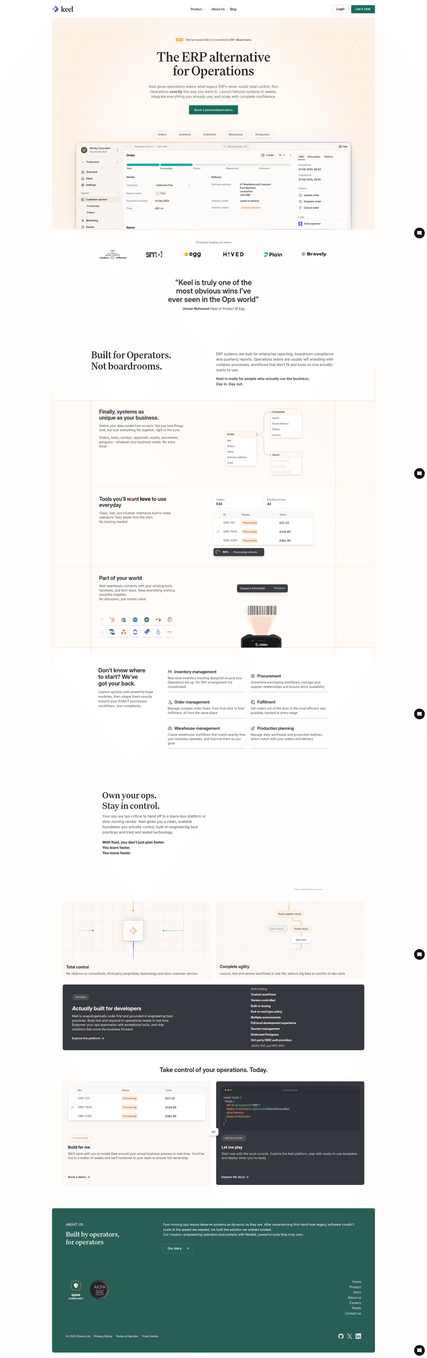


_value_proposition.png&w=1440&q=85)
Hero • Rippling
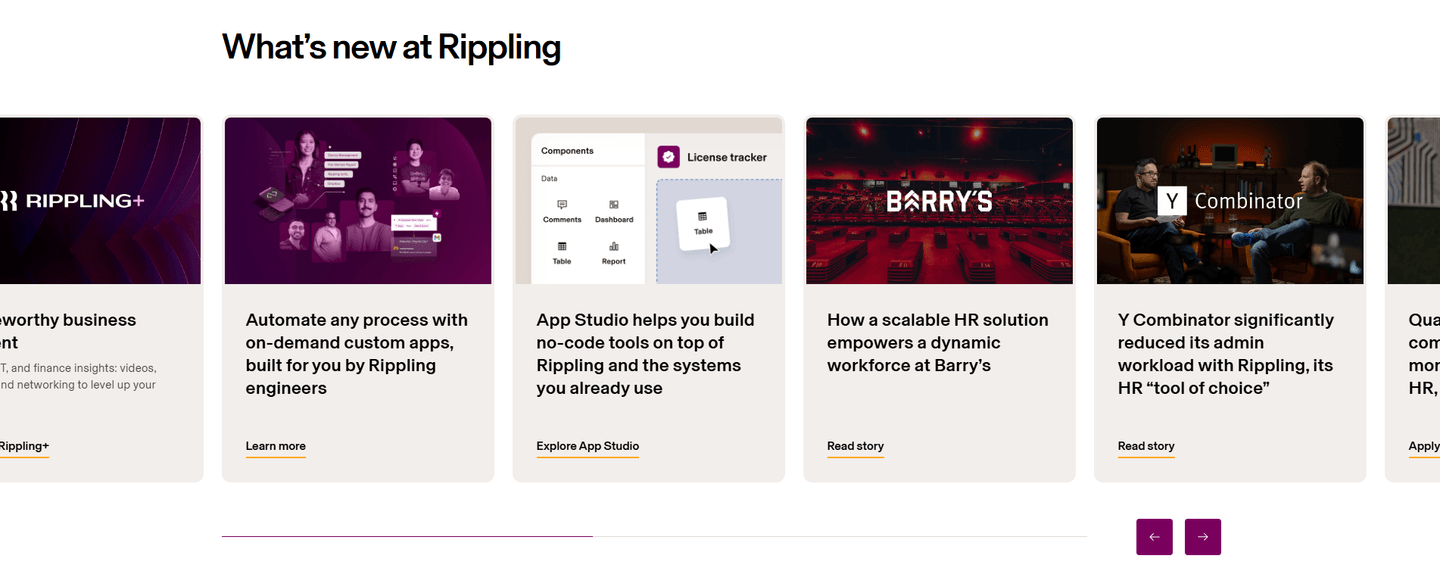
82/100How Rippling captures attention above the fold

- 1Email input with Create free account CTA plus Take a product tour secondary path cover both conversion types
- 2Social proof row (4.8 stars, 2.9K+ reviews, G2 and PC Magazine Editors Choice badges) stacks credibility
- 3Product UI on tablet showing workforce management dashboard with employee profiles proves real functionality
- 4Headline (Manage your entire workforce on one system) clearly covers HR, Payroll, IT, and Finance in the subtext
Reviewed design-pattern pick from Rippling’s hero section.
What I love about this section
- Email input with Create free account CTA plus Take a product tour secondary path cover both conversion types
- Social proof row (4.8 stars, 2.9K+ reviews, G2 and PC Magazine Editors Choice badges) stacks credibility
- Product UI on tablet showing workforce management dashboard with employee profiles proves real functionality
- Headline (Manage your entire workforce on one system) clearly covers HR, Payroll, IT, and Finance in the subtext
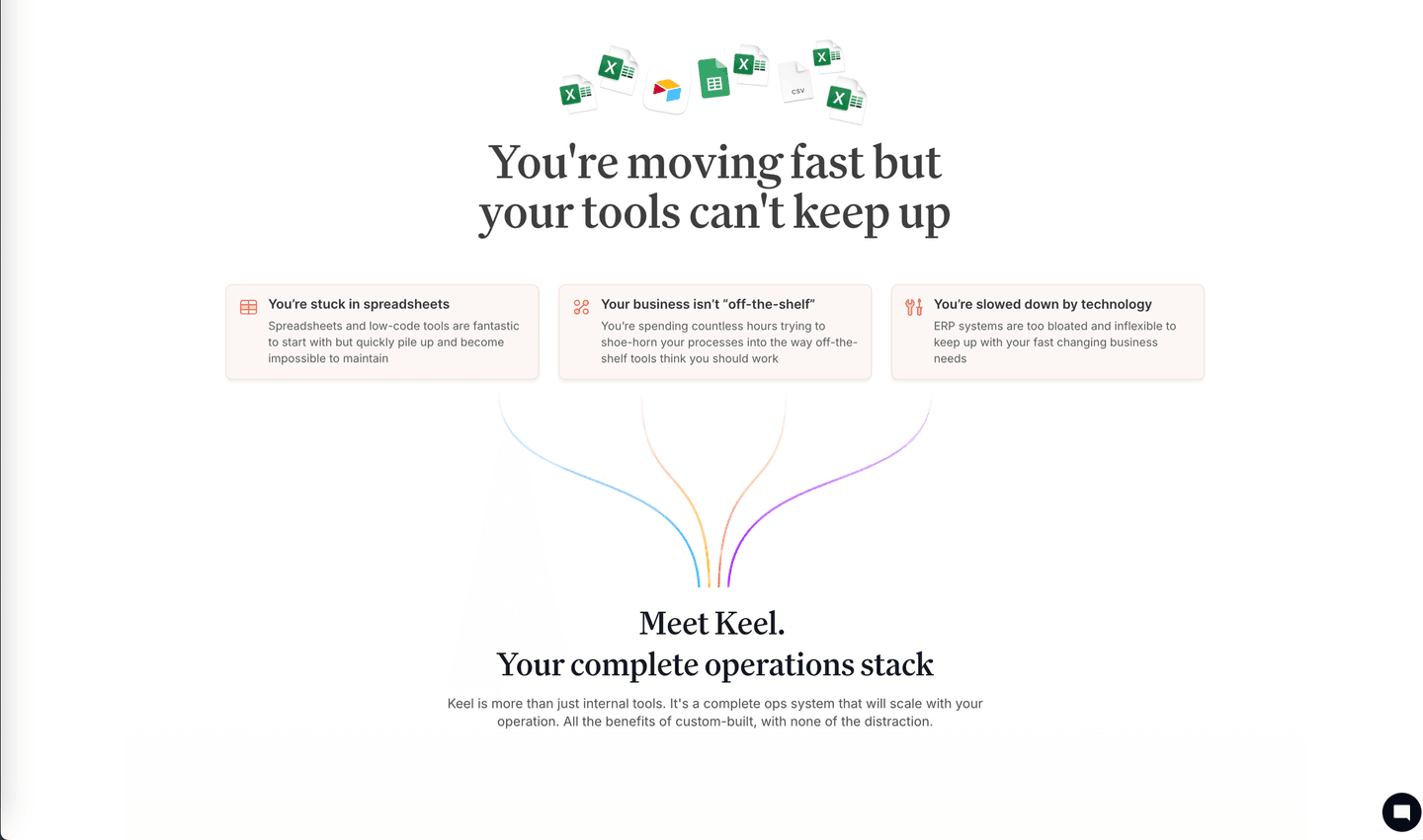
_integrations.png&w=1440&q=85)