Skip to content

Best Supply Chain Website Examples (And Why They Convert)

We scored 3 supply chain homepages on 60+ conversion criteria. See which sections separate the top performers, and what your page is probably missing.

Updated April 20263 pages analyzed
#CompanyScore

Scored by AI across 60+ conversion criteria

Safecube landing page
#1
66/100
Scroll to explore
Analyze your supply chain pageFree. Takes 2 minutes.

What high-performing supply chain homepage design gets right

Supply chain pages sell into operations teams that need proof of reliability before they trust a new vendor. The strongest pages in this benchmark do four jobs early:

47.5/100

Avg. page score

  • Make the logistics problem obvious in the first viewport so the buyer knows which operational gap the product fills.
  • Show the product as a real tracking, visibility, or management workflow so the promise feels operational instead of abstract.
  • Layer trust cues early with customer logos, shipment volume, or integration partners that logistics teams recognize.
  • Give operations buyers a clear next step with specific CTA language that matches their evaluation process.

2 best supply chain homepages analyzed in detail

Each company below is paired with its strongest section and scored across 60+ conversion criteria. See what they get right, and what you can borrow.

01

Safecube, IoT-powered supply chain visibility for logistics teams.

Editor's pick66/100
Gabriel AmzallagGabriel AmzallagFounder, Web Anatomy

Supply chain visibility made tangible. Safecube leads with IoT-powered monitoring and a clear value proposition that makes logistics tracking feel like a concrete operational upgrade.

What makes this page stand out

  • The messaging speaks directly to the real pain point: tracking containers manually through carrier websites, email chains, and spreadsheets — a universal frustration for small and mid-size importers
  • The simplicity and speed positioning — "simple, fast, and made for small teams" — differentiates against complex enterprise solutions that require months of onboarding and dedicated IT support
  • Real-time container tracking visibility across multiple carriers and shipping lines consolidates fragmented information into a single dashboard, eliminating the multi-tab browser workflow
  • Automated milestone alerts (vessel departure, port arrival, customs clearance, delivery) replace the manual check-in cadence that operations teams currently perform multiple times per day

Section we love

·Navbar
Safecube Navbar section
  1. 1The Pricing tab sits inline with Product, Developers, Integration and Resource for instant plan access
  2. 2The Start Free Trial CTA pairs with a Login button to serve both new and returning users
  3. 3The open Product menu groups features under a Container Intelligence header (Tracking, Predictive analytics, Carrier Coverage)
  4. 4Each menu item carries a one-line descriptor (Live container location, ETA forecasts) so value reads at a glance
  5. 5The dropdown icons give every feature a quick visual anchor inside the menu
02

Flexport, Supply chain platform for modern freight and logistics.

48/100
Gabriel AmzallagGabriel AmzallagFounder, Web Anatomy

Full-stack supply chain management with smart navigation. Flexport balances freight forwarding and logistics software with resource sections that help different buyer personas find their path.

What makes this page stand out

  • Digital visibility and tracking across ocean, air, and truck freight creates end-to-end supply chain transparency
  • Technology-first approach to freight brokerage differentiates from traditional, manual logistics providers
  • Customs brokerage and trade compliance capabilities address the full international shipping workflow
  • Enterprise customers (major retailers, manufacturers) validate the platform for complex supply chains

Section we love

·Navbar
Flexport Navbar section
  1. 1The Get Started CTA holds the top-right corner as the single filled button on the bar
  2. 2The open Technology mega-menu breaks into three labeled groups (Product Releases, Technology Solutions, Developers)
  3. 3A Developers column surfaces builder resources (Developer Portal, API Documentation, API Reference) directly from the nav
  4. 4Product Releases pins the latest drops (2026 Winter Release, 2026 Fall Release) at the top of the menu
  5. 5A search icon in the bar gives a direct lookup path alongside the four top-level tabs

See how your page compares to the 47.5 average page score

Run a diagnostic on your supply chain page and get a section-by-section breakdown of what to fix first to improve clarity, trust, and product proof.

Design patterns we see across high-performing supply chain pages

Across 3 supply chain pages reviewed, the pages that convert tend to make the first screen do one job: name the logistics problem and show the product solving it with real tracking or visibility workflows.

The strongest patterns pair specific operational claims with product visuals that feel real, then back those claims with proof that operations teams can verify. Use website section examples to compare how these building blocks show up across page types.

Value Proposition Safecube

67/100

How Safecube presents their value

Safecube value proposition section
  1. 1Four distinct value props (no-setup start, centralized tracking, instant alerts, flexible pricing) each get their own block
  2. 2Every block pairs the claim with a real product UI shot (track shipment, ETA table, pricing cards) that proves it
  3. 3Concrete numbers anchor each promise: 180+ carriers, 6-hour refresh cycle, $15/mo, 10 shipments a month
  4. 4Plain benefit copy (no sales call or training, only pay for what you need) over vague adjectives

Reviewed design-pattern pick from Safecube’s value proposition section.

What I love about this section

  • Four distinct value props (no-setup start, centralized tracking, instant alerts, flexible pricing) each get their own block
  • Every block pairs the claim with a real product UI shot (track shipment, ETA table, pricing cards) that proves it
  • Concrete numbers anchor each promise: 180+ carriers, 6-hour refresh cycle, $15/mo, 10 shipments a month
  • Plain benefit copy (no sales call or training, only pay for what you need) over vague adjectives

Hero Safecube

67/100

How Safecube captures attention above the fold

Safecube hero section
  1. 1Start Free - Track Your First Container In 5 Minutes combines risk reducer and time-bound promise in one CTA
  2. 2Real analytics dashboard shows In Transit (4), Delivered (65), Delayed (1) with carrier delay rates
  3. 3For SMBs targeting plus 180+ carriers coverage defines the audience and proves breadth
  4. 4Right now in the headline emphasizes real-time tracking, the core product value

Reviewed design-pattern pick from Safecube’s hero section.

What I love about this section

  • Start Free - Track Your First Container In 5 Minutes combines risk reducer and time-bound promise in one CTA
  • Real analytics dashboard shows In Transit (4), Delivered (65), Delayed (1) with carrier delay rates
  • For SMBs targeting plus 180+ carriers coverage defines the audience and proves breadth
  • Right now in the headline emphasizes real-time tracking, the core product value

Features Flexport

33/100

How Flexport showcases their product

Flexport features section
  1. 1Every capability (Customs, Ocean Freight, Trade Advisory) is a direct link to its own page so buyers explore the exact service they need
  2. 2Features grouped under action headers (Streamline, Visualize, Ship, Grow) organize a broad catalog around what the buyer wants to do
  3. 3Supporting services like Duty Drawback, Climate Services and Working Capital signal depth without crowding the core offer

Reviewed design-pattern pick from Flexport’s features section.

What I love about this section

  • Every capability (Customs, Ocean Freight, Trade Advisory) is a direct link to its own page so buyers explore the exact service they need
  • Features grouped under action headers (Streamline, Visualize, Ship, Grow) organize a broad catalog around what the buyer wants to do
  • Supporting services like Duty Drawback, Climate Services and Working Capital signal depth without crowding the core offer

Overlooked sections that quietly drive clarity and trust

In this set, resource sections and pricing pages often do more conversion work than teams expect: they shape product understanding, help buyers evaluate total cost, and keep complex multi-product stories coherent.

The biggest gaps usually appear where the page should explain integration fit and pricing transparency. When those sections are thin, operations buyers stall because they cannot evaluate implementation feasibility.

Resources Flexport

80/100

How Flexport educates before they sell

Flexport resources section
  1. 1Flexport Insights leads with one large featured card (Logistics RFP 2026 preparation hub) beside two smaller stacked secondary cards for clear priority
  2. 2Proprietary data like the Flexport Ocean Timeliness Indicator positions the brand as a logistics data authority
  3. 3Topics (RFP planning, ocean timeliness, global logistics update) align tightly with the freight forwarding product
  4. 4Read More links on each card plus carousel arrows pull visitors deeper into the content library

Reviewed overlooked-section pick from Flexport’s resources section.

What I love about this section

  • Flexport Insights leads with one large featured card (Logistics RFP 2026 preparation hub) beside two smaller stacked secondary cards for clear priority
  • Proprietary data like the Flexport Ocean Timeliness Indicator positions the brand as a logistics data authority
  • Topics (RFP planning, ocean timeliness, global logistics update) align tightly with the freight forwarding product
  • Read More links on each card plus carousel arrows pull visitors deeper into the content library

Footer Safecube

40/100

How Safecube closes the page with confidence

Safecube footer section
  1. 1Links grouped into 3 labeled columns (Containers, Port and Vessel, Platform) for clear navigation
  2. 2Legal links (Terms Of Services, Security Policy) are listed clearly within the Platform column
  3. 3Head office address, phone number and email give multiple direct contact paths in the footer
  4. 4Tagline (Make your Maritime Activities Smarter) restates the value prop above the copyright line

Reviewed overlooked-section pick from Safecube’s footer section.

What I love about this section

  • Links grouped into 3 labeled columns (Containers, Port and Vessel, Platform) for clear navigation
  • Legal links (Terms Of Services, Security Policy) are listed clearly within the Platform column
  • Head office address, phone number and email give multiple direct contact paths in the footer
  • Tagline (Make your Maritime Activities Smarter) restates the value prop above the copyright line

Pricing Safecube

75/100

How Safecube creates pricing transparency

Safecube pricing section
  1. 1Two clear plans (Basic $15/month up to 10 shipments, Enterprise Custom) each with a one-line description of who it fits
  2. 2Interactive shipments dropdown (10 Shipments) acts as a usage estimator that recalculates the plan price
  3. 3Usage-based transparency with per-unit line items (Additional shipment $1.60, 1 year commitment, Email support)
  4. 4Risk reducers in the copy and CTA (pay as you go with no surprises, Start Free Trial) lower commitment fear
  5. 5Enterprise path (Contact Sales, Custom pricing) captures high-volume buyers and payment logos reassure on checkout

Reviewed overlooked-section pick from Safecube’s pricing section.

What I love about this section

  • Two clear plans (Basic $15/month up to 10 shipments, Enterprise Custom) each with a one-line description of who it fits
  • Interactive shipments dropdown (10 Shipments) acts as a usage estimator that recalculates the plan price
  • Usage-based transparency with per-unit line items (Additional shipment $1.60, 1 year commitment, Email support)
  • Risk reducers in the copy and CTA (pay as you go with no surprises, Start Free Trial) lower commitment fear

Use the examples below as prompts for what to standardize, not just what to redesign.

Checklist: a practical audit for supply chain website design

If you are iterating on a supply chain homepage design, this checklist helps you spot missing sections and messaging gaps quickly, especially around Cta, Value Proposition, and Testimonial.

Run it on your current page, then decide what to rewrite, what to reorder, and what proof to add before you touch visual polish. For a faster baseline, you can also try our landing page audit.

Interactive quiz

What would your supply chain homepage score?

Question 1 of 5
0%

Can a logistics buyer identify what you do in under 5 seconds?

"Real-time supply chain visibility" beats "optimize your operations with AI-powered insights."

Gabriel Amzallag

Reviewed by

Gabriel Amzallag , Founder, Web Anatomy

5 years CRO + SEO at Qonto (2021–2025). After advising 15+ SaaS on their websites (Payfit, Pigment…), the same patterns kept breaking, so I decided to build the source of truth on what works on the web: the intelligence layer every tool, builder, and team uses to ship sites that perform.

See how your page compares to the 47.5 average page score

Run a diagnostic on your supply chain page and get a section-by-section breakdown of what to fix first to improve clarity, trust, and product proof.

Analyze your supply chain pageFree. Takes 2 minutes.

Explore other industries

See how conversion patterns differ across verticals. Each page scores real homepages on the same framework.

See all industries
Benchmark-backed supply chain homepage inspiration

Supply Chain FAQ

Quick answers based on our supply chain website benchmark dataset.

What are the best supply chain websites?

[01]

The strongest performers in this April 2026 benchmark are Safecube, Flexport, and Settel. We reviewed 3 pages against the same 60+-point conversion rubric, so the ranking reflects section-level execution (hero, trust, features, CTA) rather than brand familiarity.

What makes supply chain websites harder to convert than other B2B pages?
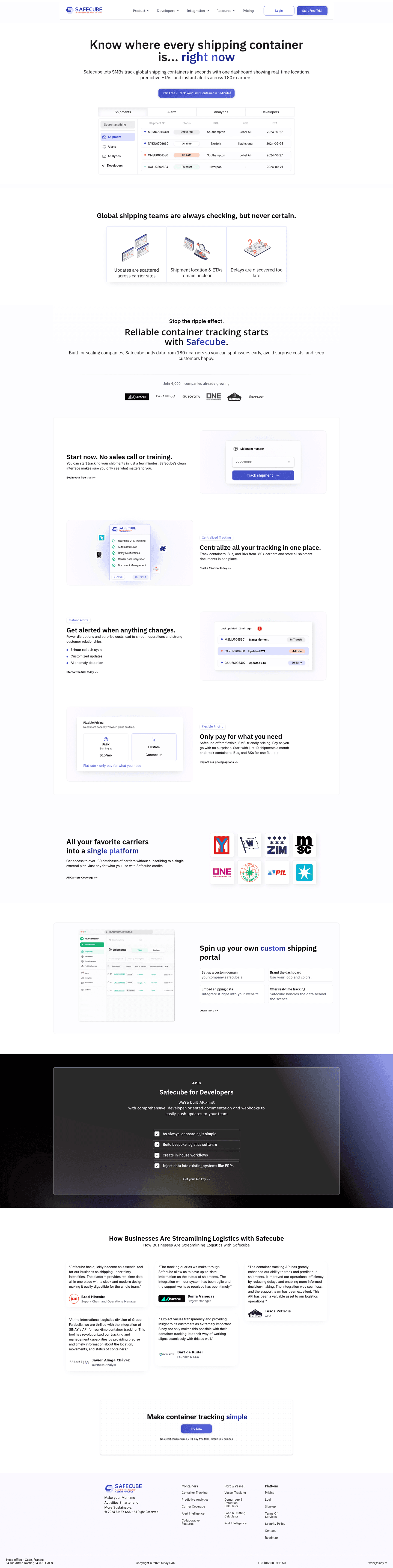
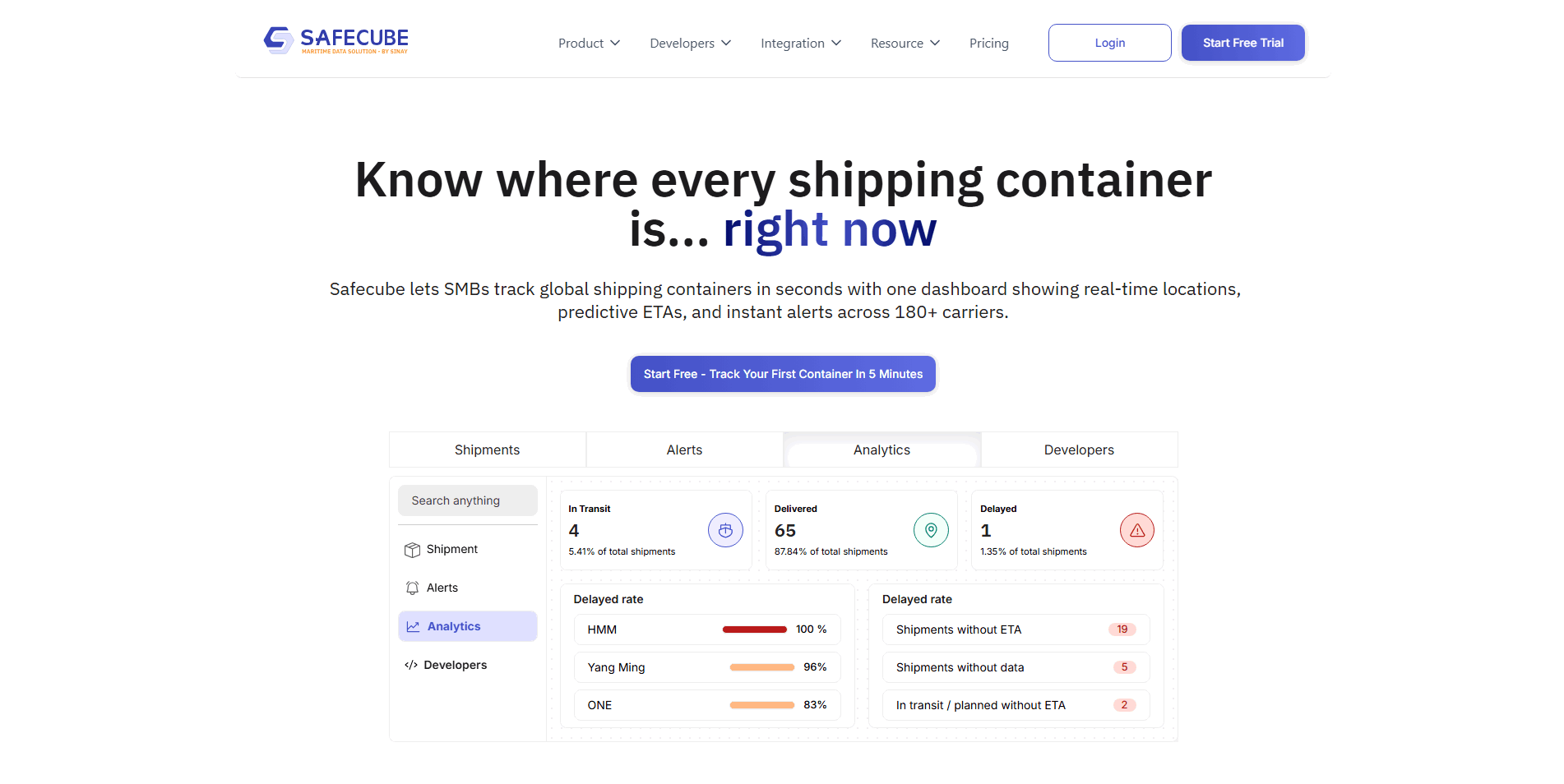
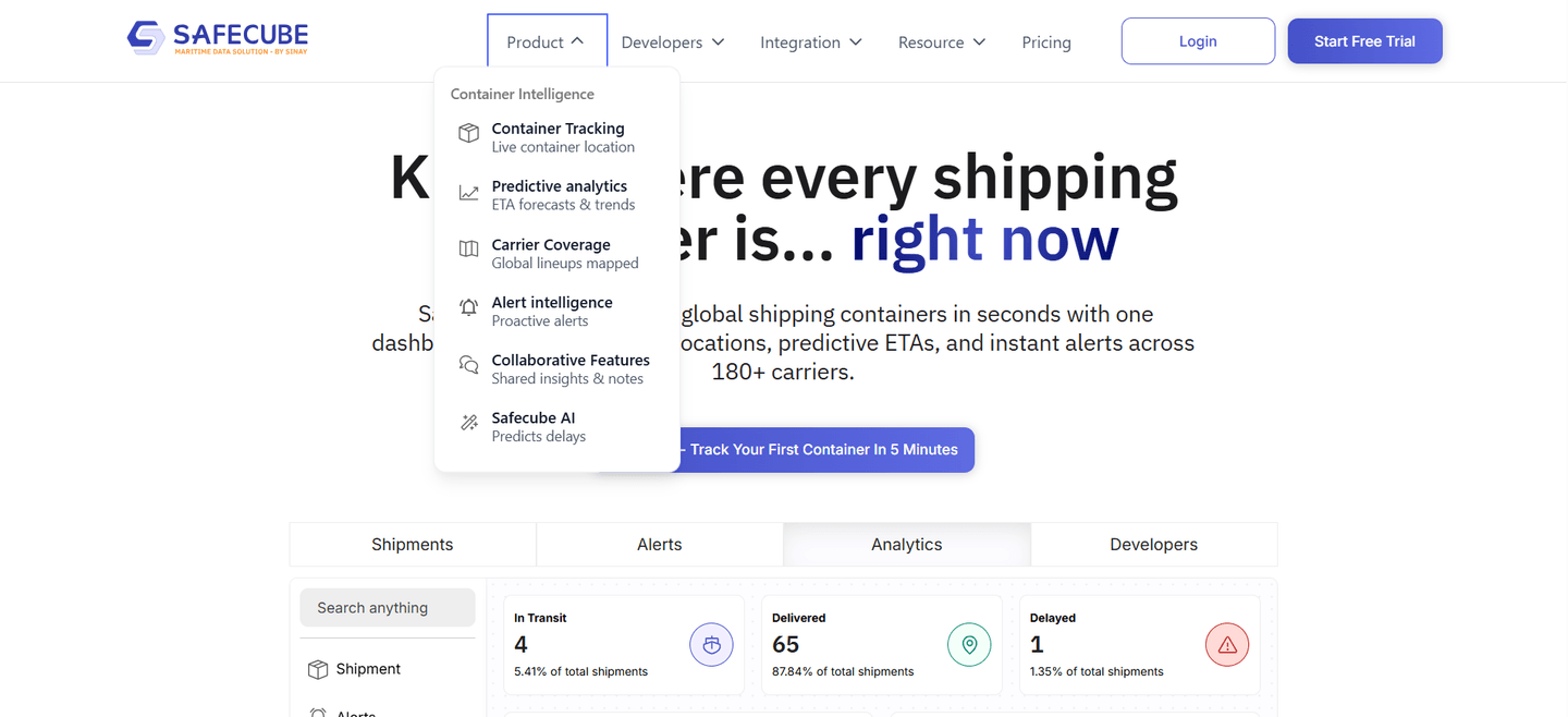
[02]

Supply chain software sells to operations teams that need proof of reliability and integration fit before trusting a new vendor. Across 3 pages reviewed, the pages that convert, Safecube, Flexport, Settel, lead with a concrete workflow ("track every shipment across carriers," "move freight with your own visibility layer"), not abstract "platform" language, and surface integration partners or shipment volume above the fold.

What is the biggest design mistake on supply chain homepages?

[03]

Leading with abstract platform language while delaying concrete workflow examples. The average page scored 47.5 across 3 homepages reviewed. Top performers replace jargon with something a logistics manager can evaluate in ten seconds: Flexport's named freight lanes, Safecube's explicit tracking surface, Settel's integration proof. If the visitor can't tell what your product actually tracks or manages, they leave.

What sections should a supply chain homepage include?
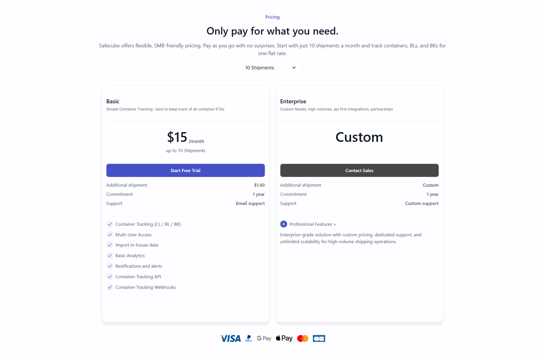
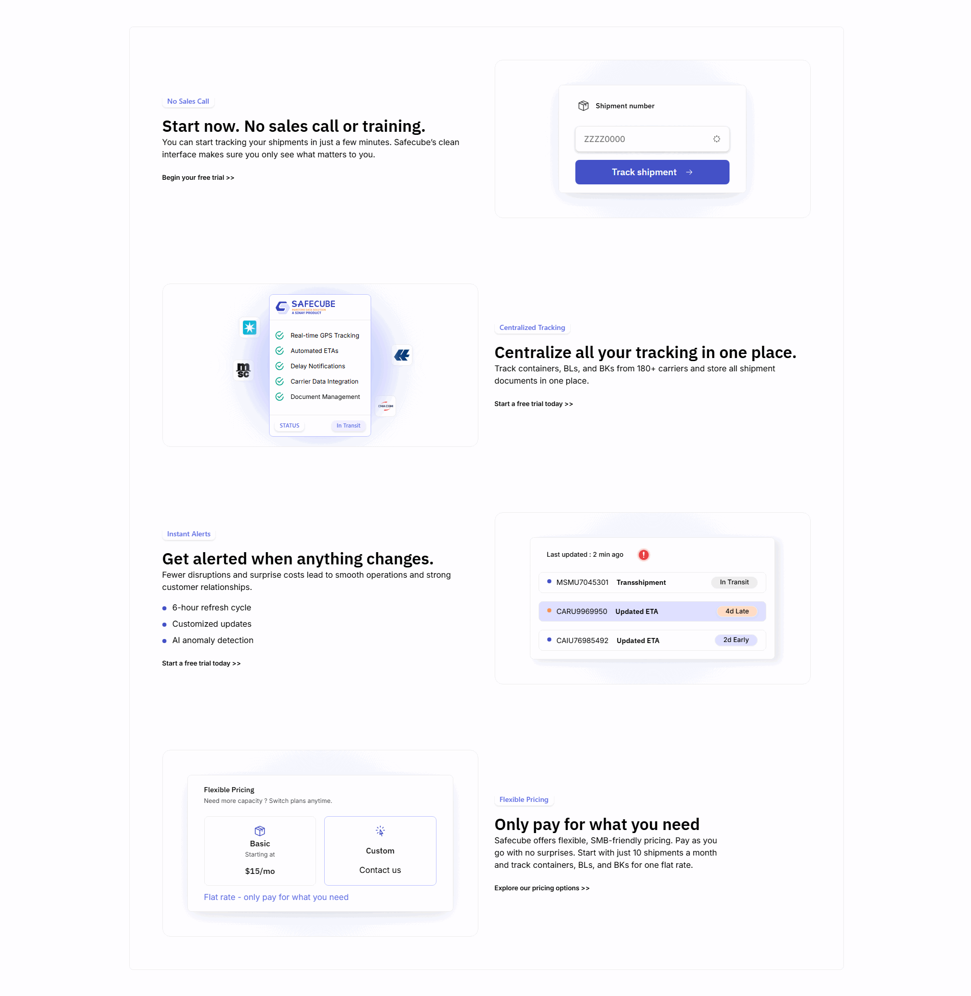
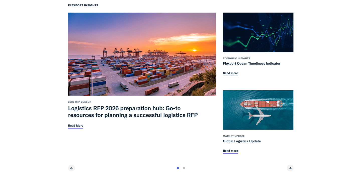
[04]

A strong supply chain homepage includes a clear hero naming the logistics problem, an early trust layer (carrier logos, shipment volume, integration partners), a product walkthrough showing the real workflow, use-case routing for operations versus procurement versus IT, and a CTA that matches operations buying expectations (demo, pilot, or a data-fit call, rarely a pure self-serve signup). Safecube and Flexport are concrete templates for how this stacks together.

How many supply chain examples do I need to review before redesigning?

[05]

Three to five strong examples are usually enough. With 3 pages benchmarked and only 11% reaching top-scoring, section-level comparison (hero vs hero, trust vs trust) matters more than collecting full-page references. Study Flexport for category-leader clarity, Safecube for tracking-surface specificity, and Settel for integration positioning.

Where can I find great inspiration for my supply chain website?

[06]

Study pages section by section, not as full-page moodboards. Browse best landing page examples for the full gallery, then drill into hero section examples and trust section examples to see how Safecube, Flexport, and Settel differ at each funnel stage.

How do I audit my supply chain homepage?

[07]

Use a structured rubric that checks clarity, trust, and friction instead of relying on subjective feedback. Run your page through the landing page analysis for a section-by-section score.