Pricing|
A monthly/annual toggle lets a buyer pick the billing rhythm that fits their budget and see the annual saving at the exact moment they choose a plan.
Key takeaways
Showing 1–28 of 39 examples


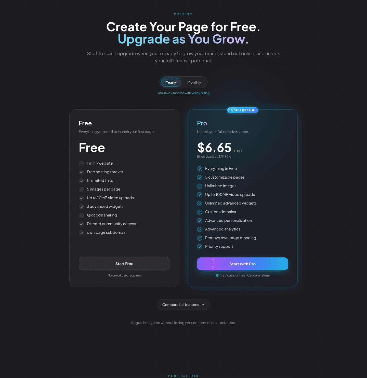
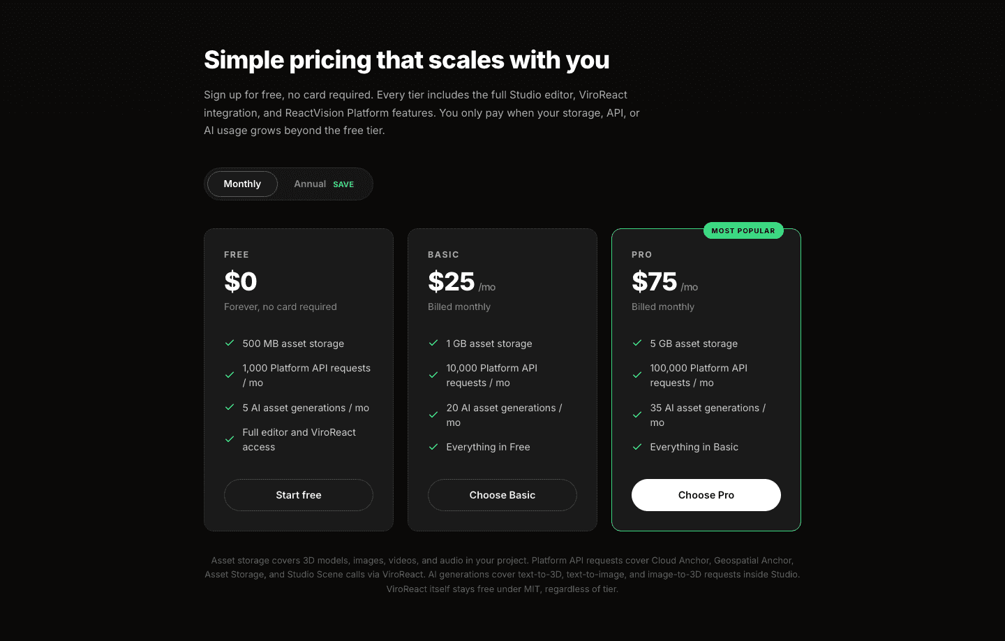
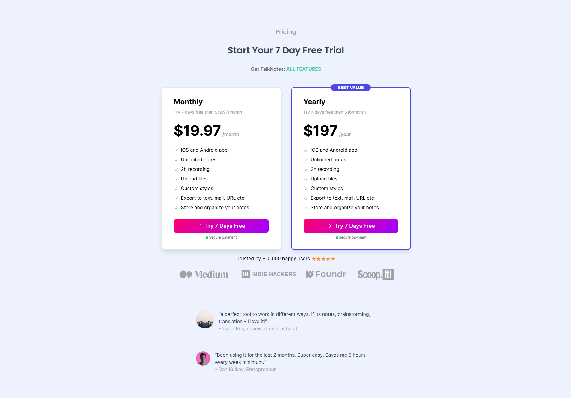
Browse every pricing pattern by UX best practice, or jump to an industry view.
Every pricing section is scored across 8 conversion best practices. Copy the best practice stack, not the layout. See what converts and why.
Hand-picked from {companies} companies and analyzed by our AI conversion agent. Not a random dump of pricing tables. Every entry earns its spot.
Found a pricing table you admire? Run yours through the same scoring engine. See where you stand on the same best practices, and what to fix first.
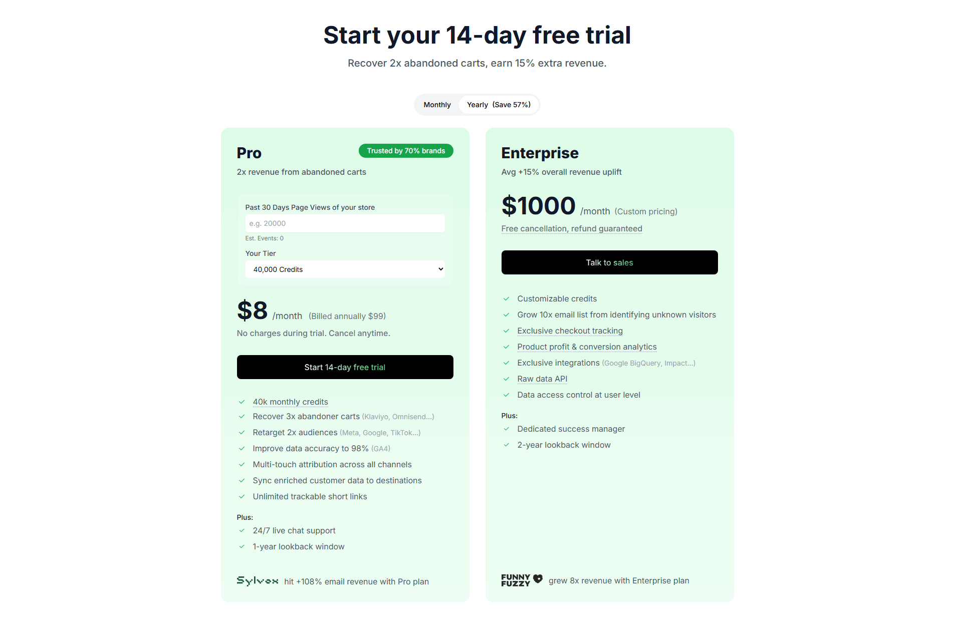
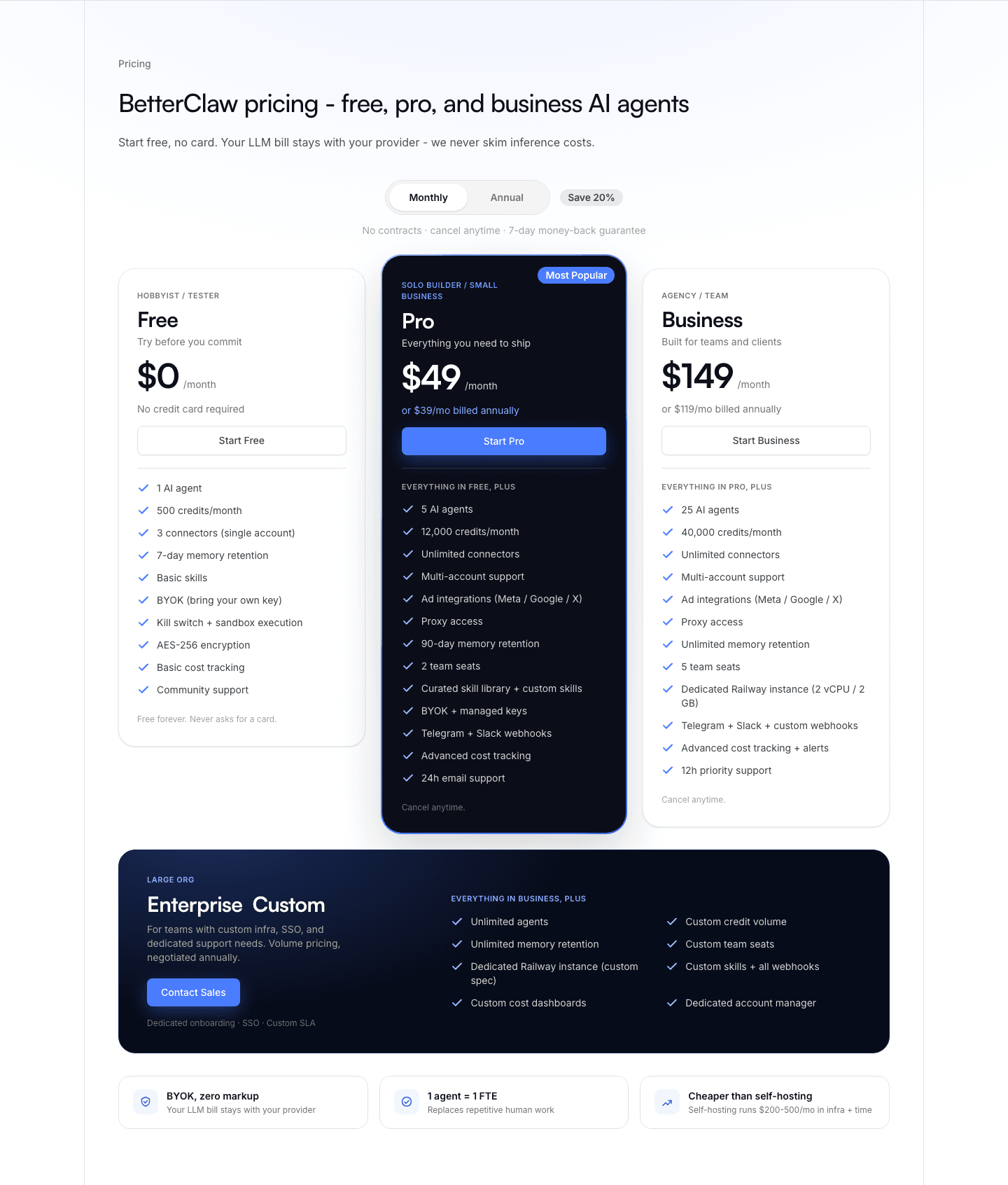
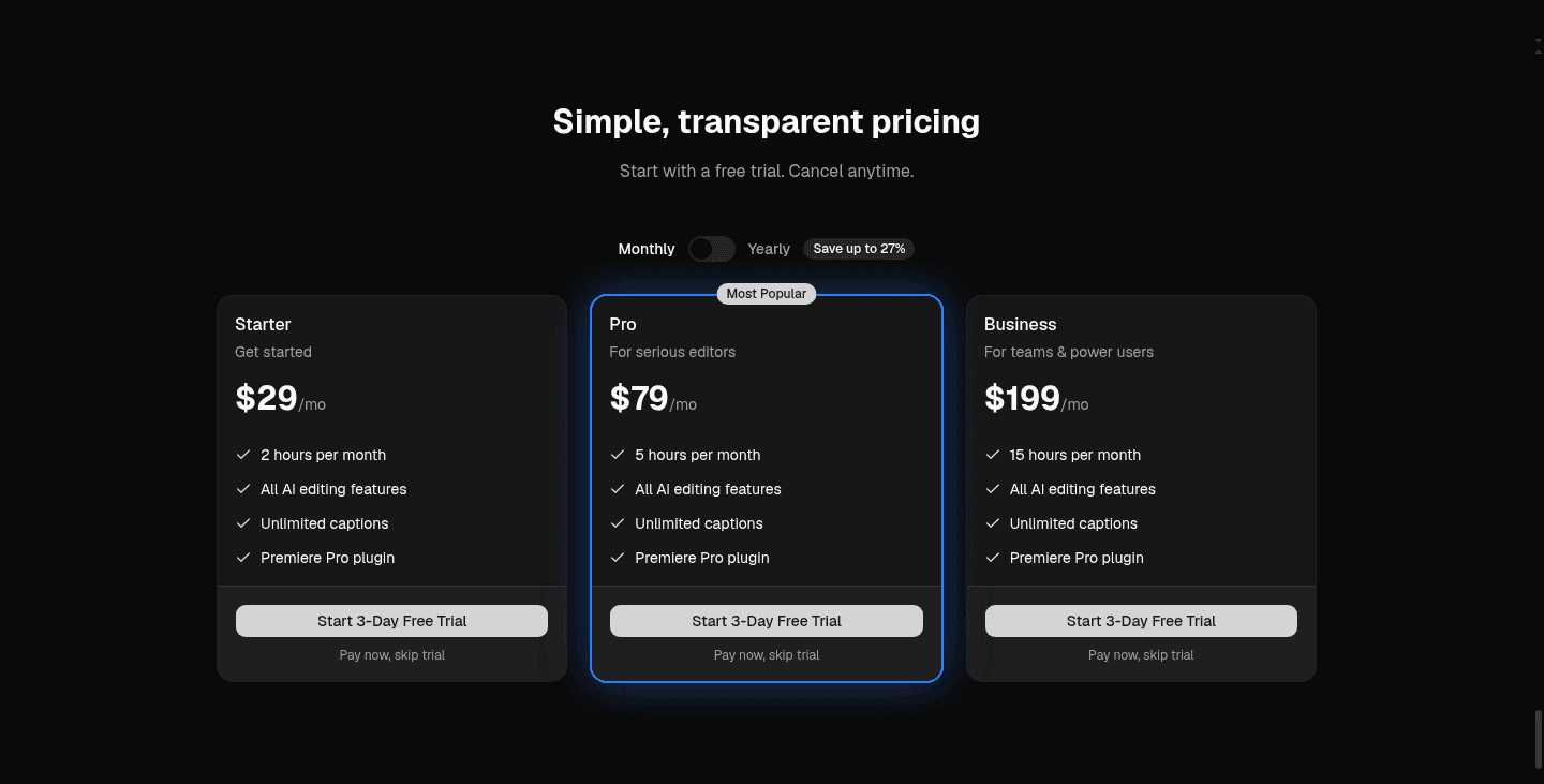
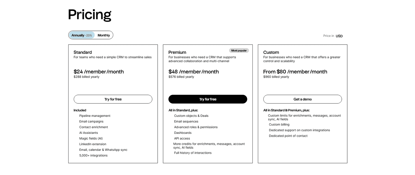
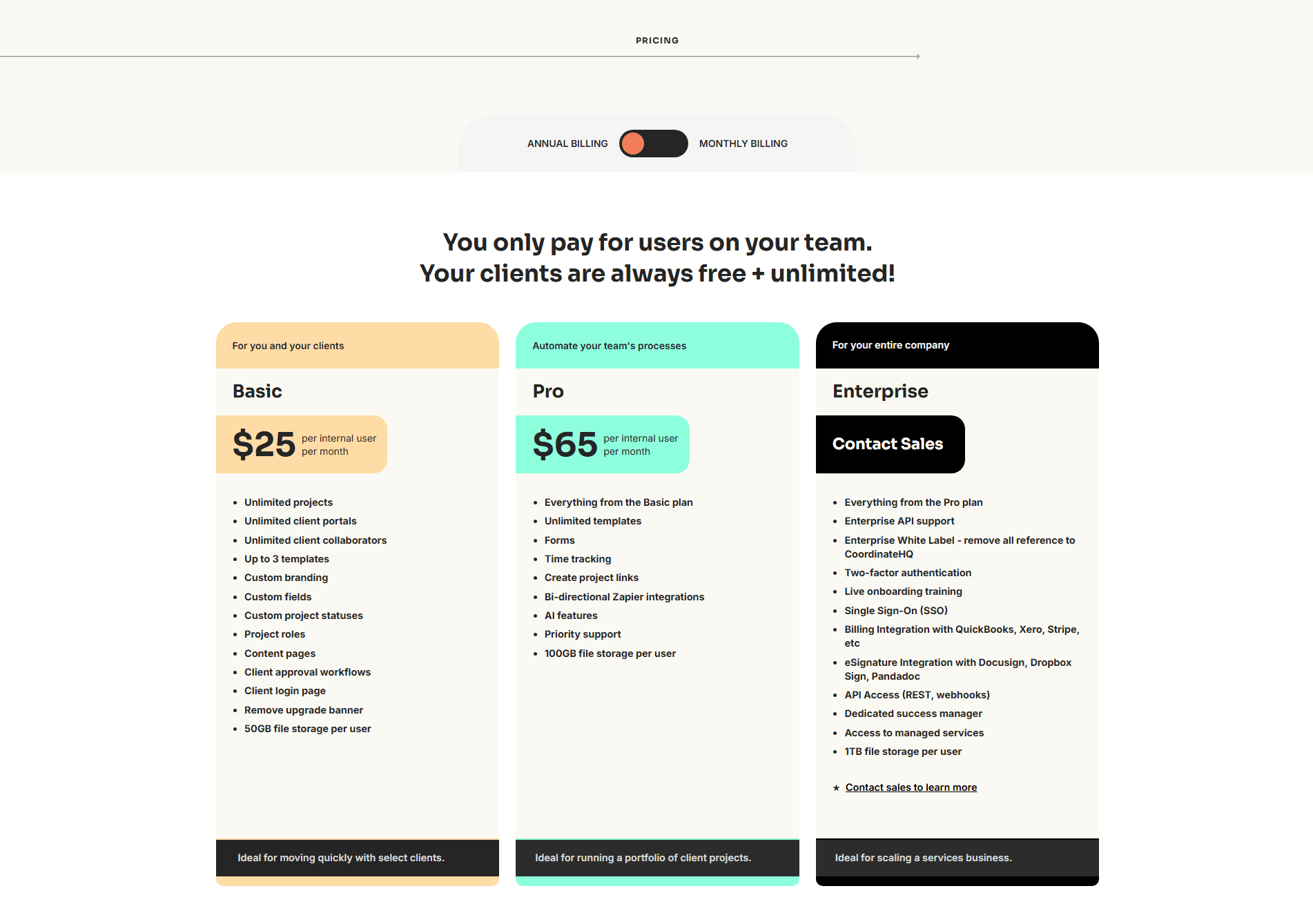
A monthly/annual billing toggle is a switch at the top of the pricing section that flips every plan between a monthly rate and a yearly one. The monthly view answers the buyer who wants a small first commitment. The annual view answers the buyer who is ready to save. Because annual billing is almost always cheaper, the toggle does a second job: it carries the discount, and it shows that discount at the moment the buyer is looking at the price.
The pattern takes a few concrete forms, and the strongest sections use more than one at once:
Buyers do not all arrive with the same budget or the same appetite for commitment. A single fixed price forces one group to feel wrong: shown only a monthly rate, the annual buyer misses the deal they would have taken, and shown only an annual rate, the cautious buyer balks at the upfront ask. A toggle removes the conflict by letting each buyer see the plan on their own terms.
The saving is the other half of the pattern. Placed on the toggle, the discount lands at the exact moment the buyer is weighing the number, so the yearly commitment reads as a deal rather than a bigger bill. A percentage, a struck-through price, or a spelled-out total does the persuading right where the decision is made, which is why the toggle rarely travels without one.
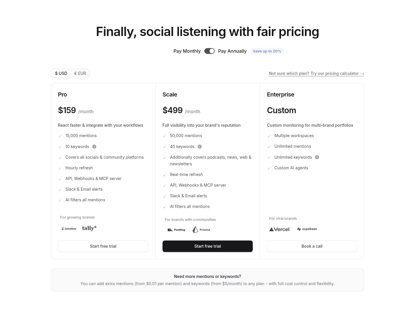
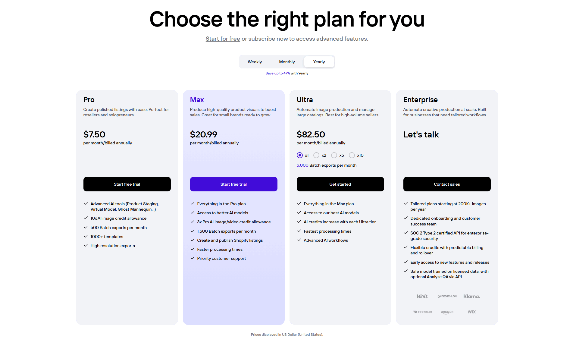
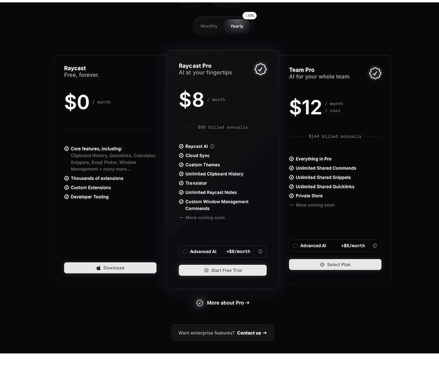
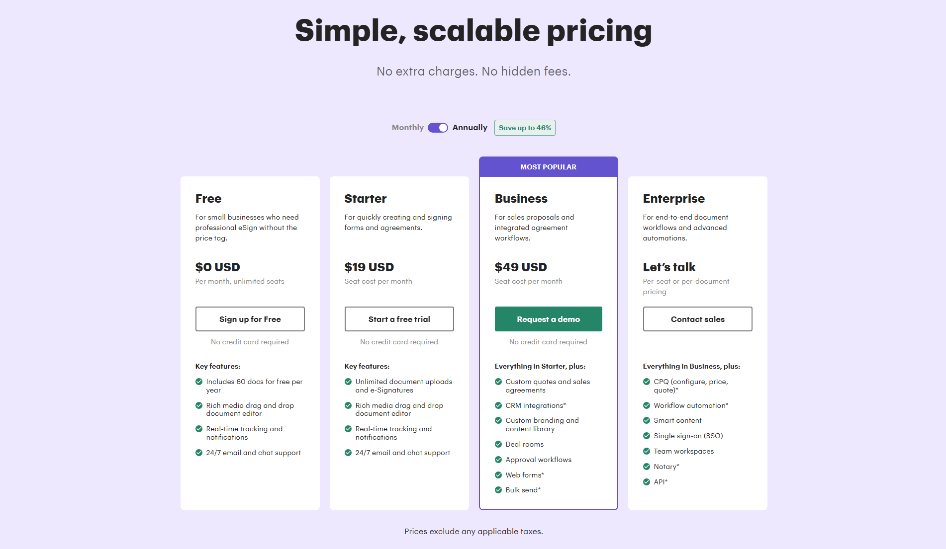
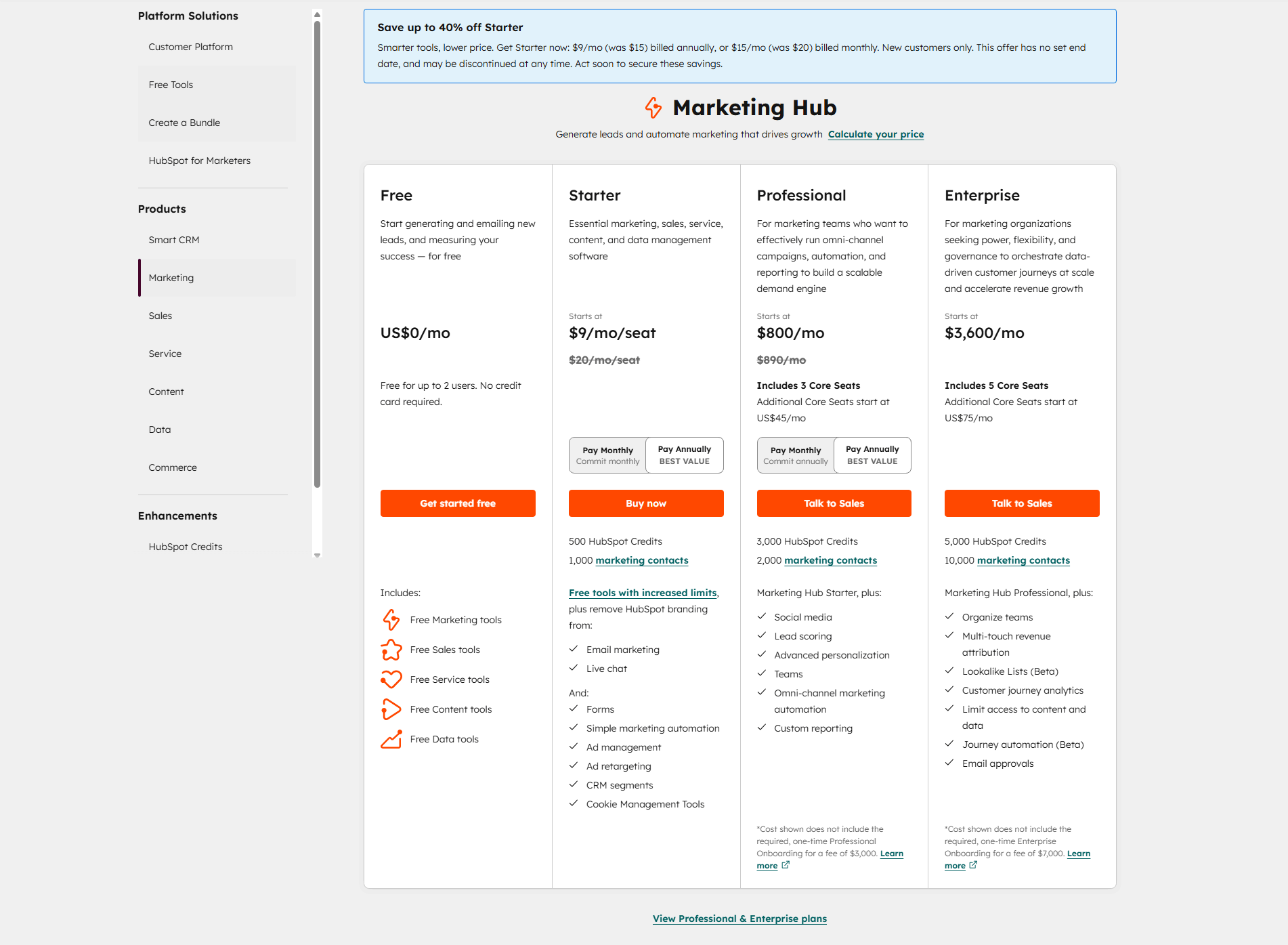
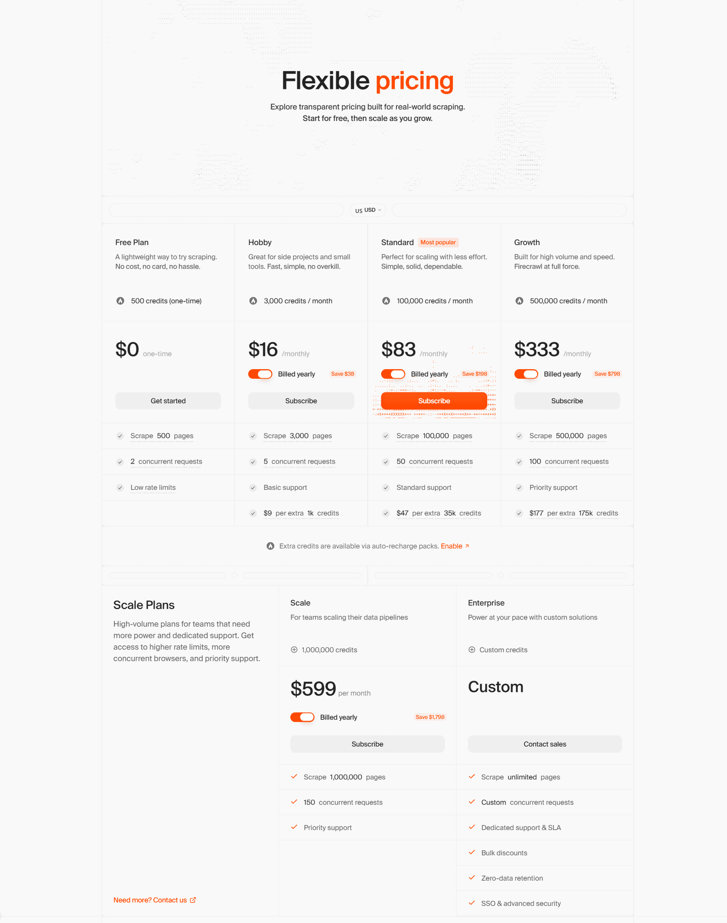
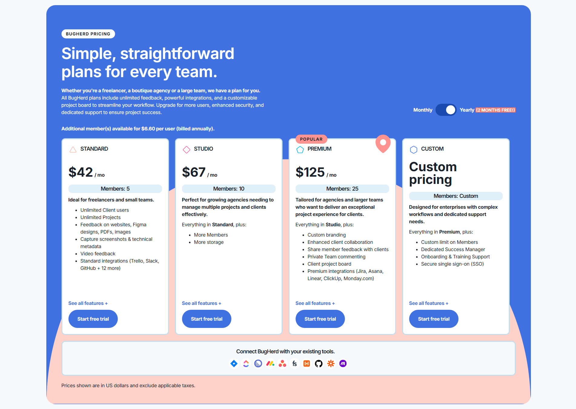
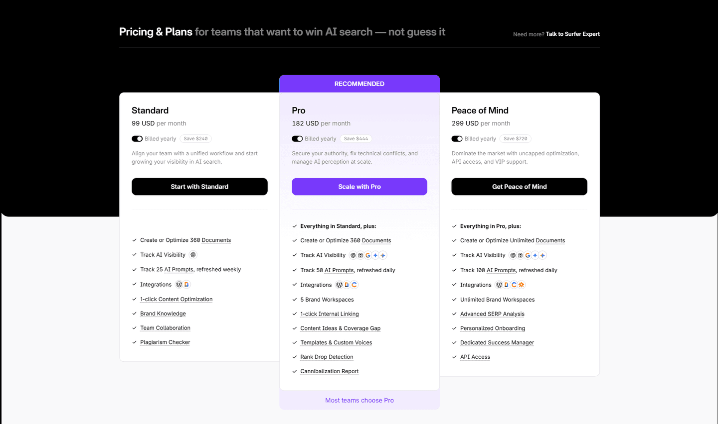
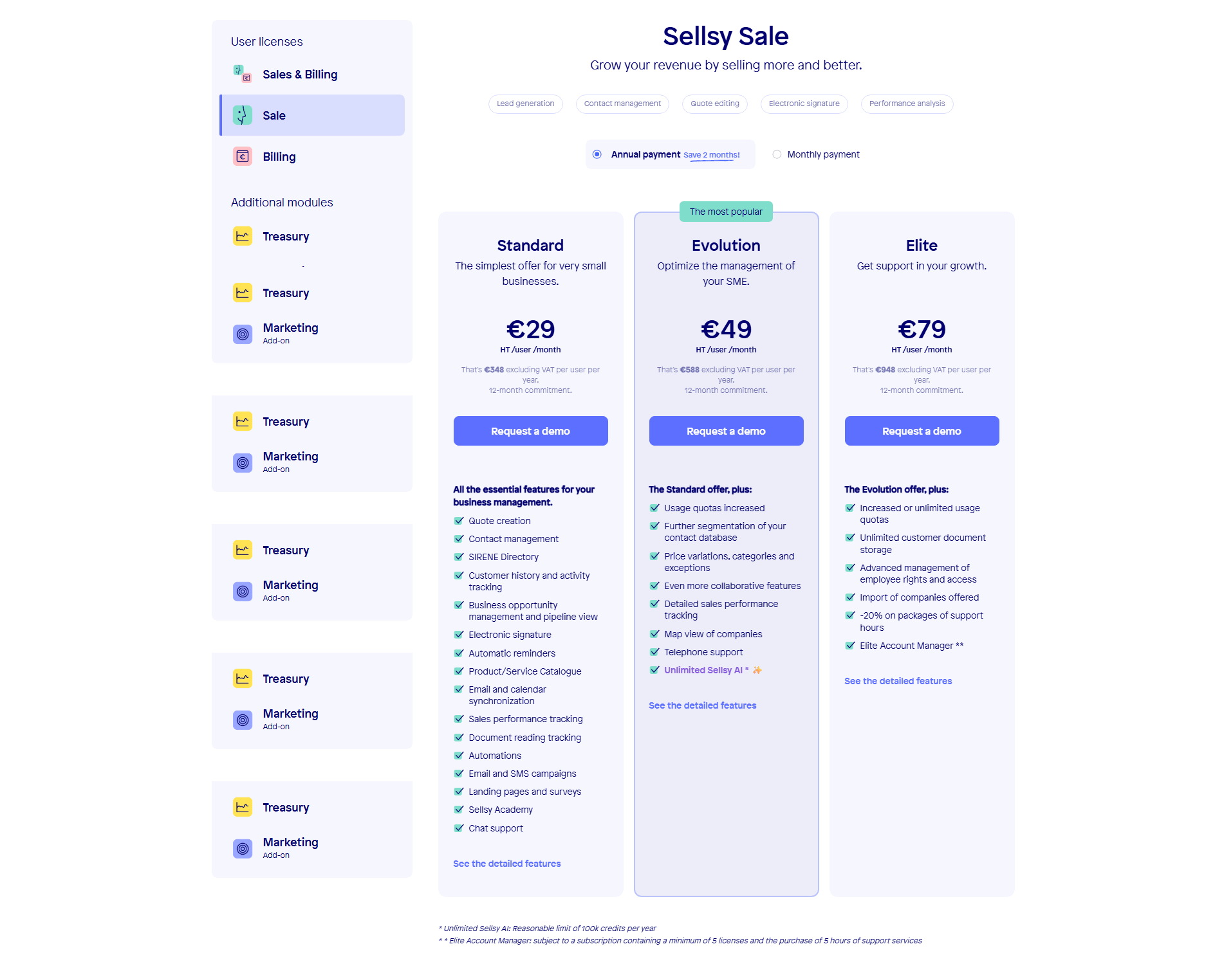
Across the scored examples below, the toggle earns its place when it makes the saving obvious and honest. Raycast pairs its -29% yearly toggle with the annual total under each price (billed $96 and $144), so the discount and the real commitment are both in view. Surfer SEO skips the percentage and states the money directly, listing Save $240, $444, and $720 on the three cards, which is harder to wave away than a vague label. PhotoRoom and PandaDoc lead with a large percentage (Save up to 47% and Save up to 46%) because the discount is their strongest argument for the year. Sellsy and Bugherd translate the saving into time, flagging Save 2 months and 12 months free, and HubSpot pairs its Pay Annually toggle with strikethrough was-prices and a BEST VALUE mark so the recommended option is unmistakable. Octolens goes one step further and adds a USD/EUR switch beside the monthly/annual one, removing a second friction for global buyers.
The toggle is one lever among several in a pricing section. It works best next to the risk reducers a pricing section uses, such as a free trial or a no-card start, and the per-feature breakdown that justifies each tier, so the buyer picks a rhythm, sees the saving, and understands what the plan actually includes.
100/100 0/100
0/100The usual failure is a toggle that hides the saving: a Billed yearly label in small gray type with no number attached, so the buyer has to do the arithmetic and the discount does no work. The second is a toggle that flips the price but never shows the annual total, so the yearly commitment becomes a surprise at checkout. The third is inconsistency, where the percentage badge and the actual price do not match, which reads as a mistake and costs trust at the worst possible moment. Show the saving in plain numbers, spell out what a year really costs, and flag the option you want chosen.

Curated by
Gabriel Amzallag , Founder, Web Anatomy
5 years CRO + SEO at Qonto (2021–2025). After advising 15+ SaaS on their websites (Payfit, Pigment…), the same patterns kept breaking, so I decided to build the source of truth on what works on the web: the intelligence layer every tool, builder, and team uses to ship sites that perform.
We find every way to grow your website’s visibility and conversions: SEO, AI search (AEO), backlinks and mentions, and UX/UI. 3 free opportunities, delivered by email.
The common questions about billing toggles and annual savings in pricing, with answers drawn from 39 scored examples.
It is a switch at the top of a pricing section that flips every plan between a monthly rate and an annual one. Because annual billing is usually discounted, the toggle also carries the saving, shown as a percentage like Save up to 20%, a struck-through monthly price, the exact yearly total, or a best-value flag on the annual option. It lets a buyer choose the billing rhythm that fits their budget without leaving the page.
Buyers arrive with different budgets and different appetites for commitment. A single fixed price forces one of them to feel wrong: monthly looks expensive next to competitors, annual looks like a big upfront ask. A toggle lets each buyer see the plan on their own terms, and it puts the annual saving in view at the exact moment they are weighing the price, which turns the yearly commitment into an obvious deal rather than a bigger bill.
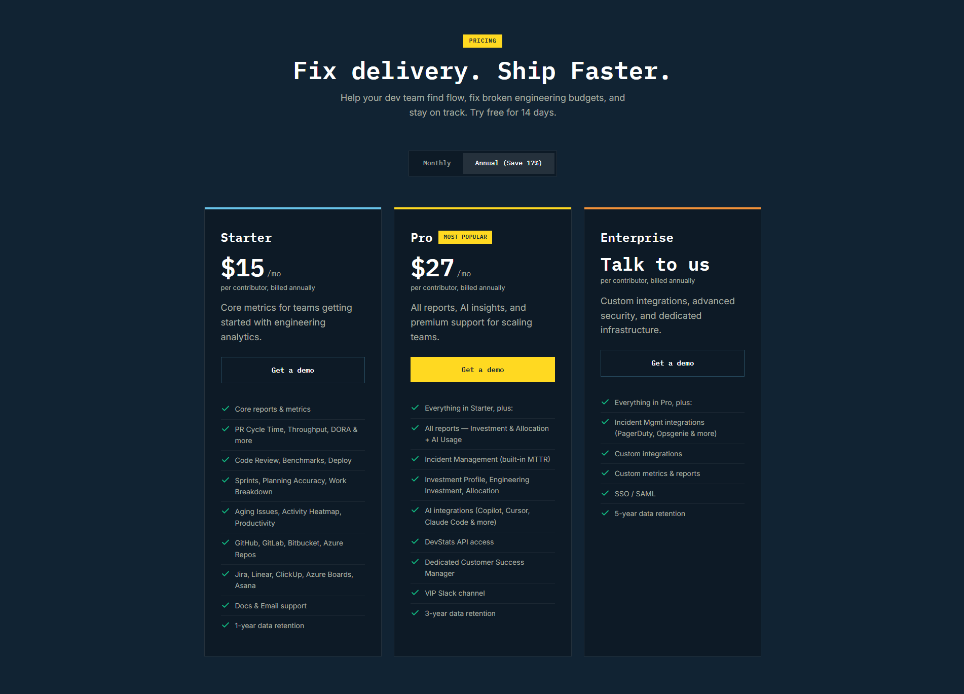
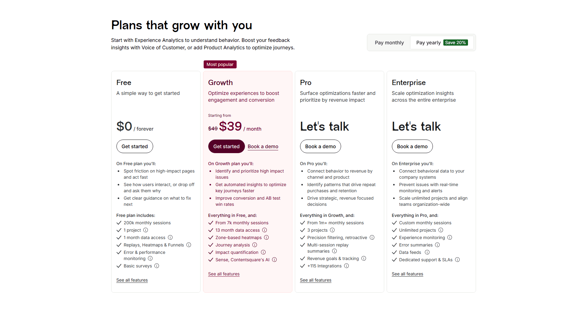
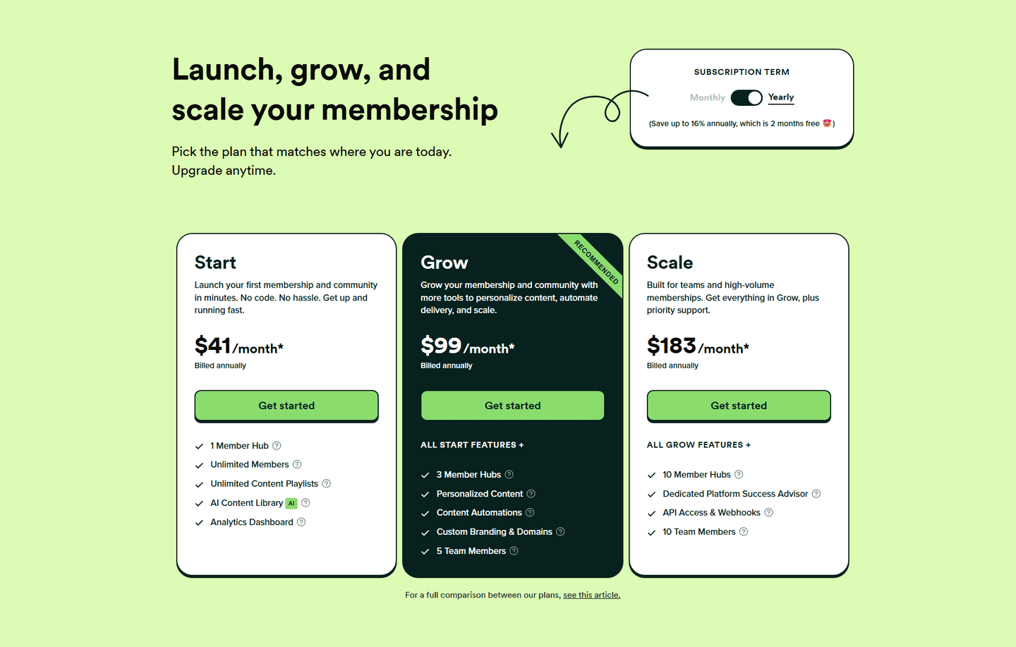
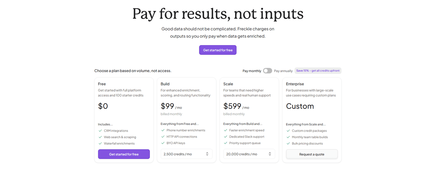
It ranges widely across the scored examples. Raycast shows -29% on its yearly plans, PhotoRoom flags Save up to 47%, and PandaDoc tags Save up to 46%, while others sit lower: Octolens and Contentsquare show around 20%, DevStats 17%, and Freckle 15%. Some skip the percentage and state the money instead, like Surfer SEO listing Save $240, $444, and $720 on each card, or spell out the equivalent, like Bugherd offering 12 months free and Sellsy Save 2 months.
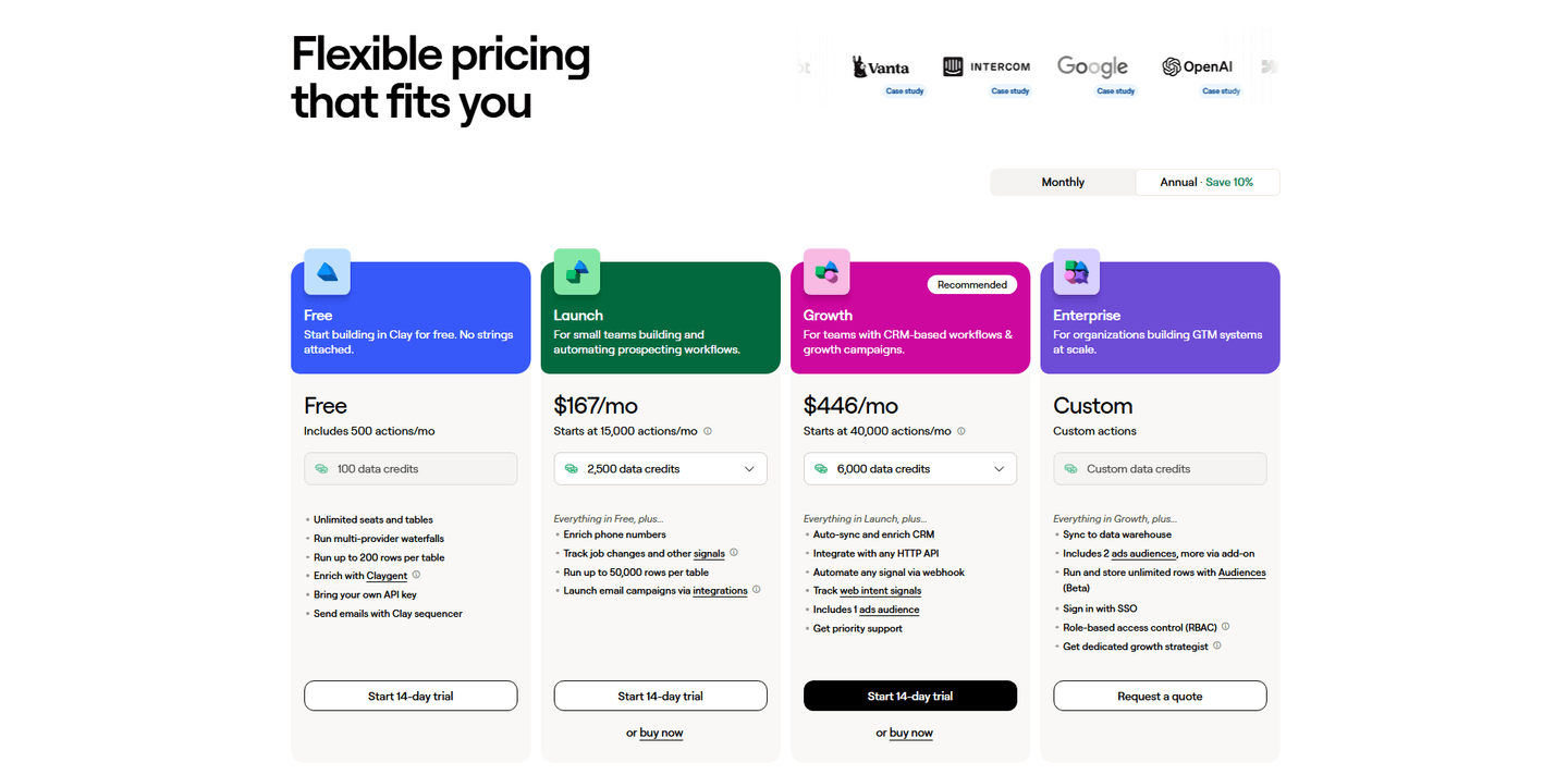
Most strong examples default to the annual view, because it shows the lower monthly-equivalent price and frames the section around the discount. What matters more than the default is that the switch is honest and legible: the saving is stated in plain numbers, the annual total is shown so the yearly commitment is not a surprise at checkout, and the option you recommend is clearly flagged, the way HubSpot marks annual as BEST VALUE.
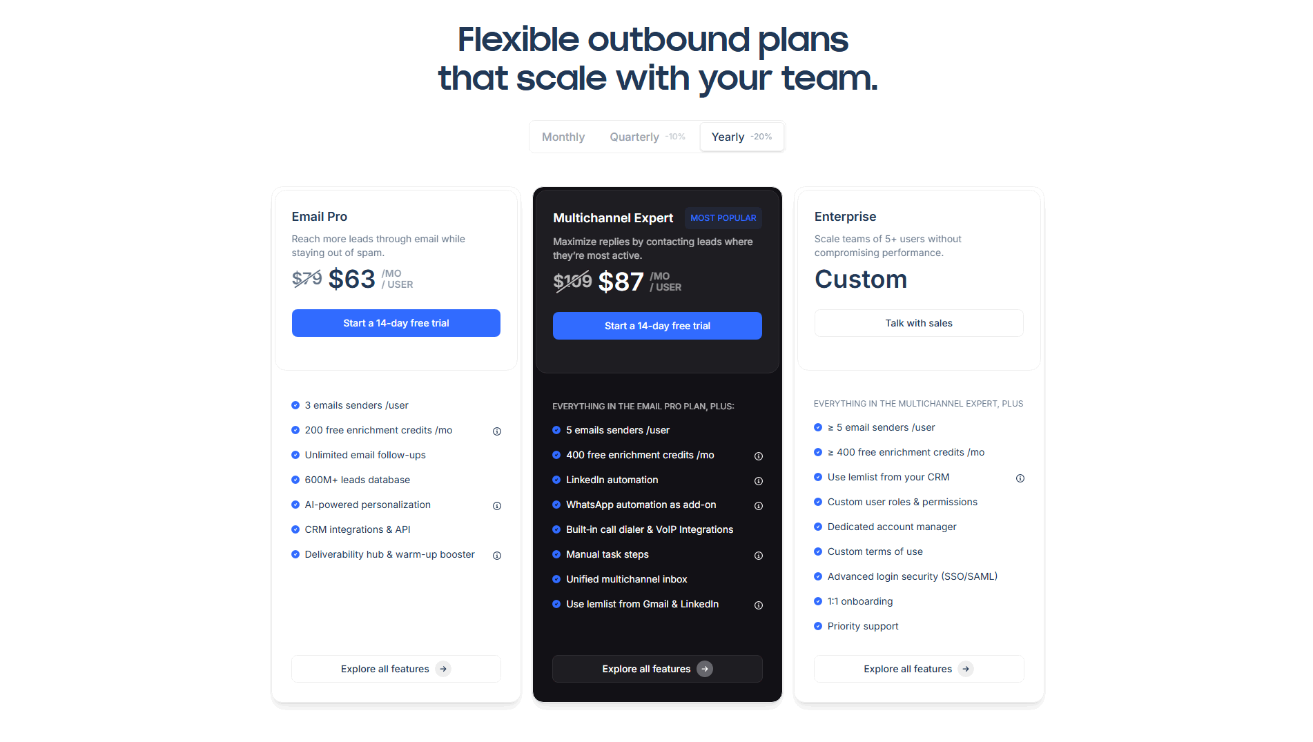
The clearest sections make the saving impossible to miss and easy to verify. A percentage badge sits next to the toggle, and the card itself often shows a struck-through monthly price, like Lemlist moving $79 to $63, or the annual total in words, like Raycast noting billed $96 annually. The weakest versions hide a Billed yearly label in small type with no number attached, so the buyer has to do the math themselves and the discount does no work.