Pricing|
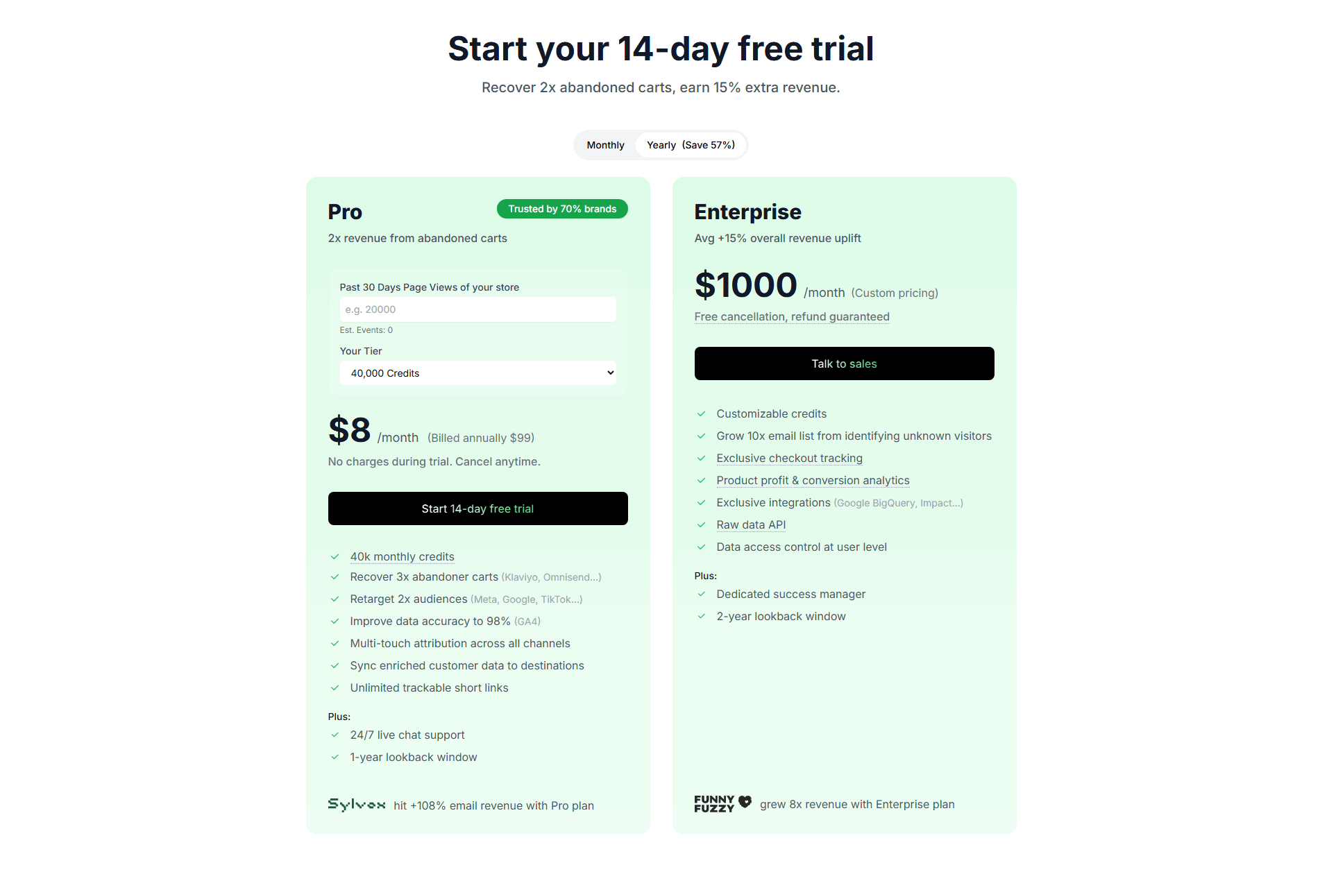
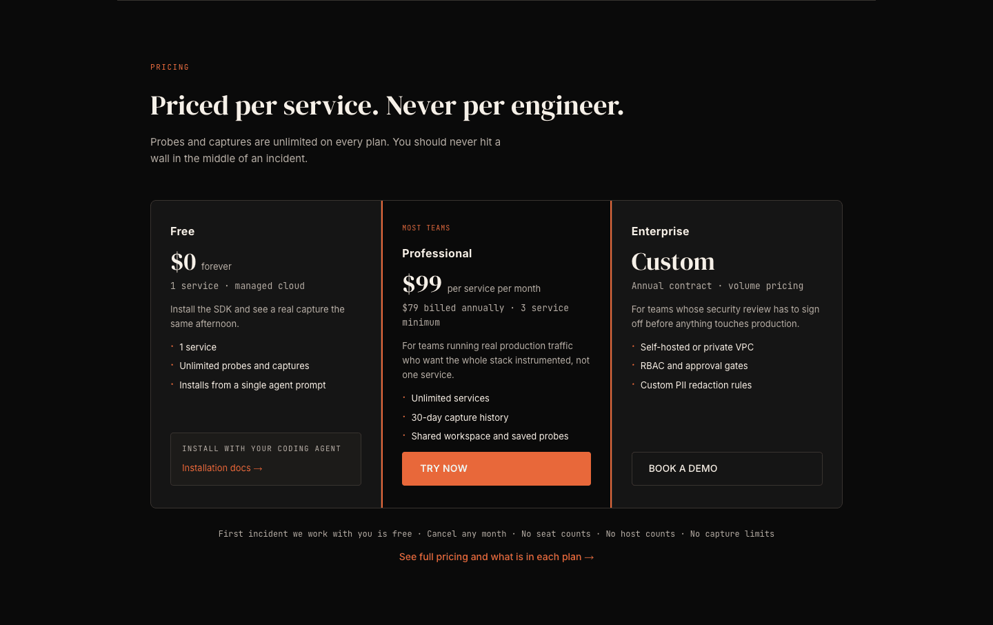
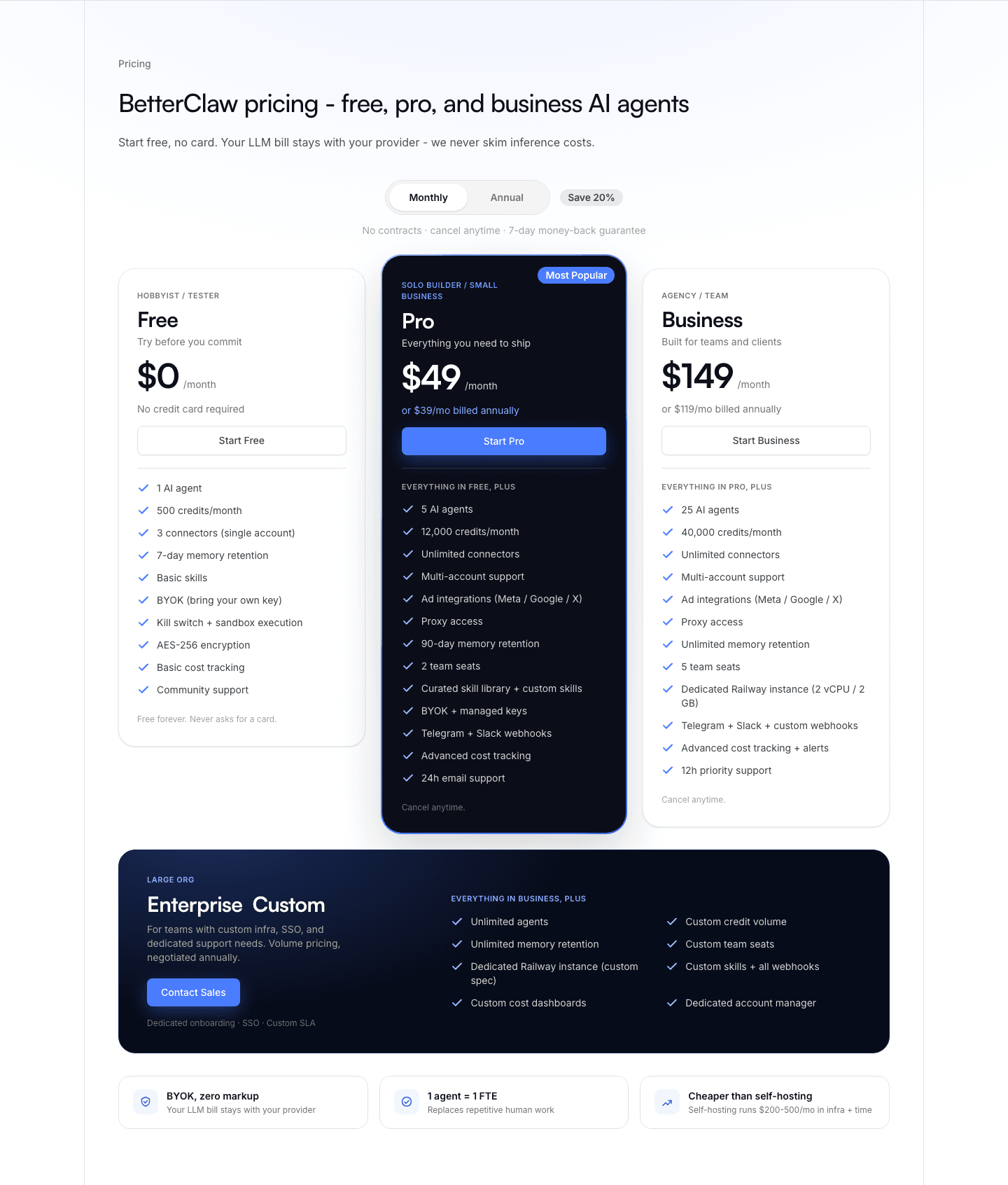
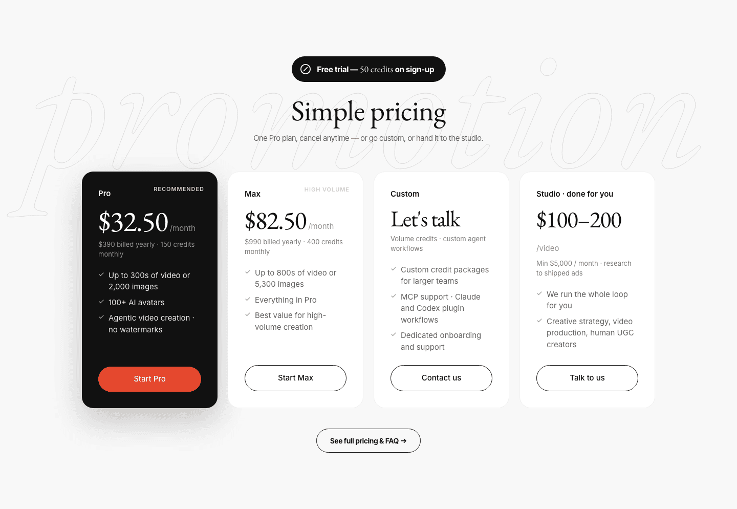
Risk-reducer pricing lowers the commitment barrier at the moment doubt peaks, pairing the plan with a free trial, a guarantee, or a no-card start so a hesitant buyer has less to lose by trying.
Key takeaways
Showing 1–28 of 62 examples
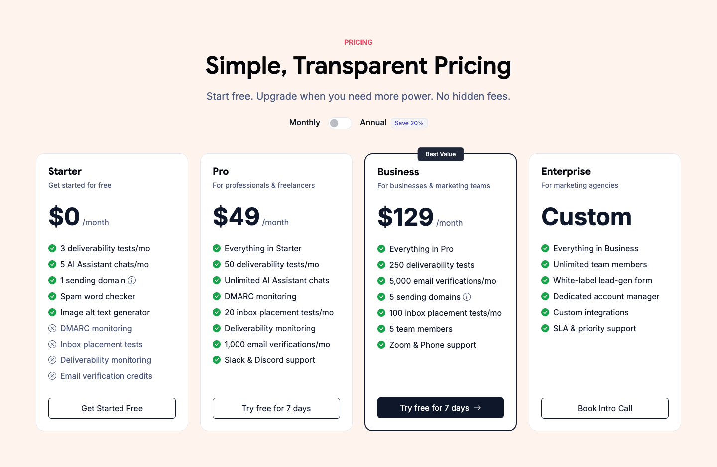
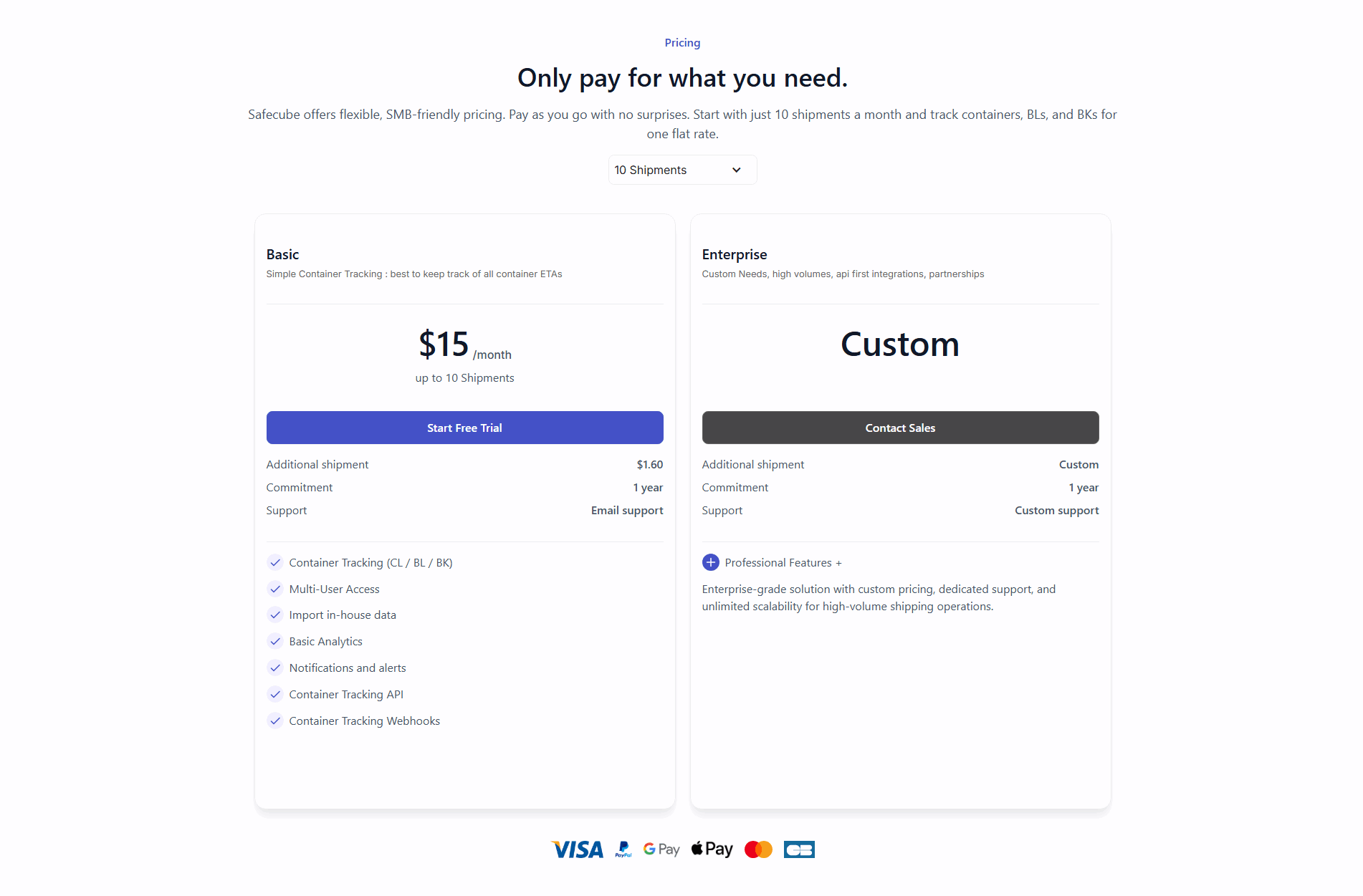
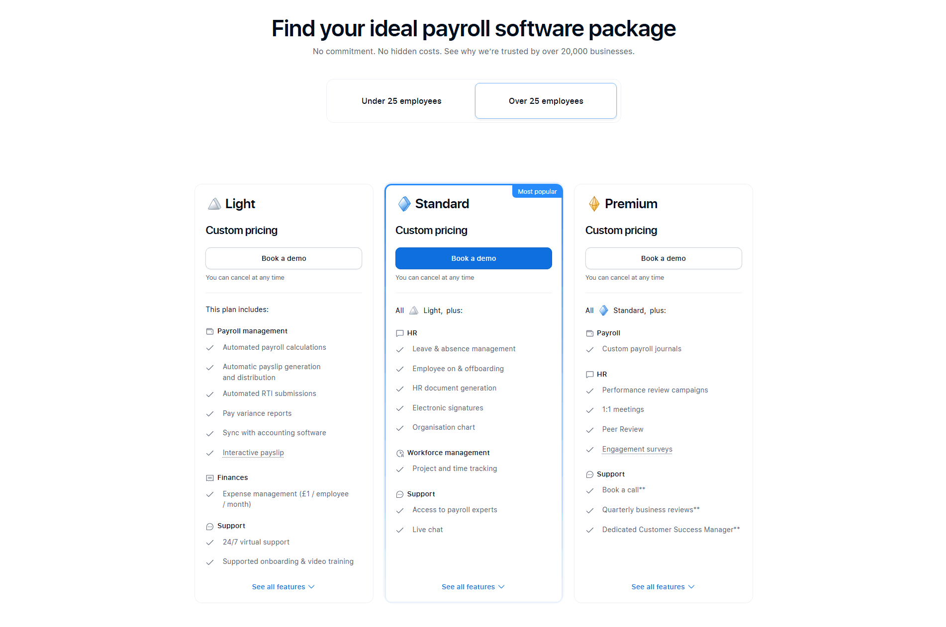
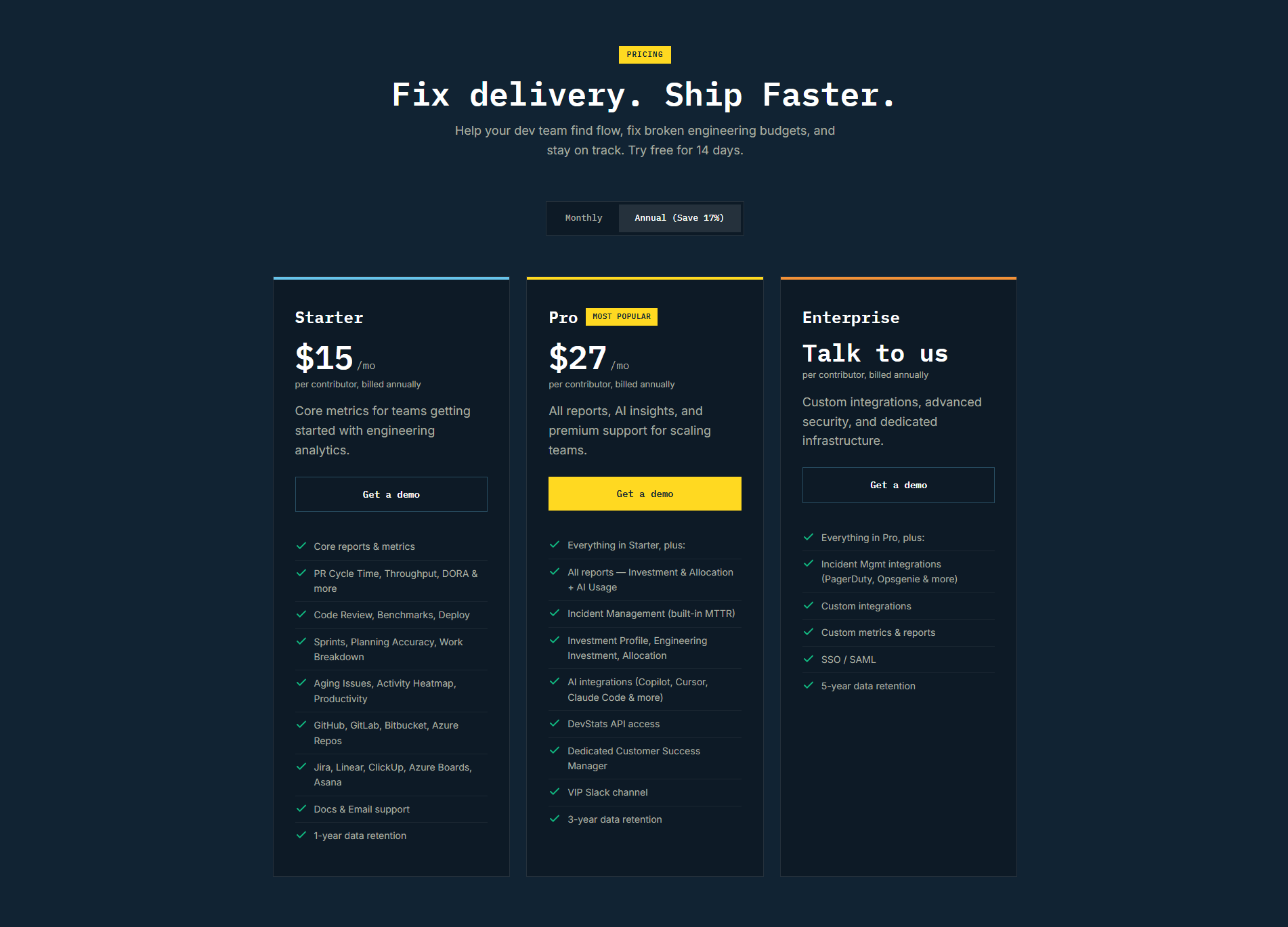

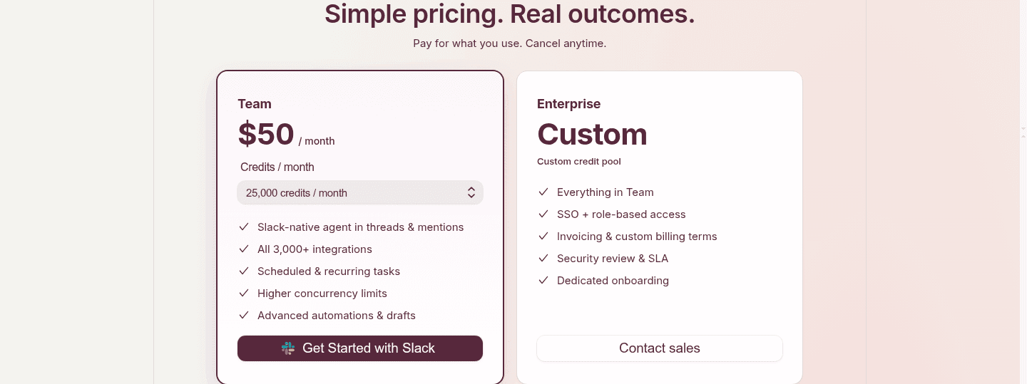
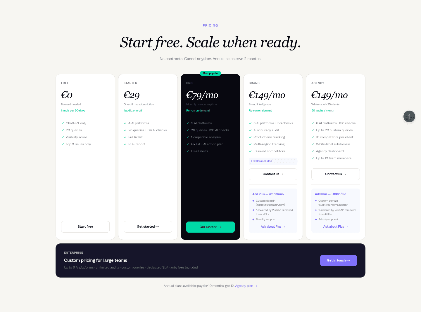
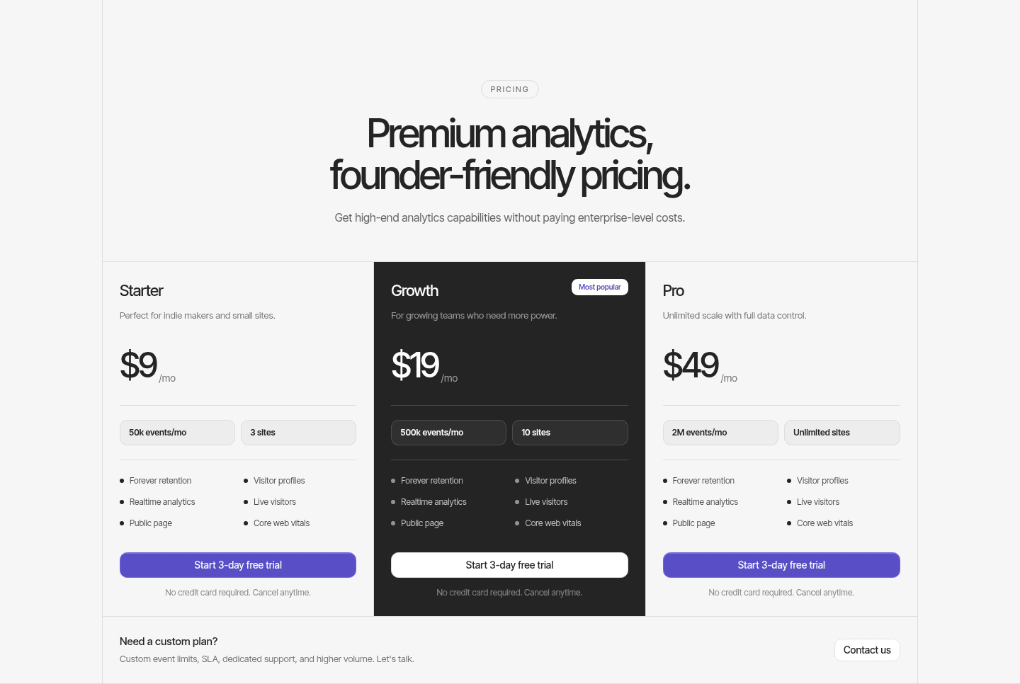
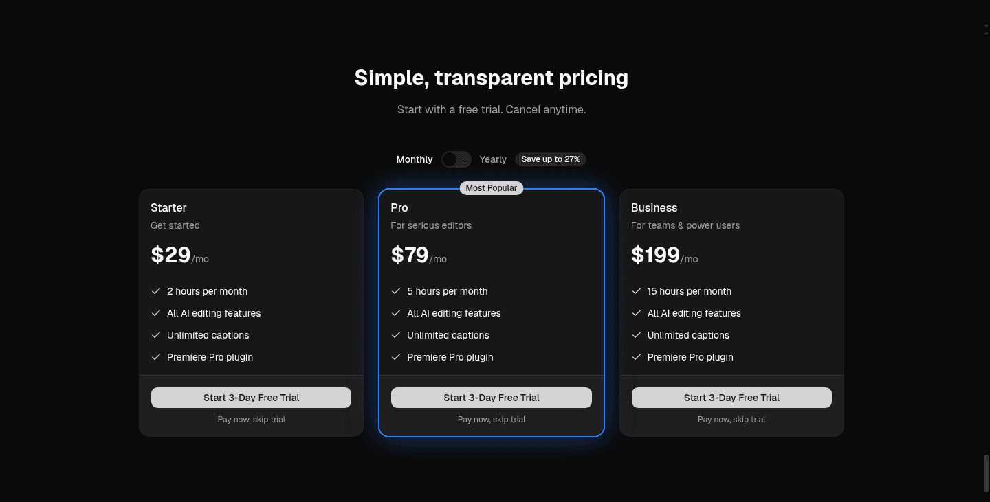
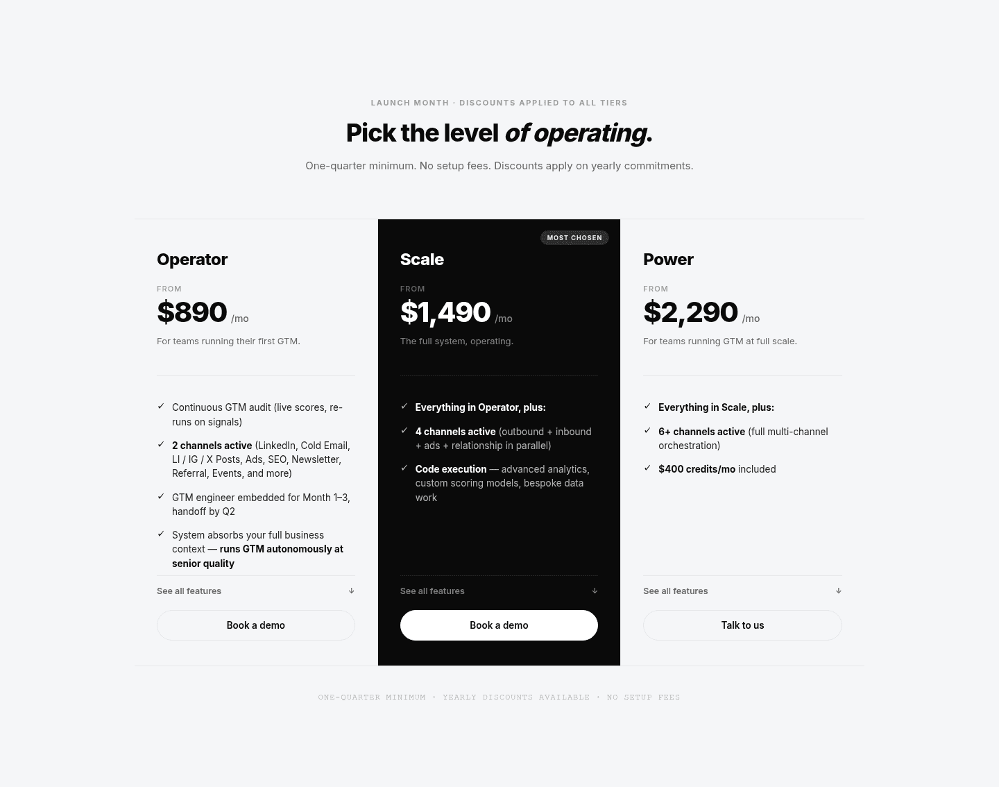
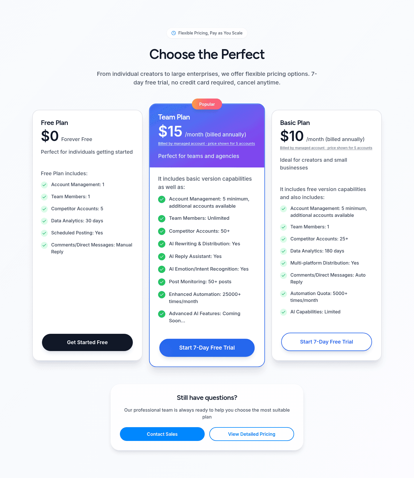
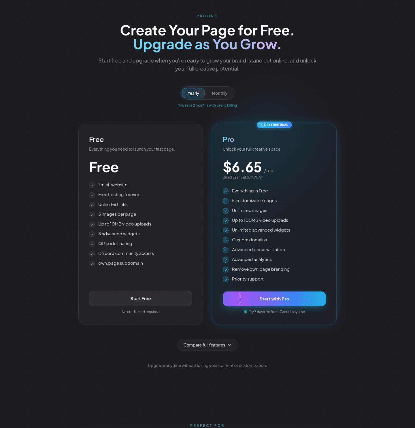
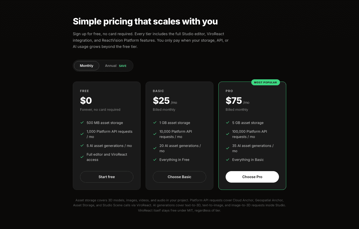
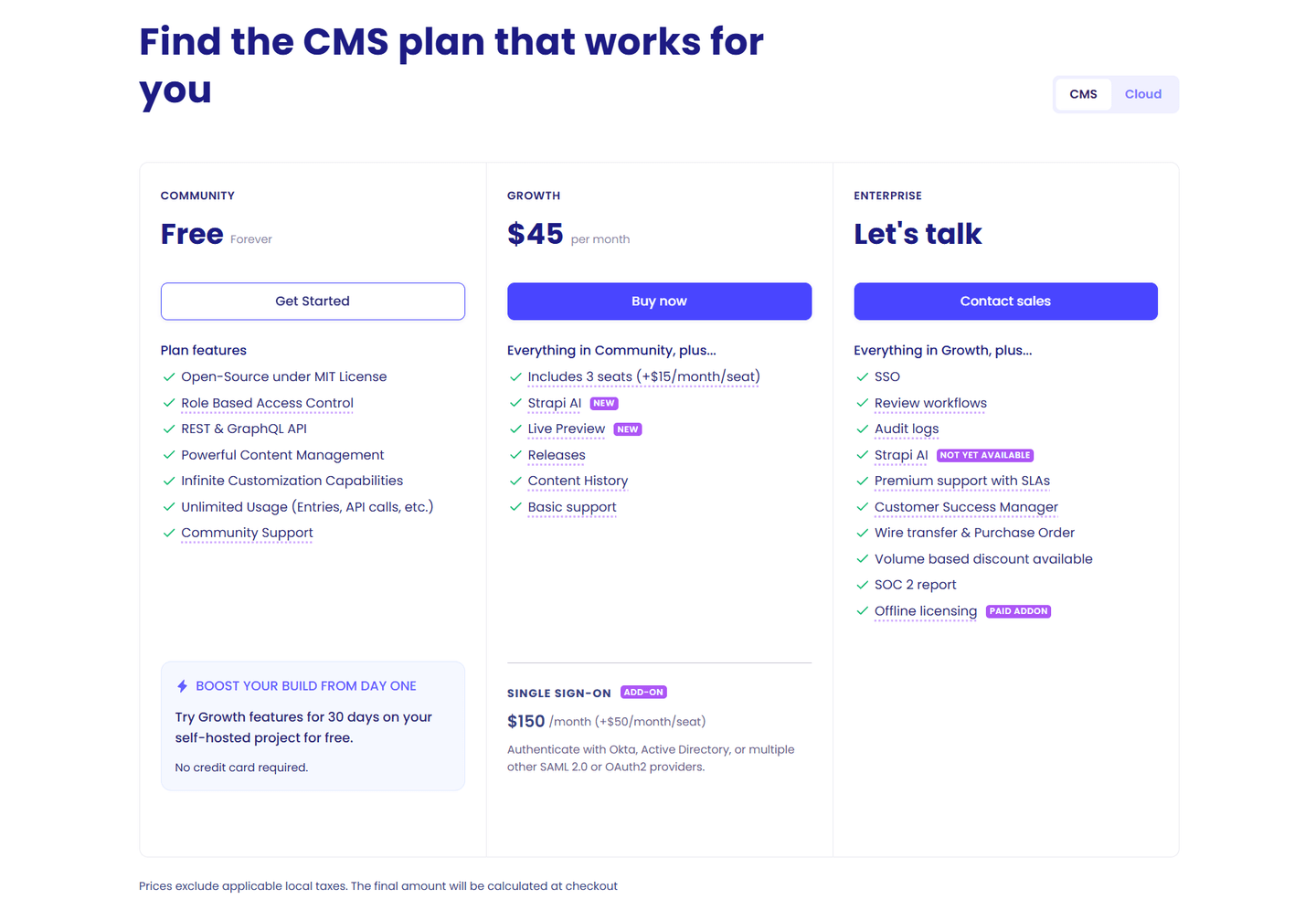
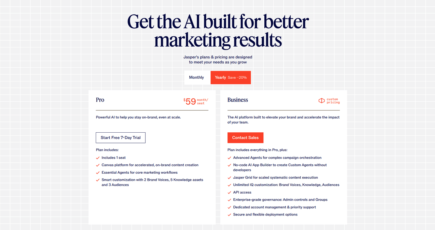
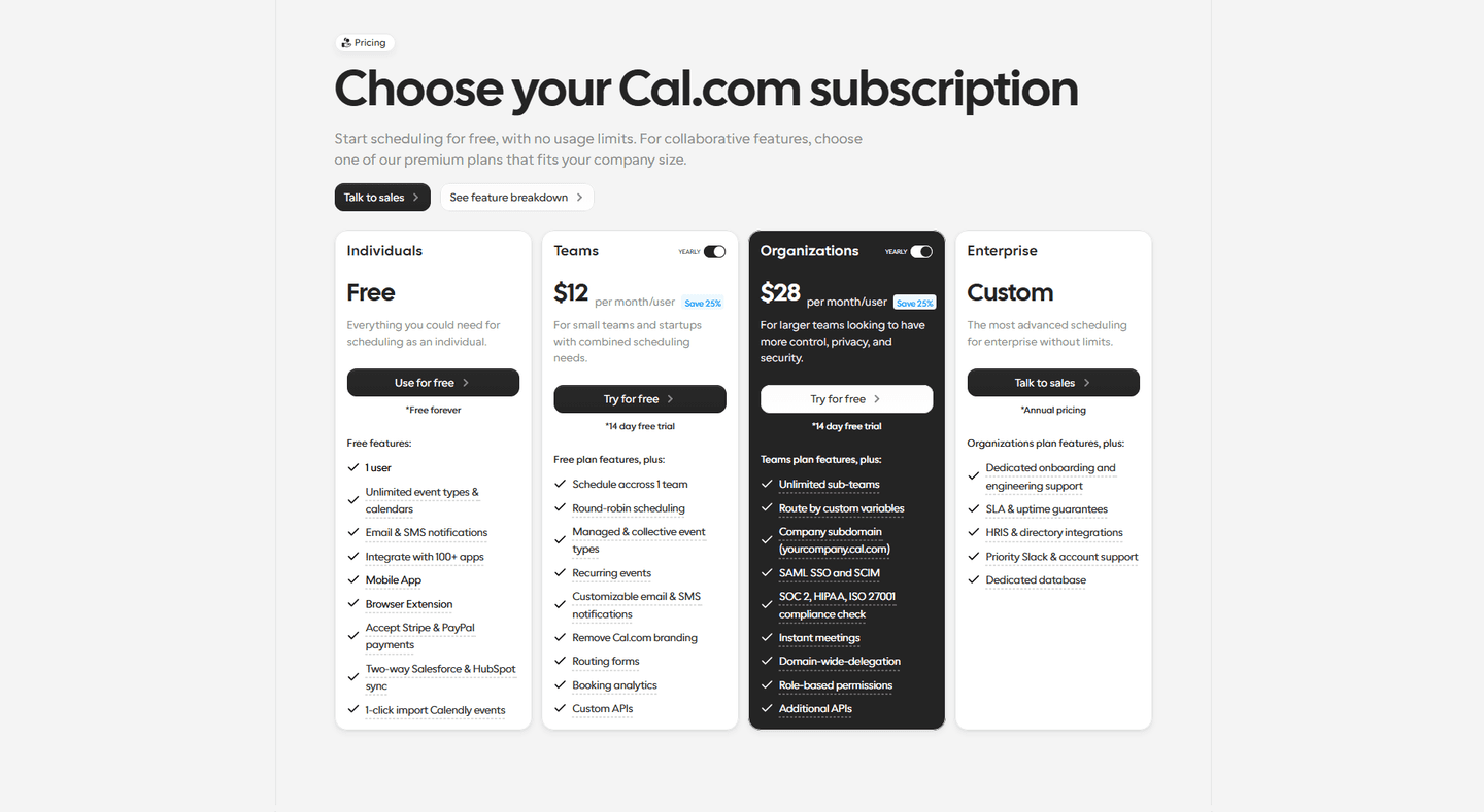
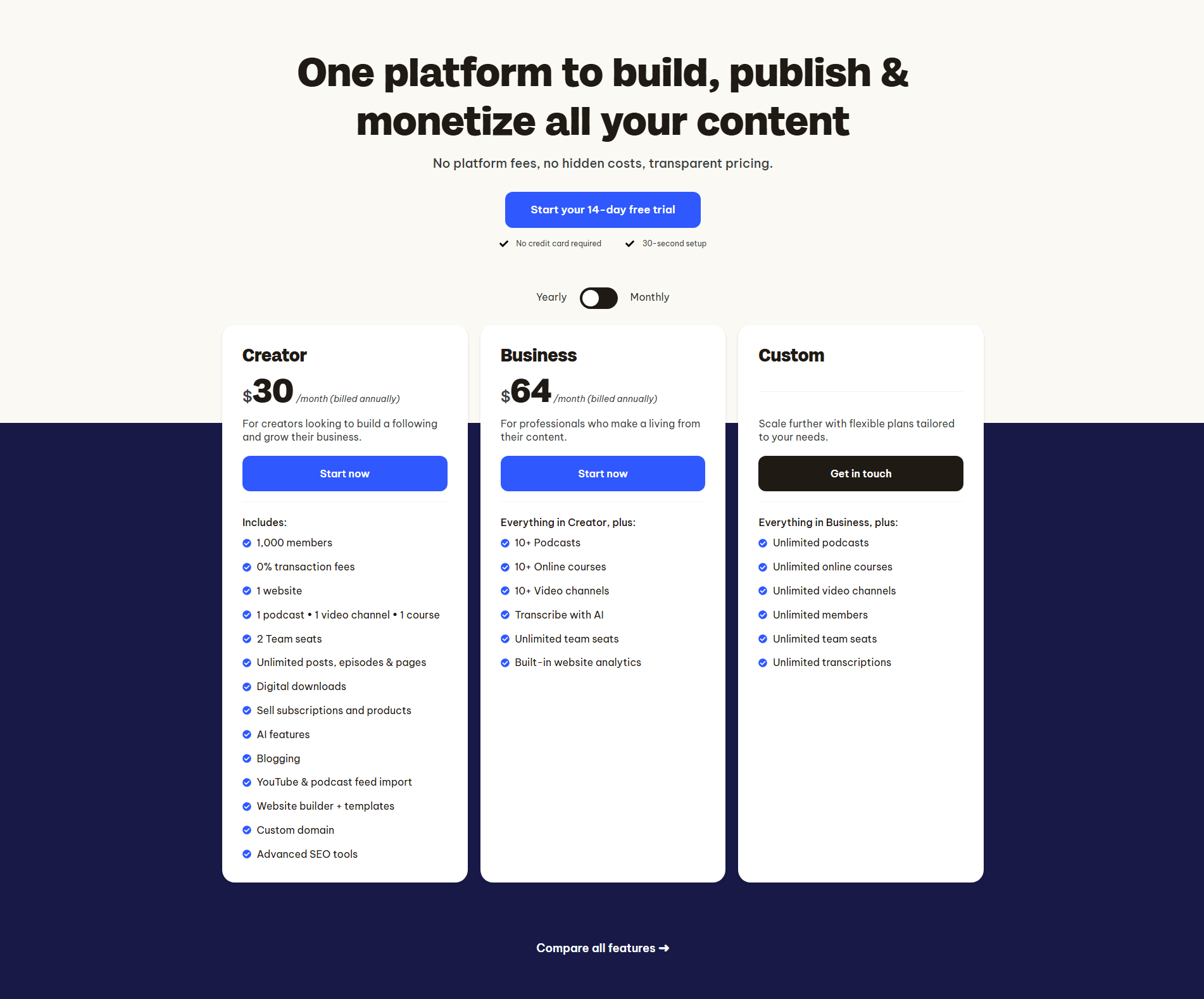
Browse every pricing pattern by UX best practice, or jump to an industry view.
Every pricing section is scored across 8 conversion best practices. Copy the best practice stack, not the layout. See what converts and why.
Hand-picked from {companies} companies and analyzed by our AI conversion agent. Not a random dump of pricing tables. Every entry earns its spot.
Found a pricing table you admire? Run yours through the same scoring engine. See where you stand on the same best practices, and what to fix first.
Risk-reducer pricing is the choice to put a reassurance next to the price, aimed at the moment a buyer's anxiety about committing is at its highest. The plan says what it costs. The reducer says what happens if the buyer is wrong: they can leave, get their money back, or never have paid at all. When both sit together, the price stops reading as a point of no return.
It usually takes one of a few forms, sometimes more than one together:
A price is where a visitor stops browsing and starts deciding, and deciding means weighing what they could lose. A plan number on its own puts the full weight of that decision on the buyer: pay first, find out later. A reducer changes the math. A free trial, a money-back guarantee, or a no-card start shrinks the downside of being wrong, so the buyer can say yes to a small step instead of a large one.
The timing is the point. The reassurance lands at the exact moment doubt peaks, next to the price rather than a scroll away, so it eases the hesitation while the buyer is still looking at the number that raised it.
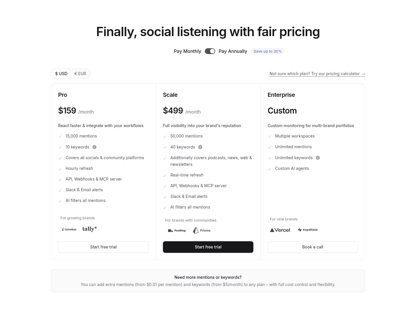
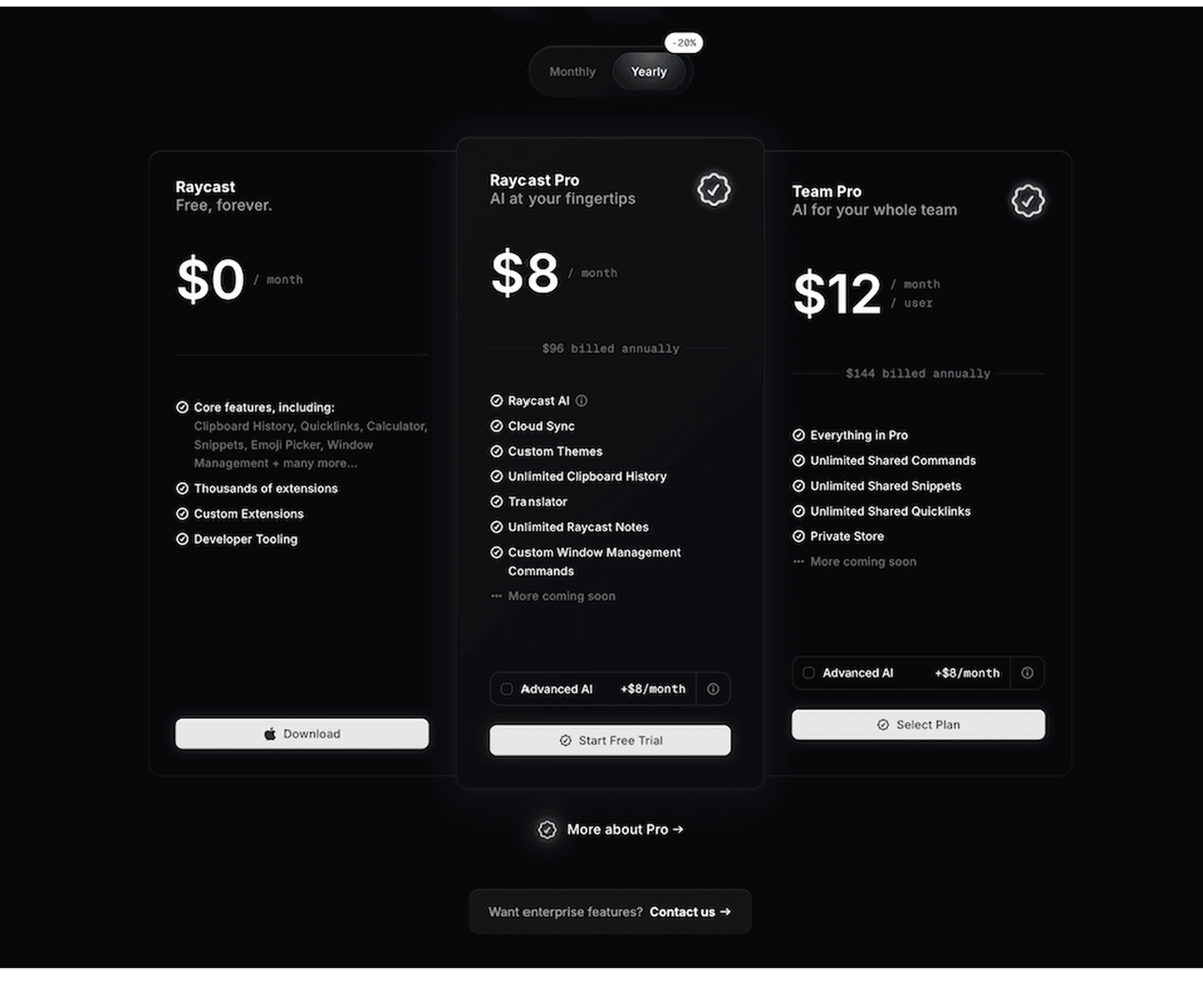
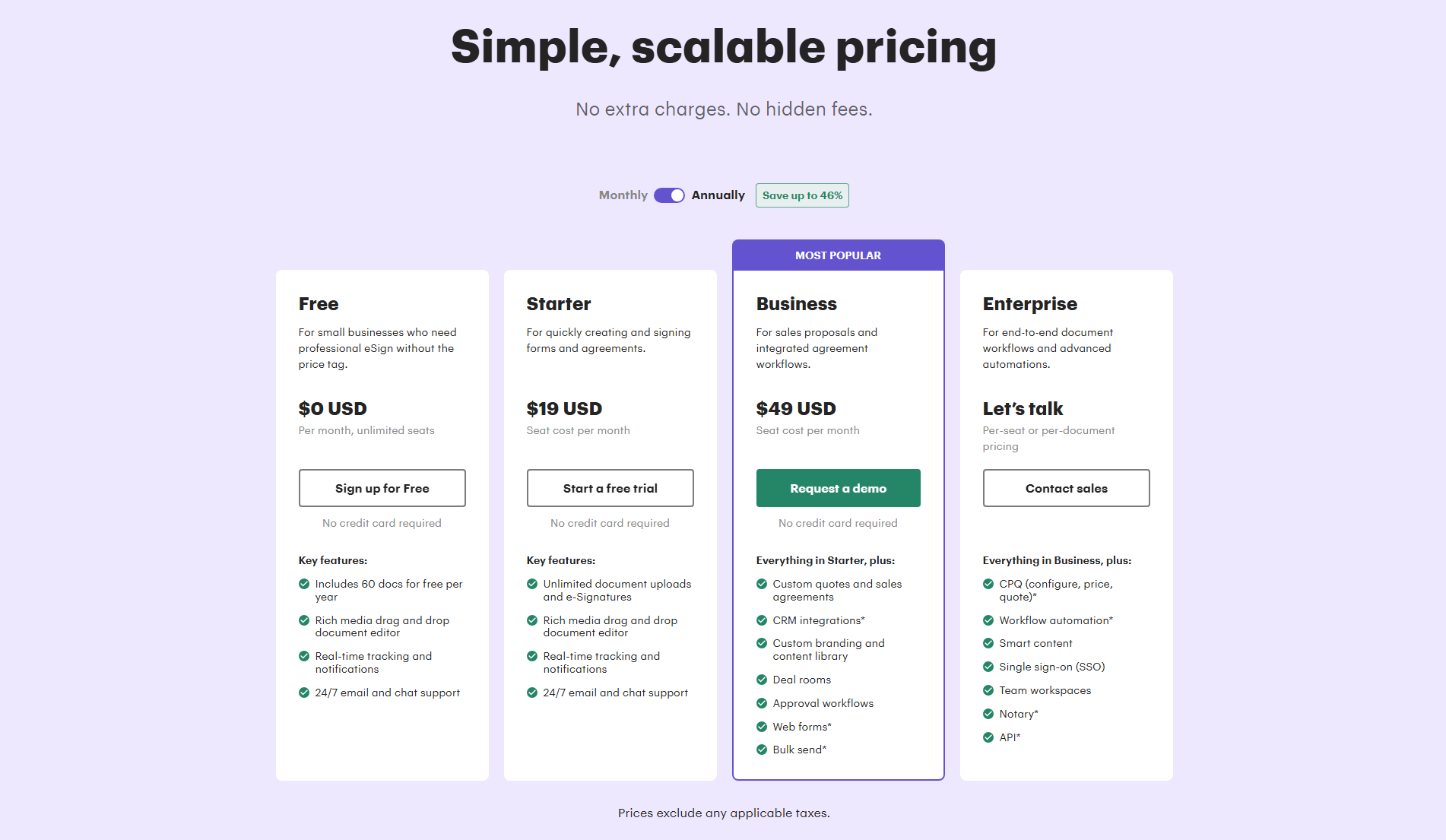
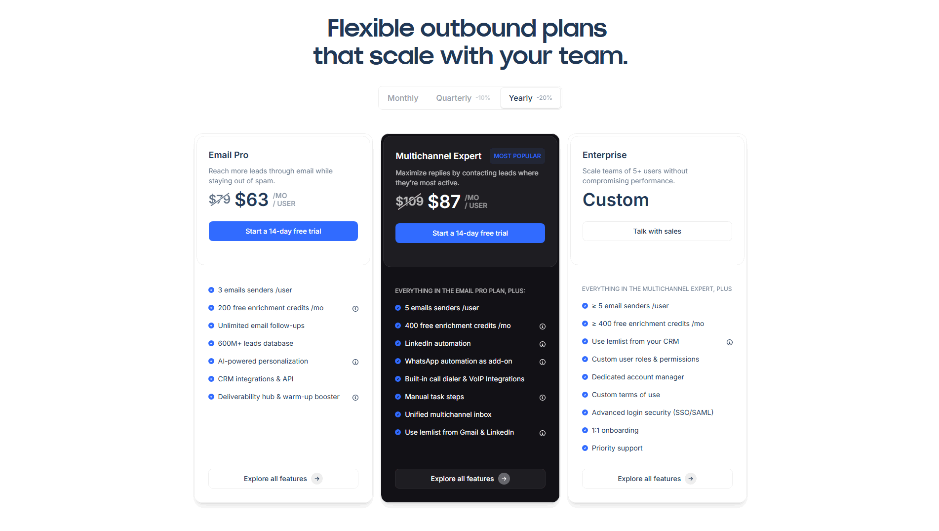
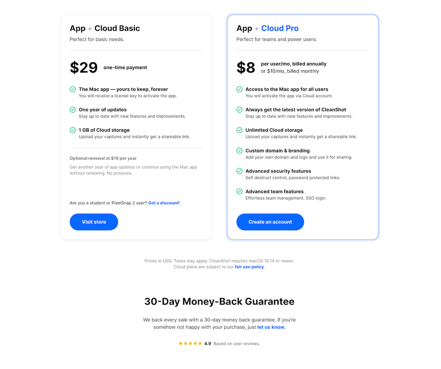
About half of the pricing sections in our library carry a risk reducer, so it is close to table stakes, and the gap now is doing it with precision. Across the examples below, the strong ones match the reducer to the fear and state it plainly. Raycast pairs a Free forever plan with a Start Free Trial button, so a cautious buyer can begin at zero cost and a ready one can trial the paid tier. PandaDoc repeats No credit card required under every CTA, which answers the quiet worry that a trial is a trap. CleanShot headlines a 30-Day Money-Back Guarantee and sits a 4.9 star rating directly beneath it, so the promise is backed by other buyers at the moment of checkout. PayFit runs No commitment and You can cancel at any time under its CTAs, aimed squarely at the fear of being locked in.
Reassurance rarely stands alone on a pricing page. The strongest pair it with a clear per-tier breakdown, which the per-feature pricing pattern covers, and the full pricing section gallery shows how these same pages handle tiers, toggles, and enterprise paths.
100/100 0/100
0/100The usual failure is a reducer that says nothing: a Risk-free badge with no terms, or a "try it today" with no hint of what happens next. The second is a promise the page then contradicts, like a free trial that demands a credit card three clicks later, which turns reassurance into bait. The third is placement, a guarantee stranded at the foot of the page far from the button where the decision is actually made. The last is stacking so many badges that none of them lands. Pick the one reducer that answers your buyer's real fear, state its terms in plain words, and put it under the CTA where the hesitation lives.

Curated by
Gabriel Amzallag , Founder, Web Anatomy
5 years CRO + SEO at Qonto (2021–2025). After advising 15+ SaaS on their websites (Payfit, Pigment…), the same patterns kept breaking, so I decided to build the source of truth on what works on the web: the intelligence layer every tool, builder, and team uses to ship sites that perform.
We find every way to grow your website’s visibility and conversions: SEO, AI search (AEO), backlinks and mentions, and UX/UI. 3 free opportunities, delivered by email.
The common questions about lowering the commitment barrier at the price, with answers drawn from 62 scored examples.
Risk-reducer pricing puts a reassurance next to the price, aimed at the moment a buyer's anxiety about committing is highest. The common forms are a free trial, a no-credit-card start, a money-back guarantee, a cancel-anytime or no-contract promise, and a genuinely free plan. Each one shrinks the downside of being wrong, so the decision to start reads as a small step rather than a point of no return.
A plan number on its own puts the full weight of the decision on the buyer: pay first, find out later. A reducer changes that math by shrinking what the buyer stands to lose if the product is not a fit. It also works on timing, because the reassurance lands at the exact moment doubt peaks, next to the price rather than a scroll away, so it eases the hesitation while the buyer is still looking at the number that raised it.
PandaDoc puts No credit card required under every CTA, CleanShot headlines a 30-Day Money-Back Guarantee below its plans, Raycast offers a Free forever tier alongside a Start Free Trial, and Sleek Analytics stacks No credit card required. Cancel anytime. under each button. PayFit runs No commitment and You can cancel at any time under its CTAs. Each removes a different reason to hesitate at the moment of decision.
Match the reducer to the fear it answers: a free trial for 'will it actually work for me', a money-back guarantee for 'will I regret paying', a no-card start or free plan for 'is this a trap'. Place it directly under the call to action, where the hesitation lives, not stranded at the foot of the page. The test is that a buyer reading the price sees the reassurance in the same glance.
It can if it is vague or contradicted, for example a Risk-free badge with no terms, or a free trial that quietly demands a card three clicks later. A specific, honest reducer does the opposite: a dated guarantee, a clear trial length, or a real free tier reads as confidence, not desperation. The strongest pricing sections state the terms in plain words so the promise is believable rather than a slogan.