Pricing|
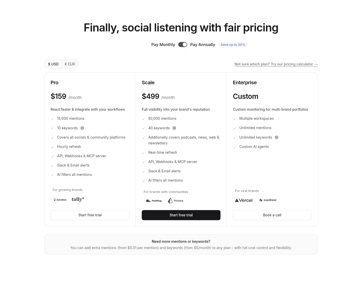
Tooltip explanations let a buyer clarify what a plan feature or line item actually means without leaving the pricing section, so the table reads as clear instead of confusing.
Key takeaways
Showing 1–13 of 13 examples
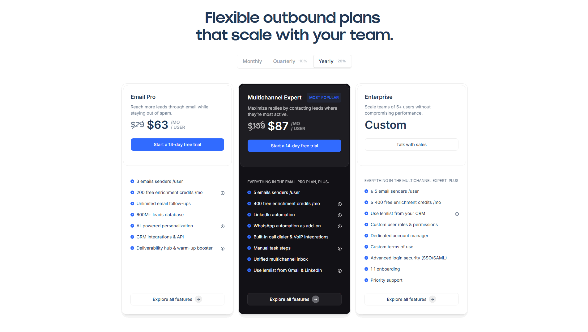
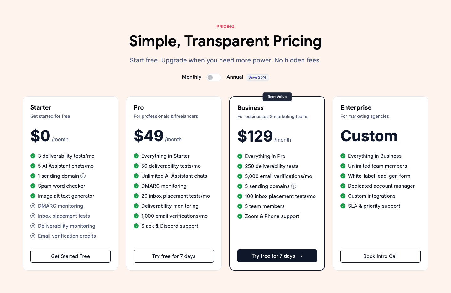

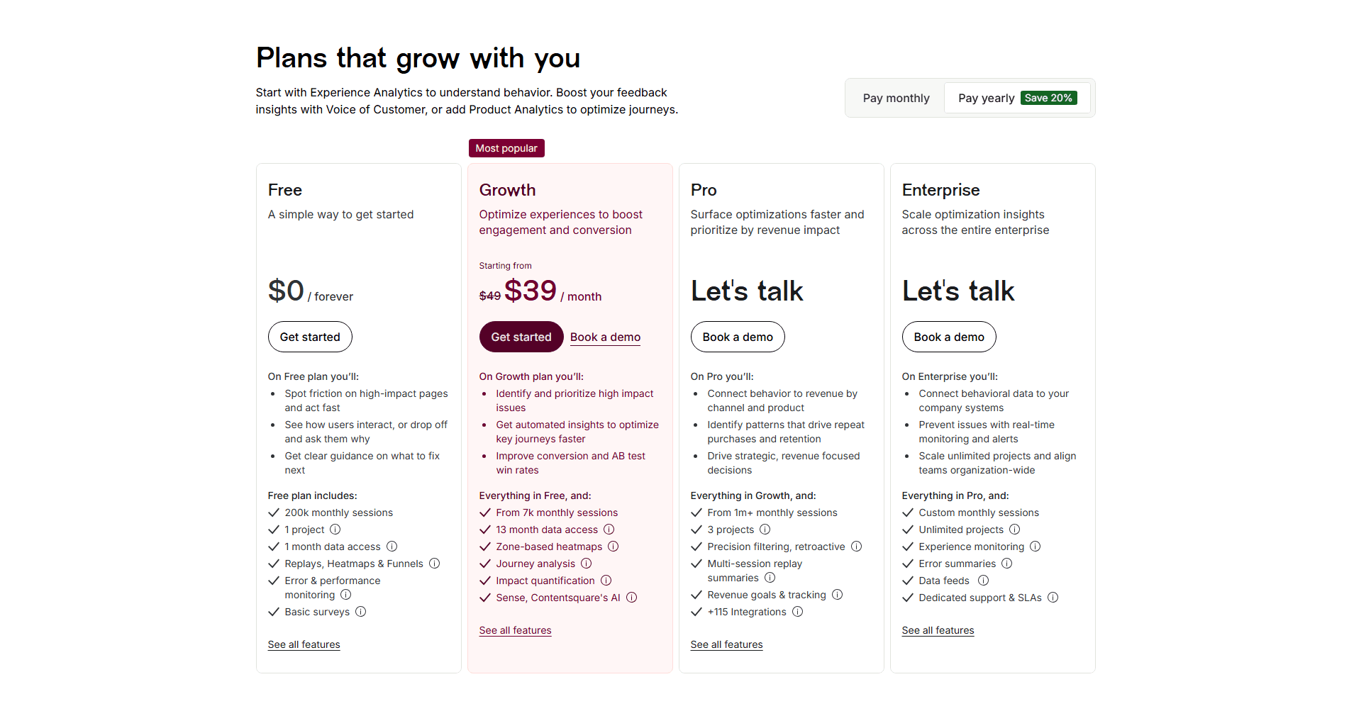
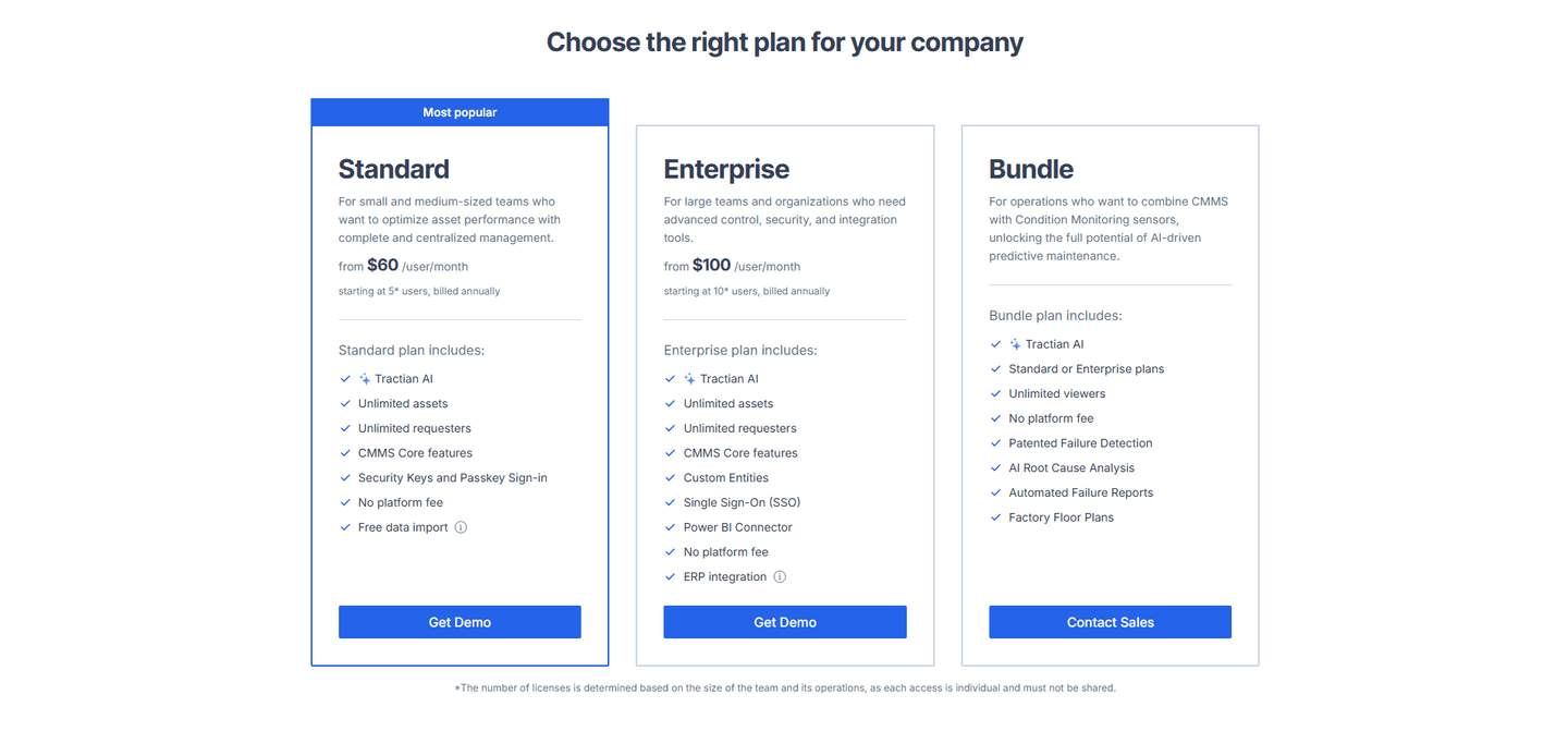
Browse every pricing pattern by UX best practice, or jump to an industry view.
Every pricing section is scored across 8 conversion best practices. Copy the best practice stack, not the layout. See what converts and why.
Hand-picked from {companies} companies and analyzed by our AI conversion agent. Not a random dump of pricing tables. Every entry earns its spot.
Found a pricing table you admire? Run yours through the same scoring engine. See where you stand on the same best practices, and what to fix first.
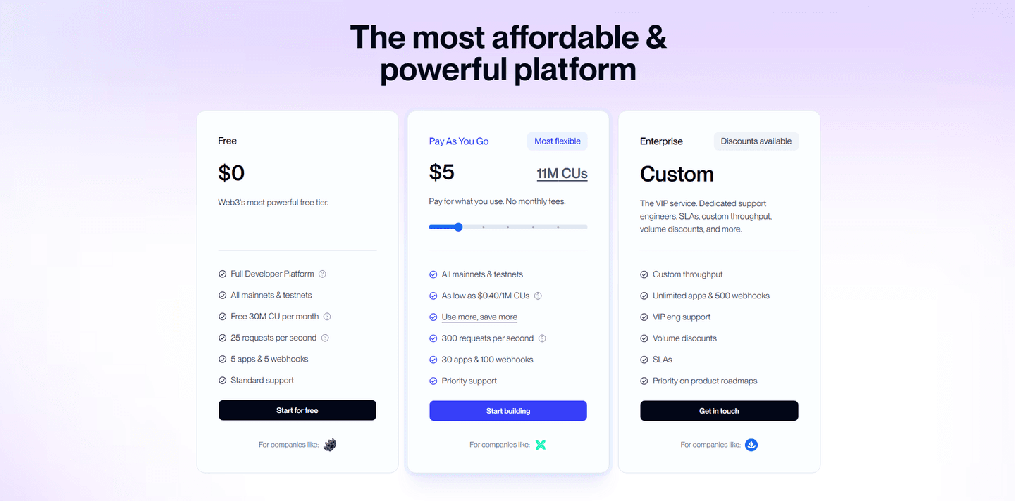
Tooltip explanations are the decision to attach a plain answer to the parts of a pricing table a buyer cannot read at face value. A feature row says "11M compute units" or "enrichment credits" or "priority routing." On its own, that is a label, not information. A tooltip turns the label into something the buyer can act on, without making them leave the page to find out what it means.
The best pricing sections use one of a few forms, often more than one together:
Pricing is the section where a visitor is deciding to spend money, so every unanswered question carries more weight than it would anywhere else on the page. When a plan lists a term the buyer cannot decode, they have three options, and two of them lose the sale: guess and risk overpaying, leave to go search, or stop to email sales. A tooltip removes the fork. It answers the question at the exact spot it appears, so the buyer stays on the path to the call to action instead of stepping off it.
The clarity compounds with the rest of the table. A tooltip that explains a usage unit is what makes side-by-side plan comparison honest rather than confusing, and it is what makes per-feature and usage-based pricing feel fair instead of opaque. The explanation is the thing that lets the numbers do their job.
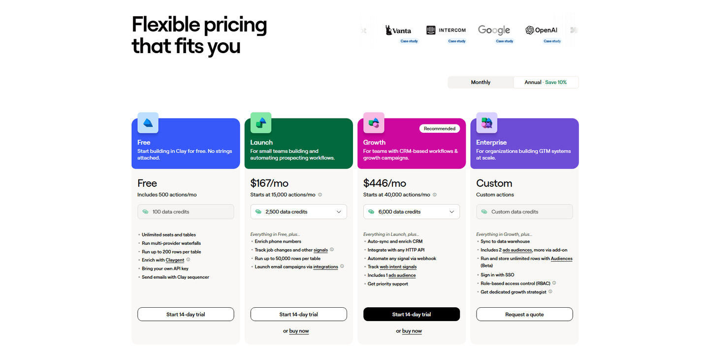
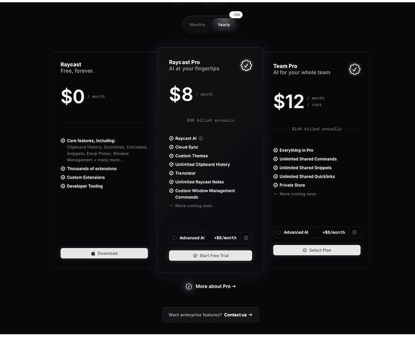
A minority of the pricing sections in the library add inline explanations, and the examples below show why the ones that do stand apart. The pattern that works is restraint paired with placement. The strongest pricing sections do not explain every row; they explain the specific terms a buyer cannot infer, and they park that detail behind an icon so the card itself stays short and scannable. Raycast pairs info icons with individual feature rows so the plan reads clean while the definitions sit one hover away. Alchemy puts tooltip icons on the rows that carry its usage units and limits, exactly where a metered plan would otherwise lose people. Contentsquare adds an info icon to every feature row so a buyer can clarify a limit without leaving the table. In each case the explanation is written as a plain answer, not a second, longer feature name.
100/100 0/100
0/100The usual failure is a tooltip that repeats the label instead of explaining it: hovering "enrichment credits" to read "credits used for enrichment" tells the buyer nothing they did not already know. The second is burying the terms that actually matter, so the one unit that drives the whole cost has no explanation while trivial rows get three. The third is a tooltip that only works on hover, invisible to every buyer on a phone. Explain the words a buyer cannot guess, write the answer in plain language, and make sure it opens on tap as well as hover.

Curated by
Gabriel Amzallag , Founder, Web Anatomy
5 years CRO + SEO at Qonto (2021–2025). After advising 15+ SaaS on their websites (Payfit, Pigment…), the same patterns kept breaking, so I decided to build the source of truth on what works on the web: the intelligence layer every tool, builder, and team uses to ship sites that perform.
Paste your URL. Get a scored analysis of your pricing section, including whether buyers can decode what they are paying for. Free, no signup.
The common questions about explaining features inside the pricing table, with answers drawn from 13 scored examples.
They are small, on-demand notes attached to a feature or price line that explain what it means. The most common forms are an info icon next to a feature row, a hover card that defines a usage unit or limit, an inline footnote on credits or add-ons, and an expandable row that reveals the detail only when a buyer asks for it.
Pricing is where a buyer commits real money, so unanswered questions cost sales. When a plan lists a term the buyer cannot decode, such as compute units, enrichment credits, or a per-seat rule, the choice is to guess, leave and search, or ask sales. A tooltip answers the question in place, at the exact moment it comes up, so the buyer keeps moving toward the call to action instead of away from it.
The things a buyer cannot infer from the label alone. That means usage units and how they are counted, what a credit or an action buys, where a limit sits, what an add-on costs, and any condition hidden behind an asterisk. If a term is plain English already, it does not need a tooltip. Reserve them for the words that would otherwise send a buyer to a docs page.
Done well, they do the opposite. The whole point is to keep the card clean and readable while parking the detail behind an icon, so only the buyers who want the fine print see it. Cluttered tables come from cramming every caveat into the visible row. A tooltip lets the row stay short and the explanation stay one hover away.
They are a minority pattern, which is part of why they stand out. Most pricing sections list features as bare labels and leave the buyer to interpret them. The pricing sections that add inline explanations tend to be the usage-based and multi-tier ones, where a single unexplained unit can stall the whole decision.