Pricing|
Trust signals cost a buyer nothing to add, yet most pricing sections leave them out; these 14 examples show how the strongest ones place logos, ratings, and customer counts right where the buying decision happens.
Key takeaways
Showing 1–14 of 14 examples
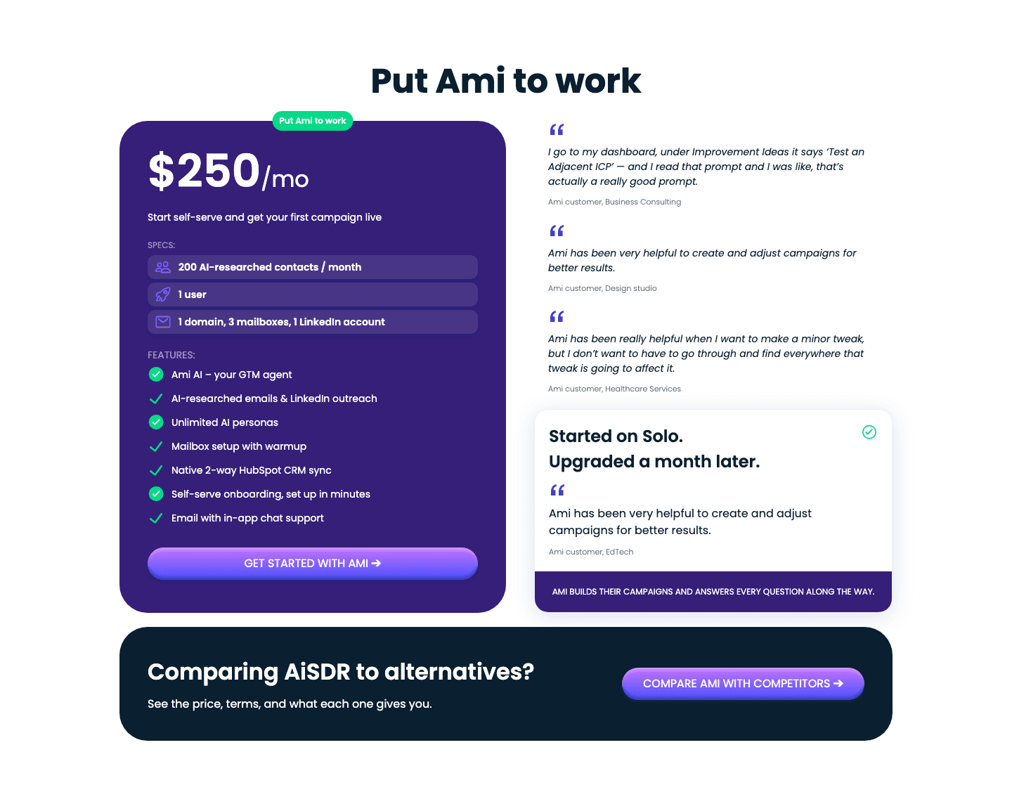
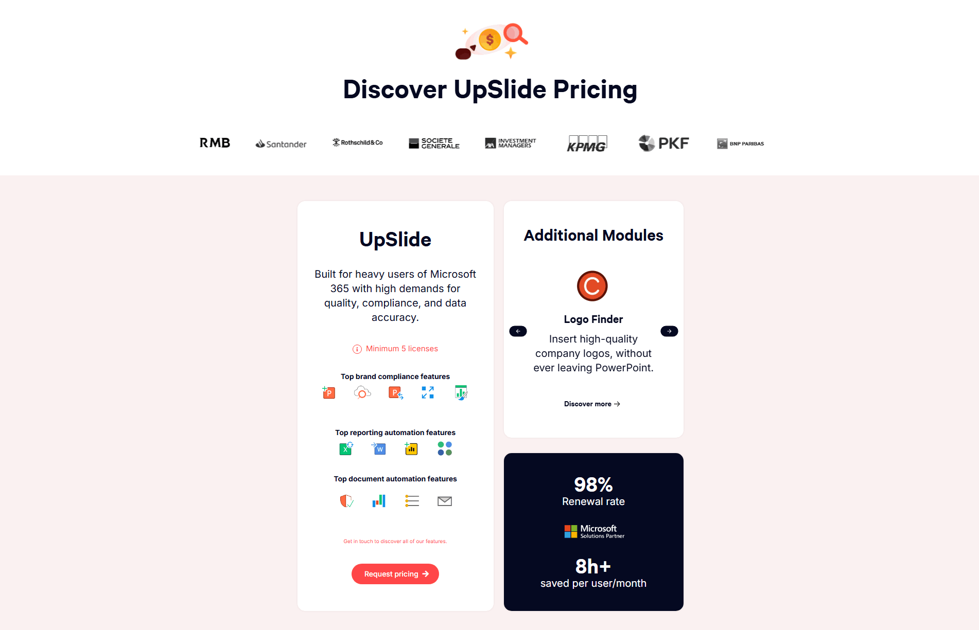
Browse every pricing pattern by UX best practice, or jump to an industry view.
Every pricing section is scored across 8 conversion best practices. Copy the best practice stack, not the layout. See what converts and why.
Hand-picked from {companies} companies and analyzed by our AI conversion agent. Not a random dump of pricing tables. Every entry earns its spot.
Found a pricing table you admire? Run yours through the same scoring engine. See where you stand on the same best practices, and what to fix first.
Social proof in pricing is the decision to place evidence right at the tiers, so the buyer sees who already trusts the product at the same moment they read the price. Most of the page has already made the case; the pricing section is where the visitor weighs a real commitment. Putting proof next to the number means the reassurance arrives at the exact point doubt tends to show up.
The best pricing sections use one of a few concrete forms, often more than one at once:
The pricing section is where a visitor switches from reading to deciding, and deciding is where hesitation lives: is this worth the money, will it work for a team like mine, is it safe to pay. A plan card with a price and a button answers none of that on its own. The same card with a logo the buyer recognizes, a rating they trust, or a real customer count answers it without a word of extra copy.
Placement is what makes the proof land. Trust signals stacked at the top of the page reach the visitor before they care about price, and a testimonial three sections below the plans reaches them after they have already decided to leave. Proof at the tiers reaches the buyer in the one moment it matters most, when their eye is on the number and their hand is near the button.
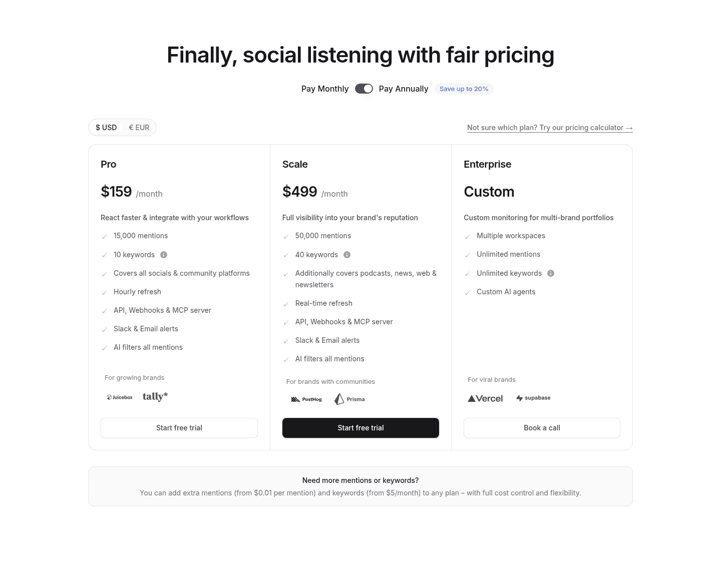
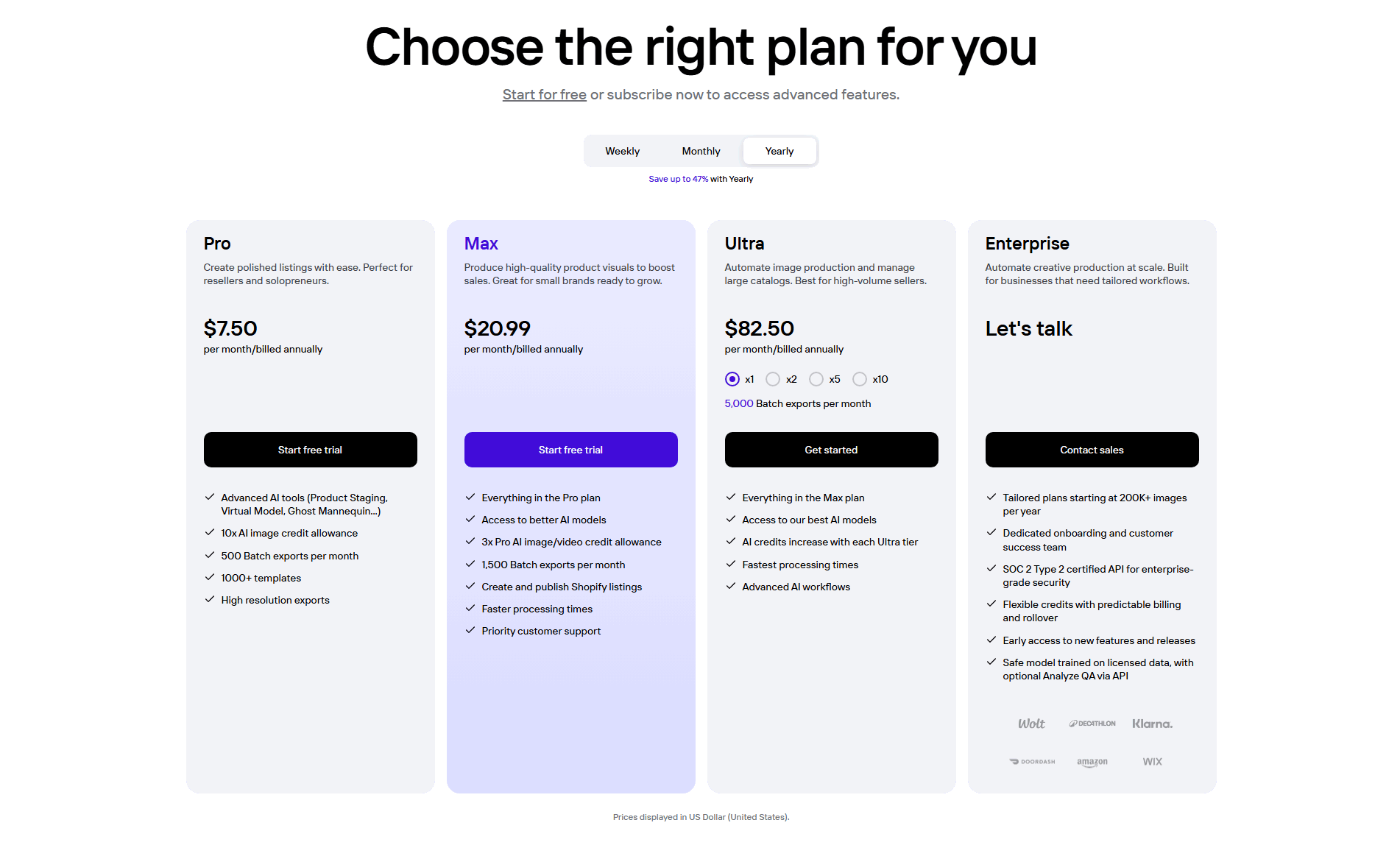
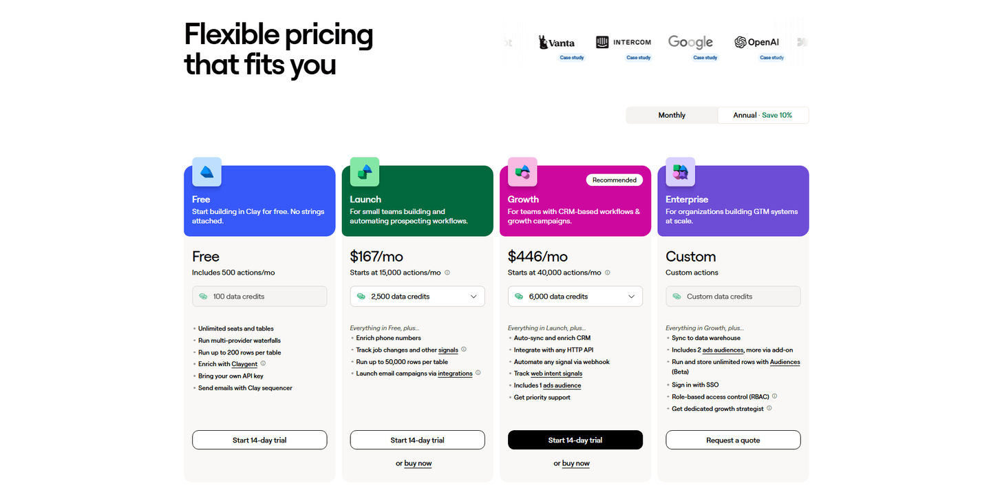
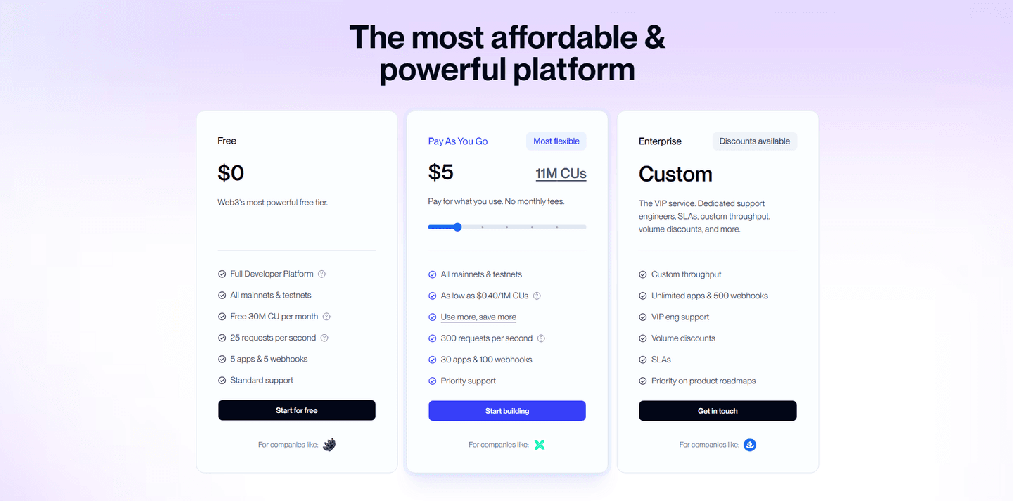
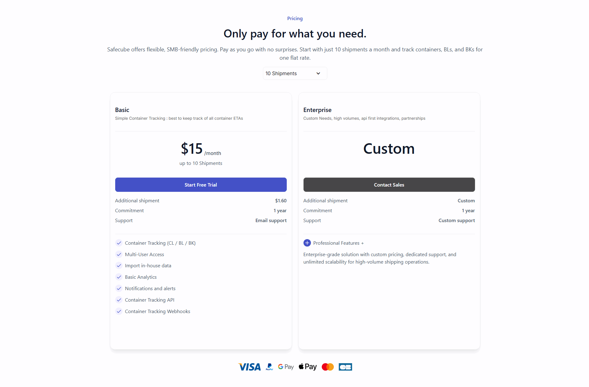
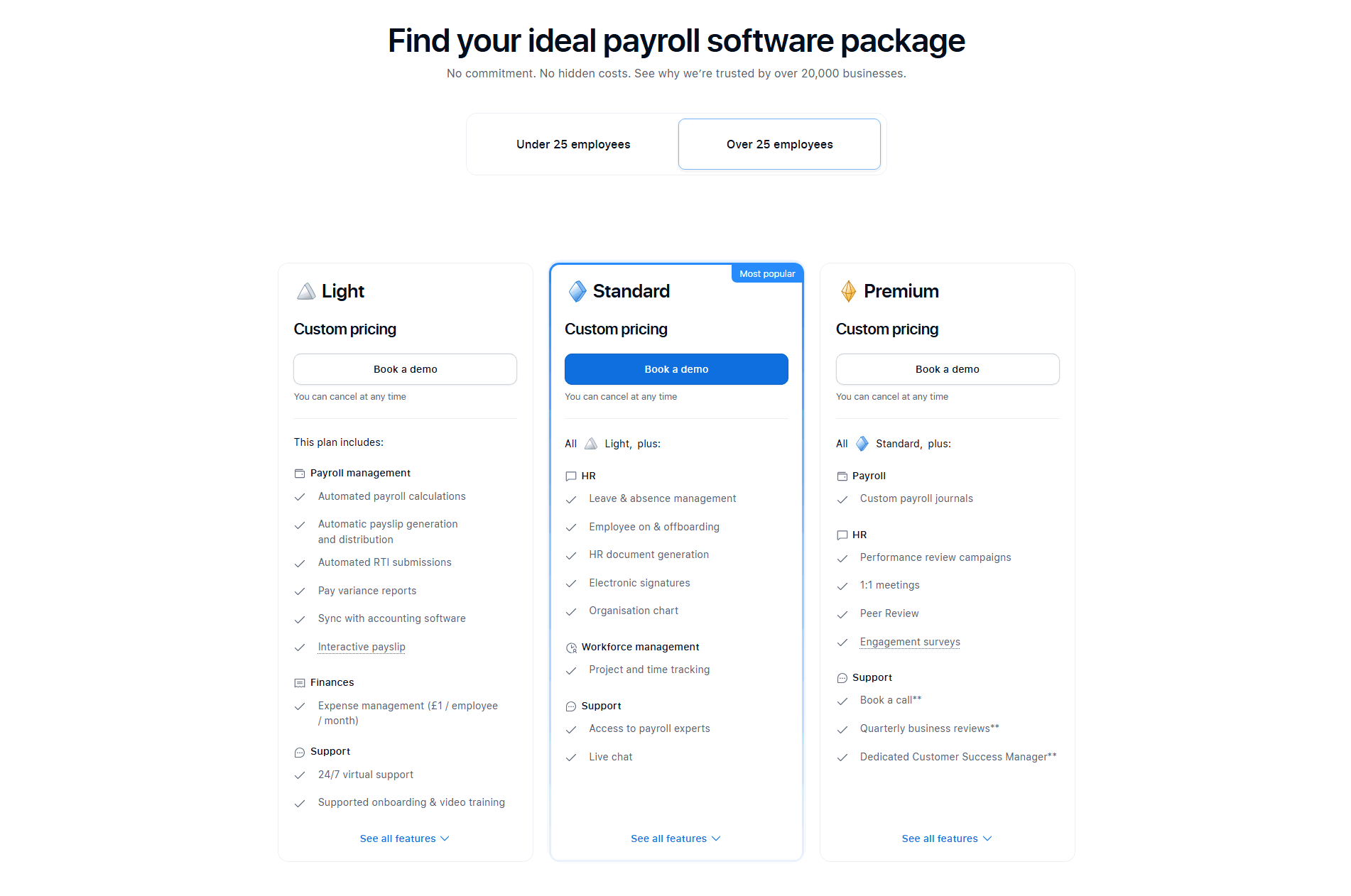
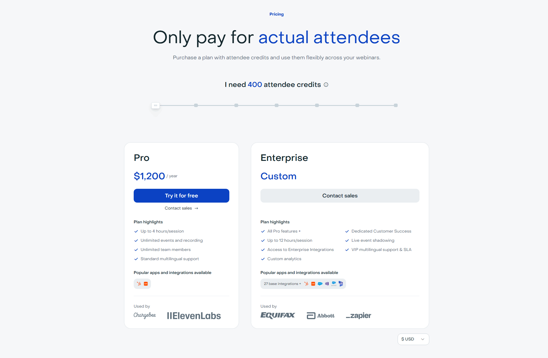
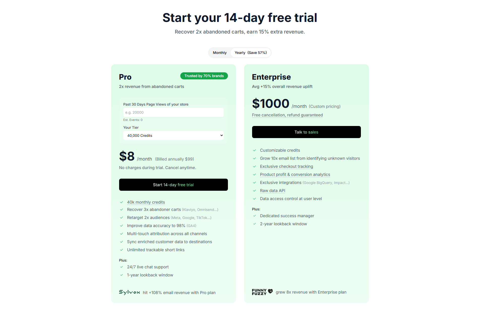
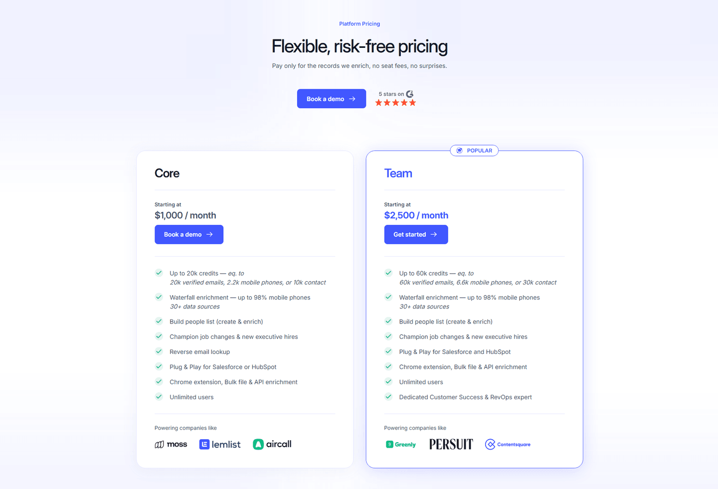
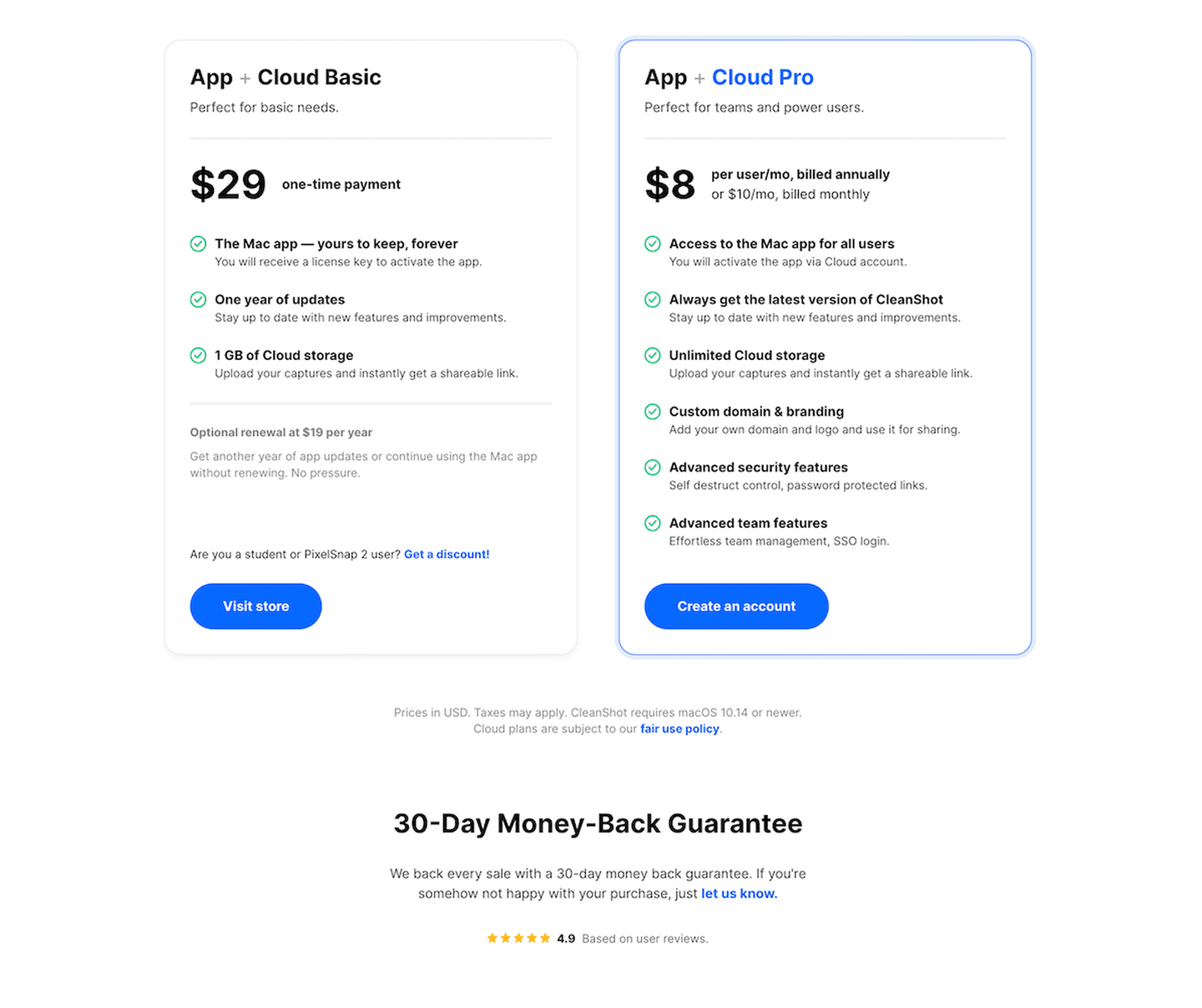
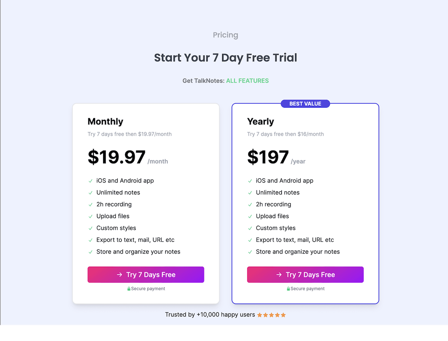
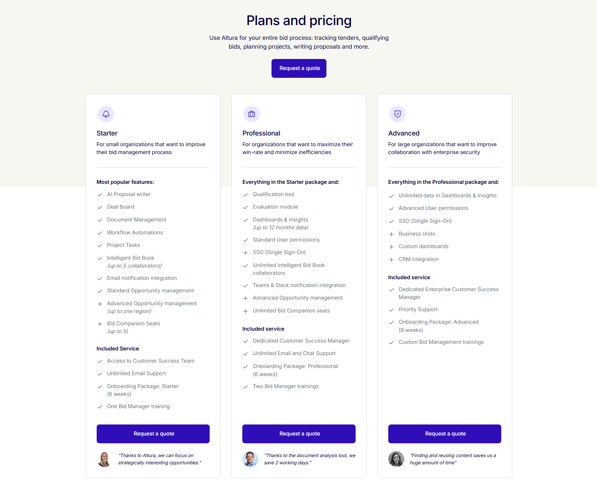
Across the scored examples below, the pricing sections that use proof well share one habit: they match the signal to the buyer and keep it close to the decision. Octolens and Alchemy tuck customer logos under each tier, so a developer sees names like the ones they already use before they read a feature. Livestorm goes further and tiers the proof itself, showing self-serve logos on its Pro card and enterprise names on Enterprise, so each buyer sees peers rather than a generic wall. Clay places its case-study logos beside the pricing header, PayFit states its customer count in the subhead right above the plans, and CleanShot and Talknotes put a star rating directly under the cards, next to the buy button. In every case the proof shares the screen with the price instead of living somewhere the buyer has to scroll back to find.
Proof rarely carries a price on its own. It reads strongest next to a risk reducer like a money-back guarantee that removes the downside of saying yes, and a recommended-plan badge that anchors attention on the tier most buyers should pick, so the visitor trusts the product, feels safe paying, and knows which plan to choose.
100/100 0/100
0/100The usual failure is proof that sits nowhere near the price: a strong logo bar in the hero and a wall of testimonials at the bottom, with the pricing section left as bare cards and buttons in between, exactly where the buyer needed the reassurance. The second is vague proof that a skeptic discounts on sight, a "trusted by thousands" with no name, number, or rating behind it. The third is over-stacking, where so many badges and logos crowd the tiers that the plans and the buy button lose the eye. Keep one strong, specific signal per tier, place it beside the number, and let the plans stay the thing the buyer reads first.

Curated by
Gabriel Amzallag , Founder, Web Anatomy
5 years CRO + SEO at Qonto (2021–2025). After advising 15+ SaaS on their websites (Payfit, Pigment…), the same patterns kept breaking, so I decided to build the source of truth on what works on the web: the intelligence layer every tool, builder, and team uses to ship sites that perform.
Paste your URL. Get a scored analysis of your pricing section, including whether your proof lands right where buyers decide. Free, no signup.
The common questions about placing trust signals at the pricing tiers, with answers drawn from 14 scored examples.
It means placing credibility signals inside or right beside the pricing tiers, at the moment a visitor is deciding whether to buy. The common forms are a row of customer logos next to or inside the plan cards, an aggregate star rating near the call to action, a quantified count like 'trusted by 20,000 businesses', or a short customer result line stated on a card. Octolens puts customer logos under each tier, and CleanShot places a 4.9 star rating directly below its money-back guarantee.
The pricing section is where a visitor stops reading and starts weighing a real commitment, and that is exactly the moment doubt shows up: is this worth it, will it work for a team like mine, is it safe to pay. Proof placed at the tiers answers that doubt in the same glance as the price. Logos, a rating, or a real customer count tell the buyer that people like them already decided yes, so the number on the card reads as a fair price rather than a risk.
Customer logos, an aggregate rating from an app store or review site, a count of users or companies, and a short named result all work. The strongest pricing sections match the proof to the buyer: Livestorm shows Chargebee and ElevenLabs on its self-serve Pro card and Equifax, Abbott, and Zapier on Enterprise, so each tier carries logos its buyer recognizes. Talknotes pairs a plus-10,000 user count with a 5-star rating under the cards, combining breadth with a rating a buyer already knows how to read.
As close to the decision as possible: inside the plan cards, in the pricing header, or in a thin strip directly under the plans and the buy buttons. Clay sits its case-study logos beside the pricing header, Octolens and Alchemy tuck logos under each tier, and CleanShot and Talknotes run a rating right below the cards. The goal is that a buyer never has to scroll away from the price to find the reason to trust it.
Enough to reassure without burying the plans. One well-placed signal per tier, or one rating and one count under the cards, is usually right. A wall of logos or three competing badges pulls the eye off the plans and the buy button, which is the opposite of the goal. Lead with the single proof point the buyer most needs at that price, and keep it legible next to the number.